library(ggplot2)

te_pal <- list(forest = "#275139", green = "#2f8f63", sage = "#93a87f",
               clay = "#b5534e", gold = "#cda23f", line = "#dad9ca",
               ink = "#16241d", paper = "#f5f4ee")

theme_te <- function() {
  theme_minimal(base_size = 12) +
    theme(panel.grid.minor = element_blank(),
          panel.grid.major = element_line(colour = "#e7e6dc"),
          plot.background = element_rect(fill = "#f5f4ee", colour = NA),
          panel.background = element_rect(fill = "#f5f4ee", colour = NA),
          plot.title = element_text(face = "bold", colour = te_pal$ink),
          axis.title = element_text(colour = "#2c3a31"))
}Checking a presence-only model
R
MaxEnt
species distributions
presence-only
model diagnostics
ecology tutorial
ggplot2
Four diagnostics for a presence-only species distribution model in R: novel environments and clamping, the four MaxEnt outputs, the AUC ceiling and splits.
Three posts in this cluster have built a presence-only model and taken it apart. MaxEnt as a Poisson point process established what the fitting is. Regularisation and features in MaxEnt measured what the two settings everyone changes do to a fitted response curve. Sampling bias in presence-only models measured what happens when the records describe the recorder rather than the species. None of them checked the result.
Checking is where presence-only modelling borrows most heavily from a method it does not resemble. The habits come from presence-absence work: hold some records back, compute an AUC, cut the map at a threshold, call the output a probability. Every one of those steps assumes something the records do not supply, and the assumption stays invisible because the software returns a number either way.
This post runs four checks on simulated landscapes where the truth is fixed. Each is self-contained: a simulator, a measurement, and a consequence for something an ecologist would report. Two show a familiar diagnostic measuring the wrong quantity, one shows a standard fix doing less than it appears to, and one ends with a train-test split I would not have chosen. Where the data contain real absences the ordinary tools work and Evaluating species distribution model performance covers them.
Check one: where the covariates run out
The first check is the one that gets skipped, because nothing about a fitted model announces that it is being asked a question outside the range of its training data. The setting is ordinary: a model fitted on records from one area and used to map a larger one, which happens whenever a model is projected to a future climate, to a neighbouring country, or to the parts of the region nobody surveyed.
The landscape is a square grid of cells, each one square kilometre. Two covariates run across it. The species responds to the first with a sharp peak, and with a second, smaller peak at a covariate value of 0.86, deliberately placed outside the range the training area covers. Records come only from the western band, where the first covariate never gets above 0.547.
set.seed(20260816)
side_n <- 60
n_cell <- side_n * side_n
cell_area <- 1
gx <- rep(seq(0, 1, length.out = side_n), times = side_n)
gy <- rep(seq(0, 1, length.out = side_n), each = side_n)

wig <- function(u, v, k1, k2) 0.07 * sin(6 * k1 * u + 2.2 * v) + 0.05 * cos(5 * k2 * v - 1.4 * u)
rescale01 <- function(u) (u - min(u)) / (max(u) - min(u))
env_a <- rescale01(gx + wig(gx, gy, 1.0, 1.0))
env_b <- rescale01(gy + wig(gy, gx, 1.3, 0.8))

resp_a <- function(u) 3.2 * exp(-0.5 * ((u - 0.35) / 0.11)^2) +
                      2.6 * exp(-0.5 * ((u - 0.86) / 0.07)^2)
resp_b <- function(u) 1.6 * u - 1.0 * u^2
eta_true <- resp_a(env_a) + resp_b(env_b)

in_train <- gx <= 0.60
n_rec <- 1500
pr_tr <- exp(eta_true) * in_train
rec_cell <- sample.int(n_cell, n_rec, replace = TRUE, prob = pr_tr / sum(pr_tr))

print(c(cells = n_cell, train_cells = sum(in_train), records = n_rec,
        area_sq_km = n_cell * cell_area))
cells train_cells records area_sq_km
3600 2160 1500 3600 print(round(c(train_lo_a = min(env_a[in_train]), train_hi_a = max(env_a[in_train]),
full_hi_a = max(env_a), hidden_peak = 0.86), 3)) train_lo_a train_hi_a full_hi_a hidden_peak
0.000 0.547 1.000 0.860 A novelty measure says how far outside the training range each prediction cell sits. The idea is the multivariate environmental similarity surface of Elith, Kearney and Phillips: score each covariate by its distance from the nearer edge of the training range, as a percentage of that range, and take the minimum across covariates. Positive means inside on every covariate, negative outside on at least one. The version below drops the original’s percentile refinement.
novelty <- function(vals, lo, hi) 100 * pmin(vals - lo, hi - vals) / (hi - lo)
lo_a <- min(env_a[in_train]); hi_a <- max(env_a[in_train])
lo_b <- min(env_b[in_train]); hi_b <- max(env_b[in_train])
mess_v <- pmin(novelty(env_a, lo_a, hi_a), novelty(env_b, lo_b, hi_b))
inside <- mess_v >= 0

print(round(c(mess_min = min(mess_v), mess_max = max(mess_v)), 2))
mess_min mess_max
-82.70 48.96 print(c(inside_cells = sum(inside), novel_cells = sum(!inside)))inside_cells novel_cells
2324 1276 Now three treatments of the same prediction problem: an unclamped hinge-basis fit, the default kind of MaxEnt model; the same fit with the covariates truncated to the training range before the features are built, which is what clamping does; and a feature class with no capacity to bend, linear and quadratic terms only. The fit is the penalised point process likelihood from the first post in this cluster, with a small ridge term for stability, and the background points are the cells of the training band.
ppm_fit <- function(xp, xq, wq, pen) {
  sp <- colSums(xp); bb <- rep(0, ncol(xq)); bb[1] <- log(nrow(xp) / sum(wq))
  for (it in 1:80) {
    mu <- wq * exp(as.vector(xq %*% bb))
    gr <- sp - as.vector(crossprod(xq, mu)) - pen * bb; gr[1] <- gr[1] + pen * bb[1]
    hs <- crossprod(xq * mu, xq) + pen * diag(ncol(xq)); hs[1, 1] <- hs[1, 1] - pen
    st <- solve(hs, gr); bb <- bb + st
    if (max(abs(st)) < 1e-8) break
  }
  list(par = bb, iter = it)
}

n_knot <- 6
knot_a <- unname(quantile(env_a[in_train], seq(0.08, 0.92, length.out = n_knot)))
knot_b <- unname(quantile(env_b[in_train], seq(0.08, 0.92, length.out = n_knot)))
hinges <- function(v, kn) cbind(outer(v, kn, function(p, q) pmax(0, p - q)),
                                outer(v, kn, function(p, q) pmax(0, q - p)))
x_hinge <- function(va, vb) cbind(1, va, vb, hinges(va, knot_a), hinges(vb, knot_b))
x_quad <- function(va, vb) cbind(1, va, va^2, vb, vb^2)

ridge_pen <- 1e-3
wq_tr <- rep(cell_area, sum(in_train))
fit_h <- ppm_fit(x_hinge(env_a[rec_cell], env_b[rec_cell]),
                 x_hinge(env_a[in_train], env_b[in_train]), wq_tr, ridge_pen)
fit_q <- ppm_fit(x_quad(env_a[rec_cell], env_b[rec_cell]),
                 x_quad(env_a[in_train], env_b[in_train]), wq_tr, ridge_pen)
print(c(hinge_columns = length(fit_h$par), quad_columns = length(fit_q$par),
        hinge_iters = fit_h$iter, quad_iters = fit_q$iter))
hinge_columns quad_columns hinge_iters quad_iters
27 5 7 8 ca <- pmin(pmax(env_a, lo_a), hi_a)
cb <- pmin(pmax(env_b, lo_b), hi_b)
align <- function(e) e - mean(e[inside])
tt <- align(eta_true)
preds <- list(unclamped = align(as.vector(x_hinge(env_a, env_b) %*% fit_h$par)),
clamped = align(as.vector(x_hinge(ca, cb) %*% fit_h$par)),
quadratic = align(as.vector(x_quad(env_a, env_b) %*% fit_q$par)))
err_tab <- t(vapply(preds, function(e)
c(rmse_inside = sqrt(mean((e - tt)[inside]^2)),
rmse_novel = sqrt(mean((e - tt)[!inside]^2)),
lowest = min(e)), numeric(3)))
print(round(err_tab, 3)) rmse_inside rmse_novel lowest
unclamped 0.214 8.459 -14.982
clamped 0.214 1.581 -2.371
quadratic 0.793 10.008 -21.489print(round(c(truth_lowest = min(tt), truth_highest = max(tt),
truth_highest_novel = max(tt[!inside])), 3)) truth_lowest truth_highest truth_highest_novel
-2.003 1.745 1.145 Presence-only output has no level, so each prediction is aligned to the truth on the cells inside the envelope before the errors are taken; the numbers below are errors of shape, on the log intensity scale. Inside the envelope the two hinge treatments are identical, as they must be, at a root mean squared error of 0.214, and the stiff quadratic fit is several times worse at 0.793. That is the ordinary trade and the one people tune for.
Outside the envelope the ordering means nothing. The unclamped hinge fit reaches 8.459 and the quadratic 10.008, against a truth whose entire span across the region is from -2.003 to 1.745: both are wrong by more than the dynamic range of the thing they estimate. The lowest value the unclamped fit puts anywhere is -14.982 and the quadratic -21.489, one part in three million and one part in two thousand million on a relative intensity scale. Neither came from data. They came from a hinge segment and a parabola followed off the end of the evidence.
top_novel <- which(!inside)[which.max(tt[!inside])]
print(round(c(env_a_there = env_a[top_novel], truth = tt[top_novel],
              unclamped = preds$unclamped[top_novel],
              clamped = preds$clamped[top_novel],
              quadratic = preds$quadratic[top_novel]), 3))
env_a_there truth unclamped clamped quadratic
0.860 1.145 -10.620 -1.706 -12.350 step_w <- 2.5
brk <- seq(0, ceiling(max(-mess_v[!inside]) / step_w) * step_w, by = step_w)
bin_mid <- brk[-1] - step_w / 2
gapv <- tapply(abs(preds$unclamped - preds$clamped)[!inside],
cut(-mess_v[!inside], breaks = brk, include.lowest = TRUE), median)
cross <- bin_mid[which(gapv > log(2))[1]]
print(round(c(log_two = log(2), crossing_novelty = cross,
gap_at_bin_8 = unname(gapv[bin_mid == 8.75]),
gap_at_bin_38 = unname(gapv[bin_mid == 38.75]),
factor_at_bin_38 = exp(unname(gapv[bin_mid == 38.75]))), 3)) log_two crossing_novelty gap_at_bin_8 gap_at_bin_38
0.693 6.250 1.307 6.045
factor_at_bin_38
422.185 The cell where the truth is highest outside the envelope sits at a covariate value of 0.860, on the second peak, and the truth there is 1.145, against 1.745 at the best cell anywhere in the region. The unclamped model predicts -10.620 and the quadratic -12.350. Both maps say, without hedging, that the best remaining habitat in the study area is empty.
Clamping is the standard answer and it does help: the novel-area error falls to 1.581 and the lowest predicted value stops at -2.371. But look at what it did. The clamped prediction at the second peak is -1.706, which is not right either; it is the value at the edge of the training range, held flat for as far as the map runs. Clamping does not make an extrapolated prediction correct. It makes it constant, and a constant is easier to look at than a chasm. In bins 2.5 per cent wide, the clamped and unclamped maps part company by a factor of two at 6.25 per cent beyond the envelope edge, and by 38.75 per cent beyond it the median disagreement is 6.045 log units, a factor of 422.
u_seq <- seq(0, 1, length.out = 250)
b_mid <- median(env_b[in_train])
uc <- pmin(pmax(u_seq, lo_a), hi_a)
ctr <- function(e) e - mean(e[u_seq <= hi_a])
trans_df <- rbind(
  data.frame(u = u_seq, val = ctr(resp_a(u_seq) + resp_b(b_mid)), what = "truth"),
  data.frame(u = u_seq, val = ctr(as.vector(x_hinge(u_seq, rep(b_mid, 250)) %*% fit_h$par)),
             what = "unclamped hinge"),
  data.frame(u = u_seq, val = ctr(as.vector(x_hinge(uc, rep(b_mid, 250)) %*% fit_h$par)),
             what = "clamped hinge"),
  data.frame(u = u_seq, val = ctr(as.vector(x_quad(u_seq, rep(b_mid, 250)) %*% fit_q$par)),
             what = "linear plus quadratic"))
trans_df$what <- factor(trans_df$what, levels = c("truth", "unclamped hinge",
                                                  "clamped hinge", "linear plus quadratic"))

ggplot(trans_df, aes(x = u, y = val, colour = what, linetype = what)) +
  annotate("rect", xmin = hi_a, xmax = 1, ymin = -12, ymax = 4,
           fill = te_pal$clay, alpha = 0.09) +
  geom_line(linewidth = 0.9) +
  geom_vline(xintercept = hi_a, colour = te_pal$ink, linetype = "dotted") +
  coord_cartesian(ylim = c(-12, 4)) +
  scale_colour_manual(values = c(truth = te_pal$ink, "unclamped hinge" = te_pal$clay,
                                 "clamped hinge" = te_pal$gold,
                                 "linear plus quadratic" = te_pal$green), name = NULL) +
  scale_linetype_manual(values = c(truth = "dashed", "unclamped hinge" = "solid",
                                   "clamped hinge" = "solid",
                                   "linear plus quadratic" = "solid"), name = NULL) +
  labs(title = "Outside the training envelope the model is inventing",
       x = "covariate env_a", y = "relative log intensity") +
  theme_te()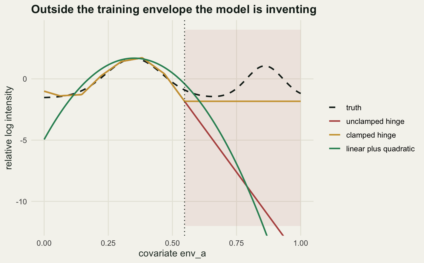
The surprise is the third treatment. A simple feature class is often recommended as the safe choice for projection, and here it is the worst of the three outside the envelope, because a parabola extrapolates faster than a straight line. Stiffness is not safety. What the measurement supports is duller: 1276 of the 3600 cells are novel on at least one covariate, and the honest output is a map with those cells masked and the mask shown to whoever reads it.
Check two: one surface wearing four hats
MaxEnt reports its prediction as raw, cumulative, logistic or cloglog output, and the choice is usually made by whichever one the last paper used. The second check builds all four from the same fitted model. The landscape is the one above, refitted with records from the whole region so that there is no extrapolation to confuse the issue.
set.seed(20260819)
rec_all <- sample.int(n_cell, n_rec, replace = TRUE, prob = exp(eta_true) / sum(exp(eta_true)))
knot_fa <- unname(quantile(env_a, seq(0.08, 0.92, length.out = n_knot)))
knot_fb <- unname(quantile(env_b, seq(0.08, 0.92, length.out = n_knot)))
x_full <- function(va, vb) cbind(1, va, vb, hinges(va, knot_fa), hinges(vb, knot_fb))
xq_all <- x_full(env_a, env_b)
fit_f <- ppm_fit(x_full(env_a[rec_all], env_b[rec_all]), xq_all,
                 rep(cell_area, n_cell), ridge_pen)
eta_f <- as.vector(xq_all %*% fit_f$par)

raw_v <- exp(eta_f) / sum(exp(eta_f))
ent_h <- -sum(raw_v * log(raw_v))
srt <- sort(raw_v)
cum_v <- 100 * cumsum(srt)[match(raw_v, srt)]
logi_v <- raw_v * exp(ent_h) / (1 + raw_v * exp(ent_h))
clog_v <- 1 - exp(-raw_v * exp(ent_h))
outs <- list(raw = raw_v, cumulative = cum_v, logistic = logi_v, cloglog = clog_v)
print(round(c(entropy = ent_h, log_cells = log(n_cell), exp_entropy = exp(ent_h),
              raw_sum = sum(raw_v), raw_max = max(raw_v)), 4))
entropy log_cells exp_entropy raw_sum raw_max
7.7348 8.1887 2286.4996 1.0000 0.0014 Raw output is the Gibbs density: it sums to one over the background, so on this map of 3600 cells its largest value is 0.0014. Cumulative output replaces each cell by the total raw output of that cell and every cell below it, times 100. Logistic and cloglog rescale the raw value by exp(H), where H is the entropy of the raw distribution: here 7.7348 against a maximum of 8.1887 for a flat map, so the scaling constant is 2286.4996. All three are increasing functions of the raw value alone.
nm <- names(outs)
cor_tab <- data.frame()
for (i in 1:3) for (j in (i + 1):4)
  cor_tab <- rbind(cor_tab, data.frame(pair = paste(nm[i], nm[j], sep = " vs "),
                    spearman = cor(outs[[i]], outs[[j]], method = "spearman")))
print(cor_tab)
pair spearman
1 raw vs cumulative 1
2 raw vs logistic 1
3 raw vs cloglog 1
4 cumulative vs logistic 1
5 cumulative vs cloglog 1
6 logistic vs cloglog 1auc_fun <- function(sp, sb) {
rr <- rank(c(sp, sb)); np <- length(sp); nb <- length(sb)
(sum(rr[seq_len(np)]) - np * (np + 1) / 2) / (np * nb)
}
auc_v <- vapply(outs, function(v) auc_fun(v[rec_all], v), numeric(1))
print(signif(auc_v, 10)) raw cumulative logistic cloglog
0.7628659 0.7628659 0.7628659 0.7628659 print(c(auc_spread = max(auc_v) - min(auc_v), spearman_min = min(cor_tab$spearman))) auc_spread spearman_min
0 1 Every pairwise Spearman correlation is 1, exactly, and the AUC against background is 0.7628659 under all four, with a spread across the four of 0. That is not an approximation and it is not luck. Rank statistics cannot see a monotone transform, so any diagnostic built on ranking gives the same answer whichever output you chose. If two papers report different AUCs from the same data, the transform is not the reason.
What the transforms do change is where the values sit, and that matters the moment anyone applies a threshold.
cut_off <- 0.5
sel_tab <- data.frame(output = nm,
                      pct_above = round(100 * vapply(outs, function(v)
                        mean(v > cut_off), numeric(1)), 2),
                      area_sq_km = vapply(outs, function(v)
                        sum(v > cut_off) * cell_area, numeric(1)))
print(sel_tab, row.names = FALSE)
output pct_above area_sq_km
raw 0.00 0
cumulative 94.50 3402
logistic 22.78 820
cloglog 33.69 1213One fitted model, one cut-off of 0.5, four answers: 0 square kilometres of suitable habitat under raw output, 820 under logistic, 1213 under cloglog and 3402 under cumulative, which is 0 per cent against 94.5 per cent of a 3600 square kilometre region. A methods section reading “cells above 0.5 were classed as suitable” does not describe an analysis.
The rescaling constant is where the real assumption hides. Multiplying the raw density by exp(H) is a choice that makes the output 0.5 at a cell of average conditions. Written the other way round, it assumes a prevalence: a fraction of the region the species occupies. Replace that assumption with an explicit one and the map moves.
s_v <- raw_v * n_cell
k_for_tau <- function(tau) {
  ff <- function(lk) mean(1 - exp(-exp(lk) * s_v)) - tau
  exp(uniroot(ff, c(-30, 30), tol = 1e-10)$root)
}
tau_lo <- 0.10
tau_hi <- 0.50
p_lo <- 1 - exp(-k_for_tau(tau_lo) * s_v)
p_hi <- 1 - exp(-k_for_tau(tau_hi) * s_v)
focal <- which.min(abs(rank(raw_v) - 0.90 * n_cell))
print(round(c(default_prevalence = mean(clog_v),
              focal_low = p_lo[focal], focal_high = p_hi[focal],
              area_low = sum(p_lo > cut_off) * cell_area,
              area_high = sum(p_hi > cut_off) * cell_area,
              spearman_lo_hi = cor(p_lo, p_hi, method = "spearman")), 4))
default_prevalence focal_low focal_high area_low
0.3806 0.2465 0.9317 0.0000
area_high spearman_lo_hi
1682.0000 1.0000 The default cloglog map on this fit carries an implied prevalence of 0.3806: it is asserting that the species occupies about 38 per cent of the region. Set the assumed prevalence to 0.1 instead and the cell at the 90th percentile of suitability reads 0.2465; set it to 0.5 and the same cell reads 0.9317. The area above the 0.5 cut-off goes from 0 to 1682 square kilometres. The Spearman correlation between the two maps is 1. The ranking is data. The level is a keystroke.
pct <- 100 * (rank(raw_v) - 0.5) / n_cell
tr_df <- rbind(data.frame(pct = pct, val = raw_v, out = "raw"),
               data.frame(pct = pct, val = cum_v, out = "cumulative"),
               data.frame(pct = pct, val = logi_v, out = "logistic"),
               data.frame(pct = pct, val = clog_v, out = "cloglog"))
tr_df$out <- factor(tr_df$out, levels = nm)
hl_df <- data.frame(out = factor(c("cumulative", "logistic", "cloglog"), levels = nm),
                    ycut = cut_off)

ggplot(tr_df, aes(x = pct, y = val)) +
  geom_line(colour = te_pal$forest, linewidth = 0.9) +
  geom_hline(data = hl_df, aes(yintercept = ycut), colour = te_pal$clay,
             linetype = "dashed") +
  facet_wrap(~out, scales = "free_y", nrow = 2) +
  labs(title = "One ranking, four scales, one threshold",
       x = "map cells ordered by suitability (percentile)", y = "reported output") +
  theme_te()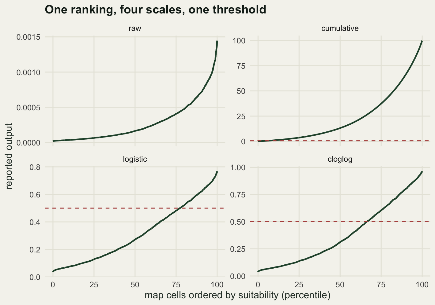
The reliability diagrams and recalibration methods in Probability calibration for classifiers are the right tools for asking whether a predicted probability means what it says, and they cannot be applied here: they need observed outcomes at known sites, and a presence-only dataset has none. A presence-only model is uncalibratable in that sense, not because nobody wrote the function, but because the data carry no information about the level.
Check three: AUC against background has a ceiling
Presence-only evaluation almost always ends with an AUC computed from presences against background points. The third check measures what that number can be.
The reasoning is short. Background points come from the whole region, not from places the species is known to be absent, so a share of them fall inside genuinely suitable habitat. Against those, even a perfect model cannot rank the presences higher; the best it can do is tie, and a tie contributes half. If the species occupies a fraction a of the region, a perfect ranking gives (1 - a) from the unsuitable background plus a/2 from the suitable background: a ceiling of 1 - a/2. Phillips, Anderson and Schapire state it in the original MaxEnt paper. It is easy to forget, so here it is measured.
set.seed(20260817)
side_c <- 100
n_c <- side_c * side_c
cx <- rep(seq(0.005, 0.995, length.out = side_c), times = side_c)
cy <- rep(seq(0.005, 0.995, length.out = side_c), each = side_c)
fld <- function(px, py, npk, wid) {
  ax <- runif(npk); ay <- runif(npk); am <- rnorm(npk)
  zz <- numeric(length(px))
  for (k in seq_len(npk)) zz <- zz + am[k] * exp(-((px - ax[k])^2 + (py - ay[k])^2) / wid)
  zz
}
env_c <- (rank(fld(cx, cy, 16, 0.02)) - 0.5) / n_c

n_pres <- 300; n_bg <- 4000; n_rep_c <- 40
prev_v <- c(0.05, 0.10, 0.20, 0.40, 0.60)
ceil_tab <- data.frame()
for (aa in prev_v) {
  suit <- which(env_c >= 1 - aa)
  ach <- numeric(n_rep_c)
  for (r in seq_len(n_rep_c))
    ach[r] <- auc_fun(env_c[sample(suit, n_pres, replace = TRUE)],
                      env_c[sample.int(n_c, n_bg, replace = TRUE)])
  ceil_tab <- rbind(ceil_tab, data.frame(prevalence = aa, achieved = mean(ach),
                                         spread = sd(ach), ceiling = 1 - aa / 2))
}
ceil_tab$gap <- ceil_tab$ceiling - ceil_tab$achieved
print(round(ceil_tab, 4), row.names = FALSE)
prevalence achieved spread ceiling gap
0.05 0.9754 0.0022 0.975 -0.0004
0.10 0.9496 0.0037 0.950 0.0004
0.20 0.8994 0.0053 0.900 0.0006
0.40 0.8004 0.0079 0.800 -0.0004
0.60 0.6983 0.0124 0.700 0.0017print(c(cells = n_c, presences = n_pres, background = n_bg, replicates = n_rep_c)) cells presences background replicates
10000 300 4000 40 Five species are simulated on the same landscape, occupying the top 5, 10, 20, 40 and 60 per cent of the covariate. Each is fitted with a model that ranks cells exactly right, so any shortfall is the ceiling and nothing else. The achieved AUC lands on 1 - a/2 every time: the largest departure across the five is 0.0017, smaller than the replicate spread at the widest range.
The consequence is hard to avoid. The narrow-range species scores 0.9754 and the widespread one 0.6983, and both models are exactly right. An AUC of 0.70 from a species occupying most of the region is a perfect model; so is an AUC of 0.90 from a species restricted to a fifth of it. Comparing the two measures range size. Lobo, Jimenez-Valverde and Real make the general case against AUC here; the range-size confound turns up in every multi-species table.
The same effect arrives from the other direction if you keep the species and change the map.
rad <- 0.20
ctr_xy <- 0.25
dst <- sqrt((cx - ctr_xy)^2 + (cy - ctr_xy)^2)
in_range <- dst <= rad
wid_v <- c(0.5, 0.6, 0.75, 0.9, 1.0)
ext_tab <- data.frame()
for (ww in wid_v) {
  keep <- which(cx <= ww & cy <= ww)
  suit2 <- which(in_range & cx <= ww & cy <= ww)
  ach <- numeric(n_rep_c)
  for (r in seq_len(n_rep_c))
    ach[r] <- auc_fun(-dst[sample(suit2, n_pres, replace = TRUE)],
                      -dst[sample(keep, n_bg, replace = TRUE)])
  aeff <- length(suit2) / length(keep)
  ext_tab <- rbind(ext_tab, data.frame(extent_cells = length(keep), prev_eff = aeff,
                                       achieved = mean(ach), ceiling = 1 - aeff / 2))
}
print(round(ext_tab, 4), row.names = FALSE)
extent_cells prev_eff achieved ceiling
2500 0.5056 0.7471 0.7472
3600 0.3511 0.8244 0.8244
5625 0.2247 0.8881 0.8876
8100 0.1560 0.9215 0.9220
10000 0.1264 0.9381 0.9368print(round(c(range_cells = sum(in_range),
auc_small_extent = ext_tab$achieved[1],
auc_large_extent = ext_tab$achieved[5],
extent_factor = ext_tab$extent_cells[5] / ext_tab$extent_cells[1]), 3)) range_cells auc_small_extent auc_large_extent extent_factor
1264.000 0.747 0.938 4.000 One species, occupying a disc of 1264 cells, and one model that ranks by distance from the centre of that disc. Nothing about either changes. Enlarging the study extent by a factor of 4 moves the reported AUC from 0.7471 to 0.9381, because the extra area is empty and easy. Whoever draws the box around the study area sets the score.
ceil_pts <- rbind(data.frame(prev = ceil_tab$prevalence, auc = ceil_tab$achieved,
                             src = "species range varied"),
                  data.frame(prev = ext_tab$prev_eff, auc = ext_tab$achieved,
                             src = "study extent varied"))
ceil_line <- data.frame(prev = seq(0.02, 0.62, length.out = 120))
ceil_line$auc <- 1 - ceil_line$prev / 2

ggplot(ceil_pts, aes(x = prev, y = auc)) +
  geom_line(data = ceil_line, colour = te_pal$ink, linewidth = 0.8) +
  geom_hline(yintercept = 1, colour = te_pal$sage, linetype = "dotted", linewidth = 0.9) +
  geom_point(aes(colour = src, shape = src), size = 3) +
  scale_colour_manual(values = c("species range varied" = te_pal$clay,
                                 "study extent varied" = te_pal$green), name = NULL) +
  scale_shape_manual(values = c("species range varied" = 16,
                                "study extent varied" = 17), name = NULL) +
  coord_cartesian(ylim = c(0.65, 1.02)) +
  labs(title = "A perfect model cannot reach an AUC of one",
       x = "fraction of the study extent the species occupies",
       y = "AUC against background") +
  theme_te()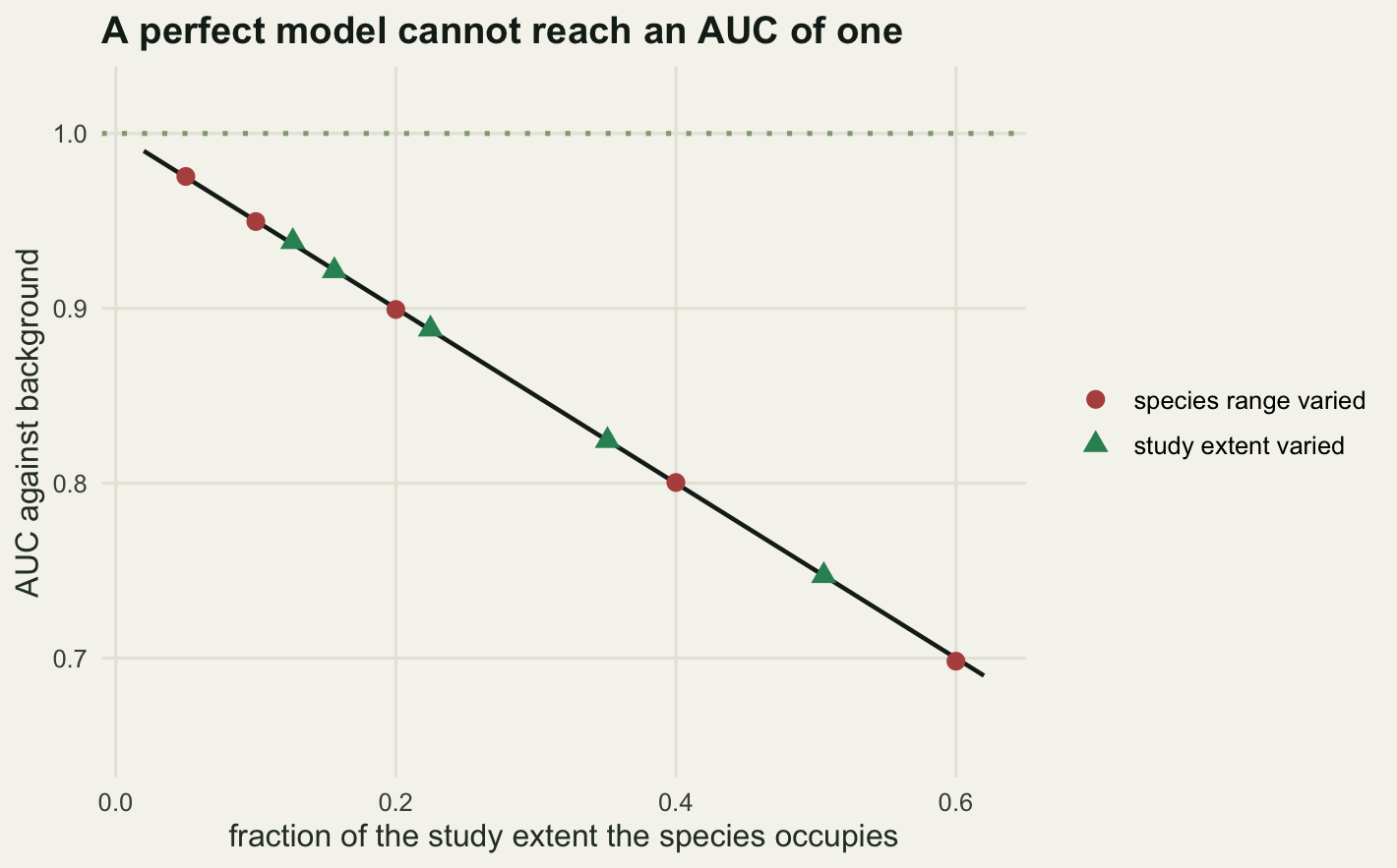
Check four: held-out records are not held-out sites
The last check is about the split. Holding records back is supposed to say how the map will behave on data it has not seen. With presence-only records the held-out set carries the same sampling bias as the training set, so a good score can be the bias agreeing with itself.
The simulation has two covariates. The species responds to the first and is indifferent to the second; survey effort follows the second. Records are drawn from the product, as in the sampling bias post, and the fitted model includes both covariates, so it will read the effort pattern as habitat. Three splits are compared: a random split of the records, a spatially blocked split holding out 7 of 25 blocks, and a split on the effort surface, training in the well-surveyed half and testing in the poorly surveyed half. Each is scored against background from its own test area. The truth is a separate unbiased sample that no model ever sees.
set.seed(20260818)
side_d <- 60
n_d <- side_d * side_d
dx <- rep((seq_len(side_d) - 0.5) / side_d, times = side_d)
dy <- rep((seq_len(side_d) - 0.5) / side_d, each = side_d)
env_1 <- (rank(fld(dx, dy, 12, 0.04)) - 0.5) / n_d
env_2 <- (rank(fld(dx, dy, 6, 0.10)) - 0.5) / n_d
b_env <- 1.8
g_eff <- 1.8
p_true <- exp(b_env * env_1); p_true <- p_true / sum(p_true)
p_obs <- exp(b_env * env_1 + g_eff * env_2); p_obs <- p_obs / sum(p_obs)
blk <- floor(dx * 5) * 5 + floor(dy * 5) + 1
n_block_out <- 7
hi_eff <- env_2 > median(env_2)
xall <- cbind(1, env_1, env_2)

n_obs <- 600; n_ind <- 600; n_rep_d <- 30
acc <- array(0, c(n_rep_d, 3, 3))
n_test <- matrix(0, n_rep_d, 3)
for (r in seq_len(n_rep_d)) {
  rc <- sample.int(n_d, n_obs, replace = TRUE, prob = p_obs)
  ic <- sample.int(n_d, n_ind, replace = TRUE, prob = p_true)
  tr <- sample.int(n_obs, round(0.7 * n_obs))
  ho <- sample(unique(blk), n_block_out)
  isho <- blk[rc] %in% ho
  ise <- hi_eff[rc]
  sets <- list(list(tr = rc[tr], te = rc[-tr], q = seq_len(n_d), bg = seq_len(n_d)),
               list(tr = rc[!isho], te = rc[isho], q = which(!(blk %in% ho)),
                    bg = which(blk %in% ho)),
               list(tr = rc[ise], te = rc[!ise], q = which(hi_eff), bg = which(!hi_eff)))
  for (s in 1:3) {
    ss <- sets[[s]]
    bb <- ppm_fit(xall[ss$tr, , drop = FALSE], xall[ss$q, , drop = FALSE],
                  rep(1, length(ss$q)), 1e-4)$par
    sc <- as.vector(xall %*% bb)
    acc[r, s, 1] <- auc_fun(sc[ss$te], sc[ss$bg])
    acc[r, s, 2] <- auc_fun(sc[ic], sc)
    acc[r, s, 3] <- bb[3]
    n_test[r, s] <- length(ss$te)
  }
}
split_tab <- data.frame(scheme = c("random records", "spatial blocks", "effort split"),
                        test_records = colMeans(n_test),
                        reported = apply(acc[, , 1], 2, mean),
                        truth = apply(acc[, , 2], 2, mean),
                        env_2_slope = apply(acc[, , 3], 2, mean))
split_tab$gap <- split_tab$reported - split_tab$truth
print(split_tab$scheme)
[1] "random records" "spatial blocks" "effort split" print(round(split_tab[, -1], 4), row.names = FALSE) test_records reported truth env_2_slope gap
180.0000 0.7222 0.6021 1.8256 0.1201
161.1333 0.6874 0.6034 1.8001 0.0841
138.7667 0.5991 0.6049 1.7587 -0.0058print(c(records = n_obs, unbiased = n_ind, replicates = n_rep_d,
blocks_held_out = n_block_out, true_env_2_effect = 0)) records unbiased replicates blocks_held_out
600 600 30 7
true_env_2_effect
0 print(round(c(best_gap = min(abs(split_tab$gap)), worst_gap = max(abs(split_tab$gap)),
gap_ratio = max(abs(split_tab$gap)) / min(abs(split_tab$gap))), 3)) best_gap worst_gap gap_ratio
0.006 0.120 20.745 All three fitted models are equally wrong about the species. The effort covariate has no effect on it, and the three fits give it a slope of 1.8256, 1.8001 and 1.7587, against a true effect of 0. Only the evaluation differs. On this run the random split reports 0.7222 against a truth of 0.6021, overstating by 0.1201; the spatial blocks report 0.6874 and overstate by 0.0841; the effort split reports 0.5991 and is out by 0.0058, twenty times closer than the random split.
bar_df <- data.frame(scheme = factor(split_tab$scheme, levels = split_tab$scheme),
                     auc = split_tab$reported,
                     spread = apply(acc[, , 1], 2, sd))

ggplot(bar_df, aes(x = scheme, y = auc)) +
  geom_col(fill = te_pal$sage, width = 0.6) +
  geom_errorbar(aes(ymin = auc - spread, ymax = auc + spread), width = 0.14,
                colour = te_pal$forest) +
  geom_hline(yintercept = mean(split_tab$truth), colour = te_pal$clay,
             linetype = "dashed", linewidth = 0.9) +
  coord_cartesian(ylim = c(0.52, 0.78)) +
  labs(title = "What each split reports, against the truth",
       x = NULL, y = "AUC of held-out records against background") +
  theme_te()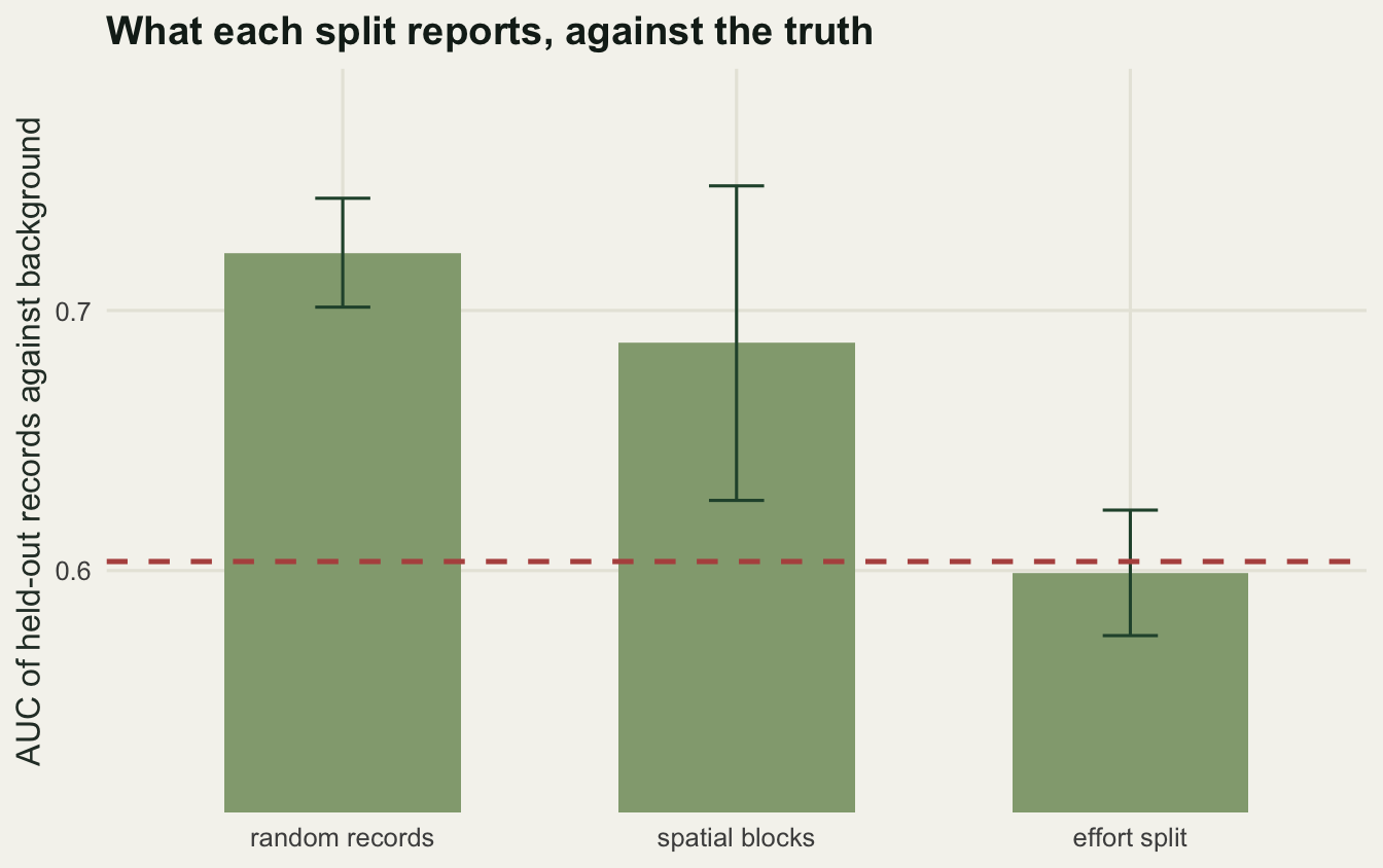
Spatial blocking is the recommended fix and in this simulation it recovers about a third of the overstatement, which is worth having but is not the fix it is sold as. The effort surface still varies inside the blocks, so holding out whole blocks does not break the association between effort and the covariate the model is using. What breaks it is splitting along effort itself, at a price of its own here, since that split trains on the well-surveyed half and tests on about 139 records rather than 180. It is also the scheme nobody can run without an effort surface, the thing the previous post in this cluster needed and could not get from the records.
What none of these checks can catch
Every check above compares the model with the data that produced it, or with a simulator built from the same assumptions. That is the boundary of the exercise, and it should be stated without softening.
None of the four can tell you whether the environmental covariates are the ones that matter. A model fitted to temperature and rainfall when the species is limited by a soil type nobody mapped will interpolate cleanly, transform consistently, sit exactly on its AUC ceiling and hold up under an effort split. Variable importance and partial dependence do not rescue this either, for reasons measured in Checking a tree ensemble.
None of them can tell you whether the species is in equilibrium with the covariates it was fitted to. A species still spreading occupies a subset of what suits it, so the fitted response describes the invasion front, not the niche, and every diagnostic here will be satisfied.
None of them can tell you what the records refer to. Herbarium sheets from garden escapes, vagrants a long way from any breeding population, misidentifications concentrated in the species that a keen recorder was looking for: all of these enter the likelihood as presences and none of them leave a trace in a residual, a transform or a split.
A model built on the wrong covariates, fitted to records of a species that is still expanding, passes all four checks and produces a confident map of nothing in particular. The checks are worth running because they catch a specific set of failures that are common and invisible. They are not evidence that the model is about the species.
Where to go next
The cluster ends here. The first post left the reader with a fitted surface that has a shape and no level; the second with a response curve whose smoothness is a setting rather than a finding; the third with a bias that cannot be removed from the records alone. This post adds that the usual checks either cannot see those problems or quietly assume them away.
The route out of all three is not a better diagnostic. It is a second dataset with known effort, fitted jointly with the records, which is what Integrated species distribution models in R does. That is where the level, the absences and the unbiased evaluation come from, because presence-only data cannot supply any of them.
References
Phillips SJ, Anderson RP, Schapire RE 2006 Ecological Modelling 190(3-4):231-259 (10.1016/j.ecolmodel.2005.03.026)
Elith J, Kearney M, Phillips S 2010 Methods in Ecology and Evolution 1(4):330-342 (10.1111/j.2041-210X.2010.00036.x)
Lobo JM, Jimenez-Valverde A, Real R 2008 Global Ecology and Biogeography 17(2):145-151 (10.1111/j.1466-8238.2007.00358.x)
Merow C, Smith MJ, Silander JA 2013 Ecography 36(10):1058-1069 (10.1111/j.1600-0587.2013.07872.x)
Phillips SJ, Anderson RP, Dudik M, Schapire RE, Blair ME 2017 Ecography 40(7):887-893 (10.1111/ecog.03049)
Elith J, Phillips SJ, Hastie T, Dudik M, Chee YE, Yates CJ 2011 Diversity and Distributions 17(1):43-57 (10.1111/j.1472-4642.2010.00725.x)