library(ggplot2)

te_paper  <- "#f5f4ee"
te_ink    <- "#16241d"
te_body   <- "#2c3a31"
te_forest <- "#275139"
te_rust   <- "#b5534e"
te_gold   <- "#c9b458"
te_line   <- "#dad9ca"

theme_datasheet <- function() {
  theme_minimal(base_size = 12) +
    theme(plot.background  = element_rect(fill = te_paper, colour = NA),
          panel.background = element_rect(fill = te_paper, colour = NA),
          panel.grid.major = element_line(colour = te_line, linewidth = 0.3),
          panel.grid.minor = element_blank(),
          text             = element_text(colour = te_body),
          plot.title       = element_text(colour = te_ink, face = "bold"),
          plot.subtitle    = element_text(colour = te_body),
          axis.text        = element_text(colour = te_body),
          strip.text       = element_text(colour = te_ink))
}The continuous Boyce index for presence-only SDMs
R
species distributions
presence-only
model evaluation
simulation
ecology tutorial
A perfect distribution map scores well below one on the continuous Boyce index when presences are few. Measuring in R what records and window width do to it.
Forty-odd herbarium sheets of a mountain gentian, a stack of climate and soil layers, and a suitability map from a presence-background model. The map looks sensible, the reviewer asks how well it predicts, and there are no absences to test it against. So the methods section reports a continuous Boyce index of 0.7, and the next paper on a related species reports 0.9, and a reader is left to decide whether the second map is better. The question this post answers is the plain one: what does a Boyce index of 0.7 mean, and what should be reported beside it so that it means something.
The usual evaluation on this site assumes absences. Evaluating species distribution models in R scores a model on a held-out test set of presences and absences with the AUC and the true skill statistic. With presence-only records that route is closed, and Checking a presence-only model measures what happens when the AUC is computed against background points instead: even a perfect ranking cannot reach one, because part of the background lies in suitable habitat, and the ceiling is one minus half the occupied share of the region. The Boyce index is the other number that presence-only papers report, and it has no such ceiling. That is part of its appeal, and this post measures the part that the appeal hides.
The index has a history in resource selection. Boyce and colleagues 2002 proposed it to validate resource selection functions: bin the predicted scores, count how many withheld use locations fall in each bin against the bin’s share of what was available, and take the Spearman rank correlation between that ratio and the bin rank. Resource selection functions in R cites the same paper for a different point, that the fitted surface is relative, and does not use the index. Hirzel and colleagues 2006 replaced the fixed bins with a window that slides along the suitability axis in small steps, and that continuous version is the one the ecospat package computes. The definition below is theirs, written to follow the moving-window rule of the ecospat.boyce function. That a small sample of records moves a rank correlation is no surprise; what is measured here is by how much, on maps whose quality is known exactly because the data are simulated.
The small-sample question has a neighbour too. Leave-one-out AUC on a small survey shows a working model being marked down by the way its AUC is computed on thirty ponds. The Boyce index has its own version of that problem, and it has a second one that the AUC does not share: a setting, the window width, that the analyst chooses.
Presences over expected, window by window
Take the predicted suitability of every background cell and of every presence record. Place a window of fixed width at the bottom of the suitability axis and slide it to the top in small steps. In each window, P is the share of presences whose predicted value falls inside it and E is the share of background cells that do. Their ratio, P/E, is above one where the map puts more records than the area alone would, and below one where it puts fewer. A good map has a P/E curve that rises from left to right, and the continuous Boyce index is the Spearman correlation between P/E and window position: one when the curve only ever rises, minus one when it only ever falls.
The details that change the number are the width, the step, and what happens to windows whose ratios repeat. The function below follows the source of ecospat.boyce in ecospat 4.1.4, the current CRAN release; the function is unchanged from version 4.1.3 on GitHub. The default width there is a tenth of the range of the background predictions, and window starts are placed at 101 equally spaced points from the lowest predicted value to the highest minus one width. The source then adds one to the last start. On a zero-to-one scale that pushes the last window above the top of the scale, it holds nothing, and 100 windows enter the calculation; on a scale where a window is wider than one unit, such as suitability from 0 to 1000, the last window keeps most of its values and 101 enter, so the same map can score slightly differently on the two scales. Both window edges are inclusive. Windows with neither background nor records give 0/0 and are dropped; a window with records but no background gives an infinite ratio and is kept. By default every window whose ratio equals the next one is dropped as well, which collapses a run of equal ratios to its last member. The ecospat function rounds the index to three decimals; with that rounding removed, the code here was checked against a copy of the source on 300 random maps, widths and sample sizes on a zero-to-one scale, outside this post, and returned the same index to the last digit in every case.
pe_curve <- function(pres, bg_sorted, width = 0.1, n_step = 100) {
  lo    <- min(bg_sorted[1], pres)
  hi    <- max(bg_sorted[length(bg_sorted)], pres)
  w_abs <- width * (bg_sorted[length(bg_sorted)] - bg_sorted[1])
  win_lo <- seq(lo, hi - w_abs, length.out = n_step + 1)[seq_len(n_step)]
  win_hi <- win_lo + w_abs
  # values inside [win_lo, win_hi]: at most win_hi minus strictly below win_lo
  n_in <- function(v) findInterval(win_hi, v) - findInterval(win_lo, v, left.open = TRUE)
  p_share <- n_in(sort(pres)) / length(pres)
  e_share <- n_in(bg_sorted) / length(bg_sorted)
  list(win_lo = win_lo, win_mid = win_lo + w_abs / 2,
       pe = round(p_share / e_share, 10))
}

boyce_index <- function(curve, drop_runs = TRUE) {
  ok  <- !is.nan(curve$pe)
  pe  <- curve$pe[ok]
  pos <- curve$win_lo[ok]
  if (drop_runs) {
    # as in the ecospat source: keep the last of each run of equal ratios
    keep <- pe != c(pe[-1], TRUE)
    pe  <- pe[keep]
    pos <- pos[keep]
  }
  if (length(pe) < 2 || length(unique(pe)) < 2) return(NA_real_)
  cor(pe, pos, method = "spearman")
}

stopifnot(findInterval(0.5, c(0.5, 1)) == 1,
          findInterval(0.5, c(0.5, 1), left.open = TRUE) == 0)
The stopifnot() line guards the one piece of R behaviour the counting relies on: findInterval() counts the values at or below a point by default, and with left.open = TRUE only those strictly below it, so the difference counts a closed window.
set.seed(20261014)
n_bg      <- 20000
suit_true <- runif(n_bg)
use_rel   <- suit_true^2
map_good  <- suit_true
map_weak  <- (rank(suit_true + rnorm(n_bg, sd = 0.5)) - 0.5) / n_bg
map_misp  <- ifelse(suit_true <= 0.7, suit_true / 0.7, (1 - suit_true) / 0.3)
maps        <- list(good = map_good, weak = map_weak, misplaced = map_misp)
maps_sorted <- lapply(maps, sort)
cor_truth   <- sapply(maps, cor, y = suit_true)
draw_pres <- function(n) sample.int(n_bg, n, replace = TRUE, prob = use_rel)
The landscape is simulated and deliberately plain. There are 20000 background cells whose true suitability is uniform between zero and one, and the species uses a cell in proportion to the square of its suitability, so the best cells are used far more than middling ones. Presence records are drawn from the cells with that probability. Three maps are scored against them. The good map is the true suitability itself: it ranks every cell correctly, which is as well as any model can do. The weak map is built from a covariate that shares the gradient only in part, and its correlation with the truth is 0.51. The misplaced map has its optimum in the wrong place: it rises with the truth up to seven tenths of the gradient and then falls, so the cells above seven tenths are ranked in reverse, and the very best cells get the lowest scores. The weak and the misplaced map were chosen before any index was computed, and all three are spread uniformly between zero and one, so the same window width means the same thing on each.
set.seed(311)
idx_small   <- draw_pres(20)
idx_large   <- draw_pres(200)
curve_small <- pe_curve(map_good[idx_small], maps_sorted$good, 0.1)
curve_large <- pe_curve(map_good[idx_large], maps_sorted$good, 0.1)
bi_small    <- boyce_index(curve_small)
bi_large    <- boyce_index(curve_large)
n_win       <- length(curve_small$pe)
zero_small  <- sum(curve_small$pe == 0)
kept_small  <- sum(curve_small$pe != c(curve_small$pe[-1], TRUE))
zero_runs   <- rle(curve_small$pe == 0)
zero_bottom <- if (zero_runs$values[1]) zero_runs$lengths[1] else 0L
true_pe <- function(a, w) ((a + w)^3 - a^3) / w
pe_true_lo <- true_pe(0, 0.1)
pe_true_hi <- true_pe(0.9, 0.1)
For the good map the true P/E curve can be written down. Presence records have density three times the squared suitability, the background is uniform, so a window from a to a + w has P equal to (a + w) cubed minus a cubed and E equal to w. The ratio rises strictly across the whole axis, from 0.01 on the window from 0 to 0.1 to 2.71 on the window from 0.9 to 1. The index of the true curve is exactly one. Everything below one in what follows is the sample of records and the window, not the map.
One draw of 20 records and one of 200, both scored on the good map with the default width, show what the single number summarises. With 200 records the curve climbs steadily and the index is 0.966. With 20 records the bottom 24 of the 100 windows hold no record at all, so their ratios are all zero, and 3 more zero windows are scattered higher up; the run rule collapses the bottom run to its last window, 77 windows are left, and the ragged climb above them gives an index of 0.757. Both samples came from a map that is exactly right.
curve_df <- rbind(
  data.frame(curve_small, n_lab = "20 records", kept = curve_small$pe != c(curve_small$pe[-1], TRUE)),
  data.frame(curve_large, n_lab = "200 records", kept = curve_large$pe != c(curve_large$pe[-1], TRUE)))
curve_df$status <- ifelse(curve_df$kept, "kept", "dropped as a repeat")
true_df <- data.frame(win_mid = curve_small$win_mid,
                      pe = true_pe(curve_small$win_lo, 0.1))
ggplot(curve_df, aes(win_mid, pe)) +
  geom_hline(yintercept = 1, colour = te_body, linewidth = 0.4) +
  geom_line(data = true_df, colour = te_rust, linetype = "dashed", linewidth = 0.8) +
  geom_point(aes(colour = status), size = 1.4) +
  facet_wrap(~ n_lab) +
  scale_colour_manual(values = c(kept = te_forest, "dropped as a repeat" = te_gold), name = NULL) +
  labs(x = "predicted suitability (window centre)", y = "P/E",
       title = "The same perfect map, two samples of records",
       subtitle = "dashed red: the true curve; its index is exactly one") +
  theme_datasheet() +
  theme(legend.position = "bottom")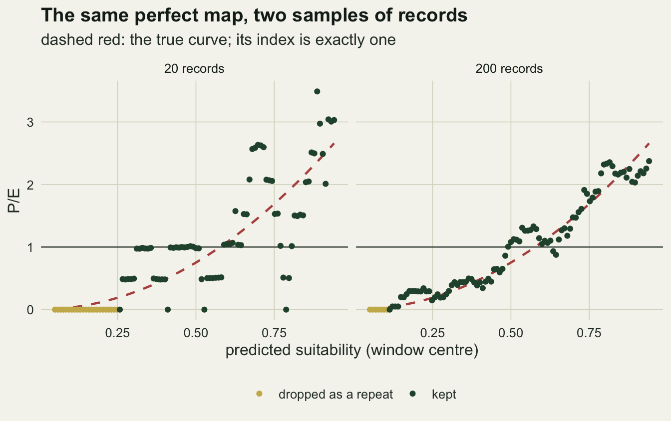
A perfect map does not score one
The index was measured on the good map for three sample sizes and three widths: 20, 50 and 200 records, and windows a twentieth, a tenth and a quarter of the suitability range. The design and the replication were fixed before the first run: 1000 independent samples of records per sample size, each scored at all three widths and on all three maps.
n_grid <- c(20, 50, 200)
w_grid <- c(0.05, 0.10, 0.25)
n_rep  <- 1000
auc_bg <- function(score, bg_sorted) {
  below <- findInterval(score, bg_sorted, left.open = TRUE)
  tied  <- findInterval(score, bg_sorted) - below
  mean(below + 0.5 * tied) / length(bg_sorted)
}
map_names <- names(maps)
bi      <- array(NA_real_, c(n_rep, 3, 3, 3), dimnames = list(NULL, map_names, n_grid, w_grid))
bi_keep <- array(NA_real_, c(n_rep, 3, 3), dimnames = list(NULL, map_names, n_grid))
auc     <- array(NA_real_, c(n_rep, 3, 3), dimnames = list(NULL, map_names, n_grid))
pe_top  <- array(NA_real_, c(n_rep, 3, 3), dimnames = list(NULL, map_names, n_grid))

set.seed(4827)
for (r in seq_len(n_rep)) for (j in seq_along(n_grid)) {
  idx <- draw_pres(n_grid[j])
  for (k in map_names) {
    pres_k <- maps[[k]][idx]
    auc[r, k, j] <- auc_bg(pres_k, maps_sorted[[k]])
    for (l in seq_along(w_grid)) {
      cv <- pe_curve(pres_k, maps_sorted[[k]], w_grid[l])
      bi[r, k, j, l] <- boyce_index(cv)
      if (w_grid[l] == 0.10) {
        bi_keep[r, k, j] <- boyce_index(cv, drop_runs = FALSE)
        pe_top[r, k, j]  <- cv$pe[length(cv$pe)]
      }
    }
  }
}
q_of <- function(a, p) apply(a, 2:length(dim(a)), quantile, p, na.rm = TRUE, names = FALSE)
bi_med <- q_of(bi, 0.5)
bi_lo  <- q_of(bi, 0.05)
bi_hi  <- q_of(bi, 0.95)
n_na   <- sum(is.na(bi))
At the default width, a map that ranks every cell correctly has a median index of 0.76 with 20 records, 0.89 with 50 and 0.975 with 200. The spread matters as much as the median: with 20 records the middle ninety per cent of samples run from 0.40 to 0.91, so one survey in twenty gives a perfect map an index below 0.40.
The width moves the number as far as the sample does. With 20 records the median goes from 0.55 at the narrowest window to 0.94 at the widest; with 50 records from 0.78 to 0.98. A wide window averages over more records, so the curve it draws is smoother and its rank correlation higher. None of the 27000 indices in the grid failed to compute (0 missing).
perf_df <- expand.grid(n_rec = n_grid, width = w_grid)
perf_df$med <- as.vector(bi_med["good", , ])
perf_df$lo  <- as.vector(bi_lo["good", , ])
perf_df$hi  <- as.vector(bi_hi["good", , ])
perf_df$width_lab <- factor(sprintf("%.2f of the range", perf_df$width),
                            levels = sprintf("%.2f of the range", w_grid))
p_perfect <- ggplot(perf_df, aes(factor(n_rec), med, colour = width_lab)) +
  geom_hline(yintercept = 1, colour = te_rust, linetype = "dashed", linewidth = 0.6) +
  geom_errorbar(aes(ymin = lo, ymax = hi), width = 0.15, linewidth = 0.7,
                position = position_dodge(width = 0.5)) +
  geom_point(size = 2.6, position = position_dodge(width = 0.5)) +
  scale_colour_manual(values = c(te_gold, te_forest, te_ink), name = "window width") +
  scale_y_continuous(limits = c(0, 1)) +
  labs(x = "presence records", y = "continuous Boyce index",
       title = "A perfect map scores what the records allow",
       subtitle = "dashed red: the index of the true curve") +
  theme_datasheet() +
  theme(legend.position = "bottom")
p_perfect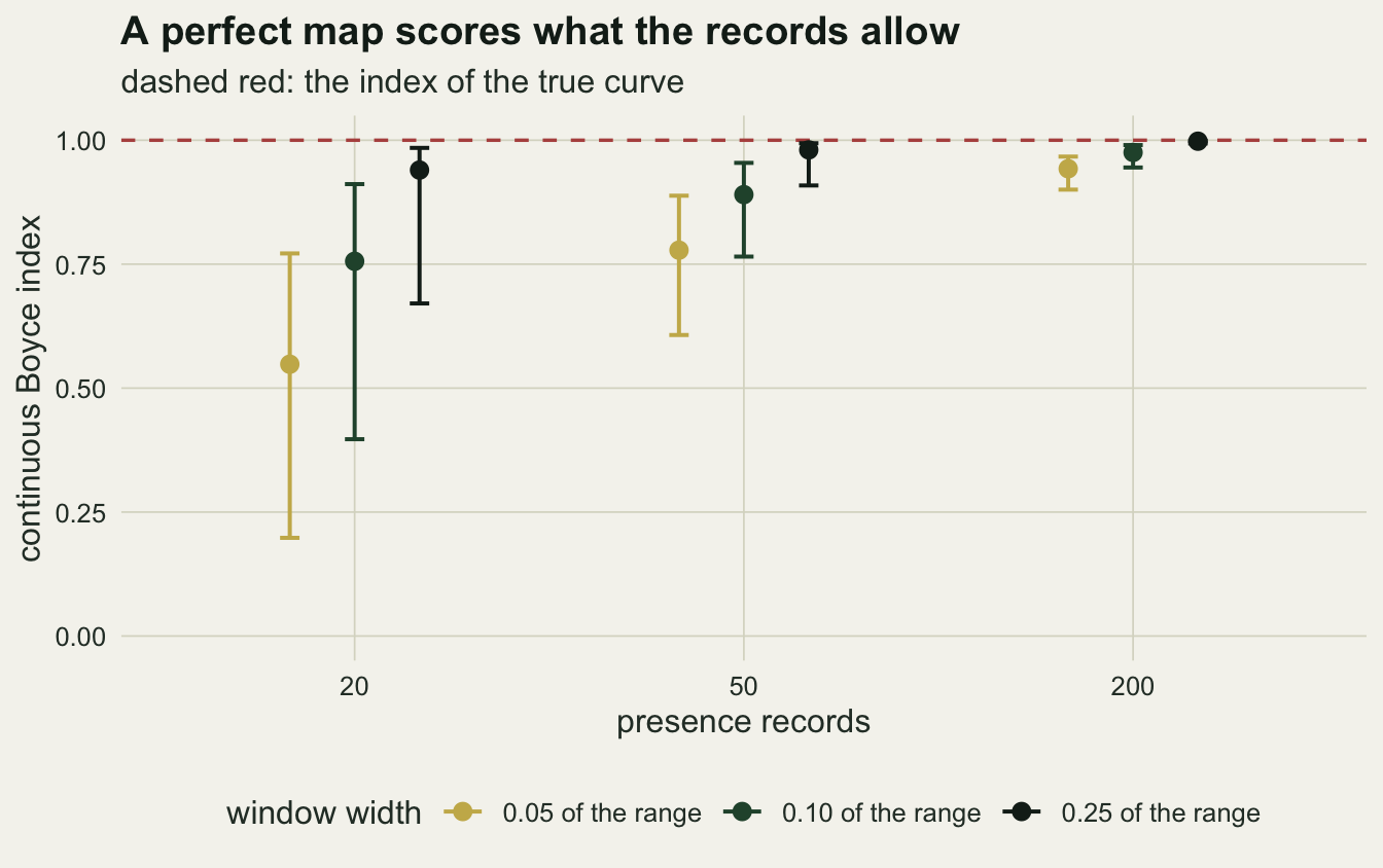
A weak map and a misplaced one against the right one
A number that rises with the window for a perfect map will rise for a worse one too, and the question that matters is whether the two stay apart. Before the sample sizes, the limit: with 100000 records the sampling noise is gone and what is left is the shape of each map’s true P/E curve.
set.seed(9001)
idx_big <- draw_pres(1e5)
lim_bi <- sapply(w_grid, function(w) sapply(map_names, function(k)
  boyce_index(pe_curve(maps[[k]][idx_big], maps_sorted[[k]], w))))
colnames(lim_bi) <- w_grid
lim_auc <- sapply(map_names, function(k) auc_bg(maps[[k]][idx_big], maps_sorted[[k]]))
lim_curves <- do.call(rbind, lapply(map_names, function(k)
  data.frame(pe_curve(maps[[k]][idx_big], maps_sorted[[k]], 0.1), map = k)))
lim_top <- sapply(map_names, function(k) {
  cv <- lim_curves[lim_curves$map == k, ]
  cv$pe[nrow(cv)]
})
auc_good_exact <- 3 / 4

# misplaced map: a score m comes from suitability 0.7 m (weight 0.7) or 1 - 0.3 m
# (weight 0.3); presence density in m is 3 (0.37 m^2 - 0.18 m + 0.3), background uniform
pe_misp_at <- function(m) 3 * (0.7 * (0.7 * m)^2 + 0.3 * (1 - 0.3 * m)^2)
pe_misp_cum <- function(m) 3 * (0.37 * m^3 / 3 - 0.09 * m^2 + 0.3 * m)
stopifnot(abs(integrate(pe_misp_at, 0, 1)$value - 1) < 1e-9,
          abs(pe_misp_at(0.4) - 3 * (0.37 * 0.4^2 - 0.18 * 0.4 + 0.3)) < 1e-12)
misp_min_at <- 0.18 / (2 * 0.37)
misp_pe <- c(bottom = pe_misp_at(0), min = pe_misp_at(misp_min_at), top = pe_misp_at(1))
misp_exact <- sapply(w_grid, function(w) {
  a  <- seq(0, 1 - w, length.out = 101)[1:100]
  pe <- (pe_misp_cum(a + w) - pe_misp_cum(a)) / w
  c(index = cor(pe, a, method = "spearman"), falling = sum(diff(pe) < 0))
})
colnames(misp_exact) <- w_grid
misp_check <- max(abs(misp_exact["index", ] - lim_bi["misplaced", ]))
With 100000 records the weak map’s index is 0.9991 at the narrowest width and 1.0000 at the widest. Its exact limit is one at every width, and the small shortfall at the narrow width is the noise that is left with 100000 records drawn from 20000 cells. The reason can be written down. The weak score is a rank of the true suitability plus independent normal noise, and for such a score the expected squared suitability of a cell rises strictly with its score (a normal error has a monotone likelihood ratio), so the true P/E curve of the weak map rises everywhere, only less steeply. A rank correlation cannot see steepness. The curve of the good map reaches a ratio of 2.73 in its top window and the weak map’s only 1.75, and at the default width both indices round to one at three decimals.
The misplaced map is caught, but not by much, and its true curve can be written down too. A cell with score m on this map has suitability 0.7 * m (the rising part, which holds seven tenths of the cells) or 1 - 0.3 * m (the falling part, three tenths), the scores are uniform, and the presence density at m, which is also the true P/E, is 3 * (0.7 * (0.7 * m)^2 + 0.3 * (1 - 0.3 * m)^2), or 3 * (0.37 * m^2 - 0.18 * m + 0.3). This curve does not rise everywhere. At the bottom of the axis it is 0.90, because the cells scored lowest include the best in the landscape as well as the worst; it falls to 0.83 at m = 0.24 and only then rises, to 1.47 at the top. The windows on the falling limb are ranked in reverse, and they are what keeps the index below one: 23, 21 and 16 of the 100 windows at the three widths step down from the one before, since a wider window shortens the limb. The exact index of this curve is 0.900 at the narrowest width, 0.918 at the default and 0.966 at the widest. The 100000 records give 0.895, 0.910 and 0.973, within 0.008 of the exact values.
The AUC against background, computed from the same records, orders the three maps as a reader would want. For the good map it has a closed form: a presence’s suitability has density three times its square, a background cell’s is uniform, and the probability that the first exceeds the second is the integral of three times the cube, which is 0.75. The large sample gives 0.7536. The weak map reaches 0.628 and the misplaced map 0.548. Where the AUC has a ceiling that has nothing to do with the map, the Boyce index has a ceiling that any map with a rising curve can reach.
lim_curves$map_lab <- factor(lim_curves$map, levels = map_names,
                             labels = sprintf("%s: index %.2f, AUC %.2f", map_names,
                                              lim_bi[, "0.1"], lim_auc))
ggplot(lim_curves, aes(win_mid, pe, colour = map_lab)) +
  geom_hline(yintercept = 1, colour = te_body, linewidth = 0.4) +
  geom_line(linewidth = 1) +
  scale_colour_manual(values = c(te_forest, te_gold, te_rust), name = NULL) +
  guides(colour = guide_legend(nrow = 3)) +
  labs(x = "predicted suitability on each map (window centre)", y = "P/E",
       title = "Rising is all the index asks for",
       subtitle = "the weak map rises less steeply and still scores one") +
  theme_datasheet() +
  theme(legend.position = "bottom")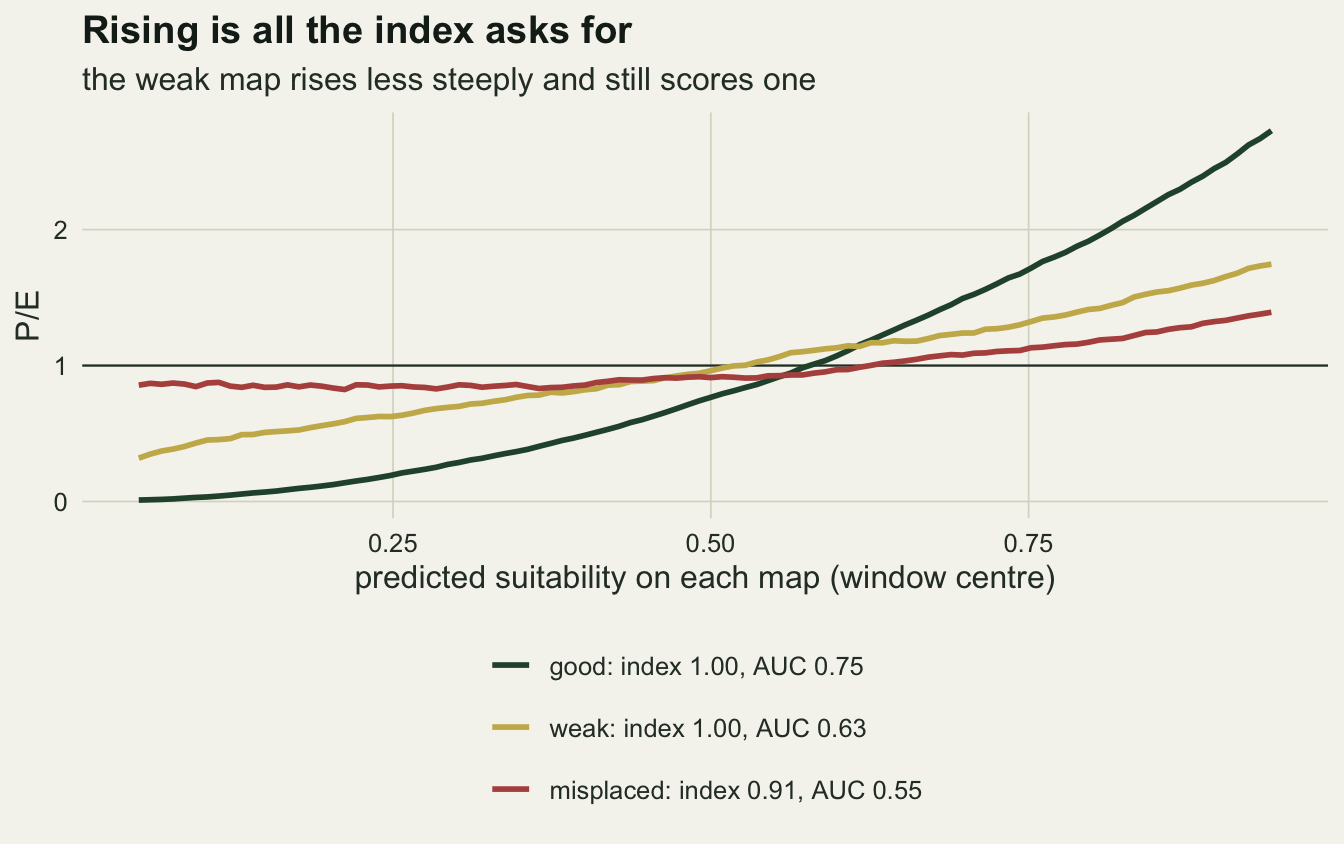
With a realistic number of records the picture is noisier. The medians in the next figure are over the same 1000 samples as before, and the three maps were scored on the same records in every sample, which is how a comparison between two maps would be made in practice.
sep <- function(k) {
  a <- bi[, "good", , , drop = FALSE] - bi[, k, , , drop = FALSE]
  apply(a, 3:4, function(v) mean(v > 0, na.rm = TRUE) + 0.5 * mean(v == 0, na.rm = TRUE))
}
sep_weak <- sep("weak")
sep_misp <- sep("misplaced")
sep_auc_weak <- apply(auc[, "good", ] > auc[, "weak", ], 2, mean)
sep_se_max   <- sqrt(0.25 / n_rep)
gap_weak <- bi_med["good", , ] - bi_med["weak", , ]
gap_misp <- bi_med["good", , ] - bi_med["misplaced", , ]
stopifnot(all(gap_weak > 0))
top_med  <- q_of(pe_top, 0.5)
top_lo   <- q_of(pe_top, 0.05)
top_hi   <- q_of(pe_top, 0.95)
With 200 records the gap between the medians of the good and the weak map shrinks from 0.132 at the narrowest window to 0.025 at the widest, and the gap to the misplaced map from 0.488 to 0.255. For the weak map the shrinking gap is not a worse map being pulled up to a better one. Its limit is one, like the good map’s, and what a wide window removes is the shortfall that a finite sample of records leaves, which is larger for the weak map at every sample size and width in the grid: with a flatter curve, neighbouring windows differ by less and the same sampling noise reorders more of them. At 200 records the weak map’s median falls short of one by 0.190 at the narrowest window and 0.027 at the widest, the good map’s by 0.058 and 0.002. At the widest window and 200 records the weak map has a median of 0.973, higher than the good map scores at the default width with 50 records (0.890), and a reader comparing indices across papers with different widths or record counts learns little from them about which map ranks the cells better.
With 20 records the pattern is different. The gap to the weak map goes from 0.225 to 0.294 and back to 0.227, and the gap to the misplaced map grows with the width, from 0.278 to 0.517. With so few records the good and the weak map gain almost the same from a wider window: their medians rise by 0.392 and 0.390 from the narrowest to the widest, the misplaced map’s only by 0.153.
Scored on the same records, the good map beats the weak one in 80.5 to 88.3 per cent of samples of 20 records as the width goes from narrowest to widest, and in 98.5 per cent or more with 200 (Monte Carlo standard error at most 1.6 percentage points). The paired comparison moves less with the width than the gap between the medians does. The AUC on the same 20 records puts the good map above the weak one in 98.1 per cent of samples, so for the question of which of two maps ranks the cells better, the AUC on the same records was the sharper tool here.
three_df <- expand.grid(map = map_names, n_rec = n_grid, width = w_grid,
                        stringsAsFactors = FALSE)
three_df$med <- as.vector(bi_med)
three_df$lo  <- as.vector(bi_lo)
three_df$hi  <- as.vector(bi_hi)
three_df$map <- factor(three_df$map, levels = map_names)
three_df$width_lab <- factor(sprintf("window %.2f of the range", three_df$width),
                             levels = sprintf("window %.2f of the range", w_grid))
ggplot(three_df, aes(factor(n_rec), med, colour = map)) +
  geom_hline(yintercept = 0, colour = te_body, linewidth = 0.3) +
  geom_errorbar(aes(ymin = lo, ymax = hi), width = 0.15, linewidth = 0.6,
                position = position_dodge(width = 0.6)) +
  geom_point(size = 2.2, position = position_dodge(width = 0.6)) +
  facet_wrap(~ width_lab) +
  scale_colour_manual(values = c(te_forest, te_gold, te_rust), name = "map") +
  labs(x = "presence records", y = "continuous Boyce index",
       title = "Wide windows raise every map's index",
       subtitle = "same records scored on all three maps in every sample") +
  theme_datasheet() +
  theme(legend.position = "bottom")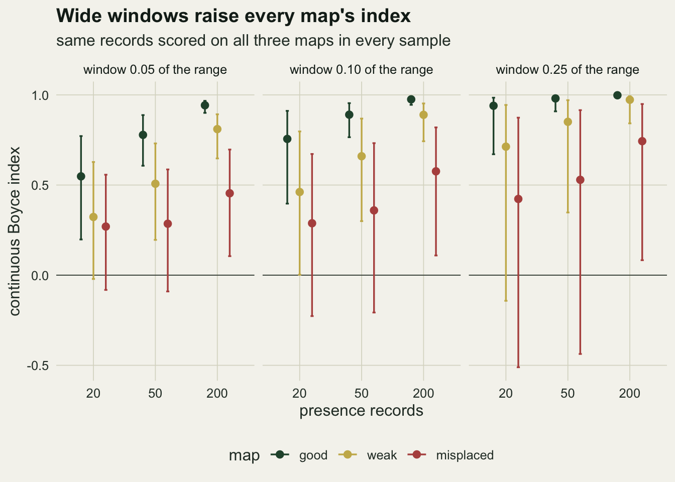
The size of the ratio in the top window, which the rank correlation discards, separates the good map from the other two more directly. Its median over samples of 200 records is 2.68 for the good map, 1.75 for the weak one and 1.36 for the misplaced one. With 20 records it is too noisy to carry the comparison alone: the middle ninety per cent for the good map runs from 1.01 to 4.55.
Dropping repeated ratios
The run rule looks like a detail and is not one at small samples. At the bottom of the axis a good map predicts few records, so with 20 of them several low windows hold none and their ratios are all zero. Those tied zeros sit where a rising curve should be lowest, so kept in they agree with the ranking; collapsed to one, they leave the correlation to the noisier windows above. The same samples scored with and without the rule at the default width:
drop_eff <- apply(bi[, , , "0.1"] - bi_keep, 2:3, mean, na.rm = TRUE)
keep_med <- q_of(bi_keep, 0.5)
On the good map the rule lowers the index by 0.103 on average with 20 records, 0.034 with 50 and 0.004 with 200; without it the median with 20 records would be 0.84 instead of 0.76. On the weak map the drop is 0.043 with 20 records. Neither choice is wrong, but two papers that differ only in this setting can differ by a tenth on a small sample, and the setting is easy to leave out of a methods section.
An interval from the presences
The obvious interval for an index computed from a sample of records is a bootstrap: resample the records with replacement, recompute, and read off the percentiles. It was measured on the good map at the default width, on 100 fresh samples per sample size with 199 resamples each, and compared with the real spread of the index across the 1000 samples of the grid.
n_draw <- 100
n_boot <- 199
boot_tab <- array(NA_real_, c(n_draw, 3, 5),
                  dimnames = list(NULL, n_grid, c("est", "bsd", "lo", "hi", "bmed")))
set.seed(6153)
for (d in seq_len(n_draw)) for (j in seq_along(n_grid)) {
  pres_d <- map_good[draw_pres(n_grid[j])]
  est_d  <- boyce_index(pe_curve(pres_d, maps_sorted$good, 0.1))
  bt_d   <- replicate(n_boot, boyce_index(pe_curve(sample(pres_d, replace = TRUE),
                                                   maps_sorted$good, 0.1)))
  boot_tab[d, j, ] <- c(est_d, sd(bt_d, na.rm = TRUE),
                        quantile(bt_d, c(0.05, 0.5, 0.95), na.rm = TRUE, names = FALSE)[c(1, 3, 2)])
}
real_sd  <- apply(bi[, "good", , "0.1"], 2, sd, na.rm = TRUE)
boot_sd  <- apply(boot_tab[, , "bsd"], 2, mean)
sd_ratio <- boot_sd / real_sd
real_w   <- bi_hi["good", , "0.1"] - bi_lo["good", , "0.1"]
boot_w   <- apply(boot_tab[, , "hi"] - boot_tab[, , "lo"], 2, mean)
boot_shift <- apply(boot_tab[, , "est"] - boot_tab[, , "bmed"], 2, mean)
cover_med <- sapply(seq_along(n_grid), function(j)
  mean(boot_tab[, j, "lo"] <= bi_med["good", j, "0.1"] &
       boot_tab[, j, "hi"] >= bi_med["good", j, "0.1"]))
cover_se <- sqrt(0.25 / n_draw)
side <- sapply(seq_along(n_grid), function(j) c(
  miss_above = mean(boot_tab[, j, "hi"] < bi_med["good", j, "0.1"]),
  n_below    = sum(boot_tab[, j, "lo"] > bi_med["good", j, "0.1"]),
  floor_ok   = mean(boot_tab[, j, "lo"] <= bi_lo["good", j, "0.1"]),
  reach_q95  = mean(boot_tab[, j, "hi"] >= bi_hi["good", j, "0.1"]),
  n_one      = sum(boot_tab[, j, "hi"] >= 1)))
distinct_share <- 1 - (1 - 1 / n_grid)^n_grid
The bootstrap overstates the spread. Its standard deviation, averaged over samples, is 1.39 times the real draw-to-draw standard deviation with 20 records, 1.79 times with 50 and 1.69 times with 200. The ninety per cent percentile interval is on average 0.75, 0.36 and 0.079 wide, against a real middle ninety per cent of 0.51, 0.19 and 0.045.
It also sits low. The bootstrap median is below the index it was built from by 0.159, 0.090 and 0.028 on average at the three sample sizes, and the interval contains the median index of repeated surveys in only 82, 66 and 60 per cent of samples, against the ninety per cent a well behaved interval would give (Monte Carlo standard error at most 5 percentage points). Every miss is on the same side: the upper end fell below that median in 18, 34 and 40 per cent of samples, and the lower end lay above it in 0 of the 300. One likely reason can be written down: a resample of n records contains on average a share of one minus (1 - 1/n) to the power n distinct records, 0.642 at 20 and 0.633 at 200, and a duplicated record counts twice in every window it falls in, so a resample is in part a smaller and lumpier sample, and the grid showed that smaller samples score lower. How much of the shift this explains was not separated.
So the percentile bootstrap gives a safe floor, not an interval. Its lower end lay at or below the real five per cent point of the index in 95, 99 and 100 per cent of samples at the three sample sizes. Its upper end reached the real ninety-five per cent point in only 6, 2 and 0 per cent, and reached one, the true index of the map, in 0 of the 300 samples. Its width does follow the number of records: it falls from 0.75 to 0.079 between 20 and 200 records, a factor of 9.5, against 0.51 to 0.045 for the real middle ninety per cent, a factor of 11.4.
What to report
Report the number of presence records the index was computed from, and the background it was computed against. On a perfect map the default window gave a median of 0.76 with 20 records and 0.975 with 200, and no reader can interpret an index without that number beside it.
Report the window width as a fraction of the background range, the number of steps, and whether repeated ratios were dropped. With 20 records the width moved the median index of a perfect map from 0.55 to 0.94, and the run rule moved it by a further 0.10 on average; the number of steps was held at 100 throughout and its effect was not measured. If the software defaults were used, name the function and the package version.
Show the P/E curve, not only its rank correlation. The curve carries the two things the index discards: how steeply the map separates good cells from poor ones, and where a curve sags or peaks. A weak map and a perfect one have the same limit index here, one (0.9999 and 1.0000 with 100000 records), while their top-window ratios were 1.75 and 2.73. Phillips and Elith 2010 build a calibration plot for presence-only models from the same ingredients, presences against background across the range of predicted values, and a reader who has the curve can do the same reading.
Give the lower bootstrap percentile over presences as a floor, and say that it is one. To ask whether the index fits a correct map, use a reference instead: the spread of the index that a map exactly right for the data would give with the same number of records and the same window. For a fitted presence-background model, the fitted relative intensity supplies that map (MaxEnt as a Poisson point process explains why the relative intensity is what such a model identifies), and the reference is a short simulation.
perfect_reference <- function(map_values, intensity, n_rec, width, n_sim = 300) {
  bg_sorted <- sort(map_values)
  sims <- replicate(n_sim, {
    idx <- sample.int(length(map_values), n_rec, replace = TRUE, prob = intensity)
    boyce_index(pe_curve(map_values[idx], bg_sorted, width))
  })
  quantile(sims, c(0.05, 0.5, 0.95), na.rm = TRUE, names = FALSE)
}
set.seed(8190)
ref_20 <- perfect_reference(map_good, use_rel, 20, 0.1)
Run on the good map with 20 records and the default width, the reference gives a median of 0.75 and a ninety per cent range from 0.37 to 0.91, in line with the grid above. That is what 0.7 means with 20 records at the default width: it sits inside the range a perfect map gives, and inside the range the weak map gives as well (its upper five per cent point was 0.80), so on its own it says the curve probably rises and little more. With 200 records the same 0.7 would sit far below the range a perfect map gives, whose lower five per cent point was 0.945, and would be evidence against the map’s ranking.
Honest limits
The good map here is exactly right, the background is uniform on its scale, and the records are drawn from the true use with no sampling bias. Real presence records are thinned by survey effort, which changes P without changing the map, and the effect of that on the index was not measured; Sampling bias in presence-only models measures what effort does to the fitted map itself. The reference simulation assumes the fitted relative intensity is right, so it describes the noise around a correct map and cannot certify that the map is correct.
The records were scored against the same map that generated them, with no fitting step. An index computed on the records used to fit the model is optimistic in the way any resubstitution score is, and the size of that optimism for the Boyce index depends on the model’s flexibility; it was not simulated.
The weak and the misplaced map are two shapes out of many. The weak map fails in steepness and the misplaced map in the upper part of the true gradient; a map that is wrong in some other way, for example flat over most of the axis with one sharp step, would give different numbers. The result that carries over is the mechanism, that a rank correlation of a rising curve cannot see how steeply it rises, not the particular gaps.
Only the moving-window estimator with the ecospat rules was measured. Other implementations bin rather than slide, use different defaults, or correlate against the window midpoint rather than its start (which gives the same Spearman correlation), and some leave repeated ratios in. A smoothed estimate of the P/E curve (Liu and colleagues 2025 propose statistical smoothing for the index) replaces the fixed window by a smoothing parameter; it was not tested here.
The bootstrap coverage was measured on the perfect map only, on 100 samples per sample size, and its Monte Carlo standard error is correspondingly wide. That the interval is too wide and sits low is clear at every sample size measured; by how much on a map whose true index is well below one is not known from this post.
References
Boyce MS, Vernier PR, Nielsen SE, Schmiegelow FKA 2002 Ecological Modelling 157(2-3):281-300 (10.1016/S0304-3800(02)00200-4)
Hirzel AH, Le Lay G, Helfer V, Randin C, Guisan A 2006 Ecological Modelling 199(2):142-152 (10.1016/j.ecolmodel.2006.05.017)
Liu C, Newell G, White M, Machunter J 2025 Ecography 2025(1):e07218 (10.1111/ecog.07218)
Phillips SJ, Elith J 2010 Ecology 91(8):2476-2484 (10.1890/09-0760.1)