library(ggplot2)

te_pal <- list(forest = "#275139", green = "#2f8f63", sage = "#93a87f",
               clay = "#b5534e", gold = "#cda23f", line = "#dad9ca",
               ink = "#16241d", paper = "#f5f4ee")

theme_te <- function() {
  theme_minimal(base_size = 12) +
    theme(panel.grid.minor = element_blank(),
          panel.grid.major = element_line(colour = "#e7e6dc"),
          plot.background = element_rect(fill = "#f5f4ee", colour = NA),
          panel.background = element_rect(fill = "#f5f4ee", colour = NA),
          plot.title = element_text(face = "bold", colour = te_pal$ink),
          axis.title = element_text(colour = "#2c3a31"))
}The speed of an invasion front
R
invasion ecology
dispersal
ecology tutorial
ggplot2
Step a spreading population forward in R with an integrodifference model, measure the speed of the invasion front, and check it against the closed form.
A survey team finds an invasive riverside herb at a single bend of a river that carried none five years earlier. The plant is perennial, it sets seed from its second year, and the catchment authority wants one number out of the ecologists: how many kilometres a year the infestation will move down the valley. There is enough field work behind the question to answer it. A demographic study gives the rate of increase at low density, and a seed trapping study gives the spread of a single year’s seed shadow. What is missing is the step that turns those two numbers into a speed.
This tutorial takes that step, and then argues with it. A population that grows and disperses along a one dimensional corridor is stepped forward with an integrodifference model, the position of the front is measured every generation, and the measured speed is compared with a closed form built from nothing but the growth rate and the moment generating function of the kernel. The calibration is the point. The simulation and the formula are allowed to disagree, and the size, the sign and the cause of the disagreement are measured rather than assumed away.
Everything below assumes the kernel is already in hand, which is a large assumption with its own group of tutorials behind it. Fitting dispersal kernels fits one to seed trap data, fat-tailed dispersal kernels shows how little the data constrain the far tail, the mean dispersal distance shows what that tail does to the summary people quote most often, and checking a dispersal kernel counts how few seeds the tail actually rests on. Those posts measure the kernel. This one measures what the kernel does.
A river corridor, a growth rate and a kernel
The corridor is one dimensional, which is not a modelling convenience here but a description of the site: the plant lives on the bank, the bank is a line, and the seed moves up and down it. Distance is measured in kilometres from the point of introduction, one time step is one year, and density is expressed relative to the carrying capacity of an occupied bank, which the demographic study puts at a thousand stems per kilometre.
Two field numbers drive everything. The first is the finite rate of increase at low density, 1.6 per year, which is what a small founding patch multiplies itself by while it is still far from capacity. The second is the standard deviation of the annual seed shadow, 4 kilometres, taken here to be Gaussian. In the diffusion language that gives a diffusion coefficient of 8 square kilometres per year, since a Gaussian spreading over one time unit has variance twice the diffusion coefficient.
sigma_d <- 4; growth <- 1.6; cap_stems <- 1000
dx0 <- 0.2; hw_sd <- 8; n_gen <- 160
marks <- c(0.5, 0.05, 5e-4)

print(round(c(growth_rate = growth, dispersal_sd_km = sigma_d,
              diffusion_km2_per_year = sigma_d^2 / 2,
              stems_per_km_at_capacity = cap_stems,
              grid_spacing_km = dx0, kernel_window_in_sd = hw_sd,
              generations = n_gen), 4))
growth_rate dispersal_sd_km diffusion_km2_per_year
1.6 4.0 8.0
stems_per_km_at_capacity grid_spacing_km kernel_window_in_sd
1000.0 0.2 8.0
generations
160.0 print(signif(marks, 4))[1] 5e-01 5e-02 5e-04print(signif(marks * cap_stems, 4))[1] 500.0 50.0 0.5The three density marks in that last line are the levels at which the front will be located later: half of carrying capacity, five per cent of it, and one plant per two kilometres of bank.
The dynamics are an integrodifference equation. In each year the population grows where it stands, and then the whole year’s production is redistributed by the kernel: \(n_{t+1}(x) = \int k(x - y)\,f(n_t(y))\,\mathrm{d}y\). Growth is Beverton-Holt, \(f(n) = Rn / (1 + (R-1)n)\), which multiplies by \(R\) at low density and saturates at one. That choice matters more than it looks. Because \(f(n)/n\) never exceeds \(f'(0)\), the population never grows faster anywhere than it does at the leading edge, and that is the condition under which the front is pulled along by its own thin front end rather than pushed from behind.
On the computer the kernel becomes a set of weights on a regular grid, truncated at eight standard deviations and renormalised to sum to one. The truncation and the renormalisation both need measuring rather than trusting, so the raw Riemann sum is printed before the normalisation, along with the analytic mass sitting outside the window.
kernel_on_grid <- function(sd_disp, dx, n_sd) {
  half <- ceiling(n_sd * sd_disp / dx)
  shift <- (-half:half) * dx
  w <- dnorm(shift, 0, sd_disp) * dx
  list(shift = shift, w = w / sum(w), raw_total = sum(w))
}

kb <- kernel_on_grid(sigma_d, dx0, hw_sd)
print(c(kernel_weights = length(kb$w)))
kernel_weights
321 print(signif(c(riemann_sum_error = kb$raw_total - 1,
kernel_mass_outside_window = 2 * pnorm(-hw_sd)), 4)) riemann_sum_error kernel_mass_outside_window
-8.882e-16 1.244e-15 Three hundred and twenty one weights, a Riemann sum that misses one by about one part in \(10^{15}\), and about one part in \(10^{15}\) of the kernel left outside the window. Neither is going to explain anything that follows, which is worth knowing before the interesting errors show up.
The speed you can work out before you simulate
An invading population that is still thin at its leading edge is governed there by the linearised model, and a linear integrodifference equation has exponential solutions. Try \(n_t(x) = \exp(-s(x - ct))\) in \(n_{t+1} = R\,(k * n_t)\) and the equation is satisfied for any positive \(s\) provided \(c = c(s) = s^{-1}\log(R\,M(s))\), where \(M(s) = \int k(y)e^{sy}\,\mathrm{d}y\) is the moment generating function of the kernel. Every \(s\) gives a wave, so the model does not name a single speed. What selects one is the initial condition: a population that starts confined to a small patch decays faster than any exponential ahead of itself, and the front it produces travels at the slowest of the available speeds, \(c^{*} = \min_s c(s)\).
For a Gaussian kernel \(M(s) = \exp(\sigma^2 s^2 / 2)\), the minimisation is one line of calculus and gives \(s^{*} = \sqrt{2\log R}\,/\,\sigma\) and \(c^{*} = \sigma\sqrt{2\log R}\). Writing \(D = \sigma^2/2\) turns that into \(c^{*} = \sqrt{4D\log R}\), which is Skellam’s 1951 diffusion result. The agreement is not an approximation for the Gaussian case: a Gaussian redistribution once per generation and a continuous diffusion with the same variance per unit time have the same moment generating function, so they give the same front speed exactly. Below, the closed form, the numerical minimisation over the grid kernel, and the Skellam expression are all evaluated and compared.
mgf <- function(s, kk) sum(kk$w * exp(s * kk$shift))
speed_curve <- function(s, kk, R) (1 / s) * log(R * mgf(s, kk))

best <- optimize(speed_curve, c(0.005, 3), kk = kb, R = growth)
c_grid <- best$objective; s_grid <- best$minimum
c_form <- sigma_d * sqrt(2 * log(growth))
s_form <- sqrt(2 * log(growth)) / sigma_d
c_skellam <- sqrt(4 * (sigma_d^2 / 2) * log(growth))

print(round(c(grid_kernel_speed = c_grid, closed_form_speed = c_form,
              skellam_speed = c_skellam, grid_kernel_shape = s_grid,
              closed_form_shape = s_form), 6))
grid_kernel_speed closed_form_speed skellam_speed grid_kernel_shape
3.878159 3.878159 3.878159 0.242376
closed_form_shape
0.242385 print(signif(c(speed_difference = c_grid - c_form,
relative_difference = c_grid / c_form - 1), 3)) speed_difference relative_difference
2.84e-09 7.33e-10 curvature <- 2 * log(growth) / s_form^3
print(round(c(speed_curve_curvature = curvature,
log_delay_coefficient = 3 / (2 * s_form)), 4))speed_curve_curvature log_delay_coefficient
66.0107 6.1885 The prediction is 3.878159 kilometres a year, reached at a leading edge decay rate of 0.242385 per kilometre. Minimising numerically over the discretised kernel gives the same speed to within \(2.84 \times 10^{-9}\) kilometres a year, a relative difference of \(7.33 \times 10^{-10}\), so the grid is not going to be responsible for any disagreement either. Two further quantities are computed there for later use: the curvature of \(c(s)\) at its minimum, 66.0107, and the number 6.1885, which is \(3/(2s^{*})\) and will turn up uninvited in the next section.
Running the front and measuring it
The simulation is a loop over generations. Growth is applied pointwise, the result is convolved with the kernel weights by direct summation, and the front position is recorded. Direct summation rather than a fast Fourier transform is a deliberate choice and the only one in the post that is about arithmetic rather than ecology. A transform of the whole grid commits a rounding error proportional to the largest density anywhere on it, which lands as noise of order \(10^{-16}\) far out in front of the wave; that noise is then multiplied by 1.6 every year, and after forty or so generations it has grown into a second, entirely fictional front that overtakes the real one. A direct sum makes each error proportional to the terms in its own local window, so the exponential structure of the leading edge survives.
The front position at a density mark is found by interpolating on the log density scale between the two grid points that straddle it, which suits a profile that is close to exponential there.
front_at <- function(dens, xg, mark) {
  hit <- which(dens >= mark)
  if (!length(hit)) return(NA_real_)
  i <- max(hit)
  if (i >= length(dens)) return(NA_real_)
  a <- dens[i]; b <- dens[i + 1]
  if (b <= 0) return(xg[i])
  xg[i] + (log(a) - log(mark)) / (log(a) - log(b)) * (xg[i + 1] - xg[i])
}

spread_run <- function(R, sd_disp, dx, half_width, n_step, at_marks,
                       n_sd = 8, floor_dens = 0, cut_at = Inf, keep = integer(0)) {
  kk <- kernel_on_grid(sd_disp, dx, n_sd)
  w <- kk$w
  if (is.finite(cut_at)) {
    ok <- abs(kk$shift) <= cut_at
    w <- w[ok] / sum(w[ok])
  }
  half <- (length(w) - 1) / 2
  m <- round(half_width / dx)
  xg <- (-m:m) * dx
  nx <- length(xg)
  n_patch <- round(1 / dx)
  dens <- numeric(nx)
  dens[((m + 1) - floor(n_patch / 2)) + seq_len(n_patch) - 1] <- 1
  pos <- matrix(NA_real_, n_step, length(at_marks))
  snaps <- list()
  for (tt in seq_len(n_step)) {
    grown <- R * dens / (1 + (R - 1) * dens)
    padded <- c(numeric(half), grown, numeric(half))
    dens <- as.numeric(stats::filter(padded, w, method = "convolution",
                                     sides = 2))[(half + 1):(half + nx)]
    dens[!is.finite(dens) | dens < 0] <- 0
    if (floor_dens > 0) dens[dens < floor_dens] <- 0
    for (j in seq_along(at_marks)) pos[tt, j] <- front_at(dens, xg, at_marks[j])
    if (tt %in% keep) snaps[[as.character(tt)]] <- dens
  }
  list(pos = pos, x = xg, dens = dens, snaps = snaps,
       edge = max(dens[c(1:5, (nx - 4):nx)]), patch_km = n_patch * dx)
}
The founding population is one kilometre of bank at carrying capacity, placed at the centre of a domain wide enough that the front never comes near the edge. Density that disperses past either end of the domain is discarded, so the domain has to be shown to be irrelevant rather than assumed to be.
half0 <- ceiling(c_form * n_gen + 90)
base <- spread_run(growth, sigma_d, dx0, half0, n_gen, marks,
                   keep = c(40, 80, 120, 160))
print(c(half_width_km = half0, grid_points = length(base$x),
        founding_patch_km = base$patch_km))
half_width_km grid_points founding_patch_km
711 7111 1 print(signif(c(density_at_domain_edge = base$edge), 4))density_at_domain_edge
2.222e-13 print(round(tail(base$pos, 3), 3)) [,1] [,2] [,3]
[158,] 572.178 593.460 617.178
[159,] 576.019 597.303 621.025
[160,] 579.861 601.146 624.872After 160 generations the three fronts sit at 579.861, 601.146 and 624.872 kilometres from the introduction, with the domain edge at 711 kilometres and a density there of \(2.222 \times 10^{-13}\).
snap_gen <- c(40, 80, 120, 160)
wave <- do.call(rbind, lapply(snap_gen, function(k) {
  d <- base$snaps[[as.character(k)]]
  ok <- d > 1e-14 & base$x > -30
  data.frame(x = base$x[ok], y = log10(d[ok]),
             rel = base$x[ok] - front_at(d, base$x, 0.05),
             gen = factor(k, levels = snap_gen))
}))
lab_a <- "Where the profile is (km)"
lab_b <- "Distance from the five per cent front (km)"
wv <- rbind(
  data.frame(x = wave$x, y = wave$y, gen = wave$gen, panel = lab_a),
  data.frame(x = wave$rel, y = wave$y, gen = wave$gen, panel = lab_b))
wv <- wv[!(wv$panel == lab_b & (wv$x < -70 | wv$x > 130)), ]
wv$panel <- factor(wv$panel, levels = c(lab_a, lab_b))
ref <- data.frame(x = c(-10, 125), panel = factor(lab_b, levels = c(lab_a, lab_b)))
ref$y <- log10(0.05) - s_form * ref$x / log(10)

ggplot(wv, aes(x, y, colour = gen)) +
  geom_line(linewidth = 0.9) +
  geom_line(data = ref, aes(x, y, linetype = "Closed form edge slope"),
            inherit.aes = FALSE, colour = te_pal$clay, linewidth = 1.1) +
  facet_wrap(~panel, scales = "free_x") +
  scale_colour_manual(values = c(te_pal$forest, te_pal$green, te_pal$sage,
                                 te_pal$gold), name = "Generation") +
  scale_linetype_manual(values = c("Closed form edge slope" = "22"), name = NULL) +
  guides(linetype = guide_legend(order = 2,
                                 override.aes = list(colour = te_pal$clay)),
         colour = guide_legend(order = 1)) +
  scale_y_continuous(breaks = seq(-14, 0, by = 2), limits = c(-14.6, 0.8)) +
  labs(x = NULL, y = "Log of density relative to capacity",
       title = "The profile keeps its shape and slides down the valley") +
  theme_te() +
  theme(legend.position = "right",
        strip.text = element_text(colour = te_pal$ink, face = "bold"))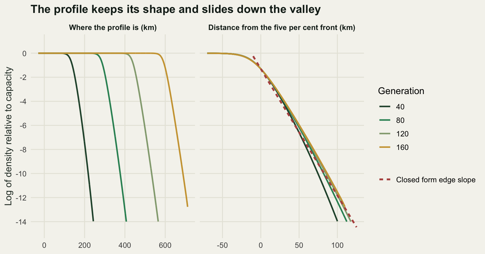
Speed is now a regression problem, and the choice of regression matters. Fitting a straight line to front position over the last hundred generations gives one answer. Fitting the per generation displacement against the reciprocal of time and reading off the intercept gives another, and the second is the one that estimates the asymptotic speed, for a reason that the numbers themselves will supply.
fit_speed <- function(pos, from) {
  tt <- seq_along(pos)
  v <- diff(pos)
  mid <- tt[-1] - 0.5
  u <- mid > from
  ex <- unname(coef(lm(v[u] ~ I(1 / mid[u]))))
  li <- unname(coef(lm(pos[tt > from] ~ tt[tt > from])))
  c(asymptote = ex[1], decay = ex[2], window_slope = li[2],
    window_intercept = li[1])
}

fits <- t(sapply(seq_along(marks), function(j) fit_speed(base$pos[, j], 60)))
rownames(fits) <- paste0("mark_", format(marks))
print(round(fits, 4))
asymptote decay window_slope window_intercept
mark_5e-01 3.8809 -6.2089 3.8223 -32.0789
mark_5e-02 3.8765 -5.3413 3.8260 -11.3393
mark_5e-04 3.8675 -3.4096 3.8350 11.0524print(round(c(closed_form = c_form,
max_error_in_asymptote_pct = 100 * max(abs(fits[, "asymptote"] / c_form - 1)),
window_slope_shortfall_pct = 100 * (1 - mean(fits[, "window_slope"]) / c_form)), 4)) closed_form max_error_in_asymptote_pct
3.8782 0.2761
window_slope_shortfall_pct
1.3004 late <- 41:n_gen
delay_fit <- lm(I(base$pos[late, 2] - c_form * late) ~ log(late) + I(1 / sqrt(late)))
print(round(c(measured_log_delay = -unname(coef(delay_fit))[2],
predicted_log_delay = 3 / (2 * s_form),
shortfall_pct = 100 * (1 + unname(coef(delay_fit))[2] /
(3 / (2 * s_form)))), 4)) measured_log_delay predicted_log_delay shortfall_pct
5.8650 6.1885 5.2268 A straight line through the last hundred generations of front position gives 3.8223, 3.8260 and 3.8350 kilometres a year at the three density marks, on average 1.3004 per cent short of the closed form. Extrapolating the per generation displacement to infinite time instead gives 3.8809, 3.8765 and 3.8675, every one of them within 0.2761 per cent of the predicted 3.878159. The formula is right and the simulation is right; what is wrong is the idea that a front reaches its asymptotic speed in finite time.
It does not, and the way it fails is known exactly. A pulled front started from a compact patch arrives at \(c^{*}t - (3/2s^{*})\log t + \text{constant}\), so the position falls further and further behind the asymptote while the speed converges to it from below like one over time. Fitting the position deficit to a logarithm plus a square root correction recovers a coefficient of 5.8650 against the predicted 6.1885, low by 5.2268 per cent, which is about as much as a run of 160 generations can resolve given the slower corrections still sitting underneath. That is where the missing 1.3004 per cent lives. It is not the grid, and it is not the kernel window.
print(c(half_spacing_km = dx0 / 2, wider_window_in_sd = 12,
        wider_domain_km = round(1.6 * half0)))
half_spacing_km wider_window_in_sd wider_domain_km
0.1 12.0 1138.0 grid_chk <- rbind(
baseline = fit_speed(base$pos[, 2], 60),
half_spacing = fit_speed(spread_run(growth, sigma_d, dx0 / 2, half0,
n_gen, 0.05)$pos[, 1], 60),
wider_kernel_window = fit_speed(spread_run(growth, sigma_d, dx0, half0, n_gen,
0.05, n_sd = 12)$pos[, 1], 60),
wider_domain = fit_speed(spread_run(growth, sigma_d, dx0, round(1.6 * half0),
n_gen, 0.05)$pos[, 1], 60))
print(round(grid_chk[, c("asymptote", "window_slope")], 5)) asymptote window_slope
baseline 3.87651 3.82596
half_spacing 3.87652 3.82596
wider_kernel_window 3.87651 3.82596
wider_domain 3.87651 3.82596print(signif(c(largest_relative_change =
max(abs(grid_chk[-1, "asymptote"] / grid_chk[1, "asymptote"] - 1))), 3))largest_relative_change
6.79e-07 Halving the grid spacing to 0.1 kilometres, widening the kernel window from eight standard deviations to twelve, and widening the domain to 1138 kilometres all leave the measured speed at 3.87651. The largest relative change across the three is \(6.79 \times 10^{-7}\). The numerical scaffolding is doing nothing, which is the only condition under which the remaining discrepancy is worth interpreting.
Where you draw the front does not change its speed
Field programmes disagree about what counts as the front. Some map the outermost record of any individual, some the outermost site above a mapping threshold, some the edge of continuous cover. The three density marks in the run stand in for that range, and they are three orders of magnitude apart: 500 stems per kilometre, 50, and one plant every two kilometres.
gap_lo <- base$pos[, 2] - base$pos[, 1]
gap_hi <- base$pos[, 3] - base$pos[, 2]
w50 <- (n_gen - 49):n_gen
print(round(c(gap_capacity_to_five_pct = mean(gap_lo[w50]), sd_of_gap = sd(gap_lo[w50]),
              gap_five_pct_to_sparse = mean(gap_hi[w50]), sd_of_gap = sd(gap_hi[w50]),
              gap_predicted_from_shape = log(100) / s_form), 4))
gap_capacity_to_five_pct sd_of_gap gap_five_pct_to_sparse
21.2381 0.0317 23.6057
sd_of_gap gap_predicted_from_shape
0.0804 18.9994 edge_levels <- c(5e-2, 5e-4, 1e-6, 1e-8, 1e-10, 1e-12)
edge_pos <- sapply(edge_levels, function(m) front_at(base$dens, base$x, m))
local_rate <- log(edge_levels[-length(edge_levels)] / edge_levels[-1]) / diff(edge_pos)
print(data.frame(level = edge_levels, position_km = round(edge_pos, 2))) level position_km
1 5e-02 601.15
2 5e-04 624.87
3 1e-06 651.62
4 1e-08 670.12
5 1e-10 687.91
6 1e-12 705.10print(round(c(local_rate, closed_form_shape = s_form), 4))
           0.1941            0.2324            0.2489            0.2588
                  closed_form_shape
           0.2679            0.2424
The three fronts travel at the same speed. Their extrapolated asymptotes agree with the closed form to within 0.2761 per cent, and more directly, the distance between them is very nearly fixed: over the last fifty generations the gap between the capacity mark and the five per cent mark averages 21.2381 kilometres with a standard deviation of 0.0317, and the gap between the five per cent mark and the sparse mark averages 23.6057 with a standard deviation of 0.0804. Neither gap has quite settled: both are still widening at the end of the run, so those standard deviations measure a slow drift rather than scatter, and the drift across the whole window is a fraction of a kilometre against a front that covers nearly four every year. A threshold moves the line up or down, not its slope. Anyone comparing published spread rates measured under different mapping rules is therefore comparing quantities that are more nearly the same than the raw distances suggest.
The size of the offset is less obedient. If the leading edge really were \(\exp(-s^{*}x)\), then two marks a hundredfold apart in density would be separated by \(\log(100)/s^{*}\), which is 18.9994 kilometres. The measured separation is 23.6057, well wide of that. The reason shows up in the last block: the local decay rate of the profile is not constant. Between five per cent and the sparse mark it is 0.1941 per kilometre, well below the predicted 0.2424; between \(10^{-6}\) and \(10^{-8}\) it is 0.2489, close to it; and between \(10^{-10}\) and \(10^{-12}\) it has climbed to 0.2679, past it. A pulled front is not a pure exponential. It carries a linear prefactor near its shoulder, which flattens the profile there, and it has not yet relaxed at all in its extreme tail, which is still carrying the shape of the founding patch. Only the middle of the leading edge, several orders of magnitude below any density a field programme could detect, decays at the rate the theory names.
mark_lab <- c("half of capacity", "five per cent of capacity",
              "one plant per two kilometres")
appr <- do.call(rbind, lapply(seq_along(marks), function(j) {
  v <- diff(base$pos[, j]); mid <- seq_len(n_gen)[-1] - 0.5
  ok <- mid > 15
  data.frame(gen = mid[ok], v = v[ok],
             mark = factor(mark_lab[j], levels = mark_lab))
}))
curve_df <- do.call(rbind, lapply(seq_along(marks), function(j) {
  gg <- seq(15, n_gen, length.out = 120)
  data.frame(gen = gg, v = fits[j, "asymptote"] + fits[j, "decay"] / gg,
             mark = factor(mark_lab[j], levels = mark_lab))
}))

ggplot(appr, aes(gen, v, colour = mark)) +
  geom_hline(yintercept = c_form, linetype = "dashed",
             colour = te_pal$ink, linewidth = 0.7) +
  geom_point(size = 1.5, alpha = 0.8) +
  geom_line(data = curve_df, linewidth = 0.8) +
  annotate("text", x = 22, y = c_form + 0.045, hjust = 0, size = 3.2,
           colour = te_pal$ink, label = "closed form: 3.8782 km per year") +
  scale_colour_manual(values = c(te_pal$forest, te_pal$gold, te_pal$clay),
                      name = "Front defined at") +
  coord_cartesian(ylim = c(3.45, 3.98)) +
  labs(x = "Generation", y = "Displacement in the year (km)",
       title = "The measured speed climbs towards the formula and never arrives") +
  theme_te() +
  theme(legend.position = "right")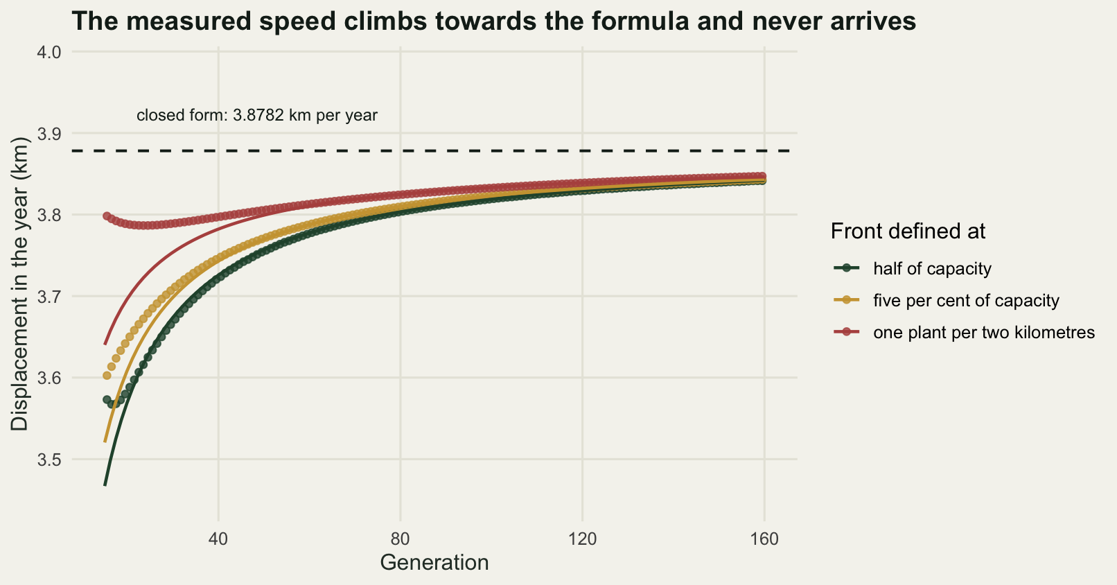
Growth or dispersal: which lever is longer
The closed form says the speed depends on the two field numbers in different ways: proportionally to \(\sigma\), and only through the square root of \(\log R\). Sweeping each in the simulation tests both statements at once, and it is a genuine test rather than an algebraic identity, because the grid spacing is held fixed at 0.2 kilometres across the dispersal sweep instead of being rescaled with the kernel.
sweep_speed <- function(R, sd_disp, n_step = 80, from = 40, dx = dx0, cut_at = Inf) {
  guess <- sd_disp * sqrt(2 * log(R))
  wide <- ceiling(guess * n_step + 12 * sd_disp + 60)
  fit_speed(spread_run(R, sd_disp, dx, wide, n_step, 0.05,
                       cut_at = cut_at)$pos[, 1], from)["asymptote"]
}

print(c(sweep_generations = 80, sweep_fit_from = 40))
sweep_generations sweep_fit_from
80 40 sd_set <- c(2, 3, 4, 6, 8)
d_set <- sd_set^2 / 2
speed_d <- sapply(sd_set, function(s) sweep_speed(growth, s))
print(data.frame(dispersal_sd = sd_set, diffusion = d_set,
measured = round(speed_d, 4),
predicted = round(sd_set * sqrt(2 * log(growth)), 4),
ratio = round(speed_d / (sd_set * sqrt(2 * log(growth))), 5))) dispersal_sd diffusion measured predicted ratio
1 2 2.0 1.9375 1.9391 0.99921
2 3 4.5 2.9053 2.9086 0.99888
3 4 8.0 3.8727 3.8782 0.99859
4 6 18.0 5.8064 5.8172 0.99813
5 8 32.0 7.7389 7.7563 0.99775loglog <- lm(log(speed_d) ~ log(d_set))
print(round(c(log_log_slope_on_diffusion = unname(coef(loglog))[2],
largest_residual = max(abs(residuals(loglog)))), 5))log_log_slope_on_diffusion largest_residual
0.49947 0.00006 growth_set <- c(1.2, 1.4, 1.6, 2, 2.5, 3, 4)
speed_r <- sapply(growth_set, function(r) sweep_speed(r, sigma_d))
print(data.frame(growth = growth_set, measured = round(speed_r, 4),
predicted = round(sigma_d * sqrt(2 * log(growth_set)), 4),
ratio = round(speed_r / (sigma_d * sqrt(2 * log(growth_set))), 5))) growth measured predicted ratio
1 1.2 2.3762 2.4154 0.98376
2 1.4 3.2692 3.2813 0.99630
3 1.6 3.8727 3.8782 0.99859
4 2.0 4.7075 4.7096 0.99955
5 2.5 5.4137 5.4149 0.99978
6 3.0 5.9283 5.9292 0.99985
7 4.0 6.6598 6.6604 0.99990through_origin <- unname(coef(lm(speed_r ~ sqrt(log(growth_set)) + 0))[1])
print(round(c(slope_on_root_log_growth = through_origin,
predicted_slope = sigma_d * sqrt(2),
ratio = through_origin / (sigma_d * sqrt(2))), 5))slope_on_root_log_growth predicted_slope ratio
5.65054 5.65685 0.99888 A log-log regression of measured speed on the diffusion coefficient gives a slope of 0.49947, with a largest residual of \(6 \times 10^{-5}\) on the log scale. Regressing measured speed on \(\sqrt{\log R}\) through the origin gives 5.65054 against the predicted \(\sigma\sqrt{2}\) of 5.65685, a ratio of 0.99888. The one row that misbehaves is the slowest population: at a growth rate of 1.2 the measured speed is 0.98376 of the prediction, against 0.99990 at a growth rate of 4. Slow populations have a shallow leading edge, a small \(s^{*}\), and therefore a large logarithmic delay, so the eighty generations used across the sweeps sit proportionally further from the asymptote for them. The pattern in that ratio column is the finite time effect again, sorted.
Now the practical question. A manager can sometimes buy a percentage off the growth rate, by removing seed heads or by grazing, and can sometimes buy a percentage off the dispersal, by screening a road corridor or by cleaning machinery. Which purchase moves the front more? The elasticities are what to compare, and the closed form gives them without any simulation: the elasticity with respect to \(\sigma\) is exactly one, and the elasticity with respect to \(R\) is \(0.5/\log R\). Those two are equal when \(\log R = 0.5\), that is at a growth rate of \(e^{0.5}\). Below that value, demography is the longer lever; above it, dispersal is. The measurement below uses a twenty per cent change in each and three growth rates spanning the crossing point.
bump <- 1.2
elas <- t(sapply(c(1.3, 1.6, 2.5), function(rb) {
  c0 <- sweep_speed(rb, sigma_d)
  cr <- sweep_speed(rb * bump, sigma_d)
  cs <- sweep_speed(rb, sigma_d * bump)
  c(growth = rb, base_speed = c0,
    growth_elasticity = log(cr / c0) / log(bump),
    dispersal_elasticity = log(cs / c0) / log(bump),
    predicted_growth_elasticity = log(sqrt(log(rb * bump) / log(rb))) / log(bump))
}))
dimnames(elas) <- list(NULL, c("growth", "base_speed", "growth_elasticity",
                               "dispersal_elasticity", "predicted_growth_elasticity"))
print(round(elas, 4))
growth base_speed growth_elasticity dispersal_elasticity
[1,] 1.3 2.8767 1.4774 0.9964
[2,] 1.6 3.8727 0.9038 0.9989
[3,] 2.5 5.4137 0.4981 0.9998
predicted_growth_elasticity
[1,] 1.4470
[2,] 0.8990
[3,] 0.4977print(round(c(crossing_growth_rate = exp(0.5), percent_step = 100 * (bump - 1)), 4))crossing_growth_rate percent_step
1.6487 20.0000 At a growth rate of 1.3 a twenty per cent gain in the growth rate buys a measured elasticity of 1.4774 against 0.9964 for the same relative gain in dispersal distance, so demography is comfortably the better buy. At 1.6 the two are close, 0.9038 against 0.9989. At 2.5 dispersal wins outright, 0.9998 against 0.4981. The crossing sits at 1.6487 for an infinitesimal change. The twenty per cent step used here moves it down to about 1.51, which is why the river plant in this post, at 1.6, already has dispersal marginally ahead, 0.9989 against 0.9038.
That inverts the usual advice, which is that spread is dispersal limited and that demographic management is a poor way to slow a front. The advice is sound for a fast growing invader and wrong for a slow one, and the boundary is a specific number rather than a matter of judgement. The mechanism is plain enough once the formula is written down: the speed depends on the logarithm of the growth rate, and a logarithm is a steep function of its argument when the argument is close to one.
cut_set <- c(8, 12, 16, 20, 24)
cut_pred <- sapply(cut_set, function(a) {
  kc <- kb
  ok <- abs(kc$shift) <= a
  kc$w <- kc$w[ok] / sum(kc$w[ok]); kc$shift <- kc$shift[ok]
  optimize(speed_curve, c(0.005, 6), kk = kc, R = growth)$objective
})
cut_meas <- sapply(cut_set, function(a) sweep_speed(growth, sigma_d, cut_at = a))

calib <- rbind(
  data.frame(pred = sd_set * sqrt(2 * log(growth)), meas = speed_d,
             sweep = "dispersal scale"),
  data.frame(pred = sigma_d * sqrt(2 * log(growth_set)), meas = speed_r,
             sweep = "growth rate"),
  data.frame(pred = cut_pred, meas = cut_meas, sweep = "truncated kernel"))

ggplot(calib, aes(pred, meas, colour = sweep, shape = sweep)) +
  geom_abline(slope = 1, intercept = 0, colour = te_pal$ink, linewidth = 0.7) +
  geom_point(size = 2.8, stroke = 1) +
  scale_colour_manual(values = c(te_pal$forest, te_pal$gold, te_pal$clay),
                      name = "Swept") +
  scale_shape_manual(values = c(16, 17, 4), name = "Swept") +
  labs(x = "Speed from the closed form (km per year)",
       y = "Speed measured from the simulation (km per year)",
       title = "Every parameter set lands on the line the formula draws") +
  theme_te() +
  theme(legend.position = "right")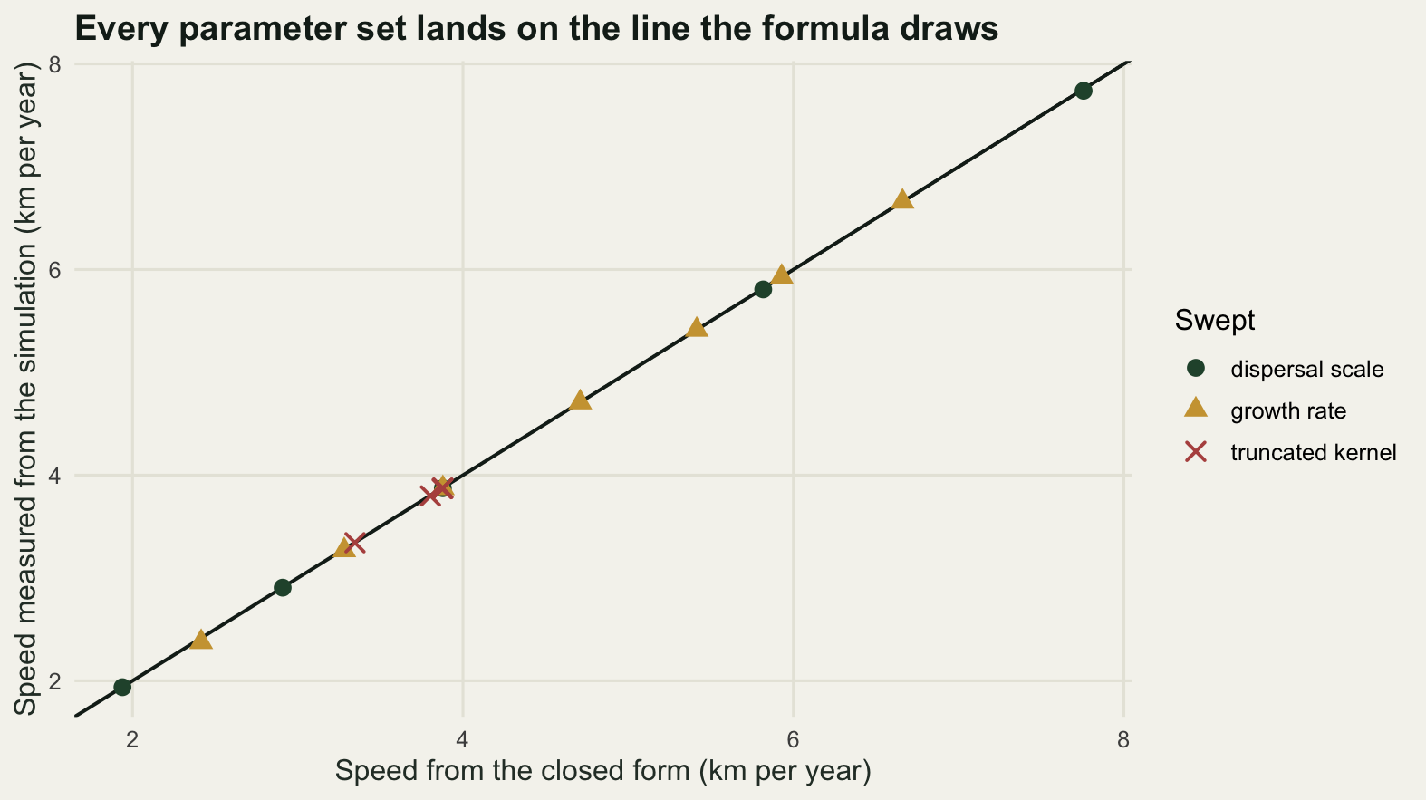
The front is pulled by almost nobody
The selection argument behind \(c^{*}\) says the speed is set in the leading edge, where density is low, and never in the bulk. That is a testable statement, and there are two ways to interfere with the leading edge.
The first is to cut the kernel off. Truncating the Gaussian at a fixed distance removes the rare long journeys and nothing else, and the predicted speed for the truncated kernel comes from the same minimisation with the same code.
print(data.frame(cut_km = cut_set, cut_in_sd = cut_set / sigma_d,
                 pct_seed_removed = round(200 * pnorm(-cut_set / sigma_d), 5),
                 predicted = round(cut_pred, 4), measured = round(cut_meas, 4),
                 pct_speed_lost = round(100 * (1 - cut_pred / c_form), 3),
                 measured_over_predicted = round(cut_meas / cut_pred, 5)))
cut_km cut_in_sd pct_seed_removed predicted measured pct_speed_lost
1 8 2 4.55003 3.3465 3.3425 13.709
2 12 3 0.26998 3.8032 3.7979 1.933
3 16 4 0.00633 3.8737 3.8683 0.114
4 20 5 0.00006 3.8781 3.8726 0.003
5 24 6 0.00000 3.8782 3.8727 0.000
measured_over_predicted
1 0.99880
2 0.99861
3 0.99860
4 0.99859
5 0.99859Cutting the kernel at four standard deviations discards 0.00633 per cent of the seed and costs 0.114 per cent of the speed. Cutting at three discards 0.27 per cent of the seed and costs 1.933 per cent. Cutting at two discards 4.55 per cent of the seed and costs 13.709 per cent, which is three times the fraction of seed thrown away. The measured speeds track their own predictions at a ratio between 0.99859 and 0.99880, the same finite time shortfall as everywhere else. So the far tail of a Gaussian is genuinely irrelevant, and this is the sense in which a thin tailed kernel is a safe object: the front is not resting on events that the data could not see.
The second interference is different in kind, and it is where the deterministic model stops describing a population. Set the density to zero wherever it falls below a floor. That floor is a caricature of a real constraint: a bank cannot hold a thousandth of a plant, and a front made of individuals has a genuine last plant beyond which there is nothing.
floor_set <- c(1e-2, 1e-3, 1e-4, 1e-6, 1e-8, 1e-10, 1e-12)
floor_speed <- sapply(floor_set, function(e) {
  wide <- ceiling(c_form * 100 + 12 * sigma_d + 60)
  fit_speed(spread_run(growth, sigma_d, dx0, wide, 100, 0.05,
                       floor_dens = e)$pos[, 1], 40)["window_slope"]
})
deficit <- c_form - floor_speed
print(data.frame(floor = floor_set, stems_per_km = floor_set * cap_stems,
                 speed = round(floor_speed, 4), deficit = round(deficit, 4),
                 pct_of_speed_lost = round(100 * deficit / c_form, 2)))
floor stems_per_km speed deficit pct_of_speed_lost
1 1e-02 1e+01 2.9454 0.9327 24.05
2 1e-03 1e+00 3.3994 0.4788 12.35
3 1e-04 1e-01 3.5962 0.2820 7.27
4 1e-06 1e-03 3.7502 0.1279 3.30
5 1e-08 1e-05 3.7903 0.0879 2.27
6 1e-10 1e-07 3.7972 0.0809 2.09
7 1e-12 1e-09 3.7980 0.0802 2.07bd <- lm(deficit ~ I(1 / log(floor_set)^2))
print(round(c(fitted_coefficient = unname(coef(bd))[2],
fitted_intercept = unname(coef(bd))[1],
brunet_derrida_value = pi^2 * curvature * s_form^2 / 2), 4)) fitted_coefficient fitted_intercept brunet_derrida_value
19.0771 0.0470 19.1379 needed <- exp(-sqrt((pi^2 * curvature * s_form^2 / 2) / (0.01 * c_form)))
print(signif(c(floor_for_one_pct_loss = needed,
capacity_per_km_implied = 1 / needed), 3)) floor_for_one_pct_loss capacity_per_km_implied
2.25e-10 4.44e+09 A floor of one plant per kilometre, which is not a severe assumption for a bank that holds a thousand plants per kilometre when full, drops the speed from 3.878 to 3.3994 kilometres a year. That is 12.35 per cent of the speed gone. Most of that is the cost of removing individuals that were never really there; the small remainder is the finite time shortfall that the next paragraph puts a number on. Push the floor down to one plant per thousand kilometres of river and the loss is still 3.30 per cent.
The scaling explains why that recovery is so slow. Regressing the deficit on the reciprocal of the squared logarithm of the floor gives a coefficient of 19.0771, against the value 19.1379 that Brunet and Derrida’s cutoff analysis predicts from the curvature of the speed curve at its minimum, \(\pi^2 c''(s^{*}) s^{*2} / 2\). Two independent routes to the same number to three significant figures. The fitted intercept of 0.0470 is the finite time shortfall that every run in this post carries.
A deficit that shrinks like one over the square of a logarithm is barely shrinking at all. To bring the loss down to one per cent, the floor has to reach \(2.25 \times 10^{-10}\), which for this corridor means a carrying capacity of about \(4.44 \times 10^{9}\) stems per kilometre of bank. No real population is that dense, so no real population moves at \(c^{*}\).
cut_curve <- data.frame(lf = seq(-12.6, -1.6, length.out = 200))
cut_curve$speed <- c_form - unname(coef(bd))[1] -
  unname(coef(bd))[2] / (cut_curve$lf * log(10))^2
cut_pts <- data.frame(lf = log10(floor_set), speed = floor_speed)

ggplot(cut_pts, aes(lf, speed)) +
  geom_hline(yintercept = c_form, linetype = "dashed",
             colour = te_pal$ink, linewidth = 0.7) +
  geom_line(data = cut_curve, colour = te_pal$sage, linewidth = 1) +
  geom_point(size = 3, colour = te_pal$clay) +
  annotate("text", x = -12.4, y = c_form + 0.055, hjust = 0, size = 3.2,
           colour = te_pal$ink,
           label = "deterministic speed: 3.8782 km per year") +
  annotate("segment", x = -4.4, xend = -3.08, y = 3.19, yend = 3.37,
           colour = te_pal$clay, linewidth = 0.5) +
  annotate("text", x = -4.5, y = 3.17, hjust = 1, size = 3.2,
           colour = te_pal$clay, label = "one plant per km") +
  scale_x_continuous(breaks = seq(-12, -2, by = 2)) +
  coord_cartesian(ylim = c(2.86, 4.0)) +
  labs(x = "Log of the density floor, relative to capacity",
       y = "Measured speed (km per year)",
       title = "A front made of whole plants runs slower than the equation") +
  theme_te() +
  theme(legend.position = "none")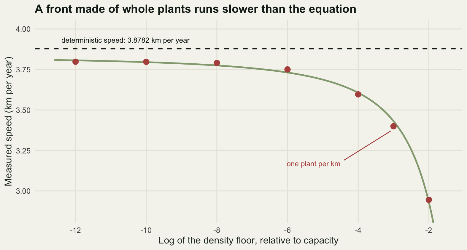
How thin the leading edge really is can be read straight off the run. Integrating the deterministic profile beyond each front mark and converting to stems gives the population that the speed is being set by.
i_five <- which(base$x >= edge_pos[1])[1]
i_sparse <- which(base$x >= edge_pos[2])[1]
tail_i <- length(base$dens)
print(round(c(stems_beyond_five_pct_mark =
                sum(base$dens[i_five:tail_i]) * dx0 * cap_stems,
              stems_beyond_sparse_mark =
                sum(base$dens[i_sparse:tail_i]) * dx0 * cap_stems,
              km_of_bank_per_stem_at_the_selection_density =
                1 / (1e-6 * cap_stems)), 4))
stems_beyond_five_pct_mark
285.7191
stems_beyond_sparse_mark
2.2206
km_of_bank_per_stem_at_the_selection_density
1000.0000 Beyond the five per cent mark the whole model contains 285.7191 stems. Beyond the sparse mark it contains 2.2206. And the part of the profile whose decay rate actually matches the theoretical selection rate, around a relative density of \(10^{-6}\), corresponds to one stem per 1000 kilometres of bank. The deterministic speed of 3.8782 kilometres a year is being set by a region of the model that, in any population you could go and count, is empty.
The honest limit
Everything above is a deterministic calculation on a homogeneous line, and each of those words is doing damage.
The largest is the one the cutoff measured. A pulled front is a mathematical object that draws its speed from arbitrarily small densities, and any population made of individuals cuts that supply off. The correction is not small, it goes the same way every time, and it dies only as the inverse square of a logarithm, so no amount of realism about the bulk of the population repairs it. Take the deterministic speed as an upper bound and a mildly optimistic one. The 12.35 per cent loss measured here at a floor of one plant per kilometre is a lower bound on the real loss, because a hard floor is a gentler caricature of individuals than genuine demographic stochasticity, which also lets the front stall and restart.
The second is the assumption that the front is pulled at all, which is what the Beverton-Holt growth function bought. If low density individuals do worse than high density ones, through mate limitation or any other Allee effect, the front is pushed from behind instead and \(\min_s c(s)\) ceases to apply. The linearised formula then overstates the speed by an amount that grows with the strength of the effect, and at sufficient strength the front stops or retreats altogether. None of that is visible in the numbers above, because the model was built so that it could not be.
The third is the kernel family. A Gaussian was chosen so that the moment generating function exists and the minimisation has a solution. That is a strong assumption disguised as a convenient one: the truncation sweep showed that the tail beyond four standard deviations of a Gaussian is irrelevant, but the same statement is false for a kernel with an algebraic tail, where the integral \(\int k(y)e^{sy}\,\mathrm{d}y\) diverges for every positive \(s\), there is no minimum to take, and there is no asymptotic speed to measure at all.
Finally the corridor is a line with no structure, the growth rate is the same every year and everywhere, and the introduction is a single patch. Real valleys have gaps, floods, and repeated introductions from upstream, and each of those breaks the travelling wave into something the regression above would fit happily and describe wrongly.
Where to go next
The kernel assumption is the one with the biggest consequence, and fat tails and accelerating spread picks it up directly: what happens to all of this when \(M(s)\) does not exist, why the front then has no speed to converge to, and how far apart two kernels that fit the same seed trap data can drive a forecast. Long-distance jumps and stratified spread takes the other route out of the smooth wave, replacing the deterministic tail with rare stochastic founding events, which changes both the mean speed and, more usefully for a manager, its variance.
If the plan is to fit a spread rate to real mapped data rather than to simulate one, checking an invasion spread model is the place to go first. It takes the reassuring result from this post, that the density threshold does not change the asymptotic speed, and shows the three situations in which it stops being reassuring.
References
Skellam JG 1951 Biometrika 38(1-2):196-218 (10.1093/biomet/38.1-2.196)
Kot M, Lewis MA, van den Driessche P 1996 Ecology 77(7):2027-2042 (10.2307/2265698)
Clark JS 1998 American Naturalist 152(2):204-224 (10.1086/286162)
Brunet E, Derrida B 1997 Physical Review E 56(3):2597-2604 (10.1103/PhysRevE.56.2597)
van Saarloos W 2003 Physics Reports 386(2-6):29-222 (10.1016/j.physrep.2003.08.001)
Neubert MG, Caswell H 2000 Ecology 81(6):1613-1628 (10.1890/0012-9658(2000)081[1613:DADCAS]2.0.CO;2)