library(ggplot2)

te_pal <- list(forest = "#275139", green = "#2f8f63", sage = "#93a87f",
               clay = "#b5534e", gold = "#cda23f", line = "#dad9ca",
               ink = "#16241d", paper = "#f5f4ee")

theme_te <- function() {
  theme_minimal(base_size = 12) +
    theme(panel.grid.minor = element_blank(),
          panel.grid.major = element_line(colour = "#e7e6dc"),
          plot.background = element_rect(fill = "#f5f4ee", colour = NA),
          panel.background = element_rect(fill = "#f5f4ee", colour = NA),
          plot.title = element_text(face = "bold", colour = te_pal$ink),
          axis.title = element_text(colour = "#2c3a31"))
}Reporting rates and effort drift
R
citizen science
monitoring
ecology tutorial
ggplot2
Recorder effort drifts over twenty years of casual species records. Measure the false trend it invents in a reporting rate, and which drifts a correction sees.
A county records centre holds twenty years of casual records for a moth: a date, a grid reference, a species name and a recorder’s initials. Nobody visited a fixed set of sites, nobody recorded for a fixed length of time, and nobody wrote down what they looked for and failed to find. The centre is asked whether the species is declining. The available answer is a reporting rate: for each year, divide the number of lists that contain the species by the number of lists submitted, and look at the sequence.
That the answer can be a fact about the recorders rather than about the moth is not news on this blog. First flowering date and sampling effort shows a first date of the year moving earlier because more people are looking; Phenological trends and temperature shows the same confound inflating an apparent temperature sensitivity; Sampling bias in presence-only models shows it in space instead of time, bending a fitted niche. Those posts establish that the confound exists. What none of them measures is how large it gets, or which part of recorder behaviour produces it.
This post measures both, on a simulated scheme where the occupancy of the target species is set by hand and is therefore known. Four things about a recording scheme can drift over twenty years: how many people record, how hard each of them works on a visit, where they choose to go, and how low they set the bar for writing a species down. Each of the four is run on its own, against an identical species with an identical trend, and the false trend each one produces is measured on the same scale as the real one. One of the four turns out to be harmless to a reporting rate. One is invisible to the standard correction. The largest is about one and a half times the size of the real trend it is hiding.
A recording scheme where the truth is known
Eighty sites, sixty species in the background pool plus one target species, and twenty years. Each site carries two independent attributes: a richness score, which raises the occupancy of the background species, and a habitat score, which raises the occupancy of the target. Keeping those two independent is deliberate and it does real work later on, because it means the places the target likes are not the places that produce long lists.
A visit is one recorder going to one site once and submitting a list. The visit has an effort value, drawn on a log scale, which is the length of time and care that went into it. A species that is present at the site is detected with probability 1 - exp(-effort * rate), so effort buys detections with diminishing returns, and each species has its own rate. A detected species reaches the list only if the recorder bothers to write it down, with a probability that depends on how conspicuous or interesting the species is. Recorders who omit the common and the dull are the norm in casual recording, not an exception.
The target species is unremarkable on both counts: a middling detection rate and a middling appetite among recorders for writing it down. Its occupancy at a site follows a logistic trend in year with a slope set by hand, so the truth is a number rather than an estimate.
n_years   <- 20
n_sites   <- 80
n_spp     <- 60
visits0   <- 200
eff_sd    <- 1.0
theta0    <- -0.6
psi_int   <- -0.4
hab_beta  <- 1.1
rich_beta <- 0.7
lam_tar   <- 0.45
cons_tar  <- 0
mid       <- (n_years + 1) / 2

grow_obs  <- log(3.0)
grow_eff  <- log(2.4)
grow_site <- 1.0
grow_thr  <- 2.4

round(c(years = n_years, sites = n_sites, background_species = n_spp,
        visits_in_year_one = visits0, effort_sd_on_log_scale = eff_sd,
        target_detection_rate = lam_tar,
        visit_multiplier_at_full_observer_drift = exp(grow_obs),
        effort_multiplier_at_full_list_drift = exp(grow_eff),
        site_tilt_at_full_site_drift = grow_site,
        threshold_shift_at_full_threshold_drift = grow_thr), 3)
years sites
20.00 80.00
background_species visits_in_year_one
60.00 200.00
effort_sd_on_log_scale target_detection_rate
1.00 0.45
visit_multiplier_at_full_observer_drift effort_multiplier_at_full_list_drift
3.00 2.40
site_tilt_at_full_site_drift threshold_shift_at_full_threshold_drift
1.00 2.40 The simulator takes the true log-odds trend per year, the name of the drift to apply, and a drift strength between zero and one. Every drift is anchored so that year one is identical whatever the drift: the scheme starts from the same place and diverges over the following nineteen years.
sim_scheme <- function(beta, drift = "none", g = 1, rho_qh = 0) {
  rich <- rnorm(n_sites)
  hab  <- rho_qh * rich + sqrt(1 - rho_qh^2) * rnorm(n_sites)
  alpha <- rnorm(n_spp, -0.3, 0.9)
  lam   <- exp(rnorm(n_spp, -1.3, 0.6))
  cons  <- rnorm(n_spp, 1.4, 1.3)
  zb <- matrix(rbinom(n_sites * n_spp, 1,
                      plogis(rep(alpha, each = n_sites) + rich_beta * rich)),
               n_sites, n_spp)

  yrs  <- seq_len(n_years)
  prog <- (yrs - 1) / (n_years - 1)
  up   <- function(kind, size) if (drift %in% c(kind, "all")) g * size * prog else 0 * prog
  nv   <- round(visits0 * exp(up("observers", grow_obs)))
  mu_e <- up("lists", grow_eff)
  kap  <- up("sites", grow_site)
  th   <- theta0 + up("threshold", grow_thr)

  eta <- outer(psi_int + hab_beta * hab, beta * (yrs - mid), "+")
  zt  <- matrix(rbinom(n_sites * n_years, 1, plogis(eta)), n_sites, n_years)

  yv   <- rep(yrs, nv)
  nvis <- length(yv)
  sv   <- integer(nvis)
  for (yy in yrs) {
    ii <- which(yv == yy)
    sv[ii] <- sample.int(n_sites, length(ii), TRUE, prob = exp(kap[yy] * hab))
  }
  ev  <- exp(rnorm(nvis, mu_e[yv], eff_sd))
  onl <- matrix(runif(nvis * n_spp), nvis, n_spp) <
    zb[sv, ] * (1 - exp(-outer(ev, lam))) * plogis(outer(th[yv], cons, "+"))
  yt  <- as.integer(runif(nvis) <
    zt[cbind(sv, yv)] * (1 - exp(-ev * lam_tar)) * plogis(th[yv] + cons_tar))
  list(year = yv, y = yt, ll = rowSums(onl), eff = ev, psi = colMeans(plogis(eta)))
}

slope_of <- function(fit) {
  s <- summary(fit)$coefficients
  c(est = unname(s[2, 1]), se = unname(s[2, 2]))
}
naive_fit  <- function(d) slope_of(glm(d$y ~ I(d$year - mid), family = binomial))
corr_fit   <- function(d) slope_of(glm(d$y ~ I(d$year - mid) + log1p(d$ll),
                                       family = binomial))
orac_fit   <- function(d) slope_of(glm(d$y ~ I(d$year - mid) + log(d$eff),
                                       family = binomial))
true_slope <- function(psi) unname(coef(lm(qlogis(psi) ~ I(seq_along(psi) - mid)))[2])
yr_rate    <- function(d) as.numeric(tapply(d$y, d$year, mean))
yr_len     <- function(d) as.numeric(tapply(d$ll, d$year, mean))
The naive estimator is a logistic regression of “was the target on this list” on year. The corrected estimator adds the log of the list length, which is the list-length analysis of List-length analysis for opportunistic data in its plainest form. The third estimator is not available to anyone: it conditions on the true effort of each visit, and it is here to separate a failure of the idea from a failure of the proxy.
Run the scheme once with a species that is not changing and a scheme that is not changing either.
set.seed(20260803)
cal <- sim_scheme(0, "none")
cal_fit <- naive_fit(cal)
round(c(visits = length(cal$y), records = sum(cal$y),
        mean_occupancy = mean(cal$psi),
        mean_list_length = mean(cal$ll),
        reporting_rate = mean(cal$y),
        reporting_rate_percent = 100 * mean(cal$y),
        chance_of_recording_when_present = mean(cal$y) / mean(cal$psi),
        naive_slope = cal_fit[1], naive_se = cal_fit[2]), 4)
visits records
4000.0000 253.0000
mean_occupancy mean_list_length
0.4514 5.8965
reporting_rate reporting_rate_percent
0.0632 6.3250
chance_of_recording_when_present naive_slope.est
0.1401 0.0112
naive_se.se
0.0113 The target occupies 0.4514 of sites, and 6.325 per cent of the 4000 lists carry it. Occupancy is a different quantity from a reporting rate and always will be: a list is a record of one visit, and a visit to an occupied site ends with the species written down only 0.1401 of the time. The fitted trend is 0.0112 in log-odds per year with a standard error of 0.0113, which on this run is a fitted trend of nothing. The scheme was built with no trend in it, and that zero, not the fitted number, is what the rest of the post is measured against.
A trend invented from nothing
Now hold the species completely still and let the scheme modernise. All four drifts run together at half strength: more recorders join, visits get longer, recorders learn which sites are worth visiting, and the bar for writing down an unremarkable moth comes down. Nothing about that description is unusual for a county scheme over two decades.
set.seed(20260803)
h_up <- sim_scheme(0, "all", 0.5)
g_up <- glm(h_up$y ~ I(h_up$year - mid), family = binomial)
f_up <- slope_of(g_up)
fit_up <- plogis(coef(g_up)[1] + coef(g_up)[2] * (seq_len(n_years) - mid))
round(c(true_slope = true_slope(h_up$psi),
        naive_slope = f_up[1], naive_se = f_up[2],
        ci_lower = f_up[1] - 1.96 * f_up[2], ci_upper = f_up[1] + 1.96 * f_up[2],
        percent_per_year = 100 * (exp(f_up[1]) - 1),
        odds_multiplier_over_the_period = exp(f_up[1] * (n_years - 1))), 4)
true_slope naive_slope.est
0.0000 0.0705
naive_se.se ci_lower.est
0.0079 0.0551
ci_upper.est percent_per_year.est
0.0859 7.3070
odds_multiplier_over_the_period.est
3.8189 c_up <- corr_fit(h_up)
round(c(corrected_slope = c_up[1], corrected_se = c_up[2],
percent_of_false_trend_removed = 100 * (1 - c_up[1] / f_up[1])), 4) corrected_slope.est corrected_se.se
0.0462 0.0082
percent_of_false_trend_removed.est
34.5308 round(c(visits_year_1 = sum(h_up$year == 1), visits_year_20 = sum(h_up$year == n_years),
records_year_1 = sum(h_up$y[h_up$year == 1]),
records_year_20 = sum(h_up$y[h_up$year == n_years]),
list_length_year_1 = yr_len(h_up)[1],
list_length_year_20 = yr_len(h_up)[n_years],
fitted_rate_percent_year_1 = 100 * fit_up[1],
fitted_rate_percent_year_20 = 100 * fit_up[n_years]), 4) visits_year_1 visits_year_20
200.0000 346.0000
records_year_1 records_year_20
8.0000 65.0000
list_length_year_1 list_length_year_20
5.8400 9.7139
fitted_rate_percent_year_1 fitted_rate_percent_year_20
5.8780 19.2565 The true slope is exactly zero. The naive slope is 0.0705 in log-odds per year, with a 95 per cent interval running from 0.0551 to 0.0859, which is a 7.31 per cent increase in the odds every year and a 3.82-fold increase over the nineteen years of the series. The fitted reporting rate climbs from 5.88 per cent of lists to 19.26 per cent. Any analyst would report that as an increase, and would be able to defend the interval, because the interval is a correct summary of the sampling variability in a large dataset. It is the dataset that is lying, not the arithmetic.
What generated it is visible in the same output. Visits per year went from 200 to 346, the mean list grew from 5.84 species to 9.71, and the number of lists carrying the target went from 8 to 65. The list-length correction pulls the estimate down to 0.0462 with a standard error of 0.0082, which removes 34.53 per cent of the false trend and leaves an interval nowhere near zero.
The same drift running backwards
The mirror case is the one that matters for conservation, because a scheme that loses recorders is at least as common as one that gains them. Give the species a genuine increase, then let the scheme fade: the same four drifts at half strength, running the other way.
set.seed(20260803)
h_dn <- sim_scheme(0.06, "all", -0.5)
g_dn <- glm(h_dn$y ~ I(h_dn$year - mid), family = binomial)
f_dn <- slope_of(g_dn)
round(c(true_slope = true_slope(h_dn$psi),
        true_percent_per_year = 100 * (exp(true_slope(h_dn$psi)) - 1),
        naive_slope = f_dn[1], naive_se = f_dn[2],
        ci_lower = f_dn[1] - 1.96 * f_dn[2], ci_upper = f_dn[1] + 1.96 * f_dn[2],
        naive_percent_per_year = 100 * (exp(f_dn[1]) - 1),
        naive_decline_percent_per_year = 100 * (1 - exp(f_dn[1])),
        corrected_slope = corr_fit(h_dn)[1]), 4)
true_slope true_percent_per_year
0.0492 5.0415
naive_slope.est naive_se.se
-0.0523 0.0193
ci_lower.est ci_upper.est
-0.0902 -0.0144
naive_percent_per_year.est naive_decline_percent_per_year.est
-5.0964 5.0964
corrected_slope.est
-0.0356 round(c(visits_year_1 = sum(h_dn$year == 1), visits_year_20 = sum(h_dn$year == n_years),
list_length_year_1 = yr_len(h_dn)[1],
list_length_year_20 = yr_len(h_dn)[n_years]), 4) visits_year_1 visits_year_20 list_length_year_1 list_length_year_20
200.0000 115.0000 5.3600 3.4522 The species is genuinely increasing at 5.04 per cent per year in the odds of occupying a site. The reporting rate falls at 5.10 per cent per year, and the interval on that decline runs from -0.0902 to -0.0144, so it excludes zero. On this run the sign is wrong and the magnitude is close to right, which is the worst of both worlds: a report of a decline of about the size of the real increase, with an interval that gives no hint of trouble. Visits fell from 200 to 115 and the mean list from 5.36 species to 3.45.
index_frame <- function(d, gfit, lab) {
  yy <- seq_len(n_years)
  pr <- plogis(coef(gfit)[1] + coef(gfit)[2] * (yy - mid))
  data.frame(year = yy, panel = lab,
             observed = 100 * yr_rate(d) / pr[1],
             fitted   = 100 * pr / pr[1],
             truth    = 100 * d$psi / d$psi[1])
}
pan <- c("Species stable, scheme growing", "Species increasing, scheme fading")
idx <- rbind(index_frame(h_up, g_up, pan[1]), index_frame(h_dn, g_dn, pan[2]))
idx$panel <- factor(idx$panel, levels = pan)

ggplot(idx, aes(year)) +
  geom_hline(yintercept = 100, colour = te_pal$line, linewidth = 0.8) +
  geom_point(aes(y = observed), colour = te_pal$sage, size = 1.9) +
  geom_line(aes(y = truth, colour = "True occupancy"), linetype = 2, linewidth = 1) +
  geom_line(aes(y = fitted, colour = "Reporting rate"), linewidth = 1.1) +
  facet_wrap(~panel) +
  scale_colour_manual(values = c("True occupancy" = te_pal$forest,
                                 "Reporting rate" = te_pal$clay), name = NULL) +
  labs(x = "Year of the scheme", y = "Index, year 1 = 100",
       title = "The recorders decide which way the reported trend points",
       subtitle = "Green points are the raw annual reporting rates behind the fitted red line.") +
  theme_te() +
  theme(legend.position = "bottom",
        plot.subtitle = element_text(colour = "#2c3a31", size = 9),
        strip.text = element_text(colour = te_pal$ink, face = "bold"))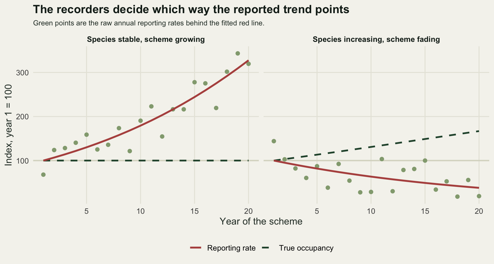
Four kinds of drift, one at a time
Compound drift makes a good demonstration and a poor diagnosis. Separate the four and give each one the same species: a real decline of 0.04 in log-odds of occupancy per year at the site level. Each drift is run at full strength on its own, twenty five times, with the seeds paired across drifts so that every scenario sees the same sites, the same background species and the same true occupancy history. The bias reported below is the difference from the no-drift run on the same seed, which removes the site to site variation from the comparison.
drifts <- c("none", "observers", "lists", "sites", "threshold")
n_rep  <- 25
run_set <- function(drift, beta = -0.04, g = 1, rho = 0, R = n_rep, full = TRUE) {
  t(sapply(seq_len(R), function(k) {
    set.seed(20260803 + k)
    d <- sim_scheme(beta, drift, g, rho)
    if (!full) return(c(naive = naive_fit(d)[1], corrected = NA, oracle = NA,
                        truth = NA, visits = NA, rec1 = NA, rec20 = NA, len1 = NA,
                        len20 = NA, rate1 = NA, rate20 = NA, cor_le = NA))
    c(naive = naive_fit(d)[1], corrected = corr_fit(d)[1], oracle = orac_fit(d)[1],
      truth = true_slope(d$psi), visits = length(d$y),
      rec1 = sum(d$y[d$year == 1]), rec20 = sum(d$y[d$year == n_years]),
      len1 = yr_len(d)[1], len20 = yr_len(d)[n_years],
      rate1 = yr_rate(d)[1], rate20 = yr_rate(d)[n_years],
      cor_le = cor(log1p(d$ll), log(d$eff)))
  }))
}
res <- lapply(drifts, run_set)
names(res) <- drifts

bias_of <- function(col) sapply(res, function(r) mean(r[, col] - res$none[, col]))
mcse_of <- function(col) sapply(res, function(r)
  sd(r[, col] - res$none[, col]) / sqrt(n_rep))
naive_bias <- bias_of(1); corr_bias <- bias_of(2)
removed <- ifelse(abs(naive_bias) > 3 * mcse_of(1),
                  100 * (1 - corr_bias / naive_bias), NA)

drift_tab <- cbind(naive_slope = sapply(res, function(r) mean(r[, 1])),
                   false_trend = naive_bias, mcse = mcse_of(1),
                   visits = sapply(res, function(r) mean(r[, 5])),
                   record_ratio = sapply(res, function(r)
                     mean(r[, 7]) / mean(r[, 6])),
                   list_ratio = sapply(res, function(r) mean(r[, 9]) / mean(r[, 8])))
print(round(drift_tab, 4))
naive_slope false_trend mcse visits record_ratio list_ratio
none -0.0178 0.0000 0.0000 4000 0.6736 0.9846
observers -0.0196 -0.0017 0.0026 7320 2.0483 0.9784
lists 0.0072 0.0250 0.0009 4000 1.1097 1.6057
sites 0.0075 0.0253 0.0019 4000 1.1567 0.9430
threshold 0.0305 0.0483 0.0012 4000 1.7128 1.4000true_mag <- abs(mean(res$none[, 4]))
round(c(replicates = n_rep,
true_slope_of_mean_occupancy = mean(res$none[, 4]),
naive_slope_with_no_drift = mean(res$none[, 1]),
percent_of_true_slope_recovered =
100 * mean(res$none[, 1]) / mean(res$none[, 4]),
largest_false_trend_over_true_trend =
max(naive_bias) / abs(mean(res$none[, 4]))), 4) replicates true_slope_of_mean_occupancy
25.0000 -0.0320
naive_slope_with_no_drift percent_of_true_slope_recovered
-0.0178 55.8083
largest_false_trend_over_true_trend
1.5115 The true trend, expressed as the slope of the mean occupancy across sites, is -0.0320 per year, and with no drift at all the reporting rate gives -0.0178, which is 55.8 per cent of it. That gap is a separate problem and the honest limit section returns to it. Everything below is measured against that no-drift figure, so the numbers are drift and nothing else.
More recorders is the harmless one. It produces a false trend of -0.0017 against a Monte Carlo standard error of 0.0026, which is nothing at all. It is the only one of the four that behaves. That is exactly why reporting rates are used instead of record counts: over the same twenty years the number of lists carrying the target rises by a factor of 2.05 while the species declines, and any analysis of raw record counts would report a doubling. Dividing by the number of lists disposes of the whole problem in one line.
The other three do not behave. Longer visits produce a false trend of 0.0250, better site choice 0.0253, and a falling reporting threshold 0.0483. All three are positive, and all three outweigh the -0.0178 the reporting rate carries with no drift at all: each of the three turns a declining species into a stable or increasing one. The falling threshold goes further still, at 1.51 times the size of the true trend of -0.0320. The naive slopes in the table are positive numbers for a species that is genuinely going down.
The last column of that table is the one to keep. Longer visits raise the mean list length by a factor of 1.61 and a falling threshold by 1.40, so both announce themselves in the data. Better site choice produces a list ratio of 0.94: the lists do not get longer, because the target’s habitat is not the species-rich habitat. It produces as much false trend as the drift that multiplies every list by 1.61, and it leaves no mark on the one thing an analyst usually checks.
gs <- c(0, 0.25, 0.5, 0.75, 1)
n_sweep <- 16
sweep_res <- sapply(drifts[-1], function(dd)
  sapply(gs, function(gg) {
    r <- run_set(dd, g = gg, R = n_sweep, full = FALSE)
    mean(r[, 1] - res$none[seq_len(n_sweep), 1])
  }))
rownames(sweep_res) <- gs
print(round(sweep_res, 4))
observers lists sites threshold
0 0.0000 0.0000 0.0000 0.0000
0.25 -0.0007 0.0068 0.0064 0.0195
0.5 -0.0030 0.0126 0.0088 0.0343
0.75 -0.0037 0.0191 0.0159 0.0433
1 -0.0044 0.0245 0.0249 0.0484round(c(replicates_per_point = n_sweep, real_trend_magnitude = true_mag,
share_of_real_trend_at_full = sweep_res[length(gs), ] / true_mag), 3) replicates_per_point real_trend_magnitude
16.000 0.032
share_of_real_trend_at_full.observers share_of_real_trend_at_full.lists
-0.139 0.766
share_of_real_trend_at_full.sites share_of_real_trend_at_full.threshold
0.779 1.515 Nothing above says the ranking is a property of drift in general, because each drift was given a magnitude by hand. Running each of them across a strength scale from zero to full says a little more. The falling reporting threshold is the largest at every strength on the scale, and it passes the size of the real trend at about half strength. Longer visits and better site choice climb close together and finish at 0.766 and 0.779 of the real trend, and their order swaps along the way on this run, so the difference between them should not be read as a ranking. More recorders drifts the other way instead, ending at -0.0044 at full strength, so what little it does would make a decline look slightly steeper rather than hide it.
drift_lab <- c(observers = "More recorders", lists = "Longer visits",
               sites = "Better site choice", threshold = "Lower reporting threshold")
swp <- data.frame(g = rep(gs, ncol(sweep_res)),
                  drift = factor(rep(drift_lab[colnames(sweep_res)], each = length(gs)),
                                 levels = drift_lab),
                  bias = as.vector(sweep_res))

ggplot(swp, aes(g, bias, colour = drift)) +
  annotate("rect", xmin = -0.03, xmax = 1.03, ymin = true_mag, ymax = Inf,
           fill = te_pal$line, alpha = 0.55) +
  annotate("text", x = 0.02, y = true_mag + 0.0035, hjust = 0, size = 3,
           colour = "#2c3a31", label = "larger than the real trend") +
  annotate("text", x = 1.03, y = true_mag - 0.0032, hjust = 1, size = 3,
           colour = "#2c3a31",
           label = sprintf("the size of the real trend: %.4f", true_mag)) +
  geom_hline(yintercept = 0, colour = "#c9c8b8", linewidth = 0.7) +
  geom_line(linewidth = 1.1) +
  geom_point(size = 2.4) +
  scale_colour_manual(values = c(te_pal$sage, te_pal$green, te_pal$gold, te_pal$clay),
                      name = NULL) +
  scale_x_continuous(breaks = gs) +
  labs(x = "Drift strength, 0 to full", y = "False trend, log-odds per year",
       title = "Only one of the four drifts leaves the reporting rate alone") +
  theme_te() +
  theme(legend.position = "right")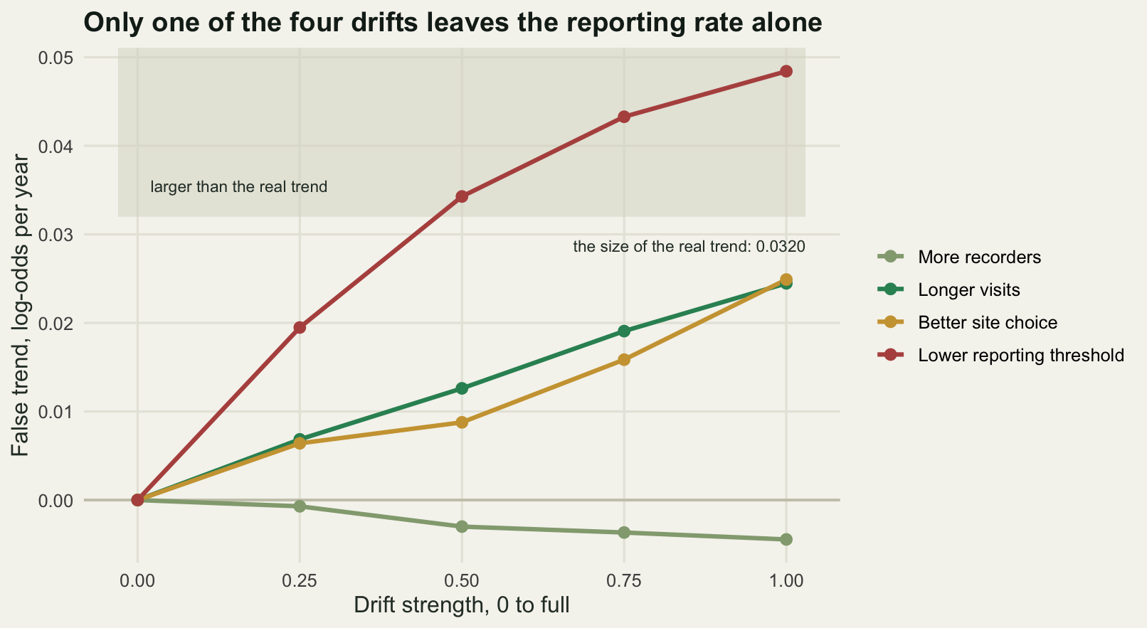
What the list-length correction can see
The list-length correction adds the length of the list to the model and asks for the trend at a fixed list length. It is the standard first move on unstructured data and it is the subject of the companion post. Run it on all four drifts and it separates them cleanly into what it can see and what it cannot.
corr_tab <- cbind(naive_false_trend = naive_bias,
                  corrected_false_trend = corr_bias,
                  oracle_false_trend = bias_of(3),
                  percent_removed = removed,
                  list_length_correlation = sapply(res, function(r) mean(r[, 12])))
print(round(corr_tab, 4))
naive_false_trend corrected_false_trend oracle_false_trend
none 0.0000 0.0000 0.0000
observers -0.0017 -0.0014 -0.0012
lists 0.0250 0.0102 0.0003
sites 0.0253 0.0263 0.0261
threshold 0.0483 0.0378 0.0504
percent_removed list_length_correlation
none NA 0.7683
observers NA 0.7676
lists 59.1912 0.7691
sites -3.8199 0.7647
threshold 21.8442 0.7835rhos <- c(0, 0.5, 0.9)
hab_tab <- t(sapply(rhos, function(rr) {
a <- run_set("none", rho = rr, R = 12)
b <- run_set("sites", rho = rr, R = 12)
c(habitat_richness_correlation = rr,
naive_false_trend = mean(b[, 1] - a[, 1]),
corrected_false_trend = mean(b[, 2] - a[, 2]),
list_ratio = mean(b[, 9]) / mean(b[, 8]),
percent_removed = 100 * (1 - mean(b[, 2] - a[, 2]) / mean(b[, 1] - a[, 1])))
}))
print(round(hab_tab, 4)) habitat_richness_correlation naive_false_trend corrected_false_trend
[1,] 0.0 0.0250 0.0257
[2,] 0.5 0.0239 0.0193
[3,] 0.9 0.0235 0.0132
list_ratio percent_removed
[1,] 0.9865 -2.9390
[2,] 1.1572 18.9689
[3,] 1.2969 43.8269Of the false trend from longer visits, the correction removes 59.2 per cent. Of the false trend from a falling reporting threshold, 21.8 per cent. Of the false trend from better site choice it removes -3.8 per cent, which is to say it removes nothing and moves the estimate very slightly the wrong way. The third column explains the pattern rather than the correction failing in three different ways: an estimator that conditions on the true effort of each visit, which no real analysis has, removes the longer-visit bias completely (0.0003 left of 0.0250) and leaves the site-choice bias entirely alone (0.0261 of 0.0253). Site choice is not an effort problem. It is a change in which population is being sampled, and no effort covariate can reach it.
Longer visits are an effort problem, so why does the correction leave 0.0102 of that bias in place? Because the list length is a poor measure of effort. Its correlation with the log of the true effort is 0.7683 with no drift and does not leave that neighbourhood under any of the four, and the missing part is site richness: a short list from a rich site and a long list from a poor site look the same to the model. Measurement error in a covariate attenuates its coefficient, and whatever the covariate fails to absorb goes back into the year term. The correction is not wrong. It is diluted, and the dilution is set by how much of the variation in list length is effort rather than habitat.
That last point has a consequence worth measuring, because it makes the invisible drift partly visible under one condition. Repeat the site-choice drift with the target’s habitat score correlated with the site richness score, so that the recorders who move to better habitat also move to richer sites. At a correlation of 0.5 the correction removes 19.0 per cent of the bias, and at 0.9 it removes 43.8 per cent, while the naive false trend stays between 0.0235 and 0.0250. The correction never saw site choice at all; what it saw was the list lengthening as a side effect, which is a fact about the study system and not about the method.
dumb <- data.frame(
  drift = factor(drift_lab[drifts[-1]], levels = rev(drift_lab)),
  naive = naive_bias[drifts[-1]], corrected = corr_bias[drifts[-1]],
  lab = sprintf("list length x%.2f",
                (sapply(res, function(r) mean(r[, 9]) / mean(r[, 8])))[drifts[-1]]))

ggplot(dumb, aes(y = drift)) +
  geom_vline(xintercept = 0, colour = te_pal$line, linewidth = 0.9) +
  geom_segment(aes(x = naive, xend = corrected, yend = drift),
               colour = te_pal$sage, linewidth = 2.6, lineend = "butt") +
  geom_point(aes(x = naive), colour = te_pal$clay, fill = te_pal$paper,
             size = 4.4, shape = 21, stroke = 1.1) +
  geom_point(aes(x = corrected), colour = te_pal$forest, size = 3, shape = 18) +
  geom_text(aes(x = 0.062, label = lab), hjust = 1, size = 3, colour = "#2c3a31") +
  scale_x_continuous(limits = c(-0.009, 0.0655)) +
  labs(x = "False trend, log-odds per year", y = NULL,
       title = "The correction only removes drift that lengthens the lists",
       subtitle = paste("Open red ring: naive. Green diamond: after the",
                        "list-length correction; overlap means no change.")) +
  theme_te() +
  theme(plot.subtitle = element_text(colour = "#2c3a31", size = 9))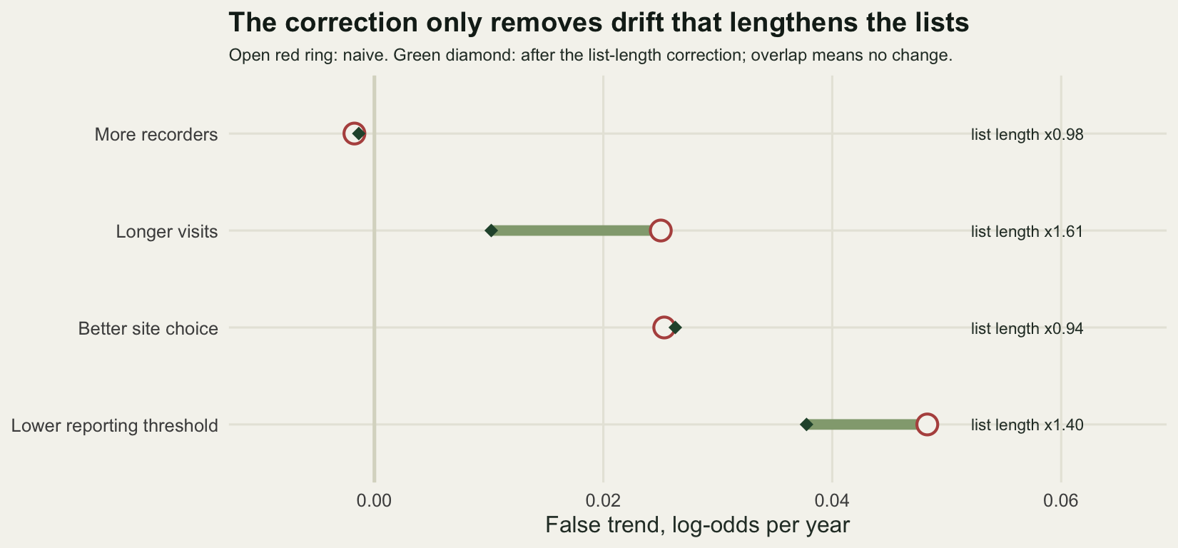
The interval is wrong as well as the estimate
A biased point estimate with an honest interval is a survivable problem: the interval says how much to trust the point. The interval here is computed from the sampling variability of a large binomial dataset, and it knows nothing about drift, so it is narrow and wrong at the same time. Measure it properly by running a hundred independent schemes for a species whose occupancy is exactly constant, and counting how often the nominal 95 per cent interval contains the truth of zero.
cov_run <- function(drift, g = 1, R = 100) {
  t(sapply(seq_len(R), function(k) {
    set.seed(20260803 + 1000 + k)
    f <- naive_fit(sim_scheme(0, drift, g))
    c(est = f[1], se = f[2], covered = as.numeric(abs(f[1]) < 1.96 * f[2]))
  }))
}
cov_lab <- c(none = "No drift", sites = "Better site choice",
             all = "All four at half strength")
cv <- list(none = cov_run("none"), sites = cov_run("sites"), all = cov_run("all", 0.5))
cov_tab <- t(sapply(cv, function(z)
  c(mean_estimate = mean(z[, 1]), sd_of_estimates = sd(z[, 1]),
    mean_model_se = mean(z[, 2]), runs_covering_zero = sum(z[, 3]),
    coverage = mean(z[, 3]))))
print(round(cov_tab, 4))
mean_estimate sd_of_estimates mean_model_se runs_covering_zero coverage
none 0.0002 0.0130 0.0114 93 0.93
sites 0.0225 0.0105 0.0104 47 0.47
all 0.0617 0.0097 0.0078 0 0.00c(schemes_per_row = 100, nominal_level = 0.95, nominal_percent = 95)schemes_per_row nominal_level nominal_percent
100.00 0.95 95.00 With no drift the interval covers the truth in 93 of 100 runs, which is the nominal 0.95 within Monte Carlo error and confirms that the machinery is sound. Add the invisible drift, better site choice, and coverage falls to 0.47. Add all four at half strength and it is 0.00: not one interval in a hundred contains the truth.
The middle column is the part that should worry anyone. The mean model standard error falls from 0.0114 with no drift to 0.0078 with all four drifts, because drift brings more visits and more records with it. The interval gets narrower as the estimate gets further from the truth, so the analysis reports rising confidence in a number that is going wrong. There is also a smaller effect in the no-drift row: the spread of estimates, 0.0130, exceeds the mean model standard error of 0.0114, because repeat visits to the same site share its occupancy and the binomial model treats them as independent.
cov_df <- do.call(rbind, lapply(names(cv), function(k)
  data.frame(est = as.numeric(cv[[k]][, 1]), panel = unname(cov_lab[k]))))
cov_df$panel <- factor(cov_df$panel, levels = cov_lab)
ann <- data.frame(panel = factor(cov_lab, levels = cov_lab),
                  lab = sprintf("coverage %.2f", cov_tab[, "coverage"]))

ggplot(cov_df, aes(est)) +
  geom_histogram(bins = 22, fill = te_pal$green, colour = te_pal$paper,
                 linewidth = 0.3) +
  geom_vline(xintercept = 0, colour = te_pal$clay, linewidth = 1) +
  geom_text(data = ann, aes(x = 0.081, y = 31, label = lab), hjust = 1, size = 3.2,
            colour = "#2c3a31", inherit.aes = FALSE) +
  expand_limits(y = 34) +
  facet_wrap(~panel) +
  labs(x = "Estimated trend, log-odds per year", y = "Schemes out of one hundred",
       title = "Drift moves the estimate further than the interval is wide") +
  theme_te() +
  theme(strip.text = element_text(colour = te_pal$ink, face = "bold"))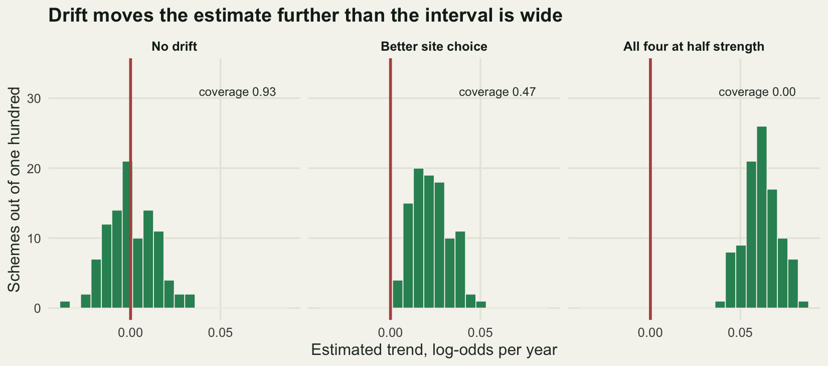
The honest limit
The reporting rate is not occupancy, and correcting the drift does not make it occupancy. With no drift at all, the reporting-rate slope recovered 55.8 per cent of the true occupancy slope. Two things compress it. A visit to an occupied site ends with the species on the list only 0.1401 of the time, so the observable quantity is a product of occupancy and detection, and its log-odds move less than the log-odds of occupancy. Sites also differ a great deal in how suitable they are, and averaging a logistic trend over that spread flattens it further. Neither of the estimators here targets occupancy; both target the trend in a reporting rate, which is a compressed version of it. If the compression factor is what you need, the answer is an occupancy model, which Occupancy from unstructured records builds from this same kind of record stream.
The ranking of the four drifts is conditional on the magnitudes I chose for them, and there is no common currency in which a tripling of recorders and a shift of 2.4 in a reporting threshold are the same size of change. The strength sweep goes some way towards that by showing the whole curve rather than one point on it, but the four curves still have four incomparable horizontal axes. What does carry across is the qualitative separation, which does not depend on magnitude: recorder numbers cancel out of a ratio, effort per visit is partly readable from the list length, and site choice is not an effort variable at all.
The invisible drift is invisible by construction, and that is the uncomfortable part. There is no internal check on it. Every diagnostic available inside the dataset (list lengths, visits per year, species per recorder) is flat while the estimate goes wrong by more than the size of the signal. The only routes out are external: a covariate for where the visits happened, which is what the spatial version of the problem uses, or a structured sample of known sites to calibrate against. The last post in this cluster measures how big that structured sample has to be.
Two simplifications should be named. Occupancy is redrawn independently each year here, so a site occupied in one year is no more likely to be occupied the next, which suppresses the year to year correlation a real population would have. And a single species was tracked, so nothing here says what happens when a reporting-rate index is averaged over a hundred species with drifts pointing in different directions.
Where to go next
The companion post, List-length analysis for opportunistic data, takes the correction that removed 59.2 per cent of one bias here and works out how much of the rest can be recovered by choosing the functional form of the list-length term with more care. If you would rather stop modelling the effort and model the detection process instead, Occupancy from unstructured records builds repeat visit histories out of a record stream and hands them to a detection model, which changes what the estimates mean as well as what they are worth.
The wider habit this post is arguing for is to treat every trend from unstructured data as a statement about recorders until proved otherwise. Cleaning GBIF occurrence data is the step before any of this, and Checking an unstructured-data analysis is a set of four tests to run once the trend is fitted.
References
Isaac NJB, van Strien AJ, August TA, de Zeeuw MP, Roy DB 2014 Methods in Ecology and Evolution 5(10):1052-1060 (10.1111/2041-210X.12254)
Isaac NJB, Pocock MJO 2015 Biological Journal of the Linnean Society 115(3):522-531 (10.1111/bij.12532)
van Strien AJ, van Swaay CAM, Termaat T 2013 Journal of Applied Ecology 50(6):1450-1458 (10.1111/1365-2664.12158)
Szabo JK, Vesk PA, Baxter PWJ, Possingham HP 2010 Ecological Applications 20(8):2157-2169 (10.1890/09-0877.1)
Boakes EH, McGowan PJK, Fuller RA, Chang-qing D, Clark NE, O’Connor K, Mace GM 2010 PLoS Biology 8(6):e1000385 (10.1371/journal.pbio.1000385)