---
title: "Phenological trends and temperature"
description: "Estimate phenological sensitivity to temperature in R, and see how rising effort in warm years inflates the first-date trend while the mean date holds."
date: "2026-06-22 13:00"
categories: [R, phenology, climate change, ggplot2, ecology tutorial]
image: thumbnail.png
image-alt: "First-date and mean-date regressions against spring temperature, with the first-date slope much steeper than the mean-date slope."
date-modified: "2026-10-07"
---
*Corrected 7 October 2026: the closing section said a percentile date sidesteps the effort trap just as the mean and median dates do; it now says that with few plants a sample percentile is pulled towards the median, so an early percentile date still drifts with effort, though less than the first date does. It also said Parmesan and Yohe assembled the studies named before them, one of which appeared after theirs; it now says they assembled trends of this kind.*
*Corrected 27 September 2026: the caption of the effort-control figure told the two runs apart by open and solid points, but both are drawn as filled points; it now names them by colour (red for effort tracking warmth, green for constant effort).*
The flagship result of phenological research is a sensitivity: a plant flowers so many days earlier per degree of spring warming, or a species advances so many days per decade. These numbers are estimated by regressing a timing statistic on temperature or on year. The previous tutorial showed that the first date advances with monitoring effort on its own. This post follows that bias into the trend, because effort is rarely constant across years, and shows how it inflates the sensitivity estimated from first dates while leaving the mean date untouched.
```{r}
#| label: setup
#| code-fold: true
#| code-summary: "Setup: packages, colours and plot theme"
#| results: hide
#| message: false
#| warning: false
library(ggplot2)
forest <- "#275139"; gold <- "#cda23f"; terra <- "#b5534e"; mown <- "#2f8f63"
theme_te <- function(base = 13) {
  theme_minimal(base_size = base) +
    theme(panel.grid.minor = element_blank(),
          panel.grid.major = element_line(colour = "#e7e6da", linewidth = 0.3),
          axis.title = element_text(colour = "#46604a"),
          axis.text  = element_text(colour = "#2c3a31"),
          plot.title = element_text(colour = "#16241d", face = "bold"),
          plot.subtitle = element_text(colour = "#5d6b61"),
          plot.background  = element_rect(fill = "#f5f4ee", colour = NA),
          panel.background = element_rect(fill = "#f5f4ee", colour = NA),
          legend.position = "bottom", legend.title = element_text(colour = "#46604a"))
}
theme_set(theme_te())
```
## A monitored population across warm and cold years
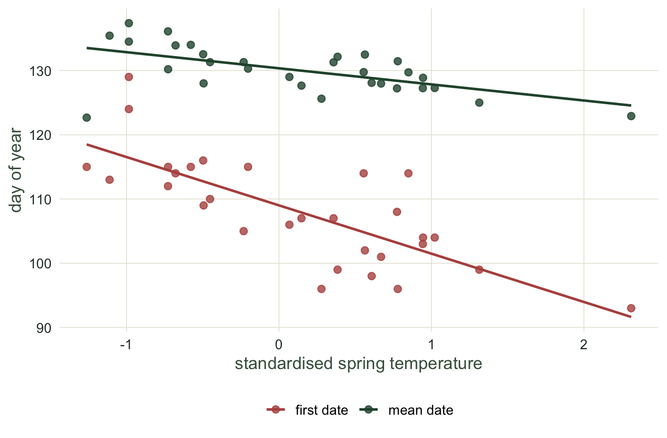
Here is a thirty-year record. Each year has a standardised spring temperature anomaly, and the true mean flowering date advances by three days for every degree of warming. That is the truth we will try to recover. The catch is that effort covaries with temperature: warm springs bring people outdoors, so warm years are watched by more recorders than cold years.
```{r}
#| label: data
set.seed(303)
Y <- 30
beta_true <- 3                                   # true days earlier per degree
sdev <- 12
temp <- rnorm(Y, 0, 1)                            # standardised spring temperature
mean_true <- 130 - beta_true * temp               # true mean date each year
n_year <- round(exp(3.0 + 0.9 * temp))            # warm years -> more plants observed

first_obs <- mean_obs <- numeric(Y)
for (y in 1:Y) {
  x <- draw <- round(rnorm(n_year[y], mean_true[y], sdev))
  first_obs[y] <- min(x); mean_obs[y] <- mean(x)
}
range(n_year)
```
```{r}
#| label: eff-store
#| include: false
n_lo <- range(n_year)[1]; n_hi <- range(n_year)[2]
```
Effort ranges from `r n_lo` plants in the coldest year to `r n_hi` in the warmest. That is the confound in a nutshell: temperature drives both the flowering date and the number of eyes on the population.
## Two sensitivities from the same data
Now regress each timing statistic on temperature. The slope is the estimated sensitivity in days per degree.
```{r}
#| label: fits
fit_mean  <- lm(mean_obs  ~ temp)
fit_first <- lm(first_obs ~ temp)
s_mean  <- coef(fit_mean)[2];  ci_mean  <- confint(fit_mean)[2, ]
s_first <- coef(fit_first)[2]; ci_first <- confint(fit_first)[2, ]
rbind(mean_date  = c(slope = s_mean,  ci_mean),
      first_date = c(slope = s_first, ci_first))
```
```{r}
#| label: fit-store
#| include: false
sm <- sprintf("%.2f", s_mean); cml <- sprintf("%.2f", ci_mean[1]); cmh <- sprintf("%.2f", ci_mean[2])
sf <- sprintf("%.2f", s_first); cfl <- sprintf("%.2f", ci_first[1]); cfh <- sprintf("%.2f", ci_first[2])
ratio_est <- round(s_first / s_mean, 1)
ratio_true <- round(abs(s_first) / beta_true, 1)
```
The mean-date slope is `r sm` days per degree. It is a noisy estimate, as thirty years always will be, but it is unbiased. Its confidence interval runs from `r cml` to `r cmh`. The first-date slope is `r sf` days per degree. This is not merely noisier. Its interval runs from `r cfl` to `r cfh`. It reports the population advancing `r ratio_est` times faster than the mean date does, and `r ratio_true` times faster than the truth.
```{r}
#| label: fig-sensitivity
#| fig-cap: "Sensitivity of two timing statistics to spring temperature. The first-date regression is far steeper than the mean-date regression, because warm years are also better monitored."
#| fig-alt: "A scatter of day of year against standardised spring temperature. Mean-date points scatter around a gentle downward line; first-date points scatter lower with a much steeper downward line."
#| fig-width: 7
#| fig-height: 4.6
plotdf <- rbind(
  data.frame(temp = temp, day = mean_obs,  metric = "mean date"),
  data.frame(temp = temp, day = first_obs, metric = "first date"))
ggplot(plotdf, aes(temp, day, colour = metric)) +
  geom_point(size = 2.2, alpha = 0.8) +
  geom_smooth(method = "lm", se = FALSE, linewidth = 0.9, formula = y ~ x) +
  scale_colour_manual(values = c("mean date" = forest, "first date" = terra)) +
  labs(x = "standardised spring temperature", y = "day of year", colour = NULL)
```
## Proving the confound: hold effort constant
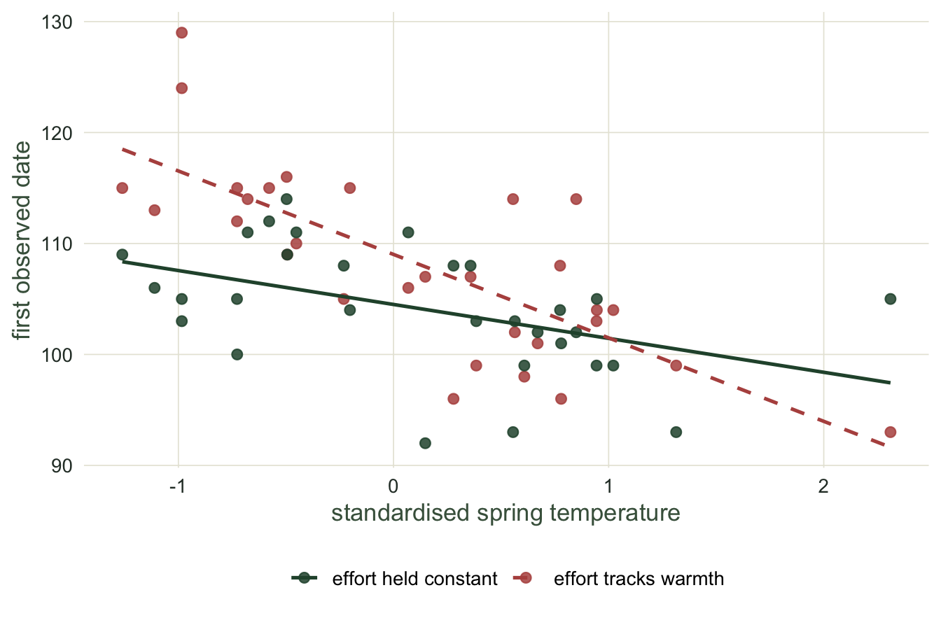
Is the first date inflated because it is a first date, or because effort tracked temperature? Rerun the same years and the same true dates, but monitor a constant 30 plants every year, warm or cold.
```{r}
#| label: control
set.seed(404)
first_const <- numeric(Y)
for (y in 1:Y) first_const[y] <- min(round(rnorm(30, mean_true[y], sdev)))
s_const <- coef(lm(first_const ~ temp))[2]
round(s_const, 2)
```
```{r}
#| label: control-store
#| include: false
sc <- round(s_const, 2)
```
With effort fixed, the first-date slope is `r sc` days per degree, against a true value of -3. The bias was never a property of the first date on its own; it was the interaction between the first date and effort that changed alongside temperature. Remove the changing effort and the bias disappears.
```{r}
#| label: fig-control
#| fig-cap: "The first date against temperature under two effort regimes. When effort rises in warm years (red points, dashed fit) the fitted line is steep; with constant effort (green points, solid fit) it is much shallower."
#| fig-alt: "First observed date against standardised spring temperature. Red points with a steep dashed line show the confounded case, in which effort rises in warm years; dark green points with a shallower solid line show the run with effort held at 30 plants in every year, warm or cold."
#| fig-width: 7
#| fig-height: 4.6
cdf <- rbind(
  data.frame(temp = temp, day = first_obs,   effort = "effort tracks warmth"),
  data.frame(temp = temp, day = first_const, effort = "effort held constant"))
ggplot(cdf, aes(temp, day, colour = effort, linetype = effort)) +
  geom_point(size = 2.2, alpha = 0.85) +
  geom_smooth(method = "lm", se = FALSE, linewidth = 0.9, formula = y ~ x) +
  scale_colour_manual(values = c("effort tracks warmth" = terra,
                                 "effort held constant" = forest)) +
  scale_linetype_manual(values = c("effort tracks warmth" = 2,
                                    "effort held constant" = 1)) +
  labs(x = "standardised spring temperature", y = "first observed date", colour = NULL,
       linetype = NULL)
```
## The honest boundary
Temperature sensitivities and long-term trends are among the most cited numbers in climate-change ecology. Sparks and colleagues related flowering times to Central England temperature over half a century, Menzel and colleagues mapped a coherent European advance, and Parmesan and Yohe assembled trends of this kind into a global fingerprint. All of that rests on the timing statistic being well behaved. A first-date sensitivity is not, whenever effort and the driver move together, which they usually do (van Strien et al. 2008): warmer decades are also more heavily recorded decades. A mean or median date sidesteps the trap, because those summaries do not chase the sample size. A percentile date only softens it: with few plants a sample percentile is pulled towards the median, so an early percentile date still drifts with effort, though less than the first date does. The number to distrust is not the trend itself but the statistic it was built from.
## Where to go next
Estimating a phenological trend involves several assumptions that can quietly fail: effort, the survey window, and the choice of summary. The final tutorial turns each of those into a concrete diagnostic you can run on your own data before you trust a reported shift.
## References
Sparks TH, Jeffree EP, Jeffree CE 2000 International Journal of Biometeorology 44(2):82-87 (10.1007/s004840000049)
Menzel A, Sparks TH, Estrella N, Koch E, Aasa A, Ahas R et al. 2006 Global Change Biology 12(10):1969-1976 (10.1111/j.1365-2486.2006.01193.x)
van Strien AJ, Plantenga WF, Soldaat LL, van Swaay CAM, WallisDeVries MF 2008 Oecologia 156(1):227-235 (10.1007/s00442-008-0959-4)
Parmesan C, Yohe G 2003 Nature 421(6918):37-42 (10.1038/nature01286)
## Related tutorials
- [First flowering dates and sampling effort](../first-flowering-date-and-sampling/)
- [Phenology in R: day of year and event timing](../phenology-and-day-of-year/)
- [Checking a phenology analysis](../checking-a-phenology-analysis/)
- [Chilling, forcing and projected leaf-out](../chilling-and-forcing-in-spring-phenology/)