---
title: "Phenology in R: day of year and event timing"
description: "Turn field dates into day of year and measure phenological event timing in R: first, mean, median, peak and duration, and which summary to report for a season."
date: "2026-06-22 11:00"
date-modified: "2026-10-14"
categories: [R, phenology, ggplot2, ecology tutorial]
image: thumbnail.png
image-alt: "A skewed flowering season with first, peak, median and mean dates marked as vertical lines."
---
*Corrected 14 October 2026: the caption of the season histogram still derived the order of peak, median and mean from right skew alone; it now says that order holds here, as expected for a gamma-shaped season.*
*Corrected 30 September 2026: the post said a right-skewed season always puts the peak before the median and the median before the mean; it now says that order is expected for a gamma-shaped season like this one but is a tendency of right skew, not a rule.*
*Updated 27 September 2026: a new section, When the date is only a month, measures what putting herbarium dates known only to the month or the year on the first of the month or on 1 January does to a century-long flowering trend, and which fixes recover it.*
Phenology is the study of when biological events happen: when a plant first flowers, when a butterfly first appears, when birds start to breed. In R the raw material is almost always a calendar date, and the first job is to turn that date into a number you can model. That number is the day of year, and this post is about getting it right and then deciding what "when did it happen" even means, because a flowering season is not one date but a whole distribution of dates.
```{r}
#| label: setup
#| code-fold: true
#| code-summary: "Setup: packages, colours and plot theme"
#| results: hide
#| message: false
#| warning: false
library(ggplot2)

forest <- "#275139"; gold <- "#cda23f"; terra <- "#b5534e"; mown <- "#2f8f63"
theme_te <- function(base = 13) {
  theme_minimal(base_size = base) +
    theme(panel.grid.minor = element_blank(),
          panel.grid.major = element_line(colour = "#e7e6da", linewidth = 0.3),
          axis.title = element_text(colour = "#46604a"),
          axis.text  = element_text(colour = "#2c3a31"),
          plot.title = element_text(colour = "#16241d", face = "bold"),
          plot.subtitle = element_text(colour = "#5d6b61"),
          plot.background  = element_rect(fill = "#f5f4ee", colour = NA),
          panel.background = element_rect(fill = "#f5f4ee", colour = NA),
          legend.position = "none")
}
theme_set(theme_te())
```
## From a date to a day of year
R stores a date as a `Date` object, and `format(x, "%j")` returns the day of year as a character string. Wrap it in `as.integer()` and you have a number from 1 to 365 (or 366) that a regression can use.
```{r}
#| label: doy
d   <- as.Date(c("2023-03-01", "2024-03-01"))
doy <- as.integer(format(d, "%j"))
doy
```
```{r}
#| label: doy-store
#| include: false
doy23 <- doy[1]; doy24 <- doy[2]
```
The same calendar date can map to a different day of year. The first of March is day `r doy23` in 2023 but day `r doy24` in 2024, because 2024 is a leap year and the extra 29 February pushes everything after it forward by one. If you are comparing early spring dates across many years, decide up front whether you want the raw day of year (which carries this one-day wobble) or a day count from a fixed anchor. For most spring phenology the wobble is small and harmless, but it is worth knowing it is there.
## A season is a distribution, not a date
Imagine monitoring a population of a spring wildflower and recording the day each plant opens its first flower. The result is not a single number but a spread of dates: a few early plants, a peak in the middle, and a long tail of stragglers. Real flowering seasons are usually skewed this way, with the early edge sharper than the late edge.
```{r}
#| label: season
set.seed(101)
onset <- 105
flow  <- round(onset + rgamma(400, shape = 4.5, scale = 5.5))   # first-flower day per plant

first_d  <- min(flow)
last_d   <- max(flow)
mean_d   <- mean(flow)
median_d <- median(flow)
tab      <- table(flow)
peak_d   <- as.integer(names(tab)[which.max(tab)])              # busiest single day
span     <- last_d - first_d
iqr80    <- as.numeric(quantile(flow, 0.9) - quantile(flow, 0.1))
c(first = first_d, peak = peak_d, median = median_d,
  mean = round(mean_d, 1), last = last_d)
```
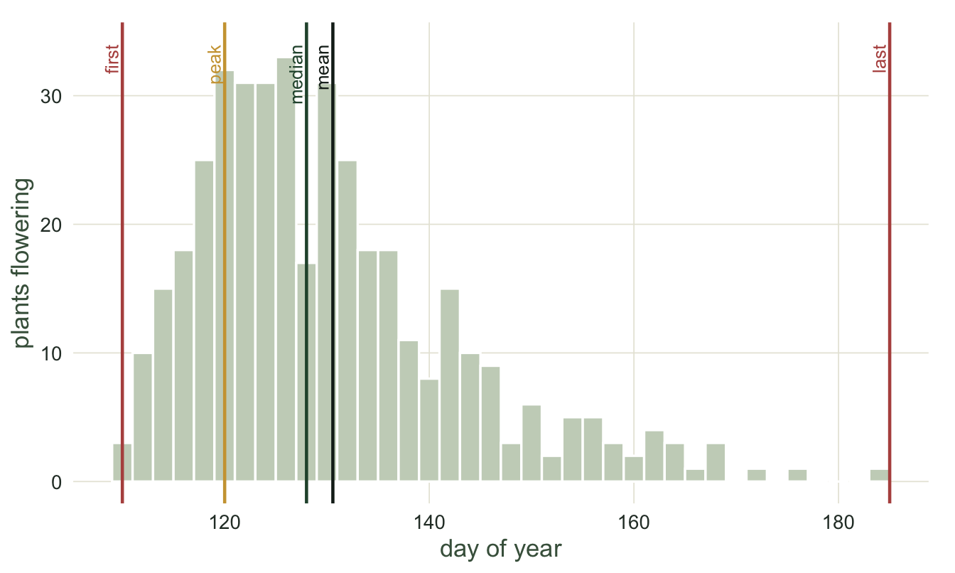
Five people could summarise this same season with five different numbers. The first date is day `r first_d`, the busiest day is day `r peak_d`, the median (the day by which half the plants have flowered) is day `r median_d`, the mean is day `r round(mean_d, 1)`, and the last plant flowers on day `r last_d`. Two more numbers describe the spread rather than the centre: the full span from first to last is `r span` days, and the interval holding the middle 80 per cent of plants is `r round(iqr80, 1)` days.
```{r}
#| label: fig-season
#| fig-cap: "One simulated flowering season of 400 plants, with five common phenophase summaries marked. The season is right skewed, and here the mean sits to the right of the median, which sits to the right of the peak, the order expected for a gamma-shaped season."
#| fig-alt: "A histogram of flowering dates rising sharply near day 110, peaking near day 120, and trailing off to day 185. Vertical lines mark the first, peak, median, mean and last dates, with mean to the right of median to the right of peak."
#| fig-width: 7
#| fig-height: 4.2
marks <- data.frame(
  day = c(first_d, peak_d, median_d, mean_d, last_d),
  lab = c("first", "peak", "median", "mean", "last"),
  col = c(terra, gold, forest, "#16241d", terra))
ggplot(data.frame(flow), aes(flow)) +
  geom_histogram(binwidth = 2, fill = "#c9d3c2", colour = "white") +
  geom_vline(data = marks, aes(xintercept = day, colour = col), linewidth = 0.8) +
  geom_text(data = marks, aes(x = day, y = 34, label = lab, colour = col),
            angle = 90, vjust = -0.3, hjust = 1, size = 3.4) +
  scale_colour_identity() +
  labs(x = "day of year", y = "plants flowering") +
  coord_cartesian(clip = "off") +
  theme(plot.margin = margin(12, 14, 6, 6))
```
Because the season is right skewed, these summaries fall in the usual order: the peak (day `r peak_d`) comes first, then the median (day `r median_d`), then the mean (day `r round(mean_d, 1)`). For a gamma-shaped season like this one that ordering is expected, but it is a tendency of right skew rather than a rule, and some right-skewed distributions break it. Either way the choice of summary can move your reported date by `r round(mean_d - peak_d, 1)` days without anything in the biology changing. Moussus and colleagues compared ten such estimators on simulated seasons and found their accuracy differs a lot, so the summary is a real modelling decision, not a formality.
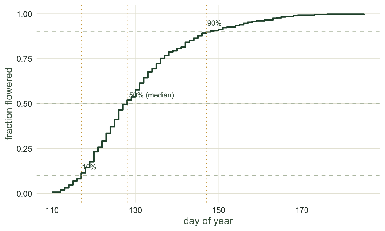
A cleaner way to see the percentile-based summaries is the cumulative curve: the fraction of plants that have flowered by each day. The median is simply where this curve crosses one half, and the 10th and 90th percentiles bracket the bulk of the season.
```{r}
#| label: fig-cumulative
#| fig-cap: "The cumulative flowering curve for the same season. The median date is where the curve crosses 0.5; the 10th and 90th percentile dates bracket the middle 80 per cent of plants."
#| fig-alt: "An S-shaped cumulative curve rising from 0 near day 110 to 1 near day 185. Horizontal dashed lines at 0.1, 0.5 and 0.9 meet the curve at the 10th percentile, median and 90th percentile dates."
#| fig-width: 7
#| fig-height: 4.2
qs   <- quantile(flow, c(0.1, 0.5, 0.9))
ecdf_df <- data.frame(day = sort(unique(flow)))
ecdf_df$cum <- ecdf(flow)(ecdf_df$day)
ggplot(ecdf_df, aes(day, cum)) +
  geom_step(colour = forest, linewidth = 0.9) +
  geom_hline(yintercept = c(0.1, 0.5, 0.9), colour = "#b9c2b0", linetype = 2) +
  geom_vline(xintercept = qs, colour = gold, linetype = 3) +
  annotate("text", x = qs, y = 0.97,
           label = c("10%", "50% (median)", "90%"), hjust = -0.05, size = 3.3,
           colour = "#46604a") +
  labs(x = "day of year", y = "fraction flowered") +
  scale_y_continuous(limits = c(0, 1))
```
## When the linear day of year breaks
The day of year works because a spring season lives comfortably in the middle of the calendar, far from the December-January boundary. That is not always true. Consider events clustered around midwinter, some in late December and some in early January.
```{r}
#| label: winter
winter   <- c(350, 355, 358, 360, 3, 6, 10, 12)   # days of year, spanning the boundary
lin_mean <- mean(winter)
ang       <- winter / 365 * 2 * pi
circ_mean <- (atan2(mean(sin(ang)), mean(cos(ang))) / (2 * pi) * 365) %% 365
c(linear_mean = round(lin_mean, 1), circular_mean = round(circ_mean, 1))
```
The arithmetic mean of these dates is day `r round(lin_mean, 1)`, which lands in the middle of summer, the opposite side of the year from every single observation. The problem is that day 360 and day 5 are ten days apart on the calendar but 355 apart as plain numbers. The fix is to treat the dates as angles on a circle: the circular mean is day `r round(circ_mean, 1)`, back in late December where it belongs. Any phenological question that wraps around the year, or that asks about time of day, needs this circular treatment rather than a linear day of year. The [circular data and the von Mises distribution](../circular-data-and-von-mises/) tutorial covers exactly that machinery.
For a normal spring season none of this bites, and the linear day of year is the right, simple choice. But it is worth carrying the distinction in your head, because the moment your events cross the boundary the arithmetic mean stops meaning anything.
## When the date is only a month
Everything above starts from a date known to the day. Herbarium sheets and old survey cards often are not: a sheet from 1920 may say only "May 1920", or only "1920". In a GBIF download such a record keeps its precision in the `eventDate` string, "1920-05" or "1920", and current GBIF processing leaves the `day` column blank for the first and both `month` and `day` blank for the second (see GBIF's notes on [temporal interpretation](https://techdocs.gbif.org/en/data-processing/temporal-interpretation)). Older GBIF processing put such dates on the first of the month or on 1 January, as a user's post on GBIF's [community forum](https://discourse.gbif.org/t/the-first-of-the-month-year-gbif-problem-and-the-interval-date-gbif-problem/3790) describes (a forum report, not GBIF documentation). The same GBIF page asks publishers not to write a day of 1 when only the month or year is known, so the fill can also happen at source, and any step that turns the string into a full `Date` has to invent a day. A filled date looks exact. Because imprecise dates are common in old records and rare in new ones, the fill does not just add noise to a long-term trend; it adds a trend of its own. The mechanism is not new: it is the moving censoring rule of [values below the detection limit](../values-below-the-detection-limit/), where an improving laboratory and a substituted value make a trend out of a quantity that never changes, and the unequal coarsening of two groups in [digit preference and heaping](../digit-preference-and-heaping/). How R parses the strings in the first place is in [dates and times in ecological data](../dates-and-times-in-ecological-data/).
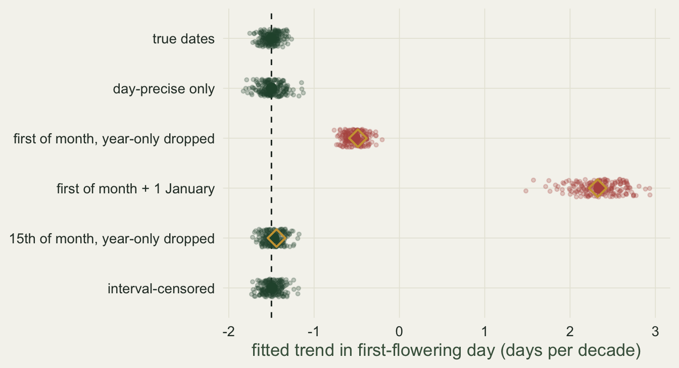
The simulation builds a century of first-flowering records, 20 a year from 1921 to 2020, on this post's season (the onset of day `r onset` plus the same gamma spread), with flowering advancing by 1.5 days per decade. The share of records known only to the month falls along a logistic curve centred on 1960, from 0.5 towards 0.03, and the share known only to the year from 0.2 towards 0; these constants were fixed before anything was run. Each record's `eventDate` is cut to 4, 7 or 10 characters, and everything after that reads only the string, as with a download, so `nchar()` tells the three kinds apart. Six codings are fitted to each of 200 centuries: the true dates; the day-precise records alone; the first of the month with the year-only records dropped; the first of the month plus 1 January for the year-only records; the 15th of the month with the year-only records dropped; and an interval-censored regression (`survival::survreg()` with `type = "interval2"`), in which a month-only record is the interval from the first to the last day of its month, a year-only record the whole year, and a day record its day plus and minus half a day. The chunk checks that the log-likelihood `survreg()` reports is the sum of the log probabilities that each true day lies in its interval.
```{r}
#| label: imprecise-dates
herb_adv <- -1.5                                  # true advance, days per decade
one_century <- function(n_year = 20) {
  yr <- rep(1921:2020, each = n_year)
  doy_true <- round(onset + herb_adv * (yr - 1921) / 10 + rgamma(length(yr), 4.5, scale = 5.5))
  w <- plogis((yr - 1960) / 12)                   # recording improves around 1960
  p_year <- 0.2 * (1 - w); p_month <- 0.5 * (1 - w) + 0.03 * w; u <- runif(length(yr))
  n_char <- ifelse(u < p_year, 4, ifelse(u < p_year + p_month, 7, 10))
  when <- format(as.Date(paste0(yr, "-01-01")) + doy_true - 1)   # "yyyy-mm-dd"
  data.frame(year = yr, doy_true, event_date = substr(when, 1, n_char))
}
fit_codings <- function(rec) {                    # reads only year and event_date
  len <- nchar(rec$event_date); kept <- len > 4; dec <- (rec$year - 1921) / 10
  jday <- function(x) as.integer(format(x, "%j"))
  m_first <- as.Date(paste0(substr(rec$event_date, 1, 7), "-01"), format = "%Y-%m-%d")
  m_last <- as.Date(format(m_first + 31, "%Y-%m-01")) - 1
  first <- ifelse(len == 10, jday(as.Date(rec$event_date, format = "%Y-%m-%d")), jday(m_first))
  jan1 <- ifelse(len == 4, 1, first); mid <- ifelse(len == 7, first + 14, first)
  lo <- ifelse(len == 4, 1, first) - 0.5; hi <- ifelse(len == 7, jday(m_last), first) + 0.5
  hi[len == 4] <- jday(as.Date(paste0(rec$year[len == 4], "-12-31"))) + 0.5
  sl <- function(y, s = TRUE) unname(coef(lm(y[s] ~ dec[s]))[2])
  ic <- survival::survreg(survival::Surv(lo, hi, type = "interval2") ~ dec, dist = "gaussian")
  z_lo <- (lo - ic$linear.predictors) / ic$scale; z_hi <- (hi - ic$linear.predictors) / ic$scale
  p_in <- ifelse(z_lo > 0, pnorm(-z_lo) - pnorm(-z_hi), pnorm(z_hi) - pnorm(z_lo))
  stopifnot(abs(sum(log(p_in)) - ic$loglik[2]) < 1e-6)   # P(true day in its interval)
  off <- function(y, k) mean((y - rec$doy_true)[len == k])
  c(exact = sl(rec$doy_true), drop = sl(first, len == 10), first = sl(first, kept),
    jan1 = sl(jan1), mid = sl(mid, kept), interval = unname(coef(ic)[2]),
    off_m = off(first, 7), off_y = off(jan1, 4), off_mid = off(mid, 7),
    s_m = sl(1 * (len == 7), kept), s_m_all = sl(1 * (len == 7)), s_y_all = sl(1 * (len == 4)),
    day1_fill = mean(len[kept] == 7 | substr(rec$event_date[kept], 9, 10) == "01"),
    day1_exact = mean(substr(rec$event_date[len == 10], 9, 10) == "01"))
}
set.seed(27092601); cent <- as.data.frame(t(replicate(200, fit_codings(one_century()))))
cf <- with(cent, c(first = mean(off_m * s_m), jan1 = mean(off_m * s_m_all + off_y * s_y_all),
                   mid = mean(off_mid * s_m)))               # mean offset x change in share
shift <- sapply(cent[2:6], function(v) mean(v - cent$exact)); gap <- cf[c("first", "mid")] - shift[c("first", "mid")]
shift_se <- sapply(cent[2:6], function(v) sd(v - cent$exact) / sqrt(nrow(cent))); stopifnot(isTRUE(all.equal(gap[[1]], gap[[2]])))
```
On the true dates the fitted trend averages `r sprintf("%.2f", mean(cent$exact))` days per decade over the 200 centuries, and the day-precise records alone give `r sprintf("%.2f", mean(cent$drop))`. Filling month-only records with the first of the month and dropping the year-only ones gives `r sprintf("%.2f", mean(cent$first))`: `r sprintf("%.0f", 100 * (1 - mean(cent$first) / herb_adv))` per cent of the advance is gone. Adding the year-only records as 1 January reverses the sign, to `r sprintf("%+.2f", mean(cent$jan1))` days per decade, a flowering season that seems to get later. The 15th of the month gives `r sprintf("%.2f", mean(cent$mid))` and the interval-censored fit `r sprintf("%.2f", mean(cent$interval))`. The shifts from the true-date fit, taken century by century, have Monte Carlo standard errors of at most `r sprintf("%.3f", max(shift_se))`. The size of the shift is arithmetic. A fill puts each imprecise record at a fixed point, so it carries an offset, the filled day minus the true day; for the first of the month the mean offset here is `r sprintf("%.1f", mean(cent$off_m))` days. Among the kept records the month-only share changes by `r sprintf("%.3f", mean(cent$s_m))` per decade (the slope of a 0/1 indicator on the decade). If the mean offset does not change over the century, the fitted slope moves by the mean offset times the change in the share: `r sprintf("%.4f", cf[["first"]])` days per decade, against a measured shift of `r sprintf("%.4f", shift[["first"]])`. For the 15th the mean offset is `r sprintf("%.1f", mean(cent$off_mid))` days and the product `r sprintf("%.4f", cf[["mid"]])` against `r sprintf("%.4f", shift[["mid"]])`. Both products are high by the same `r sprintf("%.4f", gap[["first"]])`, because the 15th is the first plus 14 days, and what the product leaves out, any change of the offset over the century, is the same for the two. With 1 January the year-only records add a mean offset of `r sprintf("%.0f", mean(cent$off_y))` days times a year-only share that changes by `r sprintf("%.3f", mean(cent$s_y_all))` per decade, and with the month-only share now taken over all records (`r sprintf("%.3f", mean(cent$s_m_all))` per decade) the product over both kinds is `r sprintf("%.2f", cf[["jan1"]])` against a measured `r sprintf("%.2f", shift[["jan1"]])`.
```{r}
#| label: fig-imprecise-dates
#| fig-cap: "Fitted trend in first-flowering day over 200 simulated centuries of records, under six ways of handling dates known only to the month or the year. Small points are single centuries, the large point their mean, the dashed line the true advance of 1.5 days per decade, and the open gold diamonds the closed-form prediction for the three fill-in codings."
#| fig-alt: "A dot chart with six rows, one per coding, of fitted trends in days per decade on an axis from -2 to 3, with a dashed vertical line at -1.5. The green clouds for true dates, day-precise only, 15th of month and interval-censored sit on the dashed line, the day-precise cloud a little wider than the others. A red cloud for first of month with year-only records dropped sits near -0.5, and a red cloud for first of month plus 1 January spreads from about 1.5 to 3, centred near 2.3. Open gold diamonds sit in the middle of both red clouds and just to the right of the dashed line in the 15th-of-month row."
#| fig-height: 3.8
lev <- c(exact = "true dates", drop = "day-precise only",
         first = "first of month, year-only dropped", jan1 = "first of month + 1 January",
         mid = "15th of month, year-only dropped", interval = "interval-censored")
slopes <- data.frame(coding = factor(rep(lev, each = nrow(cent)), levels = rev(lev)),
                     slope = unlist(cent[names(lev)]))
pred <- data.frame(coding = factor(lev[names(cf)], levels = rev(lev)), slope = mean(cent$exact) + cf)
ggplot(slopes, aes(slope, coding, colour = coding %in% lev[c("first", "jan1")])) +
  geom_vline(xintercept = herb_adv, colour = "#16241d", linetype = 2, linewidth = 0.5) +
  geom_point(alpha = 0.25, size = 1, position = position_jitter(width = 0, height = 0.18, seed = 1)) +
  geom_point(data = aggregate(slope ~ coding, data = slopes, FUN = mean), size = 3.2) +
  geom_point(data = pred, shape = 5, colour = gold, size = 3.6, stroke = 1.1) +
  scale_colour_manual(values = c("FALSE" = forest, "TRUE" = terra)) +
  labs(x = "fitted trend in first-flowering day (days per decade)", y = NULL)
```
The practical check comes before any conversion: tabulate `nchar(eventDate)` (or the blank `day` and `month`) by decade, and if the share of short strings moves across the series, a fill on the first of the month or on 1 January will make a trend. Dropping the imprecise records is the cheapest fix and it is unbiased here, a shift of `r sprintf("%.3f", shift[["drop"]])` days per decade (Monte Carlo standard error `r sprintf("%.3f", shift_se[["drop"]])`), because whether a record carries a day depends on its year only, not on when the plant flowered. The interval-censored fit keeps every record and is off the true-date fit by `r sprintf("%+.3f", shift[["interval"]])` (standard error `r sprintf("%.3f", shift_se[["interval"]])`, so `r sprintf("%.1f", shift[["interval"]] / shift_se[["interval"]])` standard errors from zero), and it fits a normal curve to this post's right-skewed season; what it buys is precision, not a smaller bias. Its trend varies across the 200 centuries with a standard deviation of `r sprintf("%.3f", sd(cent$interval))` days per decade, against `r sprintf("%.3f", sd(cent$drop))` for the day-precise records alone and `r sprintf("%.3f", sd(cent$exact))` with every true date. A fill done at source leaves no short string, only a heap on the first of the month: with first-of-month fills `r sprintf("%.3f", mean(cent$day1_fill))` of the kept records fall on a first, against `r sprintf("%.3f", mean(cent$day1_exact))` of the day-precise ones, close to the 12 in 365 (`r sprintf("%.3f", 12 / 365)`) of a day drawn at random. If precision were tied to the flowering date itself, say a collector who wrote only the month on late-season visits, dropping the imprecise records would become selection and the shape the interval fit assumes would matter more; neither was simulated here.
## Where to go next
You now have a season represented as a distribution and a menu of summaries for it. The next tutorial takes the most popular summary of all, the first date, and shows that it is the least trustworthy: it moves with how hard you look, not just with the biology. That single fact reshapes how phenological trends should be read.
## References
Moussus J-P, Julliard R, Jiguet F 2010. Methods in Ecology and Evolution 1(2):140-150 (10.1111/j.2041-210X.2010.00020.x)
Miller-Rushing AJ, Inouye DW, Primack RB 2008. Journal of Ecology 96(6):1289-1296 (10.1111/j.1365-2745.2008.01436.x)
CaraDonna PJ, Iler AM, Inouye DW 2014. Proceedings of the National Academy of Sciences 111(13):4916-4921 (10.1073/pnas.1323073111)
## Related tutorials
- [Harmonics or cyclic splines for a narrow seasonal peak](../cyclic-splines-for-seasonal-data/)
- [Phenological trends and temperature](../phenological-trends-and-temperature/)
- [Checking a phenology analysis](../checking-a-phenology-analysis/)
- [Daylength as a predictor in ecology](../daylength-as-a-predictor/)