---
title: "First flowering dates and sampling effort"
description: "Why the first flowering date advances as monitoring effort grows while the mean date stays put: an extreme-value bias that can fake phenological shifts, in R."
date: "2026-06-22 12:00"
date-modified: "2026-10-15"
categories: [R, phenology, extreme values, ggplot2, ecology tutorial]
image: thumbnail.png
image-alt: "The first flowering date advancing as sampling effort increases, while the mean and median dates stay flat."
---
*Corrected 15 October 2026: the description called the effort bias the extreme-value bias behind phenological shifts, and now says it can fake them; the section on real records said herbarium collections, like volunteer schemes, grow so that later years are watched by more people, and now says only that herbarium collecting effort changes from decade to decade.*
*Corrected 7 October 2026: the closing section offered a percentile date as an effort-proof summary alongside the mean; it now names the mean and the median, and says an early percentile date still drifts with effort, though less than the first date does. It also said Miller-Rushing and colleagues showed that mean and median dates stay stable across sample sizes while first and last dates do not; it now gives their site-dependent finding for first flowering dates and their advice.*
The first flowering date, or first arrival date, is the most widely reported phenological statistic. It is easy to record, it needs no counting, and a run of ever-earlier first dates is the headline evidence that spring is advancing. But the first date has a property that makes it treacherous: it depends on how hard you look. Watch more plants, or visit more often, and the first date moves earlier on its own, with nothing in the biology having changed. This post pins that down with a simulation and shows why the mean and median dates do not have the problem.
```{r}
#| label: setup
#| code-fold: true
#| code-summary: "Setup: packages, colours and plot theme"
#| results: hide
#| message: false
#| warning: false
library(ggplot2)
forest <- "#275139"; gold <- "#cda23f"; terra <- "#b5534e"; mown <- "#2f8f63"
theme_te <- function(base = 13) {
  theme_minimal(base_size = base) +
    theme(panel.grid.minor = element_blank(),
          panel.grid.major = element_line(colour = "#e7e6da", linewidth = 0.3),
          axis.title = element_text(colour = "#46604a"),
          axis.text  = element_text(colour = "#2c3a31"),
          plot.title = element_text(colour = "#16241d", face = "bold"),
          plot.subtitle = element_text(colour = "#5d6b61"),
          plot.background  = element_rect(fill = "#f5f4ee", colour = NA),
          panel.background = element_rect(fill = "#f5f4ee", colour = NA),
          legend.position = "bottom",
          legend.title = element_text(colour = "#46604a"))
}
theme_set(theme_te())
```
## The set-up: one fixed population, different amounts of effort
Suppose the individual flowering dates in a population follow a fixed distribution, centred on day 130 with a standard deviation of 12 days. This distribution does not change. What changes is the number of plants we happen to monitor, which I will call the effort. The first observed date is just the earliest flowering date among the plants we watched.
```{r}
#| label: pop
mu <- 130; sdev <- 12
draw_pop <- function(n) round(rnorm(n, mu, sdev))   # n monitored plants, fixed phenology
```
The first date is the minimum of the sample. That single word, minimum, is the whole story: the more plants you draw, the further into the early tail the minimum reaches. Let me simulate this across a range of effort levels, drawing many replicate samples at each level and averaging, so we see the expected behaviour rather than one noisy realisation.
```{r}
#| label: effort-sim
set.seed(202)
efforts <- c(5, 15, 50, 150, 500)
R <- 4000
sim <- lapply(efforts, function(n) {
  m <- replicate(R, { x <- draw_pop(n); c(min(x), mean(x), median(x)) })
  list(first = m[1, ], mean = m[2, ], median = m[3, ])
})
res <- data.frame(
  effort = efforts,
  first  = sapply(sim, function(s) mean(s$first)),
  mean   = sapply(sim, function(s) mean(s$mean)),
  median = sapply(sim, function(s) mean(s$median)))
res$depth <- (mu - res$first) / sdev            # first date's depth below the mean, in SDs
round(res, 2)
```
```{r}
#| label: effort-store
#| include: false
f_lo <- round(res$first[res$effort == 5], 1)
f_hi <- round(res$first[res$effort == 500], 1)
adv <- round(f_lo - f_hi, 1)
mrange <- round(diff(range(res$mean)), 1)
medrange <- round(diff(range(res$median)), 1)
d_lo <- round(res$depth[res$effort == 5], 2)
d_hi <- round(res$depth[res$effort == 500], 2)
```
## The result
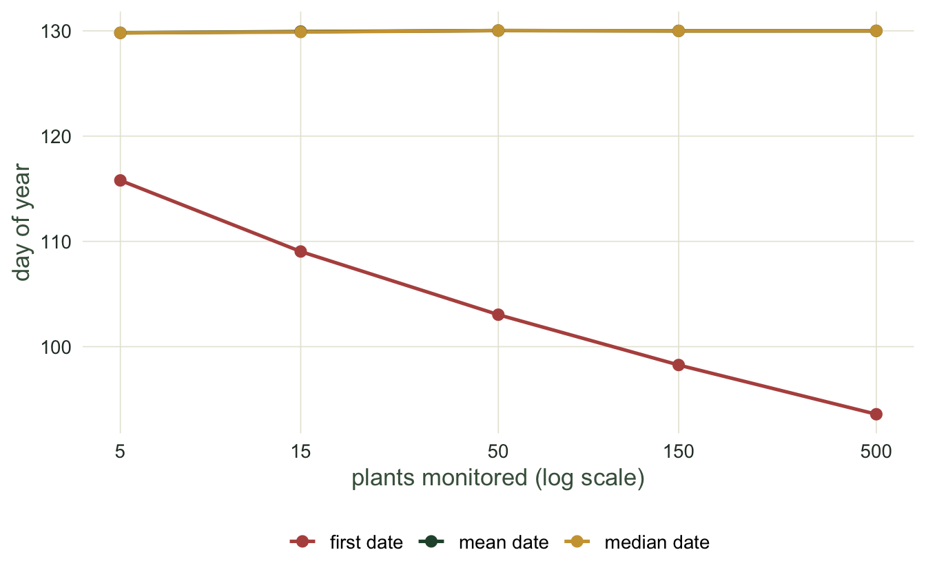
Monitoring 5 plants, the average first date is day `r f_lo`. Monitoring 500, it is day `r f_hi`. That is an advance of `r adv` days from a hundredfold change in effort alone, with the population phenology held exactly fixed. Meanwhile the mean date barely moves (its range across all effort levels is `r mrange` days) and the median is just as steady (`r medrange` days). The mean and the median are consistent estimators of the centre of the distribution; the first date is an estimator of nothing stable, because the minimum of a sample from an unbounded distribution keeps receding as you sample more.
```{r}
#| label: fig-effort
#| fig-cap: "The expected first date advances steeply with monitoring effort (note the log scale), while the mean and median dates stay flat. The population phenology is identical at every point."
#| fig-alt: "Three lines against log effort from 5 to 500 plants. The first-date line falls from about day 116 to about day 94, while the mean and median lines stay flat near day 130."
#| fig-width: 7
#| fig-height: 4.4
long <- rbind(
  data.frame(effort = res$effort, day = res$first,  metric = "first date"),
  data.frame(effort = res$effort, day = res$mean,   metric = "mean date"),
  data.frame(effort = res$effort, day = res$median, metric = "median date"))
ggplot(long, aes(effort, day, colour = metric)) +
  geom_line(linewidth = 0.9) + geom_point(size = 2.4) +
  scale_x_log10(breaks = efforts) +
  scale_colour_manual(values = c("first date" = terra, "mean date" = forest,
                                 "median date" = gold)) +
  labs(x = "plants monitored (log scale)", y = "day of year", colour = NULL)
```
## Why: the first date is an extreme value
The last column of the table, `depth`, makes the mechanism explicit. It is how far below the population mean the first date sits, measured in standard deviations. At 5 plants the first date is `r d_lo` standard deviations below the mean; at 500 plants it is `r d_hi` below. That growing depth is not arbitrary. It is minus the expected minimum of a sample of standard normals, and that minimum falls without bound as the sample grows. The first date is a block minimum, and it behaves exactly the way extreme-value theory says a block minimum should: pushed steadily into the tail by larger samples. The [block maxima and the GEV](../block-maxima-and-the-gev/) tutorial develops that theory for the maximum; the minimum is its mirror image.
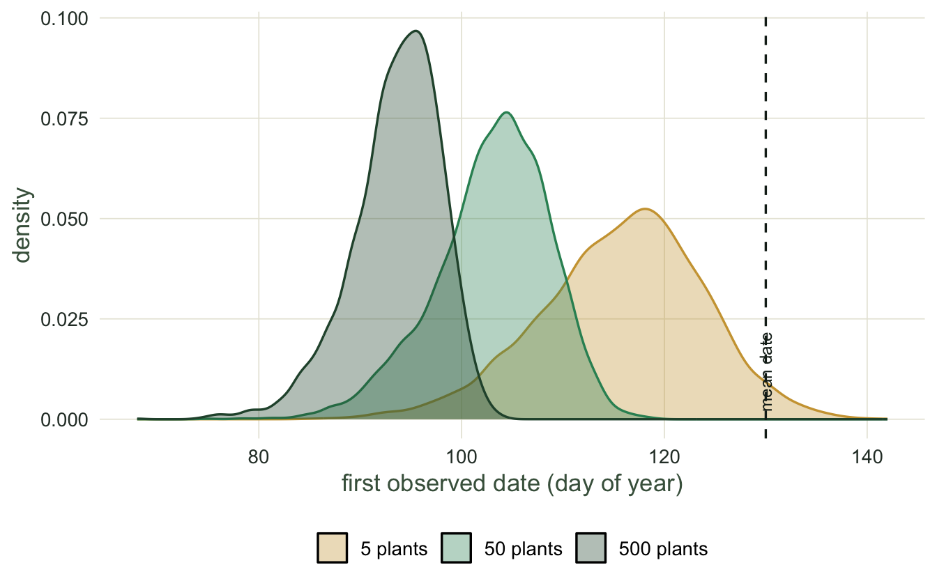
Seeing the whole sampling distribution makes the point vivid. Below are the distributions of the first date across replicate samples at three effort levels. As effort rises, the entire distribution of possible first dates slides earlier and tightens.
```{r}
#| label: fig-mindist
#| fig-cap: "The sampling distribution of the first date at three effort levels. More effort shifts the whole distribution earlier and narrows it; the mean date (dashed) does not move."
#| fig-alt: "Three density curves for the first date. At 5 plants the curve is centred near day 116 and wide; at 50 near day 103; at 500 near day 94 and narrow. A dashed vertical line marks the fixed mean date at 130."
#| fig-width: 7
#| fig-height: 4.4
pick <- match(c(5, 50, 500), efforts)
dens <- do.call(rbind, Map(function(i, lab)
  data.frame(first = sim[[i]]$first, effort = lab),
  pick, factor(c("5 plants", "50 plants", "500 plants"),
               levels = c("5 plants", "50 plants", "500 plants"))))
ggplot(dens, aes(first, fill = effort, colour = effort)) +
  geom_density(alpha = 0.35, linewidth = 0.6) +
  geom_vline(xintercept = mu, linetype = 2, colour = "#16241d") +
  annotate("text", x = mu, y = 0.03, label = "mean date", hjust = -0.05,
           vjust = -0.4, angle = 90, size = 3.2, colour = "#16241d") +
  scale_fill_manual(values = c("5 plants" = gold, "50 plants" = mown,
                               "500 plants" = forest)) +
  scale_colour_manual(values = c("5 plants" = gold, "50 plants" = mown,
                                 "500 plants" = forest)) +
  labs(x = "first observed date (day of year)", y = "density", fill = NULL, colour = NULL) +
  guides(colour = "none")
```
## Why this matters for real records
Almost no long-term phenology record holds effort constant. Volunteer recording schemes and community-science platforms grow over time, so later years are watched by more people than earlier years, and herbarium collecting effort changes from decade to decade too. Read through the lens of this simulation, that growth alone drives the first date earlier, manufacturing an advancing trend from a rising number of observers. Miller-Rushing and colleagues found that observed first flowering dates were strongly related to changes in population size in Massachusetts, though not in Colorado, and suggested tracking peak or mean flowering dates instead; van Strien and colleagues found the first-appearance date of butterflies is sensitive both to the number of monitoring sites and to population trend. The safe move is to report a central summary, the mean or the median date, and to reserve the first date for cases where effort really is fixed and comparable. An early percentile date only softens the problem: with few plants a sample percentile is pulled towards the median, so it still drifts earlier as effort grows, though less than the first date does.
## Where to go next
The effort bias in the first date is not just a nuisance for single seasons; it contaminates trends across years and the sensitivity of phenology to temperature, because effort itself usually trends over time. The next tutorial estimates those trends and shows how the effort confound inflates them, and how the mean date escapes it.
## References
Miller-Rushing AJ, Inouye DW, Primack RB 2008. Journal of Ecology 96(6):1289-1296 (10.1111/j.1365-2745.2008.01436.x)
van Strien AJ, Plantenga WF, Soldaat LL, van Swaay CAM, WallisDeVries MF 2008. Oecologia 156(1):227-235 (10.1007/s00442-008-0959-4)
## Related tutorials
- [Phenology in R: day of year and event timing](../phenology-and-day-of-year/)
- [Phenological trends and temperature](../phenological-trends-and-temperature/)
- [Checking a phenology analysis](../checking-a-phenology-analysis/)
- [Records as a test for trend](../records-and-order-statistics/)