library(ggplot2)

te_paper  <- "#f5f4ee"
te_ink    <- "#16241d"
te_body   <- "#2c3a31"
te_forest <- "#275139"
te_rust   <- "#b5534e"
te_gold   <- "#c9b458"
te_line   <- "#dad9ca"

theme_datasheet <- function() {
  theme_minimal(base_size = 12) +
    theme(plot.background  = element_rect(fill = te_paper, colour = NA),
          panel.background = element_rect(fill = te_paper, colour = NA),
          panel.grid.major = element_line(colour = te_line, linewidth = 0.3),
          panel.grid.minor = element_blank(),
          text             = element_text(colour = te_body),
          plot.title       = element_text(colour = te_ink, face = "bold"),
          plot.subtitle    = element_text(colour = te_body),
          axis.text        = element_text(colour = te_body))
}Records as a test for trend
R
trend
monitoring
statistics
ecology tutorial
The expected number of record years in an independent series is a harmonic number, whatever the distribution. Testing ecological trends with records in R.
A reserve has kept the same weather station for sixty years and logs the highest daily maximum temperature of each summer. Three of the last ten summers have been the hottest on record. The newsletter writes that records are falling one after another, and nobody in the room disagrees, because the sentence sounds like an observation rather than a claim. The same sentence gets written about the earliest flowering date of an orchid, the earliest arrival of a migrant warbler, and the largest single-day count at a raptor watch point.
A record is a well defined event: an observation larger than everything before it. What makes it useful, and what makes the newsletter sentence testable, is that the number of records in a sequence of independent, identically distributed observations has a null distribution that can be written down exactly, with no assumption beyond a continuous parent. The count does not care whether the summers are normal, exponential or heavily skewed; its expected value over n years is the harmonic number, and its variance is a second harmonic sum. That is the whole subject of this post: not how large the record is, but how many records there are and where they sit.
This is a different question from the one the extreme value posts on this site answer. Block maxima and the GEV models the distribution of the annual maximum and estimates a shape parameter for the tail, and its honest catch is that a few decades of maxima barely constrain that shape; peaks over threshold and the GPD answers the same tail question from every exceedance above a high threshold instead of from the maxima, which is how it recovers the information the block approach discards. Here nothing is estimated and no tail parameter appears. The record count has a known null distribution that holds for every continuous parent, so the test is free of the parametric step that makes the extreme value cluster difficult.
It is also a different question from the one asked in first flowering dates and sampling effort. That post treats the first flowering date as a minimum order statistic and shows that its value drifts earlier as more plants are watched, while the mean date stays put. There the subject is the value of an order statistic and the problem is monitoring effort. Here the subject is the number of times a running maximum is beaten, and the values themselves are irrelevant: any monotone transformation of the series leaves the record count untouched.
The rest of the post does four things. It writes the exact null distribution and checks it against three very different parents. It shows how fast records thin out, which is the piece of intuition most readers are missing. It measures the power of a record based test against a Mann-Kendall test on the same series, and finds the record test much the weaker of the two. Finally it shows the null failing under serial correlation, which is the condition every real monitoring series is in.
The null distribution is exact and has no parameters
Chandler set the problem out in 1952 and Glick’s 1978 exposition is still the clearest short account of it. Let the observations be independent draws from any continuous distribution. The first one is a record by convention. The k-th observation is a record when it is the largest of the first k, and because the largest of the first k observations is equally likely to sit in any of the k positions, that happens with probability one over k. Renyi went further and showed that these indicators are not merely marginally correct but mutually independent, which is the fact that turns a list of probabilities into a distribution. Arnold, Balakrishnan and Nagaraja give that result, and the modern textbook treatment of records around it.
So the record count is a sum of independent Bernoulli variables with probabilities one, one half, one third and so on. Its mean is the harmonic number and its variance is the harmonic number minus the sum of reciprocal squares. The whole distribution follows by convolving the Bernoulli terms, which is six lines of base R and exact to machine precision.
n_year <- 60
k_idx  <- seq_len(n_year)
h_n    <- sum(1 / k_idx)
h_two  <- sum(1 / k_idx^2)
sd_rec <- sqrt(h_n - h_two)

rec_pmf <- function(n) {
  p_vec <- 1
  for (k in seq_len(n)) {
    p_k   <- 1 / k
    p_vec <- c(p_vec * (1 - p_k), 0) + c(0, p_vec * p_k)
  }
  p_vec
}

pmf_rec  <- rec_pmf(n_year)
n_grid   <- seq_along(pmf_rec) - 1
tail_rec <- rev(cumsum(rev(pmf_rec)))
pmf_mean <- sum(n_grid * pmf_rec)
pmf_sd   <- sqrt(sum(n_grid^2 * pmf_rec) - pmf_mean^2)

crit_rec  <- which(tail_rec <= 0.05)[1] - 1
size_rec  <- tail_rec[crit_rec + 1]
size_next <- tail_rec[crit_rec]
mode_rec  <- n_grid[which.max(pmf_rec)]
Over 60 years the expected number of records is 4.680 with a standard deviation of 1.747. The convolution reproduces both: its mean is 4.679870 against a harmonic number of 4.679870, and its standard deviation is 1.747. The most likely single outcome is 4 records.
That distribution is the test. An upper tail critical value follows directly: rejecting when the count reaches 9 gives an exact level of 0.0220, while the next value down, 8, would give 0.0616 and overshoot five per cent. The count is an integer and the level cannot be tuned, so the honest test is the conservative one. Its real level is a little over two per cent, not five, and that matters later when its power is compared with anything else.
count_records <- function(x) sum(x > cummax(c(-Inf, x[-length(x)])))

n_sim  <- 20000
log_sd <- 3
n_pool <- 3 * n_sim
set.seed(1861)
sim_norm <- replicate(n_sim, count_records(rnorm(n_year)))
sim_expo <- replicate(n_sim, count_records(rexp(n_year)))
sim_skew <- replicate(n_sim, count_records(exp(log_sd * rnorm(n_year))))

parent_mean <- c(normal = mean(sim_norm), exponential = mean(sim_expo),
                 skewed = mean(sim_skew))
parent_se   <- c(sd(sim_norm), sd(sim_expo), sd(sim_skew)) / sqrt(n_sim)
parent_gap  <- max(abs(parent_mean - h_n))
gap_in_se   <- parent_gap / max(parent_se)

pooled_rej <- mean(c(sim_norm, sim_expo, sim_skew) >= crit_rec)
pooled_se  <- sqrt(pooled_rej * (1 - pooled_rej) / n_pool)
skew_ratio <- exp(log_sd^2 / 2)
The distribution-free claim is worth checking rather than repeating. Three parents were simulated 20000 times each: a standard normal, an exponential, and a lognormal with a log scale of three, whose mean is 90.0 times its median in closed form. The mean record counts are 4.698, 4.663 and 4.678, against a theoretical 4.680. The largest discrepancy is 0.018, which is 1.5 Monte Carlo standard errors.
Pooling all 60000 series, the fraction with at least 9 records is 0.0218 with a Monte Carlo standard error of 0.0006, against the exact level of 0.0220. The test keeps its level on all three parents.
sim_freq <- function(v, lab) {
  tb <- tabulate(v + 1, nbins = length(n_grid))
  data.frame(n_rec = n_grid, p = tb / length(v), parent = lab)
}
freq_all <- rbind(sim_freq(sim_norm, "normal"),
                  sim_freq(sim_expo, "exponential"),
                  sim_freq(sim_skew, "lognormal, heavily skewed"))
show_max  <- max(n_grid[pmf_rec > 0.001])
exact_df  <- data.frame(n_rec = n_grid, p = pmf_rec)

ggplot(exact_df[exact_df$n_rec <= show_max, ], aes(n_rec, p)) +
  geom_col(fill = te_line, colour = NA, width = 0.8) +
  geom_point(data = freq_all[freq_all$n_rec <= show_max, ],
             aes(colour = parent), size = 1.9,
             position = position_dodge(width = 0.55)) +
  geom_vline(xintercept = crit_rec - 0.5, linetype = "dashed",
             colour = te_rust, linewidth = 0.7) +
  scale_colour_manual(values = c(te_forest, te_gold, te_ink), name = NULL) +
  scale_x_continuous(breaks = seq(0, show_max, by = 2)) +
  labs(x = "records in sixty years", y = "probability",
       title = "One null distribution, three parents",
       subtitle = paste0("grey columns: exact; dashed red: the critical value, ",
                         "exact level ", sprintf("%.3f", size_rec))) +
  theme_datasheet() +
  theme(legend.position = "bottom")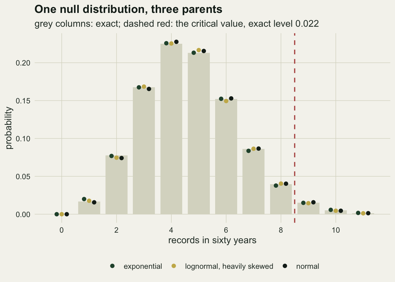
Records thin out, and that is the missing intuition
The reason a run of recent records feels like evidence is that most people carry no expectation for how many records a trendless series should produce, and no expectation at all for when they should occur. The one over k probability answers both questions at once, and the answer is sharply uneven.
dec_edge <- seq(0, n_year, by = 10)
dec_lab  <- sprintf("%d to %d", dec_edge[-length(dec_edge)] + 1, dec_edge[-1])
dec_exp  <- vapply(seq_along(dec_lab),
                   function(i) sum(1 / ((dec_edge[i] + 1):dec_edge[i + 1])), 0)
dec_ratio <- dec_exp[1] / dec_exp[length(dec_exp)]
n_dec     <- length(dec_exp)

p_last_dec  <- (n_year - dec_edge[n_dec]) / n_year
p_quiet_dec <- dec_edge[n_dec] / n_year

set.seed(2749)
dec_sim <- replicate(n_sim, {
  x_s    <- rnorm(n_year)
  is_rec <- x_s > cummax(c(-Inf, x_s[-n_year]))
  as.numeric(tapply(is_rec, cut(k_idx, dec_edge), sum))
})
dec_obs <- rowMeans(dec_sim)
dec_se  <- apply(dec_sim, 1, sd) / sqrt(n_sim)
dec_max <- max(abs(dec_obs - dec_exp) / dec_se)

win_pmf <- function(k_win) {
  p_vec <- 1
  for (k in k_win) {
    p_k   <- 1 / k
    p_vec <- c(p_vec * (1 - p_k), 0) + c(0, p_vec * p_k)
  }
  p_vec
}
last_win  <- (dec_edge[n_dec] + 1):n_year
tail_last <- rev(cumsum(rev(win_pmf(last_win))))
p_last_3  <- tail_last[4]
one_in    <- 1 / p_last_3
p_six_all <- tail_rec[7]
n_six     <- n_grid[7]
In a trendless series of 60 years, the first decade is expected to hold 2.93 records and the last decade 0.181, a ratio of 16.2. The simulated means agree with the exact values to within 2.0 Monte Carlo standard errors across all 6 decades.
There is an exact statement hiding behind the second number that is easier to argue with in a meeting. The probability that no record at all occurs after year 50 is exactly 50 over 60, which is 0.833, because that is the probability that the largest of the 60 values landed in the earlier part of the series. So the chance that the series maximum falls in the final decade is 0.167 and nothing more: one series in six, with no trend anywhere.
Return to the reserve and its three record summers in the last ten years. Under independence the probability of that many records or more in the final decade of a 60 year series is 0.000643, about one trendless series in 1556. The newsletter is not imagining things, and the record count is not a useless statistic. What the next two sections measure is the rest of the sentence: how much of that evidence a trend test would have extracted from the same numbers, and what happens to the probability once the summers are allowed to remember each other.
dec_df <- data.frame(decade = factor(dec_lab, levels = dec_lab),
                     expected = dec_exp, observed = dec_obs,
                     lo = dec_obs - 1.96 * dec_se, hi = dec_obs + 1.96 * dec_se)

ggplot(dec_df, aes(decade, expected)) +
  geom_col(fill = te_forest, colour = NA, width = 0.7) +
  geom_errorbar(aes(ymin = lo, ymax = hi), width = 0.12,
                colour = te_ink, linewidth = 0.5) +
  geom_point(aes(y = observed), size = 2, colour = te_ink) +
  labs(x = "year of the series", y = "expected records in the decade",
       title = "Records are front loaded",
       subtitle = "columns: harmonic sums; points: twenty thousand simulated series") +
  theme_datasheet()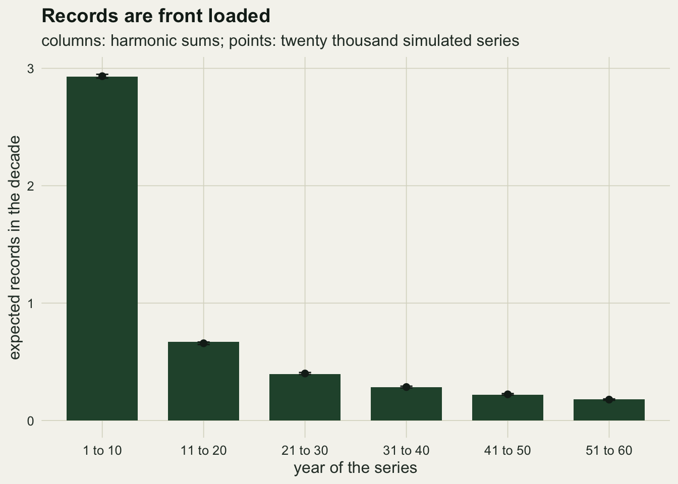
A trend test reads the same series better
The record count is a legitimate test statistic, and under a rising mean it does rise. The question is whether it is a sensible thing to spend a monitoring series on, and that is a power question. The comparison below puts a linear trend into an otherwise independent normal series and applies two tests to the same data: the record count, and the Mann-Kendall test that Mann described in 1945, which counts concordant and discordant pairs and is the standard nonparametric trend test in monitoring work. A least squares slope test is carried along as a third reference.
The trend has to be chosen before any of this runs, and it is chosen from what the comparison needs rather than from what makes it look good. The least squares slope on 60 equally spaced years has a standard error of one over the square root of the centred sum of squares, so the slope at which that test has eighty per cent power follows from two normal quantiles. The design trend used below is the round value nearest to it.
lower_pairs <- lower.tri(matrix(0, n_year, n_year))
mk_var <- n_year * (n_year - 1) * (2 * n_year + 5) / 18

mk_z <- function(x) {
  s_stat <- sum(sign(outer(x, x, "-"))[lower_pairs])
  (s_stat - sign(s_stat)) / sqrt(mk_var)
}

t_cent <- k_idx - mean(k_idx)
sxx    <- sum(t_cent^2)
ols_t <- function(x) {
  b_hat   <- sum(t_cent * x) / sxx
  resid_x <- x - mean(x) - b_hat * t_cent
  b_hat / sqrt(sum(resid_x^2) / (n_year - 2) / sxx)
}
slope_se  <- 1 / sqrt(sxx)
slope_80  <- (qnorm(0.95) + qnorm(0.80)) * slope_se
slope_use <- 0.02
rise_use  <- slope_use * n_year
A slope of 0.0185 noise standard deviations per year gives the least squares test eighty per cent power, so the design trend is 0.02 standard deviations per year: over 60 years that is a rise of 1.2 standard deviations of the year to year noise, which is a large and perfectly ordinary climate signal.
n_rep      <- 10000
mc_se_max  <- sqrt(0.25 / n_rep)
slope_grid <- c(0.005, 0.010, 0.015, 0.020, 0.030, 0.040, 0.060, 0.080)
slope_min  <- min(slope_grid)
z_05    <- qnorm(0.95)
z_match <- qnorm(1 - size_rec)
t_05    <- qt(0.95, n_year - 2)

set.seed(9143)
pow_tab <- as.data.frame(t(vapply(slope_grid, function(b_slope) {
  m_out <- replicate(n_rep, {
    y_s <- b_slope * k_idx + rnorm(n_year)
    c(count_records(y_s), mk_z(y_s), ols_t(y_s))
  })
  c(slope    = b_slope,
    rec      = mean(m_out[1, ] >= crit_rec),
    mk_05    = mean(m_out[2, ] >= z_05),
    mk_match = mean(m_out[2, ] >= z_match),
    ols_05   = mean(m_out[3, ] >= t_05),
    mean_rec = mean(m_out[1, ]))
}, numeric(6))))

row_use  <- which(pow_tab$slope == slope_use)
pow_rec  <- pow_tab$rec[row_use]
pow_mk   <- pow_tab$mk_05[row_use]
pow_mkm  <- pow_tab$mk_match[row_use]
pow_ols  <- pow_tab$ols_05[row_use]
pow_gap  <- pow_mkm - pow_rec
slope_eq <- approx(pow_tab$rec, pow_tab$slope, xout = pow_mkm)$y
slope_mult <- slope_eq / slope_use
The replication was fixed at 10000 series per trend value before the simulation ran, chosen so that the Monte Carlo standard error of any rejection rate is at most 0.005. That is small enough to resolve a difference of one percentage point and it was not revised afterwards.
At the design trend the record test rejects in 10.8 per cent of series. The Mann-Kendall test on the identical series rejects in 82.0 per cent at the conventional five per cent level, and in 70.2 per cent when it is held to the same exact level as the record test, 0.0220, so that the comparison is not a comparison of levels. The least squares slope test reaches 84.3 per cent. The level matched gap between the Mann-Kendall test and the record count is 59.5 percentage points.
Reading the same gap along the trend axis makes it concrete. The record count reaches the power the Mann-Kendall test already has at the design trend only when the trend is about 0.071 standard deviations per year, which is 3.6 times steeper. A monitoring programme that judges by records is, to that approximation, throwing away the difference between a series it can call and a series it cannot.
pow_long <- rbind(
  data.frame(slope = pow_tab$slope, power = pow_tab$rec,
             test = "record count (level 0.022)"),
  data.frame(slope = pow_tab$slope, power = pow_tab$mk_05,
             test = "Mann-Kendall (level 0.05)"),
  data.frame(slope = pow_tab$slope, power = pow_tab$mk_match,
             test = "Mann-Kendall (level 0.022)"))

ggplot(pow_long, aes(slope, power, colour = test)) +
  geom_vline(xintercept = slope_use, linetype = "dashed",
             colour = te_body, linewidth = 0.6) +
  geom_line(linewidth = 0.9) +
  geom_point(size = 2) +
  scale_colour_manual(values = c(te_forest, te_gold, te_rust), name = NULL) +
  scale_y_continuous(limits = c(0, 1)) +
  labs(x = "trend (noise standard deviations per year)",
       y = "probability of rejecting no trend",
       title = "The record count is the weaker reading",
       subtitle = "dashed line: the trend chosen before the simulation ran") +
  theme_datasheet() +
  theme(legend.position = "bottom")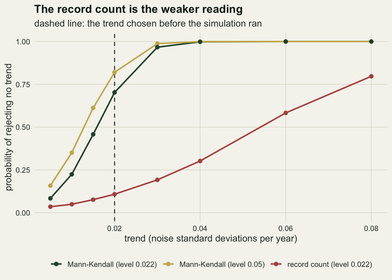
The conclusion is not that a record count is wrong. It is exact, it is distribution free, and it answers a question that a slope does not: whether the extremes themselves are behaving oddly. The conclusion is that whatever a run of records tells a monitoring programme about trend, a trend test tells it earlier and more reliably from the same numbers, so the records should be read as a description and the trend test as the evidence.
The null fails when the series is autocorrelated
Everything above rests on independence, and a monitoring series is rarely independent. Temperature, water level, population size and phenological date all carry the previous year into the next one. The usual first order autoregressive model is the cheapest way to price what that does to the record count, and the price is large.
ar1_path <- function(n, phi) {
  z_in  <- rnorm(n)
  x_out <- numeric(n)
  x_out[1] <- z_in[1]
  s_inn <- sqrt(1 - phi^2)
  for (i in 2:n) x_out[i] <- phi * x_out[i - 1] + s_inn * z_in[i]
  x_out
}
phi_grid <- c(0, 0.3, 0.5, 0.7, 0.9)
phi_use  <- 0.7

set.seed(3311)
ar_tab <- as.data.frame(t(vapply(phi_grid, function(p_ar) {
  v_rec <- replicate(n_sim, count_records(ar1_path(n_year, p_ar)))
  c(phi = p_ar, mean_rec = mean(v_rec), se = sd(v_rec) / sqrt(n_sim),
    rej = mean(v_rec >= crit_rec))
}, numeric(4))))

row_ar    <- which(ar_tab$phi == phi_use)
ar_mean   <- ar_tab$mean_rec[row_ar]
ar_se     <- ar_tab$se[row_ar]
ar_shift  <- ar_mean - h_n
ar_pct    <- 100 * ar_shift / h_n
ar_rej    <- ar_tab$rej[row_ar]
ar_rej_se <- sqrt(ar_rej * (1 - ar_rej) / n_sim)
rej_mult  <- ar_rej / size_rec
ar_slope  <- approx(pow_tab$mean_rec, pow_tab$slope, xout = ar_mean)$y
ar_rise   <- ar_slope * n_year
With a lag one correlation of 0.7 and no trend at all, the mean record count is 5.678 with a Monte Carlo standard error of 0.016, against the independent value of 4.680. The shift is +0.998 records, or 21.3 per cent, and the direction is upward: positive autocorrelation produces more records, not fewer.
The mechanism is easy to see once the number is in front of you. A persistent series wanders in slow excursions rather than jumping about, so when it does climb above its old maximum it tends to stay up for several years and beat the running maximum again and again. Runs of consecutive records are exactly what a reader takes as the signature of a trend, and a stationary autocorrelated series manufactures them for free.
The consequence for the test is worse than the shift in the mean suggests, because the critical value sits in the tail. Under this autocorrelation the record test rejects in 0.1182 of trendless series, with a Monte Carlo standard error of 0.0023, against its nominal 0.0220. That is a false alarm rate 5.4 times the intended one.
Put on the trend scale used in the previous section, an autocorrelated series with no trend whatever produces on average as many records as an independent series with a trend of 0.0152 standard deviations per year, which over 60 years is a rise of 0.91 standard deviations. Serial correlation and trend are not distinguishable by a record count, and the record count has no way to be told about the correlation, because its whole appeal was that it needed no model.
ar1_burn <- function(n, phi, burn) {
  z_in  <- rnorm(n + burn)
  x_out <- numeric(n + burn)
  x_out[1] <- z_in[1]
  s_inn <- sqrt(1 - phi^2)
  for (i in 2:(n + burn)) x_out[i] <- phi * x_out[i - 1] + s_inn * z_in[i]
  x_out[(burn + 1):(burn + n)]
}
burn_len <- 200
set.seed(4411)
burn_rec  <- replicate(n_sim, count_records(ar1_burn(n_year, phi_use, burn_len)))
burn_mean <- mean(burn_rec)
burn_se   <- sd(burn_rec) / sqrt(n_sim)
burn_gap  <- abs(burn_mean - ar_mean) / sqrt(burn_se^2 + ar_se^2)
One thing had to be checked before any of that could be reported. The simulator starts the series at a draw from the stationary distribution, which means no burn-in is needed, but that is an assertion until it is tested. Repeating the run with a burn-in of 200 steps discarded gives a mean of 5.655 against 5.678 without one, a difference of 1.0 standard errors of the difference. The stationary start is doing its job, and the reported shift is a property of the process rather than of a transient.
ggplot(ar_tab, aes(phi, mean_rec)) +
  geom_hline(yintercept = h_n, linetype = "dashed",
             colour = te_rust, linewidth = 0.7) +
  geom_line(colour = te_forest, linewidth = 0.9) +
  geom_point(size = 2.6, colour = te_forest) +
  labs(x = "lag one autocorrelation", y = "mean records in sixty years",
       title = "Persistence manufactures records",
       subtitle = "dashed red: the independent expectation, the harmonic number") +
  theme_datasheet()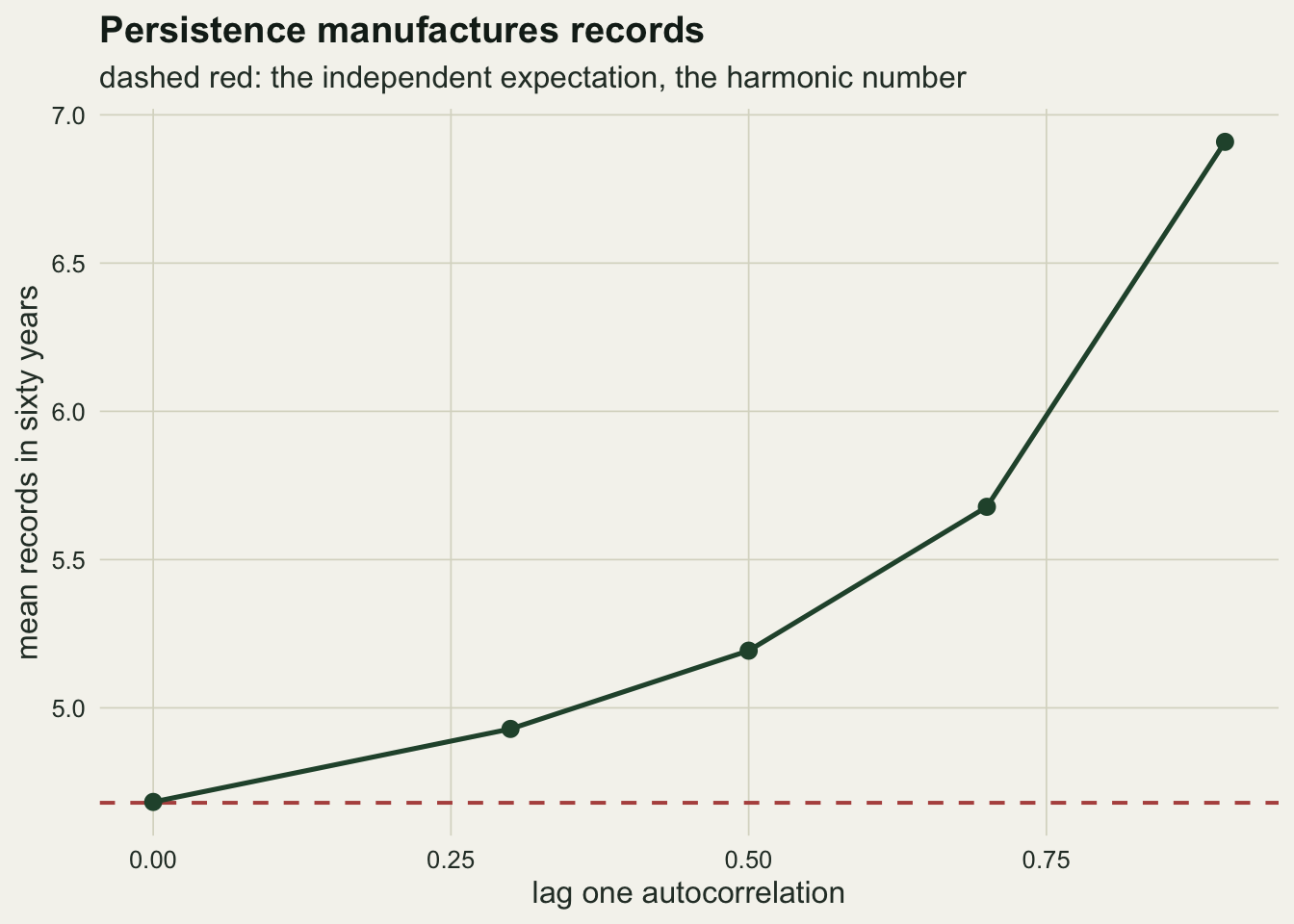
What to report
Give the record count with the exact null attached, not on its own. The two numbers that make a record count interpretable are the expected count for the length of series in hand and the upper tail probability of the count observed. Both come from the harmonic sums, both take one line of R, and neither needs a distributional assumption.
Say where the records fell, not just how many there were. A count of 6 or more records in 60 years occurs in 0.30 of trendless series and is unremarkable; the same count confined to the final decade is not, and the one over k probabilities give the expected number and the exact tail for any window directly. The probability that the series maximum falls in the final decade of a sixty year record is one in six under the null, and quoting that alongside the observation prevents the most common overreading.
Report a trend test as the primary evidence and the record count as description. On the same series and at the same exact level the Mann-Kendall test found the design trend in 70.2 per cent of series against 10.8 per cent for the record count. If a programme has the annual values, it has more information than the record count uses, and the trend test uses it.
State the lag one autocorrelation of the series whenever a record count is quoted. A persistent series produces more records than an independent one, the inflation is large at correlations that are entirely ordinary in ecological monitoring, and there is no version of the record test that repairs itself. If the autocorrelation is appreciable, the honest options are a block bootstrap null or an explicit time series model, and both of those have left the distribution free setting behind.
Honest limits
The test used here is one sided and looks only for an excess of records in the upper tail. A cooling trend, or a declining count, produces a deficit of high records and a surplus of low ones, and the mirror test on the minima is the appropriate statistic. Nothing above examines the two sided case, and the level of a two sided record test is even coarser than the one sided level because it combines two discrete tails.
The level itself is coarse and cannot be fixed. With 60 years the achievable exact levels near five per cent are 0.0220 and 0.0616, and there is nothing in between unless the test is randomised, which no monitoring programme will accept. The comparison against Mann-Kendall was run at the matched level for that reason, and the conventional five per cent Mann-Kendall figure is quoted separately so that neither reading is hidden.
Ties are ignored. The theory needs a continuous parent so that no two observations are equal, and real records are rounded: temperatures to a tenth of a degree, dates to a day, counts to an integer. Ties break the one over k argument, and the usual convention of not counting an equal value as a record makes the test conservative by an amount that depends on the rounding and on the spread of the data. A phenological series recorded to the nearest day over a narrow window can be badly affected.
The power grid starts at a trend of 0.005 standard deviations per year and holds no zero-trend point, so the curves in the power figure never touch their own levels at the left edge. The level under no trend was measured separately, from the 60000 trendless series pooled in the distribution-free check above, where the rejection rate came out at 0.0218 against the exact 0.0220; that exact value is the one the matched Mann-Kendall comparison uses.
The alternative simulated here is a straight line in the mean with constant variance. Real trends bend, and a change in variance alone will change the record count without changing the mean at all, which is one of the few cases where the record count carries information a slope test misses. The power comparison should be read as applying to the linear mean shift it simulated and not as a general ranking of the two tests.
The autocorrelation result covers a first order autoregressive process with fixed lag one correlation and normal innovations. Longer memory, of the kind found in hydrological and climate series, inflates the record count further, and a series with a stochastic trend rather than a stationary one behaves differently again: for a random walk the record count grows like the square root of the series length rather than like its logarithm. The direction of the bias is the same in all these cases; the magnitude is not, and it cannot be read off from the lag one correlation alone.
The record count also says nothing about the size of the records. Two series can have identical record counts while one exceeds its old maximum by a hundredth of a degree each time and the other by half a degree. Benestad set out how record events behave in climate series, and Redner and Petersen worked through what a warming trend does to record breaking temperatures in detail; both make the point that the magnitude of the exceedance and the count are separate pieces of information. Where the size of the extreme is the quantity of interest, the extreme value posts on this site are the right tools, and this one is not.
References
Chandler KN 1952 Journal of the Royal Statistical Society Series B 14(2):220-228 (10.1111/j.2517-6161.1952.tb00115.x)
Glick N 1978 The American Mathematical Monthly 85(1):2-26 (10.2307/2978044)
Mann HB 1945 Econometrica 13(3):245-259 (10.2307/1907187)
Arnold BC, Balakrishnan N, Nagaraja HN 1998 Records (ISBN 978-0-471-08108-1)
Benestad RE 2003 Climate Research 25:3-13 (10.3354/cr025003)
Redner S, Petersen MR 2006 Physical Review E 74(6):061114 (10.1103/PhysRevE.74.061114)