---
title: "Checking a phenology analysis"
description: "Three checks for a phenology analysis in R: effort sensitivity by thinning, survey-window censoring, and whether first, mean and median agree on the trend."
date: "2026-06-22 14:00"
date-modified: "2026-10-15"
categories: [R, phenology, model checking, ggplot2, ecology tutorial]
image: thumbnail.png
image-alt: "Single panel histogram of flowering day of year: 24 pale green bars run from day 100 to day 148 inside a shaded band, peaking at 19 around day 116, while six brick red bars stand left of a vertical line at day 100 marking the survey opening."
---
*Corrected 15 October 2026: the thinning check relied on a single thinning, which leaves the first date unchanged whenever the earliest record survives the cut; it now says to repeat the thinning and compare the average shift. The censoring check said to look for records piling up against the window edge, which the post's own season, whose early plants go unseen, does not show; it now says to look for recorded dates that start abruptly at the edge with no tail before them, and the closing summary follows both changes.*
*Corrected 7 October 2026: the censoring check called the observed onset a lower bound; it is an upper bound, since the true onset lies on or before it. The closing summary said that failing any check makes a result a statement about the sampling; it now says so of the thinning and censoring checks only, since the summaries also diverge when the season changes shape; for the same reason the introduction no longer says that the checks tell the biology from the sampling.*
The first three tutorials in this series argued that phenological summaries are estimators with sampling properties, and that the first date is the shakiest of them. This one turns that argument into a short checklist. Before you trust a reported onset, sensitivity or trend, three quick diagnostics flag a number that could be an artefact of the sampling: does it move when you thin the data, is the season censored by the survey window, and do different summaries agree.
```{r}
#| label: setup
#| code-fold: true
#| code-summary: "Setup: packages, colours and plot theme"
#| results: hide
#| message: false
#| warning: false
library(ggplot2)
forest <- "#275139"; gold <- "#cda23f"; terra <- "#b5534e"; mown <- "#2f8f63"
theme_te <- function(base = 13) {
  theme_minimal(base_size = base) +
    theme(panel.grid.minor = element_blank(),
          panel.grid.major = element_line(colour = "#e7e6da", linewidth = 0.3),
          axis.title = element_text(colour = "#46604a"),
          axis.text  = element_text(colour = "#2c3a31"),
          plot.title = element_text(colour = "#16241d", face = "bold"),
          plot.subtitle = element_text(colour = "#5d6b61"),
          plot.background  = element_rect(fill = "#f5f4ee", colour = NA),
          panel.background = element_rect(fill = "#f5f4ee", colour = NA),
          legend.position = "bottom", legend.title = element_text(colour = "#46604a"))
}
theme_set(theme_te())
```
## Check 1: does the estimate survive thinning?
Take a well-monitored season and throw away records at random. A summary that tracks the true phenology should barely move; a summary that tracks effort will tend to shift. This is the single most useful check, because it turns the effort bias into something you can measure on data you already have.
```{r}
#| label: thin
set.seed(505)
mu <- 128; sdev <- 12
full <- round(rnorm(300, mu, sdev))              # a well-monitored season
metrics <- function(x) c(first = min(x), mean = round(mean(x), 1), median = median(x))
m_full <- metrics(full)
m_50   <- metrics(sample(full, 150))             # keep half the records
m_20   <- metrics(sample(full, 60))              # keep a fifth
rbind(full = m_full, half = m_50, fifth = m_20)
```
```{r}
#| label: thin-store
#| include: false
d_first_50 <- m_50["first"] - m_full["first"]
d_mean_50 <- m_50["mean"] - m_full["mean"]
d_first_20 <- m_20["first"] - m_full["first"]
```
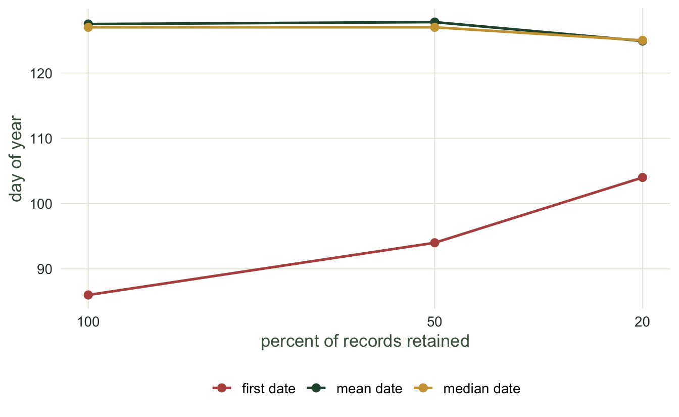
Halving the records pushes the first date `r sprintf("%+d", d_first_50)` days later while the mean moves only `r sprintf("%+.1f", d_mean_50)` days. Keep only a fifth and the first date is `r sprintf("%+d", d_first_20)` days from the full-effort value, further again. The interpretation is direct: if your onset estimate lurches when you drop data, it was measuring your effort, not the plant. The mean and median pass this check; the first date fails it. One thinning is a weak test of the first date, though: the earliest record survives the cut with a probability equal to the share of records kept, a coin toss at half effort, and whenever it survives the first date does not move at all. Repeat the thinning many times and compare the average shift: the first date moves later on average, while the mean and median stay close to their full-effort values.
```{r}
#| label: fig-thin
#| fig-cap: "Each summary under three levels of retained effort. The first date drifts steadily later as records are removed, while the mean and median hold roughly steady."
#| fig-alt: "Three summaries plotted against retained effort of 100, 50 and 20 per cent. The first-date line rises steeply from about day 86 to day 104, while the mean and median lines stay near day 127."
#| fig-width: 7
#| fig-height: 4.3
tdf <- data.frame(
  frac = rep(c(100, 50, 20), 3),
  day  = c(m_full["first"], m_50["first"], m_20["first"],
           m_full["mean"],  m_50["mean"],  m_20["mean"],
           m_full["median"],m_50["median"],m_20["median"]),
  metric = rep(c("first date", "mean date", "median date"), each = 3))
ggplot(tdf, aes(frac, day, colour = metric)) +
  geom_line(linewidth = 0.9) + geom_point(size = 2.4) +
  scale_x_reverse(breaks = c(100, 50, 20)) +
  scale_colour_manual(values = c("first date" = terra, "mean date" = forest,
                                 "median date" = gold)) +
  labs(x = "per cent of records retained", y = "day of year", colour = NULL)
```
## Check 2: is the season censored by the survey window?
Surveys start and end on fixed dates. If flowering begins before the survey opens, the early plants are simply invisible, and the first observed date is pinned to the opening day rather than measured. This is left censoring, and it is easy to miss because the observed first date looks like a real number.
```{r}
#| label: censor
set.seed(606)
win_lo <- 100; win_hi <- 165                     # the survey runs day 100 to 165
cold  <- round(rnorm(200, 116, 12))              # an early (cold-adapted) year
true_first <- min(cold)
seen  <- cold[cold >= win_lo & cold <= win_hi]   # only what falls inside the window
obs_first <- min(seen)
below <- mean(cold < win_lo)                      # fraction that flowered before the window
c(true_first = true_first, observed_first = obs_first,
  frac_before_window = round(below, 3))
```
```{r}
#| label: censor-store
#| include: false
pct_before <- round(100 * below)
pinned <- obs_first == win_lo
```
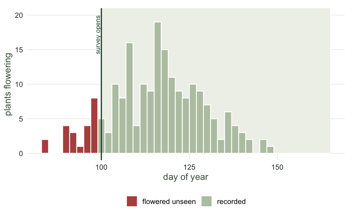
The true first flowering is day `r true_first`, but the survey does not open until day `r win_lo`, so the observed first date is day `r obs_first`, exactly the opening day. Fully `r pct_before` per cent of the population had already flowered before anyone was watching. The tell is that the observed first date, day `r obs_first`, equals the survey start, day `r win_lo`: when that happens you cannot separate a real onset on the opening day from an onset hidden before it. The diagnostic is to check whether the recorded dates start abruptly at the window edge, with no tail of early records before it, and to be honest that the observed onset is an upper bound, not a measurement: the true onset lies on or before the opening day.
```{r}
#| label: fig-censor
#| fig-cap: "A season whose onset falls before the survey opens. The shaded band is the survey window; the plants to its left flowered unseen, so the observed first date is pinned to the opening day rather than measured."
#| fig-alt: "A histogram of flowering dates centred near day 116. A shaded vertical band from day 100 to 165 marks the survey window. Bars to the left of the band are highlighted as invisible, and a line marks the observed first date at the window edge."
#| fig-width: 7
#| fig-height: 4.3
cdf <- data.frame(day = cold, visible = cold >= win_lo)
ggplot(cdf, aes(day, fill = visible)) +
  annotate("rect", xmin = win_lo, xmax = win_hi, ymin = 0, ymax = Inf,
           fill = "#eef1e9") +
  geom_histogram(binwidth = 2, colour = "white") +
  geom_vline(xintercept = win_lo, colour = forest, linewidth = 0.8) +
  annotate("text", x = win_lo, y = 20, label = "survey opens", angle = 90,
           vjust = -0.3, hjust = 1, size = 3.3, colour = forest) +
  scale_fill_manual(values = c("FALSE" = terra, "TRUE" = "#b9c6b0"),
                    labels = c("FALSE" = "flowered unseen", "TRUE" = "recorded")) +
  labs(x = "day of year", y = "plants flowering", fill = NULL) +
  coord_cartesian(clip = "off") + theme(plot.margin = margin(12, 12, 6, 6))
```
## Check 3: do the summaries agree on the trend?
Run the trend three ways, with the first date, the mean and the median. If they agree, the reported shift does not depend on which summary you chose. If they diverge, either the distribution is changing shape or effort is confounding the result, and the single number you were about to report is not safe.
```{r}
#| label: agree
set.seed(707)
Y <- 15; sdev <- 12
temp <- rnorm(Y, 0, 1)
mean_true <- 130 - 3 * temp                       # true 3 days per degree
n_year <- round(exp(3.2 + 0.8 * temp))            # warm years better monitored
first <- mn <- med <- numeric(Y)
for (y in 1:Y) {
  x <- round(rnorm(n_year[y], mean_true[y], sdev))
  first[y] <- min(x); mn[y] <- mean(x); med[y] <- median(x)
}
slope <- function(z) coef(lm(z ~ temp))[2]
c(first = round(slope(first), 2), mean = round(slope(mn), 2),
  median = round(slope(med), 2))
```
```{r}
#| label: agree-store
#| include: false
sl_first <- round(slope(first), 2)
sl_mean <- round(slope(mn), 2)
sl_med <- round(slope(med), 2)
```
The mean and median agree closely, at `r sl_mean` and `r sl_med` days per degree, both near the true value of -3. The first date reports `r sl_first`, far steeper. That disagreement is the warning: here it flags the effort confound, but the same check catches a season whose shape is changing over time. CaraDonna and colleagues showed with a long flowering record that first, peak and last dates often shift independently of one another, so no single statistic captures the change, which is exactly why cross-checking summaries is worth the few extra lines.
## Bringing it together
None of these checks needs a new model or a special package. Thin the data many times and watch whether the estimate holds on average; look at the season edges for a season cut off by the survey window; compute the trend with more than one summary and see whether they agree. A phenological shift that survives all three is worth reporting. One that fails either of the first two is a statement about the sampling, dressed up as a statement about the season; one that fails the third needs a closer look, because the summaries also part company when the season itself changes shape. Every summary is a decision, and these three checks make the decision defensible; the [checking a circular analysis](../checking-a-circular-analysis/) tutorial applies the same spirit to directional and time-of-day data.
## References
Moussus J-P, Julliard R, Jiguet F 2010. Methods in Ecology and Evolution 1(2):140-150 (10.1111/j.2041-210X.2010.00020.x)
CaraDonna PJ, Iler AM, Inouye DW 2014. Proceedings of the National Academy of Sciences 111(13):4916-4921 (10.1073/pnas.1323073111)
Miller-Rushing AJ, Inouye DW, Primack RB 2008. Journal of Ecology 96(6):1289-1296 (10.1111/j.1365-2745.2008.01436.x)
## Related tutorials
- [First flowering dates and sampling effort](../first-flowering-date-and-sampling/)
- [Phenological trends and temperature](../phenological-trends-and-temperature/)
- [Flight-season shifts and false occupancy trends](../flight-season-shifts-and-occupancy-trends/)
- [Quantifying phenological mismatch](../quantifying-phenological-mismatch/)