library(ggplot2)

te_paper  <- "#f5f4ee"
te_ink    <- "#16241d"
te_body   <- "#2c3a31"
te_forest <- "#275139"
te_rust   <- "#b5534e"
te_gold   <- "#c9b458"
te_line   <- "#dad9ca"

theme_datasheet <- function() {
  theme_minimal(base_size = 12) +
    theme(plot.background  = element_rect(fill = te_paper, colour = NA),
          panel.background = element_rect(fill = te_paper, colour = NA),
          panel.grid.major = element_line(colour = te_line, linewidth = 0.3),
          panel.grid.minor = element_blank(),
          text             = element_text(colour = te_body),
          plot.title       = element_text(colour = te_ink, face = "bold"),
          axis.text        = element_text(colour = te_body))
}

doy       <- seq(90, 200, by = 0.25)
food_tot  <- 6      # seasonal caterpillar biomass, in brood requirements
brood_w   <- 5      # width of one brood's demand curve, days
laying_sd <- 8      # spread of laying dates across pairs, days

supply <- function(peak, spread) food_tot * dnorm(doy, peak, spread)
demand <- function(peak) dnorm(doy, peak, brood_w)

# fraction of one brood's requirement that is actually met
met <- function(d, s) sum(pmin(d, s)) / sum(d)

# average over a population of pairs with their own laying dates
pop_met <- function(mean_peak, s, n_pairs = 400, seed) {
  set.seed(seed)
  mean(sapply(rnorm(n_pairs, mean_peak, laying_sd), function(p) met(demand(p), s)))
}Quantifying phenological mismatch
R
phenology
climate change
trophic interactions
ecology tutorial
Warming can close the gap between peak demand and peak food while leaving consumers hungrier. The days between peaks is the wrong currency, measured in R.
A woodland tit population lays eggs in April and feeds nestlings on a caterpillar flush that lasts a few weeks in May. The standard summary of how well those two things line up is the difference in days between the peak of caterpillar biomass and the peak of nestling food demand. It goes into the abstract, it goes on the y axis, and its trend over years is the headline result of a mismatch study.
Visser and Both called that difference a yardstick in 2005 and were explicit that a yardstick needs a fitness consequence attached to it. What gets published is usually the yardstick on its own, and that number ignores everything about the food supply except where its peak is. It does not know how long the flush lasts, how much of it there is, or how far the laying dates of individual pairs are spread around the population mean. This post builds a season where all of those are known, applies warming that closes the peak gap, and measures what happens to the quantity that actually feeds nestlings.
The site already has posts on turning dates into day of year and on regressing phenological dates against temperature. Neither touches the mismatch itself, which is a property of two curves rather than of two dates.
Two curves and a currency
Caterpillar supply through the season is a Gaussian pulse with a peak date and a width, scaled so that the total biomass over the season is the same in every scenario. A brood’s food demand is a smaller Gaussian around its own peak date. A brood cannot eat more than it needs and cannot eat more than is present, so its intake at any moment is the smaller of the two, and the fraction of its requirement that gets met is the ratio of the two integrals.
In the baseline season the caterpillar peak falls in the second half of May and the mean brood peak falls after it, which is the kind of gap a long running study reports. Warming advances both, and advances the birds more than the caterpillars, so the gap narrows. Warming also compresses the flush, which is the part the standard metric cannot see.
scen <- data.frame(
  scenario  = c("baseline", "warmed"),
  food_peak = c(140, 130),
  food_sd   = c(12, 4),
  brood_peak = c(152, 134))
scen$gap <- scen$brood_peak - scen$food_peak
scen$met <- sapply(seq_len(nrow(scen)), function(i)
  pop_met(scen$brood_peak[i], supply(scen$food_peak[i], scen$food_sd[i]),
          seed = 4400 + i))
data.frame(scenario = scen$scenario, gap = scen$gap, food_sd = scen$food_sd,
           met = round(scen$met, 3))
scenario gap food_sd met
1 baseline 12 12 0.887
2 warmed 4 4 0.674The caterpillar peak advances from day 140 to day 130 and the mean brood peak from day 152 to day 134. The peak gap falls from 12 days to 4, an improvement of 67 per cent by the standard metric. The fraction of nestling demand that is actually met falls from 0.887 to 0.674, a drop of 24 per cent. The same warming makes the published index look better and the birds worse.
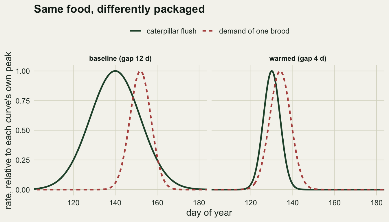
The two panels carry the same total caterpillar biomass. What changes is the packaging, and the standard metric reads only the horizontal distance between the two peaks.
offsets <- seq(-20, 20, by = 1)
by_pair <- do.call(rbind, lapply(seq_len(nrow(scen)), function(i) {
  sup <- supply(scen$food_peak[i], scen$food_sd[i])
  data.frame(offset = offsets,
             met = sapply(offsets, function(o)
               met(demand(scen$brood_peak[i] + o), sup)),
             scenario = scen$scenario[i])
}))
range_fed <- tapply(by_pair$offset[by_pair$met > 0.9], by_pair$scenario[by_pair$met > 0.9],
                    function(z) diff(range(z)) + 1)
range_fed
baseline warmed
26 9 A pair that lays at the population mean has an offset of zero. In the baseline season, at least 26 days of laying dates are wide enough to keep a brood above nine tenths of its requirement, and the true window is wider because it runs past the earliest offset computed; after warming it closes to 9 days, and the laying dates of real pairs are spread over a standard deviation of 8 days.
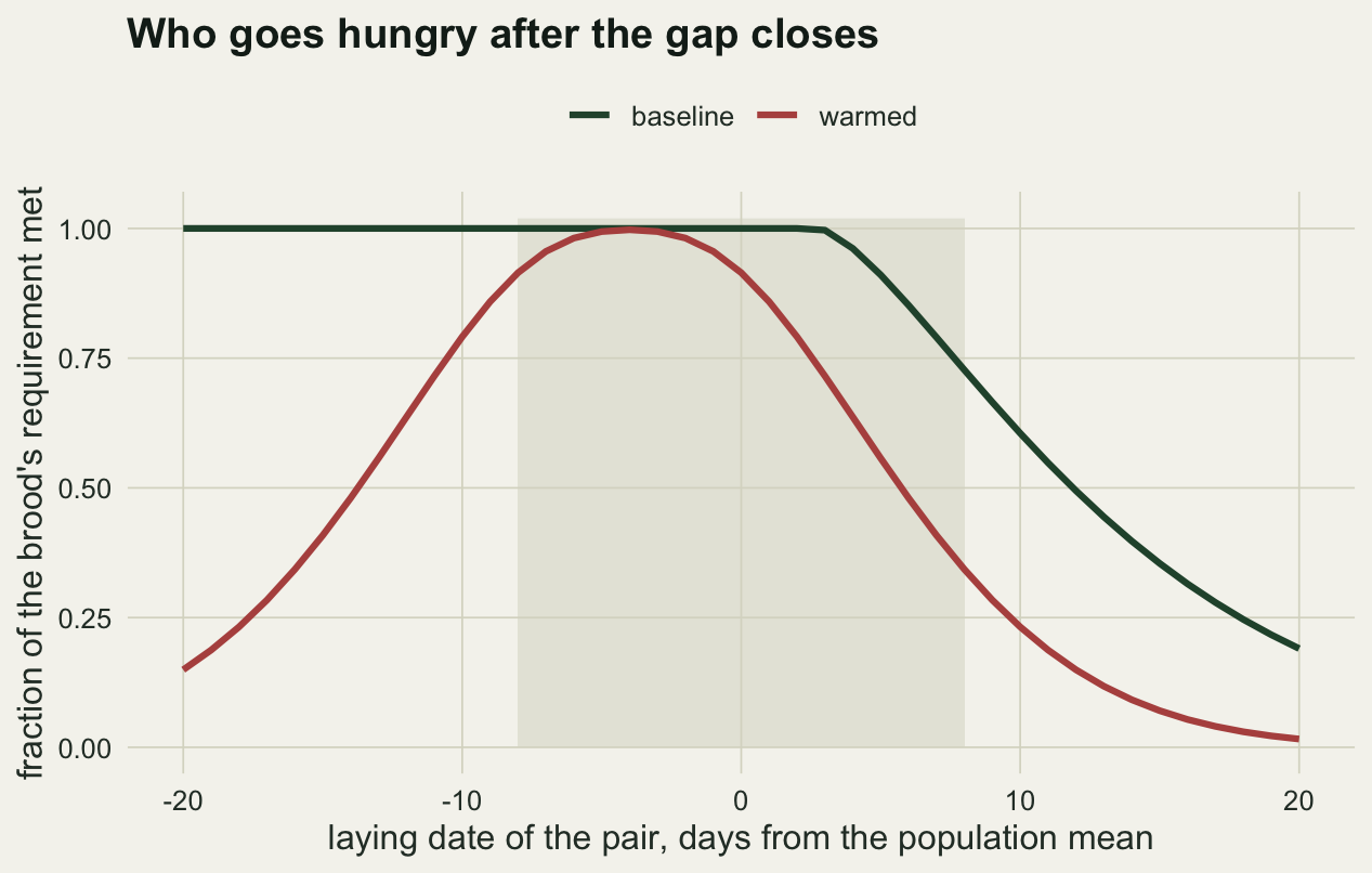
Durant and colleagues drew this distinction in 2007 between a match in timing and a match in the amount of food actually delivered, and the two figures show why they come apart. A pair sitting at the population mean is fed in both scenarios: 1.000 of its requirement before warming and 0.915 after. The pairs that lose are the late ones: a laying standard deviation after the mean, the narrow flush has already passed, and their demand rises over an empty season. Averaging over pairs, the population goes hungrier while its average member looks better matched.
The gap improves by the same amount every time
One scenario is a story. The sweep below closes the gap from 12 days to 4 in every case and varies only the width of the warmed caterpillar flush, holding total biomass fixed.
widths <- 12:3
sweep <- data.frame(food_sd = widths)
sweep$met <- sapply(widths, function(w)
  pop_met(scen$brood_peak[2], supply(scen$food_peak[2], w), seed = 4500))
sweep$change <- 100 * (sweep$met / scen$met[1] - 1)
round(sweep, 2)
food_sd met change
1 12 0.99 11.17
2 11 0.98 10.51
3 10 0.97 9.50
4 9 0.96 7.90
5 8 0.94 5.61
6 7 0.91 2.17
7 6 0.86 -3.20
8 5 0.79 -10.78
9 4 0.70 -20.89
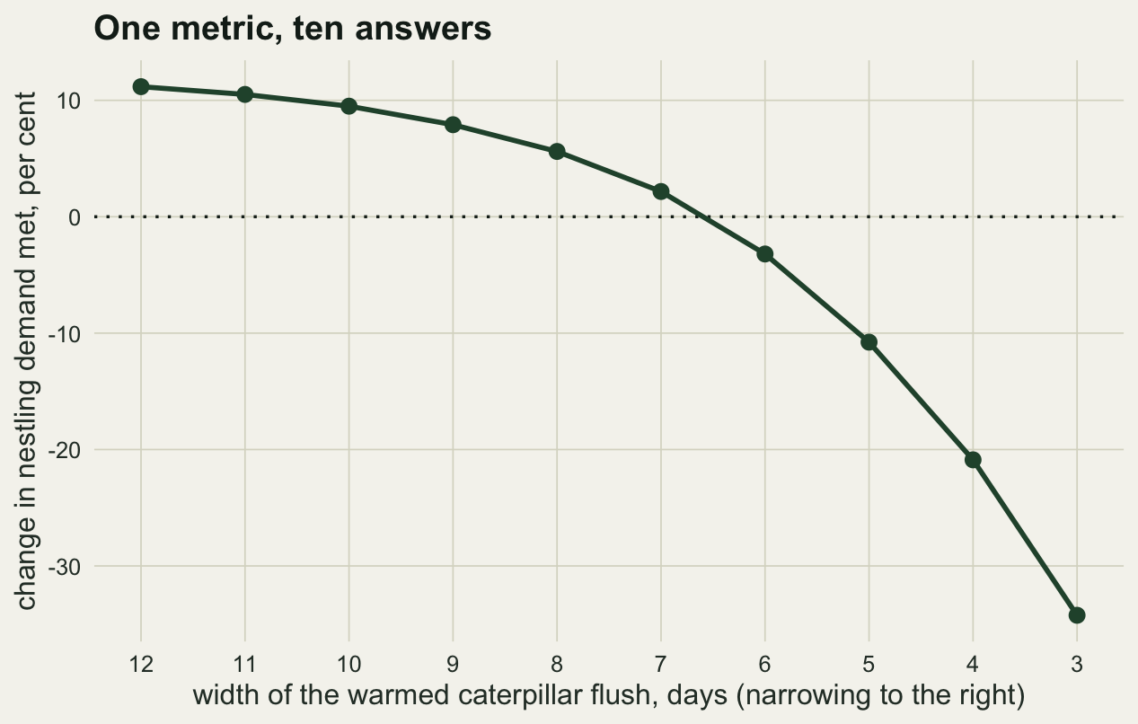
10 3 0.58 -34.24Each row uses the same draw of laying dates, so only the width moves the fraction met from row to row. That draw is not the one behind the headline scenario, so the four day row differs from it, at 0.702 against 0.674. With no compression at all, food met changes by 11.2 per cent. The change shrinks as the flush narrows, crosses zero between a width of 7 and 6 days, and reaches -34.2 per cent at the narrowest flush tested.
The point is the range. An eight day improvement in the standard mismatch metric is compatible with anything from 11 per cent to -34 per cent in the quantity that feeds the nestlings, and which of those happened is decided by a property of the food supply that the metric never looks at.
The trend in a difference is a weaker instrument
The second problem is statistical rather than ecological, and it appears as soon as the mismatch is tracked over years. A study usually has two date series, one for the food peak and one for the consumer, each estimated with error, and it regresses their difference on year.
n_year <- 30; yr <- seq_len(n_year)
food_slope <- -0.25; bird_slope <- -0.15; date_noise <- 4

set.seed(4600)
trend_sim <- t(replicate(2000, {
  food_date <- 140 + food_slope * yr + rnorm(n_year, 0, date_noise)
  bird_date <- 152 + bird_slope * yr + rnorm(n_year, 0, date_noise)
  a <- summary(lm(food_date ~ yr))$coefficients[2, ]
  b <- summary(lm(I(bird_date - food_date) ~ yr))$coefficients[2, ]
  c(se_food = a[2], p_food = a[4], se_gap = b[2], p_gap = b[4])
}))
c(se_food_date = mean(trend_sim[, 1]), se_gap = mean(trend_sim[, 3]),
  ratio = mean(trend_sim[, 3]) / mean(trend_sim[, 1]),
  power_food = mean(trend_sim[, 2] < 0.05),
  power_gap  = mean(trend_sim[, 4] < 0.05))
se_food_date se_gap ratio power_food power_gap
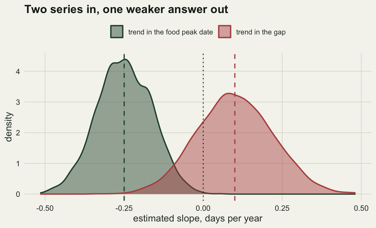
0.08381313 0.11862253 1.41532152 0.81400000 0.13350000 The two date series have independent noise of the same size, so the difference carries twice the variance and its slope has a standard error 1.42 times that of either date on its own, which is the square root of two.
That is only half the problem. The quantity being estimated has also shrunk: the food peak advances at 0.25 days per year and the birds at 0.15, so the gap opens at 0.10 days per year, smaller than either trend. A smaller signal measured with a larger standard error is a bad combination: over 30 years the food date trend is detected in 81 per cent of studies and the divergence in 13 per cent.
What to report
Report the width of the resource pulse alongside its peak. Two seasons with the same peak date and the same total biomass are different food supplies if one lasts three weeks and the other lasts one, and the consumer notices even when the metric does not.
Report the spread of consumer timing. The population average of a nonlinear function is not that function evaluated at the population average, and here the gap between the two is the whole result: the mean pair loses little after warming while the pairs laying later than it go hungry. A study that summarises its consumers by one date per year has thrown away the variable that carries the effect.
If a fitness or provisioning measure is available, report the mismatch metric and the fitness measure side by side and let the reader see whether they move together. When they do not, the interesting result is the disagreement, not either number.
For the trend, report both date series and their trends separately, not only the difference. The difference is the quantity of interest but it is the noisiest thing in the dataset, and a non significant divergence over thirty years is weak evidence of no divergence when the power to detect the real one is 13 per cent.
Honest limits
The compression used in the headline scenario is strong: the flush narrows from a standard deviation of 12 days to 4. Published caterpillar series do show shorter, sharper peaks in warm springs, but a three fold narrowing is at the extreme end, and the sweep is in the post precisely so the reader can see how the answer changes with a milder assumption. The sign of the effect flips at a width most warm springs would reach; the size at the narrow end would not be seen in the field.
Total seasonal biomass is held constant, which is a deliberate and disputable choice. It isolates the packaging of the resource from the amount of it. If warming also reduces the total, the fitness currency falls further while the peak gap metric is unmoved, so the direction of the result is unchanged and its magnitude is understated here.
The consumer in this model cannot respond. Real birds adjust brood size, feeding rate and foraging range, and Reed and colleagues showed in 2013 that density dependence can buffer the population consequences of a mismatch that is real at the level of the individual brood. The satisfied fraction here is a measure of food available to a fixed demand, not a prediction of population growth.
The demand curve is a Gaussian and the supply is a Gaussian, which makes both symmetric. Real caterpillar seasons are right skewed and real brood demand rises faster than it falls. Skewness changes the numbers and does not change the mechanism, which is that a metric reading only the distance between two peaks is blind to the shape of both.
Finally, the trend section assumes independent measurement error on the two dates. If both are estimated from the same survey visits, the errors are correlated, and positive correlation reduces the variance of the difference. That helps, and it does not help with the other half of the problem, which is that the divergence is a small difference between two larger trends.
References
Visser ME, Both C 2005 Proceedings of the Royal Society B 272(1581):2561-2569 (10.1098/rspb.2005.3356)
Durant JM, Hjermann DO, Ottersen G, Stenseth NC 2007 Climate Research 33:271-283 (10.3354/cr033271)
Reed TE, Grotan V, Jenouvrier S, Saether BE, Visser ME 2013 Science 340(6131):488-491 (10.1126/science.1232870)