library(ggplot2)

te_pal <- list(forest = "#275139", green = "#2f8f63", sage = "#93a87f",
               clay = "#b5534e", gold = "#cda23f", line = "#dad9ca",
               ink = "#16241d", paper = "#f5f4ee")

theme_te <- function() {
  theme_minimal(base_size = 12) +
    theme(panel.grid.minor = element_blank(),
          panel.grid.major = element_line(colour = "#e7e6dc"),
          plot.background = element_rect(fill = "#f5f4ee", colour = NA),
          panel.background = element_rect(fill = "#f5f4ee", colour = NA),
          plot.title = element_text(face = "bold", colour = te_pal$ink),
          axis.title = element_text(colour = "#2c3a31"),
          legend.position = "bottom")
}Checking a range shift analysis
R
climate change
model checking
ecology tutorial
ggplot2
Four checks on a range shift analysis in R: resurvey effort, the null distribution of a shift, elevation against latitude, and what a rising CTI hides.
The upland survey was walked in the 1980s by two people over three summers, and again last year by a county group with a rota, a phone app and a grant. The old cards give the species and the tetrad and not much else. The new database gives the species, the tetrad, the date, the recorder and the time spent. Somebody lines the two up, takes the highest tetrad each species was found in, subtracts, divides by the years between, and gets a table of upslope shifts in metres per decade. Most of them are positive. The mean is positive with a small standard error. The report writes itself.
This post is about what has to be true for that table to mean what it says, and it measures four things that can each break it. The modern survey is not the old survey repeated: it has more visits, better observers and a different set of tetrads, and every one of those pushes an edge estimate uphill on its own. A shift estimate has a sampling distribution, and almost nobody prints it. The elevational and latitudinal axes are not two independent readings of the same tracking; they are two shares of one budget, and how they split depends on the shape of the landscape. And the community temperature index rises for at least three quite different reasons, of which one is not ecological at all.
Every number here comes from a simulated gradient, for the usual reason: a simulated survey comes with a truth column, so the difference between what the estimator says and what actually happened can be measured rather than argued. The species in it track temperature exactly and instantly. That is deliberately generous, and it means everything measured below is a lower bound on the trouble.
Two companion posts build the quantities this one attacks. Climate velocity in R computes the speed a species would have to move to hold its climate, and range shifts and the climate lag puts an observed shift beside that requirement and reads off the shortfall. Both take the observed shift as given. This post is about how much of it is real.
The gradient and the two surveys
The world is one mountain side. Sites sit at regular elevations from sea level to a ceiling, and temperature falls with elevation at the standard environmental lapse rate. Sixty species have Gaussian thermal niches: occupancy is highest where site temperature matches the species optimum and falls away with a fixed thermal breadth. Twenty of the sixty are the focal set on which the range edge machinery runs; the other forty are there to make species lists the right length, which matters in check 1.
Warming raises every site temperature by the same amount and the species track it exactly, so the whole occupancy curve of every species translates upslope by the warming divided by the lapse rate. That gives a truth to check against, and it is checked rather than assumed.
The range edge is defined once and used everywhere: it is the elevation below which 95 per cent of the occupancy of a species lies, taken over the full grid of sites. It has the property that the raw data have an obvious analogue, the 95th percentile of the elevations at which the species was recorded, so the estimator and the target are the same functional applied to different weights.
lapse <- 0.0065
t_base <- 20
elev_max <- 2400
n_site <- 200L
elev <- seq(0, elev_max, length.out = n_site)

n_sp <- 60L
topt <- seq(9, 16, length.out = n_sp)
focal <- seq(3L, n_sp, by = 3L)
tsd <- 1.5
psi_max <- 0.75
d_temp <- 0.75
gap_yr <- 40L

psi_of <- function(tt) psi_max * exp(-outer(tt, topt, "-")^2 / (2 * tsd^2))
wq_grid <- function(w, prob = 0.95) elev[which(cumsum(w) / sum(w) >= prob)[1]]
edge_of <- function(warm) apply(psi_of(t_base - lapse * elev + warm), 2, wq_grid)
cent_of <- function(warm) {
  p <- psi_of(t_base - lapse * elev + warm)
  colSums(p * elev) / colSums(p)
}
true_edge <- mean((edge_of(d_temp) - edge_of(0))[focal])
true_cent <- mean((cent_of(d_temp) - cent_of(0))[focal])

print(c(sites = n_site, species = n_sp, focal_species = length(focal),
        survey_gap_years = gap_yr))
sites species focal_species survey_gap_years
200 60 20 40 round(c(lapse_c_per_metre = lapse, warming_c = d_temp, thermal_breadth_c = tsd,
peak_occupancy = psi_max, ceiling_m = elev_max, site_spacing_m = elev[2]), 5)lapse_c_per_metre warming_c thermal_breadth_c peak_occupancy
0.0065 0.7500 1.5000 0.7500
ceiling_m site_spacing_m
2400.0000 12.0603 round(c(shift_from_lapse_rate = d_temp / lapse, measured_true_edge_shift = true_edge,
measured_true_centroid_shift = true_cent,
closed_form_minus_measured = d_temp / lapse - true_edge,
true_shift_per_decade = true_edge / (gap_yr / 10)), 4) shift_from_lapse_rate measured_true_edge_shift
115.3846 114.5729
measured_true_centroid_shift closed_form_minus_measured
115.0327 0.8118
true_shift_per_decade
28.6432 Dividing the warming by the lapse rate gives 115.3846 metres. Measuring the true edge before and after on the grid, with the same functional the estimators use, gives 114.5729 metres, and the true centroid moves 115.0327. The gap of 0.8118 metres between the closed form and the measured edge is the grid: sites are 12.0603 metres apart, so a translation of that size cannot land exactly on a site. Nothing below turns on a metre. The true shift is 28.6432 metres per decade, which is between two and three times the median elevational shift Chen and colleagues compiled across taxa in 2011, and the reason it is larger is that these species track perfectly and real ones do not.
Now the two surveys. The historical one made three visits to each site it visited, found an occupied site on a given visit with probability 0.22, and went uphill less often: the chance a site was surveyed at all fell from 0.95 at sea level to 0.40 at the ceiling. The modern one made seven visits, has a per visit detection probability of 0.42, and covered the gradient evenly at 0.70. None of that is extreme. It is a rota with more people, better optics and a vehicle.
J1 <- 3L; p1 <- 0.22
J2 <- 7L; p2 <- 0.42
sel1 <- 0.95 - 0.55 * (elev / elev_max)
sel2 <- rep(0.70, n_site)
round(c(visits_then = J1, visits_now = J2, per_visit_then = p1, per_visit_now = p2,
        site_chance_then_low = sel1[1], site_chance_then_top = sel1[n_site],
        site_chance_now = sel2[1]), 4)
visits_then visits_now per_visit_then
3.00 7.00 0.22
per_visit_now site_chance_then_low site_chance_then_top
0.42 0.95 0.40
site_chance_now
0.70 round(c(occupied_site_found_then = 1 - (1 - p1)^J1,
occupied_site_found_now = 1 - (1 - p2)^J2), 4)occupied_site_found_then occupied_site_found_now
0.5254 0.9779 draw <- function(w, sel, J, p, full = TRUE) {
keep <- runif(n_site) < sel
ee <- elev[keep]; ns <- length(ee)
z <- matrix(runif(ns * n_sp) < psi_of(t_base - lapse * ee + w), ns, n_sp)
if (!full) return(list(elev = ee, y = matrix(rbinom(ns * n_sp, J, p), ns) * z,
J = J, ns = ns))
d <- array(runif(ns * n_sp * J) < rep(as.numeric(z) * p, J), c(ns, n_sp, J))
list(elev = ee, y = apply(d, c(1, 2), sum), det = d,
ll = apply(d, c(1, 3), sum), J = J, ns = ns)
}An occupied site is found at all with probability 0.5254 in the historical survey and 0.9779 in the modern one. That pair of numbers is most of what follows.
Check 1: the resurvey is not a repeat of the original survey
Three estimators are in routine use for the leading edge and all three are computed here from the records alone. The highest record is the elevation of the highest site with any detection. The 95th percentile is the weighted 95th percentile of the elevations at which the species was recorded, with weights equal to the number of detections. The centroid is the detection weighted mean elevation, which is not an edge at all but is reported as a shift more often than either of the others.
Three corrections are tried against them. The first fits a smooth occupancy curve over the whole gradient and reads the edge off the fitted curve, with no effort term of any kind; it is the cheapest thing that is not a raw quantile. The second adds a list length term, in the sense of list length analysis and reporting rates and effort drift: each visit to a site is a list, the number of species on it is the effort proxy, and the curve is read at a standard list length. The third is a single season occupancy model with a detection parameter estimated from the repeat visits, as in imperfect detection occupancy and occupancy from unstructured records. All three fit the same shape, a Gaussian in elevation on the logit scale, so what separates them is only how they treat effort. That shape is not the shape the data were generated from, so all three are misspecified in the same way on purpose.
set.seed(20260726)
n_rep_a <- 8L
est_names <- c("highest record", "95th percentile", "record centroid",
               "curve, no effort term", "curve plus list length", "occupancy model")

wq <- function(x, w, prob) {
  o <- order(x); x <- x[o]; w <- w[o]
  x[which(cumsum(w) / sum(w) >= prob)[1]]
}
raw_est <- function(sv, sp = seq_len(n_sp)) {
  t(vapply(sp, function(j) {
    y <- sv$y[, j]
    if (sum(y) == 0) return(c(NA_real_, NA_real_, NA_real_))
    c(max(sv$elev[y > 0]), wq(sv$elev, y, 0.95), sum(sv$elev * y) / sum(y))
  }, numeric(3)))
}
zsc <- function(e) (e - 1200) / 1000
xg <- zsc(elev)
curve_edge <- function(th) wq_grid(plogis(th[1] - exp(th[2]) * (xg - th[3])^2))

fit_occ <- function(ee, y, J) {
  x <- zsc(ee)
  nll <- function(th) {
    psi <- plogis(th[1] - exp(th[2]) * (x - th[3])^2)
    -sum(log(pmax(psi * dbinom(y, J, plogis(th[4])) + (1 - psi) * (y == 0), 1e-300)))
  }
  curve_edge(optim(c(1, log(3), 0, 0), nll, method = "BFGS",
                   control = list(maxit = 400, reltol = 1e-11))$par)
}
fit_curve <- function(ee, y) {
  x <- zsc(ee); yv <- as.numeric(y > 0)
  nll <- function(th) {
    lp <- th[1] - exp(th[2]) * (x - th[3])^2
    -sum(plogis(ifelse(yv == 1, lp, -lp), log.p = TRUE))
  }
  curve_edge(optim(c(0, log(3), 0), nll, method = "BFGS",
                   control = list(maxit = 400, reltol = 1e-11))$par)
}
fit_ll <- function(ee, dj, ll, ll0) {
  ok <- ll > 0
  x <- rep(zsc(ee), times = ncol(dj))[ok]
  yv <- as.numeric(dj)[ok]
  lv <- log(as.numeric(ll)[ok] / ll0)
  nll <- function(th) {
    lp <- th[1] - exp(th[2]) * (x - th[3])^2 + th[4] * lv
    -sum(plogis(ifelse(yv == 1, lp, -lp), log.p = TRUE))
  }
  curve_edge(optim(c(-1, log(3), 0, 1), nll, method = "BFGS",
                   control = list(maxit = 400, reltol = 1e-11))$par[1:3])
}
six_est <- function(sv, ll0) {
  m <- raw_est(sv, focal)
  occ <- cur <- lls <- numeric(length(focal))
  for (k in seq_along(focal)) {
    j <- focal[k]
    occ[k] <- fit_occ(sv$elev, sv$y[, j], sv$J)
    cur[k] <- fit_curve(sv$elev, sv$y[, j])
    lls[k] <- fit_ll(sv$elev, sv$det[, j, ], sv$ll, ll0)
  }
  cbind(m[, 1], m[, 2], m[, 3], cur, lls, occ)
}

res <- array(NA_real_, c(n_rep_a, 6L, 2L))
std_list <- numeric(n_rep_a)
for (r in seq_len(n_rep_a)) {
  a1 <- draw(0, sel1, J1, p1)
  a2 <- draw(0, sel2, J2, p2)
  b2 <- draw(d_temp, sel2, J2, p2)
  ll0 <- median(c(a1$ll[a1$ll > 0], a2$ll[a2$ll > 0]))
  std_list[r] <- ll0
  e1 <- six_est(a1, ll0)
  res[r, , 1] <- colMeans(six_est(a2, ll0) - e1)
  res[r, , 2] <- colMeans(six_est(b2, ll0) - e1)
}
eff_tab <- cbind(stationary = apply(res[, , 1], 2, mean),
                 se_stationary = apply(res[, , 1], 2, sd) / sqrt(n_rep_a),
                 genuine = apply(res[, , 2], 2, mean),
                 se_genuine = apply(res[, , 2], 2, sd) / sqrt(n_rep_a))
rownames(eff_tab) <- est_names
print(c(resurvey_pairs = n_rep_a, standard_list_length = unique(std_list)))
resurvey_pairs standard_list_length
8 5 print(round(eff_tab, 3)) stationary se_stationary genuine se_genuine
highest record 104.397 12.377 230.201 9.312
95th percentile 41.080 7.268 155.276 8.330
record centroid 34.027 5.591 143.207 5.239
curve, no effort term 17.864 6.567 135.678 7.302
curve plus list length 14.925 14.126 116.382 11.452
occupancy model 28.417 7.670 146.759 8.026removed <- unname(100 * (1 - eff_tab[4:6, "stationary"] / eff_tab[2, "stationary"]))
recovered <- unname(eff_tab[, "genuine"] - eff_tab[, "stationary"])
pd <- res[, 6, 1] - res[, 4, 1]
paired_gap <- c(occupancy_minus_curve = mean(pd), se = sd(pd) / sqrt(n_rep_a))
print(round(paired_gap, 3))occupancy_minus_curve se
10.553 3.013 print(round(c(pct_of_q95_artefact_removed_by = removed), 3))pct_of_q95_artefact_removed_by1 pct_of_q95_artefact_removed_by2
56.514 63.670
pct_of_q95_artefact_removed_by3
30.826 print(round(c(artefact_free_recovery = recovered, truth = true_edge), 3))artefact_free_recovery1 artefact_free_recovery2 artefact_free_recovery3
125.804 114.196 109.180
artefact_free_recovery4 artefact_free_recovery5 artefact_free_recovery6
117.814 101.457 118.342
truth
114.573 round(c(highest_record_per_decade = eff_tab[1, "stationary"] / (gap_yr / 10),
q95_per_decade = eff_tab[2, "stationary"] / (gap_yr / 10)), 4)highest_record_per_decade q95_per_decade
26.0992 10.2701 Nothing has moved. The species are stationary, the true shift is zero, and the highest record still walks uphill by 104.397 metres between the two surveys. The 95th percentile gains 41.080 metres and the centroid 34.027. Those are means over 8 independent pairs of surveys, and the standard errors say the first two are not noise: 12.377 and 7.268 metres. Scaled to the units a paper would use, the apparent rate is 26.0992 metres per decade for the highest record, on a species whose range did not move at all.
The corrections work, and the ranking is not the one I expected. Fitting a curve over the whole gradient with no effort term at all cuts the 95th percentile artefact by 56.514 per cent. Adding the list length term takes it to 63.670 per cent. The occupancy model, which needs repeat visits at every site in both periods and is the only one of the three that could not be run on the old card index, removes 30.826 per cent. On these data the expensive correction is worse than the free one: over the 8 paired replicates the occupancy model leaves 10.553 metres more artefact than the curve with no effort term, with a paired standard error of 3.013. It came third of the three, but eight replicates cannot separate it from the curve with a list length term.
That is worth pausing on rather than smoothing over. The occupancy model estimates detection correctly, and that is not where it loses. It loses because the effort difference here is mostly about which sites were visited rather than how hard each one was searched, and a curve fitted over the whole gradient already handles that by borrowing strength from the sites that were visited. The occupancy model spends its extra parameter on a nuisance the edge estimate barely uses. The lesson is not that detection modelling is pointless. It is that for a range edge the thing worth paying for is fitting a shape to the whole gradient instead of reading an extreme quantile off the records.
The negative control matters as much as the artefact, because a correction that always answers “artefact” is not a check. The same six estimators were run on a resurvey with a genuine 114.5729 metre shift in it, against the same historical survey. Subtracting each estimator’s own stationary artefact from its genuine shift figure gives 125.804, 114.196, 109.180, 117.814, 101.457 and 118.342 metres against a truth of 114.5729. Every one of them recovers the real signal. The corrections remove the bias and not the biology.
eff_df <- rbind(
  data.frame(est = est_names, shift = eff_tab[, 1], se = eff_tab[, 2],
             panel = "Stationary species: truth is zero"),
  data.frame(est = est_names, shift = eff_tab[, 3], se = eff_tab[, 4],
             panel = "Genuine shift: truth is the dashed line"))
eff_df$est <- factor(eff_df$est, levels = rev(est_names))
eff_df$kind <- ifelse(as.character(eff_df$est) %in% est_names[1:3],
                      "Raw records", "Fitted curve")
truth_df <- data.frame(panel = unique(eff_df$panel), z = c(0, true_edge))

ggplot(eff_df, aes(shift, est, colour = kind, shape = kind)) +
  geom_vline(data = truth_df, aes(xintercept = z), colour = te_pal$ink,
             linetype = "22", linewidth = 0.5) +
  geom_errorbar(aes(xmin = shift - se, xmax = shift + se), orientation = "y",
                width = 0.25, linewidth = 0.6) +
  geom_point(size = 2.6) +
  facet_wrap(~panel, scales = "free_x") +
  scale_colour_manual(values = c(te_pal$forest, te_pal$clay), name = NULL) +
  scale_shape_manual(values = c(17, 16), name = NULL) +
  labs(x = "Apparent shift over 40 years (m)", y = NULL,
       title = "Six estimators, two truths") +
  theme_te() +
  theme(strip.text = element_text(colour = te_pal$ink, face = "bold"),
        plot.margin = margin(10, 16, 6, 6))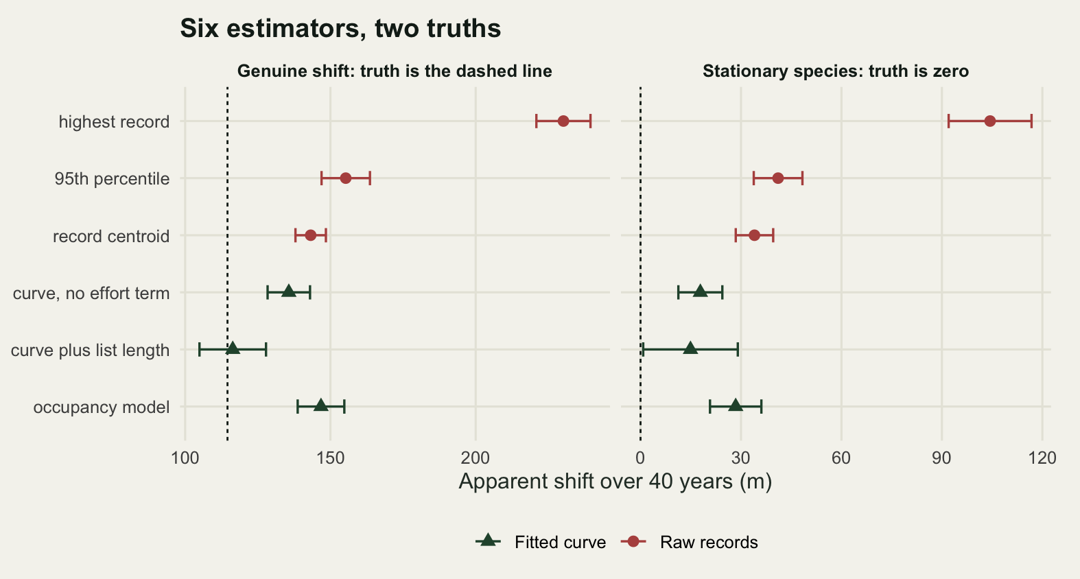
Check 2: what a stationary species can produce
A shift estimate is a statistic and it has a sampling distribution. The null model is the obvious one: hold every species still, run the two surveys again, and see what comes out. Two versions are run. In the first the two surveys differ in effort exactly as above. In the second both surveys use the modern protocol, so the effort histories are matched and only sampling noise is left. Four hundred replicates of each, and all sixty species are kept, so the null exists at two levels: the shift of one species, and the mean shift across the assemblage.
set.seed(20260727)
n_rep_b <- 400L
raw_names <- est_names[1:3]
one_rep <- function(diff_effort) {
  if (diff_effort) {
    s_a <- draw(0, sel1, J1, p1, FALSE); s_b <- draw(0, sel2, J2, p2, FALSE)
  } else {
    s_a <- draw(0, sel2, J2, p2, FALSE); s_b <- draw(0, sel2, J2, p2, FALSE)
  }
  raw_est(s_b) - raw_est(s_a)
}
sh_d <- sh_m <- array(NA_real_, c(n_rep_b, n_sp, 3L))
for (r in seq_len(n_rep_b)) {
  sh_d[r, , ] <- one_rep(TRUE)
  sh_m[r, , ] <- one_rep(FALSE)
}
qtab <- function(a) {
  z <- t(apply(a, 3, function(m) quantile(as.vector(m), c(0.025, 0.5, 0.95, 0.975))))
  dimnames(z) <- list(raw_names, c("2.5%", "median", "95%", "97.5%"))
  z
}
mn_d <- apply(sh_d, c(1, 3), mean)
mn_m <- apply(sh_m, c(1, 3), mean)
mtab <- function(a) {
  z <- t(apply(a, 2, quantile, c(0.025, 0.5, 0.975)))
  dimnames(z) <- list(raw_names, c("2.5%", "median", "97.5%"))
  z
}
q_d <- qtab(sh_d); q_m <- qtab(sh_m); m_d <- mtab(mn_d); m_m <- mtab(mn_m)
p_d <- apply(sh_d, c(1, 3), function(v) t.test(v)$p.value)
p_m <- apply(sh_m, c(1, 3), function(v) t.test(v)$p.value)

print(c(null_replicates = n_rep_b, species_per_replicate = n_sp))
null_replicates species_per_replicate
400 60 cat("one species, different effort\n"); print(round(q_d, 2))one species, different effort 2.5% median 95% 97.5%
highest record -253.27 96.48 385.93 434.17
95th percentile -301.51 36.18 301.51 349.75
record centroid -141.41 18.95 155.28 183.75cat("one species, matched effort\n"); print(round(q_m, 2))one species, matched effort 2.5% median 95% 97.5%
highest record -325.63 0.0 265.33 325.63
95th percentile -301.51 0.0 241.21 301.51
record centroid -130.55 -1.4 107.58 129.24cat("mean of 60 species, different effort\n"); print(round(m_d, 2))mean of 60 species, different effort 2.5% median 97.5%
highest record 45.57 90.25 142.71
95th percentile -12.26 33.27 71.86
record centroid -6.34 18.76 45.06cat("mean of 60 species, matched effort\n"); print(round(m_m, 2))mean of 60 species, matched effort 2.5% median 97.5%
highest record -45.44 -3.32 41.85
95th percentile -40.25 -1.71 38.21
record centroid -23.92 -0.71 18.52per_dec <- unname(q_d[, "95%"]) / (gap_yr / 10)
published_per_decade <- 11.0
print(round(c(null_95th_per_decade = per_dec,
published_median_per_decade = published_per_decade,
null_over_published = per_dec / published_per_decade), 4)) null_95th_per_decade1 null_95th_per_decade2
96.4824 75.3769
null_95th_per_decade3 published_median_per_decade
38.8192 11.0000
null_over_published1 null_over_published2
8.7711 6.8524
null_over_published3
3.5290 print(round(c(narrowing_matched = (q_m[, "97.5%"] - q_m[, "2.5%"]) /
(m_m[, "97.5%"] - m_m[, "2.5%"])), 4)) narrowing_matched.highest record narrowing_matched.95th percentile
7.4607 7.6854
narrowing_matched.record centroid
6.1206 print(round(c(reject_different_effort = unname(colMeans(p_d < 0.05)),
reject_matched_effort = unname(colMeans(p_m < 0.05))), 4))reject_different_effort1 reject_different_effort2 reject_different_effort3
0.9775 0.3275 0.4325
reject_matched_effort1 reject_matched_effort2 reject_matched_effort3
0.0675 0.0625 0.1250 n_out <- vapply(seq_len(3), function(k)
rowSums(sh_d[, , k] < q_m[k, "2.5%"] | sh_d[, , k] > q_m[k, "97.5%"]),
numeric(n_rep_b))
notable <- vapply(seq_len(3), function(k) {
s <- p_d[, k] < 0.05
c(mean(n_out[s, k]), mean(n_out[s, k] <= 5))
}, numeric(2))
print(round(c(species_outside_when_mean_rejects = notable[1, ],
share_with_five_or_fewer = notable[2, ]), 4))species_outside_when_mean_rejects1 species_outside_when_mean_rejects2
5.7238 4.3893
species_outside_when_mean_rejects3 share_with_five_or_fewer1
7.8266 0.5090
share_with_five_or_fewer2 share_with_five_or_fewer3
0.7252 0.2254 Take the 95th percentile estimator, the most defensible of the three, and a single stationary species. With the effort difference in place its apparent shift has a null median of 36.18 metres and a 95 per cent interval running from -301.51 to 349.75 metres. The one sided 95th percentile is 301.51 metres over the forty years, which is 75.3769 metres per decade. Chen and colleagues reported a median elevational shift of 11.0 metres per decade across the taxa they compiled. The null here is 6.8524 times that. For the highest record the null 95th percentile is 96.4824 metres per decade and for the centroid 38.8192. A stationary species surveyed twice by ordinary means routinely produces an apparent shift several times the size of the shifts that get published.
Matching the effort helps and does not solve it. With both surveys on the modern protocol the 95th percentile null loses its offset, with a median of 0.00, but the 95 per cent interval is still -301.51 to 301.51 metres. The spread is not the effort difference. It is that a range edge is an extreme quantile of a small number of records, and extreme quantiles of small samples move a long way for nothing.
The multi-species version is where papers actually live, and it is worse. Averaging over sixty species collapses the noise: with matched effort the mean shift for the 95th percentile has a 95 per cent interval of -40.25 to 38.21 metres, narrower than the single species interval by a factor of 7.6854. With the effort difference in place the mean does not collapse to zero, because the artefact is common to every species. It collapses to the artefact, with an interval of -12.26 to 71.86. Testing that mean against zero with a one sample t test, which treats the sixty species as sixty independent observations, rejects in 0.3275 of replicates under the effort difference and 0.0625 under matched effort. With 400 replicates the second number sits within Monte Carlo error of the nominal five per cent, so it is the centroid that carries the point: its records are spread over many more sites, and the matched effort test on it runs at 0.1250. That is the cost of pretending species are independent when they share a set of sites and a set of observers.
The last measurement in this section is the one that explains how such results survive review. Take the effort difference replicates in which the assemblage mean is significantly different from zero, and count how many of the sixty species have an individual shift outside the matched effort null interval. The average is 4.3893 species for the 95th percentile, and in 0.7252 of those replicates five or fewer species stand out at all. The assemblage result is not sixty species agreeing. It is a common bias with a small standard error attached, and the small standard error is what makes it look like evidence.
mk_long <- function(a, agg, eff) {
  col_k <- function(k) if (length(dim(a)) == 3L) as.vector(a[, , k]) else a[, k]
  do.call(rbind, lapply(seq_len(3), function(k)
    data.frame(shift = col_k(k), est = raw_names[k], agg = agg, eff = eff)))
}
null_raw <- rbind(mk_long(sh_m, "One species", "Matched effort"),
                  mk_long(sh_d, "One species", "Different effort"),
                  mk_long(mn_m, "Mean of 60 species", "Matched effort"),
                  mk_long(mn_d, "Mean of 60 species", "Different effort"))
null_raw$panel <- factor(
  paste0(null_raw$eff, ": ", tolower(null_raw$agg)),
  levels = c("Matched effort: one species",
             "Matched effort: mean of 60 species",
             "Different effort: one species",
             "Different effort: mean of 60 species"))

# each panel is drawn on its own window and its own vertical scale: the single
# species nulls have tails hundreds of metres long, and sharing a scale with the
# assemblage means flattens all four panels into the same lump
keep_frac <- 0.998
tail_p <- (1 - keep_frac) / 2
dens_df <- do.call(rbind, lapply(levels(null_raw$panel), function(pn) {
  d <- null_raw[null_raw$panel == pn, ]
  w <- c(min(vapply(raw_names, function(k)
               quantile(d$shift[d$est == k], tail_p), numeric(1))),
         max(vapply(raw_names, function(k)
               quantile(d$shift[d$est == k], 1 - tail_p), numeric(1))))
  do.call(rbind, lapply(raw_names, function(k) {
    z <- density(d$shift[d$est == k], adjust = 1.3, from = w[1], to = w[2],
                 n = 512)
    data.frame(shift = z$x, dens = z$y, est = k, panel = pn)
  }))
}))
dens_df$est <- factor(dens_df$est, levels = raw_names)
dens_df$panel <- factor(dens_df$panel, levels = levels(null_raw$panel))
mark_df <- data.frame(z = c(published_per_decade * gap_yr / 10, true_edge),
                      what = c("Published median shift, scaled to 40 years",
                               "True shift in this simulation"))

ggplot(dens_df, aes(shift, dens, colour = est)) +
  geom_vline(data = mark_df, aes(xintercept = z, linetype = what),
             colour = te_pal$ink, linewidth = 0.5) +
  geom_line(linewidth = 0.9) +
  facet_wrap(~panel, ncol = 2, scales = "free") +
  scale_colour_manual(values = c(te_pal$forest, te_pal$gold, te_pal$clay), name = NULL) +
  scale_linetype_manual(values = c("dotted", "42"), name = NULL) +
  guides(colour = guide_legend(order = 1, nrow = 3),
         linetype = guide_legend(order = 2, nrow = 3)) +
  labs(x = "Apparent shift of a stationary species over 40 years (m)", y = "Density",
       title = "What a range that did not move looks like") +
  theme_te() +
  theme(legend.box = "horizontal", legend.text = element_text(size = 8.5),
        strip.text = element_text(colour = te_pal$ink, face = "bold",
                                  size = 8.5),
        plot.margin = margin(10, 14, 6, 6))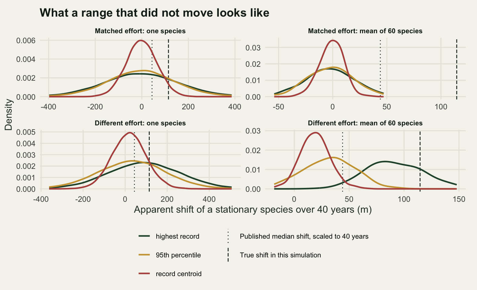
Check 3: elevation and latitude on the same data
Uphill and poleward are usually reported as two separate results, and the pair is often read as two independent confirmations that the species is tracking climate. They are not independent. They are two shares of the same temperature budget, and the split between them is a property of the landscape rather than of the species.
The landscape here is two dimensional: sites have an elevation and a latitude, temperature falls with both, and the two gradients are set so that one metre of elevation is worth exactly as much temperature as one kilometre of latitude. The elevational span is 1800 metres and the latitudinal span 600 kilometres, so the elevation axis carries three times as much climate as the latitude axis. No sampling is involved: the shifts come from the true occupancy surface, so what follows is geometry and not noise.
set.seed(20260728)
grad_lat <- 0.0065
n_land <- 1200L
elev_top <- 1800
lat_top <- 600
zz1 <- rnorm(n_land)
zz2 <- residuals(lm(rnorm(n_land) ~ zz1))
zz1 <- (zz1 - mean(zz1)) / sd(zz1)
zz2 <- zz2 / sd(zz2)

two_axes <- function(rho, warm) {
  ee <- elev_top * pnorm(zz1)
  la <- lat_top * pnorm(rho * zz1 + sqrt(1 - rho^2) * zz2)
  tt <- t_base - lapse * ee - grad_lat * la
  q1 <- psi_of(tt); q2 <- psi_of(tt + warm)
  list(de = colSums(q2 * ee) / colSums(q2) - colSums(q1 * ee) / colSums(q1),
       dl = colSums(q2 * la) / colSums(q2) - colSums(q1 * la) / colSums(q1),
       r = cor(ee, la))
}
flat <- two_axes(0, d_temp)
print(c(landscape_sites = n_land, elevation_span_m = elev_top,
        latitude_span_km = lat_top))
landscape_sites elevation_span_m latitude_span_km
1200 1800 600 round(c(climate_in_elevation_c = lapse * elev_top,
climate_in_latitude_c = grad_lat * lat_top,
exchange_rate_m_per_km = grad_lat / lapse), 4)climate_in_elevation_c climate_in_latitude_c exchange_rate_m_per_km
11.7 3.9 1.0 round(c(realised_correlation = flat$r, mean_elevation_shift_m = mean(flat$de),
mean_latitude_shift_km = mean(flat$dl),
elevation_over_latitude = mean(flat$de) / mean(flat$dl)), 4) realised_correlation mean_elevation_shift_m mean_latitude_shift_km
0.0105 102.5067 5.5428
elevation_over_latitude
18.4937 round(c(climatic_sum_c = lapse * mean(flat$de) + grad_lat * mean(flat$dl),
warming_c = d_temp,
share_of_warming_accounted = (lapse * mean(flat$de) +
grad_lat * mean(flat$dl)) / d_temp,
species_correlation = cor(flat$de, flat$dl)), 4) climatic_sum_c warming_c
0.7023 0.7500
share_of_warming_accounted species_correlation
0.9364 -0.8754 rhos <- seq(0, 0.95, by = 0.05)
sweep <- t(vapply(rhos, function(r) {
s <- two_axes(r, d_temp)
c(r_obs = s$r, elev_m = mean(s$de), lat_km = mean(s$dl))
}, numeric(3)))
sweep <- cbind(sweep, lat_inflation = sweep[, "lat_km"] / sweep[1, "lat_km"],
elev_change = sweep[, "elev_m"] / sweep[1, "elev_m"])
lo <- which.min(abs(sweep[, "r_obs"] - 0.45))
hi <- which.min(abs(sweep[, "r_obs"] - 0.85))
print(round(sweep[c(1, lo, hi), ], 4)) r_obs elev_m lat_km lat_inflation elev_change
[1,] 0.0105 102.5067 5.5428 1.0000 1.0000
[2,] 0.4433 94.4839 16.7753 3.0265 0.9217
[3,] 0.8384 88.4701 25.7004 4.6367 0.8631On the uncorrelated landscape the realised correlation between elevation and latitude across sites is 0.0105, the assemblage moves 102.5067 metres uphill and 5.5428 kilometres north, and those two numbers weighted by their gradients sum to 0.7023 degrees against the 0.75 degrees applied, so the two axes together account for 0.9364 of the warming. The remainder is the landscape being finite at both ends and not only at the top: the further a species sits toward either end of the temperature range, the fewer sites it has to move through, and the further it falls short of the full budget. That is the calibration: the budget balances, and the axes are shares of it.
The exchange rate is 1.0000 metre of elevation per kilometre of latitude, by construction. The ratio of the two measured shifts is 18.4937 metres per kilometre. Those two numbers have nothing to do with each other, and confusing them is the mistake. The exchange rate says what a metre buys. The ratio of the shifts says how the assemblage spent its budget, and it spent it on whichever axis held more climate. A paper reporting 102.5067 metres uphill and 5.5428 kilometres north, and remarking that the elevational response is the stronger of the two, has described the shape of its study region.
Across species the two shifts correlate at -0.8754. A species that went a long way uphill went a short way north. They are substitutes and not confirmations, and treating a matching pair of positive shifts as two lines of evidence counts one measurement twice.
Now the trap. Put the mountains in the north, so elevation and latitude are positively correlated across sites, and analyse the latitudinal axis alone. Part of what is really elevational tracking is now recorded as northward movement, because the sites a species moves to are both higher and further north.
ax_lev <- c("Elevation shift (m)", "Latitude shift (km)")
ax_df <- rbind(
  data.frame(r = sweep[, "r_obs"], shift = sweep[, "elev_m"], axis = ax_lev[1]),
  data.frame(r = sweep[, "r_obs"], shift = sweep[, "lat_km"], axis = ax_lev[2]))
ax_df$axis <- factor(ax_df$axis, levels = ax_lev)
lab_df <- data.frame(
  r = rep(sweep[c(lo, hi), "r_obs"], 2),
  y = c(100, 100, 8, 8),
  axis = factor(rep(ax_lev, each = 2), levels = ax_lev),
  lab = sprintf("%.2f times", c(sweep[c(lo, hi), "elev_change"],
                                sweep[c(lo, hi), "lat_inflation"])))

ggplot(ax_df, aes(r, shift, colour = axis)) +
  geom_vline(xintercept = sweep[c(lo, hi), "r_obs"], colour = te_pal$ink,
             linetype = "22", linewidth = 0.5) +
  geom_line(linewidth = 1.1) +
  geom_text(data = lab_df, aes(r, y, label = lab), inherit.aes = FALSE,
            hjust = -0.12, size = 3.4, colour = te_pal$ink) +
  facet_wrap(~axis, scales = "free_y") +
  scale_colour_manual(values = c(te_pal$forest, te_pal$clay), guide = "none") +
  scale_x_continuous(limits = c(0, 1.32), breaks = seq(0, 1, by = 0.25)) +
  expand_limits(y = 0) +
  labs(x = "Correlation between elevation and latitude across sites", y = NULL,
       title = "The same warming, the same species, a different region",
       subtitle = "Dotted verticals mark two example regions; each label gives the shift as a multiple of the shift on an uncorrelated landscape") +
  theme_te() +
  theme(strip.text = element_text(colour = te_pal$ink, face = "bold", size = 9),
        plot.subtitle = element_text(size = 8.5, colour = te_pal$ink),
        plot.margin = margin(10, 16, 6, 6))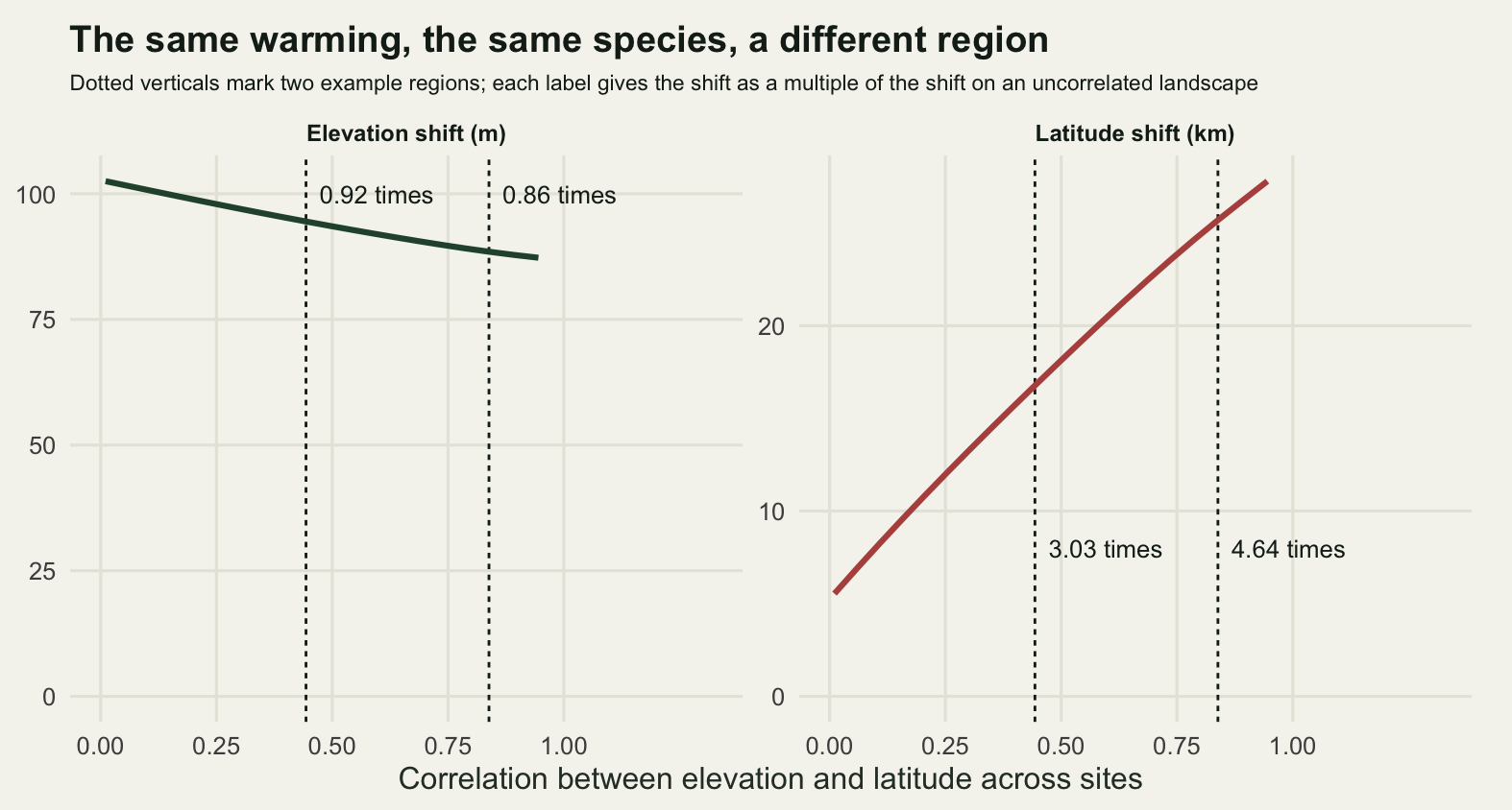
At a correlation of 0.4433 the assemblage moves 16.7753 kilometres north, which is 3.0265 times the 5.5428 kilometres it moved on the uncorrelated landscape. At 0.8384 it moves 25.7004 kilometres, 4.6367 times the flat case. The warming is identical, the species are identical and their thermal tolerances are identical. All that changed is where the high ground sits. The elevational estimate goes the other way, falling to 0.8631 of its uncorrelated value at the higher correlation, because the latitude axis is now absorbing part of what used to be elevational.
The consequence is for comparison rather than for any single study. Two regions with the same warming and the same species can report poleward shifts differing by a factor of 4.6367, and a meta-analysis treating those as two estimates of one biological quantity is averaging geometry. The fix is not subtle: report both axes, report their climatic sum, and report the correlation between the axes in the study region.
Check 4: the community temperature index and what it measures
The community temperature index is the abundance weighted mean thermal affinity of the species present. Each species gets a thermal affinity, usually the mean temperature over its range, and the community index is the weighted mean of those affinities. It is the standard community level summary of thermal reorganisation, and a rising index is read as a community following the climate. The arithmetic is the arithmetic of a community weighted mean of a trait, covered in community weighted means; what follows takes that as read and asks what the thermal version contains.
Three mechanisms are simulated on the same sites and all three are tuned to produce the same change in the index. The first is a genuine shift: the sites warm and the species redistribute. The second is abundance change alone, in exactly the species already present, with nothing gained and nothing lost. The third is a recording change: a group of warm affinity species that was barely recorded historically becomes well recorded, with no ecological change of any kind.
The decomposition splits every species contribution to the index change three ways, by whether the species was gained at a site, lost from it, or present in both periods. Writing the change as a sum over species of the change in relative abundance times the species affinity measured from the starting index makes the split exact, so the three parts add to the total by construction rather than by approximation.
n_cs <- 60L
sti <- seq(6, 19, length.out = n_cs)
ab_sd <- 1.2
ab_max <- 100
ab_thr <- 1
warm_grp <- sti >= 13 & sti <= 18.5
f_hist <- 0.04
t_cti <- (t_base - lapse * elev)[elev >= (t_base - 15.5) / lapse &
                                 elev <= (t_base - 9.5) / lapse]

record <- function(tt, fw = f_hist) {
  m <- ab_max * exp(-outer(tt, sti, "-")^2 / (2 * ab_sd^2))
  m[, warm_grp] <- m[, warm_grp] * fw
  m * (m >= ab_thr)
}
share <- function(m) m / rowSums(m)
cti_of <- function(m) drop(share(m) %*% sti)
M1 <- record(t_cti)
C1 <- cti_of(M1)

split_up <- function(m2) {
  p <- share(M1); q <- share(m2)
  S <- matrix(sti, nrow(p), ncol(p), byrow = TRUE)
  Cm <- matrix(C1, nrow(p), ncol(p))
  list(ct = (q - p) * (S - Cm), g = p == 0 & q > 0, l = p > 0 & q == 0)
}
parts_of <- function(m2) {
  z <- split_up(m2); n <- nrow(z$ct)
  c(total = sum(z$ct), gained = sum(z$ct[z$g]), lost = sum(z$ct[z$l]),
    shared = sum(z$ct[!(z$g | z$l)])) / n
}
profile_of <- function(m2) {
  z <- split_up(m2); n <- nrow(z$ct)
  cbind(gained = colSums(z$ct * z$g), lost = colSums(z$ct * z$l),
        shared = colSums(z$ct * !(z$g | z$l))) / n
}
cti_target <- 0.60
tune <- function(f, lo_v, hi_v, n = 900L) {
  v <- seq(lo_v, hi_v, length.out = n)
  v[which.min(abs(vapply(v, function(z) mean(cti_of(f(z))) - mean(C1),
                         numeric(1)) - cti_target))]
}
m_shift <- function(w) record(t_cti + w)
m_abun <- function(b) {
  m <- M1 * rep(exp(b * (sti - mean(sti))), each = nrow(M1))
  m * (M1 > 0)
}
m_det <- function(g) record(t_cti, fw = g)
w_hit <- tune(m_shift, 0, 2)
b_hit <- tune(m_abun, 0, 1.2)
g_hit <- tune(m_det, f_hist, 1)
sets <- list(m_shift(w_hit), m_abun(b_hit), m_det(g_hit))
mech <- c("Range shift", "Abundance change", "Recording change")

print(c(cti_sites = length(t_cti), species_pool = n_cs,
        warm_affinity_group = sum(warm_grp)))
cti_sites species_pool warm_affinity_group
76 60 25 round(c(target_cti_change = cti_target, historical_cti = mean(C1),
historical_richness = mean(rowSums(M1 > 0)), warming_needed_c = w_hit,
abundance_slope = b_hit, recording_then = f_hist, recording_now = g_hit,
recording_multiple = g_hit / f_hist), 4) target_cti_change historical_cti historical_richness warming_needed_c
0.6000 11.8228 26.4079 0.5873
abundance_slope recording_then recording_now recording_multiple
0.4832 0.0400 0.6796 16.9911 cti_tab <- t(vapply(sets, parts_of, numeric(4)))
rownames(cti_tab) <- mech
print(round(cti_tab, 5)) total gained lost shared
Range shift 0.59944 0.09309 0.03961 0.46674
Abundance change 0.60019 0.00000 0.00000 0.60019
Recording change 0.59986 0.10448 0.00000 0.49537cti_pct <- 100 * cti_tab[, 2:4] / cti_tab[, 1]
print(round(cti_pct, 2)) gained lost shared
Range shift 15.53 6.61 77.86
Abundance change 0.00 0.00 100.00
Recording change 17.42 0.00 82.58rich_chg <- vapply(sets, function(m)
mean(rowSums(m > 0)) - mean(rowSums(M1 > 0)), numeric(1))
print(round(c(richness_change = rich_chg,
loss_term_degrees = cti_tab[1, "lost"]), 4)) richness_change1 richness_change2 richness_change3 loss_term_degrees
-0.5789 0.0000 6.0263 0.0396 All three mechanisms raise the index by the same 0.60 degrees, matched to within a thousandth: the totals are 0.59944, 0.60019 and 0.59986. Read off the index alone, the three surveys are the same survey. Producing it takes 0.5873 degrees of warming, or an abundance slope of 0.4832 across the affinity axis, or the warm affinity group going from 0.04 of its true abundance to 0.6796, a 16.9911 fold improvement in recording. The last is large but it is not absurd: it is what happens to a group when it stops being hard to identify.
For the genuine range shift the split is 15.53 per cent from species gained, 6.61 per cent from species lost and 77.86 per cent from abundance change in shared species. For pure abundance change it is 0.00, 0.00 and 100.00. For the recording change it is 17.42, 0.00 and 82.58.
That is the useful output, and its useful part is one small number. Abundance change alone is easy to spot: no gains, no losses. A genuine shift and a recording change both gain species in almost the same proportion, and the only thing separating them is the loss term, which is 6.61 per cent of the total for the real shift and exactly 0.00 for the recording change. Warming pushes cold affinity species out of sites; better recording pushes nothing out. Richness carries the same signal in cruder form: it falls by 0.5789 species per site under the genuine shift, does not move under the abundance mechanism, and rises by 6.0263 under the recording change.
The loss term is 0.0396 degrees on an index change of 0.60. To use it as a diagnostic you have to be sure that a species absent from a modern list was really absent, which is precisely the confidence check 1 said you do not have. The decomposition tells you what to look for. It does not tell you that you can see it.
part_lev <- c("Present in both", "Gained at a site", "Lost from a site")
# the two rows carry scales an order of magnitude apart and the tick labels
# differ by one character, so the row strip has to say which is which
row_lev <- c("Gains and shared", "Losses, finer scale")
prof_df <- do.call(rbind, lapply(seq_along(sets), function(k) {
  pm <- profile_of(sets[[k]])
  data.frame(sti = rep(sti, 3), value = as.vector(pm),
             part = rep(part_lev[c(2, 3, 1)], each = n_cs),
             mech = mech[k])
}))
prof_df$mech <- factor(prof_df$mech, levels = mech)
prof_df$part <- factor(prof_df$part, levels = part_lev)
# the loss term is an order of magnitude below the tallest bar, so stacking it
# with the rest hides the one part of the split that does any diagnostic work
prof_df$band <- factor(ifelse(prof_df$part == "Lost from a site",
                              row_lev[2], row_lev[1]), levels = row_lev)
tot_df <- data.frame(mech = factor(mech, levels = mech),
                     band = factor(row_lev[1], levels = row_lev),
                     lab = sprintf("Total %+.2f deg C", cti_tab[, "total"]))
# an empty panel reads as a plotting failure unless it says why it is empty
loss_zero <- mech[cti_tab[, "lost"] == 0]
empty_df <- data.frame(mech = factor(loss_zero, levels = mech),
                       band = factor(row_lev[2], levels = row_lev),
                       lab = "No species lost")

ggplot(prof_df, aes(sti, value, fill = part)) +
  geom_col(width = 0.19) +
  geom_hline(yintercept = 0, colour = te_pal$ink, linewidth = 0.4) +
  geom_text(data = tot_df, aes(x = min(sti), y = Inf, label = lab),
            inherit.aes = FALSE, hjust = 0, vjust = 1.5, size = 3.2,
            colour = te_pal$ink) +
  geom_text(data = empty_df, aes(x = min(sti), y = Inf, label = lab),
            inherit.aes = FALSE, hjust = 0, vjust = 1.5, size = 3.2,
            colour = te_pal$ink) +
  facet_grid(band ~ mech, scales = "free_y") +
  scale_fill_manual(values = c(te_pal$sage, te_pal$gold, te_pal$forest), name = NULL) +
  labs(x = "Species thermal affinity (degrees C)",
       y = "Contribution to the change in CTI",
       title = "One index, three profiles, the same total") +
  theme_te() +
  theme(strip.text = element_text(colour = te_pal$ink, face = "bold",
                                  size = 8.5),
        plot.margin = margin(10, 16, 6, 6))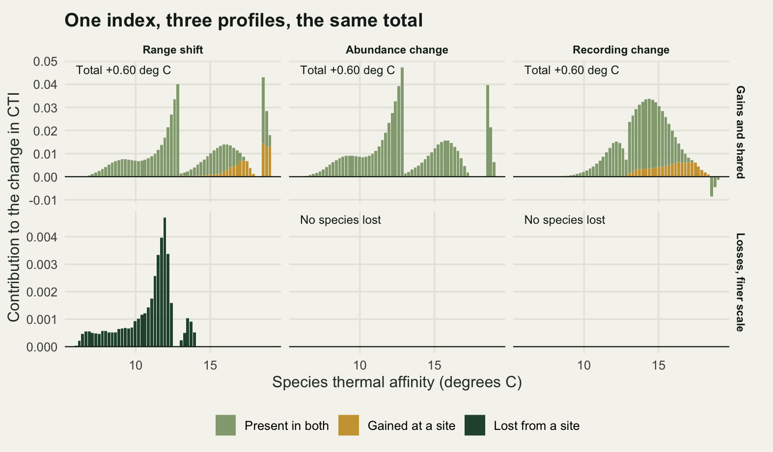
The honest limit: none of this is attribution
Every check above asks whether the shift estimate is an estimate of the range. Not one of them asks whether climate moved it. That question is not answerable from these data, and it is worth being blunt about why: a habitat change running along the elevational gradient produces the same records, the same edge shift and the same rise in the community index as warming does. The simulator cannot separate them because the data cannot.
What separates them is a design. The cheapest is a control gradient: a second region that did not warm, surveyed the same way, where the same species should not move. The null from check 2 prices it. The contrast between two regions is the difference of two assemblage mean shifts, so its null is the difference of two independent draws from distributions already computed.
set.seed(20260729)
ctrl_alike <- mn_m[sample.int(n_rep_b), , drop = FALSE] -
  mn_m[sample.int(n_rep_b), , drop = FALSE]
ctrl_drift <- mn_d[sample.int(n_rep_b), , drop = FALSE] -
  mn_m[sample.int(n_rep_b), , drop = FALSE]
band <- function(a) {
  z <- t(apply(a, 2, quantile, c(0.025, 0.975)))
  dimnames(z) <- list(raw_names, c("2.5%", "97.5%"))
  z
}
b_alike <- band(ctrl_alike); b_drift <- band(ctrl_drift)
cat("both regions surveyed alike\n"); print(round(b_alike, 2))
both regions surveyed alike 2.5% 97.5%
highest record -63.77 67.35
95th percentile -58.52 54.93
record centroid -30.65 30.37cat("one region's effort history changed\n"); print(round(b_drift, 2))one region's effort history changed 2.5% 97.5%
highest record 28.86 158.99
95th percentile -25.35 93.27
record centroid -12.04 54.43false_alike <- unname(colMeans(abs(ctrl_alike) > true_edge))
false_drift <- unname(colMeans(ctrl_drift > true_edge))
print(round(c(true_contrast = true_edge, false_when_alike = false_alike,
false_when_drifted = false_drift), 4)) true_contrast false_when_alike1 false_when_alike2 false_when_alike3
114.5729 0.0000 0.0025 0.0000
false_when_drifted1 false_when_drifted2 false_when_drifted3
0.2925 0.0075 0.0000 If both regions were surveyed the same way, the design works: the null contrast for the 95th percentile has a 95 per cent interval of -58.52 to 54.93 metres against a real contrast of 114.5729 metres, and only 0.0025 of null contrasts reach the real one by chance. If one region’s effort history changed and the other’s did not, the null contrast exceeds the real signal in 0.2925 of replicates for the highest record and 0.0075 for the 95th percentile, and in none of the replicates for the centroid. What a mismatch costs depends on the estimator: it breaks the design for the highest record, while the other two still almost never overtake the real signal. The control gradient is only as good as the effort matching between the two regions. A period without warming, or a land use covariate fitted alongside the climate term, are the other two designs, and both carry the same requirement: the comparison has to be between things surveyed alike.
Three further limits are worth stating plainly. The species here track temperature exactly and instantly, which removes the lag that range shifts and the climate lag is entirely about, so the artefacts measured here sit on top of that problem rather than replacing it. The occupancy model in check 1 was handed a detection probability that really was constant across sites, the most generous case it will ever get, and it still came third; with site varying detection it would have more to do and more ways to fail. And the whole post treats one gradient at a time, so nothing here addresses movement along an axis nobody measured, which by construction turns up either as unexplained scatter or as an inflated estimate on the axis that was measured, as check 3 showed.
Where to go next
The cheapest useful thing to do with an existing range shift table is check 2 on your own data: hold the species still, resample the two surveys, and print the interval. If a stationary species in your survey design can produce most of the shift you reported, the shift is not evidence, and no amount of model fitting downstream repairs that. Building that null is a simulation rather than a formula, and power analysis by simulation sets out the pattern.
After that, the effort corrections in check 1 are worth their cost in the order measured here, which is not the order of their sophistication. Start by fitting a curve over the whole gradient. Reporting rates and effort drift and list length analysis supply the effort term when the records carry one. If the surveys have repeat visits, imperfect detection occupancy is the standard route, and occupancy from unstructured records handles the case where they do not.
For the community side, check 4 measured turnover and abundance separately because they answer different questions, and the same split is worth having on the diversity side: beta diversity partitioning separates turnover from nestedness in the composition change itself. Where the response is timing rather than place, phenological trends and temperature has the same shape of problem, since a shift in first arrival date is also an extreme quantile of a record set whose effort changed.
References
Chen IC, Hill JK, Ohlemuller R, Roy DB, Thomas CD 2011 Science 333(6045):1024-1026 (10.1126/science.1206432)
Tingley MW, Beissinger SR 2009 Trends in Ecology and Evolution 24(11):625-633 (10.1016/j.tree.2009.05.009)
Bates AE, Bird TJ, Stuart-Smith RD, Wernberg T, Sunday JM, Barrett NS, Edgar GJ, Frusher S, Hobday AJ, Pecl GT, Smale DA, McCarthy M 2015 Diversity and Distributions 21(1):13-22 (10.1111/ddi.12263)
Shoo LP, Williams SE, Hero JM 2006 Austral Ecology 31(1):22-29 (10.1111/j.1442-9993.2006.01539.x)
Devictor V, Julliard R, Couvet D, Jiguet F 2008 Proceedings of the Royal Society B 275(1652):2743-2748 (10.1098/rspb.2008.0878)
Kampichler C, van Turnhout CAM, Devictor V, van der Jeugd HP 2012 PLoS ONE 7(4):e35272 (10.1371/journal.pone.0035272)