library(ggplot2)

te_pal <- list(forest = "#275139", green = "#2f8f63", sage = "#93a87f",
               clay = "#b5534e", gold = "#cda23f", line = "#dad9ca",
               ink = "#16241d", paper = "#f5f4ee")

theme_te <- function() {
  theme_minimal(base_size = 12) +
    theme(panel.grid.minor = element_blank(),
          panel.grid.major = element_line(colour = "#e7e6dc"),
          plot.background = element_rect(fill = "#f5f4ee", colour = NA),
          panel.background = element_rect(fill = "#f5f4ee", colour = NA),
          plot.title = element_text(face = "bold", colour = te_pal$ink),
          axis.title = element_text(colour = te_pal$ink),
          legend.position = "bottom")
}

f0 <- function(x) sprintf("%.0f", x)
f1 <- function(x) sprintf("%.1f", x)
f2 <- function(x) sprintf("%.2f", x)
f4 <- function(x) sprintf("%.4f", x)

# mix a palette colour towards another, used to darken the gold series and to
# get two neutral greys for the abundance profiles
shade <- function(hex, f, to = te_pal$ink) {
  a <- col2rgb(hex); b <- col2rgb(to)
  rgb(t((1 - f) * a + f * b), maxColorValue = 255)
}
# plain gold is the palest thing the palette has; on cream it is the first
# series to disappear, so every gold data mark in this post is darkened
gold_dk <- shade(te_pal$gold, 0.25)
grey_ref <- shade(te_pal$line, 0.45)Range shifts and the climate lag
R
climate change
macroecology
ecology tutorial
ggplot2
Measure what an elevational range shift estimate contains: four ways to define an edge, the bias each carries, and what that leaves of the climatic debt.
The transect was walked in 1978 and again last summer. The old record cards give a species list for each of a set of numbered stations up the valley side, in pencil, with the elevations read off a paper map. The resurvey used a handheld GPS, four visits instead of one, and three times as many stations, because the crew had a vehicle and the old crew had a bus timetable. The highest station holding the species in 1978 was at 2359.9 m. Last summer it was at 2426.5 m. The species has moved 67 m uphill in forty years.
That is the sentence the analysis produces, and the next step is standard. Over the same forty years the valley warmed by about 1.2 degrees. At a lapse rate of 6.5 degrees per kilometre of elevation, holding temperature constant would have required a move of 185 m. The species managed 67 m. The difference is the climate lag: the climatic debt, the distance the species is behind the climate it used to live in. It goes into the table, and later into a mean across species, and later still into a statement about which taxa are keeping up.
Every number in that paragraph except the warming is an estimate, and one of them is an estimate of something that was never measured. The highest occupied station is not a property of the range. It is a property of the range crossed with where the stations are, how many there are, how many times each was visited, and how abundant the species was at the top of its range on the day somebody looked. Three of those four changed between 1978 and last summer, and all three changed in the same direction.
This post measures the size of that problem. It builds a species on an elevational gradient with a known abundance profile, moves the profile by a known amount, surveys it twice, and then measures what four common definitions of a range edge report. It then feeds those estimates into the standard debt calculation and asks what the calculation returns when the truth is known by construction. The data are simulated for the usual reason: a simulated survey comes with a truth column, and the whole question here is the size of a gap between an estimate and a truth that no real resurvey can see.
The climate side of the calculation, the velocity the species is being asked to match, is worked out in climate velocity in R; this post takes that velocity as given and spends its effort on the other term in the subtraction. If you want the diagnostics to run on a range shift analysis you already have, they are in checking a range shift analysis.
Four definitions of an edge
The gradient runs from 200 m to 2600 m. The species has a Gaussian abundance profile with a standard deviation of 260 m and an expected count of 14 individuals at the optimum, and the profile is translated bodily uphill between the two periods, so that every part of the range moves by the same known amount. Survey stations are drawn once and kept for both periods, which is the paired resurvey design that a permanent plot network gives you. Their elevations are not uniform: there is less mountain the higher you go, so station density falls to three tenths of its valley value at the top of the gradient. That detail matters later and it is not a nuisance parameter, it is the shape of a mountain.
Four ways of turning a survey into a range edge, in rough order of how often they appear in the literature:
- the highest station at which the species was recorded, which is what almost every historical comparison uses because it is the only thing an old record card supports;
- the 95th percentile of the elevations of occupied stations, which trims the extreme record;
- the abundance weighted mean elevation, the range centroid, which uses counts rather than presence;
- the elevation at which a fitted occupancy curve falls through a fixed threshold, here 0.2, with the curve fitted by a kernel smoother of bandwidth 100 m.
The first three are arithmetic on the observations. The fourth is a model, and it is written with a smoother rather than a quadratic logistic regression for a practical reason: over hundreds of simulated surveys a quadratic logistic fit hits separation at the edge often enough to matter, and a warning in a loop is a result you cannot trust. The single fit below shows what the two forms give on the same data.
set.seed(20260726)

elev_min <- 200; elev_max <- 2600
sd_prof <- 260
peak_lam <- 14
n_site <- 300
mu1 <- 1500
true_shift <- 120
mu2 <- mu1 + true_shift

# station elevations: mountain area falls with height, so the network thins uphill
draw_elev <- function(n) {
  u <- runif(n)
  elev_min + (elev_max - elev_min) * (1 - sqrt(1 - 0.91 * u)) / 0.7
}
lam <- function(e, mu) peak_lam * exp(-(e - mu)^2 / (2 * sd_prof^2))

site_e <- draw_elev(n_site)

# one survey: counts are Poisson, each visit detects each individual with
# probability alpha, presence is any detection over the visits
survey <- function(e, mu, visits, alpha) {
  N <- rpois(length(e), lam(e, mu))
  y <- matrix(rbinom(length(e) * visits, rep(N, visits), alpha), nrow = length(e))
  list(occ = rowSums(y) > 0, cnt = rowMeans(y))
}

occ_threshold <- function(e, occ, thr = 0.2, bw = 100,
                          grid = seq(elev_min, elev_max, by = 10)) {
  w <- exp(-outer(grid, e, "-")^2 / (2 * bw^2))
  p <- as.numeric((w %*% occ) / rowSums(w))
  i <- which.max(p)
  gs <- grid[i:length(grid)]; ps <- p[i:length(grid)]
  k <- which(ps < thr)[1]
  if (is.na(k)) return(gs[length(gs)])
  if (k == 1) return(gs[1])
  gs[k - 1] + (ps[k - 1] - thr) / (ps[k - 1] - ps[k]) * (gs[k] - gs[k - 1])
}

est4 <- function(e, s) c(
  record = max(e[s$occ]),
  q95 = as.numeric(quantile(e[s$occ], 0.95)),
  centroid = sum(s$cnt * e) / sum(s$cnt),
  threshold = occ_threshold(e, s$occ))

est_names <- c("Highest record", "95th percentile", "Abundance centroid",
               "Occupancy threshold")

s1 <- survey(site_e, mu1, 1, 1)   # a perfect census at every station
s2 <- survey(site_e, mu2, 1, 1)
est1 <- est4(site_e, s1); est2 <- est4(site_e, s2)

one_run <- rbind(period_1 = est1, period_2 = est2, shift = est2 - est1,
                 error = est2 - est1 - true_shift)
print(round(one_run, 4))
record q95 centroid threshold
period_1 2359.9151 2111.4711 1470.4343 2314.921
period_2 2426.4757 2172.2474 1601.4854 2439.715
shift 66.5606 60.7763 131.0511 124.794
error -53.4394 -59.2237 11.0511 4.794round(c(true_shift_m = true_shift,
stations = n_site,
stations_above_2000_m = sum(site_e > 2000),
stations_above_2200_m = sum(site_e > 2200),
occupied_period_1 = sum(s1$occ),
occupied_period_2 = sum(s2$occ)), 4) true_shift_m stations stations_above_2000_m
120 300 51
stations_above_2200_m occupied_period_1 occupied_period_2
29 154 147 # the same threshold from a quadratic logistic fit, for comparison
gfit <- glm(s1$occ ~ site_e + I(site_e^2), family = binomial)
cf <- unname(coef(gfit))
tg <- log(0.2 / 0.8)
disc <- cf[2]^2 - 4 * cf[3] * (cf[1] - tg)
roots <- sort((-cf[2] + c(-1, 1) * sqrt(disc)) / (2 * cf[3]))
round(c(glm_upper_crossing_m = roots[2],
smoother_upper_crossing_m = unname(est1["threshold"]),
smoother_minus_glm_m = unname(est1["threshold"]) - roots[2]), 4) glm_upper_crossing_m smoother_upper_crossing_m smoother_minus_glm_m
2235.2207 2314.9206 79.6999 On this one pair of surveys the four estimators report shifts of 66.6 m, 60.8 m, 131.1 m and 124.8 m against a truth of 120 m. They are not four measurements of the same quantity with different error bars. The four disagree with each other, and the census was perfect: every individual at every station was counted.
The two fitted-occupancy crossings differ by 80 m, the smoother sitting higher than the quadratic logistic fit. Neither is wrong. A threshold estimator is a statement about a fitted curve, and two curves fitted to the same points with different assumptions cross 0.2 in different places. That is worth knowing before comparing a threshold from one paper with a threshold from another.
One realisation says nothing about bias, so here is the same design run 300 times, with the site network fixed and the survey effort identical in both periods.
set.seed(101)
n_rep <- 300
rep_shift <- replicate(n_rep, {
  a1 <- survey(site_e, mu1, 1, 1); a2 <- survey(site_e, mu2, 1, 1)
  est4(site_e, a2) - est4(site_e, a1)
})
census_bias <- cbind(mean_shift = rowMeans(rep_shift),
                     bias = rowMeans(rep_shift) - true_shift,
                     sd = apply(rep_shift, 1, sd),
                     se = apply(rep_shift, 1, sd) / sqrt(n_rep))
print(round(census_bias, 4))
mean_shift bias sd se
record 94.7142 -25.2858 108.5308 6.2660
q95 105.9450 -14.0550 42.9745 2.4811
centroid 117.0910 -2.9090 10.4938 0.6059
threshold 134.2060 14.2060 64.7989 3.7412round(c(replicates = n_rep,
record_sd_over_true_shift = census_bias["record", "sd"] / true_shift), 4) replicates record_sd_over_true_shift
300.0000 0.9044 With effort held equal the centroid is the only one of the four whose bias is small beside the shift it is measuring: -2.9 m out of 120 m, with a standard error of 0.61 m. The highest record is biased low by 25.3 m and, more to the point, has a standard deviation of 108.5 m, which is 0.9044 of the shift it is trying to measure. A single species scored on its highest record carries an uncertainty nearly the size of the signal, from sampling alone, with no detection error and no change in effort.
The low bias in the record has a cause worth naming, because it is not noise. The network thins uphill: 51 of the 300 stations sit above 2000 m and 29 above 2200 m. As the profile moves up, its leading edge moves into country with fewer stations in it, so the highest record cannot follow at full speed. There is less mountain up there, which is the same geometry that makes uphill shifts run out of room, and it attenuates the measurement before it does anything to the species.
gx <- seq(elev_min, elev_max, by = 5)
band_lev <- c("Where each definition puts the edge",
              "Abundance profile, relative to the peak")
# the profiles are context rather than one of the five categories, so they get
# two neutral greys and leave ink to mean the true shift and nothing else
prof_col <- c(shade(te_pal$line, 0.50), shade(te_pal$line, 0.82))

prof <- data.frame(
  elev = rep(gx, 2),
  rel = c(lam(gx, mu1), lam(gx, mu2)) / peak_lam,
  period = factor(rep(c("Period 1 profile", "Period 2 profile"), each = length(gx)),
                  levels = c("Period 1 profile", "Period 2 profile")),
  band = factor(band_lev[2], levels = band_lev))

row_lab <- c(est_names[c(3, 2, 4, 1)], "True shift")
seg <- data.frame(
  y = 1:5,
  x0 = c(est1[c("centroid", "q95", "threshold", "record")], mu1),
  x1 = c(est2[c("centroid", "q95", "threshold", "record")], mu2),
  col = c(te_pal$green, gold_dk, te_pal$forest, te_pal$clay, te_pal$ink),
  band = factor(band_lev[1], levels = band_lev))

ggplot() +
  geom_line(data = prof, aes(elev, rel, colour = period, linetype = period),
            linewidth = 0.9) +
  geom_segment(data = seg, aes(x = x0, xend = x1, y = y, yend = y),
               colour = seg$col, linewidth = 1.3) +
  geom_point(data = seg, aes(x = x0, y = y), colour = seg$col, shape = 21,
             fill = te_pal$paper, size = 2.6, stroke = 1.1) +
  geom_point(data = seg, aes(x = x1, y = y), colour = seg$col, size = 2.6) +
  facet_wrap(~band, ncol = 1, scales = "free_y") +
  scale_colour_manual(values = prof_col, name = NULL) +
  scale_linetype_manual(values = c(2, 1), name = NULL) +
  scale_x_continuous(limits = c(elev_min, elev_max), breaks = seq(400, 2600, 400)) +
  scale_y_continuous(
    breaks = function(lim) if (max(lim) > 2) 1:5 else c(0, 0.5, 1),
    labels = function(b) if (length(b) == 5L && isTRUE(all(b == 1:5)))
      row_lab else format(b)) +
  labs(x = "Elevation (m)", y = NULL,
       title = "Four edge definitions, one profile, one known shift",
       subtitle = "Open circle: the period 1 estimate. Filled circle: the period 2 estimate.") +
  theme_te() +
  theme(strip.text = element_text(colour = te_pal$ink, face = "bold",
                                  size = 8.5),
        plot.subtitle = element_text(size = 9, colour = te_pal$ink),
        axis.text.y = element_text(colour = te_pal$ink),
        plot.margin = margin(6, 14, 6, 6))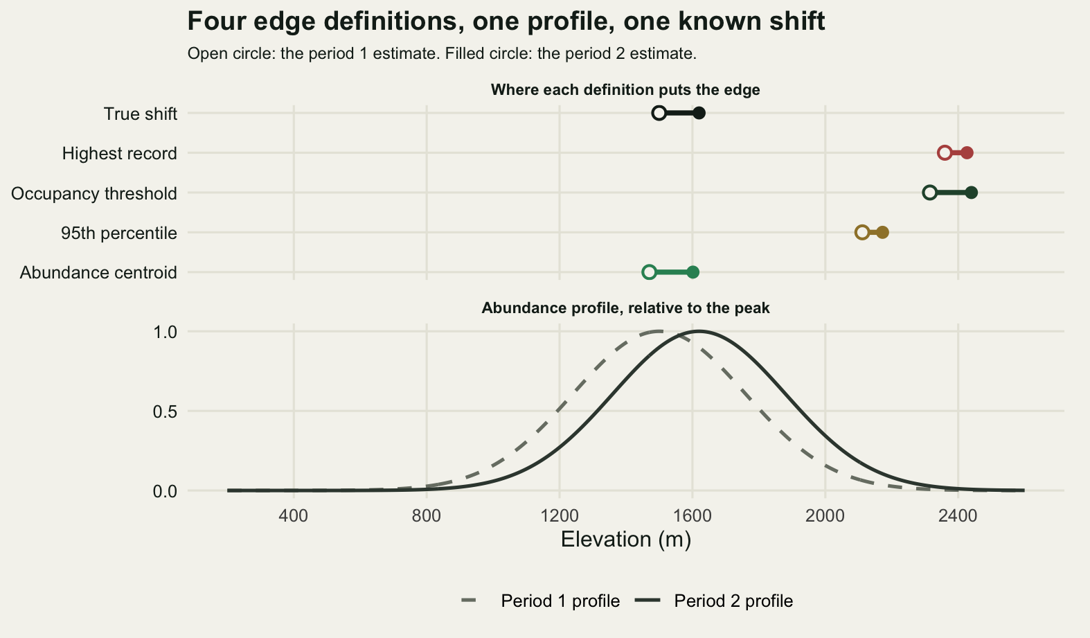
Effort moves the edge on its own
Now hold the species completely still. The profile in period two is the profile in period one, the true shift is zero, and the only thing that changes is the survey. Two changes, one at a time, both taken from what actually happens between a historical survey and a modern resurvey.
The first is more stations: 300 in period one, the same 300 plus 600 more in period two. The second is more visits: one visit per station in period one, four in period two. From here on detection is imperfect, because that is what makes visits worth anything. Each visit finds each individual present at the station with probability 0.35, and a station counts as occupied if any visit found anything. The count used by the centroid is the mean over visits, which estimates 0.35 times the true abundance and therefore weights stations correctly whatever the number of visits.
set.seed(88)
alpha <- 0.35
extra_e <- draw_elev(600)
big_e <- c(site_e, extra_e)

eff_sites <- replicate(n_rep, {
  a1 <- survey(site_e, mu1, 2, alpha)
  a2 <- survey(big_e, mu1, 2, alpha)
  est4(big_e, a2) - est4(site_e, a1)
})
eff_visits <- replicate(n_rep, {
  a1 <- survey(site_e, mu1, 1, alpha)
  a2 <- survey(site_e, mu1, 4, alpha)
  est4(site_e, a2) - est4(site_e, a1)
})
effort_tab <- cbind(more_sites = rowMeans(eff_sites),
                    se_sites = apply(eff_sites, 1, sd) / sqrt(n_rep),
                    more_visits = rowMeans(eff_visits),
                    se_visits = apply(eff_visits, 1, sd) / sqrt(n_rep))
print(round(effort_tab, 4))
more_sites se_sites more_visits se_visits
record 71.6607 6.6030 67.8313 6.4124
q95 -19.6739 2.0477 57.9134 3.1136
centroid -0.9830 0.7398 -0.8834 0.9437
threshold -9.2108 3.0365 100.4285 3.7507round(c(true_shift_here_m = 0,
stations_period_2 = length(big_e),
visits_period_2 = 4,
detection_per_visit = alpha), 4) true_shift_here_m stations_period_2 visits_period_2 detection_per_visit
0.00 900.00 4.00 0.35 Tripling the number of stations moves the highest record up by 71.7 m on a species that did not move, with a standard error of 6.60 m. Quadrupling the visits moves it by 67.8 m. Neither of those is a shift. The extreme record is an order statistic: it is the largest of however many draws you took from the upper tail of the occupied distribution, so it grows with the number of draws, and it grows again when a low probability of detection at the top of the range is raised by returning to the same station.
The 95th percentile behaves differently under the two levers, which is the useful part. Under more stations it moves by -19.7 m, that is, slightly down, because a sample quantile out in a thin tail is estimated with a small-sample bias that shrinks as the sample grows. Under more visits it moves up by 57.9 m, because raising detection changes which stations count as occupied and the change is concentrated where abundance is low, at both ends of the range. Trimming the extreme record buys a great deal of stability against one kind of effort change and almost none against the other.
The occupancy threshold moves little under more stations (-9.2 m) and is the worst of the four under more visits (100.4 m). It models occupancy as a function of elevation, so adding stations only sharpens the fit, but the quantity it fits is detected occupancy, and four visits raise detected occupancy everywhere the species is thin.
The centroid moves by -0.98 m and -0.88 m under the two levers, against standard errors of 0.74 and 0.94 m. It is the only one of the four that does not care, and the reason is structural rather than lucky: it is a ratio of two sums over the same stations, and multiplying every count by the same detection constant leaves the ratio alone.
Detection at the leading and the trailing edge
The next question is what imperfect detection does to each end of the range at one point in time. The comparison is paired: the same simulated abundances at the same stations, scored once as a perfect census and once through two visits with detection 0.35. Whatever the difference is, it is detection and nothing else.
set.seed(99)
edges <- function(e, s) c(
  upper_record = max(e[s$occ]),
  upper_q95 = as.numeric(quantile(e[s$occ], 0.95)),
  lower_record = min(e[s$occ]),
  lower_q05 = as.numeric(quantile(e[s$occ], 0.05)))

det <- replicate(n_rep, {
  N <- rpois(n_site, lam(site_e, mu1))
  y <- matrix(rbinom(n_site * 2, rep(N, 2), alpha), nrow = n_site)
  cen <- list(occ = N > 0, cnt = N)
  obs <- list(occ = rowSums(y) > 0, cnt = rowMeans(y))
  ec <- edges(site_e, cen); eo <- edges(site_e, obs)
  c(eo - ec,
    extent_record = (eo[1] - eo[3]) - (ec[1] - ec[3]),
    extent_q = (eo[2] - eo[4]) - (ec[2] - ec[4]),
    census_extent_record = ec[1] - ec[3],
    census_extent_q = ec[2] - ec[4],
    stations_occupied_census = sum(cen$occ),
    stations_occupied_observed = sum(obs$occ))
})
det_m <- rowMeans(det)
names(det_m) <- c("upper_record_bias", "upper_q95_bias", "lower_record_bias",
                  "lower_q05_bias", "extent_record_bias", "extent_q95_bias",
                  "census_extent_record", "census_extent_q95",
                  "occupied_census", "occupied_observed")
print(round(cbind(mean = det_m, sd = apply(det, 1, sd)), 4))
mean sd
upper_record_bias -38.0066 62.6349
upper_q95_bias -35.2335 26.1907
lower_record_bias 39.1454 74.1171
lower_q05_bias 47.0380 31.7676
extent_record_bias -77.1521 93.2943
extent_q95_bias -82.2716 40.0347
census_extent_record 1680.0520 122.4619
census_extent_q95 1260.1723 42.4605
occupied_census 154.9033 4.4789
occupied_observed 138.9333 4.4918round(c(extent_record_bias_percent =
100 * det_m["extent_record_bias"] / det_m["census_extent_record"],
extent_q95_bias_percent =
100 * det_m["extent_q95_bias"] / det_m["census_extent_q95"],
stations_lost_to_detection =
det_m["occupied_census"] - det_m["occupied_observed"]), 4)extent_record_bias_percent.extent_record_bias
-4.5922
extent_q95_bias_percent.extent_q95_bias
-6.5286
stations_lost_to_detection.occupied_census
15.9700 The upper edge is reported 38.0 m too low by the highest record and 35.2 m too low by the 95th percentile. The lower edge is reported 39.1 m and 47.0 m too high by the corresponding definitions. Both edges are pulled inward, so the errors do not cancel in the extent, they add: the range is reported 77.2 m narrower than it is on the record definition and 82.3 m narrower on the percentile definition, against true extents of 1680 m and 1260 m.
That is worth stating plainly because the verbal version usually goes the other way. The story told about trailing edges is that a species lingers, that absence is declared late, and that retreat is therefore under-reported. That story is about records that never expire, a historical dot on a map that stays there until somebody proves otherwise. It is not what a survey does. A survey with imperfect detection declares absence early at both ends, because both ends are where the species is rare, and the measured consequence is a range that looks smaller than it is at every point in time. The two mechanisms are opposites and a study can contain both, which is a reason to know which of them produced the map you are differencing.
The good news is mostly in the difference. Detection biases each edge, and most of that bias is the same in both periods, so most of it subtracts out. What survives is the attenuation from the first section rather than detection: the species moves into thinner station cover than the cover it left, and the two definitions that read an edge straight off the observations keep the most of it.
set.seed(77)
same_effort <- replicate(n_rep, {
  a1 <- survey(site_e, mu1, 2, alpha)
  a2 <- survey(site_e, mu2, 2, alpha)
  est4(site_e, a2) - est4(site_e, a1)
})
same_tab <- cbind(mean_shift = rowMeans(same_effort),
                  bias = rowMeans(same_effort) - true_shift,
                  sd = apply(same_effort, 1, sd),
                  se = apply(same_effort, 1, sd) / sqrt(n_rep))
print(round(same_tab, 4))
mean_shift bias sd se
record 92.2748 -27.7252 118.3043 6.8303
q95 95.9044 -24.0956 44.0627 2.5440
centroid 114.7673 -5.2327 15.1566 0.8751
threshold 127.4237 7.4237 70.7078 4.0823With two visits in both periods and the same stations, the four shift estimates are biased by -27.7, -24.1, -5.2 and 7.4 m against a true shift of 120 m. Compare those with the effort columns in the previous section, where nothing moved at all and the highest record reported up to 71.7 m. Detection is not the problem. A change in detection is the problem, and the change is delivered by the survey, not by the species.
scen_lev <- c("More stations, no real shift", "More visits, no real shift",
              "Real shift of 120 m, same effort")
mk <- function(m, scen) data.frame(
  est = factor(est_names, levels = rev(est_names)),
  mid = rowMeans(m),
  lo = apply(m, 1, quantile, 0.1),
  hi = apply(m, 1, quantile, 0.9),
  scen = factor(scen, levels = scen_lev))
bias_df <- rbind(mk(eff_sites, scen_lev[1]), mk(eff_visits, scen_lev[2]),
                 mk(same_effort, scen_lev[3]))
truth_df <- data.frame(scen = factor(scen_lev, levels = scen_lev),
                       v = c(0, 0, true_shift))

ggplot(bias_df, aes(mid, est, colour = est)) +
  geom_vline(data = truth_df, aes(xintercept = v), linetype = 2,
             colour = te_pal$ink, linewidth = 0.6) +
  geom_linerange(aes(xmin = lo, xmax = hi), linewidth = 1.3) +
  geom_point(size = 3) +
  facet_wrap(~scen) +
  scale_colour_manual(values = rev(c(te_pal$clay, gold_dk, te_pal$green,
                                     te_pal$forest)),
                      guide = "none") +
  scale_x_continuous(breaks = seq(-200, 400, 100)) +
  labs(x = "Reported shift (m)", y = NULL,
       title = "The survey moves the edge as far as the climate does") +
  theme_te() +
  theme(strip.text = element_text(colour = te_pal$ink, face = "bold", size = 8.5),
        plot.margin = margin(6, 12, 6, 6))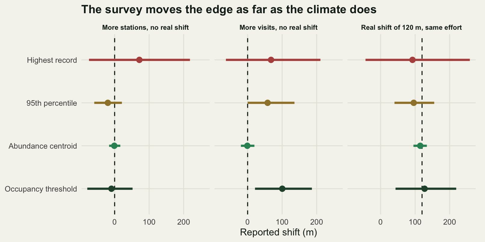
The lag inherits the bias
Now the debt calculation itself. Give the species a tracking rule with a known answer: each year it moves a fixed fraction of what the climate demands that year. With warming of 0.03 degrees a year for 40 years and a lapse rate of 6.5 degrees per kilometre, the demand over the study is 185 m of elevation. A species with tracking fraction 1 has no lag by construction, a species with tracking fraction 0 has a lag equal to the whole demand, and everything in between is linear.
The estimate is made the standard way. Take the expected shift from the climate, subtract the observed shift, and call the difference the debt. The sweep below runs the tracking fraction from 0 to 1 in steps of 0.1 and does the whole thing twice: once with effort rising between periods (the historical survey is 300 stations and one visit, the resurvey is 900 stations and four visits) and once with effort falling (the same two surveys in the other order, which is what happens when an intensive old plot network is compared with a thin modern sample).
warming <- 0.03; years <- 40; lapse <- 0.0065
demand <- warming * years / lapse

fracs <- seq(0, 1, by = 0.1)
n_sweep <- 50
sweep_lag <- function(rising) {
  t(sapply(fracs, function(f) {
    rowMeans(replicate(n_sweep, {
      if (rising) {
        a1 <- survey(site_e, mu1, 1, alpha)
        a2 <- survey(big_e, mu1 + f * demand, 4, alpha)
        demand - (est4(big_e, a2) - est4(site_e, a1))
      } else {
        a1 <- survey(big_e, mu1, 4, alpha)
        a2 <- survey(site_e, mu1 + f * demand, 1, alpha)
        demand - (est4(site_e, a2) - est4(big_e, a1))
      }
    }))
  }))
}
set.seed(2026); lag_up <- sweep_lag(TRUE)
set.seed(3030); lag_down <- sweep_lag(FALSE)

true_lag <- (1 - fracs) * demand
fit_line <- function(v) unname(coef(lm(v ~ true_lag))[2:1])
lag_fits <- rbind(
  record_effort_rising = fit_line(lag_up[, "record"]),
  record_effort_falling = fit_line(lag_down[, "record"]),
  q95_effort_rising = fit_line(lag_up[, "q95"]),
  centroid_effort_rising = fit_line(lag_up[, "centroid"]),
  centroid_effort_falling = fit_line(lag_down[, "centroid"]),
  threshold_effort_rising = fit_line(lag_up[, "threshold"]))
colnames(lag_fits) <- c("slope", "intercept")
print(round(lag_fits, 4))
slope intercept
record_effort_rising 0.8493 -87.4735
record_effort_falling 0.9760 141.9089
q95_effort_rising 0.9993 -44.0101
centroid_effort_rising 0.9602 8.2948
centroid_effort_falling 0.9684 3.3988
threshold_effort_rising 1.1270 -114.6112round(c(demand_m = demand,
tracking_fractions = length(fracs),
replicates_per_point = n_sweep,
perfect_tracker_true_lag = 0,
perfect_tracker_reported_rising = lag_up[fracs == 1, "record"],
perfect_tracker_reported_falling = lag_down[fracs == 1, "record"],
non_tracker_true_lag = demand,
non_tracker_reported_rising = lag_up[fracs == 0, "record"],
non_tracker_reported_falling = lag_down[fracs == 0, "record"],
centroid_perfect_tracker_rising = lag_up[fracs == 1, "centroid"],
centroid_non_tracker_rising = lag_up[fracs == 0, "centroid"],
perfect_tracker_falling_percent_of_demand =
100 * lag_down[fracs == 1, "record"] / demand,
non_tracker_rising_percent_of_demand =
100 * lag_up[fracs == 0, "record"] / demand), 4) demand_m
184.6154
tracking_fractions
11.0000
replicates_per_point
50.0000
perfect_tracker_true_lag
0.0000
perfect_tracker_reported_rising.record
-97.8774
perfect_tracker_reported_falling.record
159.3733
non_tracker_true_lag
184.6154
non_tracker_reported_rising.record
84.1329
non_tracker_reported_falling.record
345.0623
centroid_perfect_tracker_rising.centroid
10.1632
centroid_non_tracker_rising.centroid
184.7004
perfect_tracker_falling_percent_of_demand.record
86.3272
non_tracker_rising_percent_of_demand.record
45.5720 Read the slope first. If the method measured what it claims, estimated debt against true debt would be a line of slope 1 through the origin. On the highest record the slope is 0.8493 with effort rising and 0.9760 with effort falling. Neither is 1. The shortfall is the attenuation from the first section: the leading edge of the range moves into thinning station cover, so a real shift is followed at less than its true rate. The gap between the two slopes is another matter: each point on a sweep is a mean of 50 surveys of the noisiest estimator of the four, which is enough to place the attenuation and not enough to say which of the two effort directions attenuates more. A slope below 1 compresses the differences between species, which is exactly the axis a comparative study cares about: the species that are keeping up and the species that are not are pushed towards each other before anybody fits a model to the contrast.
The intercept is the larger problem. With effort rising it is -87.5 m; with effort falling it is 141.9 m. An intercept is a debt reported for a species whose true debt is zero. With the modern resurvey the better sampled of the two, a species tracking the climate exactly is reported at -97.9 m, a negative debt, an apparent credit: it looks as though it has overshot its climate. With the modern resurvey the poorer of the two, the same perfectly tracking species is reported at 159.4 m of debt, which is 86 per cent of the entire climate demand. The species has kept up perfectly and the analysis says it has hardly moved.
The other end of the sweep is as bad in the other direction. A species that did not move at all carries a true debt of 184.6 m and is reported at 84.1 m when effort rises, 46 per cent of what it owes. The sign of the error is set by the sign of the effort change, and nothing in the data tells you which one you have unless the effort was recorded.
The centroid is the exception again, with slopes of 0.9602 and 0.9684 and intercepts of 8.3 and 3.4 m. It needs counts, which historical presence records rarely have, and the honest limit below shows the way it can be broken. But between an abundance weighted mean and an extreme record there is no contest, and the choice is usually made by what the old data support rather than by what the estimator does.
lag_series <- c("Highest record, effort falls", "Abundance centroid, effort rises",
                "Highest record, effort rises")
lag_df <- data.frame(
  true = rep(true_lag, 3),
  est = c(lag_down[, "record"], lag_up[, "centroid"], lag_up[, "record"]),
  series = factor(rep(lag_series, each = length(fracs)), levels = lag_series))

ggplot(lag_df, aes(true, est, colour = series, shape = series)) +
  geom_hline(yintercept = 0, colour = shade(te_pal$line, 0.25),
             linewidth = 0.8) +
  geom_abline(slope = 1, intercept = 0, linetype = 2, colour = grey_ref,
              linewidth = 1.9) +
  annotate("text", x = 118, y = 186, label = "One to one", size = 3.1,
           colour = shade(te_pal$line, 0.72)) +
  geom_line(linewidth = 0.9) +
  geom_point(size = 2.4) +
  scale_colour_manual(values = c(te_pal$clay, te_pal$green, gold_dk),
                      name = NULL) +
  scale_shape_manual(values = c(16, 17, 15), name = NULL) +
  scale_x_continuous(breaks = seq(0, 200, 50)) +
  labs(x = "True climatic debt (m of elevation)",
       y = "Debt the analysis reports (m)",
       title = "The reported debt is the true debt plus the survey") +
  theme_te() +
  theme(legend.text = element_text(size = 9), plot.margin = margin(6, 14, 6, 6))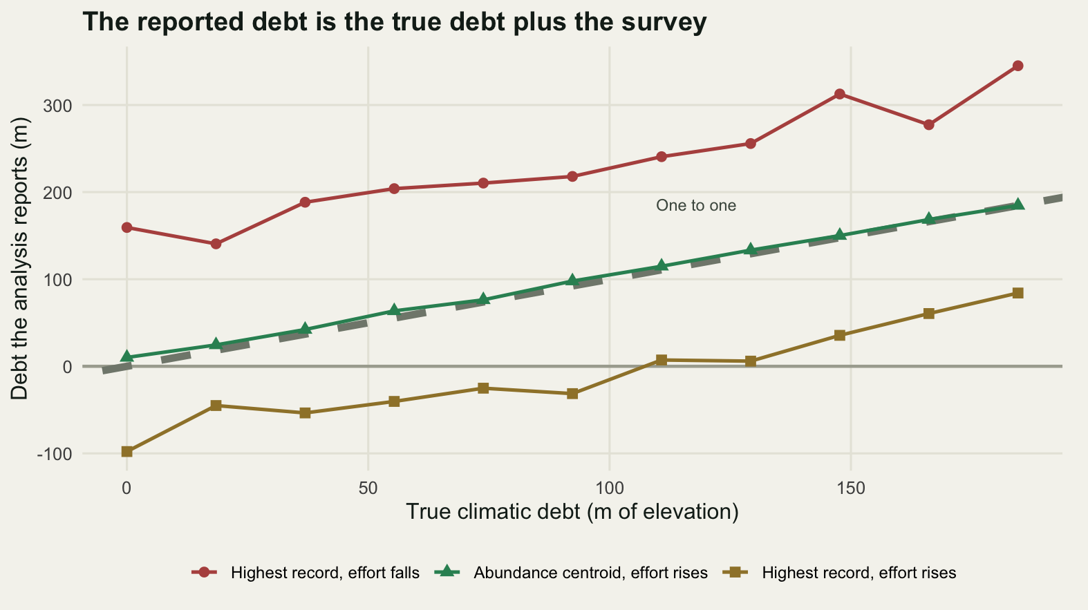
Uphill and polewards are not the same measurement
A species can move uphill without moving polewards, and the two shifts are not two readings of one quantity. They are movements along two gradients of very different steepness, and the arithmetic that converts between them is short enough to do in full.
Temperature falls with elevation at about 6.5 degrees per kilometre. It falls with latitude at about 0.75 degrees per degree of latitude, which at 111.2 km to the degree is about 6.7 degrees per thousand kilometres. One is a gradient per kilometre and the other is a gradient per thousand kilometres, and the ratio of the two is the exchange rate between the axes.
lat_per_degree_km <- 111.2
lat_gradient <- 0.75 / lat_per_degree_km      # degrees C per km of latitude
km_per_m <- lapse / lat_gradient              # km polewards equal to 1 m uphill
total_warming <- warming * years

demand_elev_m <- total_warming / lapse
demand_lat_km <- total_warming / lat_gradient

# a species that tracks temperature exactly, splitting the move between the axes
phi <- 0.5
round(c(lapse_rate_C_per_km = lapse * 1000,
        lat_gradient_C_per_1000_km = lat_gradient * 1000,
        lat_gradient_C_per_km = lat_gradient,
        km_of_latitude_per_m_of_elevation = km_per_m,
        total_warming_C = total_warming,
        elevational_demand_m = demand_elev_m,
        latitudinal_demand_km = demand_lat_km,
        split_uphill_fraction = phi,
        elevational_shift_m = phi * demand_elev_m,
        latitudinal_shift_km = (1 - phi) * demand_lat_km,
        apparent_debt_elevation_only_C = (1 - phi) * total_warming,
        apparent_debt_elevation_only_m = (1 - phi) * demand_elev_m,
        true_debt_C = 0), 4)
lapse_rate_C_per_km lat_gradient_C_per_1000_km
6.5000 6.7446
lat_gradient_C_per_km km_of_latitude_per_m_of_elevation
0.0067 0.9637
total_warming_C elevational_demand_m
1.2000 184.6154
latitudinal_demand_km split_uphill_fraction
177.9200 0.5000
elevational_shift_m latitudinal_shift_km
92.3077 88.9600
apparent_debt_elevation_only_C apparent_debt_elevation_only_m
0.6000 92.3077
true_debt_C
0.0000 # published medians, for scale: Chen et al. 2011 Science
chen_elev_m_per_decade <- 11.0
chen_lat_km_per_decade <- 16.9
obs_elev_m <- chen_elev_m_per_decade * years / 10
obs_lat_km <- chen_lat_km_per_decade * years / 10
round(c(median_elevational_shift_m_over_40_yr = obs_elev_m,
median_latitudinal_shift_km_over_40_yr = obs_lat_km,
elevation_only_tracking_fraction = obs_elev_m / demand_elev_m,
latitude_only_tracking_fraction = obs_lat_km / demand_lat_km,
temperature_tracked_elevation_C = obs_elev_m * lapse,
temperature_tracked_latitude_C = obs_lat_km * lat_gradient,
both_axes_tracking_fraction =
(obs_elev_m * lapse + obs_lat_km * lat_gradient) / total_warming), 4) median_elevational_shift_m_over_40_yr median_latitudinal_shift_km_over_40_yr
44.0000 67.6000
elevation_only_tracking_fraction latitude_only_tracking_fraction
0.2383 0.3799
temperature_tracked_elevation_C temperature_tracked_latitude_C
0.2860 0.4559
both_axes_tracking_fraction
0.6183 One metre of elevation is worth 0.9637 km of latitude. That is the number behind the rule of thumb that a kilometre up is a thousand kilometres north, and it is why the two axes cannot be compared without it: 184.6 m and 177.9 km are the same climatic demand, 1.2 degrees, expressed twice.
Take a species that tracks temperature exactly and splits its move evenly between the two axes. It goes 92.3 m uphill and 89.0 km polewards, and it carries no debt at all. A study that measures only the elevational axis sees 92.3 m, converts that to 0.6 degrees of temperature tracked, and reports a debt of 0.6 degrees, or 92.3 m in elevational units, for a species with a true debt of zero. The under-reporting is exactly the fraction of the move that went along the axis nobody measured.
The published medians make the same point without a simulation. Chen and colleagues report a median elevational shift of 11.0 m per decade and a median latitudinal shift of 16.9 km per decade. Over the 40 years used here those are 44.0 m and 67.6 km. Scored against the elevational demand alone the first is 0.2383 of what was needed; scored against the latitudinal demand alone the second is 0.3799. Add the temperature the two moves each account for, 0.2860 and 0.4559 degrees, and a species doing both would have tracked 0.6183 of the warming rather than the quarter or the two fifths that either axis reports alone. Those medians come from different species in different studies, so the sum is an illustration of the arithmetic rather than an estimate for any real animal. It still sets the scale of what a single-axis study leaves on the table.
ph <- seq(0, 1, by = 0.05)
pan <- c("Elevational shift (m)", "Latitudinal shift (km)",
         "Apparent debt (degrees C)")
ax_df <- rbind(
  data.frame(phi = ph, v = ph * demand_elev_m, who = "Elevational axis",
             panel = pan[1]),
  data.frame(phi = ph, v = (1 - ph) * demand_lat_km, who = "Latitudinal axis",
             panel = pan[2]),
  data.frame(phi = ph, v = (1 - ph) * total_warming, who = "Elevational axis",
             panel = pan[3]),
  data.frame(phi = ph, v = ph * total_warming, who = "Latitudinal axis",
             panel = pan[3]))
ax_df$panel <- factor(ax_df$panel, levels = pan)
# each label sits just above the high end of its OWN line: the elevation only
# curve starts high on the left, the latitude only curve ends high on the right,
# so the two labels are mirrored and neither can be read off the other line
ax_lab <- data.frame(
  phi = c(0.06, 0.94),
  v = c((1 - 0.06) * total_warming, 0.94 * total_warming),
  who = c("Elevational axis", "Latitudinal axis"),
  lab = c("Elevation\nonly study", "Latitude\nonly study"),
  hj = c(0, 1),
  panel = factor(pan[3], levels = pan))
ax_zero <- data.frame(panel = factor(pan[3], levels = pan), v = 0)

ggplot(ax_df, aes(phi, v, colour = who)) +
  geom_hline(data = ax_zero, aes(yintercept = v),
             colour = shade(te_pal$line, 0.25), linewidth = 0.8) +
  geom_line(linewidth = 1.0) +
  geom_text(data = ax_lab, aes(label = lab, hjust = hj), size = 3.1,
            vjust = -0.25, lineheight = 0.95, show.legend = FALSE) +
  facet_wrap(~panel, scales = "free_y") +
  scale_colour_manual(values = c(te_pal$forest, te_pal$green), guide = "none") +
  scale_x_continuous(breaks = c(0, 0.25, 0.5, 0.75, 1)) +
  scale_y_continuous(expand = expansion(mult = c(0.05, 0.22))) +
  labs(x = "Fraction of the move made uphill", y = NULL,
       title = "One species, two axes, two different reported debts") +
  theme_te() +
  theme(strip.text = element_text(colour = te_pal$ink, face = "bold", size = 8.5),
        plot.margin = margin(6, 14, 6, 6))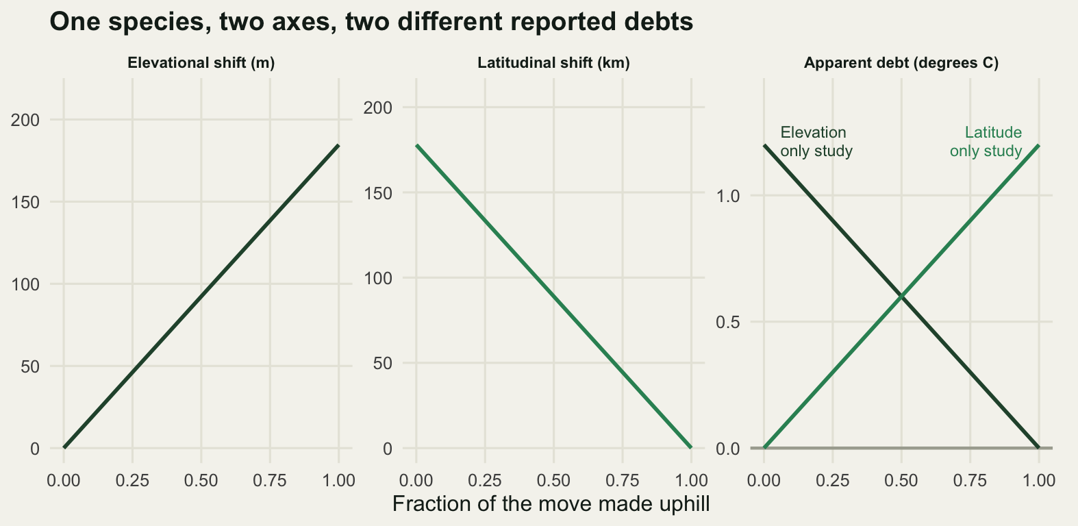
This is not an invasion front
A range moving across a map looks like an invasion, and the blog has a cluster on invasion spread that models exactly that: the speed of an invasion front works out the speed a species generates for itself from its own growth rate and dispersal kernel. The two problems share the mathematics of a travelling wave and they differ in what sets the speed. An invading species sets its own; a species tracking a climate is being pushed at a speed decided elsewhere, and its own biology only decides how far behind it runs.
That is a testable difference rather than a distinction in words. Below, the same discrete time model with the same Gaussian dispersal kernel is run twice. In the self-driven run the species grows wherever it lands, and the wave speed should match the closed form for a pulled front, sigma times the square root of twice the log of the growth rate. In the climate-driven run the growth rate is positive only inside a habitat band reaching 250 km on either side of its centre, which slides polewards at the climate velocity from the previous section, and is negative outside it.
dx <- 0.5; nx <- 4000
xg <- (seq_len(nx) - 1) * dx

gauss_kernel <- function(sigma) {
  h <- ceiling(8 * sigma / dx)
  k <- exp(-(seq(-h, h) * dx)^2 / (2 * sigma^2))
  k / sum(k)
}
disperse <- function(v, k) {
  h <- (length(k) - 1) / 2
  z <- c(rep(0, h), v, rep(0, h))
  as.numeric(stats::filter(z, k, sides = 2))[(h + 1):(h + length(v))]
}
growth <- function(v, R0) R0 * v / (1 + (R0 - 1) * v)
front_pos <- function(v, thr) {
  w <- which(v > thr)
  if (!length(w)) return(NA_real_)
  i <- max(w)
  if (i >= nx) return(NA_real_)
  xg[i] + dx * (v[i] - thr) / (v[i] - v[i + 1])
}
speed_of <- function(pos, tt) {
  y <- pos[tt + 1]
  if (any(!is.finite(y))) return(NA_real_)
  unname(coef(lm(y ~ tt))[2])
}

run_self <- function(sigma, R0, steps = 80) {
  k <- gauss_kernel(sigma)
  v <- ifelse(xg <= 200, 1, 0)
  pos <- numeric(steps + 1); pos[1] <- front_pos(v, 0.05)
  for (t in seq_len(steps)) {
    v <- disperse(growth(v, R0), k)
    pos[t + 1] <- front_pos(v, 0.05)
  }
  speed_of(pos, 30:70)
}
run_climate <- function(sigma, R0, vel, steps = 80, half = 250, cen0 = 400) {
  k <- gauss_kernel(sigma)
  v <- ifelse(abs(xg - cen0) <= half, 1, 0)
  pos <- numeric(steps + 1); tot <- numeric(steps + 1)
  pos[1] <- front_pos(v, 0.5); tot[1] <- sum(v)
  for (t in seq_len(steps)) {
    R <- ifelse(abs(xg - (cen0 + vel * t)) <= half, R0, 0.2)
    v <- disperse(growth(v, R), k)
    pos[t + 1] <- front_pos(v, 0.5); tot[t + 1] <- sum(v)
  }
  c(speed = speed_of(pos, 30:70),
    lag_km = (cen0 + vel * steps + half) - pos[steps + 1],
    abundance_ratio = tot[steps + 1] / tot[1])
}

R0 <- 3
clim_vel <- warming / lat_gradient          # km per year, from the axes section
sigmas <- c(2, 4, 8)
front_tab <- t(sapply(sigmas, function(sg) c(
  sigma_km = sg,
  formula_speed = sg * sqrt(2 * log(R0)),
  simulated_self_speed = run_self(sg, R0),
  run_climate(sg, R0, clim_vel))))
print(round(front_tab, 4))
sigma_km formula_speed simulated_self_speed speed lag_km
[1,] 2 2.9646 2.9259 2.9230 132.3008
[2,] 4 5.9292 5.8519 4.4485 8.9049
[3,] 8 11.8584 11.7038 4.4490 4.5793
abundance_ratio
[1,] 0.9129
[2,] 0.9879
[3,] 0.9924fast <- run_self(4, 6)
round(c(climate_velocity_km_per_year = clim_vel,
self_speed_ratio_8_over_4 =
front_tab[3, "simulated_self_speed"] / front_tab[2, "simulated_self_speed"],
climate_speed_ratio_8_over_4 =
front_tab[3, "speed"] / front_tab[2, "speed"],
simulated_over_formula_sigma_4 =
front_tab[2, "simulated_self_speed"] / front_tab[2, "formula_speed"],
growth_6_self_speed = fast,
growth_6_formula = 4 * sqrt(2 * log(6)),
growth_6_climate_speed = unname(run_climate(4, 6, clim_vel)["speed"])), 4) climate_velocity_km_per_year
4.4480
self_speed_ratio_8_over_4.simulated_self_speed
2.0000
climate_speed_ratio_8_over_4.speed
1.0001
simulated_over_formula_sigma_4.simulated_self_speed
0.9870
growth_6_self_speed
7.5112
growth_6_formula
7.5721
growth_6_climate_speed
4.4491 The simulator agrees with the closed form to 0.9870 of it. The closed form is the speed a pulled front settles at, approached slowly and from below, and the speed here is fitted over steps 30 to 70, before the front has finished settling; follow it for longer and the ratio closes. The self-driven speeds can be read as the model intends them. Doubling the dispersal distance from 4 km to 8 km doubles the self-driven speed, from 5.8519 to 11.7038 km per year, a ratio of 2.0000. The same change leaves the climate-driven speed at 4.4485 and 4.4490 km per year, a ratio of 1.0001, because both are simply the speed of the climate, 4.4480 km per year. Raising the growth rate from 3 to 6 does the same thing: the self-driven speed goes to 7.5112 km per year and the climate-driven speed does not move.
What dispersal buys in the climate-driven case is not speed but position. The population sits 8.90 km behind the leading edge of its habitat band at the shorter dispersal distance and 4.58 km behind it at the longer one. That distance is the lag, and it is the only thing about a climate-driven front that the species controls.
The exception is the species whose own front speed is below the climate velocity. At a dispersal distance of 2 km the self-driven speed is 2.9259 km per year against a climate moving at 4.4480 km per year, and the band leaves it behind: it ends 132.3 km back, holding 0.9129 of the abundance it started with and still falling. That is the whole of the difference between the two problems in one line. For an invader, more dispersal means a faster front. For a species tracking a climate, more dispersal means a smaller debt, until the point where it means the difference between a debt and a decline.
The honest limit
The measurement in this post is of one confound, changing survey effort, and it treats effort as though it changed everywhere by the same factor. It does not. Effort changes where the roads went in, where a reserve was declared, where a recorder retired. Any effort trend correlated with elevation manufactures an elevational shift directly, and it does so through the centroid, the one estimator that survived everything above.
set.seed(4242)
uphill_e <- runif(300, 1500, elev_max)      # 300 new stations, all in the top half
both_e <- c(site_e, uphill_e)

set.seed(555)
confound <- replicate(n_rep, {
  a1 <- survey(site_e, mu1, 2, alpha)
  a2 <- survey(both_e, mu1, 2, alpha)
  est4(both_e, a2) - est4(site_e, a1)
})
conf_tab <- cbind(manufactured_shift_m = rowMeans(confound),
                  se = apply(confound, 1, sd) / sqrt(n_rep),
                  per_decade_m = rowMeans(confound) / (years / 10))
print(round(conf_tab, 4))
manufactured_shift_m se per_decade_m
record 104.7639 6.6528 26.1910
q95 50.0668 2.1101 12.5167
centroid 119.2018 0.7132 29.8005
threshold -11.0376 2.7862 -2.7594round(c(published_median_m_per_decade = chen_elev_m_per_decade,
centroid_manufactured_over_published =
conf_tab["centroid", "per_decade_m"] / chen_elev_m_per_decade,
record_manufactured_over_published =
conf_tab["record", "per_decade_m"] / chen_elev_m_per_decade,
true_shift_m = 0), 4) published_median_m_per_decade centroid_manufactured_over_published
11.0000 2.7091
record_manufactured_over_published true_shift_m
2.3810 0.0000 Three hundred new stations, all of them above 1500 m, on a species that did not move: the centroid reports 119.2 m, which is 29.8 m per decade, or 2.71 times the published median elevational shift across species. The highest record reports 104.8 m. The occupancy threshold reports -11.0 m and is the only one that stays near zero, because it is the only one that conditions on elevation rather than averaging over whatever elevations happened to be surveyed.
That reverses the ranking from every earlier section, and the reversal is the point. The centroid is immune to how much you survey and vulnerable to where; the threshold estimator is the other way round. There is no estimator here that is safe against both, and a study with both problems, which is most of them, cannot be repaired by choosing a better statistic.
The deeper limit is that none of this touches attribution. Everything above measures a distance and compares it with a climatic demand. It never tests whether the climate caused the move. Over the same 40 years land use changed, and it changed along the elevational gradient: abandonment and regrowth uphill, intensification in the valley. A species moving uphill because the valley meadows became maize is indistinguishable, in a two-period shift estimate, from a species moving uphill because the valley became warm. Both give the same number, and the debt calculation will attribute all of it to the climate because the climate is the only term in the subtraction. Separating them needs a design with land use in it, or a species that has an elevational range and no reason to respond to the land use, and neither is available after the fact.
The third limit is the profile itself. This species translated bodily uphill: same shape, same peak abundance, one number moved. Real ranges deform. Density at the leading edge is below equilibrium because the population is new, density at the trailing edge stays up for a while because the adults that are already there do not die on cue, and both make the observed shift a biased reading of the demographic one. Every estimator here would report something different if the profile changed shape as it moved, and which direction it goes depends on the deformation, not on the estimator.
Where to go next
The other half of this calculation is the climate side, and it has its own estimator problems: climate velocity in R builds the velocity from a temperature surface and measures how much the answer depends on the grain the surface was computed at. When the analysis exists and needs auditing rather than building, checking a range shift analysis runs the diagnostics that would have caught the effort artefact measured here.
For the detection half, imperfect detection occupancy is where the visit structure used above comes from, and it is the model to fit if you have repeat visits and want an edge that does not move when the effort does. Reporting rates and effort drift measures the same confound in its other common form, a reporting rate that moves because recorders changed rather than because the species did, and list length analysis is the standard correction when the only effort covariate you have is how many species somebody wrote down.
References
Chen IC, Hill JK, Ohlemuller R, Roy DB, Thomas CD 2011 Science 333(6045):1024-1026 (10.1126/science.1206432)
Parmesan C, Yohe G 2003 Nature 421(6918):37-42 (10.1038/nature01286)
Lenoir J, Gegout JC, Marquet PA, de Ruffray P, Brisse H 2008 Science 320(5884):1768-1771 (10.1126/science.1156831)
Devictor V, van Swaay C, Brereton T, Brotons L, Chamberlain D, Heliola J, Herrando S, Julliard R, Kuussaari M, Lindstrom A, Reif J, Roy DB, Schweiger O, Settele J, Stefanescu C, Van Strien A, Van Turnhout C, Vermouzek Z, WallisDeVries M, Wynhoff I, Jiguet F 2012 Nature Climate Change 2(2):121-124 (10.1038/nclimate1347)
Loarie SR, Duffy PB, Hamilton H, Asner GP, Field CB, Ackerly DD 2009 Nature 462(7276):1052-1055 (10.1038/nature08649)
MacKenzie DI, Nichols JD, Lachman GB, Droege S, Royle JA, Langtimm CA 2002 Ecology 83(8):2248-2255 (10.1890/0012-9658(2002)083[2248:ESORWD]2.0.CO;2)