library(MASS)
library(ggplot2)
library(dplyr)

# randomised quantile (PIT) residuals from any model that supports simulate()
sim_pit <- function(model, n_sim = 1000, seed = 1) {
  set.seed(seed)
  sims <- as.matrix(simulate(model, nsim = n_sim))
  y    <- as.numeric(model.response(model.frame(model)))
  vapply(seq_along(y), function(i) {
    s <- sims[i, ]
    mean(s < y[i]) + runif(1) * mean(s == y[i])   # randomise within the jump
  }, numeric(1))
}

KS <- function(u) suppressWarnings(ks.test(u, "punif")) # distance from uniformGLM residual diagnostics with simulation in R
R
GLM
model diagnostics
count data
statistics
Why Pearson and deviance residuals mislead for GLMs, and how to build simulation-based quantile residuals in R to spot overdispersion and zero-inflation.
The way you check a linear model is to look at its residuals: plot them against the fitted values, against each predictor, and on a normal quantile plot, and look for structure that should not be there. For a generalised linear model the same instinct is right but the usual tools betray you. The count data GLM post fits Poisson and negative binomial models and reads their coefficients, but stops short of a residual check, because a residual plot for count data is genuinely hard to read. This post explains why, then builds a diagnostic that works for any GLM by simulating from the fitted model.
Why the usual residuals mislead
Ordinary least squares assumes constant variance and normal errors, so its raw residuals are directly interpretable. A GLM assumes neither. For Poisson or negative binomial counts the variance rises with the mean, so the spread of the residuals changes across the plot by design. Worse, the response is discrete: for a given fitted mean only whole-number outcomes are possible, so the residuals fall on a set of curved bands, one per observed count. Those bands draw the eye into seeing curvature that is an artefact of the discreteness, not a fault in the model. Pearson and deviance residuals rescale the raw residuals but cannot remove either problem. A correctly specified count model can produce a residual plot that looks alarming, and a misspecified one can look fine.
The idea: ask where each observation falls
Dunn and Smyth proposed a fix that sidesteps the discreteness entirely. For each observation, take the distribution the fitted model predicts for that case and ask what fraction of that distribution lies below the observed value. This is the probability integral transform. If the model is correct, those fractions are uniform on the interval from zero to one, whatever the mean structure or the family. The catch for discrete data is that the transform lands on a few flat values rather than a continuous spread, so the method adds a small random jump within the gap at each observed count. The result is a set of randomised quantile residuals that should look like a uniform sample when the model fits, and depart from it in readable ways when it does not.
You do not need a closed form for the predicted distribution. R can draw from the fitted model with simulate(), and the fraction below the observed value is just the share of simulated values that fall short. The whole diagnostic is a few lines.
This is the mechanic inside the DHARMa package, which is the production tool for this job and the practical recommendation at the end of this post. Building it by hand once makes the package output legible rather than magical.
Signature one: overdispersion
The first failure is fitting a Poisson model to counts that are more variable than Poisson allows. We simulate overdispersed counts, fit both a Poisson and a negative binomial, and compare.
set.seed(101); n <- 200; x <- runif(n, 0, 3)
y <- rnbinom(n, mu = exp(0.6 + 1.1 * x), size = 1.2)

mp <- glm(y ~ x, family = poisson)
mn <- glm.nb(y ~ x)
up <- sim_pit(mp, seed = 11)
un <- sim_pit(mn, seed = 11)

cat("Poisson Pearson dispersion:",
    round(sum(residuals(mp, "pearson")^2) / df.residual(mp), 2), "\n")
Poisson Pearson dispersion: 13.14 cat("Poisson PIT vs uniform, KS:", round(KS(up)$statistic, 3),
" p =", signif(KS(up)$p.value, 2), "\n")Poisson PIT vs uniform, KS: 0.317 p = 7.7e-18 cat("NB PIT vs uniform, KS: ", round(KS(un)$statistic, 3),
" p =", round(KS(un)$p.value, 2), "\n")NB PIT vs uniform, KS: 0.047 p = 0.77 cat("extreme-tail share (residual < .05 or > .95): Poisson",
round(mean(up < .05 | up > .95), 2), " NB",
round(mean(un < .05 | un > .95), 2), "\n")extreme-tail share (residual < .05 or > .95): Poisson 0.59 NB 0.1 The Poisson Pearson dispersion is 13, where the model assumes one, so this case would be caught by the dispersion check from the count data post too. The quantile residuals tell the same story in a way that generalises: the Poisson residuals sit far from uniform, with a Kolmogorov-Smirnov distance of 0.32 and a p-value indistinguishable from zero, while the negative binomial residuals are uniform, with a distance of 0.05 and a p-value of 0.77. Plotting the sorted residuals against the uniform quantiles makes the contrast plain.
qq <- function(u, lab) { u <- sort(u); data.frame(theo = ppoints(length(u)), emp = u, model = lab) }
f1 <- rbind(qq(up, "Poisson (ignores overdispersion)"),
            qq(un, "negative binomial (correct)"))
ggplot(f1, aes(theo, emp, colour = model)) +
  geom_abline(slope = 1, intercept = 0, colour = te_ink, linewidth = .4, linetype = "dashed") +
  geom_point(size = 1.4, alpha = .8) +
  scale_colour_manual(values = c("Poisson (ignores overdispersion)" = te_red,
                                 "negative binomial (correct)" = te_forest)) +
  coord_equal() +
  labs(title = "Quantile residuals on a uniform QQ plot",
       subtitle = "A well-specified model lies on the dashed line",
       x = "Theoretical uniform quantile", y = "Observed quantile", colour = NULL) + base_t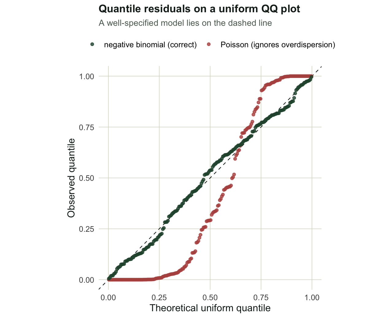
The Poisson curve has too many residuals near zero and one: a share of 0.59 of its residuals fall in the extreme five percent at either end, against about 0.10 for the negative binomial. Too much mass in the tails of the quantile residuals is the fingerprint of a variance that the model has set too small.
Signature two: a wrong mean that hides from the QQ plot
The second case is the dangerous one, because the global QQ plot can pass while the model is wrong. We generate a humped relationship and fit two negative binomial models: one with a linear term, which is misspecified, and one with the correct quadratic term.
set.seed(202); n <- 200; x2 <- runif(n, 0, 10)
y2 <- rnbinom(n, mu = exp(-0.2 + 1.2 * x2 - 0.12 * x2^2), size = 4)

mlin <- glm.nb(y2 ~ x2)
mqua <- glm.nb(y2 ~ x2 + I(x2^2))
ul <- sim_pit(mlin, seed = 22)
uq <- sim_pit(mqua, seed = 22)

cat("linear model PIT vs uniform, KS:", round(KS(ul)$statistic, 3), "\n")
linear model PIT vs uniform, KS: 0.049 cat("quadratic model PIT vs uniform, KS:", round(KS(uq)$statistic, 3), "\n")quadratic model PIT vs uniform, KS: 0.037 Both models look acceptable on the uniform QQ test: the misspecified linear model has a Kolmogorov-Smirnov distance of 0.05, close to the correct quadratic at 0.04. Averaged over the whole sample the residuals are uniform even though the mean is the wrong shape, because the model is too high in the middle of the gradient and too low at the ends in roughly equal measure. The misspecification only shows up when you plot the residuals against the predictor.
mid <- x2 > quantile(x2, .33) & x2 < quantile(x2, .66)
cat("linear: mean PIT in middle third =", round(mean(ul[mid]), 3),
    " at the ends =", round(mean(ul[!mid]), 3), "\n")
linear: mean PIT in middle third = 0.739 at the ends = 0.382 cat("quadratic: mean PIT in middle third =", round(mean(uq[mid]), 3), "\n")quadratic: mean PIT in middle third = 0.496 For the linear model the residuals average 0.74 across the middle of the gradient and 0.38 at the two ends: a clear arc away from the expected 0.5, because the straight line runs below the hump in the centre and above it at the edges. The quadratic model averages 0.50 in the middle, with no trend. The lesson is that the QQ plot checks the distribution overall, while the residual-versus-predictor plot checks the shape of the mean, and you need both.
f2 <- rbind(data.frame(x = x2, pit = ul, model = "linear term (mis-specified mean)"),
            data.frame(x = x2, pit = uq, model = "quadratic term (correct)"))
f2$model <- factor(f2$model, levels = c("linear term (mis-specified mean)",
                                        "quadratic term (correct)"))
ggplot(f2, aes(x, pit)) +
  geom_hline(yintercept = .5, colour = te_ink, linewidth = .4, linetype = "dashed") +
  geom_point(colour = te_sage, alpha = .55, size = 1.4) +
  geom_smooth(method = "loess", se = TRUE, colour = te_high, fill = te_sage,
              linewidth = 1, alpha = .25) +
  facet_wrap(~model) +
  labs(title = "The QQ plot can look fine while the mean is wrong",
       subtitle = "Residual vs predictor: a trend away from 0.5 signals mis-specified structure",
       x = "Environmental gradient", y = "Simulated quantile residual") + base_t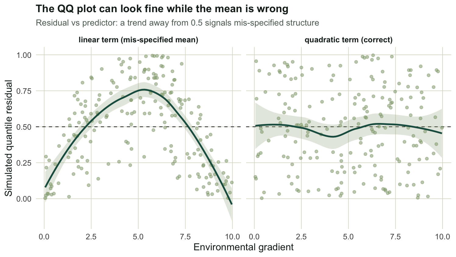
Signature three: zero-inflation
The third case is excess zeros. We build counts where a structural process forces 35 percent of sites to zero regardless of the gradient, then fit a plain negative binomial that has no zero-inflation component, and ask whether the diagnostic notices.
set.seed(303); n <- 250; x3 <- runif(n, 0, 2); lam <- exp(1.4 + 0.7 * x3)
struct0 <- rbinom(n, 1, 0.35)
y3 <- ifelse(struct0 == 1, 0, rnbinom(n, mu = lam, size = 6))

mzi <- glm.nb(y3 ~ x3)
set.seed(33); sim_zeros <- colSums(as.matrix(simulate(mzi, nsim = 1000)) == 0)

cat("observed zeros:", sum(y3 == 0), "(", round(100 * mean(y3 == 0)), "% )\n")
observed zeros: 87 ( 35 % )cat("fitted theta:", round(mzi$theta, 2), "\n")fitted theta: 0.56 cat("simulated zeros per dataset: mean", round(mean(sim_zeros), 1),
" max", max(sim_zeros), "\n")simulated zeros per dataset: mean 64.9 max 84 cat("observed exceeds every simulation:", sum(y3 == 0) > max(sim_zeros), "\n")observed exceeds every simulation: TRUE The negative binomial fits without complaint and reports a finite theta of 0.56. Nothing in the coefficient table flags a problem. But the model cannot generate the zeros it was asked to explain: across 1000 simulated datasets the fitted model produces about 65 zeros on average and never more than 84, while the data hold 87. The observed count is outside the entire simulated range, so the zero-inflation p-value is zero. This is exactly the test the DHARMa package performs with testZeroInflation, and it follows Warton’s argument that excess zeros are defined relative to a model, not in the abstract: a low mean already produces many zeros, so the right question is whether there are more zeros than this fitted model expects, not simply whether there are many.
obs0 <- sum(y3 == 0)
ggplot(data.frame(zeros = sim_zeros), aes(zeros)) +
  geom_histogram(binwidth = 2, fill = te_sage, colour = "white", alpha = .9) +
  geom_vline(xintercept = obs0, colour = te_red, linewidth = 1.2) +
  annotate("text", x = obs0, y = Inf, label = paste0("observed = ", obs0, "  "),
           colour = te_red, hjust = 1, vjust = 1.6, size = 3.7, fontface = "bold") +
  scale_x_continuous(expand = expansion(mult = c(.04, .04))) +
  labs(title = "Zero-inflation test: observed vs simulated zeros",
       subtitle = "Each bar is one simulated dataset; the fitted model never reaches the observed count",
       x = "Number of zeros per simulated dataset", y = "Simulated datasets") + base_t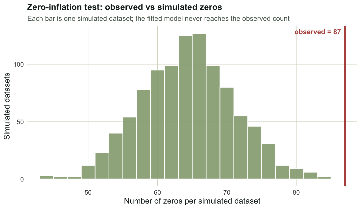
Once you see this, the zero-inflated count models post has a natural entry point: when the simulated zeros fall short of the observed count, that is the cue to reach for a zero-inflated or hurdle model rather than a plain GLM.
Use DHARMa in practice
Writing sim_pit by hand is a way to understand the diagnostic, not a recommendation to maintain your own copy. The DHARMa package by Florian Hartig does all of this and more, scaling the residuals to the zero-to-one range and providing ready-made tests and plots for overdispersion, zero-inflation, and residual spatial, temporal and phylogenetic autocorrelation. It works for ordinary and generalised linear models, including the negative binomial from MASS used here, and for mixed models from lme4 and glmmTMB, which makes it the natural diagnostic companion to the GLMM post.
Two cautions carry over to the package. The randomisation step adds noise, so at small sample sizes a single set of residuals can shift the picture; use a generous number of simulations and do not over-read one plot. And the Kolmogorov-Smirnov number is a global summary that can miss a localised problem, which is why the residual-versus-predictor plot earned its own section above. As Hartig puts it in the package documentation, the absence of a pattern does not prove the model is correct; it only means the checks you ran did not find a fault.
References
Dunn PK, Smyth GK 1996 Journal of Computational and Graphical Statistics 5(3):236-244 (10.1080/10618600.1996.10474708)
Warton DI 2005 Environmetrics 16(3):275-289 (10.1002/env.702)
Hartig F. DHARMa: residual diagnostics for hierarchical (multi-level / mixed) regression models. R package version 0.5.0 (CRAN)