library(ggplot2)

te_pal <- list(forest = "#275139", green = "#2f8f63", sage = "#93a87f",
               clay = "#b5534e", gold = "#cda23f", line = "#dad9ca",
               ink = "#16241d", paper = "#f5f4ee")

theme_te <- function() {
  theme_minimal(base_size = 12) +
    theme(panel.grid.minor = element_blank(),
          panel.grid.major = element_line(colour = "#e7e6dc"),
          plot.background = element_rect(fill = "#f5f4ee", colour = NA),
          panel.background = element_rect(fill = "#f5f4ee", colour = NA),
          plot.title = element_text(face = "bold", colour = te_pal$ink),
          axis.title = element_text(colour = "#2c3a31"))
}Seasonality and recurrent epidemics
R
epidemiology
disease ecology
population dynamics
ecology tutorial
ggplot2
An SIR model with host turnover in R: measure the intrinsic epidemic period, the seasonal forcing that turns annual cycles biennial, and stochastic fadeout.
An endemic pathogen does not sit still. Measles in a pre-vaccination city, whooping cough in a rural district, phocine distemper in a seal colony: the case records rise and fall on a schedule that looks almost mechanical, and the schedule is not the same everywhere. Some populations run a clean annual cycle. Some alternate a large year with a small one. Some lose the pathogen entirely for a while and get it back when a traveller brings it in.
The usual explanation is that transmission is seasonal, and that is part of it. It is not enough on its own, because a seasonally driven system does not have to follow the season. The host density and endemic disease tutorial built the SIR model with births and deaths and found the endemic equilibrium: a stable interior point at which the pathogen persists indefinitely. What that post did not ask is how the model gets there. The answer is that it spirals in, with a period set by the biology rather than by the calendar, and that spiral is the thing seasonality acts on.
This post measures three quantities in one model. First the intrinsic period of the damped oscillation, against two closed forms that are usually quoted without a check. Then the forcing amplitude at which the annual cycle gives way to a two year cycle, which turns out to be smaller than the eye would guess and much harder to locate than the standard recipe suggests. Then the population size below which demographic noise kills the pathogen in the trough between epidemics. Everything is integrated by hand with a fixed step Runge-Kutta scheme written in the post, and the integrator is verified by step halving before any result rests on it.
The model, and an integrator worth trusting
The state variables are the fractions of the host population that are susceptible, infectious and recovered. Hosts are born susceptible at per capita rate \(\mu\) and die at the same rate from every class, so the population size is constant and the susceptible pool is replenished. Infection is frequency dependent and recovery is at rate \(\gamma\):
\[\frac{dS}{dt} = \mu (1 - S) - \beta(t) S I, \qquad \frac{dI}{dt} = \beta(t) S I - (\gamma + \mu) I.\]
The recovered fraction is \(1 - S - I\) and never feeds back, so two equations are enough. The parameters below are measles-like: a basic reproduction number of 17, an infectious period of 13 days, and a host life expectancy of 50 years. Nothing in the argument depends on the pathogen being measles, but the numbers are recognisable and the literature has something to compare them against.
D_days <- 13
gamma_r <- 365 / D_days
mu <- 0.02
R0 <- 17
beta0 <- R0 * (gamma_r + mu)
gm <- gamma_r + mu
D <- 1 / gamma_r
A_age <- 1 / (mu * (R0 - 1))
S_eq <- 1 / R0
I_eq <- mu * (R0 - 1) / beta0
pc <- 1e5

print(round(c(R0 = R0, infectious_days = D_days, life_expectancy_years = 1 / mu,
              gamma_per_year = gamma_r, beta0_per_year = beta0,
              mean_age_at_infection_years = A_age), 4))
R0 infectious_days
17.0000 13.0000
life_expectancy_years gamma_per_year
50.0000 28.0769
beta0_per_year mean_age_at_infection_years
477.6477 3.1250 print(round(c(S_eq_percent = 100 * S_eq, I_eq_per_100k = I_eq * pc), 3)) S_eq_percent I_eq_per_100k
5.882 66.995 At equilibrium the susceptible fraction is exactly \(1/R_0\), which is 5.882 per cent of the population, and prevalence settles at 66.995 infectious hosts per hundred thousand. The mean age at first infection follows from the same algebra as \(1 / (\mu (R_0 - 1))\), which is 3.125 years. That is the quantity a serological survey measures, and it will reappear in the period formula.
The integrator is classical fourth order Runge-Kutta with a fixed step. Writing it out is three lines longer than calling a solver and it removes every question about what the solver did to the step size when the trajectory dived into a trough. The transmission rate is evaluated three times per step, at the start, the midpoint and the end, because \(\beta\) depends on time explicitly.
sir_step <- function(S, I, tt, h, amp) {
  b1 <- beta0 * (1 + amp * cos(2 * pi * tt))
  bm <- beta0 * (1 + amp * cos(2 * pi * (tt + 0.5 * h)))
  b2 <- beta0 * (1 + amp * cos(2 * pi * (tt + h)))
  n1 <- b1 * S * I;       aS <- mu * (1 - S) - n1;  aI <- n1 - gm * I
  Sb <- S + 0.5 * h * aS; Ib <- I + 0.5 * h * aI
  n2 <- bm * Sb * Ib;     bS <- mu * (1 - Sb) - n2; bI <- n2 - gm * Ib
  Sc <- S + 0.5 * h * bS; Ic <- I + 0.5 * h * bI
  n3 <- bm * Sc * Ic;     cS <- mu * (1 - Sc) - n3; cI <- n3 - gm * Ic
  Sd <- S + h * cS;       Id <- I + h * cI
  n4 <- b2 * Sd * Id;     dS <- mu * (1 - Sd) - n4; dI <- n4 - gm * Id
  list(S = S + (h / 6) * (aS + 2 * bS + 2 * cS + dS),
       I = I + (h / 6) * (aI + 2 * bI + 2 * cI + dI))
}

sir_run <- function(S0, I0, amp, burn, keep, spy) {
  h <- 1 / spy
  na <- length(amp)
  S <- rep(S0, length.out = na); I <- rep(I0, length.out = na); tt <- 0
  if (burn > 0) for (j in seq_len(burn * spy)) {
    z <- sir_step(S, I, tt, h, amp); S <- z$S; I <- z$I; tt <- tt + h
  }
  nk <- keep * spy
  Sm <- matrix(0, nk, na); Im <- matrix(0, nk, na); tv <- numeric(nk)
  for (j in seq_len(nk)) {
    z <- sir_step(S, I, tt, h, amp); S <- z$S; I <- z$I; tt <- tt + h
    Sm[j, ] <- S; Im[j, ] <- I; tv[j] <- tt
  }
  list(t = tv, S = Sm, I = Im)
}

spy_use <- 365
The state arguments to sir_step may be vectors, so the same code integrates one trajectory or a whole grid of them in parallel, which is what makes the amplitude sweep later in the post affordable in base R. The loop runs over time steps, not over parameter values.
A fourth order scheme should have global error falling by a factor of sixteen every time the step is halved. Measuring that ratio is the only way to know the step is small enough, so we run the same five years at 100, 200, 400 and 800 steps per year and compare each against a reference at 12800 steps per year.
endstate <- function(spy, amp, years) {
  z <- sir_run(S_eq, 2 * I_eq, amp, burn = years - 1, keep = 1, spy = spy)
  c(S = z$S[spy, 1], I = z$I[spy, 1])
}

steps_per_year <- c(100, 200, 400, 800)
conv <- do.call(rbind, lapply(c(0, 0.15), function(aa) {
  ref <- endstate(12800, aa, 5)
  er_S <- sapply(steps_per_year, function(s) abs(endstate(s, aa, 5)["S"] / ref["S"] - 1))
  er_I <- sapply(steps_per_year, function(s) abs(endstate(s, aa, 5)["I"] / ref["I"] - 1))
  data.frame(amplitude = aa, steps_per_year = steps_per_year,
             rel_err_S = er_S, rel_err_I = er_I,
             ratio_S = c(NA, er_S[-length(er_S)] / er_S[-1]),
             ratio_I = c(NA, er_I[-length(er_I)] / er_I[-1]))
}))
print(signif(conv, 4))
amplitude steps_per_year rel_err_S rel_err_I ratio_S ratio_I
1 0.00 100 3.032e-09 1.669e-08 NA NA
2 0.00 200 1.906e-10 1.018e-09 15.91 16.39
3 0.00 400 1.194e-11 6.292e-11 15.96 16.19
4 0.00 800 7.462e-13 3.953e-12 16.00 15.91
5 0.15 100 1.362e-08 2.992e-07 NA NA
6 0.15 200 8.782e-10 2.534e-08 15.51 11.81
7 0.15 400 5.630e-11 1.813e-09 15.60 13.98
8 0.15 800 4.225e-12 1.406e-10 13.33 12.89work_err <- sapply(c(0, 0.15), function(aa)
abs(endstate(spy_use, aa, 5)["I"] / endstate(12800, aa, 5)["I"] - 1))
print(c(reference_steps_per_year = 12800, steps_per_year_used = spy_use))reference_steps_per_year steps_per_year_used
12800 365 print(round(c(unforced_error_parts_per_billion = unname(1e9 * work_err[1]),
forced_error_parts_per_billion = unname(1e9 * work_err[2])), 5))unforced_error_parts_per_billion forced_error_parts_per_billion
0.09085 2.57632 Without seasonal forcing the ratios on the susceptible fraction are 15.91, 15.96 and 16.00, converging on the fourth order value of 16 and reaching it to two decimal places at the smallest step. With forcing at an amplitude of 0.15 the susceptible ratios are 15.51, 15.60 and 13.33, and the prevalence ratios are noisier still at 11.81, 13.98 and 12.89. That degradation is real and it is worth understanding rather than rounding away. A forced trajectory passes through a deep trough where prevalence falls by orders of magnitude and then regrows exponentially; a small timing error at the bottom of the trough is multiplied by the regrowth, so the relative error in prevalence is a harsher test than the error in the susceptible fraction, and at the finest steps it runs into the accuracy of the reference itself.
The working step is one day, 365 steps per year. At that step the five year endpoint is wrong by 0.09085 parts per billion without forcing and 2.576 parts per billion with it. Nothing in this post turns on a difference that small.
The intrinsic period of an endemic disease
Start the unforced model close to the endemic equilibrium, with prevalence at twice its equilibrium value, and watch it return. It does not return directly. Each epidemic depletes the susceptible pool below the level that sustains transmission, prevalence collapses, births refill the pool over several years, and the next epidemic fires. The result is a damped oscillation whose period is a property of the host and the pathogen together.
Peaks are located by finding local maxima of the discrete series and refining each one with a parabola through the three surrounding points, fitted on the logarithm of prevalence because the peaks are sharp. The period is the spacing between successive peaks and the damping time comes from a straight line through the logarithm of the peak heights above equilibrium.
free <- sir_run(S_eq, 2 * I_eq, 0, burn = 0, keep = 60, spy = spy_use)
tv <- free$t; Iv <- free$I[, 1]; nI <- length(Iv); hu <- 1 / spy_use

j <- which(Iv[2:(nI - 1)] > Iv[1:(nI - 2)] & Iv[2:(nI - 1)] > Iv[3:nI]) + 1
y1 <- log(Iv[j - 1]); y2 <- log(Iv[j]); y3 <- log(Iv[j + 1])
shift <- 0.5 * (y1 - y3) / (y1 - 2 * y2 + y3)
peak_t <- tv[j] + shift * hu
peak_l <- y2 - 0.25 * (y1 - y3) * shift
gaps <- diff(peak_t)

T_meas <- mean(tail(gaps, 10))
T_form1 <- 2 * pi / sqrt(mu * (R0 - 1) / D - (mu * R0 / 2)^2)
T_form2 <- 2 * pi * sqrt(A_age * D)
damp_fit <- lm(log(peak_l - log(I_eq)) ~ peak_t)

print(c(run_years = 60, peaks_found = length(j)))
run_years peaks_found
60 28 print(round(c(first_gap = gaps[1], second_gap = gaps[2], measured_period = T_meas,
closed_form_full = T_form1, closed_form_root_AD = T_form2), 5)) first_gap second_gap measured_period closed_form_full
2.11638 2.10724 2.09882 2.09957
closed_form_root_AD
2.09619 print(round(c(full_form_minus_measured_days = (T_form1 - T_meas) * 365,
measured_minus_root_AD_days = (T_meas - T_form2) * 365,
full_form_percent_error = 100 * (T_form1 / T_meas - 1),
root_AD_percent_error = 100 * (T_form2 / T_meas - 1)), 4))full_form_minus_measured_days measured_minus_root_AD_days
0.2739 0.9596
full_form_percent_error root_AD_percent_error
0.0358 -0.1253 print(round(c(damping_time_measured = -1 / coef(damp_fit)[2],
damping_time_predicted = 2 / (mu * R0),
first_peak_over_equilibrium = exp(peak_l[1] - log(I_eq)),
tenth_peak_over_equilibrium = exp(peak_l[10] - log(I_eq))), 4))damping_time_measured.peak_t damping_time_predicted
5.9119 5.8824
first_peak_over_equilibrium tenth_peak_over_equilibrium
1.6495 1.0221 The linearisation about the endemic equilibrium gives a complex pair of eigenvalues whose imaginary part fixes the period,
\[T = \frac{2\pi}{\sqrt{\dfrac{\mu (R_0 - 1)}{D} - \left(\dfrac{\mu R_0}{2}\right)^2}},\]
and the term that is subtracted inside the square root is small enough that the textbook shortcut \(T \approx 2\pi \sqrt{A D}\), with \(A\) the mean age at infection and \(D\) the infectious period, usually stands in for it. Both are worth checking against the trajectory.
The simulation produces 28 peaks in 60 years. The spacing between the last ten of them settles at 2.09882 years. The full closed form gives 2.09957 and the square root shortcut gives 2.09619, so one is high by 0.2739 of a day and the other is low by 0.9596 of a day, which is 0.0358 and -0.1253 per cent. Both formulae are better than any field data could distinguish, and the shortcut is the one to quote in a paper because it says what the period is made of: the geometric mean of a demographic timescale and an epidemiological one.
The first gap between peaks is 2.11638 years and the second 2.10724, both longer than the asymptotic value. The linearisation is only exact in the limit of small deviations, and the first epidemic in this run overshoots equilibrium prevalence by a factor of 1.6495. By the tenth peak the overshoot is down to 1.0221 and the spacing has converged. Anyone measuring a period from the first two epidemics after an introduction is measuring a slightly different number from the one the formula predicts.
The damping time comes out at 5.9119 years against a predicted \(2/(\mu R_0)\) of 5.8824. That is the reason a real population never shows this oscillation cleanly: the amplitude falls by a factor of e in under six years, so an undisturbed system reaches equilibrium within a couple of decades and stays there. Whatever keeps real epidemics recurring has to be putting energy back in.
show_t <- tv <= 26
traj <- data.frame(year = tv[show_t], prev = Iv[show_t] * pc)
pk_df <- data.frame(year = peak_t, prev = exp(peak_l) * pc)
pk_df <- pk_df[pk_df$year <= 26, ]
grid_df <- data.frame(year = peak_t[1] + (0:11) * T_form1)
grid_df <- grid_df[grid_df$year <= 26, , drop = FALSE]

ggplot(traj, aes(year, prev)) +
  geom_vline(data = grid_df, aes(xintercept = year), colour = te_pal$gold,
             linewidth = 0.5, linetype = "22") +
  geom_hline(yintercept = I_eq * pc, colour = te_pal$clay, linewidth = 0.6) +
  geom_line(colour = te_pal$forest, linewidth = 0.7) +
  geom_point(data = pk_df, colour = te_pal$green, size = 2) +
  scale_y_log10() +
  labs(x = "Year", y = "Infectious hosts per 100,000",
       title = "Damped oscillations settle onto the endemic equilibrium") +
  theme_te()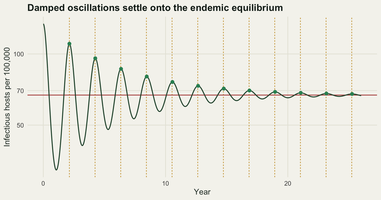
It is worth asking what a spectral method would have said about the same series, because a periodogram is the reflex tool for a question about periods and it is much less precise here than the peak spacing. The transform below is written out rather than called: sample prevalence monthly, take logarithms, remove the mean, and evaluate the squared modulus of the discrete Fourier sum on a fine grid of frequencies.
sel <- seq(1, nI, by = 30)
ts <- tv[sel]; xs <- log(Iv[sel]); xs <- xs - mean(xs)
fgrid <- seq(0.20, 1.20, length.out = 2001)
pgram <- as.numeric(abs(exp(-2i * pi * outer(fgrid, ts)) %*% xs)^2) / length(xs)
f_top <- fgrid[which.max(pgram)]
ray <- 1 / diff(range(ts))

print(round(c(samples = length(xs), record_years = diff(range(ts)),
              peak_frequency_per_year = f_top, period_from_periodogram = 1 / f_top,
              frequency_resolution = ray,
              period_band_width_years = 1 / (f_top - ray) - 1 / (f_top + ray)), 5))
samples record_years peak_frequency_per_year
730.00000 59.91781 0.47500
period_from_periodogram frequency_resolution period_band_width_years
2.10526 0.01669 0.14812 The dominant frequency is 0.475 per year, a period of 2.10526 years, which agrees with the peak spacing. The precision is another matter. With 730 monthly samples over 59.9 years the frequency resolution is 0.01669 per year, and one resolution element either side of the peak covers a band of periods 0.14812 years wide. The peak spacing measurement resolved the same quantity to within a day. A periodogram is the right tool when the signal is noisy and the period is unknown; when the peaks are as clean as these, counting them is better by a wide margin. The spectral analysis of population cycles tutorial works through what the resolution limit does to real ecological series.
Seasonal forcing, and how much prevalence it moves
Transmission is not constant through the year. For a directly transmitted childhood infection the dominant driver is the school term; for wildlife it is aggregation at water, breeding synchrony or a seasonal change in contact behaviour. The standard idealisation is a sinusoid,
\[\beta(t) = \beta_0 \left( 1 + a \cos(2 \pi t) \right),\]
with \(t\) in years and \(a\) the relative amplitude. An amplitude of 0.10 means transmission is 10 per cent above its mean in the middle of the season and 10 per cent below it half a year later. That is a modest perturbation, and the point of this section is that prevalence does not treat it as one.
The sweep below runs 61 amplitudes from 0 to 0.30 in parallel, discards a 600 year transient, and records 40 years. For each amplitude it takes the largest prevalence in each recorded year and counts how many distinct values those annual peaks take, with two peaks counted as distinct if they differ by more than 1 per cent.
amps <- round(seq(0, 0.30, by = 0.005), 4)
sweep <- sir_run(S_eq, I_eq, amps, burn = 600, keep = 40, spy = spy_use)

ann_peaks <- function(v) apply(matrix(v, nrow = spy_use), 2, max)
peaks <- sapply(seq_along(amps), function(k) ann_peaks(sweep$I[, k]))
n_levels <- function(v, tol = 0.01) {
  s <- sort(log(v)); sum(c(TRUE, diff(s) > tol))
}
nlev <- apply(peaks, 2, n_levels)
troughs <- apply(sweep$I, 2, min)

print(c(amplitudes_swept = length(amps), transient_years = 600,
        recorded_years = 40, distinctness_tolerance_percent = 1))
amplitudes_swept transient_years
61 600
recorded_years distinctness_tolerance_percent
40 1 show <- amps %in% c(0, 0.025, 0.05, 0.055, 0.06, 0.10, 0.15, 0.20,
0.205, 0.23, 0.25, 0.26, 0.265, 0.30)
print(data.frame(amplitude = amps[show], distinct_peaks = nlev[show],
big_peak_per_100k = signif(apply(peaks, 2, max)[show] * pc, 5),
small_peak_per_100k = signif(apply(peaks, 2, min)[show] * pc, 5),
trough_per_100k = signif(troughs[show] * pc, 4))) amplitude distinct_peaks big_peak_per_100k small_peak_per_100k
1 0.000 1 66.995 6.6995e+01
2 0.025 1 77.015 7.7015e+01
3 0.050 1 87.622 8.7622e+01
4 0.055 2 101.600 7.8883e+01
5 0.060 2 129.710 9.2823e+01
6 0.100 2 227.890 1.1417e+02
7 0.150 2 304.810 1.0142e+02
8 0.200 2 364.100 8.3676e+01
9 0.205 6 379.490 4.5082e+01
10 0.230 3 394.530 6.9931e+01
11 0.250 4 401.630 4.8801e+01
12 0.260 13 421.590 4.1799e+01
13 0.265 37 808.200 1.8490e-02
14 0.300 29 1613.300 1.7352e-05
trough_per_100k
1 6.699e+01
2 5.771e+01
3 4.926e+01
4 4.479e+01
5 3.692e+01
6 1.888e+01
7 1.124e+01
8 7.267e+00
9 3.514e+00
10 5.297e+00
11 3.064e+00
12 2.502e+00
13 2.849e-04
14 6.438e-07k5 <- which(amps == 0.05)
k10 <- which(amps == 0.10)
amp5 <- max(peaks[, k5]) / I_eq
print(round(c(forcing_amplitude = 0.05,
peak_over_equilibrium = amp5,
prevalence_increase_percent = 100 * (amp5 - 1),
transmission_increase_percent = 5,
amplification_ratio = 100 * (amp5 - 1) / 5), 4)) forcing_amplitude peak_over_equilibrium
0.0500 1.3079
prevalence_increase_percent transmission_increase_percent
30.7895 5.0000
amplification_ratio
6.1579 print(round(c(trough_over_equilibrium = min(sweep$I[, k5]) / I_eq,
peak_to_trough_ratio = max(peaks[, k5]) / min(sweep$I[, k5]),
at_0.10_peak_over_equilibrium = max(peaks[, k10]) / I_eq,
at_0.10_big_peak_per_100k = max(peaks[, k10]) * pc,
at_0.10_small_peak_per_100k = min(peaks[, k10]) * pc,
at_0.10_big_over_small = max(peaks[, k10]) / min(peaks[, k10])), 4)) trough_over_equilibrium peak_to_trough_ratio
0.7353 1.7788
at_0.10_peak_over_equilibrium at_0.10_big_peak_per_100k
3.4016 227.8892
at_0.10_small_peak_per_100k at_0.10_big_over_small
114.1693 1.9961 Take the amplitude of 0.05 first, where the system still runs a single annual cycle. Transmission varies by 5 per cent above and below its mean. Peak prevalence is 1.3079 times the unforced equilibrium, an increase of 30.7895 per cent, so the prevalence response is 6.1579 times the size of the driver that produced it. The trough falls to 0.7353 of equilibrium in the same year and the peak to trough ratio within the year is 1.7788. A 5 per cent wobble in contact rate has become a near doubling in prevalence.
The amplification comes from the free oscillation the first section measured, but not from ordinary resonance. Seasonal forcing has a period of exactly one year and the free oscillation has a period of 2.09882 years, so the forcing sits close to twice the natural frequency, which for an oscillator pushed from outside is where the response is smallest rather than largest. The forcing here is not a push from outside: \(\beta(t)\) multiplies the product of susceptibles and infectives rather than adding to it, and driving a parameter at twice the natural frequency is the condition under which a lightly damped oscillator responds far more than the driving amplitude. It is the same instability that splits the annual cycle in two further down this page, which is why the gain grows as the amplitude approaches that point. Damping is weak here because the damping time of 5.9119 years is several free periods long.
Push the amplitude to 0.10 and the response stops being a simple magnification. The annual peaks now alternate: 227.8892 infectious hosts per hundred thousand in one year and 114.1693 in the next, a ratio of 1.9961, with the larger peak 3.4016 times the unforced equilibrium. The forcing is still strictly annual. The epidemic is not.
last6 <- (nrow(sweep$I) - 6 * spy_use + 1):nrow(sweep$I)
reg_lab <- c("Forcing amplitude 0.05: annual", "Forcing amplitude 0.10: biennial")
cyc <- rbind(
  data.frame(year = sweep$t[last6] - min(sweep$t[last6]),
             prev = sweep$I[last6, k5] * pc, regime = reg_lab[1]),
  data.frame(year = sweep$t[last6] - min(sweep$t[last6]),
             prev = sweep$I[last6, k10] * pc, regime = reg_lab[2]))
cyc$regime <- factor(cyc$regime, levels = reg_lab)

ggplot(cyc, aes(year, prev)) +
  geom_hline(yintercept = I_eq * pc, colour = te_pal$clay, linewidth = 0.6) +
  geom_line(colour = te_pal$forest, linewidth = 0.7) +
  facet_wrap(~regime) +
  scale_y_log10() +
  labs(x = "Year of the recorded window", y = "Infectious hosts per 100,000",
       title = "The same annual driver gives two different epidemic rhythms") +
  theme_te() +
  theme(strip.text = element_text(colour = te_pal$ink, face = "bold"))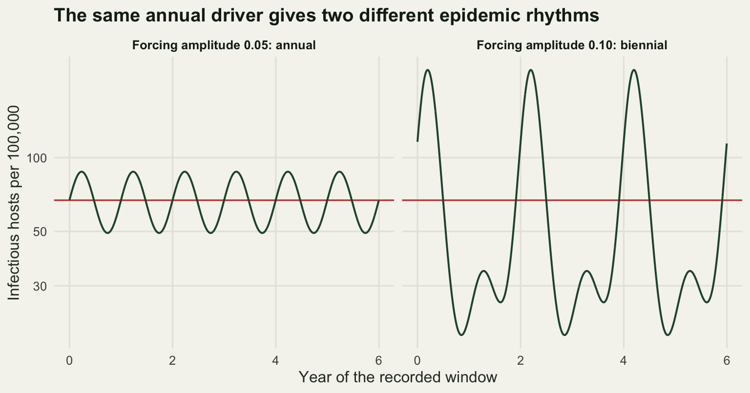
Where the annual cycle becomes biennial
Somewhere between 0.05 and 0.10 the annual attractor loses stability and is replaced by one of period two. The obvious way to find that amplitude is to refine the grid, run a long transient at each amplitude, and report the first grid point at which two distinct annual peaks survive. That is what the block below does, on a grid of 0.0005 with a thousand year transient.
fine <- round(seq(0.050, 0.060, by = 0.0005), 5)
fsw <- sir_run(S_eq, I_eq, fine, burn = 1000, keep = 12, spy = spy_use)
fpk <- sapply(seq_along(fine), function(k) ann_peaks(fsw$I[, k]))
fspread <- apply(fpk, 2, function(v) max(log(v)) - min(log(v)))
flev <- apply(fpk, 2, n_levels)

print(data.frame(amplitude = fine, distinct_peaks = flev,
                 log_spread = signif(fspread, 4),
                 big_per_100k = signif(apply(fpk, 2, max) * pc, 6),
                 small_per_100k = signif(apply(fpk, 2, min) * pc, 6)))
amplitude distinct_peaks log_spread big_per_100k small_per_100k
1 0.0500 1 5.053e-12 87.6224 87.6224
2 0.0505 1 8.435e-11 87.8394 87.8394
3 0.0510 1 1.429e-09 88.0566 88.0566
4 0.0515 1 2.351e-08 88.2740 88.2740
5 0.0520 1 3.760e-07 88.4915 88.4915
6 0.0525 1 5.849e-06 88.7095 88.7090
7 0.0530 1 8.830e-05 88.9310 88.9232
8 0.0535 1 1.282e-03 89.2023 89.0881
9 0.0540 2 1.694e-02 90.1225 88.6090
10 0.0545 2 1.256e-01 95.3164 84.0656
11 0.0550 2 2.565e-01 101.7650 78.7433
12 0.0555 2 2.997e-01 106.1470 78.6595
13 0.0560 2 3.031e-01 109.7400 81.0477
14 0.0565 2 3.067e-01 112.8950 83.0795
15 0.0570 2 3.104e-01 115.7580 84.8690
16 0.0575 2 3.142e-01 118.4070 86.4785
17 0.0580 2 3.182e-01 120.8930 87.9463
18 0.0585 2 3.222e-01 123.2450 89.2983
19 0.0590 2 3.263e-01 125.4890 90.5531
20 0.0595 2 3.304e-01 127.6390 91.7244
21 0.0600 2 3.346e-01 129.7080 92.8227k_tr <- which(flev >= 2)[1]
print(c(transient_years = 1000))transient_years
1000 print(round(c(grid_step = 0.0005, grid_transition_amplitude = fine[k_tr],
spread_one_step_below = fspread[k_tr - 1],
spread_at_transition = fspread[k_tr]), 6)) grid_step grid_transition_amplitude spread_one_step_below
0.000500 0.054000 0.001282
spread_at_transition
0.016936 That recipe returns 0.054, where the log spread between the largest and smallest annual peak is 0.016936. The trouble is visible in the same table: the difference between the two peak sizes does not appear from nothing at that point. One grid step below it the spread is already 0.001282, and it shrinks smoothly at every step further down rather than vanishing. Those small spreads are not attractors. They are transients that a thousand years has failed to remove, and the reported threshold is an artefact of how long the burn-in was.
The quantity that actually decides the question is the stability of the annual cycle, which is governed by the multiplier of the year to year map: the factor by which a small alternation between successive annual peaks is multiplied each year. Below the bifurcation the multiplier has magnitude less than one and the alternation dies; above it, the magnitude exceeds one and the alternation grows to a new attractor. Measuring it needs a short transient, not a long one, because the alternation has to still be visible.
mult_grid <- round(seq(0.045, 0.056, by = 0.0005), 5)
msw <- sir_run(S_eq, I_eq, mult_grid, burn = 150, keep = 24, spy = spy_use)
mult_tab <- do.call(rbind, lapply(seq_along(mult_grid), function(k) {
  alt <- abs(diff(log(ann_peaks(msw$I[, k]))))
  yr <- seq_along(alt)
  ff <- lm(log(alt) ~ yr)
  data.frame(amplitude = mult_grid[k], log_multiplier = unname(coef(ff)[2]),
             multiplier = exp(unname(coef(ff)[2])), r_squared = summary(ff)$r.squared)
}))
print(c(transient_years = 150, recorded_years = 24))
transient_years recorded_years
150 24 print(signif(mult_tab, 6)) amplitude log_multiplier multiplier r_squared
1 0.0450 -5.48312e-02 0.946645 1.000000
2 0.0455 -5.15418e-02 0.949764 1.000000
3 0.0460 -4.83093e-02 0.952839 1.000000
4 0.0465 -4.51294e-02 0.955874 1.000000
5 0.0470 -4.19984e-02 0.958871 1.000000
6 0.0475 -3.89127e-02 0.961835 1.000000
7 0.0480 -3.58693e-02 0.964766 1.000000
8 0.0485 -3.28656e-02 0.967669 1.000000
9 0.0490 -2.98991e-02 0.970543 1.000000
10 0.0495 -2.69675e-02 0.973393 1.000000
11 0.0500 -2.40690e-02 0.976218 1.000000
12 0.0505 -2.12021e-02 0.979021 1.000000
13 0.0510 -1.83655e-02 0.981802 1.000000
14 0.0515 -1.55592e-02 0.984561 1.000000
15 0.0520 -1.28052e-02 0.987276 1.000000
16 0.0525 -1.00585e-02 0.989992 1.000000
17 0.0530 -7.35603e-03 0.992671 0.999999
18 0.0535 -4.76704e-03 0.995244 0.999998
19 0.0540 -2.30223e-03 0.997700 0.999992
20 0.0545 -1.11863e-04 0.999888 0.999969
21 0.0550 1.62642e-03 1.001630 0.999878
22 0.0555 2.68616e-03 1.002690 0.999571
23 0.0560 5.48707e-05 1.000050 0.055501up <- which(mult_tab$log_multiplier > 0)[1]
lo <- mult_tab$log_multiplier[up - 1]; hi <- mult_tab$log_multiplier[up]
a_crit <- mult_tab$amplitude[up - 1] +
(mult_tab$amplitude[up] - mult_tab$amplitude[up - 1]) * (-lo) / (hi - lo)
m54 <- mult_tab$multiplier[mult_tab$amplitude == 0.054]
print(round(c(bracket_low = mult_tab$amplitude[up - 1],
bracket_high = mult_tab$amplitude[up],
critical_amplitude = a_crit,
multiplier_at_0.054 = m54,
decay_over_1000_years = m54^1000,
grid_answer_below_by_percent = 100 * (a_crit - 0.054) / a_crit), 6)) bracket_low bracket_high
0.054500 0.055000
critical_amplitude multiplier_at_0.054
0.054532 0.997700
decay_over_1000_years grid_answer_below_by_percent
0.100036 0.975894 The multiplier rises smoothly through the sweep and crosses one between amplitudes of 0.0545 and 0.055, at 0.054532 by linear interpolation. At the amplitude the grid recipe reported, 0.054, the multiplier is 0.9977, so an alternation shrinks to 0.100036 of its starting size over a thousand years. The burn-in removed nine tenths of a transient and the classification rule counted what was left. The two answers differ by 0.975894 per cent of the amplitude, which is small, but the lesson is not: a period doubling located by looking at a finite record is always located slightly early, and the only fix is to measure the stability rather than the state. The bottom row of the multiplier table shows the other side of the same problem. At 0.056 the alternation reaches its attractor inside the recorded window, the straight line stops fitting, the r squared collapses, and the multiplier estimated there means nothing.
Now the peak sizes on either side. Close to the bifurcation the approach to the attractor is slow, so quoting values from immediately beside it would report transients again; the amplitudes below use a margin.
kb <- which(amps == 0.05); ka <- which(amps == 0.06)
print(round(c(below_amplitude = amps[kb],
              below_annual_peak_per_100k = max(peaks[, kb]) * pc,
              below_peak_spread_log = diff(range(log(peaks[, kb]))),
              above_amplitude = amps[ka],
              amplitude_step_between_them = amps[ka] - amps[kb],
              above_big_peak_per_100k = max(peaks[, ka]) * pc,
              above_small_peak_per_100k = min(peaks[, ka]) * pc,
              above_big_over_small = max(peaks[, ka]) / min(peaks[, ka])), 5))
below_amplitude below_annual_peak_per_100k
0.05000 87.62242
below_peak_spread_log above_amplitude
0.00000 0.06000
amplitude_step_between_them above_big_peak_per_100k
0.01000 129.70768
above_small_peak_per_100k above_big_over_small
92.82269 1.39737 Below the transition, at an amplitude of 0.05, every year peaks at 87.622 infectious hosts per hundred thousand and the spread across the 40 recorded years is 0 in log units. Above it, at 0.06, the peaks alternate between 129.70768 and 92.82269 per hundred thousand, a ratio of 1.39737. A change of 0.01 in the forcing amplitude has produced a qualitatively different disease history: one that a surveillance record would describe as a two year cycle rather than an annual one.
The sweep table shows what happens beyond that. The two year cycle persists to about 0.20, then the period doubling cascade continues in windows: six distinct annual peaks at an amplitude of 0.205, three at 0.23, four at 0.25, and beyond 0.26 the annual peaks rarely repeat, with 37 distinct values in 40 years at an amplitude of 0.265 and 29 at 0.30. This is the regime Earn and colleagues mapped for measles, where a slow change in the mean transmission rate or in the birth rate moves a population between annual, biennial and irregular epidemics without anything else changing.
bif <- data.frame(amplitude = rep(amps, each = nrow(peaks)),
                  peak = as.vector(peaks) * pc)

ggplot(bif, aes(amplitude, peak)) +
  geom_vline(xintercept = a_crit, colour = te_pal$clay,
             linewidth = 0.6, linetype = "22") +
  geom_point(colour = te_pal$forest, size = 0.7, alpha = 0.5) +
  scale_y_log10() +
  coord_cartesian(ylim = c(20, 2200)) +
  labs(x = "Seasonal forcing amplitude a", y = "Annual peak, infectious per 100,000",
       title = "One annual peak becomes two, and then many") +
  theme_te()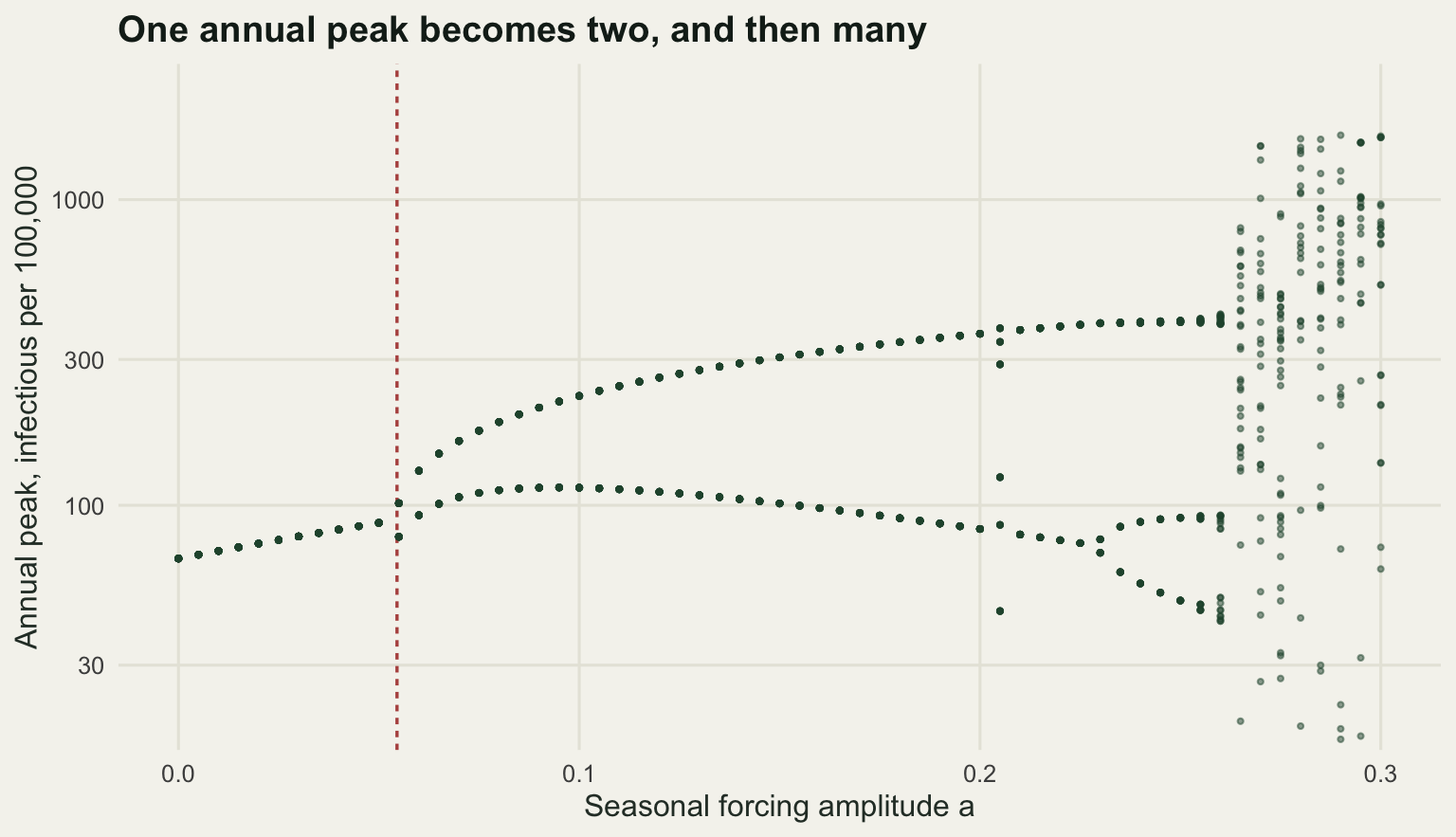
Stochastic fadeout and the critical community size
Every result so far comes from a differential equation, in which prevalence is a real number and can be as small as it likes without ever reaching zero. Real hosts are counted in integers. In the trough between epidemics a small population may hold only a handful of infectious individuals, and a handful is a quantity that demographic accident can take to zero.
The stochastic version replaces the flows with counts. Over a step of one day, the number of new infections is Poisson with mean \(\beta(t) S I \tau / N\), recoveries are Poisson with mean \(\gamma I \tau\), births and deaths are Poisson with the corresponding demographic means, and every draw is capped at the number of individuals available to make that transition. This is fixed step tau leaping, and it is accurate enough at a one day step because the largest per capita rate in the model multiplied by \(\tau\) is 0.07692. Once prevalence hits zero the infection rate is zero and the state is absorbing, which is the whole point: there is no importation in this model.
amp_st <- 0.15
k15 <- which(amps == 0.15)
det_I <- sweep$I[, k15]; det_S <- sweep$S[, k15]
yr_max <- sapply(0:39, function(q) max(det_I[(q * spy_use + 1):((q + 1) * spy_use)]))
q0 <- which.max(yr_max)
S_start <- det_S[(q0 - 1) * spy_use + 1]; I_start <- det_I[(q0 - 1) * spy_use + 1]
det_trough <- min(det_I)

tau_leap <- function(Nv, amp, years, S0f, I0f, tau) {
  n <- length(Nv)
  S <- round(S0f * Nv); I <- round(I0f * Nv); Rc <- Nv - S - I
  ext <- rep(NA_real_, n); tt <- 0
  for (j in seq_len(round(years / tau))) {
    bt <- beta0 * (1 + amp * cos(2 * pi * tt))
    n_inf <- pmin(rpois(n, bt * S * I / Nv * tau), S)
    d_S <- pmin(rpois(n, mu * S * tau), S - n_inf)
    n_rec <- pmin(rpois(n, gamma_r * I * tau), I)
    d_I <- pmin(rpois(n, mu * I * tau), I - n_rec)
    d_R <- pmin(rpois(n, mu * Rc * tau), Rc)
    S <- S - n_inf - d_S + rpois(n, mu * Nv * tau)
    I <- I + n_inf - n_rec - d_I
    Rc <- Rc + n_rec - d_R
    tt <- tt + tau
    gone <- is.na(ext) & I == 0
    if (any(gone)) ext[gone] <- tt
  }
  ext
}

set.seed(20260718)
Nsizes <- c(5e4, 1e5, 2e5, 3e5, 5e5, 7e5, 1e6, 1.5e6, 2e6, 3e6)
n_rep <- 100
years_st <- 10
Ngrid <- rep(Nsizes, each = n_rep)
extt <- tau_leap(Ngrid, amp_st, years_st, S_start, I_start, 1 / 365)
p_ext <- as.numeric(tapply(!is.na(extt), Ngrid, mean))
med_t <- as.numeric(tapply(extt, Ngrid, function(z) median(z, na.rm = TRUE)))

print(round(c(forcing_amplitude = amp_st, replicates_per_size = n_rep,
              years_followed = years_st, step_days = 1,
              largest_rate_times_step = gamma_r / 365,
              deterministic_trough_per_100k = det_trough * pc), 5))
forcing_amplitude replicates_per_size
0.15000 100.00000
years_followed step_days
10.00000 1.00000
largest_rate_times_step deterministic_trough_per_100k
0.07692 11.24331 print(data.frame(N = Nsizes, p_fadeout = p_ext,
median_fadeout_year = round(med_t, 2),
deterministic_trough_infected = round(det_trough * Nsizes, 1))) N p_fadeout median_fadeout_year deterministic_trough_infected
1 50000 1.00 0.87 5.6
2 100000 0.99 1.50 11.2
3 200000 0.92 3.72 22.5
4 300000 0.80 3.52 33.7
5 500000 0.53 3.79 56.2
6 700000 0.43 6.07 78.7
7 1000000 0.19 6.38 112.4
8 1500000 0.06 4.67 168.6
9 2000000 0.00 NA 224.9
10 3000000 0.00 NA 337.3k_ccs <- which(p_ext < 0.5)[1]
N_ccs <- Nsizes[k_ccs]
print(round(c(critical_community_size = N_ccs, p_at_that_size = p_ext[k_ccs],
p_one_size_smaller = p_ext[k_ccs - 1],
trough_infected_at_that_size = det_trough * N_ccs), 4)) critical_community_size p_at_that_size
700000.0000 0.4300
p_one_size_smaller trough_infected_at_that_size
0.5300 78.7032 At a forcing amplitude of 0.15 the deterministic trough sits at 11.2433 infectious hosts per hundred thousand. Scale that by population size and the mechanism is in front of you. In a population of 50000 the trough holds 5.6 individuals and the pathogen is gone within ten years in every one of the 100 replicates, at a median of 0.87 years. At 200000 the trough holds 22.5 and fadeout still happens in 0.92 of replicates. The probability passes one half near 500000, where it is 0.53, and is below it by 700000, where it is 0.43; with 100 replicates a value that close to one half can land either side of it, so which grid step the crossing falls on is not firm. At 2000000 hosts and above fadeout all but disappears: at most two of the 100 replicates over ten years.
The critical community size on this grid is therefore 700000, and the deterministic trough at that size holds 78.7032 infectious individuals. That sounds like plenty until you notice that they are spread over a season in which the effective reproduction number is at or below one, so the chain of transmission is a branching process near criticality with a few dozen lineages and several months to run before the susceptible pool refills. That is the mechanism, and it is why the answer scales with the trough rather than with the mean.
Bartlett’s original estimate from English and Welsh measles notifications was around a quarter of a million, smaller than what this model produces. The difference is a modelling choice, not a disagreement about data: an SIR model with no latent period has shallower troughs than a real childhood infection, whose extra exposed class lengthens the generation interval and drives prevalence further down between epidemics. The SEIR model and the latent period tutorial measures that effect directly.
fade <- data.frame(N = Nsizes, p = p_ext)

ggplot(fade, aes(N, p)) +
  geom_hline(yintercept = 0.5, colour = te_pal$line, linewidth = 0.9) +
  geom_vline(xintercept = N_ccs, colour = te_pal$clay,
             linewidth = 0.6, linetype = "22") +
  geom_line(colour = te_pal$forest, linewidth = 0.8) +
  geom_point(colour = te_pal$green, size = 2.4) +
  scale_x_log10(breaks = c(5e4, 1e5, 3e5, 1e6, 3e6),
                labels = c("50k", "100k", "300k", "1M", "3M")) +
  labs(x = "Host population size", y = "Probability of fadeout within ten years",
       title = "Fadeout probability falls as the host population grows") +
  theme_te()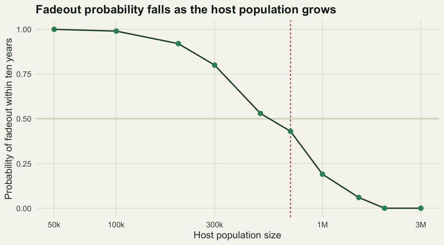
What the deterministic model cannot do
The honest limit of this whole exercise is measurable, and it sits in the trough. A differential equation for prevalence has no smallest positive value. It can hold a millionth of an infected host through a trough and hand it back on the other side, and nothing in the mathematics objects.
a_max <- max(amps)
kmax <- which(amps == a_max)
tr_max <- min(sweep$I[, kmax])

print(round(c(largest_amplitude = a_max), 3))
largest_amplitude
0.3 print(signif(c(trough_prevalence = tr_max,
infected_hosts_at_that_trough = tr_max * N_ccs,
population_for_one_infected_host = 1 / tr_max,
trough_at_amplitude_0.15_per_100k = det_trough * pc,
trough_at_amplitude_0.30_per_100k = tr_max * pc,
ratio_of_the_two_troughs = det_trough / tr_max), 5)) trough_prevalence infected_hosts_at_that_trough
6.4384e-12 4.5069e-06
population_for_one_infected_host trough_at_amplitude_0.15_per_100k
1.5532e+11 1.1243e+01
trough_at_amplitude_0.30_per_100k ratio_of_the_two_troughs
6.4384e-07 1.7463e+07 At the largest forcing amplitude in the sweep, 0.3, the deepest trough over the recorded 40 years is a prevalence of 6.4384e-12. In the population of 700000 where the stochastic model put the critical community size, that is 4.5069e-06 infected hosts. Not a count of hosts, and not a fraction of one that you might round up: about 4.5 millionths of a single individual. To hold one infectious host at that trough the population would have to number 1.5532e+11, which is more than an order of magnitude beyond every human being alive.
The comparison with the other amplitude is the sharpest way to see it. Doubling the forcing from 0.15 to 0.3 takes the trough from 11.243 infectious hosts per hundred thousand, a perfectly sensible number, to 6.4384e-07 per hundred thousand, a fall by a factor of 1.7463e+07, and the second of those is not a number about hosts at all. The model does not warn you when it crosses that line. It returns a smooth trajectory with a plausible looking peak, and the peak is real, and the trough that produced it is fiction. Every deterministic result in the sections above about the biennial and higher order regimes carries this caveat: the attractor exists, and no finite population would ever ride it, because the pathogen would be gone.
There is a second limit that the stochastic model does not repair. Its answer, a critical community size of 700000, is conditional on a closed population. Real host populations are not closed. A city below the critical size loses the pathogen and gets it back from a larger neighbour, so what a surveillance record shows is not persistence or extinction but the interplay between local fadeout and the rate of reintroduction, and neither the deterministic model nor the single population stochastic one contains that rate. The critical community size is the point at which a population stops needing its neighbours, not the point at which it starts having an epidemic history.
Finally, the seasonal forcing here is a cosine with one parameter. Real seasonality in transmission is a term time pattern for a school infection, a birth pulse for many wild mammals, or a rainfall driven vector abundance, and those shapes have harmonics that a sinusoid does not. The location of the period doubling depends on the shape of the forcing as well as its amplitude, so the value of 0.054532 measured above belongs to this model and not to a field system.
Where to go next
The obvious next question is what the model does to the transitions when a latent period is added, because the generation interval is what sets both the intrinsic period and the depth of the trough. The SEIR tutorial in this cluster measures both. The other direction is inference rather than simulation: given an incidence series with these dynamics in it, what can actually be estimated, and what does a seasonal signal do to an estimate of \(R_0\) that assumes constant transmission.
References
Earn DJD, Rohani P, Bolker BM, Grenfell BT 2000 Science 287(5453):667-670 (10.1126/science.287.5453.667)
Bartlett MS 1957 Journal of the Royal Statistical Society Series A 120(1):48-70 (10.2307/2342553)
Keeling MJ, Rohani P 2008 Modeling Infectious Diseases in Humans and Animals. Princeton University Press, ISBN 978-0-691-11617-4
Altizer S, Dobson A, Hosseini P, Hudson P, Pascual M, Rohani P 2006 Ecology Letters 9(4):467-484 (10.1111/j.1461-0248.2005.00879.x)
Grenfell BT, Bjornstad ON, Kappey J 2001 Nature 414(6865):716-723 (10.1038/414716a)