library(ggplot2)
library(grid)

te_pal <- list(forest = "#275139", green = "#2f8f63", sage = "#93a87f",
               clay = "#b5534e", gold = "#cda23f", line = "#dad9ca",
               ink = "#16241d", paper = "#f5f4ee")

theme_te <- function() {
  theme_minimal(base_size = 12) +
    theme(panel.grid.minor = element_blank(),
          panel.grid.major = element_line(colour = "#e7e6dc"),
          plot.background = element_rect(fill = "#f5f4ee", colour = NA),
          panel.background = element_rect(fill = "#f5f4ee", colour = NA),
          plot.title = element_text(face = "bold", colour = te_pal$ink),
          axis.title = element_text(colour = "#2c3a31"))
}

two_panel <- function(pa, pb) {
  grid.newpage()
  pushViewport(viewport(layout = grid.layout(1, 2)))
  print(pa, vp = viewport(layout.pos.row = 1, layout.pos.col = 1))
  print(pb, vp = viewport(layout.pos.row = 1, layout.pos.col = 2))
}Checking an epidemic estimate
R
epidemiology
disease ecology
model diagnostics
ecology tutorial
ggplot2
Four checks for an epidemic reproduction number in R: reporting delay, under-reporting, weekly aggregation and an assumption sweep priced against the interval.
Three posts in this cluster end with a number that someone acts on. The SEIR model and the latent period turns contact rates and waiting times into an epidemic curve. Estimating R0 from incidence data turns the early part of such a curve back into a reproduction number. Seasonality and recurrent epidemics asks what forcing does to the timing of the next outbreak. All three take the case counts as given: a case is a case, it happened on the day it is recorded, and the counts are a fixed fraction of the infections.
None of that is true of a surveillance system. Cases arrive days after onset, so the most recent part of the curve is a stub that will grow. Only a fraction of infections are ever seen, and that fraction moves when testing policy moves. Counts arrive weekly in many systems, not daily. The generation interval and the delay distribution used in the estimator are assumptions, not measurements from the outbreak in front of you.
This post is the observation-process sibling of Checking an epidemic model. That post attacks the transmission assumptions: mixing, immunity, the shape of the infectious period. This one attacks the data. Four checks, each a self-contained measurement against a known truth: corrupt the observation process in one controlled way, run the estimator, and see how far the answer moves.
Every threshold used below is measured in the same simulator rather than quoted. The simulator is a stochastic renewal process with a fixed reproduction number and a fixed generation interval, run in a closed population so that susceptible depletion is included and the true reproduction number is known on every day. The estimator under test is the renewal-equation estimator of Cori and colleagues: incidence over a trailing window divided by the total infectiousness those days inherit from earlier cases, with a gamma prior that also supplies the interval.
The epidemic under test, and the estimator
Incidence on day \(t\) is Poisson with mean \(R_t \sum_s w_s I_{t-s}\), where \(w\) is the generation interval distribution discretised to days and \(R_t\) is the reproduction number after susceptible depletion. The estimator inverts that: over a trailing window it takes the posterior mean of \(R\) under a gamma prior, which is the sum of cases in the window divided by the sum of the total infectiousness \(\Lambda_t = \sum_s w_s I_{t-s}\), with the prior’s shape and rate added on. The truth against which every check is scored is the infectiousness-weighted mean of \(R_t\) over the same window, so the estimator and the target refer to the same days.
gi_weights <- function(mu, cv, smax = 20) {
  shape <- 1 / cv^2
  rate <- shape / mu
  s <- seq_len(smax)
  w <- pgamma(s + 0.5, shape, rate) - pgamma(pmax(s - 0.5, 0), shape, rate)
  w / sum(w)
}

delay_probs <- function(mu, cv, dmax = 25) {
  shape <- 1 / cv^2
  rate <- shape / mu
  d <- 0:dmax
  p <- pgamma(d + 0.5, shape, rate) - pgamma(pmax(d - 0.5, 0), shape, rate)
  p / sum(p)
}

sim_renewal <- function(rpath, w, npop, seed_cases, ndays) {
  inc <- numeric(ndays); sus <- numeric(ndays); reff <- numeric(ndays)
  nseed <- length(seed_cases)
  inc[seq_len(nseed)] <- seed_cases
  left <- npop - sum(seed_cases)
  smax <- length(w)
  for (t in seq_len(ndays)) {
    sus[t] <- left
    reff[t] <- rpath[t] * left / npop
    if (t <= nseed) next
    ss <- seq_len(min(smax, t - 1))
    lam <- sum(w[ss] * inc[t - ss]) * reff[t]
    inc[t] <- min(rpois(1, lam), left)
    left <- left - inc[t]
  }
  data.frame(day = seq_len(ndays), inc = inc, sus = sus, rt = reff)
}

lam_series <- function(inc, w) {
  smax <- length(w)
  sapply(seq_along(inc), function(t) {
    if (t == 1) return(0)
    ss <- seq_len(min(smax, t - 1))
    sum(w[ss] * inc[t - ss])
  })
}

cori <- function(inc, w, t_end, tau = 7, aa = 1, bb = 5) {
  lam <- lam_series(inc, w)
  idx <- seq(t_end - tau + 1, t_end)
  sh <- aa + sum(inc[idx])
  rt <- 1 / bb + sum(lam[idx])
  c(mean = sh / rt, lo = qgamma(0.025, sh, rt), hi = qgamma(0.975, sh, rt))
}

true_R <- function(dd, w, t_end, tau = 7) {
  lam <- lam_series(dd$inc, w)
  idx <- seq(t_end - tau + 1, t_end)
  sum(dd$rt[idx] * lam[idx]) / sum(lam[idx])
}set.seed(20260719)
r0_true <- 2.2
gi_mu <- 6.5; gi_cv <- 0.46
w_true <- gi_weights(gi_mu, gi_cv)
npop <- 1e6
ndays <- 50
epi <- sim_renewal(rep(r0_true, ndays), w_true, npop, rep(5, 5), ndays)
print(c(population = npop))population
1e+06 print(round(c(R0 = r0_true, gi_mean = gi_mu, gi_sd = gi_mu * gi_cv, gi_cv = gi_cv,
days = ndays, seed_cases_per_day = 5, interval_percent = 95), 4)) R0 gi_mean gi_sd gi_cv
2.20 6.50 2.99 0.46
days seed_cases_per_day interval_percent
50.00 5.00 95.00 print(round(c(final_day_cases = epi$inc[ndays], cumulative_cases = sum(epi$inc),
attack_percent = 100 * sum(epi$inc) / npop,
true_R_final = true_R(epi, w_true, ndays)), 4)) final_day_cases cumulative_cases attack_percent true_R_final
1285.0000 10770.0000 1.0770 2.1844 print(round(cori(epi$inc, w_true, ndays), 4)) mean lo hi
2.1509 2.0986 2.2039 A closed population of one million, a reproduction number of 2.2, and a generation interval with a mean of 6.5 days and a standard deviation of 2.99, which is the kind of shape an acute respiratory infection has. Fifty days from a seed of five cases a day for five days leaves 10770 infections, 1.077 per cent of the population, so depletion has pulled the true reproduction number in the final week down to 2.1844. Fed the complete daily onset curve, the estimator returns 2.1509 with a 95 per cent interval from 2.0986 to 2.2039. That interval is narrow, it covers the truth, and everything below is about what happens to it when the data stop being perfect.
Check 1: reporting delay and right truncation
A case is counted when the report lands, not when the person fell ill. Plot the curve by onset date and the last few days are a cliff, because most of those cases are still in the post. The delay here is gamma with a mean of 3 days and a standard deviation of 2.1, applied case by case with a multinomial draw, and the analysis is run on day 50 with everything that has arrived by then.
set.seed(4407)
del_mu <- 3.0; del_cv <- 0.7
p_del <- delay_probs(del_mu, del_cv)
cum_del <- cumsum(p_del)

report_by <- function(inc, p_del, vintage = length(inc)) {
  mat <- matrix(0, nrow = length(inc), ncol = length(p_del))
  for (t in seq_along(inc)) {
    if (inc[t] > 0) mat[t, ] <- as.vector(rmultinom(1, inc[t], p_del))
  }
  sapply(seq_along(inc), function(t)
    sum(mat[t, seq_len(min(ncol(mat), vintage - t + 1))]))
}

obs_trunc <- report_by(epi$inc, p_del)
frac_rep <- sapply(seq_len(ndays), function(t) cum_del[min(length(cum_del), ndays - t + 1)])
now_cast <- obs_trunc / frac_rep

last5 <- (ndays - 4):ndays
print(round(rbind(day = last5, true_cases = epi$inc[last5],
                  reported_by_day_50 = obs_trunc[last5],
                  apparent_drop_percent = 100 * (1 - obs_trunc[last5] / epi$inc[last5]),
                  expected_reported_percent = 100 * frac_rep[last5]), 2))
[,1] [,2] [,3] [,4] [,5]
day 46.00 47.00 48.00 49.00 50.00
true_cases 788.00 867.00 1067.00 1146.00 1285.00
reported_by_day_50 635.00 578.00 527.00 284.00 50.00
apparent_drop_percent 19.42 33.33 50.61 75.22 96.11
expected_reported_percent 80.19 67.67 49.43 26.05 4.26tr <- true_R(epi, w_true, ndays)
e_full <- as.numeric(cori(epi$inc, w_true, ndays)["mean"])
e_trunc <- as.numeric(cori(obs_trunc, w_true, ndays)["mean"])
e_now <- as.numeric(cori(now_cast, w_true, ndays)["mean"])
print(round(c(true_R = tr, complete_data = e_full, truncated = e_trunc, nowcast = e_now,
truncated_shortfall_percent = 100 * (1 - e_trunc / tr),
nowcast_shortfall_percent = 100 * (1 - e_now / tr),
complete_shortfall_percent = 100 * (1 - e_full / tr)), 3)) true_R complete_data
2.184 2.151
truncated nowcast
1.155 2.090
truncated_shortfall_percent nowcast_shortfall_percent
47.115 4.333
complete_shortfall_percent
1.535 On day 50 the reporting system holds 50 of the 1285 cases that actually had onset that day, an apparent drop of 96.11 per cent. The four days before it are down by 75.22, 50.61, 33.33 and 19.42 per cent. Those figures track the cumulative delay distribution closely, as they should: 4.26 per cent of a day’s cases are expected to have been reported on the day itself, 26.05 per cent by the next day, then 49.43, 67.67 and 80.19 per cent.
Feed that curve to the estimator and the reproduction number on the final day comes back as 1.155 against a truth of 2.184, a shortfall of 47.115 per cent. The epidemic is growing at a rate that would double cases in five days, and the surveillance data say it is barely growing at all. Nothing in the estimator is wrong. The numerator is missing most of its recent cases while the denominator, built from days further back, is nearly complete.
The standard correction is a nowcast: divide the count for onset day \(t\) by the probability that a case with that onset date has been reported by now. Here the delay distribution is known exactly, which is the most generous possible case, and the corrected estimate is 2.090, a residual gap of 4.333 per cent. The remaining gap is not bias in the correction. It is noise, and the next block separates the two.
n_del_rep <- 30
set.seed(881)
disc <- 0:14
bias_tab <- sapply(seq_len(n_del_rep), function(i) {
  ob <- report_by(epi$inc, p_del)
  sapply(disc, function(d) {
    te <- ndays - d
    100 * (1 - as.numeric(cori(ob, w_true, te)["mean"]) / true_R(epi, w_true, te))
  })
})
mean_bias <- rowMeans(bias_tab)
names(mean_bias) <- disc
print(round(mean_bias, 3))
0 1 2 3 4 5 6 7 8 9 10
46.588 32.100 20.693 13.053 7.625 4.852 3.219 1.553 1.597 1.451 1.732
11 12 13 14
0.878 1.054 0.090 -2.935 first_ok <- disc[which(abs(mean_bias) < 5)[1]]
print(round(c(replicates = n_del_rep, delay_mean = del_mu, delay_sd = del_mu * del_cv,
days_discarded = first_ok,
shortfall_there = mean_bias[as.character(first_ok)],
shortfall_one_before = mean_bias[as.character(first_ok - 1)]), 3)) replicates delay_mean delay_sd
30.000 3.000 2.100
days_discarded shortfall_there.5 shortfall_one_before.4
5.000 4.852 7.625 set.seed(1512)
nc_reps <- sapply(seq_len(n_del_rep), function(i) {
nc <- report_by(epi$inc, p_del) / frac_rep
c(now = as.numeric(cori(nc, w_true, ndays)["mean"]),
now_drop2 = as.numeric(cori(nc[seq_len(ndays - 2)], w_true, ndays - 2)["mean"]))
})
print(round(c(replicates = n_del_rep,
nowcast_mean = mean(nc_reps[1, ]), nowcast_sd = sd(nc_reps[1, ]),
nowcast_shortfall_percent = 100 * (1 - mean(nc_reps[1, ]) / tr),
model_interval_width = as.numeric(diff(cori(epi$inc, w_true, ndays)[2:3])),
drop2_excess_percent = 100 * (mean(nc_reps[2, ]) /
true_R(epi, w_true, ndays - 2) - 1),
drop2_sd = sd(nc_reps[2, ])), 4)) replicates nowcast_mean nowcast_sd
30.0000 2.1557 0.0642
nowcast_shortfall_percent model_interval_width drop2_excess_percent
1.3143 0.1053 0.0197
drop2_sd
0.0260 days_show <- (ndays - 24):ndays
ser_lev <- c("True onsets", "Reported", "Nowcast")
d1 <- rbind(
data.frame(day = days_show, value = epi$inc[days_show], series = ser_lev[1]),
data.frame(day = days_show, value = obs_trunc[days_show], series = ser_lev[2]),
data.frame(day = days_show, value = now_cast[days_show], series = ser_lev[3]))
d1$series <- factor(d1$series, levels = ser_lev)
pa <- ggplot(d1, aes(day, value, colour = series)) +
geom_line(linewidth = 0.8) + geom_point(size = 1.3) +
scale_colour_manual(values = c(te_pal$ink, te_pal$clay, te_pal$gold), name = NULL) +
guides(colour = guide_legend(nrow = 1)) +
labs(x = "Day of onset", y = "Cases", title = "The tail that has not arrived yet") +
theme_te() +
theme(legend.position = "top", legend.text = element_text(size = 9),
plot.title = element_text(face = "bold", size = 11, colour = te_pal$ink))
pb <- ggplot(data.frame(discard = disc, bias = mean_bias), aes(discard, bias)) +
geom_hline(yintercept = 5, colour = te_pal$clay, linetype = "22") +
geom_hline(yintercept = 0, colour = te_pal$line) +
geom_line(colour = te_pal$forest, linewidth = 0.8) +
geom_point(colour = te_pal$forest, size = 1.8) +
labs(x = "Days of tail discarded", y = "Shortfall in R, per cent",
title = "What discarding the tail buys") +
theme_te() +
theme(plot.title = element_text(face = "bold", size = 11, colour = te_pal$ink))
two_panel(pa, pb)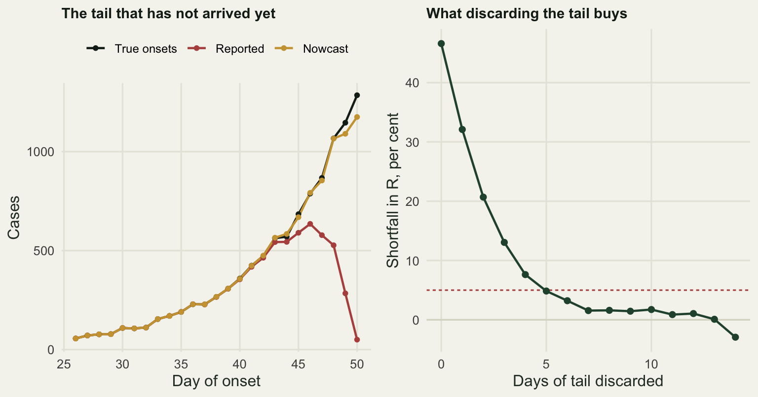
Averaged over 30 independent delay realisations, the uncorrected estimate is 46.588 per cent short with no tail discarded, 7.625 per cent short with four days discarded, and 4.852 per cent short with five. Five days of tail is what this delay distribution costs, and five days is a long time in an outbreak that doubles in five.
The nowcast is a better answer than throwing data away, but the price is variance rather than bias. Across the same 30 realisations its mean is 2.1557, a departure of 1.3143 per cent against the 1.535 per cent the complete data give, so it is not a defect of the correction. Its standard deviation across realisations is 0.0642. Estimated two days back, where the divisor is 49.43 per cent rather than 4.26 per cent, the mean sits 0.0197 per cent from the truth and the standard deviation drops to 0.0260. What the two days buy reliably is the smaller scatter, not a smaller departure from the truth. Set both against the model’s own interval, which is 0.1053 wide: the scatter induced by the delay process alone at the tip of the curve is more than half the width of the interval the model prints, and the model’s interval knows nothing about it.
Check 2: under-reporting, constant and time varying
Most infections are never reported. The reflex worry is that a low reporting rate biases the reproduction number, and for a constant rate that worry is misplaced. Thinning a Poisson process by a constant fraction leaves the growth rate untouched, and the reproduction number implied by a growth rate depends only on the growth rate and the generation interval. The estimate is taken here through the growth rate route: fit a Poisson regression of counts on day over the exponential phase, then map the fitted growth rate \(r\) to \(R = 1 / \sum_s w_s e^{-rs}\), which is the discrete version of the Wallinga and Lipsitch relation.
r_from_growth <- function(rr, w) 1 / sum(w * exp(-rr * seq_along(w)))

fit_growth <- function(counts, days) {
  fit <- glm(counts ~ days, family = poisson)
  c(r = as.numeric(coef(fit)[2]), dev_ratio = fit$deviance / fit$df.residual)
}

win <- 20:45
n_thin <- 40
rho_grid <- c(1, 0.5, 0.1)
set.seed(9091)
const_tab <- t(sapply(rho_grid, function(rh) {
  vals <- sapply(seq_len(n_thin), function(i) {
    y <- if (rh == 1) epi$inc[win] else rbinom(length(win), epi$inc[win], rh)
    fg <- fit_growth(y, win)
    c(fg["r"], R = r_from_growth(fg["r"], w_true), fg["dev_ratio"])
  })
  c(rho = rh, r = mean(vals[1, ]), R = mean(vals[2, ]), dev = mean(vals[3, ]))
}))
print(round(const_tab, 4))
rho r R dev
[1,] 1.0 0.1319 2.1965 0.9138
[2,] 0.5 0.1318 2.1952 0.9121
[3,] 0.1 0.1336 2.2185 1.0301print(round(c(replicates = n_thin, window_start = min(win), window_end = max(win),
true_R0 = r0_true,
largest_deviation = max(abs(const_tab[, "R"] - r0_true)),
largest_deviation_percent =
100 * max(abs(const_tab[, "R"] / r0_true - 1))), 4)) replicates window_start window_end
40.0000 20.0000 45.0000
true_R0 largest_deviation largest_deviation_percent
2.2000 0.0185 0.8420 Averaged over 40 replicate thinnings of the same epidemic, reporting everything gives 2.1965, reporting half gives 2.1952 and reporting one case in ten gives 2.2185. The largest deviation from the true 2.2 is 0.0185, which is 0.842 per cent, and the ordering of the three is noise. A surveillance system that misses nine infections in ten measures the reproduction number as well as one that misses none, as long as it misses them at a steady rate.
The rate is what moves. Surveillance intensifies when an outbreak becomes news: testing capacity goes up, case definitions widen, people who would have stayed home present at a clinic. Model that as a reporting probability rising exponentially from 0.1, which is a slope of 0.06 per day on the log scale over the fitting window.
rho_slope <- 0.06
rho_t <- pmin(0.6, 0.10 * exp(rho_slope * (win - min(win))))
set.seed(313)
tv <- sapply(seq_len(n_thin), function(i) {
  y <- rbinom(length(win), epi$inc[win], rho_t)
  fg <- fit_growth(y, win)
  c(fg["r"], R = r_from_growth(fg["r"], w_true), fg["dev_ratio"])
})
r_const <- as.numeric(const_tab[const_tab[, "rho"] == 1, "r"])
print(round(c(reporting_start = rho_t[1], reporting_end = rho_t[length(rho_t)],
              log_reporting_slope = rho_slope,
              r_constant = r_const, r_time_varying = mean(tv[1, ]),
              spurious_growth = mean(tv[1, ]) - r_const,
              R_time_varying = mean(tv[2, ]),
              overestimate_percent = 100 * (mean(tv[2, ]) / r0_true - 1),
              deviance_ratio_constant = as.numeric(const_tab[1, "dev"]),
              deviance_ratio_time_varying = mean(tv[3, ])), 4))
reporting_start reporting_end
0.1000 0.4482
log_reporting_slope r_constant
0.0600 0.1319
r_time_varying spurious_growth
0.1914 0.0595
R_time_varying overestimate_percent
3.0121 36.9151
deviance_ratio_constant deviance_ratio_time_varying
0.9138 1.0055 set.seed(77)
lev2 <- c("All cases", "Half reported", "One in ten reported", "Reporting rising to a half")
mk <- function(y, lab) {
fit <- glm(y ~ win, family = poisson)
data.frame(day = win, count = y, fitted = as.numeric(fitted(fit)), scen = lab)
}
d2 <- rbind(mk(epi$inc[win], lev2[1]),
mk(rbinom(length(win), epi$inc[win], 0.5), lev2[2]),
mk(rbinom(length(win), epi$inc[win], 0.1), lev2[3]),
mk(rbinom(length(win), epi$inc[win], rho_t), lev2[4]))
d2$scen <- factor(d2$scen, levels = lev2)
ggplot(d2[d2$count > 0, ], aes(day, count, colour = scen)) +
geom_point(size = 1.5) +
geom_line(aes(y = fitted), linewidth = 0.8) +
scale_y_log10() +
scale_colour_manual(values = c(te_pal$ink, te_pal$green, te_pal$sage, te_pal$clay),
name = NULL) +
guides(colour = guide_legend(nrow = 2)) +
labs(x = "Day", y = "Reported cases, log scale",
title = "Three of these curves carry the same growth rate") +
theme_te() + theme(legend.position = "top")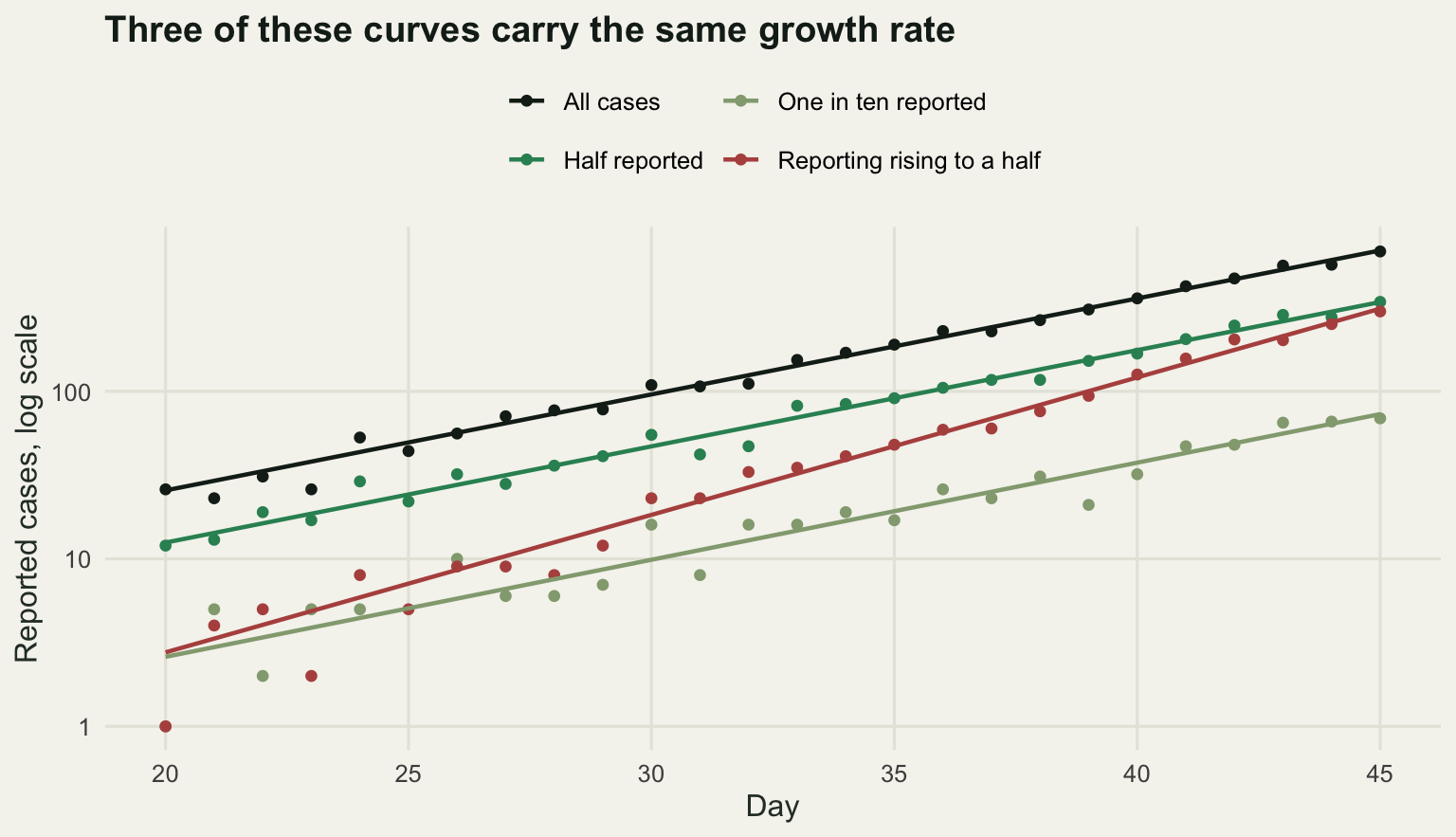
The reporting probability runs from 0.1 to 0.4482 across the window. The fitted growth rate goes from 0.1319 per day to 0.1914, an added 0.0595 per day, which is the slope of the log reporting rate to within the noise of 40 replicates. Mapped through the generation interval that becomes a reproduction number of 3.0121, an overestimate of 36.9151 per cent. A control measure evaluated against that number will look like a failure, and a threshold crossing will be declared weeks early.
The measurement that matters is the last one in the block. The Poisson fit to the corrupted series has a deviance per degree of freedom of 1.0055, against 0.9138 for the clean series. Both are about one, which is to say both series look exactly like clean exponential growth. Multiplying an exponential by another exponential gives an exponential. No goodness of fit statistic, no residual plot and no eye can separate a fast epidemic under steady reporting from a slower one under improving reporting, because the two produce the same curve. The tilt in the figure is visible only because the truth is drawn on the same axes. This is the check with no internal remedy: the fix has to come from outside the case data, from a test positivity series, a serological survey, or a severity indicator whose ascertainment did not change.
Check 3: aggregation
Many surveillance systems publish weekly. The natural thing to do with a weekly total is to spread it evenly over its seven days and carry on, which is what the block below does before handing the series to the same estimator, with a two-week window so that daily and weekly have the same amount of information.
weekly_spread <- function(inc) {
  nwk <- floor(length(inc) / 7)
  wk <- sapply(seq_len(nwk), function(k) sum(inc[(7 * k - 6):(7 * k)]))
  list(week = wk, daily = rep(wk / 7, each = 7))
}

agg_end <- 7 * floor(ndays / 7)
ws <- weekly_spread(epi$inc)
tau_w <- 14
tr_w <- true_R(epi, w_true, agg_end, tau_w)
e_daily <- as.numeric(cori(epi$inc, w_true, agg_end, tau_w)["mean"])
e_week <- as.numeric(cori(ws$daily, w_true, agg_end, tau_w)["mean"])
print(round(c(window_end_day = agg_end, window_days = tau_w, true_R = tr_w,
              from_daily = e_daily, from_weekly = e_week,
              daily_shortfall_percent = 100 * (1 - e_daily / tr_w),
              weekly_shortfall_percent = 100 * (1 - e_week / tr_w),
              daily_minus_weekly = e_daily - e_week), 4))
window_end_day window_days true_R
49.0000 14.0000 2.1887
from_daily from_weekly daily_shortfall_percent
2.1749 2.0210 0.6293
weekly_shortfall_percent daily_minus_weekly
7.6624 0.1539 Estimated on day 49 with the true value at 2.1887, daily counts give 2.1749 and weekly counts give 2.0210. The weekly figure is 7.6624 per cent low, against 0.6293 per cent off the truth for the daily, a gap of 0.1539 in the reproduction number itself. Flattening the within-week rise costs a little of the growth signal, and the estimator reads that flattening as slower transmission.
The bias is small. The loss of resolution is not.
set.seed(5150)
n_step <- 91
day_step <- 49
rpath <- c(rep(2.2, day_step), rep(0.8, n_step - day_step))
epi2 <- sim_renewal(rpath, w_true, npop, rep(5, 5), n_step)
ws2 <- weekly_spread(epi2$inc)
days_d <- seq(day_step - 7, n_step)
rt_daily <- sapply(days_d, function(t) as.numeric(cori(epi2$inc, w_true, t, 7)["mean"]))
wk_ends <- seq(7, length(ws2$daily), by = 7)
wk_ends <- wk_ends[wk_ends >= day_step - 7]
rt_week <- sapply(wk_ends, function(t) as.numeric(cori(ws2$daily, w_true, t, 14)["mean"]))
det_daily <- days_d[which(rt_daily < 1)[1]]
det_week <- wk_ends[which(rt_week < 1)[1]]
print(round(c(step_day = day_step, R_before = 2.2, R_after = 0.8,
              detected_daily = det_daily, detected_weekly = det_week,
              lag_daily = det_daily - day_step, lag_weekly = det_week - day_step,
              extra_delay_days = det_week - det_daily), 3))
step_day R_before R_after detected_daily
49.0 2.2 0.8 55.0
detected_weekly lag_daily lag_weekly extra_delay_days
63.0 6.0 14.0 8.0 Transmission is cut on day 49, from 2.2 to 0.8, the sort of step a lockdown or a ring vaccination campaign produces. Daily counts push the estimate below one on day 55, six days later, which is the cost of a seven-day trailing window. Weekly counts get there on day 63, fourteen days after the step and eight days after the daily series. Part of that is the wider window and part is granularity: an estimate that only exists on Sundays cannot cross a threshold on a Wednesday.
The last piece of the check is what happens when the generation interval is short relative to the aggregation interval. The sweep below runs the renewal equation deterministically, without Poisson noise, so that what is measured is the aggregation bias alone.
det_renewal <- function(rr, w, ndays, seed_cases) {
  inc <- numeric(ndays)
  inc[seq_along(seed_cases)] <- seed_cases
  smax <- length(w)
  for (t in (length(seed_cases) + 1):ndays) {
    ss <- seq_len(min(smax, t - 1))
    inc[t] <- rr * sum(w[ss] * inc[t - ss])
  }
  inc
}

gi_seq <- c(1.5, 2, 2.5, 3, 4, 5, 6.5, 8, 10)
sweep_gi <- t(sapply(gi_seq, function(gm) {
  ww <- gi_weights(gm, gi_cv, smax = max(20, ceiling(4 * gm)))
  inc <- det_renewal(r0_true, ww, 56, rep(5, 5))
  wd <- weekly_spread(inc)$daily
  ed <- as.numeric(cori(inc, ww, 56, tau_w)["mean"])
  ew <- as.numeric(cori(wd, ww, 56, tau_w)["mean"])
  c(gi_mean = gm, ratio = gm / 7, from_daily = ed, from_weekly = ew,
    weekly_shortfall_percent = 100 * (1 - ew / r0_true),
    daily_shortfall_percent = 100 * (1 - ed / r0_true))
}))
print(round(sweep_gi, 3))
gi_mean ratio from_daily from_weekly weekly_shortfall_percent
[1,] 1.5 0.214 2.200 1.278 41.918
[2,] 2.0 0.286 2.200 1.378 37.363
[3,] 2.5 0.357 2.200 1.484 32.550
[4,] 3.0 0.429 2.200 1.589 27.777
[5,] 4.0 0.571 2.200 1.777 19.224
[6,] 5.0 0.714 2.200 1.916 12.887
[7,] 6.5 0.929 2.200 2.038 7.342
[8,] 8.0 1.143 2.200 2.098 4.635
[9,] 10.0 1.429 2.201 2.137 2.879
daily_shortfall_percent
[1,] 0.000
[2,] 0.000
[3,] 0.000
[4,] 0.000
[5,] 0.000
[6,] 0.000
[7,] -0.002
[8,] -0.007
[9,] -0.025cross <- approx(sweep_gi[, "weekly_shortfall_percent"], sweep_gi[, "ratio"], xout = 20)$y
print(round(c(threshold_percent = 20, ratio_at_threshold = cross,
gi_days_at_threshold = cross * 7), 3)) threshold_percent ratio_at_threshold gi_days_at_threshold
20.000 0.558 3.909 lev3 <- c("Truth", "Daily counts", "Weekly counts")
d3a <- rbind(data.frame(day = days_d, R = epi2$rt[days_d], series = lev3[1]),
data.frame(day = days_d, R = rt_daily, series = lev3[2]),
data.frame(day = wk_ends, R = rt_week, series = lev3[3]))
d3a$series <- factor(d3a$series, levels = lev3)
p3a <- ggplot(d3a, aes(day, R, colour = series)) +
geom_hline(yintercept = 1, colour = te_pal$line, linewidth = 0.8) +
geom_vline(xintercept = day_step, colour = te_pal$ink, linetype = "22") +
geom_line(linewidth = 0.8) + geom_point(size = 1.2) +
scale_colour_manual(values = c(te_pal$ink, te_pal$forest, te_pal$clay), name = NULL) +
guides(colour = guide_legend(nrow = 1)) +
labs(x = "Day", y = "Estimated reproduction number",
title = "The brakes seen eight days late") +
theme_te() +
theme(legend.position = "top", legend.text = element_text(size = 9),
plot.title = element_text(face = "bold", size = 11, colour = te_pal$ink))
p3b <- ggplot(data.frame(ratio = sweep_gi[, "ratio"],
bias = sweep_gi[, "weekly_shortfall_percent"]),
aes(ratio, bias)) +
geom_hline(yintercept = c(0, 20), colour = te_pal$clay, linetype = "22") +
geom_line(colour = te_pal$forest, linewidth = 0.8) +
geom_point(colour = te_pal$forest, size = 2) +
labs(x = "Generation interval mean / aggregation interval",
y = "Shortfall in R from weekly counts, per cent",
title = "Short generations break the week") +
theme_te() +
theme(plot.title = element_text(face = "bold", size = 11, colour = te_pal$ink))
two_panel(p3a, p3b)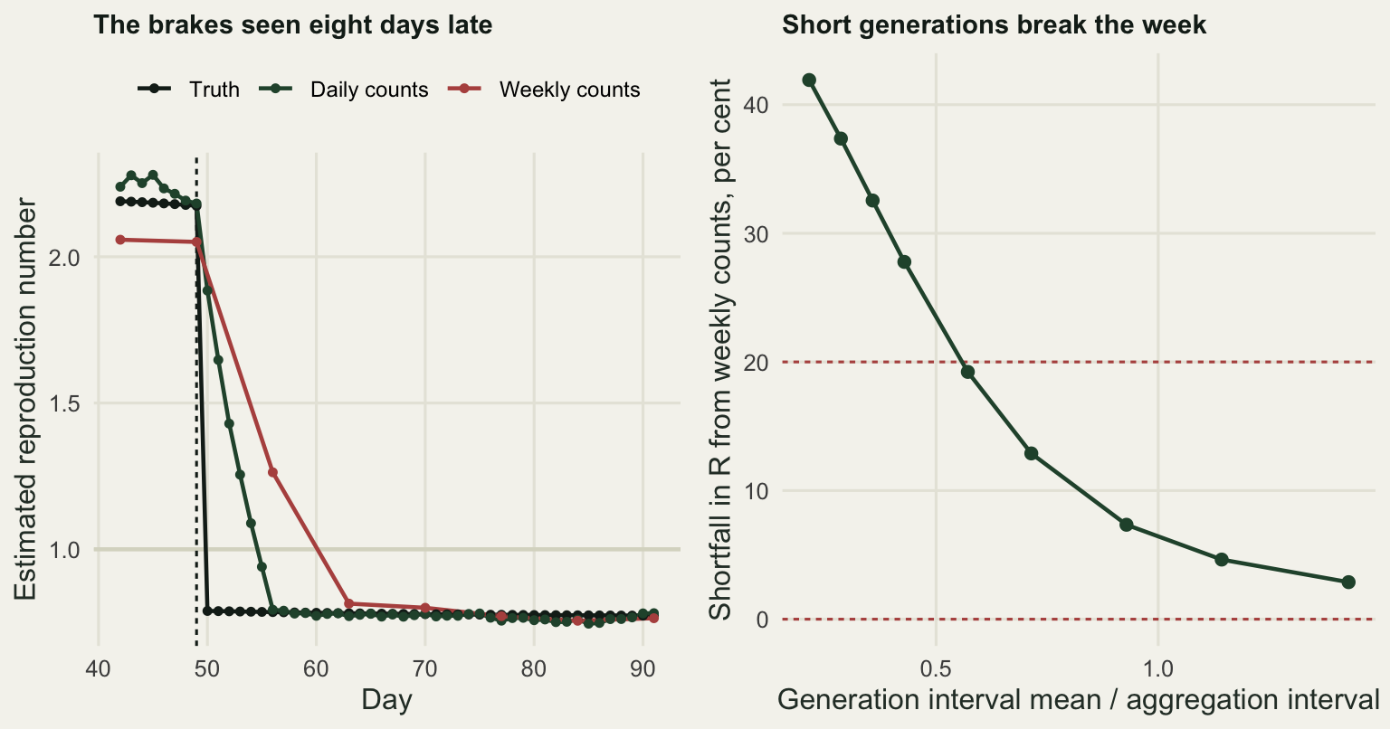
With a generation interval of 10 days against a seven-day aggregation interval, a ratio of 1.429, the weekly shortfall is 2.879 per cent and nobody would notice. At the 6.5 days of the epidemic above it is 7.342 per cent. At 4 days it is 19.224 per cent, and at 1.5 days, a ratio of 0.214, the weekly estimate is 1.278 against a truth of 2.2, a shortfall of 41.918 per cent. Interpolating for a 20 per cent shortfall puts the crossing at a ratio of 0.558, a generation interval of 3.909 days. Below roughly half the aggregation interval, weekly counts spread evenly across the week cannot support this estimator at all. That covers influenza in a household setting and most gastrointestinal outbreaks, and it is an argument for keeping daily line lists rather than a reason to distrust the estimator.
Check 4: the assumption sweep, priced against the model’s own interval
The estimator does not estimate the generation interval or the reporting delay. It is handed both. Sweep them across the range a careful analyst would call plausible and see how far the answer moves, then compare that range with the width of the interval the model prints. Ten values of the assumed generation interval mean, four values of its coefficient of variation, and eight values of the assumed delay mean drive both the nowcast correction and the renewal denominator.
est_under <- function(obs, gi_m, gi_c, del_m, del_c = del_cv, t_end = ndays) {
  ww <- gi_weights(gi_m, gi_c)
  cp <- cumsum(delay_probs(del_m, del_c))
  fr <- sapply(seq_len(t_end), function(t) cp[min(length(cp), ndays - t + 1)])
  cori(obs[seq_len(t_end)] / fr, ww, t_end)
}

gi_m_seq <- seq(4.5, 9, by = 0.5)
gi_c_seq <- c(0.3, 0.46, 0.6, 0.75)
del_m_seq <- seq(1.5, 5, by = 0.5)
sw4 <- do.call(rbind, lapply(gi_m_seq, function(gm)
  do.call(rbind, lapply(gi_c_seq, function(gc)
    do.call(rbind, lapply(del_m_seq, function(dm) {
      z <- est_under(obs_trunc, gm, gc, dm)
      data.frame(gi_mean = gm, gi_cv = gc, del_mean = dm, R = as.numeric(z["mean"]))
    }))))))
base4 <- est_under(obs_trunc, gi_mu, gi_cv, del_mu)
ci_w <- as.numeric(base4["hi"] - base4["lo"])
iqr_w <- as.numeric(diff(quantile(sw4$R, c(0.25, 0.75))))
print(round(c(combinations = nrow(sw4), central_estimate = as.numeric(base4["mean"]),
              ci_lo = as.numeric(base4["lo"]), ci_hi = as.numeric(base4["hi"]),
              ci_width = ci_w, sweep_lo = min(sw4$R), sweep_hi = max(sw4$R),
              sweep_width = diff(range(sw4$R)), ratio = diff(range(sw4$R)) / ci_w,
              sweep_iqr = iqr_w, iqr_ratio = iqr_w / ci_w), 4))
combinations central_estimate ci_lo ci_hi
320.0000 2.0898 2.0382 2.1420
ci_width sweep_lo sweep_hi sweep_width
0.1038 1.1416 5.0228 3.8812
ratio sweep_iqr iqr_ratio
37.3999 1.0375 9.9971 print(round(c(gi_mean_span = diff(range(sw4$R[sw4$gi_cv == gi_cv & sw4$del_mean == del_mu])),
gi_cv_span = diff(range(sw4$R[sw4$gi_mean == gi_mu & sw4$del_mean == del_mu])),
delay_span = diff(range(sw4$R[sw4$gi_cv == gi_cv & sw4$gi_mean == gi_mu])),
true_R = tr), 4))gi_mean_span gi_cv_span delay_span true_R
1.0338 0.2444 1.8535 2.1844 t48 <- ndays - 2
sw4b <- do.call(rbind, lapply(gi_m_seq, function(gm)
do.call(rbind, lapply(gi_c_seq, function(gc)
do.call(rbind, lapply(del_m_seq, function(dm) {
z <- est_under(obs_trunc, gm, gc, dm, t_end = t48)
data.frame(gi_mean = gm, gi_cv = gc, del_mean = dm, R = as.numeric(z["mean"]))
}))))))
base4b <- est_under(obs_trunc, gi_mu, gi_cv, del_mu, t_end = t48)
ci_wb <- as.numeric(base4b["hi"] - base4b["lo"])
print(round(c(window_end = t48, central_estimate = as.numeric(base4b["mean"]),
ci_width = ci_wb, sweep_lo = min(sw4b$R), sweep_hi = max(sw4b$R),
sweep_width = diff(range(sw4b$R)), ratio = diff(range(sw4b$R)) / ci_wb,
gi_mean_span = diff(range(sw4b$R[sw4b$gi_cv == gi_cv &
sw4b$del_mean == del_mu])),
delay_span = diff(range(sw4b$R[sw4b$gi_cv == gi_cv &
sw4b$gi_mean == gi_mu]))), 4)) window_end central_estimate ci_width sweep_lo
48.0000 2.1774 0.1206 1.4414
sweep_hi sweep_width ratio gi_mean_span
4.3604 2.9190 24.1967 1.0825
delay_span
1.1317 sw4$panel <- factor(paste0("Assumed CV ", sw4$gi_cv))
band4 <- data.frame(ymin = as.numeric(base4["lo"]), ymax = as.numeric(base4["hi"]))
ggplot(sw4, aes(gi_mean, R, colour = del_mean, group = del_mean)) +
geom_rect(data = band4, aes(ymin = ymin, ymax = ymax, xmin = -Inf, xmax = Inf),
inherit.aes = FALSE, fill = te_pal$gold, alpha = 0.75) +
geom_hline(yintercept = c(band4$ymin, band4$ymax), colour = "#8c6b1a",
linewidth = 0.55) +
geom_hline(yintercept = tr, colour = te_pal$ink, linetype = "22", linewidth = 0.6) +
geom_line(linewidth = 0.8) +
facet_wrap(~panel, nrow = 1) +
scale_colour_gradient(low = te_pal$green, high = te_pal$clay,
name = "Assumed delay mean, days") +
labs(x = "Assumed generation interval mean, days",
y = "Estimated reproduction number",
title = "The band is the interval the model reports") +
theme_te() +
theme(legend.position = "top",
strip.text = element_text(colour = te_pal$ink, face = "bold"))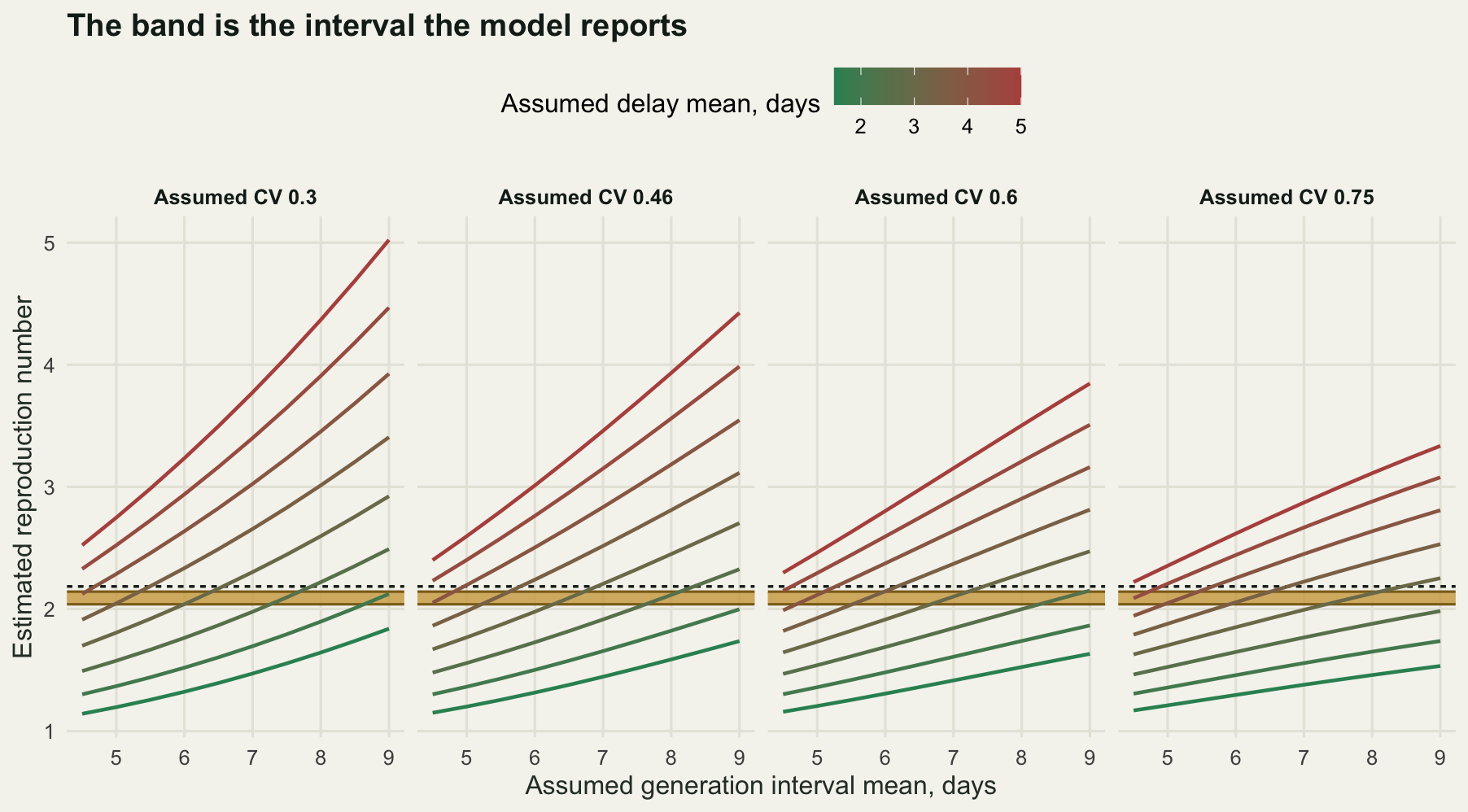
At the central assumption the nowcast-corrected estimate on the final day is 2.0898 with a 95 per cent interval from 2.0382 to 2.1420, a width of 0.1038. Across the 320 assumption combinations the estimate runs from 1.1416 to 5.0228, a width of 3.8812. The ratio is 37.3999. Even the middle half of the sweep, discarding the quarter of combinations at each end, spans 1.0375, which is 9.9971 times the model’s interval.
Read that plainly. The interval the model reports is a statement about how many cases were counted. It is conditional on a generation interval and a delay distribution that were supplied by the analyst, and within the range of values an analyst could defend, the answer moves by a factor of four. Quoting the interval without the sweep beside it describes the wrong uncertainty, and the number to put on that claim is 37.3999.
The marginal spans say where the money is. Sweeping the generation interval mean alone moves the estimate by 1.0338, the delay mean alone by 1.8535, and the coefficient of variation alone by 0.2444. The delay assumption dominates because the final day is nowcast by dividing by a small number, and small changes in the assumed delay change that divisor a great deal. Estimating two days back instead, which is what check 1 recommended anyway, gives a central estimate of 2.1774 with an interval of 0.1206, a sweep width of 2.9190 and a ratio of 24.1967. The delay span falls to 1.1317 and now sits alongside the generation interval span of 1.0825. Discarding two days of tail cuts the influence of the delay assumption by nearly two fifths and still leaves the assumption sweep more than twenty times the model’s interval.
What none of these checks can see
The four failures above are all in the observation process, and each is fixable in principle. Delay can be nowcast or discarded. Constant under-reporting does not matter and time-varying reporting can be constrained with an external series. Aggregation can be undone by publishing daily. Assumptions can be swept, and the sweep can be reported.
The failure that none of them touches is the denominator. A reproduction number is a rate of spread. It says nothing about who is at risk. Two measurements make that concrete.
set.seed(2718)
sev_hi <- 0.30; sev_slope <- 0.02
sev_p <- sev_hi * exp(-sev_slope * (seq_len(ndays) - 1))
sev_obs <- rbinom(ndays, epi$inc, sev_p)
e_sev <- as.numeric(cori(sev_obs, w_true, ndays)["mean"])
sev_growth <- fit_growth(sev_obs[win], win)
all_growth <- fit_growth(epi$inc[win], win)
print(round(c(severe_fraction_day_1 = sev_p[1], severe_fraction_day_50 = sev_p[ndays],
              true_R = tr, from_severe_cases = e_sev,
              underestimate_percent = 100 * (1 - e_sev / tr),
              r_all_cases = as.numeric(all_growth["r"]),
              r_severe_cases = as.numeric(sev_growth["r"]),
              growth_deficit = as.numeric(all_growth["r"] - sev_growth["r"])), 4))
severe_fraction_day_1 severe_fraction_day_50 true_R
0.3000 0.1126 2.1844
from_severe_cases underestimate_percent r_all_cases
1.7931 17.9156 0.1319
r_severe_cases growth_deficit
0.1113 0.0206 The first is a severity-biased observation process. Surveillance that sees hospitalisations sees a sample whose severe fraction depends on the age of the epidemic: the first cases are found in the oldest and frailest contacts of the introduction, and as the outbreak spreads into the general population the mix shifts younger and milder. Let the severe fraction fall from 0.3 on day 1 to 0.1126 on day 50 and estimate from severe cases alone. The estimate is 1.7931 against a truth of 2.1844, an underestimate of 17.9156 per cent, and the growth rate is short by 0.0206 per day, which is the decay rate of the severe fraction. Arithmetically this is check 2 run backwards. What makes it different is that the correction is not available: a system that only sees severe cases has no way to measure the mix of the cases it does not see.
set.seed(6161)
project <- function(hist, npop, rr, w, extra) {
  inc <- c(hist, numeric(extra))
  left <- npop - sum(hist)
  smax <- length(w)
  for (t in (length(hist) + 1):length(inc)) {
    ss <- seq_len(min(smax, t - 1))
    inc[t] <- rr * (left / npop) * sum(w[ss] * inc[t - ss])
    left <- left - inc[t]
  }
  inc
}

sev_a <- 0.05; pop_a <- 1e6
sev_b <- 0.25; pop_b <- 5e4
obs_flat <- rbinom(ndays, epi$inc, sev_a)
inf_a <- obs_flat / sev_a
inf_b <- obs_flat / sev_b
proj_a <- project(inf_a, pop_a, r0_true, w_true, 150)
proj_b <- project(inf_b, pop_b, r0_true, w_true, 150)
print(c(population_a = pop_a, population_b = pop_b))
population_a population_b
1e+06 5e+04 print(round(c(severe_percent_a = 100 * sev_a, severe_percent_b = 100 * sev_b,
observed_day_50 = obs_flat[ndays], observed_total = sum(obs_flat),
R_interpretation_a = as.numeric(cori(inf_a, w_true, ndays)["mean"]),
R_interpretation_b = as.numeric(cori(inf_b, w_true, ndays)["mean"]),
R_difference = as.numeric(cori(inf_b, w_true, ndays)["mean"] -
cori(inf_a, w_true, ndays)["mean"]),
infected_a_percent = 100 * sum(inf_a) / pop_a,
infected_b_percent = 100 * sum(inf_b) / pop_b,
peak_day_a = which.max(proj_a), peak_day_b = which.max(proj_b),
peak_gap_days = which.max(proj_a) - which.max(proj_b),
peak_severe_a = sev_a * max(proj_a),
peak_severe_b = sev_b * max(proj_b),
true_R = tr,
shortfall_percent = 100 * (1 - as.numeric(cori(inf_a, w_true,
ndays)["mean"]) / tr)), 4)) severe_percent_a severe_percent_b observed_day_50 observed_total
5.0000 25.0000 65.0000 552.0000
R_interpretation_a R_interpretation_b R_difference infected_a_percent
2.0391 2.0398 0.0007 1.1040
infected_b_percent peak_day_a peak_day_b peak_gap_days
4.4160 83.0000 72.0000 11.0000
peak_severe_a peak_severe_b true_R shortfall_percent
1558.3858 389.4405 2.1844 6.6526 The second measurement uses one observed series and two interpretations of it. A surveillance system has recorded 552 severe cases, 65 of them on day 50. Interpretation A says severe cases are 5 per cent of infections in a population of one million. Interpretation B says they are 25 per cent of infections in a vulnerable subgroup of fifty thousand, which is the same outbreak seen as a care-home or clinical-risk epidemic rather than a community one. The two give reproduction numbers of 2.0391 and 2.0398, a difference of 0.0007 that comes entirely from the prior, because the estimator is scale free and never sees a denominator.
Project both forward with the same reproduction number and the same generation interval, and they part company. Interpretation A has infected 1.104 per cent of its population and peaks on day 83. Interpretation B has infected 4.416 per cent of its population and peaks on day 72, eleven days earlier, though its peak severe caseload is 389.4405 against A’s 1558.3858, so it is A that puts the heavier load on the same hospital. Same data, same estimate, a peak burden four times higher under A and eleven days of difference in when to open the ward.
That single estimate of 2.0391 is also 6.6526 per cent off the true 2.1844, and the reason is worth naming: this series holds 552 cases where the full curve holds 10770. Check 2 established that constant under-reporting leaves the growth rate unbiased. It leaves it noisier, and the interval reported alongside it does not account for that: the estimator is handed the observed count divided by the assumed severe fraction, so its interval prices the precision of that scaled-up series, not of the 552 cases actually seen.
Where to go next
The cluster closes here. The first post gave the mechanism, the second the estimate, the third the recurrence, and this one the caveats that decide whether any of them survive contact with a surveillance database. The most useful habit to take away is the cheapest: before quoting a reproduction number, sweep the two distributions you assumed and put that range next to the one the software printed. If the sweep is wider, and it usually is, the interval is the wrong number to quote.
For the same estimate-then-decide loop where the corruption is in the model rather than the data, Checking an epidemic model runs the equivalent exercise on the transmission assumptions: homogeneous mixing, a well mixed population, and an infectious period with the wrong shape.
References
Cori A, Ferguson NM, Fraser C, Cauchemez S 2013 American Journal of Epidemiology 178(9):1505-1512 (10.1093/aje/kwt133)
Gostic KM, McGough L, Baskerville EB, Abbott S, Joshi K, Tedijanto C, Kahn R, Niehus R, Hay JA, De Salazar PM, Hellewell J, Meakin S, Munday JD, Bosse NI, Sherratt K, Thompson RN, White LF, Huisman JS, Scire J, Bonhoeffer S, Stadler T, Wallinga J, Funk S, Lipsitch M, Cobey S 2020 PLoS Computational Biology 16(12):e1008409 (10.1371/journal.pcbi.1008409)
Wallinga J, Lipsitch M 2007 Proceedings of the Royal Society B 274(1609):599-604 (10.1098/rspb.2006.3754)
Hohle M, an der Heiden M 2014 Biometrics 70(4):993-1002 (10.1111/biom.12194)