library(ggplot2)
library(patchwork)

te_paper  <- "#f5f4ee"
te_ink    <- "#16241d"
te_body   <- "#2c3a31"
te_forest <- "#275139"
te_rust   <- "#b5534e"
te_gold   <- "#c9b458"
te_line   <- "#dad9ca"

theme_datasheet <- function() {
  theme_minimal(base_size = 12) +
    theme(plot.background  = element_rect(fill = te_paper, colour = NA),
          panel.background = element_rect(fill = te_paper, colour = NA),
          panel.grid.major = element_line(colour = te_line, linewidth = 0.3),
          panel.grid.minor = element_blank(),
          text             = element_text(colour = te_body),
          plot.title       = element_text(colour = te_ink, face = "bold"),
          plot.subtitle    = element_text(colour = te_body),
          axis.text        = element_text(colour = te_body))
}

foi_true <- 0.22
n_class  <- 12
sampled  <- c(180, 160, 140, 120, 100, 85, 70, 55, 45, 35, 25, 20)

set.seed(17)
sero <- data.frame(age = seq_len(n_class), n = sampled)
sero$pos  <- rbinom(n_class, sero$n, 1 - exp(-foi_true * sero$age))
sero$neg  <- sero$n - sero$pos
sero$prev <- sero$pos / sero$n

wilson <- function(x, n, z = 1.96) {
  ph <- x / n
  mid <- (ph + z^2 / (2 * n)) / (1 + z^2 / n)
  hw  <- z * sqrt(ph * (1 - ph) / n + z^2 / (4 * n^2)) / (1 + z^2 / n)
  cbind(lo = pmax(0, mid - hw), hi = pmin(1, mid + hw))
}
sero[, c("lo", "hi")] <- wilson(sero$pos, sero$n)
n_total <- sum(sero$n)Force of infection from age prevalence
R
disease ecology
epidemiology
GLM
ecology tutorial
A cloglog binomial GLM with a log age offset returns the force of infection directly. Fitting catalytic models to wildlife serology data in R, from scratch.
A serological survey gives one number per animal: seropositive or not, plus an age. The result is usually summarised as a prevalence, and prevalence is a stock. It says what fraction of the population currently carries the mark of infection, not how fast animals are acquiring it.
The rate is what the ecology usually turns on, and a single cross-section can supply it, because age is time. An animal aged five has been exposed for five years, and the fraction of five year olds carrying antibodies is the probability of having been infected at least once in five years of exposure. That is a survival problem wearing different clothes, and its answer is a hazard: the force of infection.
The model that makes that translation is nearly a century old, and in R it is one call to glm() with a link most people never use and an offset. The purpose of this post is to write that line, show why the logistic regression people reach for instead is a different model, extend it when the rate is not constant, and then describe the one thing a cross-section cannot do.
A cross-section of a wildlife host
Twelve age classes, one serological result per animal, no repeat sampling. The generating process is an irreversible infection acquired at a constant rate, so the truth is known.
1035 animals, 561 of them seropositive, 54.2 per cent overall. That headline figure is the stock. It mixes a lightly exposed cohort of yearlings with animals that have had a decade to meet the pathogen, and on its own it says nothing about transmission.
The test is treated as perfect here. Correcting an observed prevalence for imperfect sensitivity and specificity is a separate step covered elsewhere on the site, and it should be done before anything below.
The catalytic model is one line of glm
If infection arrives as a Poisson process of constant rate lambda and never reverses, then the probability that an animal aged a has been infected at least once is one minus the probability of no events, which is 1 - exp(-lambda * a). Rearranging gives the whole model:
log(-log(1 - p)) = log(lambda) + log(a)
The left side is the complementary log-log of the prevalence. The right side is an intercept plus a term in log(a) whose coefficient is fixed at one. So a binomial GLM with a cloglog link and log(age) as an offset returns log(lambda) as its intercept, with a standard error and everything else a GLM gives.
m_cat <- glm(cbind(pos, neg) ~ 1 + offset(log(age)), data = sero,
             family = binomial(link = "cloglog"))

foi_hat <- unname(exp(coef(m_cat)[1]))
foi_ci  <- unname(exp(confint.default(m_cat)[1, ]))
se_log  <- summary(m_cat)$coefficients[1, 2]

nll_const <- function(log_l) {
  p <- 1 - exp(-exp(log_l) * sero$age)
  -sum(sero$pos * log(p) + sero$neg * log(1 - p))
}
foi_optim <- exp(optimize(nll_const, c(-5, 2))$minimum)
dev_cat   <- deviance(m_cat)
df_cat    <- m_cat$df.residual
ci_pct    <- 95
mean_age_inf <- 1 / foi_hat
The estimate is 0.211 infections per animal per year, with a 95 per cent interval of 0.193 to 0.231 against a true value of 0.22. Writing the likelihood out by hand and minimising it returns 0.211, which is the same number: the offset trick is not an approximation to the catalytic model, it is the catalytic model.
The intercept is a log rate, not a log odds. Its exponent has units of one over time, its reciprocal 4.7 years is the mean age at first infection, and that quantity connects to the reproduction number by an identity the site derives in the context of recurrent epidemics. The residual deviance is 17.7 on 11 degrees of freedom, so a constant rate describes these data.
A logistic regression on age is a different model
The reflex is glm(cbind(pos, neg) ~ age, family = binomial). It has one more parameter than the catalytic model, it will produce a rising curve, and it will look fine.
m_logit <- glm(cbind(pos, neg) ~ age, data = sero, family = binomial)

dev_logit  <- deviance(m_logit)
df_logit   <- m_logit$df.residual
aic_gap    <- AIC(m_logit) - AIC(m_cat)
p_at_birth <- unname(plogis(coef(m_logit)[1]))
logit_slope <- unname(coef(m_logit)[2])
slope_ratio <- logit_slope / foi_hat
It fits worse while spending more: a residual deviance of 37.2 on 10 degrees of freedom against 17.7 on 11, and an AIC 21.5 higher. That gap is not a small preference. It is the model saying that the shape imposed by the logistic link is the wrong shape for a process of accumulating exposure.
The clearest symptom is at the left edge. The logistic fit puts prevalence at birth at 20.4 per cent, which for an infection acquired after birth is an impossible claim, and the catalytic model puts it at zero because the algebra forces it to. The slope, 0.366 per year, is a change in log odds and reading it as a rate would overstate the force of infection by a factor of 1.7.
grid_age <- data.frame(age = seq(0, n_class, length.out = 200))
grid_age$catalytic <- 1 - exp(-foi_hat * grid_age$age)
grid_age$logistic  <- predict(m_logit, grid_age, type = "response")
fit_long <- data.frame(
  age = rep(grid_age$age, 2),
  p   = c(grid_age$catalytic, grid_age$logistic),
  fit = rep(c("catalytic (cloglog, log age offset)", "logistic in age"),
            each = nrow(grid_age)))

ggplot(sero, aes(age, prev)) +
  geom_errorbar(aes(ymin = lo, ymax = hi), width = 0.18,
                colour = te_body, linewidth = 0.4) +
  geom_point(size = 2.4, colour = te_ink) +
  geom_line(data = fit_long, aes(age, p, colour = fit), linewidth = 0.9) +
  scale_colour_manual(values = c(te_forest, te_rust), name = NULL) +
  scale_y_continuous(limits = c(0, 1)) +
  labs(x = "age (years)", y = "seroprevalence",
       title = "Two curves through the same points",
       subtitle = "one of them says a fifth of newborns are already positive") +
  theme_datasheet() +
  theme(legend.position = "bottom")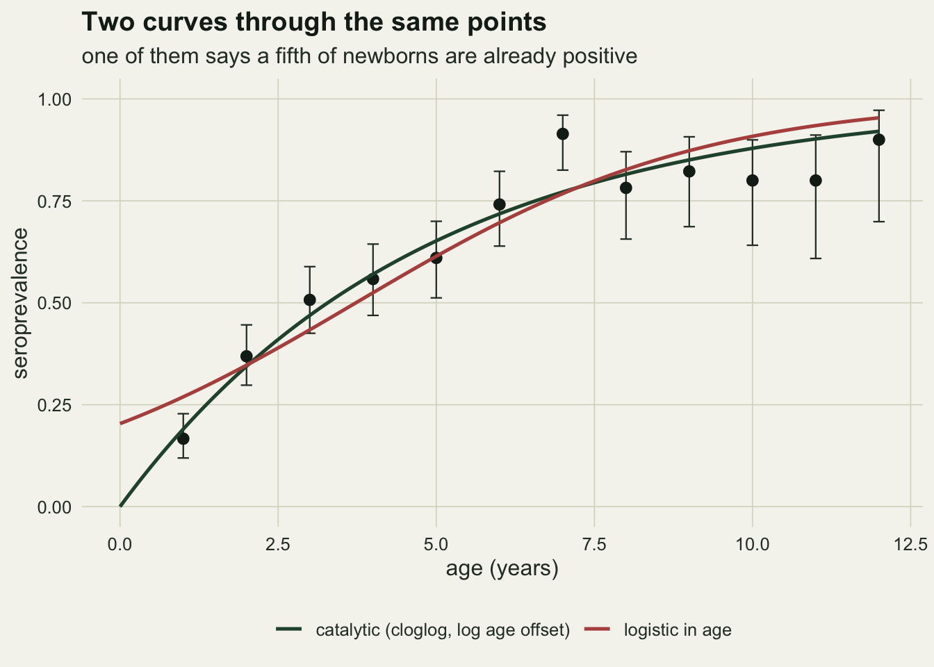
When the rate is not constant
A constant force of infection is a hypothesis, and it is often wrong: juveniles may be protected by maternal antibody, or exposure may peak when animals disperse. The offset trick does not extend directly, because a piecewise constant rate enters through a cumulative hazard that is a sum rather than a product, so the model is no longer log linear. Writing the likelihood out takes six lines.
band_edge <- c(0, 3, 7, 14)
band_foi  <- c(0.07, 0.30, 0.14)

cum_hazard <- function(a, edge, lam) {
  vapply(a, function(x)
    sum(lam * pmax(pmin(x, edge[-1]) - edge[-length(edge)], 0)), 0)
}

n_class2 <- 13
sampled2 <- c(200, 180, 165, 150, 135, 120, 105, 95, 85, 78, 70, 62, 55)
set.seed(23)
vary <- data.frame(age = seq_len(n_class2), n = sampled2)
vary$pos  <- rbinom(n_class2, vary$n, 1 - exp(-cum_hazard(vary$age, band_edge, band_foi)))
vary$neg  <- vary$n - vary$pos
vary$prev <- vary$pos / vary$n
vary[, c("lo", "hi")] <- wilson(vary$pos, vary$n)

m_flat <- glm(cbind(pos, neg) ~ 1 + offset(log(age)), data = vary,
              family = binomial(link = "cloglog"))
foi_flat <- unname(exp(coef(m_flat)[1]))

nll_bands <- function(par) {
  p <- 1 - exp(-cum_hazard(vary$age, band_edge, exp(par)))
  p <- pmin(pmax(p, 1e-12), 1 - 1e-12)
  -sum(vary$pos * log(p) + vary$neg * log(1 - p))
}
fit_bands <- optim(rep(log(0.2), length(band_foi)), nll_bands,
                   method = "BFGS", hessian = TRUE)
foi_bands <- exp(fit_bands$par)
se_bands  <- sqrt(diag(solve(fit_bands$hessian)))
band_lo   <- exp(fit_bands$par - 1.96 * se_bands)
band_hi   <- exp(fit_bands$par + 1.96 * se_bands)

deviance_of <- function(p, obs) {
  p <- pmin(pmax(p, 1e-12), 1 - 1e-12)
  2 * sum(ifelse(obs$pos > 0, obs$pos * log(obs$prev / p), 0) +
          ifelse(obs$neg > 0, obs$neg * log((1 - obs$prev) / (1 - p)), 0))
}
dev_bands <- deviance_of(1 - exp(-cum_hazard(vary$age, band_edge, foi_bands)), vary)
df_bands  <- n_class2 - length(band_foi)
lrt_stat  <- deviance(m_flat) - dev_bands
lrt_df    <- length(band_foi) - 1
lrt_p     <- pchisq(lrt_stat, lrt_df, lower.tail = FALSE)
band_width <- (band_hi - band_lo) / foi_bands
dev_flat   <- deviance(m_flat)
df_flat    <- m_flat$df.residual
Forcing a constant rate on these data returns 0.156 with a residual deviance of 94.7 on 12 degrees of freedom, which is a decisive rejection. The three band model recovers 0.070, 0.323 and 0.128 against generating values of 0.07, 0.30 and 0.14, with a deviance of 16.5 on 10 degrees of freedom. The likelihood ratio against the constant model is 78.2 on 2 degrees of freedom.
grid2 <- data.frame(age = seq(0, n_class2, length.out = 300))
grid2$band <- 1 - exp(-cum_hazard(grid2$age, band_edge, foi_bands))
grid2$flat <- 1 - exp(-foi_flat * grid2$age)
fit2 <- data.frame(age = rep(grid2$age, 2), p = c(grid2$band, grid2$flat),
                   fit = rep(c("three bands", "constant rate"), each = nrow(grid2)))

p_curve <- ggplot(vary, aes(age, prev)) +
  geom_errorbar(aes(ymin = lo, ymax = hi), width = 0.2,
                colour = te_body, linewidth = 0.4) +
  geom_point(size = 2.2, colour = te_ink) +
  geom_line(data = fit2, aes(age, p, colour = fit), linewidth = 0.9) +
  scale_colour_manual(values = c(te_rust, te_forest), name = NULL) +
  scale_y_continuous(limits = c(0, 1)) +
  labs(x = "age (years)", y = "seroprevalence", title = "Prevalence") +
  theme_datasheet() + theme(legend.position = "bottom")

band_tab <- data.frame(
  band = factor(sprintf("%g to %g", band_edge[-length(band_edge)], band_edge[-1]),
                levels = sprintf("%g to %g", band_edge[-length(band_edge)], band_edge[-1])),
  est = foi_bands, lo = band_lo, hi = band_hi, truth = band_foi)

p_band <- ggplot(band_tab, aes(band, est)) +
  geom_errorbar(aes(ymin = lo, ymax = hi), width = 0.14,
                colour = te_forest, linewidth = 0.6) +
  geom_point(size = 3, colour = te_forest) +
  geom_point(aes(y = truth), size = 2.6, shape = 4, colour = te_rust, stroke = 1.1) +
  labs(x = "age band (years)", y = "force of infection per year",
       title = "Rate by band", subtitle = "red crosses: generating values") +
  theme_datasheet()

p_curve + p_band + plot_annotation(theme = theme_datasheet())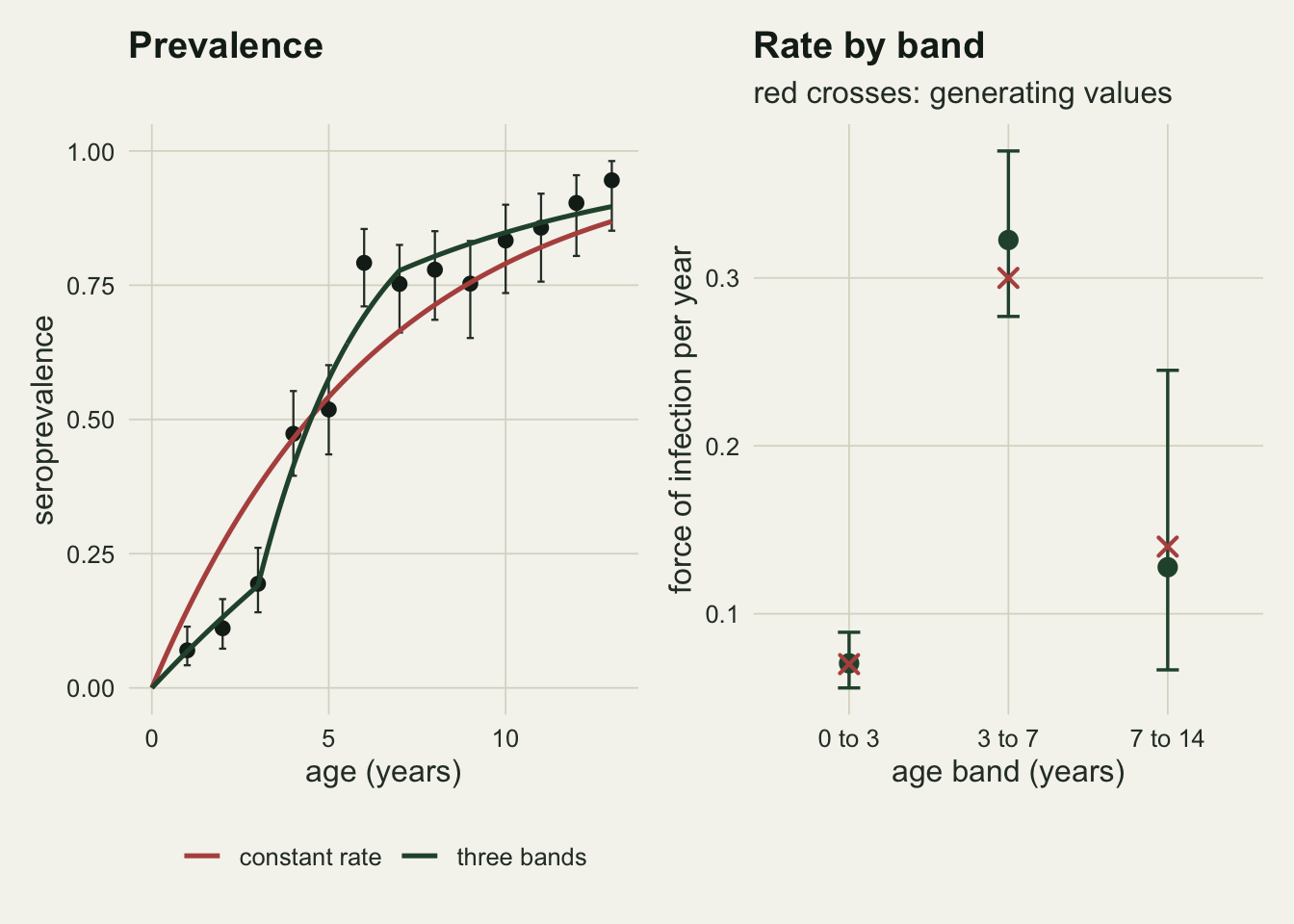
The right panel carries the warning. The interval on the oldest band spans 1.4 times its own estimate, against 0.5 for the youngest, and the reason is visible in the left panel: by age seven the prevalence is already near its ceiling, so almost no animal in the oldest band is still available to seroconvert. A cross-section carries information about the rate only where seronegative animals remain. Once prevalence saturates, the survey has nothing left to measure with, and no amount of extra sampling in old age classes will help.
There is a second constraint worth naming. In this model prevalence can only rise with age, because the cumulative hazard can only accumulate. A survey that shows prevalence falling in old animals cannot be explained by any non negative force of infection, and the explanation has to come from somewhere else.
Two mechanisms, one curve
That somewhere else is the honest limit of the whole exercise. Two processes flatten an age prevalence curve below one, and a single cross-section cannot separate them. Infection may kill: seropositive animals are removed faster, so the older age classes are enriched with survivors who were never infected. Or antibodies may wane: animals revert to seronegative and are counted as never infected.
p_mortality <- function(a, lam, alpha) {
  inf <- lam * (exp(-alpha * a) - exp(-lam * a)) / (lam - alpha)
  sus <- exp(-lam * a)
  inf / (sus + inf)
}
p_reversion <- function(a, lam, rho) lam / (lam + rho) * (1 - exp(-(lam + rho) * a))

age_grid  <- seq_len(15)
foi_mort  <- 0.30
alpha_mort <- 0.45
curve_mort <- p_mortality(age_grid, foi_mort, alpha_mort)

match_rev <- optim(log(c(0.3, 0.2)), function(par)
  sum((p_reversion(age_grid, exp(par[1]), exp(par[2])) - curve_mort)^2),
  method = "BFGS")
rev_par    <- exp(match_rev$par)
curve_rev  <- p_reversion(age_grid, rev_par[1], rev_par[2])
max_gap    <- max(abs(curve_rev - curve_mort))
half_life  <- log(2) / rev_par[2]
years_left <- 1 / alpha_mort
The best matching seroreversion model has a force of infection of 0.228 and a reversion rate of 0.135, and its curve differs from the mortality curve by at most 2.7 percentage points anywhere between ages one and 15. The two describe entirely different animals. One says infection removes a host in 2.2 years on average; the other says infection is harmless and antibodies have a half life of 5.1 years.
n_rep    <- 200
sampled3 <- c(200, 180, 165, 150, 135, 120, 105, 95, 85, 78, 70, 62, 55, 48, 42)

fit_two <- function(pos) {
  nll <- function(par, fun) {
    p <- fun(age_grid, exp(par[1]), exp(par[2]))
    p <- pmin(pmax(p, 1e-9), 1 - 1e-9)
    -sum(pos * log(p) + (sampled3 - pos) * log(1 - p))
  }
  c(2 * optim(log(c(0.3, 0.4)), nll, fun = p_mortality,  method = "BFGS")$value,
    2 * optim(log(c(0.3, 0.2)), nll, fun = p_reversion, method = "BFGS")$value)
}

set.seed(5)
two_fit <- replicate(n_rep, fit_two(rbinom(length(age_grid), sampled3, curve_mort)))
aic_diff <- two_fit[2, ] - two_fit[1, ]
wrong_wins <- mean(aic_diff < 0)
n_survey   <- sum(sampled3)
aic_mean   <- mean(aic_diff)
aic_sd     <- sd(aic_diff)
bern_var   <- 0.25
share_se   <- 100 * sqrt(bern_var / n_rep)
With 1590 animals in the survey, generated from the mortality model, the mean AIC advantage of the correct model is 1.4 points with a standard deviation of 2.4, and the wrong model has the lower AIC in 30 per cent of the surveys. This is not a power problem that a bigger sample fixes cheaply; it is two mechanisms writing nearly the same curve.
conf_long <- data.frame(
  age = rep(age_grid, 2), p = c(curve_mort, curve_rev),
  mechanism = rep(c("infection kills", "antibodies wane"), each = length(age_grid)))

p_conf <- ggplot(conf_long, aes(age, p, colour = mechanism)) +
  geom_line(linewidth = 1) + geom_point(size = 2) +
  scale_colour_manual(values = c(te_gold, te_forest), name = NULL) +
  scale_y_continuous(limits = c(0, 1)) +
  labs(x = "age (years)", y = "seroprevalence",
       title = "Same curve, opposite biology") +
  theme_datasheet() + theme(legend.position = "bottom")

p_aic <- ggplot(data.frame(d = aic_diff), aes(d)) +
  geom_histogram(bins = 30, fill = te_forest, colour = te_paper, linewidth = 0.2) +
  geom_vline(xintercept = 0, colour = te_rust, linetype = "dashed", linewidth = 0.8) +
  labs(x = "AIC of waning minus AIC of mortality", y = "surveys",
       title = "And the data cannot choose",
       subtitle = "dashed red: no preference") +
  theme_datasheet()

p_conf + p_aic + plot_annotation(theme = theme_datasheet())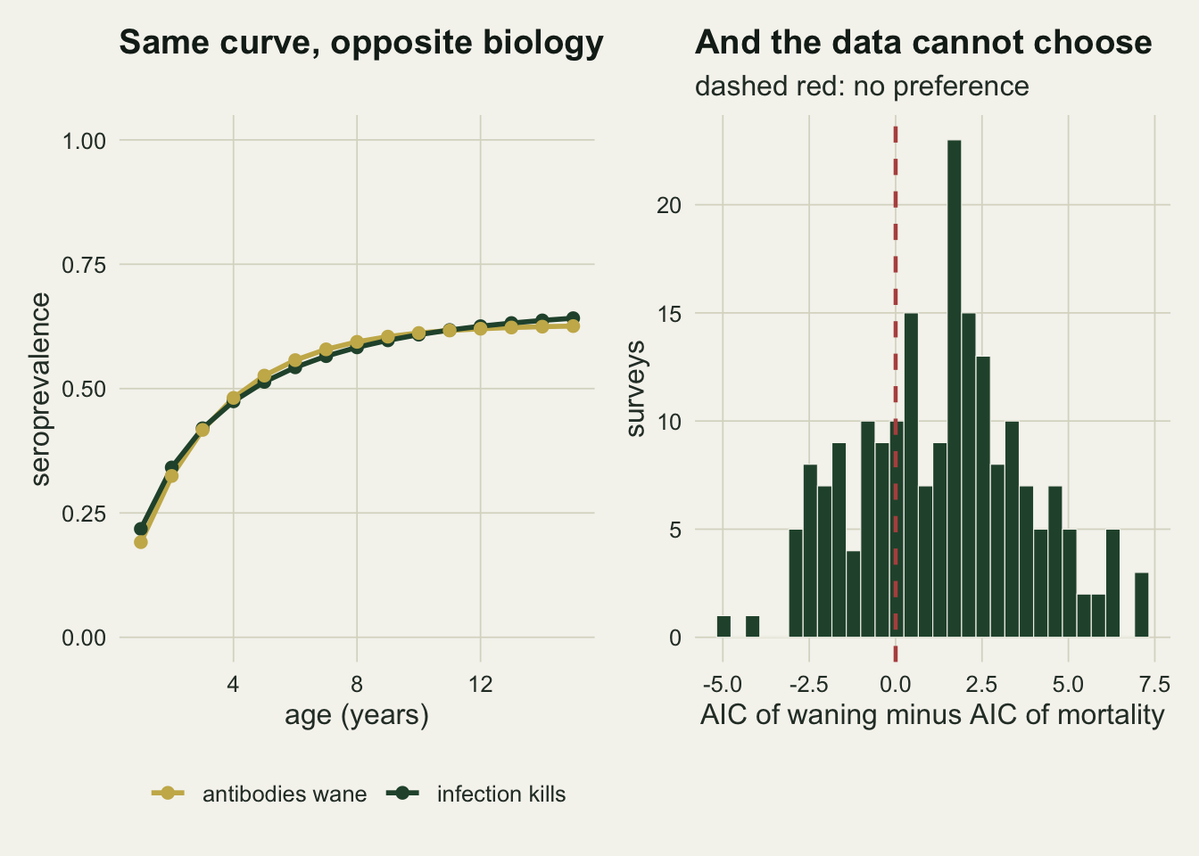
What to report
Give the age distribution of the sample, not only the prevalence. The number of seronegative animals per age class is what carries the information, and a survey that is mostly old animals can have a large sample size and almost no ability to estimate a rate.
Fit the catalytic model rather than a logistic regression on age. It is family = binomial(link = "cloglog") with offset(log(age)), its intercept exponentiates to a rate with units, and it cannot produce a positive prevalence at birth.
Report the force of infection with an interval, and report the age bands if the rate was allowed to vary. Band edges are a modelling choice, and the estimate in a band where prevalence has saturated should be quoted with its width, which will be embarrassing and should be.
Say which biological assumptions the estimate rests on: no seroreversion, no differential mortality, no maternal antibody, and a population at steady state. Every one of them is a claim about the host, and none of them is tested by the fit.
If mean age at infection or a reproduction number is derived from the rate, give the demographic quantities that went into the derivation as well. Those identities are covered separately on the site and they are only as good as the mortality schedule they assume.
Honest limits
The largest limitation is the one measured above: a cross-section cannot separate disease induced mortality from antibody waning, and both are common in wildlife. Longitudinal recaptures, or a test that distinguishes recent from historical infection, or independent mortality data, are the ways out, and all of them are more expensive than a survey.
Every model here assumes the population is at steady state and that the force of infection has been what it is now for the whole lifespan of the oldest animal sampled. A cross-section reads age as calendar time backwards, so a rate that changed five years ago appears as an age effect in exactly the same place as a genuine age effect. The two are not separable from one survey either, and the standard fix, fitting age and cohort together, needs surveys from more than one year.
Maternal antibody is ignored. In hosts where it persists for a substantial fraction of the first year, the youngest class is contaminated with positives that reflect the mother’s history and not the calf’s, and the fitted rate in the first band absorbs it. Dropping the youngest class is the crude repair and it costs the band that is otherwise best determined.
Ages are treated as exact. Field ages usually come from tooth wear or horn rings and carry error that a regression on age propagates in the familiar way, which the site covers under measurement error. The catalytic model is more sensitive to it than a logistic regression, because the offset ties the fitted curve to the age scale rather than merely to its ordering.
The band model uses fixed edges chosen with knowledge of the truth. Choosing edges from the same data that fits the rates makes the intervals optimistic, and the honest alternatives are a smooth on the cloglog scale or edges chosen from the host’s biology before the data are seen.
The comparison of the two mechanisms uses 200 simulated surveys, so the reported share of surveys favouring the wrong model has a standard error of about 3.5 percentage points. The conclusion that the two models are nearly indistinguishable does not rest on that share; it rests on the 2.7 percentage point maximum gap between the curves, which involves no sampling at all.
References
Heisey DM, Joly DO, Messier F 2006 Ecology 87(9):2356-2365 (10.1890/0012-9658(2006)87[2356:TFOGFM]2.0.CO;2)
Hens N, Aerts M, Faes C, Shkedy Z, Lejeune O, Van Damme P, Beutels P 2009 Epidemiology and Infection 138(6):802-812 (10.1017/S0950268809990781)
Grenfell BT, Anderson RM 1985 Journal of Hygiene 95(2):419-436 (10.1017/S0022172400062859)