library(ggplot2)
library(patchwork)
library(mgcv)

te_paper  <- "#f5f4ee"
te_ink    <- "#16241d"
te_body   <- "#2c3a31"
te_forest <- "#275139"
te_rust   <- "#b5534e"
te_gold   <- "#c9b458"
te_line   <- "#dad9ca"

theme_datasheet <- function() {
  theme_minimal(base_size = 12) +
    theme(plot.background  = element_rect(fill = te_paper, colour = NA),
          panel.background = element_rect(fill = te_paper, colour = NA),
          panel.grid.major = element_line(colour = te_line, linewidth = 0.3),
          panel.grid.minor = element_blank(),
          text             = element_text(colour = te_body),
          plot.title       = element_text(colour = te_ink, face = "bold"),
          plot.subtitle    = element_text(colour = te_body),
          axis.text        = element_text(colour = te_body))
}Derivatives of a GAM trend: when did it change?
R
GAMs
mgcv
trend
monitoring
thresholds
ecology tutorial
The derivative of a GAM trend with a simultaneous interval says when an ecological series declined. A breakpoint fitted to a smooth decline misplaces it.
A farmland bird index has been kept for forty years. On the log scale it sat near five for the first decade, fell through the middle of the series, and has been close to three for the last ten years. The report is drafted and the manager asks the question every trend report gets asked: when did it change? The answer matters, because the candidate causes (a switch to autumn sowing, a drainage grant, a pesticide approval) each have a date, and the one that lines up with the decline gets the attention.
There are two common ways to answer. One is to fit a breakpoint model: a straight line that bends at a single year, with the year chosen to minimise the residual sum of squares, and to report that year as the moment of change. The other is to fit a smooth trend with a generalised additive model and ask where its slope is clearly different from zero. The first gives a single date, which is what the manager asked for. The second gives a period and a rate, which is less tidy. This post argues, with measurements, that on a decline that is gradual and levels off at both ends the second answer is the right one, and that the tidy date from the first is not just imprecise but placed away from the decline itself.
The breakpoint side of this has groundwork here already. Segmented regression for a breakpoint fits the broken stick by profiling the residual sum of squares, and its closing section warns that “the profile will always return a minimum, even for data with no genuine threshold”, and that “telling a genuine break from a gradual bend is a question the data alone rarely settle”. Testing for an ecological threshold then shows that the F table for the slope-change term rejects a true straight line three to four times too often once the breakpoint is estimated, builds the null by simulation, and fits one smooth saturating data set where the break test rejects a line while a smooth curve is preferred by AIC. What neither post measures is where the breakpoint lands when the truth is smooth, how much that location moves from one realisation of the same process to the next, and what should be reported instead. Those are the questions here.
The smooth side has groundwork too. Estimating population trends in R fits a GAM to a monitoring series to show the shape a single rate hides, but stops at the fitted curve and its band. The step taken here is to differentiate that curve. The fact that a pointwise band is too narrow for a whole curve has been measured twice on this site, for point pattern envelopes and for wavelet significance maps, and local regression showed that a variance-only band is also centred in the wrong place where the curve bends. It is used below, not rediscovered, and the interval on the derivative is simultaneous from the start.
A smooth decline with no break in it
The simulated index follows a logistic curve on the log scale: a plateau, a decline whose rate rises and then falls, and a lower plateau. There is no year at which the slope jumps. A second truth is kept alongside it for later, a genuine broken stick with a level plateau until year 20 and a constant decline afterwards, falling by the same total amount by the end of the series. All design constants below were fixed before any simulation was run.
n_yr    <- 40                         # years of monitoring
yr      <- seq_len(n_yr)
top_lev <- 5                          # log index before the decline
drop_sz <- 2                          # total fall on the log scale
mid_yr  <- 20                         # year of the steepest decline
width_s <- 4                          # logistic scale, in years
sig_obs <- 0.3                        # residual standard deviation
n_gam   <- 400                        # replicate series for the GAM bands
n_bp    <- 2000                       # replicate series for the breakpoint fits

mu_logis <- function(tt) top_lev - drop_sz + drop_sz / (1 + exp((tt - mid_yr) / width_s))
d_logis  <- function(tt) {
  e_t <- exp((tt - mid_yr) / width_s)
  -(drop_sz / width_s) * e_t / (1 + e_t)^2
}
hinge_rate <- drop_sz / mid_yr        # abrupt truth: same total fall after year 20
mu_hinge <- function(tt) top_lev - hinge_rate * pmax(tt - mid_yr, 0)
d_hinge  <- function(tt) ifelse(tt > mid_yr, -hinge_rate, 0)

peak_rate <- -d_logis(mid_yr)
q_10 <- mid_yr - width_s * log(9)     # 10 per cent of the fall completed
q_90 <- mid_yr + width_s * log(9)     # 90 per cent completed
rate_yr1 <- -d_logis(1)

set.seed(2108)
y_ex <- mu_logis(yr) + rnorm(n_yr, 0, sig_obs)
The steepest decline is at year 20, where the index falls by 0.125 log units a year. Ten per cent of the total fall is complete by year 11.2 and ninety per cent by year 28.8, so most of the decline is spread over nearly two decades. The slope is never exactly zero: in year one the index is already falling at 0.0043 a year, far too slowly to be seen against a residual standard deviation of 0.3. If the manager’s question has a true answer for this series, it is a period centred on year 20, not a year.
The derivative of the fitted trend
A GAM trend fitted in mgcv (Wood 2017) is a linear combination of basis functions, and predict(..., type = "lpmatrix") returns the matrix that maps the coefficients to fitted values at any set of years. Evaluating that matrix a small step above and below each year and taking the difference gives a matrix that maps the coefficients to the slope of the trend, so the estimated derivative is that matrix times the coefficients and its standard error follows from the coefficient covariance. This is the construction Simpson (2018) uses for palaeoecological series, and it is exact for the fitted spline up to the finite difference step.
The interval has to be simultaneous, because the question “when was it declining” scans the whole curve. Ruppert, Wand and Carroll (2003) build the band by simulation: draw coefficient deviations from a multivariate normal with the model covariance, compute for each draw the largest absolute deviation of the derivative across the grid in units of its own standard error, and take the 95th percentile of those maxima as the critical multiplier. The band is the estimate plus and minus that multiplier times the pointwise standard error. The covariance used is the one vcov() returns for a gam fit, the Bayesian posterior covariance, which conditions on the estimated smoothing parameter.
grid_yr <- seq(1, n_yr, length.out = 200)
eps_fd  <- 1e-3
n_draw  <- 1000

deriv_band <- function(y, n_sim = n_draw) {
  fit <- gam(y ~ s(yr, k = 20), method = "REML")
  x_up <- predict(fit, data.frame(yr = grid_yr + eps_fd), type = "lpmatrix")
  x_dn <- predict(fit, data.frame(yr = grid_yr - eps_fd), type = "lpmatrix")
  x_d  <- (x_up - x_dn) / (2 * eps_fd)
  b_hat <- coef(fit)
  v_b   <- vcov(fit)
  d_hat <- drop(x_d %*% b_hat)
  se_d  <- sqrt(rowSums((x_d %*% v_b) * x_d))
  b_dev <- rmvn(n_sim, rep(0, length(b_hat)), v_b)
  max_dev <- apply(abs(x_d %*% t(b_dev)) / se_d, 2, max)
  crit <- unname(quantile(max_dev, 0.95))
  list(fit = fit, d = d_hat, se = se_d, crit = crit, edf = sum(fit$edf) - 1,
       fitted = predict(fit, data.frame(yr = grid_yr)))
}

set.seed(311)
ex_band <- deriv_band(y_ex)
ex_flag <- (ex_band$d + ex_band$crit * ex_band$se) < 0
ex_first <- grid_yr[which(ex_flag)[1]]
ex_last  <- grid_yr[max(which(ex_flag))]
ex_steep <- grid_yr[which.min(ex_band$d)]
ex_true_cover <- all(abs(ex_band$d - d_logis(grid_yr)) <= ex_band$crit * ex_band$se)
On the example series the smooth uses 4.5 effective degrees of freedom. The simultaneous multiplier is 3.15, against 1.96 for a pointwise band. The upper edge of the band is below zero from year 13.0 to year 24.3, and the estimated derivative is steepest at year 21.0. Does the band contain the true derivative at every grid year? Yes. That is the answer to report for this series: the index was declining between those years, fastest around year 21, at the rates the curve shows.
psi_cand <- seq(5, 35, by = 0.1)
qr_line  <- qr(cbind(1, yr))
qr_hinge <- lapply(psi_cand, function(p) qr(cbind(1, yr, pmax(yr - p, 0))))

fit_break <- function(y_mat) {
  y_mat <- as.matrix(y_mat)
  rss_line <- colSums(qr.resid(qr_line, y_mat)^2)
  rss_all <- vapply(qr_hinge, function(q) colSums(qr.resid(q, y_mat)^2),
                    numeric(ncol(y_mat)))
  rss_all <- matrix(rss_all, nrow = ncol(y_mat))
  best <- max.col(-rss_all, ties.method = "first")
  rss_min <- rss_all[cbind(seq_len(ncol(y_mat)), best)]
  data.frame(psi = psi_cand[best],
             f_stat = (rss_line - rss_min) / (rss_min / (n_yr - 3)))
}

n_null <- 10000
set.seed(7431)
null_f  <- fit_break(matrix(rnorm(n_yr * n_null), n_yr))$f_stat
crit_mc <- unname(quantile(null_f, 0.95))
crit_ft <- qf(0.95, 1, n_yr - 3)
size_ft <- mean(null_f > crit_ft)

ex_break <- fit_break(y_ex)
ex_p_naive <- pf(ex_break$f_stat, 1, n_yr - 3, lower.tail = FALSE)
ex_p_mc    <- (1 + sum(null_f >= ex_break$f_stat)) / (n_null + 1)
ex_hinge_fit <- lm(y_ex ~ yr + pmax(yr - ex_break$psi, 0))
The same series goes to a single-breakpoint model, profiled over candidate years from 5 to 35 in steps of a tenth, so that at least five years sit on each side of the bend. The profile puts the break at year 28.4, on the lower shoulder of the curve and 7.4 years after the fitted derivative is steepest. The F table gives the slope change a p-value of 0.0022; the calibrated test described further down gives 0.0133. Both would be read as a significant break, and a report built on this fit would date the change to a point where the decline was nearly over.
ex_pred <- data.frame(yr = grid_yr, gam = ex_band$fitted, truth = mu_logis(grid_yr),
                      stick = predict(ex_hinge_fit, data.frame(yr = grid_yr)))
top_panel <- ggplot(data.frame(yr = yr, y = y_ex), aes(yr, y)) +
  geom_point(colour = te_body, size = 1.6, alpha = 0.7) +
  geom_line(data = ex_pred, aes(yr, truth), colour = te_ink, linetype = "dotted",
            linewidth = 0.8) +
  geom_line(data = ex_pred, aes(yr, gam), colour = te_forest, linewidth = 1) +
  geom_line(data = ex_pred, aes(yr, stick), colour = te_rust, linetype = "dashed",
            linewidth = 0.9) +
  geom_vline(xintercept = ex_break$psi, colour = te_rust, linewidth = 0.4) +
  annotate("text", x = ex_break$psi + 0.6, y = max(y_ex), hjust = 0,
           label = "estimated break", colour = te_rust, size = 3.4) +
  labs(x = NULL, y = "log index",
       title = "A smooth decline and two answers to 'when'",
       subtitle = "green: GAM trend; dashed red: broken stick; dotted: true mean") +
  theme_datasheet()

ex_deriv <- data.frame(yr = grid_yr, d = ex_band$d, truth = d_logis(grid_yr),
                       sim_lo = ex_band$d - ex_band$crit * ex_band$se,
                       sim_hi = ex_band$d + ex_band$crit * ex_band$se,
                       pw_lo = ex_band$d - qnorm(0.975) * ex_band$se,
                       pw_hi = ex_band$d + qnorm(0.975) * ex_band$se)
bottom_panel <- ggplot(ex_deriv, aes(yr)) +
  annotate("rect", xmin = ex_first, xmax = ex_last, ymin = -Inf, ymax = Inf,
           fill = te_gold, alpha = 0.18) +
  geom_hline(yintercept = 0, colour = te_body, linewidth = 0.4) +
  geom_ribbon(aes(ymin = sim_lo, ymax = sim_hi), fill = te_forest, alpha = 0.18) +
  geom_ribbon(aes(ymin = pw_lo, ymax = pw_hi), fill = te_forest, alpha = 0.25) +
  geom_line(aes(y = d), colour = te_forest, linewidth = 1) +
  geom_line(aes(y = truth), colour = te_ink, linetype = "dotted", linewidth = 0.8) +
  labs(x = "year", y = "slope (log units per year)",
       subtitle = "outer band simultaneous, inner pointwise; gold: band wholly below zero") +
  theme_datasheet()

top_panel / bottom_panel + plot_annotation(theme = theme_datasheet())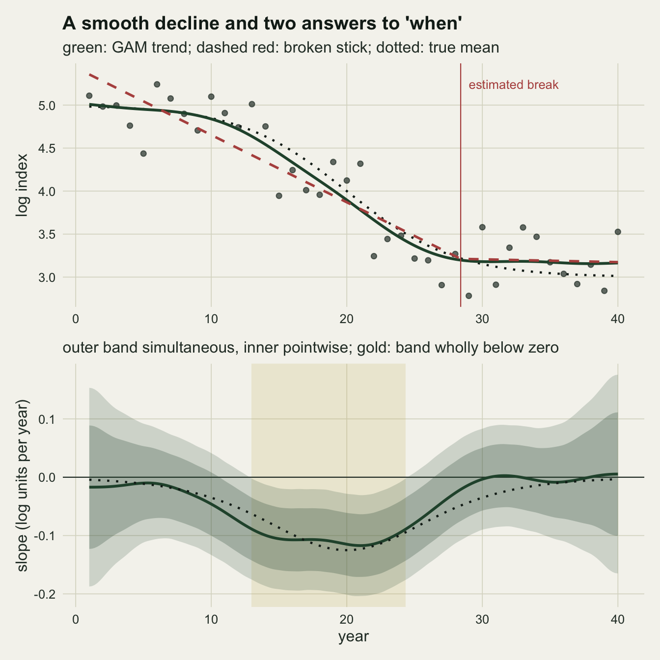
Is the band honest?
One series proves nothing about an interval. The derivative band was refitted to 400 independent realisations of the logistic truth, and to the same number of series with no trend at all, a flat mean with the same noise. On the flat series the question is the family-wise one: how often does the band claim a slope anywhere in the forty years when there is none?
set.seed(5520)
y_logis <- mu_logis(yr) + matrix(rnorm(n_yr * n_gam, 0, sig_obs), n_yr)
y_hinge <- mu_hinge(yr) + matrix(rnorm(n_yr * n_gam, 0, sig_obs), n_yr)
y_flat  <- top_lev + matrix(rnorm(n_yr * n_gam, 0, sig_obs), n_yr)

run_bands <- function(y_mat, d_true) {
  out <- lapply(seq_len(ncol(y_mat)), function(j) deriv_band(y_mat[, j]))
  flag <- t(vapply(out, function(o) (o$d + o$crit * o$se) < 0 |
                                   (o$d - o$crit * o$se) > 0, logical(length(grid_yr))))
  flag_down <- t(vapply(out, function(o) (o$d + o$crit * o$se) < 0,
                        logical(length(grid_yr))))
  covered <- vapply(out, function(o) all(abs(o$d - d_true) <= o$crit * o$se), logical(1))
  list(sim_cover = mean(covered),
       pw_cover  = mean(vapply(out, function(o)
         all(abs(o$d - d_true) <= qnorm(0.975) * o$se), logical(1))),
       covered = covered,
       worst_yr = vapply(out, function(o)
         grid_yr[which.max(abs(o$d - d_true) / (o$crit * o$se))], numeric(1)),
       steep = vapply(out, function(o) grid_yr[which.min(o$d)], numeric(1)),
       edf  = vapply(out, function(o) o$edf, numeric(1)),
       crit = vapply(out, function(o) o$crit, numeric(1)),
       flag = flag, flag_down = flag_down)
}
mc_se <- function(p, n) sqrt(p * (1 - p) / n)

bands_logis <- run_bands(y_logis, d_logis(grid_yr))
bands_flat  <- run_bands(y_flat, rep(0, length(grid_yr)))

crit_med   <- median(bands_logis$crit)
flat_any   <- mean(apply(bands_flat$flag, 1, any))
logis_runs <- apply(bands_logis$flag_down, 1, function(z) sum(diff(c(FALSE, z)) == 1))
logis_any  <- mean(logis_runs > 0)
one_run    <- mean(logis_runs == 1)
first_flag <- apply(bands_logis$flag_down, 1, function(z)
  if (any(z)) grid_yr[which(z)[1]] else NA_real_)
last_flag  <- apply(bands_logis$flag_down, 1, function(z)
  if (any(z)) grid_yr[max(which(z))] else NA_real_)
first_q <- quantile(first_flag, c(0.1, 0.5, 0.9), na.rm = TRUE)
last_q  <- quantile(last_flag, c(0.1, 0.5, 0.9), na.rm = TRUE)
mid_flagged <- mean(bands_logis$flag_down[, which.min(abs(grid_yr - mid_yr))])
rate_first  <- -d_logis(first_q[[2]])
rate_last   <- -d_logis(last_q[[2]])

miss_yr    <- bands_logis$worst_yr[!bands_logis$covered]
miss_mid   <- mean(abs(miss_yr - mid_yr) <= 5)
miss_edge  <- mean(miss_yr <= 5 | miss_yr >= n_yr - 4)
start_flag <- bands_logis$flag_down[, 1]
start_share <- mean(start_flag)
edf_start  <- median(bands_logis$edf[start_flag])
edf_rest   <- median(bands_logis$edf[!start_flag])
straight    <- bands_logis$edf < 1.1
straight_share <- mean(straight)
start_straight <- sum(straight[start_flag])
steep_curved <- bands_logis$steep[!straight]
steep_sd    <- sd(steep_curved)
steep_q     <- quantile(steep_curved, c(0.1, 0.9))
steep_near  <- mean(abs(steep_curved - mid_yr) <= 2.5)
On the flat series the band excluded zero somewhere in 0.040 of fits, with a Monte Carlo standard error of 0.010, against the nominal 0.05. The family-wise false alarm rate is where it should be. Coverage of the whole true derivative curve is less comfortable. The simultaneous band contained the logistic derivative at every grid year in 0.897 of fits (standard error 0.015), short of 0.95; the pointwise band managed 0.760. Of the fits that missed, 0.63 had their worst miss within five years of year 20, where the penalty flattens the peak of the derivative, and 0.32 in the first or last five years of the series, where the band rests on data from one side only. The first kind is the smoothing bias that local regression from scratch measured for a curve: a band built from variance alone is centred too shallow where the truth bends hardest. The median multiplier across fits was 3.12.
The detection record is the part the manager cares about. The band flagged a decline somewhere in 0.9975 of the series, and in 0.985 of them the flagged years formed a single unbroken period. Year 20 was inside the flagged period in 0.9875 of fits. The flagged period began at a median of year 13.3 (10th to 90th percentile 6.7 to 16.5) and ended at a median of year 26.3 (23.9 to 32.7). At those median edges the true decline runs at 0.067 and 0.071 log units a year, against the peak of 0.125: the band reports the part of the decline the data can resolve at this noise level, and says nothing about the slow start and finish it cannot.
The lower tail of those start years has a separate cause. In 0.065 of fits the flagged period already included year one. The median effective degrees of freedom of those fits was 1.00, against 4.06 for the rest. In most of them REML had shrunk the smooth to a straight line (20 of 26 had effective degrees of freedom below 1.1), whose derivative is one constant, so the band declared the whole early plateau to be declining. A flagged period that runs from the first year to the last is a sign to look at the effective degrees of freedom before reading any dates from it.
A breakpoint on a smooth decline lands on a shoulder
The breakpoint procedure was run on 2000 fresh realisations of the logistic truth. Before the rates, the test needs settling, because this is where the Davies problem bites. Under the hypothesis of a straight line the breakpoint does not exist, so the F statistic maximised over candidate years does not follow the F distribution with one and 37 degrees of freedom (Davies 1987). Here the null distribution can be simulated exactly rather than bootstrapped: with the years fixed and normal errors, the maximised F is unchanged by any intercept, slope or residual scale, because both models contain the intercept and the linear term. Standard normal noise on the forty years therefore gives the null distribution of the statistic for every straight line at once.
set.seed(8802)
y_bp_logis <- mu_logis(yr) + matrix(rnorm(n_yr * n_bp, 0, sig_obs), n_yr)
y_bp_hinge <- mu_hinge(yr) + matrix(rnorm(n_yr * n_bp, 0, sig_obs), n_yr)
bp_logis <- fit_break(y_bp_logis)
bp_hinge <- fit_break(y_bp_hinge)

rej_ft_logis <- mean(bp_logis$f_stat > crit_ft)
rej_mc_logis <- mean(bp_logis$f_stat > crit_mc)
psi_sd_logis <- sd(bp_logis$psi)
psi_q_logis  <- quantile(bp_logis$psi, c(0.1, 0.5, 0.9))
early_share  <- mean(bp_logis$psi < mid_yr)
edge_share   <- mean(bp_logis$psi <= min(psi_cand) | bp_logis$psi >= max(psi_cand))
near_count   <- sum(abs(bp_logis$psi - mid_yr) <= 2.5)
From 10000 null series the 95th percentile of the maximised F is 7.06, against 4.11 in the F table, and the table’s critical value is exceeded by 0.189 of null series rather than 0.05. The naive test is anticonservative by a factor of 3.8, in line with testing for an ecological threshold.
On the logistic series the naive test declares a significant break in 0.781 of replicates. The calibrated test rejects the straight line in 0.417 of them (standard error 0.011). So the claim that a break is found in most replicates is true only of the invalid test; the valid test rejects the line in fewer than half. And the calibrated rejections are correct decisions about a different question. The truth is not a straight line, so rejecting the line is right; it says nothing about whether the curve has a break.
The location is the real failure. Across replicates the estimated breakpoint has a standard deviation of 11.7 years, with a median of year 29.0 and 10th and 90th percentiles at 6.0 and 34.8. The number of breakpoints within two and a half years of the steepest decline at year 20 is 0 out of 2000. The estimates split between the two shoulders of the curve: 0.381 fall before year 20, the rest after it, and 0.166 sit on the boundary of the candidate range, where the fit is held back by the rule that five years must remain on each side.
The reason is geometric. A single bend can fit a flat stretch followed by a line, or a line followed by a flat stretch, but not both plateaus of an S-shaped curve. Whichever plateau the noise makes more convincing gets the flat piece, the line absorbs the decline and the other plateau, and the bend sits at the corner of the plateau that won. The steepest part of the decline is the one place a single hinge has no reason to put its bend.
n_show <- 40
stick_lines <- do.call(rbind, lapply(seq_len(n_show), function(j) {
  p_j <- bp_logis$psi[j]
  f_j <- lm(y_bp_logis[, j] ~ yr + pmax(yr - p_j, 0))
  data.frame(rep_id = j, yr = grid_yr,
             y = predict(f_j, data.frame(yr = grid_yr)))
}))
truth_line <- data.frame(yr = grid_yr, y = mu_logis(grid_yr))
tick_dat <- data.frame(psi = bp_logis$psi[seq_len(n_show)])

ggplot(stick_lines, aes(yr, y, group = rep_id)) +
  geom_line(colour = te_rust, alpha = 0.35, linewidth = 0.5) +
  geom_line(data = truth_line, aes(yr, y), inherit.aes = FALSE,
            colour = te_ink, linewidth = 1.2) +
  geom_segment(data = tick_dat, aes(x = psi, xend = psi, y = 2.35, yend = 2.55),
               inherit.aes = FALSE, colour = te_rust, linewidth = 0.6) +
  geom_vline(xintercept = mid_yr, colour = te_gold, linewidth = 0.7, linetype = "dashed") +
  annotate("text", x = mid_yr + 0.5, y = 5.45, hjust = 0, colour = te_body, size = 3.4,
           label = "steepest decline") +
  labs(x = "year", y = "log index",
       title = "The bend goes to a shoulder, not to the decline",
       subtitle = "red: single-breakpoint fits to forty replicates; black: true mean") +
  theme_datasheet()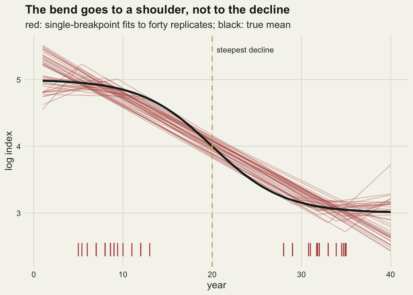
When the change really is abrupt
A breakpoint model is the right tool when the process has a corner: a weir is built, a harvest quota is imposed, a disease arrives in a season. The abrupt truth kept aside at the start is exactly the model’s own shape, a level index until year 20 and a decline of 0.10 log units a year after it. Both methods were run on it.
rej_mc_hinge <- mean(bp_hinge$f_stat > crit_mc)
psi_sd_hinge <- sd(bp_hinge$psi)
psi_q_hinge  <- quantile(bp_hinge$psi, c(0.1, 0.5, 0.9))
sd_ratio     <- psi_sd_logis / psi_sd_hinge

bands_hinge <- run_bands(y_hinge, d_hinge(grid_yr))
first_hinge <- apply(bands_hinge$flag_down, 1, function(z)
  if (any(z)) grid_yr[which(z)[1]] else NA_real_)
hinge_any    <- mean(!is.na(first_hinge))
first_q_h    <- quantile(first_hinge, c(0.1, 0.5, 0.9), na.rm = TRUE)
early_false  <- mean(first_hinge < mid_yr, na.rm = TRUE)
early_far    <- mean(first_hinge < mid_yr - 2, na.rm = TRUE)

# breakpoint on the same series, measured against the flagged period
flag_ends <- function(flag_mat) t(apply(flag_mat, 1, function(z)
  if (any(z)) range(grid_yr[z]) else c(NA_real_, NA_real_)))
bp_vs_band <- function(y_mat, flag_mat) {
  psi_j <- fit_break(y_mat)$psi
  ends_j <- flag_ends(flag_mat)
  keep <- !is.na(ends_j[, 1])
  psi_j <- psi_j[keep]; ends_j <- ends_j[keep, , drop = FALSE]
  inside <- psi_j >= ends_j[, 1] & psi_j <= ends_j[, 2]
  gap <- ifelse(inside, 0, pmin(abs(psi_j - ends_j[, 1]), abs(psi_j - ends_j[, 2])))
  list(near_start = mean(abs(psi_j - ends_j[, 1]) <= 3),
       before_start = mean(psi_j < ends_j[, 1]),
       inside = mean(inside), out_far = mean(gap > 3),
       lead_med = median(ends_j[, 1] - psi_j),
       len_med = median(ends_j[, 2] - ends_j[, 1]))
}
pb_logis <- bp_vs_band(y_logis, bands_logis$flag_down)
pb_hinge <- bp_vs_band(y_hinge, bands_hinge$flag_down)
Here the breakpoint does its job. The calibrated test rejects the line in 1.000 of replicates, the median breakpoint is year 20.0, and the 10th to 90th percentile range is 17.0 to 23.0. Its standard deviation of 2.7 years is a factor of 4.3 smaller than on the smooth truth with the same noise and the same total fall.
The derivative is the weaker tool on a corner, and the measurements say how. The band flagged a decline in 1.000 of series, with the flagged period starting at a median of year 21.8 (10th to 90th percentile 19.8 to 23.9): later than the true corner, because a smooth cannot turn instantly and its slope has to build up. In 0.113 of series the flagged period began before year 20, while the truth was still level, and in 0.013 it began more than two years early. The simultaneous band contained the true, discontinuous derivative in only 0.755 of fits, and the pointwise band in 0.0325: a smooth band cannot follow a step in the slope, and near the corner it misses it.
truth_lab <- c("smooth logistic decline", "abrupt bend at year 20")
psi_dat <- rbind(data.frame(psi = bp_logis$psi, truth = truth_lab[1]),
                 data.frame(psi = bp_hinge$psi, truth = truth_lab[2]))
psi_dat$truth <- factor(psi_dat$truth, levels = truth_lab)
flag_dat <- rbind(
  data.frame(yr = grid_yr, share = colMeans(bands_logis$flag_down), truth = truth_lab[1]),
  data.frame(yr = grid_yr, share = colMeans(bands_hinge$flag_down), truth = truth_lab[2]))
flag_dat$truth <- factor(flag_dat$truth, levels = truth_lab)

hist_panel <- ggplot(psi_dat, aes(psi)) +
  geom_histogram(breaks = seq(5, 35, by = 1), fill = te_rust, colour = te_paper,
                 linewidth = 0.2) +
  geom_vline(xintercept = mid_yr, colour = te_gold, linewidth = 0.7, linetype = "dashed") +
  facet_wrap(~ truth) +
  coord_cartesian(xlim = c(1, n_yr)) +
  labs(x = NULL, y = "replicates",
       title = "A breakpoint finds a corner only when there is one",
       subtitle = "top: estimated breakpoints; bottom: share of derivative bands below zero") +
  theme_datasheet()

share_panel <- ggplot(flag_dat, aes(yr, share)) +
  geom_area(fill = te_forest, alpha = 0.25) +
  geom_line(colour = te_forest, linewidth = 0.9) +
  geom_vline(xintercept = mid_yr, colour = te_gold, linewidth = 0.7, linetype = "dashed") +
  facet_wrap(~ truth) +
  scale_y_continuous(limits = c(0, 1)) +
  coord_cartesian(xlim = c(1, n_yr)) +
  labs(x = "year", y = "share flagged as declining") +
  theme_datasheet()

hist_panel / share_panel + plot_annotation(theme = theme_datasheet())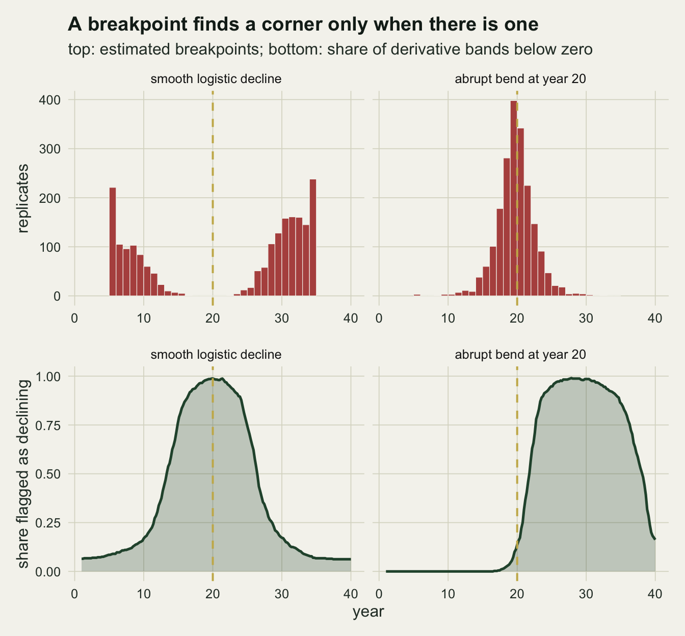
What to report
For a trend that may have changed gradually, report the fitted smooth, its derivative, and the years over which the simultaneous band on the derivative lies wholly on one side of zero, together with the year and size of the steepest rate. State that the band is simultaneous, the number of posterior draws and the basis size. The dates that come out are the dates at which the data resolve a slope, not the dates at which the process began and ended; on the logistic truth above the flagged period started when the true rate was already 0.54 of its peak, and the report should say that the onset of a slow decline comes later in the band than in the world.
Treat a breakpoint as a model of a corner, and fit it when a corner is what the mechanism predicts: a known intervention, a dated event, a policy with a start year. Test it against the straight line with a calibrated null, never the F table. On the design here the simulated critical value was 7.06 against a table value of 4.11. A significant calibrated test still only rejects the line, so fit the smooth as well and look at where the breakpoint falls relative to the flagged period. On the 400 abrupt series used for the bands, the breakpoint sat within three years of the start of the flagged period in 0.782 of them; it came before the start in 0.877 of series (median lead over all series 1.6 years), because the smooth needs time to build up its slope after a corner. On the logistic series the breakpoint sat within three years of the start in only 0.063 of them; instead the breakpoint lay more than three years outside the flagged period in 0.754 of them, out on a plateau, and inside it in 0.108. So a breakpoint within about three years of the start of the flagged period (usually just before it) is consistent with a corner, and one that lands well outside the period on a plateau points to a gradual bend. On a single series this is a hint, not a test: 0.218 of the abrupt series and 0.063 of the logistic ones would be misread by the three-year rule.
When a report needs a single date, give the year of the steepest fitted rate from the derivative with the flagged period beside it. It is not exact either. Across the logistic replicates whose smooth was not a straight line, the steepest fitted year had a standard deviation of 2.9 years, 10th and 90th percentiles at 17.1 and 22.2, and fell within two and a half years of year 20 in 0.779 of fits, against a breakpoint standard deviation of 11.7 years; on a straight-line fit (effective degrees of freedom near one) there is no steepest year to report. Do not give the breakpoint year from a model fitted to a curve that has two plateaus; on the logistic truth the number of breakpoints within two and a half years of the steepest decline was 0 out of 2000 replicates.
Honest limits
The breakpoint model here has a single bend. A two-breakpoint model can bend at both shoulders of the logistic curve and should follow it more closely, and a practitioner who looked at the data first might well choose one; it was not fitted here. The measurement above is of the model most often reached for, on a curve with two plateaus, and the failure depends on that combination. On a smooth decline with only one plateau (a slow start into a steady fall), a single bend has one shoulder to choose and would scatter less, although it would still date a gradual onset to one year. That case was not simulated.
The candidate range kept five years on each side, and 0.166 of the smooth-truth breakpoints landed on its boundary. Those estimates are censored at the limit, and a wider range was not tried. Their minimum lay at or beyond the limit, so an unrestricted profile could only place them nearer the ends of the series; if anything the reported scatter understates the spread rather than overstating it.
The simultaneous band conditions on the smoothing parameter chosen by REML and on the normal approximation to the coefficients. Its coverage of the whole logistic derivative was 0.897, not 0.95, and on the abrupt truth it was 0.755. The covariance corrected for smoothing parameter uncertainty, vcov(fit, unconditional = TRUE), gives a somewhat wider band and may recover part of the shortfall; it was not used, so that the band is the one most analyses produce, and its effect here was not measured. The multiplier comes from 1000 draws per fit, which leaves some Monte Carlo noise in each band. The band also inherits every failure of the smoothing parameter estimate: when REML returns a straight line, as it did in 0.050 of the logistic fits (effective degrees of freedom below 1.1), the band on its derivative is a band on one slope and cannot localise anything.
The residuals were independent and normal with constant variance. A monitoring index is usually autocorrelated, and checking a generalised additive model shows what that does to a GAM trend: the smooth spends extra degrees of freedom on correlated noise and the band is too narrow. A too-narrow derivative band flags spurious short periods of change, so the family-wise rate measured on the flat series here should not be expected to hold for an autocorrelated index; that case was not simulated. Real counts also need a count family, where the derivative is on the link scale unless it is transformed back.
The derivative answers “when was it declining, and how fast”. “When did the rate change” is a question about the second derivative, which is estimated with less precision than the slope from the same forty points and was not examined here. Nothing above says why the index fell; a flagged period that overlaps a policy date is a coincidence in time until something else links them.
References
Simpson GL 2018 Frontiers in Ecology and Evolution 6:149 (10.3389/fevo.2018.00149)
Ruppert D, Wand MP, Carroll RJ 2003 Semiparametric Regression (ISBN 978-0-521-78516-7)
Davies RB 1987 Biometrika 74(1):33-43 (10.1093/biomet/74.1.33)
Wood SN 2017 Generalized Additive Models: An Introduction with R, second edition (ISBN 978-1-4987-2833-1)