---
title: "Wavelet significance and the red noise null"
description: "A scalogram is thousands of tests at once. Why a white noise null flags much of the map, and how to test blobs rather than pixels in R against red noise."
date: "2026-06-13 12:00"
date-modified: "2026-09-30"
categories: [R, wavelets, time series, hypothesis testing, ecology tutorial]
image: thumbnail.png
image-alt: "Wavelet power map of pure red noise with significance contours, showing large patches flagged as significant where no cycle exists."
---
*Corrected 30 September 2026: the section on a check that came back clean said population records show pink-noise spectra with more long-period variance than an autoregressive model allows, citing two papers about environmental noise; it now says pink noise has been proposed as a null model of environmental variation, and that many measured environmental spectra flatten at low frequencies.*
Every scalogram has blobs. The transform is a filter bank, the data are noisy, and some cells will come out darker than others no matter what the series is. So the question that follows the map is: which of these blobs would surprise me if the population had no cycle at all?
That question has three separate traps in it, and the standard workflow steps on all three.
## The theory, in one line
Torrence and Compo (1998) showed that if the series is Gaussian with background power spectrum $P_k$, then at each scale the wavelet power is distributed as
$$\frac{|W_n(s)|^2}{\sigma^2} \Rightarrow \frac{1}{2} P_k \chi^2_2$$
so the 95% level at each period is `var(x) * P_k * qchisq(0.95, 2) / 2`. Two degrees of freedom, because the Morlet coefficient is complex and its real and imaginary parts each contribute one.
Everything hinges on $P_k$: the spectrum of the background you are testing against. Get that wrong and the test does not degrade gracefully, it inverts.
```{r}
#| label: engine
#| code-fold: true
#| code-summary: "Setup: packages, colours and plot theme"
morlet_daughter <- function(k, scale, dt, w0 = 6) {
  nrm <- sqrt(2 * pi * scale / dt) * pi^(-0.25)
  nrm * exp(-(scale * k - w0)^2 / 2 * (k > 0)) * (k > 0)
}
fourier_factor <- function(w0 = 6) (4 * pi) / (w0 + sqrt(2 + w0^2))
cwt <- function(x, dt = 1, dj = 0.1, s0 = 2 * dt, J = NULL, w0 = 6) {
  n1 <- length(x); x <- x - mean(x)
  x <- c(x, rep(0, 2^(floor(log2(n1) + 0.4999) + 1) - n1)); n <- length(x)
  if (is.null(J)) J <- floor(log2(n1 * dt / s0) / dj)
  kk <- seq_len(floor(n / 2)) * (2 * pi) / (n * dt)
  k <- c(0, kk, -rev(kk[seq_len(floor((n - 1) / 2))]))
  f <- fft(x); scale <- s0 * 2^((0:J) * dj)
  W <- matrix(0 + 0i, length(scale), n)
  for (a in seq_along(scale)) W[a, ] <- fft(f * morlet_daughter(k, scale[a], dt, w0), inverse = TRUE) / n
  ff <- fourier_factor(w0)
  coi <- ff / sqrt(2) * dt * c(1e-5, seq_len(ceiling((n1 + 1) / 2) - 1),
                               rev(seq_len(floor(n1 / 2) - 1)), 1e-5)
  list(W = W[, seq_len(n1), drop = FALSE], scale = scale, period = ff * scale,
       coi = coi[seq_len(n1)], dt = dt, dj = dj, w0 = w0, n = n1)
}
library(ggplot2)
theme_te <- function(base_size = 11) {
  theme_minimal(base_size = base_size) +
    theme(panel.grid.minor = element_blank(),
          panel.grid.major = element_line(colour = "#dad9ca", linewidth = 0.3),
          axis.title = element_text(colour = "#2c3a31"),
          axis.text = element_text(colour = "#5d6b61"),
          plot.title = element_text(colour = "#16241d", face = "bold", size = rel(1)),
          plot.subtitle = element_text(colour = "#5d6b61", size = rel(0.9)),
          legend.text = element_text(colour = "#5d6b61"),
          legend.title = element_text(colour = "#2c3a31"),
          plot.background = element_rect(fill = "#f5f4ee", colour = NA),
          panel.background = element_rect(fill = "#f5f4ee", colour = NA))
}
```
The transform itself is the same twenty lines as in [the previous post](../wavelet-analysis-of-population-cycles/), folded away here. What is new is everything after it.
## Trap one: the background is not white
Here is a population index with no cycle whatsoever. It is an AR(1) process: this year's deviation is 0.7 of last year's plus a shock. That is not an exotic model, it is what you get from any population with overlapping generations, carry-over of condition, or a slow-moving driver.
```{r}
#| label: sim
set.seed(285)
n <- 256
y <- as.numeric(arima.sim(list(ar = 0.7), n = n))
acf1 <- as.numeric(acf(y, lag.max = 1, plot = FALSE)$acf[2])
o <- cwt(y)
P <- Mod(o$W)^2
usable <- outer(o$period, o$coi, "<=")
c(true_phi = 0.7, sample_lag1_acf = round(acf1, 3),
  map_cells = length(P), usable_cells = sum(usable))
```
Now test it two ways. The theoretical background spectrum of an AR(1) with parameter $\alpha$ is a standard formula; setting $\alpha = 0$ gives white noise, a flat line.
```{r}
#| label: nulls
P_theor <- function(period, dt, alpha) {
  fr <- dt / period
  (1 - alpha^2) / (1 + alpha^2 - 2 * alpha * cos(2 * pi * fr))
}
sig95 <- function(o, x, alpha) var(x) * P_theor(o$period, o$dt, alpha) * qchisq(0.95, 2) / 2

lev_white <- sig95(o, y, 0)
lev_red <- sig95(o, y, acf1)
frac_white <- mean((P > lev_white)[usable])
frac_red <- mean((P > lev_red)[usable])
c(flagged_under_white_null = round(frac_white, 3),
  flagged_under_red_null = round(frac_red, 3))
```
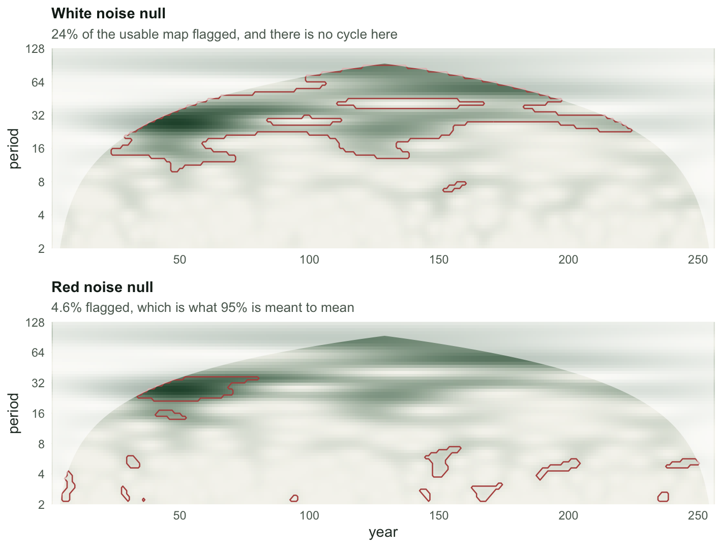
`r sprintf("%.0f%%", 100 * frac_white)` of the usable map is "significant at 95%" against a white background. There is no cycle in this series. A test that rejects `r sprintf("%.0f%%", 100 * frac_white)` of the time when the null is true is not a 5% test, it is a machine for finding cycles in anything.
Against the red background the figure is `r sprintf("%.1f%%", 100 * frac_red)`, which is what a 95% test is supposed to give.
```{r}
#| label: fig-trap
#| echo: false
#| fig-width: 7.4
#| fig-height: 5.6
#| fig-cap: "Wavelet power for pure AR(1) noise with no cycle in it. The upper panel outlines everything the white noise null calls significant; the lower panel outlines what the red noise null calls significant. Same data, same transform, same 95% level."
#| fig-alt: "Two heatmaps of the same wavelet power map. In the upper panel large outlined regions cover most of the middle and upper part of the map. In the lower panel only a few small outlined patches remain."
mk <- function(lev, ttl, sub) {
df <- expand.grid(time = 1:n, period = o$period)
df$power <- as.vector(t(P))
df$sig <- as.vector(t((P > lev) & usable))
ggplot(df, aes(time, period)) +
geom_raster(aes(fill = power)) +
geom_contour(aes(z = as.numeric(sig)), breaks = 0.5,
colour = "#b5534e", linewidth = 0.45) +
geom_ribbon(data = data.frame(time = 1:n, period = o$coi),
aes(x = time, ymin = period, ymax = max(o$period)), inherit.aes = FALSE,
fill = "white", alpha = 0.6) +
scale_fill_gradient(low = "#f5f4ee", high = "#275139", guide = "none") +
scale_y_continuous(transform = "log2", breaks = c(2, 4, 8, 16, 32, 64, 128), expand = c(0, 0)) +
scale_x_continuous(expand = c(0, 0)) +
coord_cartesian(ylim = c(2, 128)) +
labs(x = NULL, y = "period", title = ttl, subtitle = sub) + theme_te()
}
g1 <- mk(lev_white, "White noise null",
sprintf("%.0f%% of the usable map flagged, and there is no cycle here", 100 * frac_white))
g2 <- mk(lev_red, "Red noise null",
sprintf("%.1f%% flagged, which is what 95%% is meant to mean", 100 * frac_red)) +
labs(x = "year")
grid::grid.newpage()
grid::pushViewport(grid::viewport(layout = grid::grid.layout(2, 1)))
print(g1, vp = grid::viewport(layout.pos.row = 1, layout.pos.col = 1))
print(g2, vp = grid::viewport(layout.pos.row = 2, layout.pos.col = 1))
```
One series proves nothing. Repeat it two hundred times.
```{r}
#| label: mc
mc <- function(B, n, phi, seed) {
  set.seed(seed)
  out <- matrix(NA_real_, B, 2)
  for (b in 1:B) {
    z <- as.numeric(arima.sim(list(ar = phi), n = n))
    oz <- cwt(z); Pz <- Mod(oz$W)^2
    ok <- outer(oz$period, oz$coi, "<=")
    a <- as.numeric(acf(z, lag.max = 1, plot = FALSE)$acf[2])
    out[b, ] <- c(mean((Pz > sig95(oz, z, 0))[ok]), mean((Pz > sig95(oz, z, a))[ok]))
  }
  colnames(out) <- c("white", "red")
  out
}
m <- mc(200, n, 0.7, 1285)
rate_white <- mean(m[, "white"])
rate_red <- mean(m[, "red"])
c(white_null_rejection_rate = round(rate_white, 3),
  red_null_rejection_rate = round(rate_red, 3),
  red_sd_across_series = round(sd(m[, "red"]), 3))
```
Over 200 cycle-free AR(1) series, the white null flags `r sprintf("%.1f%%", 100 * rate_white)` of the usable map on average and the red null flags `r sprintf("%.1f%%", 100 * rate_red)`. The red-noise null is not a refinement. It is the difference between a test and a rubber stamp.
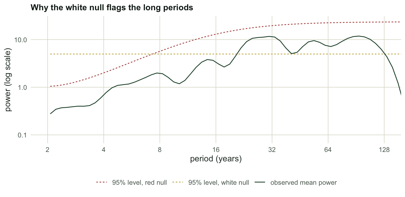
Why the gap is so large is visible in the levels themselves:
```{r}
#| label: levels
i4 <- which.min(abs(o$period - 4)); i32 <- which.min(abs(o$period - 32))
c(red_level_at_period_4 = round(lev_red[i4], 2),
  red_level_at_period_32 = round(lev_red[i32], 2),
  level_ratio = round(lev_red[i32] / lev_red[i4], 1))
```
An AR(1) background puts `r sprintf("%.1f", lev_red[i32] / lev_red[i4])` times more expected power at period 32 than at period 4. The white null sets one flat bar across all periods, so the whole long-period end of the map clears it automatically. Long-period blobs are exactly the ones people get excited about.
```{r}
#| label: fig-levels
#| echo: false
#| fig-width: 7.4
#| fig-height: 3.6
#| fig-cap: "The 95% levels under the two backgrounds, against the observed time-averaged power of the cycle-free series. The white level is flat by construction; the red level rises with period and tracks what the data actually do."
#| fig-alt: "Three curves against period on a logarithmic axis. A flat horizontal line marks the white noise level. A rising curve marks the red noise level. The observed power curve sits below the red curve almost everywhere but above the flat white line at long periods."
dfL <- rbind(
data.frame(period = o$period, v = lev_white, what = "95% level, white null"),
data.frame(period = o$period, v = lev_red, what = "95% level, red null"),
data.frame(period = o$period, v = rowMeans(P), what = "observed mean power"))
ggplot(dfL, aes(period, v, colour = what, linetype = what)) +
geom_line(linewidth = 0.5) +
scale_x_continuous(transform = "log2", breaks = c(2, 4, 8, 16, 32, 64, 128)) +
scale_y_continuous(transform = "log10") +
coord_cartesian(xlim = c(2, 128)) +
scale_colour_manual(values = c("95% level, white null" = "#c9b458",
"95% level, red null" = "#b5534e",
"observed mean power" = "#275139"), name = NULL) +
scale_linetype_manual(values = c("95% level, white null" = "22",
"95% level, red null" = "22",
"observed mean power" = "solid"), name = NULL) +
labs(x = "period (years)", y = "power (log scale)",
title = "Why the white null flags the long periods") +
theme_te() + theme(legend.position = "bottom")
```
## Trap two: the edge eats the power
The [cone of influence](../wavelet-analysis-of-population-cycles/) is not only a caveat about long periods. It attenuates power near the ends of the record, which means the same cycle is harder to detect at year 5 than at year 128, and a test that ignores the cone is less powerful exactly where records begin and end.
```{r}
#| label: coi-power
s16 <- 20 + 4 * sin(2 * pi * (1:n) / 16)   # a cycle of constant amplitude throughout
o16 <- cwt(s16); P16 <- Mod(o16$W)^2
b16 <- which.min(abs(o16$period - 16))
c(power_at_year_128 = round(P16[b16, 128], 2),
  power_at_year_20 = round(P16[b16, 20], 2),
  power_at_year_5 = round(P16[b16, 5], 2),
  year_5_as_share_of_mid = round(P16[b16, 5] / P16[b16, 128], 3),
  cone_reaches_period_16_at_year = ceiling(16 / (fourier_factor(6) / sqrt(2))))
```
The sine has constant amplitude for all 256 years. Its measured period-16 power at year 5 is `r sprintf("%.1f%%", 100 * P16[b16, 5] / P16[b16, 128])` of its mid-series value, purely because the wavelet is hanging over the edge into padding. Never read the first or last `r ceiling(16 / (fourier_factor(6) / sqrt(2)))` years of a period-16 band as evidence that a cycle started or stopped.
## Trap three: pointwise is not areawise
Here is the deepest one, and it survives fixing the other two. Look again at the red-null panel above. The test is calibrated, `r sprintf("%.1f%%", 100 * frac_red)` of cells flagged, exactly as advertised. But those cells are not scattered like confetti. Wavelet power is smooth in both directions, because neighbouring scales use overlapping wavelets and neighbouring times use overlapping windows. False positives therefore arrive in clumps.
Label them and count. Four-connected components, no package needed:
```{r}
#| label: patches
lab_patches <- function(M) {
  lab <- matrix(0L, nrow(M), ncol(M)); cur <- 0L
  for (i in seq_len(nrow(M))) for (j in seq_len(ncol(M))) {
    if (!M[i, j] || lab[i, j]) next
    cur <- cur + 1L
    stack <- list(c(i, j)); lab[i, j] <- cur
    while (length(stack)) {
      p <- stack[[length(stack)]]; stack[[length(stack)]] <- NULL
      for (d in list(c(-1, 0), c(1, 0), c(0, -1), c(0, 1))) {
        a <- p[1] + d[1]; b <- p[2] + d[2]
        if (a >= 1 && a <= nrow(M) && b >= 1 && b <= ncol(M) && M[a, b] && !lab[a, b]) {
          lab[a, b] <- cur; stack[[length(stack) + 1]] <- c(a, b)
        }
      }
    }
  }
  lab
}
flagged <- (P > lev_red) & usable
lab <- lab_patches(flagged)
sizes <- sort(tabulate(lab[lab > 0]), decreasing = TRUE)
c(flagged_cells = sum(flagged), patches = length(sizes),
  largest_patch = sizes[1], second = sizes[2], third = sizes[3])
```
`r sum(flagged)` false-positive cells, and they form only `r length(sizes)` patches. The largest is `r sizes[1]` cells: a solid, contiguous, eye-catching red island in a series with no cycle. Print that figure and the discussion writes itself.
So the honest test is not "is this cell above the level" but "is this **patch** bigger than the patches noise makes". Simulate the null again, and this time record the largest patch each time.
```{r}
#| label: areawise
mc_patch <- function(B, n, phi, seed) {
  set.seed(seed); big <- integer(B)
  for (b in 1:B) {
    z <- as.numeric(arima.sim(list(ar = phi), n = n))
    oz <- cwt(z); Pz <- Mod(oz$W)^2
    ok <- outer(oz$period, oz$coi, "<=")
    a <- as.numeric(acf(z, lag.max = 1, plot = FALSE)$acf[2])
    L <- lab_patches((Pz > sig95(oz, z, a)) & ok)
    tb <- tabulate(L[L > 0])
    big[b] <- if (length(tb)) max(tb) else 0L
  }
  big
}
null_big <- mc_patch(200, n, 0.7, 2285)
c(null_largest_patch_median = median(null_big),
  null_largest_patch_95th = round(quantile(null_big, 0.95), 0),
  null_largest_patch_max = max(null_big))
```
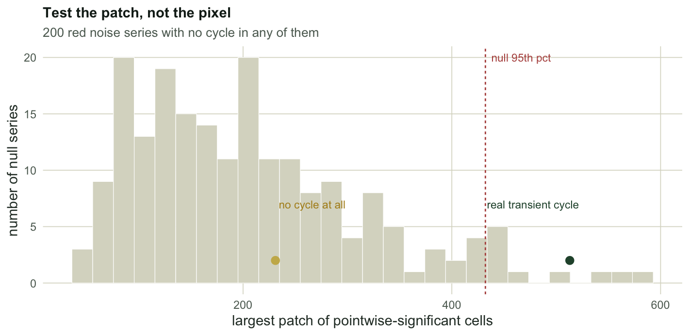
Under the correct, calibrated red-noise null the largest patch on the map is typically `r round(median(null_big))` cells, and one map in twenty has a patch of `r sprintf("%.0f", quantile(null_big, 0.95))` cells or more. Our cycle-free series produced `r sizes[1]`, comfortably inside the ordinary range. Pointwise significance told us `r sizes[1]` cells were remarkable; the areawise view says they are Tuesday.
## What does pass
The test has to be able to say yes, or it is just pessimism. Put a real transient cycle into the same red noise: a period-10 oscillation running only from year 80 to year 140.
```{r}
#| label: real
set.seed(3285)
env <- ifelse((1:n) >= 80 & (1:n) <= 140, 1, 0)
amp <- 3.0
z <- as.numeric(arima.sim(list(ar = 0.7), n = n)) + amp * env * sin(2 * pi * (1:n) / 10)
oz <- cwt(z); Pz <- Mod(oz$W)^2
okz <- outer(oz$period, oz$coi, "<=")
az <- as.numeric(acf(z, lag.max = 1, plot = FALSE)$acf[2])
Lz <- lab_patches((Pz > sig95(oz, z, az)) & okz)
tz <- sort(tabulate(Lz[Lz > 0]), decreasing = TRUE)
p_area <- mean(null_big >= tz[1])
proc_sd <- sqrt(1 / (1 - 0.7^2))
c(cycle_amplitude = amp, noise_process_sd = round(proc_sd, 2),
  flagged_cells = sum(Lz > 0), largest_patch = tz[1],
  areawise_p = round(p_area, 3))
```
The transient produces a largest patch of `r tz[1]` cells against a null 95th percentile of `r sprintf("%.0f", quantile(null_big, 0.95))`, for an areawise p-value of `r sprintf("%.3f", p_area)`. The areawise test reads the largest patch, not the count.
```{r}
#| label: fig-areawise
#| echo: false
#| fig-width: 7.4
#| fig-height: 3.6
#| fig-cap: "Distribution of the largest contiguous patch of pointwise-significant cells across 200 cycle-free red noise series, with the 95th percentile marked. The transient cycle's patch sits beyond it; the cycle-free series' patch sits inside the pile."
#| fig-alt: "A histogram of largest-patch sizes under the null, spread mostly between about 50 and 450 cells. A dashed vertical line marks the 95th percentile near 430. One marker sits beyond that line, and another sits inside the bulk of the histogram."
q95 <- as.numeric(quantile(null_big, 0.95))
ggplot(data.frame(x = null_big), aes(x)) +
geom_histogram(bins = 28, fill = "#dad9ca", colour = "white", linewidth = 0.2) +
geom_vline(xintercept = q95, colour = "#b5534e", linetype = "22", linewidth = 0.5) +
annotate("point", x = tz[1], y = 2, colour = "#275139", size = 2.6) +
annotate("point", x = sizes[1], y = 2, colour = "#c9b458", size = 2.6) +
annotate("segment", x = tz[1], xend = tz[1], y = 2.6, yend = 5.8,
colour = "#275139", linewidth = 0.3) +
annotate("segment", x = sizes[1], xend = sizes[1], y = 2.6, yend = 5.8,
colour = "#b08d1e", linewidth = 0.3) +
annotate("label", x = tz[1], y = 7, label = "real transient cycle",
colour = "#275139", size = 3, hjust = 0.9,
fill = "#f5f4ee", linewidth = 0) +
annotate("label", x = sizes[1], y = 7, label = "no cycle at all",
colour = "#b08d1e", size = 3, hjust = -0.05,
fill = "#f5f4ee", linewidth = 0) +
annotate("text", x = q95, y = 20, label = "null 95th pct",
colour = "#b5534e", size = 3, hjust = -0.1) +
labs(x = "largest patch of pointwise-significant cells", y = "number of null series",
title = "Test the patch, not the pixel",
subtitle = "200 red noise series with no cycle in any of them") +
theme_te()
```
How big does a cycle have to be? Sweep the amplitude against the same null:
```{r}
#| label: sweep
sweep_one <- function(amp, seed = 3285) {
  set.seed(seed)
  zz <- as.numeric(arima.sim(list(ar = 0.7), n = n)) + amp * env * sin(2 * pi * (1:n) / 10)
  oo <- cwt(zz); PP <- Mod(oo$W)^2
  ok <- outer(oo$period, oo$coi, "<=")
  a <- as.numeric(acf(zz, lag.max = 1, plot = FALSE)$acf[2])
  LL <- lab_patches((PP > sig95(oo, zz, a)) & ok)
  tb <- tabulate(LL[LL > 0])
  bg <- if (length(tb)) max(tb) else 0L
  c(amplitude = amp, amp_over_noise_sd = round(amp / sqrt(2) / proc_sd, 2),
    largest_patch = bg, areawise_p = round(mean(null_big >= bg), 3))
}
t(sapply(c(0, 1.0, 1.6, 2.2, 3.0, 4.0), sweep_one))
```
The `amp_over_noise_sd` column is the cycle's own standard deviation divided by the background's. The sweep prints the largest patch and the areawise p-value at each amplitude, and the cycle had six full oscillations in which to make its case. Read that column as a whole rather than picking a crossing point off it. With 200 null replicates the p-value near the boundary carries visible Monte Carlo error of its own, so a result at 0.05 is a result at 0.05, not a finding.
## A check that came back clean
Red noise is itself a model. Pink 1/f noise, with more long-period variance than a single autoregressive parameter allows, has been proposed as the best null model of environmental variation (Halley 1996), although most of the long environmental records analysed by Vasseur and Yodzis (2004) had spectra that flattened at low frequencies, and the terrestrial ones tended to be close to white. If the AR(1) null is misspecified in the 1/f direction, does it break?
```{r}
#| label: pink
pink <- function(n, beta = 1) {
  m <- 2^ceiling(log2(n)) * 2
  z <- fft(rnorm(m))
  f <- c(1, seq_len(m / 2), rev(seq_len(m / 2 - 1)))
  x <- Re(fft(z / f^(beta / 2), inverse = TRUE))[seq_len(n)]
  as.numeric(scale(x))
}
set.seed(4285)
pk_rate <- replicate(200, {
  z <- pink(n)
  oz <- cwt(z); Pz <- Mod(oz$W)^2
  ok <- outer(oz$period, oz$coi, "<=")
  mean((Pz > sig95(oz, z, as.numeric(acf(z, lag.max = 1, plot = FALSE)$acf[2])))[ok])
})
c(pink_noise_rejection_rate = round(mean(pk_rate), 3), nominal = 0.05)
```
It does not. Fitting an AR(1) null to 1/f noise flags `r sprintf("%.1f%%", 100 * mean(pk_rate))` of the usable map against a nominal 5%: conservative, not the other way. This one is worth reporting precisely because it is a negative result. The AR(1) null's weakness is not the colour of the noise. It is that people leave it set to white.
## Honest limits
The lag-1 autocorrelation is estimated from the same series that may contain the cycle, and a cycle inflates it, which lifts the null and costs power. The areawise test above uses one fixed patch definition (four-connected cells above a pointwise 95% level) and a purpose-built simulation; the published versions define patch geometry more carefully (Maraun et al. 2007). And none of this touches the deeper point that a "significant" patch means only that the background model does not explain it, which is a long way short of a cycle.
## Where to go next
One series at a time is the easy case. The next post asks whether two species cycle together and which one leads, where the null is even less forgiving and the answer to "is this coherence high" turns out to be "compared to what".
## References
Torrence and Compo 1998 Bulletin of the American Meteorological Society 79(1):61-78 (10.1175/1520-0477(1998)079<0061:APGTWA>2.0.CO;2)
Maraun and Kurths 2004 Nonlinear Processes in Geophysics 11(4):505-514 (10.5194/npg-11-505-2004)
Maraun, Kurths and Holschneider 2007 Physical Review E 75:016707 (10.1103/PhysRevE.75.016707)
Cazelles, Cazelles and Chavez 2014 Journal of the Royal Society Interface 11(91):20130585 (10.1098/rsif.2013.0585)
Halley 1996 Trends in Ecology and Evolution 11(1):33-37 (10.1016/0169-5347(96)81067-6)
Vasseur and Yodzis 2004 Ecology 85(4):1146-1152 (10.1890/02-3122)
```{r}
#| label: thumb
#| include: false
dfT <- expand.grid(time = 1:n, period = o$period)
dfT$power <- as.vector(t(P))
dfT$sig <- as.vector(t((P > lev_white) & usable))
ggsave("thumbnail.png",
ggplot(dfT, aes(time, period)) +
geom_raster(aes(fill = power)) +
geom_contour(aes(z = as.numeric(sig)), breaks = 0.5, colour = "#b5534e", linewidth = 0.6) +
geom_ribbon(data = data.frame(time = 1:n, period = o$coi),
aes(x = time, ymin = period, ymax = max(o$period)), inherit.aes = FALSE,
fill = "white", alpha = 0.6) +
scale_fill_gradient(low = "#f5f4ee", high = "#275139", guide = "none") +
scale_y_continuous(transform = "log2", breaks = c(2, 4, 8, 16, 32, 64), expand = c(0, 0)) +
scale_x_continuous(expand = c(0, 0)) +
coord_cartesian(ylim = c(2, 64)) +
labs(x = "year", y = "period") + theme_te(13),
width = 7.5, height = 5.4, dpi = 100, bg = "#f5f4ee")
```
## Related tutorials
- [Wavelet analysis of population cycles](../wavelet-analysis-of-population-cycles/)
- [Checking a wavelet analysis](../checking-a-wavelet-analysis/)
- [Spectral analysis of population cycles](../spectral-analysis-of-population-cycles/)
- [The false discovery rate and Benjamini-Hochberg](../false-discovery-rate-benjamini-hochberg/)