---
title: "Checking a wavelet analysis"
description: "Three ways a wavelet scalogram misleads you: a scale bias in the global spectrum, an event that impersonates a cycle, and the resolution knob you never set."
date: "2026-06-13 14:00"
date-modified: "2026-10-14"
categories: [R, wavelets, time series, model checking, ecology tutorial]
image: thumbnail.png
image-alt: "Wavelet power map of a single isolated spike in white noise, showing a broad vertical smear that resembles cycling across many periods."
---
*Corrected 14 October 2026: the checklist gave the cone margin at the ends of each band as a fixed multiple of the period; it now says that multiple holds for the conventional Morlet parameter and grows with it, as check three shows.*
*Corrected 7 October 2026: check two credited the spike with every significant cell and the full range of flagged periods, and said a pointwise test flags about one cell in twenty on any series; it now separates the spike's plume from small chance patches and gives that rate for a series that matches the null. Check three measured the width of the period-ten peak on a coarse scale grid, which exaggerated the gain in period resolution from a larger Morlet parameter; the probe now uses a finer grid.*
The previous three posts built the machinery: [the transform](../wavelet-analysis-of-population-cycles/), [the significance test](../wavelet-significance-and-red-noise/), [the coherence](../wavelet-coherence-and-phase/). Each of those had its own trap and its own fix. This one is about the failures that survive all of them: the map is correct, the null is right, the patch is significant, and the reading is still wrong.
Three of them, each with a number attached.
```{r}
#| label: engine
#| code-fold: true
#| code-summary: "Setup: packages, colours and plot theme"
morlet_daughter <- function(k, scale, dt, w0 = 6) {
  nrm <- sqrt(2 * pi * scale / dt) * pi^(-0.25)
  nrm * exp(-(scale * k - w0)^2 / 2 * (k > 0)) * (k > 0)
}
fourier_factor <- function(w0 = 6) (4 * pi) / (w0 + sqrt(2 + w0^2))
cwt <- function(x, dt = 1, dj = 0.1, s0 = 2 * dt, J = NULL, w0 = 6) {
  n1 <- length(x); x <- x - mean(x)
  x <- c(x, rep(0, 2^(floor(log2(n1) + 0.4999) + 1) - n1)); n <- length(x)
  if (is.null(J)) J <- floor(log2(n1 * dt / s0) / dj)
  kk <- seq_len(floor(n / 2)) * (2 * pi) / (n * dt)
  k <- c(0, kk, -rev(kk[seq_len(floor((n - 1) / 2))]))
  f <- fft(x); scale <- s0 * 2^((0:J) * dj)
  W <- matrix(0 + 0i, length(scale), n)
  for (a in seq_along(scale)) W[a, ] <- fft(f * morlet_daughter(k, scale[a], dt, w0), inverse = TRUE) / n
  ff <- fourier_factor(w0)
  coi <- ff / sqrt(2) * dt * c(1e-5, seq_len(ceiling((n1 + 1) / 2) - 1),
                               rev(seq_len(floor(n1 / 2) - 1)), 1e-5)
  list(W = W[, seq_len(n1), drop = FALSE], scale = scale, period = ff * scale,
       coi = coi[seq_len(n1)], dt = dt, dj = dj, w0 = w0, n = n1)
}
P_theor <- function(period, dt, alpha) {
  fr <- dt / period
  (1 - alpha^2) / (1 + alpha^2 - 2 * alpha * cos(2 * pi * fr))
}
sig95 <- function(o, x, alpha) var(x) * P_theor(o$period, o$dt, alpha) * qchisq(0.95, 2) / 2
library(ggplot2)
theme_te <- function(base_size = 11) {
  theme_minimal(base_size = base_size) +
    theme(panel.grid.minor = element_blank(),
          panel.grid.major = element_line(colour = "#dad9ca", linewidth = 0.3),
          axis.title = element_text(colour = "#2c3a31"),
          axis.text = element_text(colour = "#5d6b61"),
          plot.title = element_text(colour = "#16241d", face = "bold", size = rel(1)),
          plot.subtitle = element_text(colour = "#5d6b61", size = rel(0.9)),
          legend.text = element_text(colour = "#5d6b61"),
          legend.title = element_text(colour = "#2c3a31"),
          plot.background = element_rect(fill = "#f5f4ee", colour = NA),
          panel.background = element_rect(fill = "#f5f4ee", colour = NA))
}
```
## Check one: the global spectrum favours long periods
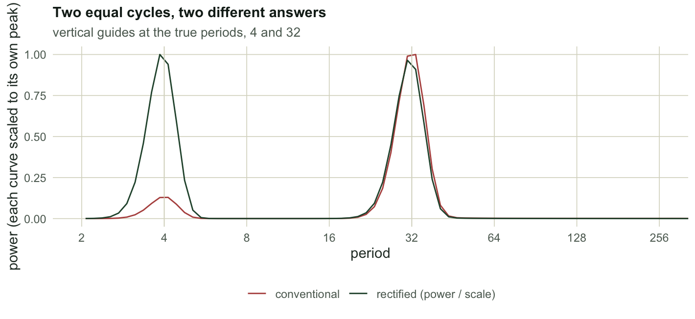
The global wavelet spectrum is the time-average of the power map, the wavelet answer to "which period dominates the record". Feed it two cycles of exactly equal amplitude, one at period 4 and one at period 32, and ask which is bigger.
```{r}
#| label: bias
n <- 1024
t <- 1:n
x <- sin(2 * pi * t / 4) + sin(2 * pi * t / 32)     # identical amplitudes
o <- cwt(x)
P <- Mod(o$W)^2
gws <- rowMeans(P)
i4 <- which.min(abs(o$period - 4)); i32 <- which.min(abs(o$period - 32))
c(gws_at_period_4 = round(gws[i4], 1), gws_at_period_32 = round(gws[i32], 1),
  conventional_ratio = round(gws[i32] / gws[i4], 2), true_ratio = 1)
```
The period-32 cycle looks `r sprintf("%.1f", gws[i32] / gws[i4])` times more powerful than the period-4 cycle. They have the same amplitude. The bias is not subtle and it is not noise: it is in the normalisation. The Morlet transform as conventionally normalised returns power proportional to the scale, so any energy at a long period is magnified simply for being at a long period.
Liu et al. (2007) traced it and gave the fix: divide the power by the scale before averaging.
```{r}
#| label: rectified
gws_rect <- rowMeans(P / o$scale)
c(rectified_at_period_4 = round(gws_rect[i4], 3),
  rectified_at_period_32 = round(gws_rect[i32], 3),
  rectified_ratio = round(gws_rect[i32] / gws_rect[i4], 2), true_ratio = 1)
```
`r sprintf("%.2f", gws_rect[i32] / gws_rect[i4])` against a truth of 1. That is the same division by `s` that appears inside the [coherence formula](../wavelet-coherence-and-phase/), and it is needed for the same reason.
```{r}
#| label: fig-bias
#| echo: false
#| fig-width: 7.4
#| fig-height: 3.4
#| fig-cap: "Global wavelet spectrum of a signal containing two equal-amplitude cycles, before and after dividing power by scale. Each curve is scaled to its own maximum so the shapes can be compared. The conventional version makes the period-32 cycle look several times larger than the period-4 cycle."
#| fig-alt: "Two curves against period on a logarithmic axis, each with peaks at period 4 and period 32. In the conventional curve the period-32 peak is far taller than the period-4 peak. In the rectified curve the two peaks are nearly equal."
dfB <- rbind(data.frame(period = o$period, v = gws / max(gws), what = "conventional"),
data.frame(period = o$period, v = gws_rect / max(gws_rect), what = "rectified (power / scale)"))
ggplot(dfB, aes(period, v, colour = what)) +
geom_line(linewidth = 0.5) +
geom_vline(xintercept = c(4, 32), colour = "#dad9ca", linewidth = 0.3) +
scale_x_continuous(transform = "log2", breaks = c(2, 4, 8, 16, 32, 64, 128, 256)) +
coord_cartesian(xlim = c(2, 256)) +
scale_colour_manual(values = c("conventional" = "#b5534e",
"rectified (power / scale)" = "#275139"), name = NULL) +
labs(x = "period", y = "power (each curve scaled to its own peak)",
title = "Two equal cycles, two different answers",
subtitle = "vertical guides at the true periods, 4 and 32") +
theme_te() + theme(legend.position = "bottom")
```
This one matters because the global spectrum is where people read off "the" dominant period, and because the bias always points the same way. Long cycles are the interesting ones. The method hands them to you.
## Check two: an event is not a cycle
Here is a series with no cycle in it at all: white noise, plus a single spike at year 128. One year, one shock, nothing periodic.
```{r}
#| label: spike
set.seed(287)
n2 <- 256; t2 <- 1:n2
z <- rnorm(n2)
z[128] <- z[128] + 12                                # one bad winter
oz <- cwt(z)
Pz <- Mod(oz$W)^2
okz <- outer(oz$period, oz$coi, "<=")
az <- as.numeric(acf(z, lag.max = 1, plot = FALSE)$acf[2])
flag <- (Pz > sig95(oz, z, az)) & okz
per_flagged <- range(oz$period[apply(flag, 1, any)])
c(share_of_map_flagged = round(mean(flag[okz]), 3),
  flagged_from_period = round(per_flagged[1], 2),
  flagged_to_period = round(per_flagged[2], 2))
```
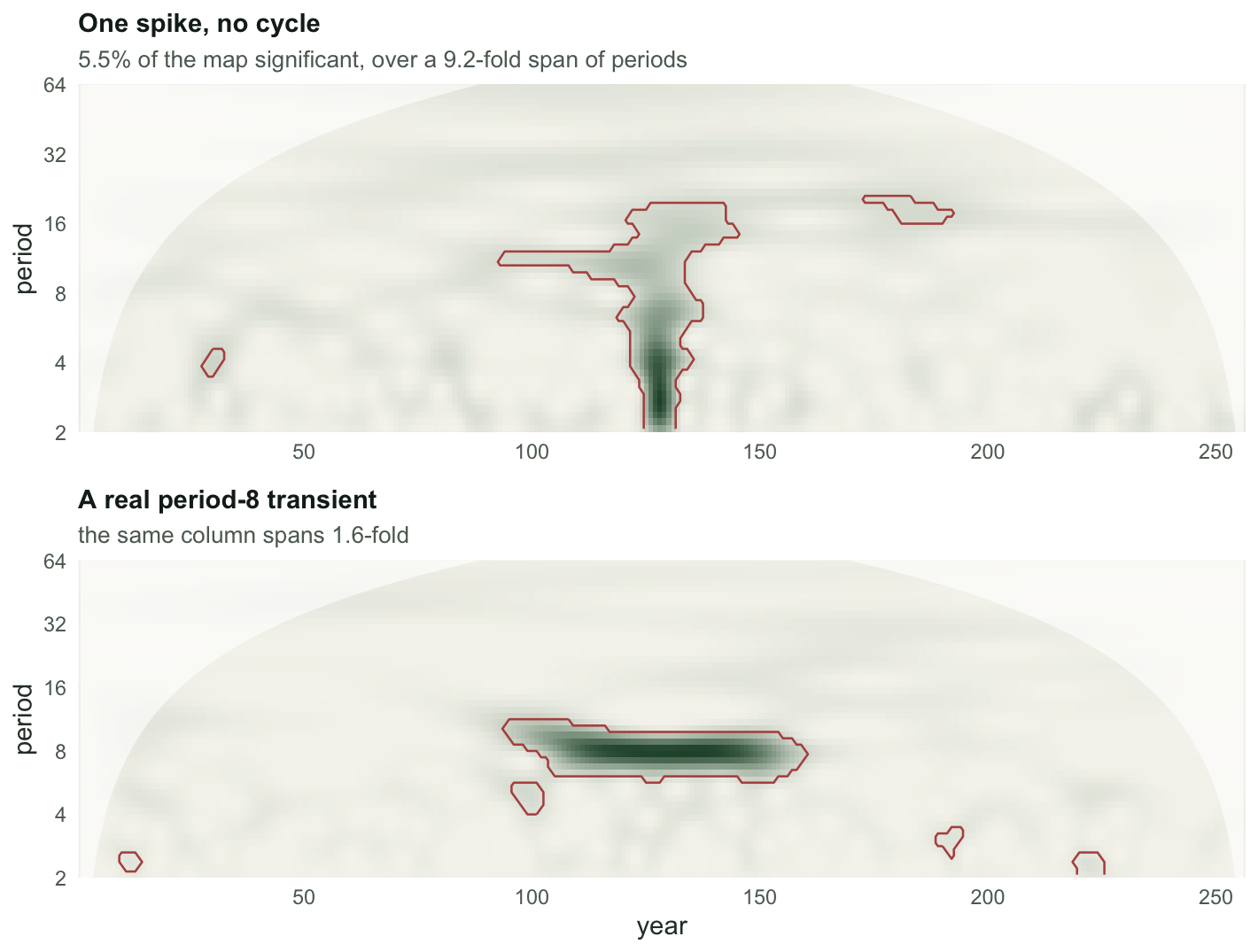
Significant cells cover `r sprintf("%.1f%%", 100 * mean(flag[okz]))` of the map, at periods from `r sprintf("%.1f", per_flagged[1])` to `r sprintf("%.1f", per_flagged[2])`, against a correctly specified red-noise null. Most of them form one plume around the spike; small chance patches elsewhere in the record make up the rest, including the longest of those periods. The share on its own is not the evidence: a pointwise 95% test flags about one cell in twenty on a series that matches the null, so a share of this size is what noise alone would give. Where those cells sit is the evidence. There is no cycle here, and the map says there is cycling across a wide band of periods.
Worse, the plume has width in time as well. The wavelet at period 8 is several years wide, so a one-year shock comes back looking like a short burst of oscillation rather than a shock:
```{r}
#| label: smear
b8 <- which.min(abs(oz$period - 8))
yrs <- which(flag[b8, ])
col_periods <- oz$period[flag[, 128]]
c(at_period = round(oz$period[b8], 2),
  flagged_from_year = min(yrs), flagged_to_year = max(yrs),
  column_period_span = round(max(col_periods) / min(col_periods), 1))
```
The last number is the tell. A vertical slice through the plume, at the year of the spike, is significant over a `r sprintf("%.1f", max(col_periods) / min(col_periods))`-fold range of periods. Compare a real transient cycle:
```{r}
#| label: real-vs-event
set.seed(3287)
env <- ifelse(t2 >= 100 & t2 <= 156, 1, 0)
r <- rnorm(n2) + 3 * env * sin(2 * pi * t2 / 8)      # a genuine period-8 transient
orr <- cwt(r)
Pr <- Mod(orr$W)^2
okr <- outer(orr$period, orr$coi, "<=")
ar <- as.numeric(acf(r, lag.max = 1, plot = FALSE)$acf[2])
flag_r <- (Pr > sig95(orr, r, ar)) & okr
col_r <- orr$period[flag_r[, 128]]
c(event_column_span = round(max(col_periods) / min(col_periods), 1),
  cycle_column_span = round(max(col_r) / min(col_r), 1))
```
A vertical slice through the event covers a `r sprintf("%.1f", max(col_periods) / min(col_periods))`-fold span of periods; a slice through the real cycle covers `r sprintf("%.1f", max(col_r) / min(col_r))`-fold. That is the diagnostic, and it costs one line of code: **a cycle is narrow in period and long in time; an event is narrow in time and broad in period.** Look at the shape of the patch, not its colour.
```{r}
#| label: fig-event
#| echo: false
#| fig-width: 7.4
#| fig-height: 5.6
#| fig-cap: "One isolated spike in white noise (upper) against a genuine period-8 transient (lower), both tested against a correctly fitted red noise null. The spike produces a broad vertical plume; the cycle produces a narrow horizontal bar."
#| fig-alt: "Two wavelet power heatmaps. The upper one shows a wide cone-shaped plume spreading upward from a single year and covering many periods. The lower one shows a compact horizontal bar confined to one period band and lasting several decades."
mk2 <- function(o_, P_, fl_, ttl, sub) {
d <- expand.grid(time = t2, period = o_$period)
d$power <- as.vector(t(P_)); d$sig <- as.vector(t(fl_))
ggplot(d, aes(time, period)) +
geom_raster(aes(fill = power)) +
geom_contour(aes(z = as.numeric(sig)), breaks = 0.5, colour = "#b5534e", linewidth = 0.45) +
geom_ribbon(data = data.frame(time = t2, period = o_$coi),
aes(x = time, ymin = period, ymax = max(o_$period)), inherit.aes = FALSE,
fill = "white", alpha = 0.6) +
scale_fill_gradient(low = "#f5f4ee", high = "#275139", guide = "none") +
scale_y_continuous(transform = "log2", breaks = c(2, 4, 8, 16, 32, 64), expand = c(0, 0)) +
scale_x_continuous(expand = c(0, 0)) +
coord_cartesian(ylim = c(2, 64)) +
labs(x = NULL, y = "period", title = ttl, subtitle = sub) + theme_te()
}
g1 <- mk2(oz, Pz, flag, "One spike, no cycle",
sprintf("%.1f%% of the map significant, over a %.1f-fold span of periods",
100 * mean(flag[okz]), max(col_periods) / min(col_periods)))
g2 <- mk2(orr, Pr, flag_r, "A real period-8 transient",
sprintf("the same column spans %.1f-fold", max(col_r) / min(col_r))) + labs(x = "year")
grid::grid.newpage()
grid::pushViewport(grid::viewport(layout = grid::grid.layout(2, 1)))
print(g1, vp = grid::viewport(layout.pos.row = 1, layout.pos.col = 1))
print(g2, vp = grid::viewport(layout.pos.row = 2, layout.pos.col = 1))
```
Ecological records are full of single events: a hard winter, a fire, a cull, a disease introduction. A large enough one will produce a plume, and the plume can be significant.
## Check three: the knob you never set
Every function above takes `w0 = 6` and nobody ever changes it. It is the number of oscillations inside the Morlet wavelet's envelope, and it sets the trade you make between resolution in time and resolution in period. There is no default that is correct; there is only a default that is conventional.
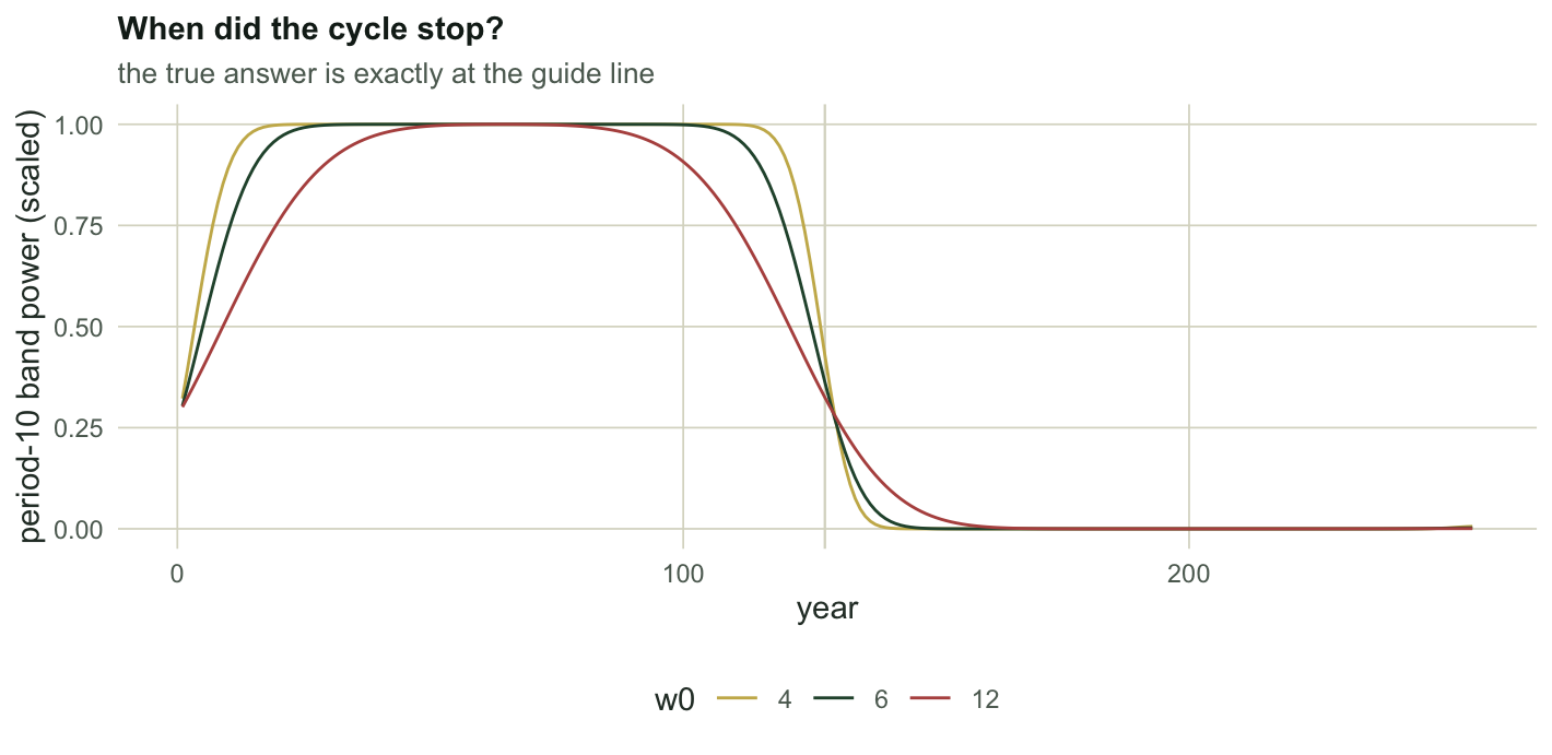
Make it visible on a signal with a known answer: period 10 for the first half, period 5 for the second, no noise at all.
```{r}
#| label: w0
half <- n2 / 2
sig2 <- c(sin(2 * pi * (1:half) / 10), sin(2 * pi * ((half + 1):n2) / 5))
fwhm <- function(g, i) {                             # width of the peak at i, at half its height
  half_h <- g[i] / 2
  lo <- i; while (lo > 1 && g[lo - 1] >= half_h) lo <- lo - 1
  hi <- i; while (hi < length(g) && g[hi + 1] >= half_h) hi <- hi + 1
  c(lo, hi)
}
probe <- function(w0) {
  ow <- cwt(sig2, w0 = w0, dj = 0.01)               # fine scale grid, so the width is not quantised
  Pw <- Mod(ow$W)^2
  g <- rowMeans(Pw / ow$scale)                       # rectified, per check one
  b10 <- which.min(abs(ow$period - 10))
  w <- fwhm(g, b10)
  band <- Pw[b10, ] / max(Pw[b10, ])                 # how long to notice the cycle stopped?
  hi <- max(which(band[1:half] > 0.9))
  lo <- min(which(band[half:n2] < 0.1)) + half - 1
  c(w0 = w0,
    fourier_factor = round(fourier_factor(w0), 4),
    period_halfwidth = round(ow$period[w[2]] - ow$period[w[1]], 2),
    transition_years = lo - hi,
    coi_cost_at_period_10 = round(10 / (fourier_factor(w0) / sqrt(2)), 1))
}
tab <- t(sapply(c(4, 6, 12), probe))
tab
```
Read the columns. `period_halfwidth` is how blurred the period-10 peak is, and `w0 = 12` resolves it `r sprintf("%.1f", tab[1, "period_halfwidth"] / tab[3, "period_halfwidth"])` times more sharply than `w0 = 4`. `transition_years` is how long the transform takes to notice the period-10 cycle stopped, and there `w0 = 12` needs `r sprintf("%.1f", tab[3, "transition_years"] / tab[1, "transition_years"])` times longer. `coi_cost_at_period_10` is how many years at each end of the record you lose at that band, and `w0 = 12` costs you `r sprintf("%.1f", tab[3, "coi_cost_at_period_10"] / tab[1, "coi_cost_at_period_10"])` times as many.
That is the trade-off, made numeric. A sharper answer about *which* period costs you a vaguer answer about *when*, and it costs you record length as well. The convention `w0 = 6` is a compromise, not a discovery, and if your question is "did the period change in 1987" rather than "is the period 9 or 11" then the compromise is not the one you want.
```{r}
#| label: fig-w0
#| echo: false
#| fig-width: 7.4
#| fig-height: 3.6
#| fig-cap: "The period-10 band through the same regime shift, at three settings of the Morlet parameter. All three see the cycle stop halfway through the record; they disagree about how sharply."
#| fig-alt: "Three curves of band power against year, all high in the first half and low in the second. The curve for the narrowest wavelet drops most steeply at the midpoint; the widest one falls gradually over several decades."
dfW <- do.call(rbind, lapply(c(4, 6, 12), function(w) {
ow <- cwt(sig2, w0 = w); Pw <- Mod(ow$W)^2
b <- which.min(abs(ow$period - 10))
data.frame(year = t2, v = Pw[b, ] / max(Pw[b, ]), w0 = factor(w))
}))
ggplot(dfW, aes(year, v, colour = w0)) +
geom_vline(xintercept = half, colour = "#dad9ca", linewidth = 0.4) +
geom_line(linewidth = 0.5) +
scale_colour_manual(values = c("4" = "#c9b458", "6" = "#275139", "12" = "#b5534e"),
name = "w0") +
labs(x = "year", y = "period-10 band power (scaled)",
title = "When did the cycle stop?",
subtitle = "the true answer is exactly at the guide line") +
theme_te() + theme(legend.position = "bottom")
```
## The checklist
Everything the four posts have established, in the order you would actually use it:
1. Is the null red rather than white? If it is white, the map is decoration. ([post two](../wavelet-significance-and-red-noise/))
2. Is the significant patch bigger than the patches the null makes on its own? Pointwise significance says nothing. ([post two](../wavelet-significance-and-red-noise/))
3. Is the patch inside the cone? At `w0 = 6`, do not read the first or last `1.37 * period` years of any band; a larger `w0` widens that margin (check three).
4. Is the patch narrow in period and long in time, or is it a plume from an event?
5. If you read a dominant period off the global spectrum, did you divide power by scale first?
6. If you report a phase lag, is it the only lag consistent with that angle, or one of several? ([post three](../wavelet-coherence-and-phase/))
7. Could a common driver produce the same coherence? It almost always could. ([post three](../wavelet-coherence-and-phase/))
8. Did you choose `w0`, or did it choose you?
## Honest limits
None of these checks makes wavelet analysis confirmatory. The method is descriptive: it says where in the time-period plane the variance sits, and the tests say only that a particular background model does not account for it. A significant, narrow, well-placed, correctly rectified patch is a reason to go and look at what happened in those years. It is not a cycle, and the map cannot tell you what caused it.
## References
Torrence and Compo 1998 Bulletin of the American Meteorological Society 79(1):61-78 (10.1175/1520-0477(1998)079<0061:APGTWA>2.0.CO;2)
Liu, Liang and Weisberg 2007 Journal of Atmospheric and Oceanic Technology 24(12):2093-2102 (10.1175/2007JTECHO511.1)
Maraun, Kurths and Holschneider 2007 Physical Review E 75:016707 (10.1103/PhysRevE.75.016707)
Cazelles, Chavez, Berteaux, Menard, Vik, Jenouvrier and Stenseth 2008 Oecologia 156(2):287-304 (10.1007/s00442-008-0993-2)
Percival and Walden 2000 Wavelet Methods for Time Series Analysis, Cambridge University Press, ISBN 978-0-521-64068-8
```{r}
#| label: thumb
#| include: false
dT <- expand.grid(time = t2, period = oz$period)
dT$power <- as.vector(t(Pz)); dT$sig <- as.vector(t(flag))
ggsave("thumbnail.png",
ggplot(dT, aes(time, period)) +
geom_raster(aes(fill = power)) +
geom_contour(aes(z = as.numeric(sig)), breaks = 0.5, colour = "#b5534e", linewidth = 0.6) +
geom_ribbon(data = data.frame(time = t2, period = oz$coi),
aes(x = time, ymin = period, ymax = max(oz$period)), inherit.aes = FALSE,
fill = "white", alpha = 0.6) +
scale_fill_gradient(low = "#f5f4ee", high = "#275139", guide = "none") +
scale_y_continuous(transform = "log2", breaks = c(2, 4, 8, 16, 32, 64), expand = c(0, 0)) +
scale_x_continuous(expand = c(0, 0)) +
coord_cartesian(ylim = c(2, 64)) +
labs(x = "year", y = "period") + theme_te(13),
width = 7.5, height = 5.4, dpi = 100, bg = "#f5f4ee")
```
## Related tutorials
- [Wavelet analysis of population cycles](../wavelet-analysis-of-population-cycles/)
- [Wavelet significance and the red noise null](../wavelet-significance-and-red-noise/)
- [Wavelet coherence and phase](../wavelet-coherence-and-phase/)
- [Quadrat variance peaks and false second scales](../blocked-quadrat-variance-patch-size/)