set.seed(284)
n <- 256
tt <- 1:n
half <- n / 2
sig <- c(sin(2 * pi * (1:half) / 10), sin(2 * pi * ((half + 1):n) / 5))
y <- 20 + 6 * sig + rnorm(n, 0, 1.6)Wavelet analysis of population cycles
R
wavelets
time series
spectral analysis
ecology tutorial
Build a Morlet continuous wavelet transform from scratch in R and see why a periodogram cannot tell you when an ecological cycle was actually running.
Corrected 14 October 2026: the post said that the reconstruction loses only the noise below the smallest period on the ladder of scales and keeps everything it was allowed to see; it now says that the shortest periods a little above that value are also rebuilt only in part, and calls the error estimate a rough count.
A periodogram answers one question: how much variance sits at each frequency, averaged over the whole series. That averaging is the problem. Ecological cycles are not polite enough to keep the same period for a century. Vole cycles have flattened across Europe since the 1980s (Cornulier et al. 2013), measles epidemics changed period when vaccination started (Grenfell et al. 2001), and any system that crosses a regime boundary can change its dynamics halfway through your record.
Feed such a series to a periodogram and it will still give you an answer. The answer will be wrong in a specific, seductive way.
A series that changes its mind
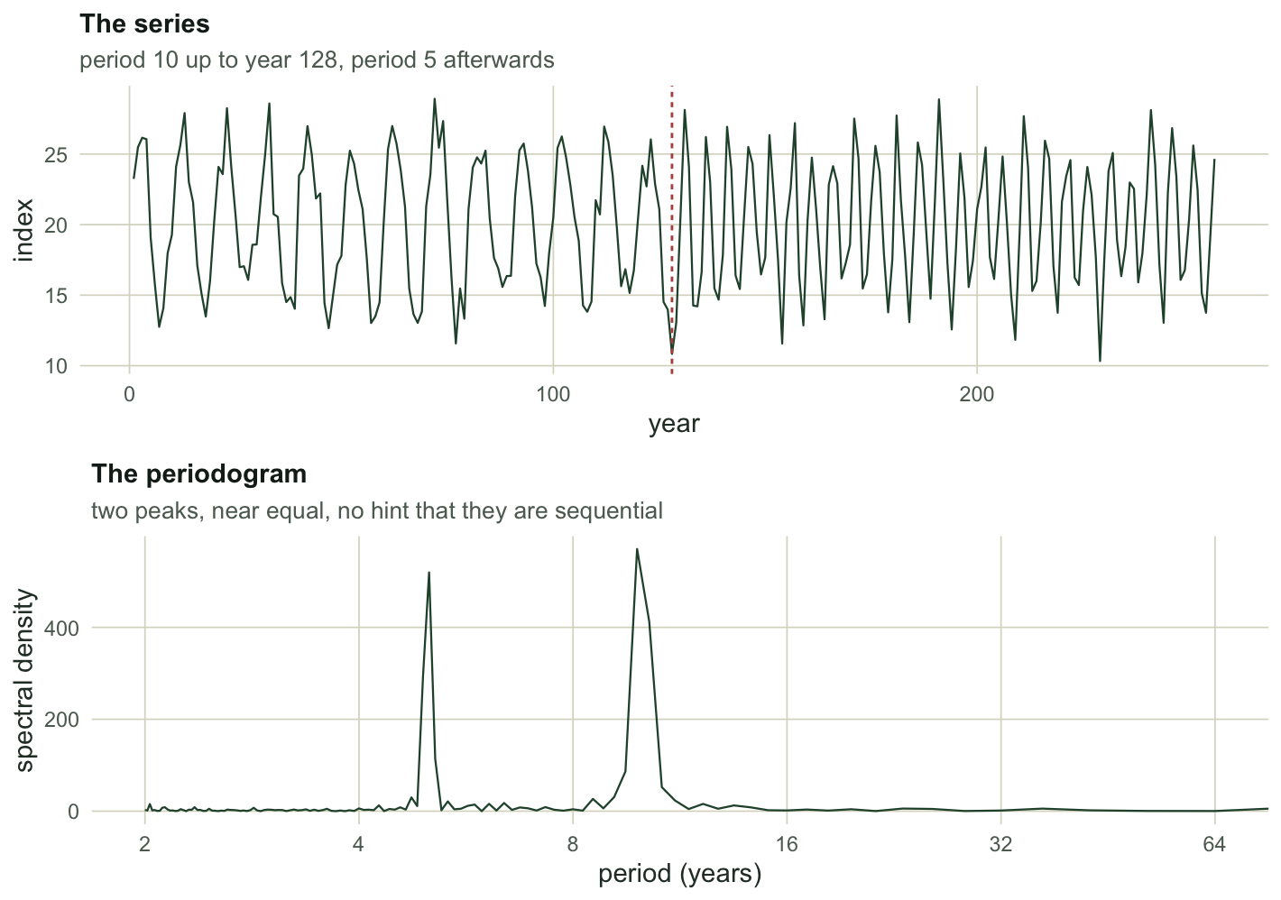
Here is a simulated annual index, 256 years long. For the first 128 years it cycles with a period of 10; for the last 128 years the period is 5. The amplitude never changes, and the two cycles never coexist.
Setup: packages, colours and plot theme
library(ggplot2)
theme_te <- function(base_size = 11) {
  theme_minimal(base_size = base_size) +
    theme(panel.grid.minor = element_blank(),
          panel.grid.major = element_line(colour = "#dad9ca", linewidth = 0.3),
          axis.title = element_text(colour = "#2c3a31"),
          axis.text = element_text(colour = "#5d6b61"),
          plot.title = element_text(colour = "#16241d", face = "bold", size = rel(1)),
          plot.subtitle = element_text(colour = "#5d6b61", size = rel(0.9)),
          legend.text = element_text(colour = "#5d6b61"),
          legend.title = element_text(colour = "#2c3a31"),
          plot.background = element_rect(fill = "#f5f4ee", colour = NA),
          panel.background = element_rect(fill = "#f5f4ee", colour = NA))
}
The periodogram of that series is unambiguous, and unambiguously misleading.
pg <- spec.pgram(y, taper = 0, detrend = TRUE, fast = FALSE, plot = FALSE)
pgp <- 1 / pg$freq
w10 <- which(pgp > 7 & pgp < 14)
w5 <- which(pgp > 3.5 & pgp < 7)
p_peak10 <- pgp[w10][which.max(pg$spec[w10])]
p_peak5 <- pgp[w5][which.max(pg$spec[w5])]
c(peak_near_10 = round(p_peak10, 2), height = round(max(pg$spec[w10]), 1),
  peak_near_5 = round(p_peak5, 2), height = round(max(pg$spec[w5]), 1))
peak_near_10 height peak_near_5 height
9.85 570.50 5.02 519.50 Two peaks, at periods 9.85 and 5.02, of almost equal height (570 and 520). Written up, that becomes “the population shows a decadal cycle with a superimposed five-year cycle”. It is a reasonable sentence. It is also false: nothing in this series ever had two periods at once.
The transform, in twenty lines
A wavelet is a short wave packet: an oscillation multiplied by an envelope that decays. Stretch it and it matches slow oscillations; squeeze it and it matches fast ones. Slide it along the series and you get a coefficient for every combination of position and stretch. That is the whole idea.
The Morlet wavelet is a complex exponential inside a Gaussian envelope, and it is the standard choice in ecology because it gives amplitude and phase together, and because its width in time and frequency is as balanced as the mathematics allows. Following Torrence and Compo (1998), the transform is computed in the Fourier domain: multiply the Fourier transform of the series by the Fourier transform of the stretched wavelet, then invert. That turns a convolution at every position into one FFT per scale.
morlet_daughter <- function(k, scale, dt, w0 = 6) {
  expnt <- -(scale * k - w0)^2 / 2 * (k > 0)
  nrm <- sqrt(2 * pi * scale / dt) * pi^(-0.25)
  nrm * exp(expnt) * (k > 0)
}
fourier_factor <- function(w0 = 6) (4 * pi) / (w0 + sqrt(2 + w0^2))

cwt <- function(x, dt = 1, dj = 0.1, s0 = 2 * dt, J = NULL, w0 = 6) {
  n1 <- length(x)
  x <- x - mean(x)
  x <- c(x, rep(0, 2^(floor(log2(n1) + 0.4999) + 1) - n1))   # zero pad
  n <- length(x)
  if (is.null(J)) J <- floor(log2(n1 * dt / s0) / dj)
  kk <- seq_len(floor(n / 2)) * (2 * pi) / (n * dt)
  k <- c(0, kk, -rev(kk[seq_len(floor((n - 1) / 2))]))       # wavenumbers
  f <- fft(x)
  scale <- s0 * 2^((0:J) * dj)
  W <- matrix(0 + 0i, length(scale), n)
  for (a in seq_along(scale)) {
    W[a, ] <- fft(f * morlet_daughter(k, scale[a], dt, w0), inverse = TRUE) / n
  }
  ff <- fourier_factor(w0)
  coi <- ff / sqrt(2) * dt * c(1e-5, seq_len(floor((n1 + 1) / 2) - 1),
                               rev(seq_len(floor(n1 / 2) - 1)), 1e-5)
  list(W = W[, seq_len(n1), drop = FALSE], scale = scale, period = ff * scale,
       coi = coi[seq_len(n1)], dt = dt, dj = dj, w0 = w0, n = n1)
}
Three things in there are worth naming.
Scale is not period. The scale argument stretches the wavelet; the period it responds to is fourier_factor(w0) * scale. For the standard w0 = 6 that factor is 1.0330, close enough to 1 that people are tempted to skip the conversion. Do not skip it: at w0 = 12 the factor is 0.5218 and your periods would be off by a factor of two.
The scales are a geometric ladder. s0 * 2^((0:J) * dj) with dj = 0.1 gives about ten scales per octave, which is dense enough that the map looks continuous. The smallest scale 2 * dt corresponds to a period of 2.07, just above the Nyquist period of 2.
The series is padded with zeros to the next power of two, both for FFT speed and to stop the transform from wrapping the end of the series onto the start. The padding is what creates the cone of influence, discussed below.
The scalogram
o <- cwt(y)
P <- Mod(o$W)^2
b10 <- which.min(abs(o$period - 10))
b5 <- which.min(abs(o$period - 5))
first <- 1:half
second <- (half + 1):n
r10 <- mean(P[b10, first]) / mean(P[b10, second])
r5 <- mean(P[b5, second]) / mean(P[b5, first])
c(band_10 = round(o$period[b10], 2), first_over_second = round(r10, 1),
  band_5 = round(o$period[b5], 2), second_over_first = round(r5, 1))
band_10 first_over_second band_5 second_over_first
10.17 39.20 5.09 50.00 At the period-10.17 band, the mean power in the first half is 39.2 times the power in the second. At the period-5.09 band the ratio runs the other way, 50.0 to one. The same series, the same variance, and now the sequence is visible.
Code behind this output; later chunks use it, so run it first
ridge <- sapply(seq_len(n), function(i) {
  ok <- o$period <= o$coi[i]
  if (!any(ok)) return(NA_real_)      # the first and last few years have nothing usable
  o$period[which.max(replace(P[, i], !ok, -Inf))]
})
ridge_df <- na.omit(data.frame(time = tt, period = ridge))
dfP <- expand.grid(time = tt, period = o$period)
dfP$power <- as.vector(t(P))
ggplot(dfP, aes(time, period, fill = power)) +
  geom_raster() +
  geom_line(data = data.frame(time = tt, period = o$coi),
            aes(time, period), inherit.aes = FALSE,
            colour = "#f5f4ee", linewidth = 0.7) +
  geom_ribbon(data = data.frame(time = tt, period = o$coi),
              aes(x = time, ymin = period, ymax = max(o$period)), inherit.aes = FALSE,
              fill = "white", alpha = 0.55) +
  geom_line(data = ridge_df, aes(time, period), inherit.aes = FALSE,
            colour = "#c9b458", linetype = "22", linewidth = 0.6) +
  scale_fill_gradient(low = "#f5f4ee", high = "#275139", name = "power") +
  scale_y_continuous(transform = "log2", breaks = c(2, 4, 8, 16, 32, 64, 128),
                     expand = c(0, 0)) +
  scale_x_continuous(expand = c(0, 0)) +
  coord_cartesian(ylim = c(2, 128)) +
  labs(x = "year", y = "period (years)", title = "Wavelet power",
       subtitle = "the two cycles are sequential, not simultaneous") +
  theme_te()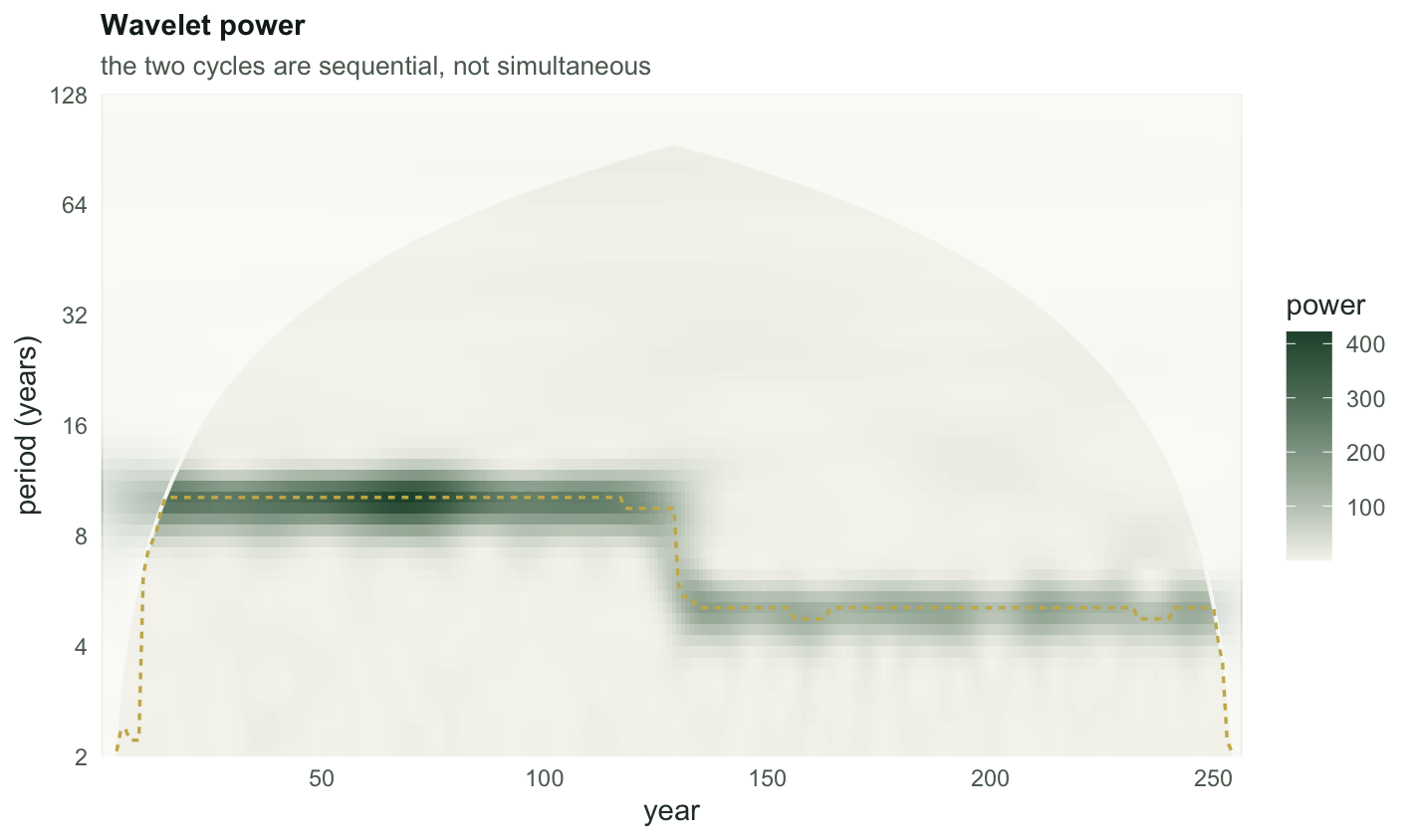
The ridge, the period carrying the most power at each year among those clear of the cone, makes it quantitative:
c(median_period_years_30_to_100 = round(median(ridge[30:100], na.rm = TRUE), 2),
  median_period_years_160_to_230 = round(median(ridge[160:230], na.rm = TRUE), 2))
median_period_years_30_to_100 median_period_years_160_to_230
10.17 5.09 One thing in that figure is a lie, and it is better to say so now than to let you find it later. The two cycles were built with the same amplitude, but the period-5 band is visibly paler than the period-10 band:
c(power_at_period_10 = round(mean(P[b10, first]), 1),
  power_at_period_5 = round(mean(P[b5, second]), 1),
  power_ratio = round(mean(P[b10, first]) / mean(P[b5, second]), 2),
  period_ratio = round(o$period[b10] / o$period[b5], 2))
power_at_period_10 power_at_period_5 power_ratio period_ratio
287.00 134.90 2.13 2.00 The power ratio is 2.13 for a period ratio of 2.00. The conventional wavelet power spectrum favours long periods roughly in proportion to the scale, so equal cycles do not get equal colour (Liu et al. 2007). Within a band, as in the 39.2-to-one comparison above, this cancels and costs you nothing. Across bands it decides which cycle looks important, which is why it gets its own section in the checking post.
Throw away time and the periodogram comes back
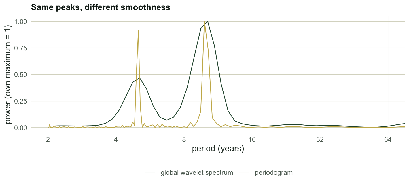
The wavelet transform is not a different answer to the periodogram’s question. It is the same answer with an extra axis. Average the power over time and you get the global wavelet spectrum, which should reproduce what spec.pgram told us.
gws <- rowMeans(P)
g10 <- which(o$period > 7 & o$period < 14)
g5 <- which(o$period > 3.5 & o$period < 7)
gws_10 <- o$period[g10][which.max(gws[g10])]
gws_5 <- o$period[g5][which.max(gws[g5])]
c(gws_peak_near_10 = round(gws_10, 2), periodogram_said = round(p_peak10, 2),
  gws_peak_near_5 = round(gws_5, 2), periodogram_said = round(p_peak5, 2))
gws_peak_near_10 periodogram_said gws_peak_near_5 periodogram_said
10.17 9.85 5.09 5.02 Peaks at 10.17 and 5.09, against the periodogram’s 9.85 and 5.02. The global wavelet spectrum is a smoothed periodogram (Percival 1995), so it is blunter about locating a peak and steadier about its height. The point is that nothing was invented: collapse the time axis and the same two peaks come back. They do not come back at the same height: the five-year peak is lower in the wavelet version, which is the long-period scale bias measured in the section above.
The map is the data
A worry worth taking seriously: does the transform paint structure that is not there? It does not, and you can check it rather than trust it. The Morlet transform is invertible. Sum the real parts across scales with the right constant and the series comes back (Torrence and Compo 1998, their equation 11; Cdelta = 0.776 for w0 = 6).
cwt_invert <- function(o, Cdelta = 0.776) {
  (o$dj * sqrt(o$dt)) / (Cdelta * pi^(-0.25)) * colSums(Re(o$W) / sqrt(o$scale))
}
yr <- cwt_invert(o)
rel_noisy <- sqrt(mean((yr - (y - mean(y)))^2)) / sd(y)
clean <- 20 + 6 * sig
oc <- cwt(clean)
rel_clean <- sqrt(mean((cwt_invert(oc) - (clean - mean(clean)))^2)) / sd(clean)
c(rel_rmse_noisy = round(rel_noisy, 4), rel_rmse_noiseless = round(rel_clean, 4))
rel_rmse_noisy rel_rmse_noiseless
0.0747 0.0120 The noiseless signal reconstructs to within 1.2% of its own standard deviation. The noisy one to within 7.5%, and that gap is not the transform failing. The ladder of scales stops at a period of 2.07, and the sum over scales rebuilds only part of the shortest periods, both below that value and a little above it, where the smaller scales that would complete the sum are missing; white noise, unlike the two cycles, has variance there. A rough count that treats the noise band below the smallest resolved period as lost and the rest as kept, expressed as a fraction of total variance, predicts a reconstruction error of about 6.3% on its own. Nothing was invented; what is missing is the short-period end of the noise, which the ladder of scales covers only in part.
The cone of influence
The zero padding has to go somewhere. Near the ends of the series a stretched wavelet hangs off the edge and half of what it sees is padding, so the power there is attenuated. The coi element of the fit marks the boundary: at a given year, periods above the cone value are contaminated.
usable <- mean(outer(o$period, o$coi, "<="))
c(cone_slope = round(fourier_factor(6) / sqrt(2), 4),
  longest_usable_period_at_year_10 = round(o$coi[10], 2),
  longest_at_year_50 = round(o$coi[50], 2),
  share_of_map_usable = round(usable, 3))
cone_slope longest_usable_period_at_year_10
0.7305 6.5700
longest_at_year_50 share_of_map_usable
35.7900 0.5800 For the Morlet with w0 = 6 the boundary opens at 0.7305 period units per year away from the edge, so at year ten, nine years in from the start of the record, the longest period you can honestly discuss is about 6.6 years. Over the whole computed map, which runs to longer periods than the figure shows, only 58% of the cells sit clear of the cone; the other 42% are inside it and are part padding. That number is not a detail. Most published scalograms show the long-period corners in full colour, and most of that colour is an artefact of where the record happens to start and stop.
Where to go next
You now have a map. What you do not have is any basis for saying which parts of it are real, and that is a longer story than it looks: the background you compare against, the edge, and the fact that a scalogram is roughly ten thousand simultaneous tests. That is the next post. After it comes the two-series version, where the question is whether a predator and its prey cycle together and who leads, and finally the checks that stop a wavelet figure from saying more than the data does.
References
Torrence, Compo 1998 Bulletin of the American Meteorological Society 79(1):61-78 (10.1175/1520-0477(1998)079<0061:APGTWA>2.0.CO;2)
Percival 1995 Biometrika 82(3):619-631 (10.1093/biomet/82.3.619)
Liu, Liang, Weisberg 2007 Journal of Atmospheric and Oceanic Technology 24(12):2093-2102 (10.1175/2007JTECHO511.1)
Cazelles, Chavez, Berteaux, Menard, Vik, Jenouvrier, Stenseth 2008 Oecologia 156(2):287-304 (10.1007/s00442-008-0993-2)
Grenfell, Bjornstad, Kappey 2001 Nature 414(6865):716-723 (10.1038/414716a)
Cornulier, Yoccoz, Bretagnolle, Brommer, Butet, Ecke, Elston, Framstad, Henttonen, Hornfeldt, Huitu, Imholt, Ims, Jacob, Jedrzejewska, Millon, Petty, Pietiainen, Tkadlec, Zub, Lambin 2013 Science 340(6128):63-66 (10.1126/science.1228992)
Percival, Walden 2000 Wavelet Methods for Time Series Analysis, ISBN 978-0-521-64068-8