---
title: "Wavelet coherence and phase"
description: "Do two ecological series cycle together, and which one leads? Build wavelet coherence and phase by hand in R, and learn why the answer needs smoothing first."
date: "2026-06-13 13:00"
date-modified: "2026-10-08"
categories: [R, wavelets, time series, species interactions, ecology tutorial]
image: thumbnail.png
image-alt: "Wavelet coherence map between a prey and a predator series, with arrows showing the quarter-cycle phase lag at the ten-year band."
---
*Corrected 8 October 2026: because of floating-point rounding in its weights, the boxcar that smooths coherence across scale spanned seven scale steps rather than the six its stated width gives; it now has exactly the stated width, and the cone of influence now matches the one in the first post of the series. Every smoothed coherence value in the post rose slightly; the recovered lag, the wrap and the conclusions are unchanged.*
*Corrected 1 October 2026: the post credited the division by scale inside the coherence smoothing to Liu et al.; it now credits the coherence definition of Grinsted et al., following Torrence and Webster, and says that Liu et al. later argued for the same division in the power spectrum.*
You have two series: hare counts and lynx counts, host and parasite, rainfall and recruitment. They both wobble. The questions are whether they wobble together, at which timescale, during which years, and who moves first.
The cross-correlation function answers a blunter version of this: one number per lag, averaged over the whole record, assuming the relationship never changed. Wavelet coherence is the version that keeps the time axis. It is also the version with the most ways to fool you, and the first of them is built into the algebra.
```{r}
#| label: engine
#| code-fold: true
#| code-summary: "Setup: packages, colours and plot theme"
morlet_daughter <- function(k, scale, dt, w0 = 6) {
  nrm <- sqrt(2 * pi * scale / dt) * pi^(-0.25)
  nrm * exp(-(scale * k - w0)^2 / 2 * (k > 0)) * (k > 0)
}
fourier_factor <- function(w0 = 6) (4 * pi) / (w0 + sqrt(2 + w0^2))
cwt <- function(x, dt = 1, dj = 0.1, s0 = 2 * dt, J = NULL, w0 = 6) {
  n1 <- length(x); x <- x - mean(x)
  x <- c(x, rep(0, 2^(floor(log2(n1) + 0.4999) + 1) - n1)); n <- length(x)
  if (is.null(J)) J <- floor(log2(n1 * dt / s0) / dj)
  kk <- seq_len(floor(n / 2)) * (2 * pi) / (n * dt)
  k <- c(0, kk, -rev(kk[seq_len(floor((n - 1) / 2))]))
  f <- fft(x); scale <- s0 * 2^((0:J) * dj)
  W <- matrix(0 + 0i, length(scale), n)
  for (a in seq_along(scale)) W[a, ] <- fft(f * morlet_daughter(k, scale[a], dt, w0), inverse = TRUE) / n
  ff <- fourier_factor(w0)
  coi <- ff / sqrt(2) * dt * c(1e-5, seq_len(floor((n1 + 1) / 2) - 1),
                               rev(seq_len(floor(n1 / 2) - 1)), 1e-5)
  list(W = W[, seq_len(n1), drop = FALSE], scale = scale, period = ff * scale,
       coi = coi[seq_len(n1)], dt = dt, dj = dj, w0 = w0, n = n1)
}
library(ggplot2)
theme_te <- function(base_size = 11) {
  theme_minimal(base_size = base_size) +
    theme(panel.grid.minor = element_blank(),
          panel.grid.major = element_line(colour = "#dad9ca", linewidth = 0.3),
          axis.title = element_text(colour = "#2c3a31"),
          axis.text = element_text(colour = "#5d6b61"),
          plot.title = element_text(colour = "#16241d", face = "bold", size = rel(1)),
          plot.subtitle = element_text(colour = "#5d6b61", size = rel(0.9)),
          legend.text = element_text(colour = "#5d6b61"),
          legend.title = element_text(colour = "#2c3a31"),
          plot.background = element_rect(fill = "#f5f4ee", colour = NA),
          panel.background = element_rect(fill = "#f5f4ee", colour = NA))
}
```
The transform is the same one from [the first post in this series](../wavelet-analysis-of-population-cycles/), folded away here.
## The cross-wavelet transform, and why its modulus is empty
Multiply one transform by the conjugate of the other and you get the cross-wavelet transform, $W_{xy} = W_x W_y^*$. Its argument is the phase difference between the two series at that time and scale, which is genuinely useful. Its modulus is called cross-wavelet power, gets plotted constantly, and contains no information about the relationship whatsoever:
```{r}
#| label: identity
set.seed(286)
n <- 300
x1 <- as.numeric(arima.sim(list(ar = 0.8), n))
x2 <- as.numeric(arima.sim(list(ar = 0.8), n))   # completely independent
o1 <- cwt(x1); o2 <- cwt(x2)
Wxy <- o1$W * Conj(o2$W)
lhs <- Mod(Wxy)^2
rhs <- Mod(o1$W)^2 * Mod(o2$W)^2
max_rel_diff <- max(abs(lhs - rhs) / rhs)
c(max_relative_difference = signif(max_rel_diff, 3))
```
$|W_{xy}|^2 = |W_x|^2 |W_y|^2$, to within floating-point rounding (the relative difference printed above). That is not an empirical finding, it is an identity: the modulus of a product is the product of the moduli. The cross-power map is the two power maps multiplied together. If both species happen to have a strong cycle at period 8, the cross-power map lights up at period 8 whether or not the species have ever met.
```{r}
#| label: crosspow
usable <- outer(o1$period, o1$coi, "<=")
lhs_ok <- replace(lhs, !usable, -Inf)
i_max <- which(lhs_ok == max(lhs_ok), arr.ind = TRUE)[1, ]
c(largest_cross_power = round(max(lhs_ok), 1),
  at_period = round(o1$period[i_max[1]], 2), at_year = as.numeric(i_max[2]))
```
The largest cross-power on the map of two unrelated series is `r sprintf("%.0f", max(lhs_ok))`, at period `r sprintf("%.1f", o1$period[i_max[1]])`, sitting where both series happened to have a large excursion at the same time. Maraun and Kurths (2004) put this plainly: the wavelet cross spectrum is not suitable for significance testing the relationship between two processes. Use coherence.
## Coherence, and why it needs smoothing
Coherence is cross-power normalised by the two individual powers, which is exactly the structure of a correlation coefficient:
$$R^2 = \frac{|S(W_{xy}/s)|^2}{S(|W_x|^2/s) \cdot S(|W_y|^2/s)}$$
The $S$ is a smoothing operator, and without it the whole thing collapses. Watch:
```{r}
#| label: unsmoothed
R2_raw <- Mod(Wxy)^2 / (Mod(o1$W)^2 * Mod(o2$W)^2)
c(max_deviation_from_one = signif(max(abs(R2_raw - 1)), 3),
  min_coherence = min(R2_raw), max_coherence = max(R2_raw))
```
Unsmoothed coherence is identically 1, everywhere, for any two series, up to floating-point rounding. It is the previous identity divided by itself. Two independent AR(1) processes are perfectly coherent at every time and every scale, which tells you the quantity is measuring nothing.
Smoothing is not a cosmetic step, then. It is what creates the statistic. Following Torrence and Webster (1999), smooth along time with a Gaussian whose width grows with the scale, then along scale with a short boxcar:
```{r}
#| label: smoother
smooth_wt <- function(M, scale, dt, dj) {
  n <- ncol(M)
  npad <- 2^ceiling(log2(n))
  kk <- seq_len(floor(npad / 2)) * (2 * pi / npad)
  k2 <- c(0, kk, -rev(kk[seq_len(floor((npad - 1) / 2))]))^2
  S <- matrix(0 + 0i, nrow(M), n)
  for (a in seq_len(nrow(M))) {                       # gaussian in time, width proportional to scale
    z <- c(M[a, ], rep(0, npad - n))
    S[a, ] <- (fft(exp(-0.5 * (scale[a] / dt)^2 * k2) * fft(z), inverse = TRUE) / npad)[seq_len(n)]
  }
  m <- 0.6 / (dj * 2)                                 # boxcar of 0.6 decorrelation length (Morlet)
  k <- -ceiling(m):ceiling(m); w <- pmax(0, pmin(1, m + 0.5 - abs(k))); w <- w / sum(w)
  h <- (length(w) - 1) / 2
  out <- matrix(0 + 0i, nrow(M), n)
  for (a in seq_len(nrow(M))) {
    idx <- pmin(pmax(seq(a - h, a + h), 1), nrow(M))
    out[a, ] <- colSums(w * S[idx, , drop = FALSE])
  }
  out
}

wcoh <- function(o1, o2) {
  s <- o1$scale
  Sxy <- smooth_wt(o1$W * Conj(o2$W) / s, s, o1$dt, o1$dj)
  Sxx <- Re(smooth_wt((Mod(o1$W)^2 + 0i) / s, s, o1$dt, o1$dj))
  Syy <- Re(smooth_wt((Mod(o2$W)^2 + 0i) / s, s, o1$dt, o1$dj))
  list(R2 = Mod(Sxy)^2 / (Sxx * Syy), phase = Arg(Sxy))
}
```
Two details that are easy to get wrong. The division by `s` inside every smoothed term comes from the coherence definition that Grinsted et al. (2004) give, following Torrence and Webster (1999), and it has to be inside the smoothing, not outside; Liu et al. (2007) later argued for the same division by scale to rectify the wavelet power spectrum. And the boxcar width `0.6 / dj` is a property of the Morlet wavelet's decorrelation length in scale, so changing `w0` or `dj` changes it.
```{r}
#| label: indep-coh
cc <- wcoh(o1, o2)
c(mean_coherence_independent_pair = round(mean(cc$R2[usable]), 3),
  max_coherence = round(max(cc$R2[usable]), 3),
  in_range = all(cc$R2 >= 0 & cc$R2 <= 1 + 1e-9))
```
Now the same two independent series give a mean coherence of `r sprintf("%.3f", mean(cc$R2[usable]))` rather than 1. The quantity exists.
## A pair that really is coupled
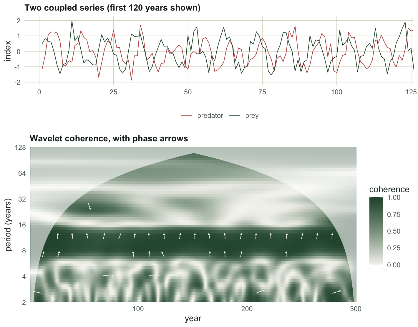
Prey drives predator with a quarter-cycle delay: the classic signature, and a good test of whether the machinery recovers a lag we planted.
```{r}
#| label: coupled
set.seed(1286)
tt <- 1:n
per <- 10
true_lag <- 2.5                                       # a quarter of the period
prey <- sin(2 * pi * tt / per) + rnorm(n, 0, 0.4)
pred <- sin(2 * pi * (tt - true_lag) / per) + rnorm(n, 0, 0.4)
q1 <- cwt(prey); q2 <- cwt(pred)
cq <- wcoh(q1, q2)
band <- which.min(abs(q1$period - per))
sel <- q1$period[band] <= q1$coi
coh_band <- mean(cq$R2[band, sel])
ph <- mean(cq$phase[band, sel])
lag_hat <- ph / (2 * pi) * q1$period[band]
c(band_period = round(q1$period[band], 2), mean_coherence = round(coh_band, 3),
  mean_phase_rad = round(ph, 4), implied_lag = round(lag_hat, 3), true_lag = true_lag)
```
Coherence `r sprintf("%.3f", coh_band)` at the period-`r sprintf("%.2f", q1$period[band])` band, and the phase implies a lag of `r sprintf("%.2f", lag_hat)` steps against a planted `r true_lag`. The phase converts to a lag by $\text{lag} = \phi \cdot \text{period} / 2\pi$. Compare what the cross-correlation gets:
```{r}
#| label: ccf
cf <- ccf(prey, pred, lag.max = 12, plot = FALSE)
c(ccf_peak_lag = cf$lag[which.max(cf$acf)], ccf_peak_value = round(max(cf$acf), 3))
```
The cross-correlation peak here is at `r cf$lag[which.max(cf$acf)]`. (R's sign convention for `ccf(a, b)` is that a negative lag means `a` leads `b`, which catches everyone once.) The wavelet gets `r sprintf("%.2f", lag_hat)`, and it gets it separately for every year, which is the part the cross-correlation cannot do at all.
```{r}
#| label: fig-coh
#| echo: false
#| fig-width: 7.4
#| fig-height: 5.8
#| fig-cap: "The prey and predator series (top) and their wavelet coherence (bottom). Arrows show the phase difference where coherence is high: along the period-10 band a phase near pi/2 points them almost straight up, which is the prey leading the predator by a quarter of a cycle. The pale wedges are the cone of influence."
#| fig-alt: "An upper panel with two offset oscillating series. A lower panel is a heatmap of coherence with a dark horizontal band at period 10 running the whole record, overlaid with small arrows that point in the same near-vertical direction along that band, while the scattered arrows at other periods point other ways."
pTop <- ggplot(rbind(data.frame(t = tt, v = prey, s = "prey"),
data.frame(t = tt, v = pred, s = "predator")), aes(t, v, colour = s)) +
geom_line(linewidth = 0.35) +
scale_colour_manual(values = c(prey = "#275139", predator = "#b5534e"), name = NULL) +
coord_cartesian(xlim = c(1, 120)) +
labs(x = NULL, y = "index", title = "Two coupled series (first 120 years shown)") +
theme_te() + theme(legend.position = "bottom")
dfc <- expand.grid(time = tt, period = q1$period)
dfc$R2 <- as.vector(t(cq$R2))
ar <- expand.grid(time = seq(12, n - 12, by = 14), period = q1$period[seq(4, length(q1$period), by = 7)])
ar$ph <- mapply(function(ti, pe) cq$phase[which.min(abs(q1$period - pe)), ti], ar$time, ar$period)
ar$r2 <- mapply(function(ti, pe) cq$R2[which.min(abs(q1$period - pe)), ti], ar$time, ar$period)
ar <- ar[ar$r2 > 0.6 & ar$period <= q1$coi[ar$time], ]
ar$dx <- 9 * cos(ar$ph); ar$dy <- 0.16 * sin(ar$ph) * ar$period
pBot <- ggplot(dfc, aes(time, period)) +
geom_raster(aes(fill = R2)) +
geom_segment(data = ar, aes(x = time, y = period, xend = time + dx, yend = period + dy),
inherit.aes = FALSE, colour = "#f5f4ee", linewidth = 0.35,
arrow = grid::arrow(length = grid::unit(0.05, "cm"), type = "closed")) +
geom_ribbon(data = data.frame(time = tt, period = q1$coi),
aes(x = time, ymin = period, ymax = max(q1$period)), inherit.aes = FALSE,
fill = "white", alpha = 0.6) +
scale_fill_gradient(low = "#f5f4ee", high = "#275139", name = "coherence", limits = c(0, 1)) +
scale_y_continuous(transform = "log2", breaks = c(2, 4, 8, 16, 32, 64, 128), expand = c(0, 0)) +
scale_x_continuous(expand = c(0, 0)) +
coord_cartesian(ylim = c(2, 128)) +
labs(x = "year", y = "period (years)", title = "Wavelet coherence, with phase arrows") +
theme_te()
grid::grid.newpage()
grid::pushViewport(grid::viewport(layout = grid::grid.layout(2, 1, heights = grid::unit(c(2, 3), "null"))))
print(pTop, vp = grid::viewport(layout.pos.row = 1, layout.pos.col = 1))
print(pBot, vp = grid::viewport(layout.pos.row = 2, layout.pos.col = 1))
```
## What counts as high coherence
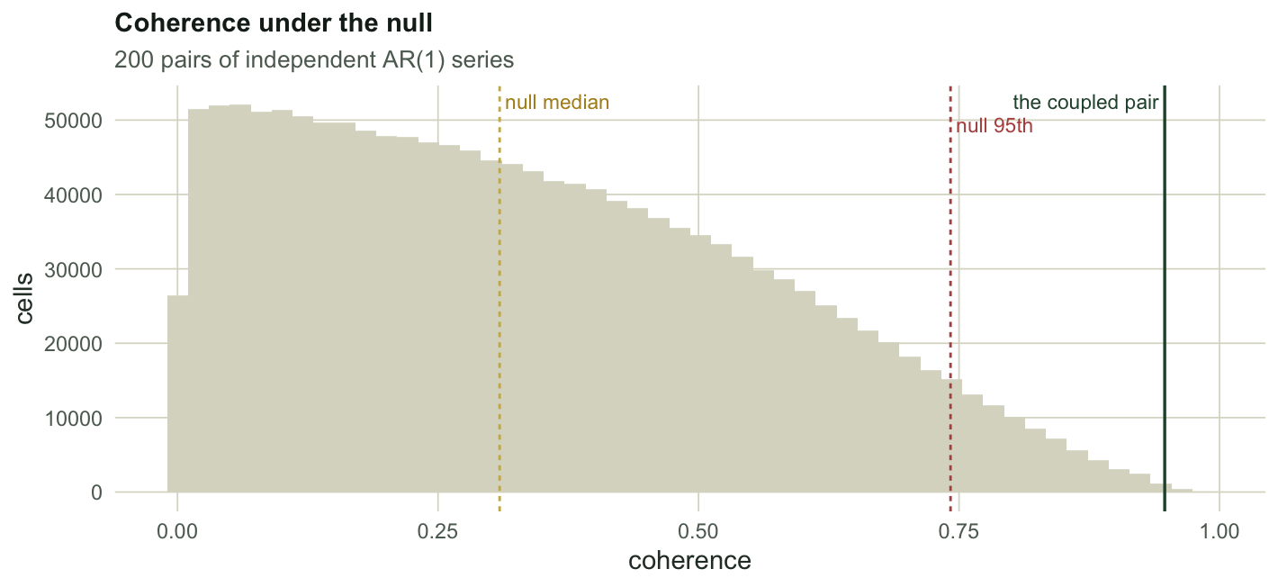
`r sprintf("%.3f", coh_band)` sounds impressive. Is 0.6? Simulate the null: two independent AR(1) series, two hundred times, and look at the whole distribution of coherence you get from nothing.
```{r}
#| label: null-coh
mc_coh <- function(B, n, phi, seed) {
  set.seed(seed)
  out <- numeric(0)
  for (b in 1:B) {
    z1 <- as.numeric(arima.sim(list(ar = phi), n))
    z2 <- as.numeric(arima.sim(list(ar = phi), n))
    p1 <- cwt(z1); p2 <- cwt(z2)
    r <- wcoh(p1, p2)$R2
    out <- c(out, r[outer(p1$period, p1$coi, "<=")])
  }
  out
}
nullR2 <- mc_coh(200, 200, 0.7, 2286)
c(null_mean = round(mean(nullR2), 3), null_median = round(median(nullR2), 3),
  null_95th = round(quantile(nullR2, 0.95), 3), null_99th = round(quantile(nullR2, 0.99), 3),
  share_of_null_above_0.5 = round(mean(nullR2 > 0.5), 3),
  share_of_null_below_0.7 = round(mean(nullR2 < 0.7), 3))
```
Two series with no connection at all produce a median coherence of `r sprintf("%.2f", median(nullR2))`, and `r sprintf("%.0f%%", 100 * mean(nullR2 > 0.5))` of the null map exceeds 0.5. The 95th percentile is `r sprintf("%.2f", quantile(nullR2, 0.95))`. So a patch at coherence 0.7 looks like a strong result and is not one: `r sprintf("%.0f%%", 100 * mean(nullR2 < 0.7))` of the pure-noise map falls below it, which leaves it short of the simulated 95 per cent level. This is why coherence figures need a simulated level, not a rule of thumb, and it is why Maraun and Kurths (2004) concluded that the widely reported ENSO to North Atlantic Oscillation coherence is an artefact for most of the twentieth century.
```{r}
#| label: fig-null
#| echo: false
#| fig-width: 7.4
#| fig-height: 3.4
#| fig-cap: "Coherence values from 200 pairs of independent red noise series, restricted to the usable part of the map. Patches of high coherence are a routine output of the method on unrelated series, not a discovery."
#| fig-alt: "A histogram of coherence values spread across the whole zero to one range with a long tail to the right. Dashed lines mark the median near one third and the 95th percentile near three quarters. The measured coupled pair sits far to the right, close to one."
ggplot(data.frame(x = nullR2), aes(x)) +
geom_histogram(bins = 50, fill = "#dad9ca", colour = NA) +
geom_vline(xintercept = median(nullR2), colour = "#c9b458", linetype = "22", linewidth = 0.5) +
geom_vline(xintercept = as.numeric(quantile(nullR2, 0.95)), colour = "#b5534e",
linetype = "22", linewidth = 0.5) +
geom_vline(xintercept = coh_band, colour = "#275139", linewidth = 0.6) +
annotate("text", x = median(nullR2), y = Inf, label = " null median", colour = "#b08d1e",
hjust = 0, vjust = 1.6, size = 3) +
annotate("text", x = as.numeric(quantile(nullR2, 0.95)), y = Inf, label = " null 95th",
colour = "#b5534e", hjust = 0, vjust = 3.2, size = 3) +
annotate("text", x = coh_band, y = Inf, label = "the coupled pair ", colour = "#275139",
hjust = 1, vjust = 1.6, size = 3) +
labs(x = "coherence", y = "cells", title = "Coherence under the null",
subtitle = "200 pairs of independent AR(1) series") +
theme_te()
```
## Three ways the phase lies
**The wrap.** Phase is an angle, so it identifies the lag only up to a whole period. Plant a lag of 7 in a period-10 cycle:
```{r}
#| label: wrap
set.seed(2287)
big_lag <- 7
w1 <- sin(2 * pi * tt / per) + rnorm(n, 0, 0.4)
w2 <- sin(2 * pi * (tt - big_lag) / per) + rnorm(n, 0, 0.4)
v1 <- cwt(w1); v2 <- cwt(w2)
cw <- wcoh(v1, v2)
selw <- v1$period[band] <= v1$coi
phw <- mean(cw$phase[band, selw])
c(true_lag = big_lag, mean_phase_rad = round(phw, 3),
  apparent_lag = round(phw / (2 * pi) * v1$period[band], 3),
  coherence = round(mean(cw$R2[band, selw]), 3))
```
The coherence is `r sprintf("%.2f", mean(cw$R2[band, selw]))`, so the relationship is unmistakable, and the phase says the lag is `r sprintf("%.2f", phw / (2 * pi) * v1$period[band])`. Negative. The follower appears to lead. A lag of 7 and a lag of -3 are the same angle in a period-10 cycle, and no amount of data will separate them. Phase gives you the lag modulo the period, and choosing between the candidates is ecology, not statistics.
**The common driver.** Two species, no interaction of any kind, both responding to the same climate index:
```{r}
#| label: driver
set.seed(3286)
driver <- sin(2 * pi * tt / 12)
sp_a <- 1.2 * driver + rnorm(n, 0, 0.5)
sp_b <- 1.2 * driver + rnorm(n, 0, 0.5)   # sp_b never sees sp_a
d1 <- cwt(sp_a); d2 <- cwt(sp_b)
cd <- wcoh(d1, d2)
bd <- which.min(abs(d1$period - 12))
seld <- d1$period[bd] <= d1$coi
c(coherence_at_period_12 = round(mean(cd$R2[bd, seld]), 3),
  mean_phase_rad = round(mean(cd$phase[bd, seld]), 4))
```
Coherence `r sprintf("%.3f", mean(cd$R2[bd, seld]))`, phase `r sprintf("%.3f", mean(cd$phase[bd, seld]))` radians: in lockstep, indistinguishable from a tight mutualism. Coherence measures association in the time-frequency plane. It has no more to say about mechanism than a correlation coefficient does, and the arrows make it look like it does.
**The edge.** Coherence is inflated near the ends of the record for the same reason power is attenuated there, and the smoothing spreads the contamination further than the cone suggests:
```{r}
#| label: edge
c(mean_coherence_usable = round(mean(cc$R2[usable]), 3),
  mean_coherence_in_the_cone = round(mean(cc$R2[!usable]), 3))
```
On the independent pair, the mean coherence inside the cone is `r sprintf("%.3f", mean(cc$R2[!usable]))` against `r sprintf("%.3f", mean(cc$R2[usable]))` in the usable region. The corners of a coherence map are the least trustworthy part and the most colourful.
## Honest limits
Everything above uses a pointwise level, and coherence maps have the same patchiness problem as power maps, so the [areawise thinking](../wavelet-significance-and-red-noise/) applies here too and matters more, because the smoothing makes the patches larger by construction. The AR(1) surrogate null assumes each series is separately AR(1), which is a modelling choice about the background and not a fact about voles. And coherence, high and beautifully arrowed, still cannot tell a shared driver from an interaction: for that you need an experiment, or a method built for the question.
## Where to go next
Three posts in, you can build the map, test it, and pair it with a second series. The last one in the series is about the ways the whole apparatus can be wrong in ways the map does not show: a bias that decides which cycle looks bigger, a single event that impersonates a cycle, and a resolution knob you chose without noticing.
## References
Grinsted, Moore and Jevrejeva 2004 Nonlinear Processes in Geophysics 11(5/6):561-566 (10.5194/npg-11-561-2004)
Torrence and Webster 1999 Journal of Climate 12(8):2679-2690 (10.1175/1520-0442(1999)012<2679:ICITEM>2.0.CO;2)
Maraun and Kurths 2004 Nonlinear Processes in Geophysics 11(4):505-514 (10.5194/npg-11-505-2004)
Liu, Liang and Weisberg 2007 Journal of Atmospheric and Oceanic Technology 24(12):2093-2102 (10.1175/2007JTECHO511.1)
Cazelles, Chavez, Berteaux, Menard, Vik, Jenouvrier and Stenseth 2008 Oecologia 156(2):287-304 (10.1007/s00442-008-0993-2)
Grenfell, Bjornstad and Kappey 2001 Nature 414(6865):716-723 (10.1038/414716a)
```{r}
#| label: thumb
#| include: false
ggsave("thumbnail.png",
ggplot(dfc, aes(time, period)) +
geom_raster(aes(fill = R2)) +
geom_segment(data = ar, aes(x = time, y = period, xend = time + dx, yend = period + dy),
inherit.aes = FALSE, colour = "#f5f4ee", linewidth = 0.4,
arrow = grid::arrow(length = grid::unit(0.06, "cm"), type = "closed")) +
geom_ribbon(data = data.frame(time = tt, period = q1$coi),
aes(x = time, ymin = period, ymax = max(q1$period)), inherit.aes = FALSE,
fill = "white", alpha = 0.6) +
scale_fill_gradient(low = "#f5f4ee", high = "#275139", guide = "none", limits = c(0, 1)) +
scale_y_continuous(transform = "log2", breaks = c(2, 4, 8, 16, 32, 64), expand = c(0, 0)) +
scale_x_continuous(expand = c(0, 0)) +
coord_cartesian(ylim = c(2, 64)) +
labs(x = "year", y = "period") + theme_te(13) +
theme(plot.margin = ggplot2::margin(8, 14, 8, 8)),
width = 7.5, height = 5.4, dpi = 100, bg = "#f5f4ee")
```
## Related tutorials
- [Wavelet analysis of population cycles](../wavelet-analysis-of-population-cycles/)
- [Wavelet significance and the red noise null](../wavelet-significance-and-red-noise/)
- [Checking a wavelet analysis](../checking-a-wavelet-analysis/)
- [Convergent cross mapping](../convergent-cross-mapping/)