---
title: "Checking a point pattern analysis"
description: "Simulation envelopes for Ripley's K are not tests. The band most ecologists draw calls a third of random maps clustered, and more simulations do not help."
date: "2026-08-07 13:00"
categories: [R, point patterns, spatial ecology, null models, ecology tutorial]
image: thumbnail.png
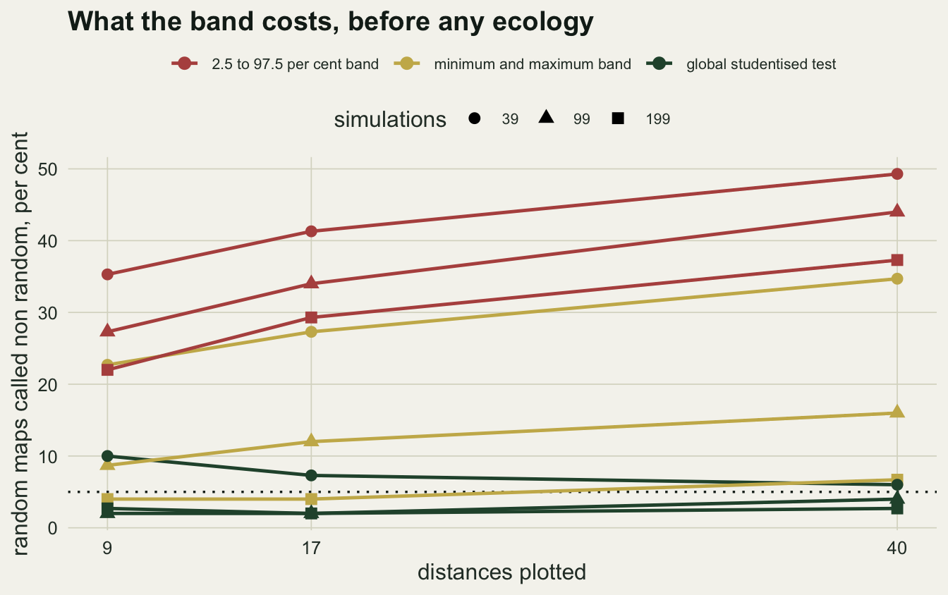
image-alt: "A line chart of the share of random maps called non random, in per cent, against distances plotted, on a warm off-white panel. Nine lines cover three test rules, each built from 39, 99 and 199 simulations: the 2.5 to 97.5 per cent band lines climb from left to right and end highest, between about 37 and 49 per cent; the minimum and maximum band lines run between about 4 and 35 per cent; and the global studentised test lines end between about 3 and 6 per cent, either side of a dotted reference line at five."
---
A hectare of forest is mapped, eighty stems of one species are digitised, and the analysis is the standard one: estimate Ripley's K, transform it to L minus r so the reference is a flat line at zero, simulate a few dozen random patterns in the same window, take the pointwise minimum and maximum of the simulated curves as an envelope, and look at where the observed curve leaves it. The curve pops out above the band at one distance near four metres. The figure is drawn, the caption says significant clustering at small scales, and the paper goes out.
The envelope is not a test. It is a picture of what the simulations did at each distance separately, and the observed curve is compared with it at every distance at once. This post measures what that costs, using patterns that are random by construction, so every departure the procedure reports is a false one.
The site's own tutorial on Ripley's K builds exactly this kind of envelope and says in passing that formal global tests exist. What it never does is price the informal one.
## The estimator, and two ways to draw a band
Ripley's K counts, for each point, how many other points fall within distance r, averages, and scales by the area per point. Pairs near the window edge lose part of their search disc, and the translation correction handles that by weighting each pair by the reciprocal of the overlap between the window and its own translate. On the unit square that weight is available in closed form.
```{r setup}
#| message: false
#| warning: false
library(ggplot2)

te_paper  <- "#f5f4ee"
te_ink    <- "#16241d"
te_body   <- "#2c3a31"
te_forest <- "#275139"
te_rust   <- "#b5534e"
te_gold   <- "#c9b458"
te_line   <- "#dad9ca"

theme_datasheet <- function() {
  theme_minimal(base_size = 12) +
    theme(plot.background  = element_rect(fill = te_paper, colour = NA),
          panel.background = element_rect(fill = te_paper, colour = NA),
          panel.grid.major = element_line(colour = te_line, linewidth = 0.3),
          panel.grid.minor = element_blank(),
          text             = element_text(colour = te_body),
          plot.title       = element_text(colour = te_ink, face = "bold"),
          axis.text        = element_text(colour = te_body))
}

# Ripley's K on the unit square with the translation edge correction, evaluated
# on a whole grid of radii in one pass through the sorted pair distances
kfun <- function(pts, radii) {
  n <- nrow(pts)
  dx <- outer(pts[, 1], pts[, 1], "-"); dy <- outer(pts[, 2], pts[, 2], "-")
  dist_ij <- sqrt(dx^2 + dy^2); wt_ij <- 1 / ((1 - abs(dx)) * (1 - abs(dy)))
  up <- upper.tri(dist_ij)
  dv <- dist_ij[up]; wv <- wt_ij[up]
  ord <- order(dv); dv <- dv[ord]; cw <- cumsum(wv[ord])
  idx <- findInterval(radii, dv)
  out <- numeric(length(radii)); out[idx > 0] <- cw[idx[idx > 0]]
  2 * out / (n * (n - 1))
}
lminusr <- function(k, radii) sqrt(k / pi) - radii
csr <- function(n) cbind(runif(n), runif(n))

n_pts <- 80
radii_full <- seq(0.02, 0.20, length.out = 40)
set.seed(3101)
c(K_at_0.10 = kfun(csr(n_pts), 0.10), disc_area = pi * 0.10^2)
```
On a random pattern the estimator returns very nearly the area of the disc, which is what K should be under complete spatial randomness.
Two bands are in common use and they are not the same object. The minimum and maximum of the simulated curves is one; the 2.5 and 97.5 per cent quantiles of them is the other. Software offers both, and papers show both, often without saying which.
```{r one-map}
envelopes <- function(sims, kind = c("minmax", "quantile")) {
  kind <- match.arg(kind)
  if (kind == "minmax")
    list(lo = apply(sims, 2, min), hi = apply(sims, 2, max))
  else
    list(lo = apply(sims, 2, quantile, 0.025),
         hi = apply(sims, 2, quantile, 0.975))
}

set.seed(3102)
obs_pts <- csr(n_pts)
obs_l   <- lminusr(kfun(obs_pts, radii_full), radii_full)
sim_l   <- t(replicate(199, lminusr(kfun(csr(n_pts), radii_full), radii_full)))

esc <- function(ob, sims, kind) {
  e <- envelopes(sims, kind); sum(ob < e$lo | ob > e$hi)
}
c(minmax_39   = esc(obs_l, sim_l[1:39, ], "minmax"),
  minmax_199  = esc(obs_l, sim_l, "minmax"),
  quantile_199 = esc(obs_l, sim_l, "quantile"))
```
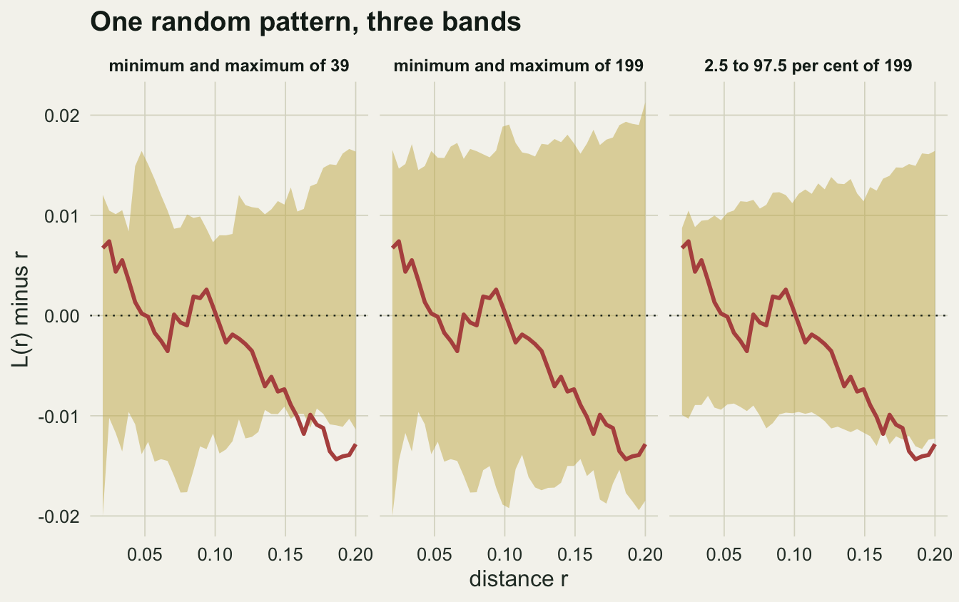
This pattern is random. It came out of `runif`. Against a thirty nine simulation minimum and maximum envelope it escapes at `r esc(obs_l, sim_l[1:39, ], "minmax")` of the forty distances, and against the quantile band from all one hundred and ninety nine simulations it escapes at `r esc(obs_l, sim_l, "quantile")`. Against the minimum and maximum of all one hundred and ninety nine it escapes at `r esc(obs_l, sim_l, "minmax")`.
```{r fig-oneband}
#| echo: false
#| fig-width: 7.0
#| fig-height: 4.4
#| fig-cap: "L(r) minus r for a single random pattern of 80 points, drawn against three bands built from the same set of simulations: the minimum and maximum of 39, the minimum and maximum of 199, and the 2.5 to 97.5 per cent quantiles of 199. The observed curve is the same in all three panels."
#| fig-alt: "Three panels of a wiggly observed curve against distance, each with a shaded band around zero. The band from 39 simulations is narrow and the curve drops below its lower edge at the largest distances. The band from 199 simulations is much wider and holds the curve throughout. The quantile band is narrow again and the curve leaves it at the largest distances."
bands <- do.call(rbind, lapply(
list(list("minimum and maximum of 39", sim_l[1:39, ], "minmax"),
list("minimum and maximum of 199", sim_l, "minmax"),
list("2.5 to 97.5 per cent of 199", sim_l, "quantile")),
function(z) {
e <- envelopes(z[[2]], z[[3]])
data.frame(r = radii_full, lo = e$lo, hi = e$hi, obs = obs_l, band = z[[1]])
}))
bands$band <- factor(bands$band, levels = unique(bands$band))
ggplot(bands, aes(r)) +
geom_ribbon(aes(ymin = lo, ymax = hi), fill = te_gold, alpha = 0.5) +
geom_hline(yintercept = 0, colour = te_ink, linewidth = 0.4, linetype = "dotted") +
geom_line(aes(y = obs), colour = te_rust, linewidth = 1.0) +
facet_wrap(~ band, nrow = 1) +
labs(x = "distance r", y = "L(r) minus r",
title = "One random pattern, three bands") +
theme_datasheet() +
theme(strip.text = element_text(colour = te_ink, face = "bold", size = 9))
```
## How often a random map is called clustered
One map settles nothing. The experiment below generates a random pattern, generates one hundred and ninety nine more to build envelopes from, and records whether the observed curve leaves the band anywhere. Two things are varied: how many simulations go into the envelope, and how many distances are plotted. Both are choices the analyst makes without thinking of them as choices.
```{r calibration}
sub_idx <- list("9" = round(seq(1, 40, length.out = 9)),
                "17" = round(seq(1, 40, length.out = 17)),
                "40" = 1:40)
n_sims <- c(39, 99, 199)
n_rep  <- 150

global_p <- function(ob, sims) {
  mu <- colMeans(sims); sdv <- apply(sims, 2, sd); sdv[sdv == 0] <- 1
  d_obs <- max(abs(ob - mu) / sdv)
  d_sim <- apply(sims, 1, function(z) max(abs(z - mu) / sdv))
  (1 + sum(d_sim >= d_obs)) / (1 + nrow(sims))
}

run_grid <- function(gen, n_rep, seed) {
  set.seed(seed)
  out <- array(0, dim = c(n_rep, length(n_sims), length(sub_idx), 3),
               dimnames = list(NULL, as.character(n_sims), names(sub_idx),
                               c("minmax", "quantile", "global")))
  for (r in seq_len(n_rep)) {
    k_obs <- lminusr(kfun(gen(), radii_full), radii_full)
    k_sim <- t(replicate(max(n_sims),
                         lminusr(kfun(csr(n_pts), radii_full), radii_full)))
    for (bi in seq_along(n_sims)) for (si in seq_along(sub_idx)) {
      ii <- sub_idx[[si]]
      ss <- k_sim[seq_len(n_sims[bi]), ii, drop = FALSE]
      ob <- k_obs[ii]
      out[r, bi, si, "minmax"]   <- esc(ob, ss, "minmax") > 0
      out[r, bi, si, "quantile"] <- esc(ob, ss, "quantile") > 0
      out[r, bi, si, "global"]   <- global_p(ob, ss) <= 0.05
    }
  }
  out
}

null_runs <- run_grid(function() csr(n_pts), n_rep, 3201)
fp <- lapply(c("minmax", "quantile", "global"),
             function(k) round(100 * apply(null_runs[, , , k], c(2, 3), mean), 1))
names(fp) <- c("minmax", "quantile", "global")
fp
```
Read the tables as false positive rates: every pattern tested was random, so every rejection is wrong. Rows are the number of simulations behind the envelope, columns the number of distances plotted.
The minimum and maximum envelope from `r n_sims[1]` simulations over `r names(sub_idx)[2]` distances calls `r sprintf("%.1f", fp$minmax["39", "17"])` per cent of random maps non random. Raising the simulation count to `r n_sims[3]` brings that down to `r sprintf("%.1f", fp$minmax["199", "17"])` per cent, much closer to the five per cent everyone thinks they are working at.
That is not a coincidence and it is not good practice either. It is arithmetic. With B simulations, the chance that the observed curve is the highest or the lowest of the B plus one curves at any one distance is two over B plus one, which is `r sprintf("%.3f", 2 / 200)` at B equal to `r n_sims[3]`. Spread across seventeen distances that are strongly correlated with each other, the total lands somewhere below seventeen per cent, and how close it comes to five is luck.
```{r per-radius}
set.seed(3210)
per_r <- rowMeans(replicate(100, {
  ob <- lminusr(kfun(csr(n_pts), radii_full), radii_full)
  ss <- t(replicate(199, lminusr(kfun(csr(n_pts), radii_full), radii_full)))
  e <- envelopes(ss, "minmax")
  as.numeric(ob < e$lo | ob > e$hi)
}))
c(mean_per_radius = mean(per_r), predicted = 2 / 200)
```
Averaged over the forty distances, a random curve sits outside a `r n_sims[3]` simulation minimum and maximum envelope at `r sprintf("%.4f", mean(per_r))` of them, against the predicted `r sprintf("%.3f", 2 / 200)`. The pointwise behaviour is exactly what the arithmetic says. What the analyst does with it, scanning the whole curve for any excursion, is what turns it into a test with no stated level.
The quantile band behaves differently and worse. Its pointwise exceedance is five per cent by construction, whatever the number of simulations, but that pointwise guarantee does not carry over to the rate across all `r names(sub_idx)[2]` distances at once: there it calls `r sprintf("%.1f", fp$quantile["199", "17"])` per cent of random maps non random, and going from `r n_sims[1]` to `r n_sims[3]` simulations takes it from `r sprintf("%.1f", fp$quantile["39", "17"])` to `r sprintf("%.1f", fp$quantile["199", "17"])` per cent. More simulation effort buys a more precise estimate of the wrong band.
```{r fig-rates}
#| echo: false
#| fig-width: 7.0
#| fig-height: 4.4
#| fig-cap: "False positive rate against the number of distances plotted, for the two envelope types at three simulation counts and for the global test. Every pattern tested was random. The dotted line is the nominal five per cent."
#| fig-alt: "A line chart with the number of distances on the horizontal axis and false positive rate on the vertical. Three quantile band lines run across the top between about twenty and fifty per cent. Three minimum and maximum lines fan out below them, the one from 199 simulations staying nearest the dotted five per cent line. Two of the global test lines sit flat just under the dotted line across the whole axis, while the one from the fewest simulations runs above it and falls towards it from left to right."
rate_df <- do.call(rbind, lapply(names(fp), function(k)
do.call(rbind, lapply(rownames(fp[[k]]), function(b)
data.frame(n_radii = as.numeric(colnames(fp[[k]])), rate = fp[[k]][b, ],
sims = b, kind = k)))))
rate_df$sims <- factor(rate_df$sims, levels = as.character(n_sims))
rate_df$kind <- factor(rate_df$kind, levels = c("quantile", "minmax", "global"),
labels = c("2.5 to 97.5 per cent band",
"minimum and maximum band",
"global studentised test"))
ggplot(rate_df, aes(n_radii, rate, colour = kind, group = interaction(kind, sims),
shape = sims)) +
geom_hline(yintercept = 5, linetype = "dotted", colour = te_ink, linewidth = 0.6) +
geom_line(linewidth = 0.85) +
geom_point(size = 2.6) +
scale_colour_manual(values = c(te_rust, te_gold, te_forest)) +
scale_x_continuous(breaks = c(9, 17, 40)) +
labs(x = "distances plotted", y = "random maps called non random, per cent",
colour = NULL, shape = "simulations",
title = "What the band costs, before any ecology") +
theme_datasheet() +
theme(legend.position = "top", legend.box = "vertical",
legend.text = element_text(size = 8), legend.margin = margin(0, 0, 0, 0))
```
## A test with a level
The repair is not more simulations. It is a single statistic for the whole curve, compared with the same statistic computed from each simulated curve. The studentised maximum deviation does it: at each distance, divide the departure from the simulated mean by the simulated standard deviation there, take the largest of those across distances, and see where the observed value falls among the simulated ones. Because every simulated curve is reduced the same way, the resulting p value has a level whatever the number of distances.
That statistic is already in the tables above, and the property to read is not its exact level but its flatness. Across nine, seventeen and forty distances it sits at `r sprintf("%.1f", fp$global["199", "9"])`, `r sprintf("%.1f", fp$global["199", "17"])` and `r sprintf("%.1f", fp$global["199", "40"])` per cent, while the minimum and maximum envelope built from the same simulations moves from `r sprintf("%.1f", fp$minmax["199", "9"])` to `r sprintf("%.1f", fp$minmax["199", "40"])` per cent over the same range. Adding distances to the plot changes the error rate of an envelope and does not change the error rate of a test. The global rates land within a few points of the nominal five per cent, and with `r n_rep` replicates each is uncertain by about two points, so which side of five a rate falls on is noise rather than a property of the test.
Calibration on its own is easy to buy by refusing to reject anything, so the three procedures need to be seen against a pattern that really is clustered.
```{r thomas}
n_parent <- 60; spread <- 0.15
thomas <- function(n) {
  par_xy <- cbind(runif(n_parent), runif(n_parent))
  who <- sample(n_parent, n, replace = TRUE)
  cbind(pmin(pmax(par_xy[who, 1] + rnorm(n, 0, spread), 0), 1),
        pmin(pmax(par_xy[who, 2] + rnorm(n, 0, spread), 0), 1))
}
```
The alternative is deliberately weak: `r n_parent` parent locations scattered at random over the window, with each of the `r n_pts` points displaced from its parent by a standard deviation of `r sprintf("%.2f", spread)` of the window width. That produces a map most readers would not call clustered by eye.
```{r power}
alt_runs <- run_grid(function() thomas(n_pts), 100, 3301)
compare <- data.frame(
  procedure = c("2.5 to 97.5 per cent band", "minimum and maximum band",
                "global studentised test"),
  false_positive = c(fp$quantile["199", "17"], fp$minmax["199", "17"],
                     fp$global["199", "17"]),
  power = 100 * c(mean(alt_runs[, "199", "17", "quantile"]),
                  mean(alt_runs[, "199", "17", "minmax"]),
                  mean(alt_runs[, "199", "17", "global"])))
compare$power_per_error <- compare$power / compare$false_positive
round(compare[, -1], 2)
```
The quantile band detects the weak clustering in `r sprintf("%.0f", compare$power[1])` per cent of maps, but it also flags `r sprintf("%.0f", compare$false_positive[1])` per cent of random ones. The minimum and maximum envelope detects it in `r sprintf("%.0f", compare$power[2])` per cent at a false positive rate of `r sprintf("%.1f", compare$false_positive[2])`. The global test detects it in `r sprintf("%.0f", compare$power[3])` per cent at `r sprintf("%.1f", compare$false_positive[3])`. The last column divides detection by error rate, and on that measure the quantile band is the worst of the three.
The important comparison is not which number is largest. It is that only one of the three has a rate the analyst sets: the global test is asked for five per cent and delivers at or under it whatever the plot contains, while the other two are wherever the arithmetic left them.
## What to report
Say which band you drew and how many simulations went into it, because minimum and maximum from `r n_sims[3]` is a different object from 2.5 to 97.5 per cent from `r n_sims[3]`, and the two disagree about `r sprintf("%.0f", fp$quantile["199", "17"] - fp$minmax["199", "17"])` per cent of random maps.
Say how many distances the curve was inspected over, and do not extend the range after seeing the figure. Adding distances widens the family being scanned and raises the error rate in every column of the tables above.
If the claim is that the pattern departs from randomness, report a global test with a p value rather than an excursion from a band. If the claim is about a particular scale, say which scale was chosen in advance and test only there, where a pointwise band means what it looks like.
Envelopes remain the right picture. They show where and in which direction the departure sits, which a single p value cannot. Drawing the envelope and reporting the global p value costs one extra line and settles both questions.
## Honest limits
Every number here is for eighty points on a unit square with the translation correction, and the false positive rate of an envelope depends on the correlation between the curve values at neighbouring distances, which depends on the point count, the window and the range of distances. Doubling the range while keeping the number of distances fixed changes the answer, because the values become less correlated and the effective number of independent looks rises.
The alternative used for power is one weak cluster process at one spatial scale. A test tuned to the whole distance range will lose to a pointwise look at the right distance whenever the departure is confined to one scale, which is the honest argument for pointwise inspection and the reason it survives.
The studentised maximum deviation is one global statistic among several. Rank based global envelopes of the kind Myllymaki and colleagues set out in 2017 have the useful property that they can be drawn as a band that means what it looks like, and an integrated deviation statistic is more sensitive to broad, shallow departures and less sensitive to a single sharp one. Loosmore and Ford made the same argument for point patterns in 2006, and the choice between these statistics matters less than the choice between having a level and not having one.
Finally, all of this assumes the null model itself is right. Complete spatial randomness is rarely the ecologically interesting null, and an inhomogeneous pattern tested against a homogeneous null will be called clustered by every procedure in this post, correctly and uselessly.
## References
Ripley BD 1977 Journal of the Royal Statistical Society Series B 39(2):172-192 (10.1111/j.2517-6161.1977.tb01615.x)
Loosmore NB, Ford ED 2006 Ecology 87(8):1925-1931 (10.1890/0012-9658(2006)87[1925:SIUTGO]2.0.CO;2)
Baddeley A, Diggle PJ, Hardegen A, Lawrence T, Milne RK, Nair G 2014 Ecological Monographs 84(3):477-489 (10.1890/13-2042.1)
Myllymaki M, Mrkvicka T, Grabarnik P, Seijo H, Hahn U 2017 Journal of the Royal Statistical Society Series B 79(2):381-404 (10.1111/rssb.12172)
## Related tutorials
- [Ripley's K function](../ripleys-k-function/)
- [Two-species point patterns](../two-species-point-patterns/)
- [Summed radiocarbon dates: an honest, nearly blind test](../summed-radiocarbon-probabilities/)
- [Inhomogeneous point processes](../inhomogeneous-point-processes/)