library(ggplot2)
library(patchwork)

te_paper  <- "#f5f4ee"
te_ink    <- "#16241d"
te_body   <- "#2c3a31"
te_forest <- "#275139"
te_rust   <- "#b5534e"
te_gold   <- "#c9b458"
te_line   <- "#dad9ca"

theme_datasheet <- function() {
  theme_minimal(base_size = 12) +
    theme(plot.background  = element_rect(fill = te_paper, colour = NA),
          panel.background = element_rect(fill = te_paper, colour = NA),
          panel.grid.major = element_line(colour = te_line, linewidth = 0.3),
          panel.grid.minor = element_blank(),
          text             = element_text(colour = te_body),
          plot.title       = element_text(colour = te_ink, face = "bold"),
          plot.subtitle    = element_text(colour = te_body),
          axis.text        = element_text(colour = te_body),
          strip.text       = element_text(colour = te_ink))
}Summed radiocarbon dates: an honest, nearly blind test
R
radiocarbon
palaeoecology
null models
simulation
ecology tutorial
A summed probability distribution of radiocarbon dates is spiky even for a constant population. The Monte Carlo test holds its level but has little power, in R.
A regional database holds a few hundred radiocarbon dates on bones of a large herbivore, collected from caves, river gravels and archaeological sites over a century of fieldwork. Nobody counted the animals, but every dated bone is evidence that some were alive at that time, so the dates are calibrated, their calendar probability densities are added up, and the resulting summed probability distribution (SPD) is read as a population curve. A rise after 4000 years ago looks like a boom. The same recipe is used for prehistoric people from charcoal in hearths, for peat initiation as a proxy for mire expansion, and for megafaunal decline before extinction.
Two things stand between that curve and a population. One is the calibration: a radiocarbon age is not a calendar age, and the curve that converts one into the other has steep sections, wiggles and plateaus. The other is sampling: a few hundred dates are a small sample of a long time axis. Williams 2012 reviewed both problems and argued for minimum sample sizes; Shennan and colleagues 2013 and Timpson and colleagues 2014 answered with a Monte Carlo test that simulates dates from a null population model, pushes them through the same calibration, and compares the observed SPD with the simulated ones through a single global statistic; Contreras and Meadows 2014 simulated SPDs from known populations to see which of their features survive calibration and sampling. Crema and Bevan 2021 describe the rcarbon implementation and the choice between normalised and unnormalised calibrated dates. None of what follows is new. It is a measurement of those arguments on simulated dates from populations whose shape is known, with the emphasis on the part that is easy to forget: the test is honest, and with a few hundred dates it misses most booms of 30 to 60 per cent.
This site has touched calibrated dates once before. Age-depth models and what they do to a proxy works inside one core and notes among its limits that calibrated radiocarbon dates have multimodal densities that no interpolation through point estimates represents; it never sums dates across sites. The test used here has two relatives on the site. Checking a point pattern analysis shows that a pointwise simulation band is not a test and that a global statistic is needed; the same lesson returns here in one paragraph. Checking a community classification shows that a null model has to repeat the whole pipeline that produced the pattern, and the radiocarbon null does exactly that with the calibration step.
No real calibration curve is used. IntCal20 is not bundled with base R and is not reproduced here, so the post builds a synthetic calibration curve: a trend with slope one, two sinusoidal wiggles and one flat plateau. It has the kind of structure a real curve has, not its detail. Results that follow from arithmetic, or that depend on sample size rather than on where the wiggles fall, carry over; anything tied to a particular plateau does not carry over, and its size is labelled as belonging to this curve.
A synthetic curve and calibration by hand
The calendar axis runs from 1000 to 7000 cal BP on a 5 year grid. The synthetic curve gives the expected radiocarbon age at each calendar year, and a plateau between 2400 and 2750 cal BP rises by only 0.05 radiocarbon years per calendar year. A date’s measurement error is 35 years and the curve’s own error 15 years, combined in quadrature. Calibrating a date means evaluating the normal likelihood of its radiocarbon age at every calendar year on the grid; a normalised calibrated date divides that likelihood by its sum so that each date carries a total probability of one, and an unnormalised one leaves it as it is. Because radiocarbon ages are reported as integers, both versions are computed once for every integer age the curve can produce and stored as a matrix, so an SPD is a weighted sum of rows.
The analysis window is 2000 to 6000 cal BP. The population that produces the dates lives from 1500 to 6500 cal BP, 500 years beyond the window on each side, which is what rcarbon does by default when it simulates dates for a test (its edgeSize argument). The SPD is smoothed with a 200 year running mean, again a common step. All of these constants were fixed before the first simulation.
cal_grid <- seq(1000, 7000, by = 5)
curve_c14 <- cal_grid - 250 + 45 * sin(2 * pi * cal_grid / 1100) +
  18 * sin(2 * pi * cal_grid / 260)
on_plateau_grid <- cal_grid >= 2400 & cal_grid <= 2750
curve_c14[on_plateau_grid] <- curve_c14[cal_grid == 2400] +
  (cal_grid[on_plateau_grid] - 2400) * 0.05
after_plateau <- cal_grid > 2750
curve_c14[after_plateau] <- curve_c14[after_plateau] -
  (curve_c14[after_plateau][1] - (curve_c14[cal_grid == 2750] + 5))

curve_slope <- diff(curve_c14) / 5
slope_q <- quantile(curve_slope, c(0.05, 0.5, 0.95))
share_flat <- mean(curve_slope < 0.2)
share_reversal <- mean(curve_slope < 0)

lab_sd <- 35; curve_sd <- 15
sd_total <- sqrt(lab_sd^2 + curve_sd^2)
c14_ages <- floor(min(curve_c14) - 300):ceiling(max(curve_c14) + 300)
lik_raw  <- outer(c14_ages, curve_c14, function(a, m) dnorm(a, m, sd_total))
lik_norm <- lik_raw / rowSums(lik_raw)

in_window <- cal_grid >= 2000 & cal_grid <= 6000
win_years <- cal_grid[in_window]
in_pop    <- cal_grid >= 1500 & cal_grid <= 6500
plateau_w <- win_years >= 2400 & win_years <= 2750
run_mean  <- function(x, k = 41) as.numeric(stats::filter(x, rep(1 / k, k), sides = 2))
The curve’s slope, measured between neighbouring grid years, has a 5th percentile of 0.05, a median of 0.98 and a 95th percentile of 1.60 radiocarbon years per calendar year. A share of 0.058 of the axis is flatter than 0.2, and that share is the plateau and nothing else; the wiggles never reverse the curve (share with negative slope 0.000). IntCal20 has more plateaus and real reversals, so this curve is gentler than the real one, and the difference matters for where spikes fall and to some degree for power, but not for whether the test holds its level: under a correctly specified null the observed and simulated data sets are exchangeable whatever the curve looks like.
What a constant population should give
Before any data are simulated, the expected SPD can be computed exactly. A population that is constant from 1500 to 6500 cal BP produces radiocarbon ages with a known distribution: average the likelihood rows over the calendar years the population occupies. The expected SPD per date is that distribution of radiocarbon ages weighted over the rows of the calibration matrix. Three versions are computed: normalised dates with the padded population, unnormalised dates with the padded population, and normalised dates with a population truncated to the analysis window, which is what happens when a study keeps only dates whose calibrated ages fall inside the window it plots.
age_dist <- function(pop_idx) {
  pr <- colMeans(t(sapply(pop_idx, function(j) dnorm(c14_ages, curve_c14[j], sd_total))))
  pr / sum(pr)
}
pr_padded <- age_dist(which(in_pop))
pr_trunc  <- age_dist(which(in_window))

exp_norm  <- run_mean(drop(crossprod(lik_norm, pr_padded)))[in_window]
exp_raw   <- run_mean(drop(crossprod(lik_raw, pr_padded)))[in_window]
exp_trunc <- run_mean(drop(crossprod(lik_norm, pr_trunc)))[in_window]

max_min <- function(x) max(x) / min(x)
plat_ratio <- function(x) mean(x[plateau_w]) / mean(x[!plateau_w])
mm_norm  <- max_min(exp_norm);  pr_norm_plat <- plat_ratio(exp_norm)
mm_raw   <- max_min(exp_raw);   pr_raw_plat  <- plat_ratio(exp_raw)
mm_trunc <- max_min(exp_trunc)
edge_left  <- exp_trunc[1] / median(exp_trunc)
edge_right <- exp_trunc[length(exp_trunc)] / median(exp_trunc)
The normalised expectation is flat: its largest value is 1.0000 times its smallest inside the window, and the plateau stands at 1.0000 times the rest. That is not a simulation result. A normalised calibrated date is a posterior distribution of calendar age under a uniform prior, and the average of posteriors over data drawn from the prior is the prior itself; the 500 years of padding make the population uniform wherever a date can reach the window. Whatever the calibration curve does, a correctly padded constant population has a flat expected SPD.
The unnormalised expectation is not flat. A date whose radiocarbon age falls on the plateau has a high likelihood over the whole plateau, so its unnormalised density has a large area. On this synthetic plateau (350 years at slope 0.05) a constant population puts 2.96 times as much summed probability per calendar year on the plateau as elsewhere, and the expectation varies 4.25-fold. The size of the bump depends on the length and flatness of the plateau; its existence does not. This bump is deterministic: it is in the expectation, and every data set carries it.
The truncated population gives a flat middle and halved ends: at the left edge the expectation is 0.50 of its median and at the right edge 0.50, a 2.00-fold range. This is arithmetic as well. At the boundary of a sharp cutoff about half of every nearby date’s probability spills outside the window, and the running mean averages over a boundary in the same way. A dataset trimmed to the window and plotted without padding shows a decline towards both ends of the study period that no population produced.
curve_df <- data.frame(cal = cal_grid[in_pop], c14 = curve_c14[in_pop])
p_curve <- ggplot(curve_df, aes(cal, c14)) +
  annotate("rect", xmin = 2400, xmax = 2750, ymin = -Inf, ymax = Inf,
           fill = te_gold, alpha = 0.35) +
  geom_line(colour = te_ink, linewidth = 0.6) +
  scale_x_reverse(limits = c(6500, 1500)) +
  labs(x = "Calendar age (cal BP)", y = "Radiocarbon age (14C BP)",
       title = "Synthetic calibration curve",
       subtitle = "Trend, two wiggles and one plateau (shaded); not IntCal20") +
  theme_datasheet()

exp_df <- data.frame(
  cal = rep(win_years, 3),
  rel = c(exp_norm / median(exp_norm), exp_raw / median(exp_raw),
          exp_trunc / median(exp_trunc)),
  arm = factor(rep(c("normalised, padded", "unnormalised, padded",
                     "normalised, truncated"), each = length(win_years)),
               levels = c("normalised, padded", "unnormalised, padded",
                          "normalised, truncated")))
p_exp <- ggplot(exp_df, aes(cal, rel, colour = arm)) +
  annotate("rect", xmin = 2400, xmax = 2750, ymin = -Inf, ymax = Inf,
           fill = te_gold, alpha = 0.35) +
  geom_hline(yintercept = 1, colour = te_body, linetype = "dashed", linewidth = 0.3) +
  geom_line(linewidth = 0.8) +
  scale_colour_manual(values = c(te_forest, te_rust, te_gold)) +
  scale_x_reverse(limits = c(6500, 1500)) +
  labs(x = "Calendar age (cal BP)", y = "Expected SPD / median", colour = NULL,
       title = "Expected SPD of a constant population") +
  theme_datasheet() +
  theme(legend.position = "bottom")

p_curve / p_exp + plot_annotation(theme = theme_datasheet())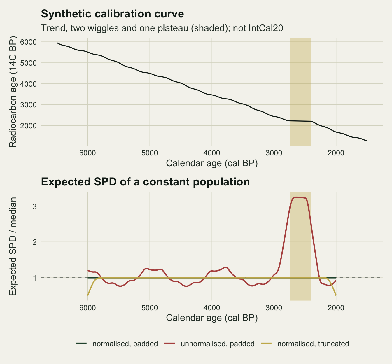
One data set is spiky anyway
A flat expectation says nothing about a single SPD. The simulation draws dates from the constant population, gives each a radiocarbon age from the curve plus normal error, rounds it to an integer, calibrates with the stored matrix and sums. The same function draws dates from a population with a boom: a multiplier on the density between 4000 and 4300 cal BP, a 300 year episode inside the window. Sample sizes are 100, 300 and 1000 dates.
pop_dates <- function(n, boom = 1) {
  wt <- ifelse(cal_grid >= 4000 & cal_grid < 4300, boom, 1)[in_pop]
  sample(cal_grid[in_pop], n, replace = TRUE, prob = wt) + runif(n, -2.5, 2.5)
}
draw_c14 <- function(cal_dates) {
  round(approx(cal_grid, curve_c14, cal_dates)$y + rnorm(length(cal_dates), 0, sd_total))
}
make_spd <- function(cal_dates, lik_mat) {
  counts <- tabulate(draw_c14(cal_dates) - c14_ages[1] + 1, nbins = length(c14_ages))
  used <- which(counts > 0)
  run_mean(drop(crossprod(lik_mat[used, , drop = FALSE], counts[used])))[in_window]
}
n_set <- c(100, 300, 1000)
span_centuries <- (6500 - 1500) / 100set.seed(3160)
single_df <- do.call(rbind, lapply(n_set, function(n) {
do.call(rbind, lapply(1:3, function(k) {
s_k <- make_spd(pop_dates(n), lik_norm)
data.frame(n = n, set = k, cal = win_years, rel = s_k / mean(s_k))
}))
}))The spread of single SPDs is measured on the data sets that the next section also uses to check the test, so its summary numbers appear after that chunk. The figure shows three data sets at each sample size.
single_df$n_lab <- factor(paste(single_df$n, "dates"), levels = paste(n_set, "dates"))
ggplot(single_df, aes(cal, rel, colour = factor(set))) +
  annotate("rect", xmin = 2400, xmax = 2750, ymin = -Inf, ymax = Inf,
           fill = te_gold, alpha = 0.3) +
  geom_hline(yintercept = 1, colour = te_body, linetype = "dashed", linewidth = 0.3) +
  geom_line(linewidth = 0.55) +
  facet_wrap(~ n_lab, ncol = 1) +
  scale_colour_manual(values = c(te_forest, te_rust, te_ink), guide = "none") +
  scale_x_reverse() +
  labs(x = "Calendar age (cal BP)", y = "SPD / its own mean",
       title = "A constant population, summed three times") +
  theme_datasheet()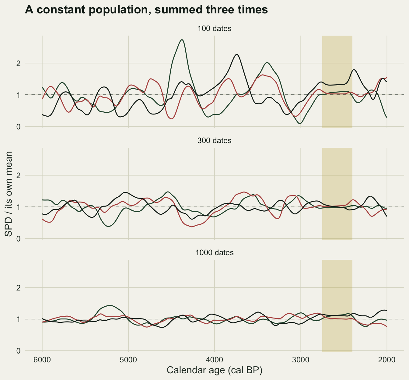
The Monte Carlo test keeps its level
The test follows modelTest() in rcarbon, checked against its source code. Simulate many data sets of the same size from the null model with padding, calibrate and smooth them the same way, and at every calendar year convert the simulated SPDs to z-scores with the simulated mean and standard deviation. The 2.5 and 97.5 percentiles of those z-scores at each year form the pointwise envelope. The global statistic is the summed distance by which the z-scores leave the envelope, above and below. The observed statistic is compared with the same statistic of every simulated SPD, and the p value is one plus the number of simulated statistics at least as large, divided by one plus the number of simulations. Two details differ from rcarbon and do not change the results here: rcarbon counts only simulated statistics strictly larger, and it rescales each simulated SPD to the area of a null fitted to the observed SPD, where this post uses the known constant null. Here the null is the constant population with 999 simulated SPDs, and the level is checked on 500 fresh data sets from that same null at each sample size.
A second statistic is computed on the same simulations for a later comparison: the mean SPD inside the pre-specified window 4000 to 4300 cal BP, with a one sided p value in the same form. It is a test of one planned episode, not a search.
global_stat <- function(z, lo, hi) sum(pmax(z - hi, 0) + pmax(lo - z, 0))
in_boom <- win_years >= 4000 & win_years < 4300

build_null <- function(n, n_sim, lik_mat) {
  sims <- replicate(n_sim, make_spd(pop_dates(n), lik_mat))
  m_s <- rowMeans(sims); s_s <- apply(sims, 1, sd)
  z_s <- (sims - m_s) / s_s
  lo <- apply(z_s, 1, quantile, 0.025); hi <- apply(z_s, 1, quantile, 0.975)
  list(mean = m_s, sd = s_s, lo = lo, hi = hi, n_sim = n_sim,
       stat = apply(z_s, 2, global_stat, lo = lo, hi = hi),
       local = colMeans(sims[in_boom, ]))
}
test_spd <- function(x, nul) {
  z <- (x - nul$mean) / nul$sd
  outside <- z > nul$hi | z < nul$lo
  c(p_global = (1 + sum(nul$stat >= global_stat(z, nul$lo, nul$hi))) / (nul$n_sim + 1),
    p_local = (1 + sum(nul$local >= mean(x[in_boom]))) / (nul$n_sim + 1),
    any_out = any(outside), share_out = mean(outside),
    max_min = max(x) / min(x), peak15 = max(x) > 1.5 * mean(x))
}

n_sim <- 999; n_fresh <- 500; alpha_lev <- 0.05
set.seed(3161)
null_pools <- lapply(n_set, build_null, n_sim = n_sim, lik_mat = lik_norm)
names(null_pools) <- n_set
fresh <- lapply(n_set, function(n) {
  sapply(seq_len(n_fresh), function(i) test_spd(make_spd(pop_dates(n), lik_norm),
                                                 null_pools[[as.character(n)]]))
})
names(fresh) <- n_set
size_global <- sapply(fresh, function(f) mean(f["p_global", ] <= alpha_lev))
size_local  <- sapply(fresh, function(f) mean(f["p_local", ] <= alpha_lev))
any_out     <- sapply(fresh, function(f) mean(f["any_out", ]))
share_out   <- sapply(fresh, function(f) median(f["share_out", ]))
spike_mm    <- sapply(fresh, function(f) median(f["max_min", ]))
spike_15    <- sapply(fresh, function(f) mean(f["peak15", ]))
mcse_size   <- sqrt(alpha_lev * (1 - alpha_lev) / n_fresh)
size_dev_se <- max(abs(size_global - alpha_lev)) / mcse_size
size_local_pooled <- mean(size_local)
mcse_local_pooled <- sqrt(alpha_lev * (1 - alpha_lev) / (3 * n_fresh))

pool300 <- null_pools[["300"]]
exp_mc_mm <- max_min(pool300$mean)
rel_sd <- pool300$sd / pool300$mean
slope_win <- run_mean(c(curve_slope, curve_slope[length(curve_slope)]))[in_window]
rel_sd_flat  <- mean(rel_sd[slope_win < 0.5])
rel_sd_other <- mean(rel_sd[slope_win >= 0.5])
With 999 simulations and 500 fresh data sets per sample size, the global test rejects the true null at the 5 per cent level in 0.034, 0.046 and 0.048 of data sets at 100, 300 and 1000 dates, each with a Monte Carlo standard error of 0.010; the largest departure from 0.05 is 1.6 standard errors. The simulated null mean at 300 dates varies only 1.04-fold across the window, Monte Carlo noise around the exact flat line.
The data sets themselves are not flat. A single SPD of normalised dates from the constant population has a median ratio of largest to smallest value of 8.46 at 100 dates, 2.99 at 300 and 1.78 at 1000, after the 200 year smoothing. The share of data sets with a peak more than 1.5 times their own mean is 0.990, 0.636 and 0.012. Those swings are what the global test is refusing to read, and at 300 dates a reader shown one such curve would see booms and busts in a population that never changed.
The noise is not spread evenly. At 300 dates the simulated standard deviation relative to the mean is 0.169 on the plateau and 0.242 on the rest of the window: a date on the plateau spreads its probability over a few centuries and averages the noise, while on ordinary and steep sections a normalised date is narrow and concentrates it. Crema and Bevan 2021 trace the artificial spikes reported at steep sections of the calibration curve to this normalising step, and note that summed unnormalised dates do not show them; the section above shows what unnormalised dates put in their place. The size of that contrast belongs to this synthetic curve, not to IntCal20.
The pointwise envelope, used as if it were a test, calls 0.850, 0.862 and 0.870 of these constant-population data sets departures somewhere, with a median of 0.039 of the calendar years outside at 300 dates. That is the lesson of the point pattern post in another setting: a 95 per cent band at each of hundreds of years is not a 95 per cent statement about the curve.
The planned window test is valid too: pooled over the three sample sizes it rejects in 0.054 of null data sets (Monte Carlo standard error 0.006), with 0.062, 0.050 and 0.050 at 100, 300 and 1000 dates.
set.seed(3162)
null_raw <- build_null(300, n_sim, lik_raw)
fresh_raw <- sapply(seq_len(n_fresh), function(i) test_spd(make_spd(pop_dates(300), lik_raw), null_raw))
size_raw <- mean(fresh_raw["p_global", ] <= alpha_lev)
spike_raw <- median(fresh_raw["max_min", ])
The unnormalised arm answers the question of whether the plateau bump fools the test. It does not, because the simulated dates are calibrated the same way and carry the same bump in their mean: at 300 dates the global test on unnormalised SPDs rejects 0.048 of null data sets, while those data sets vary by a median 7.03-fold on this curve. In rcarbon the simulated dates follow the normalisation of the observed ones unless told otherwise, and calibrate() normalises by default. The trap is a mismatch: comparing unnormalised observed dates with a null calibrated the other way, or reading an unnormalised SPD by eye.
And sees little at a few hundred dates
Power is measured with the same null pools. Booms multiply the population density between 4000 and 4300 cal BP by 1.3, 1.6 or 2.0 and leave it constant elsewhere, and each cell has 250 data sets.
boom_set <- c(1.3, 1.6, 2.0); n_power <- 250
set.seed(3163)
power_df <- do.call(rbind, lapply(n_set, function(n) {
  do.call(rbind, lapply(boom_set, function(b) {
    res <- sapply(seq_len(n_power), function(i) {
      test_spd(make_spd(pop_dates(n, boom = b), lik_norm),
               null_pools[[as.character(n)]])[c("p_global", "p_local")]
    })
    data.frame(n = n, boom = b,
               test = c("global statistic", "planned window"),
               power = c(mean(res["p_global", ] <= alpha_lev),
                         mean(res["p_local", ] <= alpha_lev)))
  }))
}))
power_df$mcse <- sqrt(power_df$power * (1 - power_df$power) / n_power)
pw <- function(n, b, tst = "global statistic") {
  power_df$power[power_df$n == n & power_df$boom == b & power_df$test == tst]
}
mcse_max <- max(power_df$mcse)
per_century <- n_set / span_centuries
A 30 per cent boom lasting 300 years is detected by the global test in 0.068 of data sets at 100 dates, 0.100 at 300 and 0.196 at 1000. A 60 per cent boom reaches 0.260 at 300 dates and 0.656 at 1000. A doubling of the population for 300 years is found in 0.188 of data sets at 100 dates, 0.636 at 300 and 0.992 at 1000. The largest Monte Carlo standard error in the table is 0.032. Expressed as sampling intensity, the three sample sizes are 2, 6 and 20 dates per century of the population span. Williams 2012 argued for minimum sample sizes; the power table shows what a data set of a given size can and cannot see on this curve, which is the question a minimum is meant to answer.
The global statistic pays for its honesty. It has to allow for a departure anywhere among hundreds of correlated calendar years, and a 300 year episode is a small part of a 4000 year window. The planned window test, which knows where to look, detects the 30 per cent boom in 0.168, 0.340 and 0.504 of data sets, and the doubling in 0.568, 0.924 and 1.000. That gain is only real if the window was fixed before the SPD was seen; a window drawn around the largest peak is the global search done by eye, without the correction.
power_df$n_lab <- factor(paste(power_df$n, "dates"), levels = paste(n_set, "dates"))
ggplot(power_df, aes(boom, power, colour = n_lab)) +
  geom_hline(yintercept = alpha_lev, colour = te_body, linetype = "dashed", linewidth = 0.3) +
  geom_errorbar(aes(ymin = pmax(power - 2 * mcse, 0), ymax = pmin(power + 2 * mcse, 1)),
                width = 0.03, linewidth = 0.4) +
  geom_line(linewidth = 0.8) +
  geom_point(size = 2) +
  facet_wrap(~ test) +
  scale_colour_manual(values = c(te_gold, te_rust, te_forest)) +
  scale_x_continuous(breaks = boom_set, labels = c("x1.3", "x1.6", "x2.0"),
                     expand = expansion(mult = 0.1)) +
  scale_y_continuous(limits = c(0, 1)) +
  labs(x = "Population multiplier for 300 years", y = "Share of data sets rejected",
       colour = NULL, title = "Power to detect a boom") +
  theme_datasheet() +
  theme(legend.position = "bottom")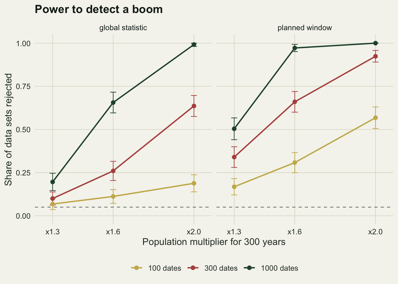
What to report
Report the number of dates and the span they cover, and give it as dates per century as well as a total. The power figures above are the reference a reader needs to judge whether a flat result means a flat population or a small sample.
State whether calibrated dates were normalised, and confirm that the simulated dates in the null were calibrated the same way. Report the padding used when simulating, or show that the analysis window does not start and end where the dates do; an SPD with falling ends in a trimmed data set is the edge arithmetic above.
Report the global p value and the number of simulations before pointing to any episode. If the global test does not reject, the local departures from the envelope are not findings, whatever they look like. If a particular episode was the hypothesis before the data were compiled, test that window directly and say that it was planned.
When the global test does not reject, say what it could have detected. A sentence such as “with 300 dates a doubling for 300 years would have been detected in 64 per cent of simulated data sets” is more informative than “no significant fluctuation”, and it can be computed by putting the real calibration curve into the code above.
Honest limits
The calibration curve is synthetic, with one plateau, gentle wiggles and no reversals. The flat expectation, the edge halving and the level of the test are properties of the method that do not depend on the curve’s detail. The spikiness of single SPDs and the power numbers depend on it somewhat, because a real curve with more plateaus and reversals redistributes probability more strongly; the contrast in noise between the plateau and the rest of the window reported here is specific to this curve. Repeating the power calculation with IntCal20 through rcarbon is the step before quoting any of these numbers for a real region.
The null is a constant population, and the booms are rectangular. Real applications fit an exponential or logistic null, often with a taphonomic loss correction, and the fitted null uses parameters estimated from the same data, which can absorb part of a real episode and would be expected to lower power further; that was not simulated. Real booms have gradual flanks rather than steps, which was not simulated either.
Every date is an independent draw from the population. Real databases contain several dates per site and per event, which is why rcarbon offers binning of dates by site before summing. Clustered dates carry less independent information than their count suggests, so the power at a nominal 300 dates is best read as optimistic for a clustered database; the size of that gap was not measured here.
Research effort is constant through time in the simulation. In real data the probability that an animal or a hearth is found and dated varies with preservation, excavation history and research interest, and no test on the SPD alone separates that from population change.
References
Williams AN 2012 Journal of Archaeological Science 39(3):578-589 (10.1016/j.jas.2011.07.014)
Shennan S, Downey SS, Timpson A, Edinborough K, Colledge S, Kerig T, Manning K, Thomas MG 2013 Nature Communications 4:2486 (10.1038/ncomms3486)
Timpson A, Colledge S, Crema E, Edinborough K, Kerig T, Manning K, Thomas MG, Shennan S 2014 Journal of Archaeological Science 52:549-557 (10.1016/j.jas.2014.08.011)
Contreras DA, Meadows J 2014 Journal of Archaeological Science 52:591-608 (10.1016/j.jas.2014.05.030)
Crema ER, Bevan A 2021 Radiocarbon 63(1):23-39 (10.1017/RDC.2020.95)