---
title: "Age-depth models and what they do to a proxy"
description: "A sediment core with a perfectly constant accumulation rate acquires a fluctuating influx record once dating error is turned into a chronology. Measured in R."
date: "2026-08-07 10:00"
categories: [R, palaeoecology, time series, uncertainty, ecology tutorial]
image: thumbnail.png
image-alt: "Inferred influx along a core whose true accumulation rate is constant, wobbling by a factor of one and a half because the age-depth model bends at each dated level."
---
Every record that comes out of a core is measured against depth and reported against time, and the thing that converts one into the other is an age-depth model fitted to a handful of dated levels. That model is an estimate, built from six or eight ages with errors of a century each, and everything downstream inherits it: accumulation rates, influx, the date of a transition, the rate of change either side of it.
The inheritance is easy to miss because the chronology is usually built once, early, by someone else, and then used as though it were a measurement. This post takes a core where the truth is known, puts realistic dating error on the dated levels, and measures what comes out the other end.
## A core with nothing happening in it
The cleanest test is a core with a constant accumulation rate. Sediment arrives at the same speed from bottom to top, a proxy arrives at a constant concentration per unit volume, and therefore the influx per unit time is constant too. Anything the analysis reports as variation is manufactured.
```{r setup}
#| message: false
#| warning: false
library(ggplot2)

te_paper  <- "#f5f4ee"
te_ink    <- "#16241d"
te_body   <- "#2c3a31"
te_forest <- "#275139"
te_rust   <- "#b5534e"
te_gold   <- "#c9b458"
te_line   <- "#dad9ca"

theme_datasheet <- function() {
  theme_minimal(base_size = 12) +
    theme(plot.background  = element_rect(fill = te_paper, colour = NA),
          panel.background = element_rect(fill = te_paper, colour = NA),
          panel.grid.major = element_line(colour = te_line, linewidth = 0.3),
          panel.grid.minor = element_blank(),
          text             = element_text(colour = te_body),
          plot.title       = element_text(colour = te_ink, face = "bold"),
          axis.text        = element_text(colour = te_body))
}

dated  <- c(15, 70, 130, 190, 245, 295)     # cm, the dated levels
sig_lo <- 60                                # dating error, years
sig_hi <- 110                               # longer tail towards older ages
conc   <- 1200                              # grains per cubic cm, constant
rate_a <- 0.08                              # cm per year, constant
age_a  <- function(d) d / rate_a

# calibrated ages are skewed, so use a two-piece normal, and keep draws in order
two_piece <- function(n, s_lo, s_hi)
  ifelse(runif(n) < s_lo / (s_lo + s_hi),
         -abs(rnorm(n, 0, s_lo)), abs(rnorm(n, 0, s_hi)))

draw_ages <- function(true_age) {
  repeat {
    a <- true_age + two_piece(length(true_age), sig_lo, sig_hi)
    if (all(diff(a) > 0) && a[1] > 0) return(a)
  }
}

set.seed(44)
obs <- draw_ages(age_a(dated))
round(rbind(depth = dated, true_age = age_a(dated), dated_age = obs))
```
Six levels, each out by up to a couple of centuries, and every one of them within what a laboratory would report. The chronology is then whatever function you choose to run through those points. Linear interpolation and a monotone spline are the two that dominate the literature, and both are one line.
```{r chronologies}
slices <- seq(15, 295, by = 10)             # the sampled slices

lin <- approxfun(c(0, dated), c(0, obs), rule = 2)
spl <- splinefun(c(0, dated), c(0, obs), method = "monoH.FC")

influx <- function(f) conc * diff(slices) / diff(f(slices))
i_lin  <- influx(lin)
i_spl  <- influx(spl)
i_true <- conc * rate_a

round(c(true_influx = i_true,
        linear_cv   = sd(i_lin) / mean(i_lin),
        spline_cv   = sd(i_spl) / mean(i_spl),
        linear_range = max(i_lin) / min(i_lin),
        spline_range = max(i_spl) / min(i_spl)), 3)
```
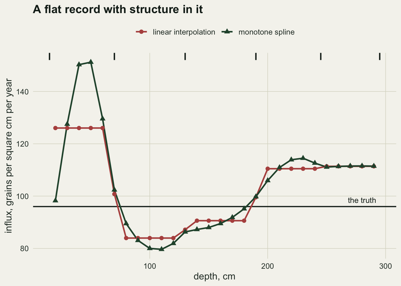
The true influx is `r sprintf("%.0f", i_true)` grains per square centimetre per year at every depth in the core. The linear chronology reports a series with a coefficient of variation of `r sprintf("%.3f", sd(i_lin)/mean(i_lin))` and a `r sprintf("%.2f", max(i_lin)/min(i_lin))`-fold range from its lowest slice to its highest. The spline reports `r sprintf("%.3f", sd(i_spl)/mean(i_spl))` and `r sprintf("%.2f", max(i_spl)/min(i_spl))`.
```{r fig-influx}
#| fig-cap: "Influx along a core whose true accumulation rate is constant. The horizontal line is the truth. Both chronologies were fitted to the same six dated levels, marked along the top."
#| fig-alt: "Two curves of influx against depth wandering above and below a flat horizontal truth line. The linear curve holds constant values between dated levels and jumps at them; the spline curve bends smoothly and overshoots sharply near the top of the core. Six tick marks along the top mark the dated levels."
mid <- slices[-length(slices)] + diff(slices) / 2
dd  <- rbind(data.frame(depth = mid, influx = i_lin, model = "linear interpolation"),
             data.frame(depth = mid, influx = i_spl, model = "monotone spline"))

ggplot(dd, aes(depth, influx, colour = model, shape = model)) +
  geom_hline(yintercept = i_true, colour = te_ink, linewidth = 0.7) +
  geom_line(linewidth = 0.9) +
  geom_point(size = 2.2) +
  geom_rug(data = data.frame(depth = dated), aes(x = depth), inherit.aes = FALSE,
           sides = "t", colour = te_ink, linewidth = 0.8,
           length = unit(0.035, "npc")) +
  annotate("text", x = 292, y = i_true, hjust = 1, vjust = -0.7, size = 3.4,
           colour = te_ink, label = "the truth") +
  scale_colour_manual(values = c("linear interpolation" = te_rust,
                                 "monotone spline" = te_forest)) +
  scale_shape_manual(values = c(16, 17)) +
  labs(x = "depth, cm", y = "influx, grains per square cm per year",
       colour = NULL, shape = NULL,
       title = "A flat record with structure in it") +
  theme_datasheet() +
  theme(legend.position = "top")
```
The shape of the artefact is worth reading off the picture. Linear interpolation holds the accumulation rate constant between dated levels and changes it abruptly at each one, so the influx record is a staircase whose steps sit exactly where the dates are. The spline spreads the same error out into smooth undulations, which look far more like an environmental signal and are for that reason more dangerous, and it overshoots near the top of the core where it has an anchor on one side only.
One core is one draw of the dating error, so repeat it.
```{r core-a}
cv_and_range <- function(f) {
  v <- conc * diff(slices) / diff(f(slices))
  c(cv = sd(v) / mean(v), range = max(v) / min(v))
}

set.seed(31)
core_a <- t(replicate(500, {
  o <- draw_ages(age_a(dated))
  c(lin = cv_and_range(approxfun(c(0, dated), c(0, o), rule = 2)),
    spl = cv_and_range(splinefun(c(0, dated), c(0, o), method = "monoH.FC")))
}))
round(rbind(median = apply(core_a, 2, median),
            upper_decile = apply(core_a, 2, quantile, 0.9)), 3)
```
Across `r sprintf("%d", nrow(core_a))` cores with a genuinely constant accumulation rate, the median manufactured coefficient of variation is `r sprintf("%.3f", median(core_a[, "lin.cv"]))` for linear interpolation and `r sprintf("%.3f", median(core_a[, "spl.cv"]))` for the spline, against a truth of zero. One core in ten reports a range of `r sprintf("%.2f", quantile(core_a[, "spl.range"], 0.9))`-fold or more from the spline. A manufactured swing of `r sprintf("%.0f", 100 * median(core_a[, "spl.cv"]))` per cent in influx is the size of result that gets a paragraph in a results section.
## What it does to a change that is really there
Manufacturing variation from nothing is one failure. The other is getting the size of a real change wrong, and that one is harder to notice because the change is genuinely present.
```{r core-b}
rate_b <- function(d) ifelse(d > 120 & d < 200, 0.02, 0.12)   # a slow section
dg <- seq(0, 300, by = 0.25)
age_b <- approxfun(dg, cumsum(c(0, diff(dg) / rate_b(dg[-1]))))

true_b   <- conc * diff(slices) / diff(age_b(slices))
true_amp <- max(true_b) / min(true_b)

set.seed(77)
core_b <- t(replicate(500, {
  o <- draw_ages(age_b(dated))
  c(lin = cv_and_range(approxfun(c(0, dated), c(0, o), rule = 2))[["range"]],
    spl = cv_and_range(splinefun(c(0, dated), c(0, o), method = "monoH.FC"))[["range"]])
}))
round(c(true_amplitude = true_amp,
        linear_median  = median(core_b[, "lin"]),
        linear_p90     = quantile(core_b[, "lin"], 0.9),
        spline_median  = median(core_b[, "spl"]),
        spline_p90     = quantile(core_b[, "spl"], 0.9)), 2)
```
The core now has a real slow section, and the true ratio between the highest and lowest influx across the sampled slices is `r sprintf("%.2f", true_amp)`. Linear interpolation reports a median of `r sprintf("%.2f", median(core_b[, "lin"]))`. The monotone spline reports `r sprintf("%.2f", median(core_b[, "spl"]))`, roughly double the truth, and in the upper decile of cores it reports `r sprintf("%.1f", quantile(core_b[, "spl"], 0.9))`.
The direction is not an accident. A spline forced through dated levels that are individually displaced has to bend to reach them, and the bending shows up as very low apparent accumulation somewhere, which turns into a very high apparent influx. The estimator that produces the smoother, better-looking chronology is the one that exaggerates the amplitude most.
## The date of a transition is a chronological quantity
Ask when something happened and the answer has two sources of error: where in the core the transition is, and what date the chronology assigns to that depth. It is worth knowing which one dominates, because effort spent sampling the core more finely is wasted if the answer is the other one.
```{r step-date}
step_depth <- 160
samp <- seq(20, 290, by = 1)

detect <- function(sharpness, noise) {
  y <- 1 + 2 * plogis((samp - step_depth) / sharpness) + rnorm(length(samp), 0, noise)
  k <- 6:(length(samp) - 5)
  gap <- vapply(k, function(i) mean(y[i:length(y)]) - mean(y[1:(i - 1)]), 1)
  samp[k[which.max(gap)]]
}

set.seed(88)
n_rep      <- 600
chron_only <- replicate(n_rep, approxfun(c(0, dated), c(0, draw_ages(age_a(dated))),
                                         rule = 2)(step_depth))
sharp_only <- replicate(n_rep, age_a(detect(0.4, 0.35)))
soft_only  <- replicate(n_rep, age_a(detect(3.5, 0.90)))

round(c(true_date = age_a(step_depth),
        sd_chronology = sd(chron_only),
        sd_sharp_transition = sd(sharp_only),
        sd_gradual_transition = sd(soft_only)), 1)
```
For a sharp transition sampled at one centimetre the proxy side contributes a standard deviation of `r sprintf("%.1f", sd(sharp_only))` years and the chronology `r sprintf("%.1f", sd(chron_only))`. The date of that event is a chronological quantity almost entirely, and no amount of extra sampling will improve it.
Make the transition gradual, spread over several centimetres and measured with more noise, and the balance reverses: the proxy side contributes `r sprintf("%.0f", sd(soft_only))` years against the same `r sprintf("%.1f", sd(chron_only))` from the chronology. Which term dominates is a property of the transition, not of the core, so it has to be worked out rather than assumed.
## An ensemble is the honest output, and it is not a confidence interval
The usual advice is to stop treating the chronology as fixed: draw many chronologies compatible with the dated levels, push the proxy through all of them, and report the spread. That is right, and it is worth knowing how well the resulting interval performs.
```{r ensemble}
set.seed(404)
ens_check <- replicate(300, {
  o  <- draw_ages(age_a(dated))               # the chronology this core actually has
  dd <- detect(0.4, 0.35)
  draws <- replicate(400, approxfun(c(0, dated), c(0, draw_ages(o)), rule = 2)(dd))
  ci <- quantile(draws, c(0.025, 0.975))
  c(covers = age_a(step_depth) >= ci[1] && age_a(step_depth) <= ci[2],
    width  = unname(diff(ci)))
})
round(c(coverage = 100 * mean(ens_check["covers", ]),
        median_width = median(ens_check["width", ])), 1)
```
The ensemble interval has a median width of `r sprintf("%.0f", median(ens_check["width", ]))` years and contains the true date in `r sprintf("%.0f", 100 * mean(ens_check["covers", ]))` per cent of cores rather than 95. The reason is structural rather than a coding slip: the ensemble is drawn around the ages the laboratory reported, and those are themselves displaced from the truth, so the interval is centred in the wrong place about as often as it is wide enough. It is a large improvement on a single chronology, which offers no interval at all, and it is not the thing its label suggests.
## What to report
Report the age-depth model as a choice, with the software, the interpolation family and the calibration curve named, because a reader cannot reconstruct any of the numbers above without them.
Push the proxy through an ensemble of chronologies rather than one, and report the spread of the quantity you actually care about: the date of the transition, the rate of change, the influx maximum. Propagating uncertainty into the final quantity is not the same as quoting the age errors of the dated levels and leaving the reader to imagine what they do.
Show accumulation rate against depth somewhere. It is the derivative that everything else runs on, it is where the chronology's structure is visible, and a reader who sees a rate series that jumps at every dated level knows exactly how much of the influx record to believe.
Be careful with influx as a currency. Concentration multiplied by an estimated accumulation rate carries the chronology's error into what looks like a measurement, and the concentration series itself is often the more honest object.
## Honest limits
The dating errors here are a two-piece normal, which gives the right skew and none of the real structure. Calibrated radiocarbon dates have multimodal probability densities, sometimes with two well-separated peaks a century apart, and no smooth interpolation through point estimates represents that. A proper treatment samples from the calibrated densities themselves.
Monotonicity is imposed throughout, both in the truth and in every fitted chronology. Cores with hiatuses, slumps and reworked material break that assumption, and when they do the failure is not a wobble in the influx record but a section of core in the wrong order.
The accumulation model has no autocorrelation. Real sedimentation is persistent, which is what the accumulation rate priors in the Bayesian age-depth packages encode, and a prior of that kind removes some of the manufactured variation measured above. It cannot remove all of it, because the dating error is still there, and adding a prior trades one set of assumptions for another.
Two chronologies were compared and there are many more, including smoothing splines that do not pass through the dated points at all and the Bayesian models that dominate current practice. The comparison here is about what interpolation does to error, not a recommendation between named packages.
Finally, the coverage figure is specific to this design. Six dated levels over three metres is a modest chronology; more dates or smaller errors narrow the interval and improve the centring, and a core with three dates does considerably worse than anything shown here.
## References
Telford RJ, Heegaard E, Birks HJB 2004 Quaternary Science Reviews 23(1-2):1-5 (10.1016/j.quascirev.2003.11.003)
Blaauw M 2010 Quaternary Geochronology 5(5):512-518 (10.1016/j.quageo.2010.01.002)
Blaauw M, Christen JA 2011 Bayesian Analysis 6(3):457-474 (10.1214/11-BA618)
Trachsel M, Telford RJ 2016 The Holocene 27(6):860-869 (10.1177/0959683616675939)
## Related tutorials
- [Weighted averaging transfer functions in R](../weighted-averaging-transfer-functions/)
- [Summed radiocarbon dates: an honest, nearly blind test](../summed-radiocarbon-probabilities/)
- [How long a calibration overlap](../how-long-a-calibration-overlap/)
- [Splicing a monitoring series](../splicing-a-monitoring-series/)