---
title: "Your first ggplot: data, aes and geom"
description: "Build a plot from three pieces: a data frame, an aes mapping and a geom. Learn the one beginner error, colour inside aes versus outside, that trips everyone."
date: "2026-06-18 13:00"
date-modified: "2026-10-15"
categories: [R, ggplot2, data visualisation, ecology tutorial]
image: thumbnail.png
image-alt: "A small bar chart of five species counts ranging from 3 for Plantago to 42 for Festuca, with each dark green bar labelled by its count and the y axis reading individuals."
---
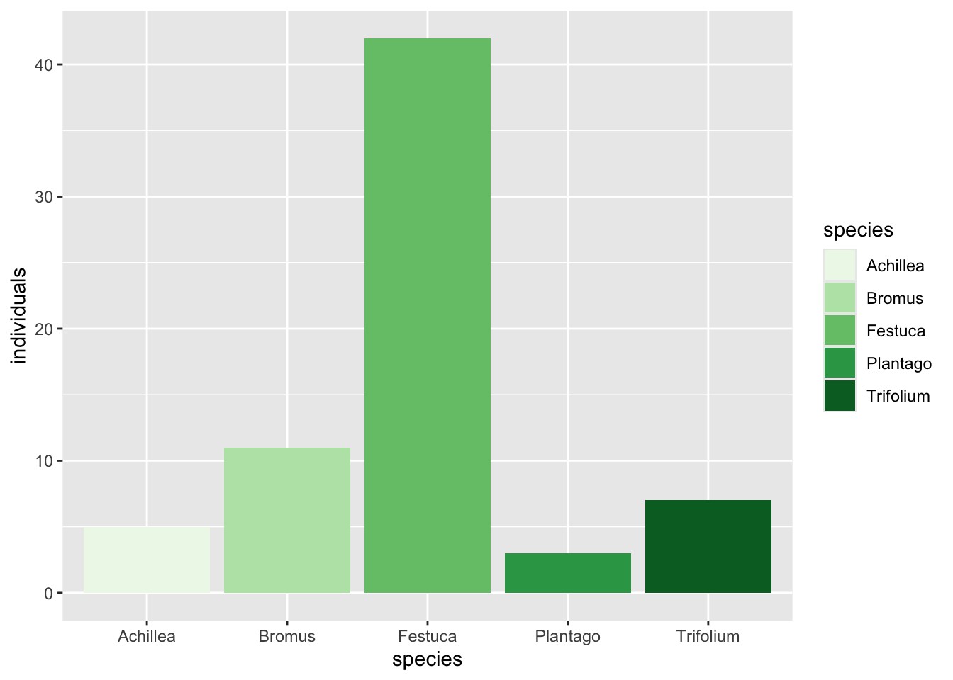
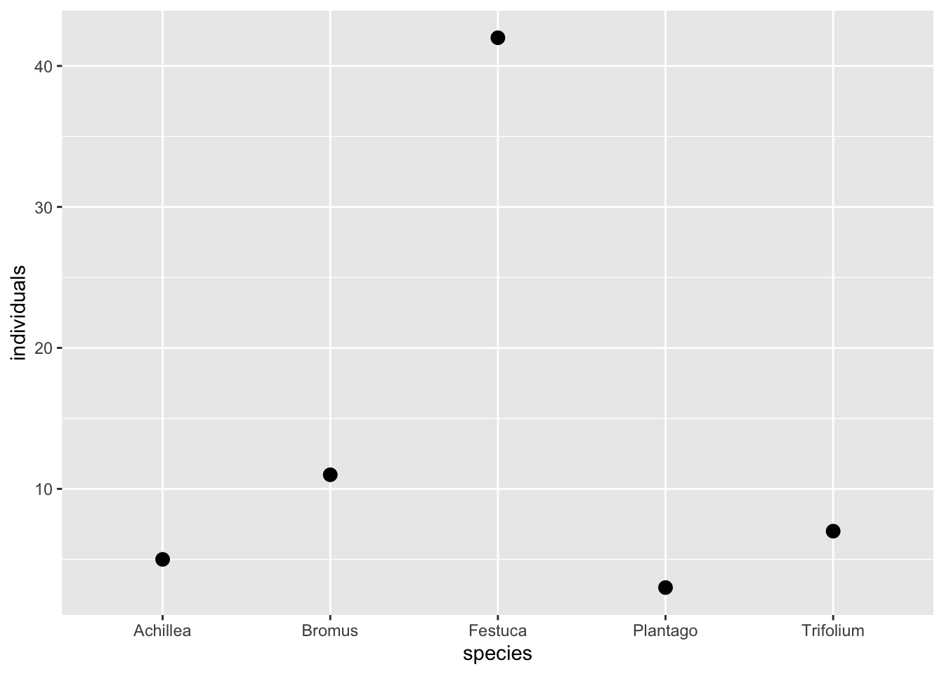
*Corrected 15 October 2026: the bar chart that maps fill to species used a sequential green palette, which implied an order the species do not have and left the palest bar almost invisible on the grey panel; it now uses a qualitative palette. The paragraph after the swap from bars to points said the axes stay the same; it now says the y axis changes, because a bar is drawn up from zero and a point is not.*
*Updated 26 September 2026: a new section, Zooming in without deleting rows, shows that ylim() removes the rows outside the limits before anything is drawn or summarised, while coord_cartesian() zooms and keeps them.*
Every ggplot is three answers to three questions: what data, which columns map to what you can see, and what marks to draw. Once those three are separated in your head, the rest of `ggplot2` is variations on them, and the error messages start to make sense. This post builds the smallest real plot, names each of the three pieces, then spends a long section on the single mistake that costs beginners the most time, putting a colour in the wrong place, and closes with how to zoom in on a plot without deleting rows.
```{r page-canvas}
#| include: false
# Site chrome only: draw on the page colour instead of white, so the figures below
# sit flush on the page. Nothing else about the default theme changes, and none of
# the code shown in this post depends on it.
library(ggplot2)
theme_set(theme_grey() + theme(plot.background = element_rect(fill = "#f5f4ee", colour = NA)))
```
## The three pieces
Here is a small species table, the kind that comes out of the reshaping in [Wide and long: reshaping species data](../wide-and-long-species-data/). `ggplot2` wants the long shape, one row per observation, so that is what we give it.
```{r data}
library(ggplot2)

counts <- data.frame(
  species = c("Festuca", "Trifolium", "Plantago", "Achillea", "Bromus"),
  individuals = c(42, 7, 3, 5, 11)
)
counts
```
The plot is three lines:
```{r fig-first}
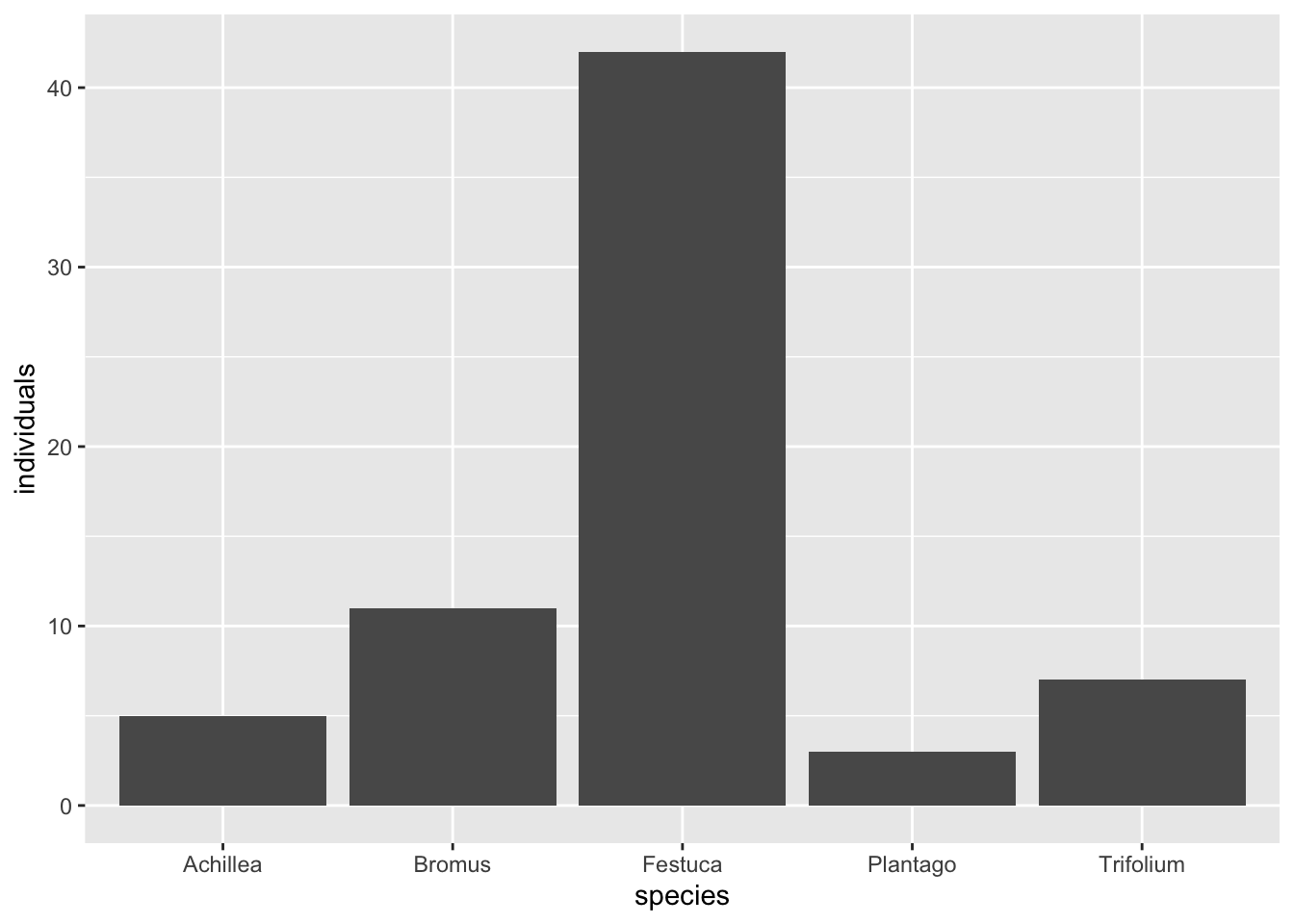
#| fig-cap: "The smallest complete plot. The data frame supplies the numbers, the aes mapping says species goes on the x axis and individuals on the y, and geom_col draws a bar for each row. Remove any one of the three and there is nothing to draw."
#| fig-alt: "A bar chart with five dark grey bars, one per species. Festuca is by far the tallest at forty-two individuals, then Bromus at eleven, with Trifolium, Achillea and Plantago much shorter."
ggplot(counts, aes(x = species, y = individuals)) +
  geom_col()
```
Read it as a sentence. `ggplot(counts, ...)` names the data frame. `aes(x = species, y = individuals)` is the mapping: it connects the `species` column to the x position and the `individuals` column to the y position. `geom_col()` is the mark: one bar per row, its height read from the y mapping. The pieces are joined with `+`, not the pipe, and that is the first thing to get used to, because `+` is particular to `ggplot2` and predates the pipe.
Each piece answers one question:
```{r pieces}
#| eval: false
ggplot(data, aes(mapping)) + geom_something()
#      ^data  ^which columns   ^what marks
```
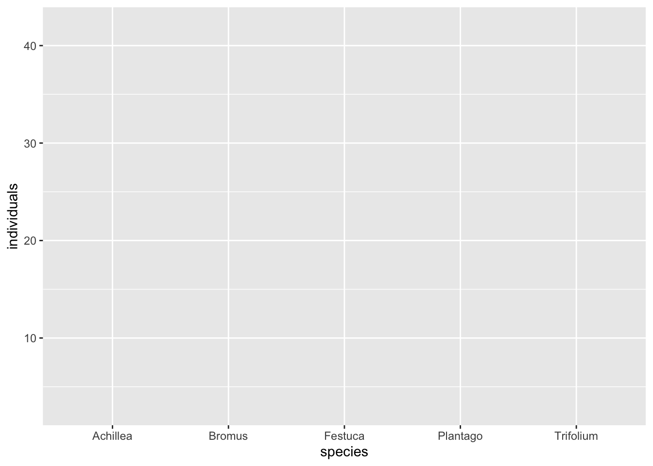
Miss the data and there is nothing to plot. Miss the mapping and ggplot does not know which column is the height. Miss the geom and you get an empty panel with correct axes and no bars, which is a genuinely useful thing to see once, because it tells you the first two pieces worked.
```{r fig-nogeom}
#| fig-cap: "The same call with no geom. The axes are built from the data and the mapping, so you can see ggplot understood both, but nothing is drawn because no mark was asked for. An empty panel with correct axes almost always means a missing geom."
#| fig-alt: "An empty plot panel. The horizontal axis lists the five species names and the vertical axis is labelled from ten to forty, but the plotting area is blank with no bars or points."
ggplot(counts, aes(x = species, y = individuals))
```
## Mapping versus setting: the one error
You want the bars a specific colour. There are two ways to write it, they look almost identical, and only one does what you meant. This is the beginner error, and seeing both side by side is the fastest way to never make it again.
The wrong way puts the colour inside `aes`:
```{r fig-wrong}
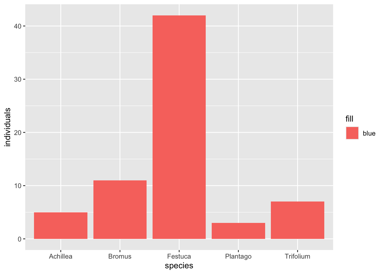
#| fig-cap: "Colour written inside aes. ggplot treats blue as data: a column with the single value blue, mapped to the fill channel. It assigns that category a colour from its own palette, which is not blue, and adds a legend for a variable that does not exist. The tell is the salmon bars and the pointless legend."
#| fig-alt: "A bar chart where all five bars are the same salmon red, not blue, with a legend on the right labelled blue containing one red swatch. The colour requested was ignored and a spurious legend appeared."
ggplot(counts, aes(x = species, y = individuals, fill = "blue")) +
  geom_col()
```
The bars are not blue, and there is a legend nobody asked for. Inside `aes`, everything is a mapping, so `fill = "blue"` tells ggplot to treat the literal word blue as a variable: a column whose only value is blue, mapped to the fill channel. ggplot dutifully assigns that one category a fill from its default palette, which is a salmon red, and builds a legend to explain the mapping. Nothing here is a bug; ggplot did exactly what mapping means. It is just not what you wanted.
The right way sets the colour outside `aes`, as an argument to the geom:
```{r fig-right}
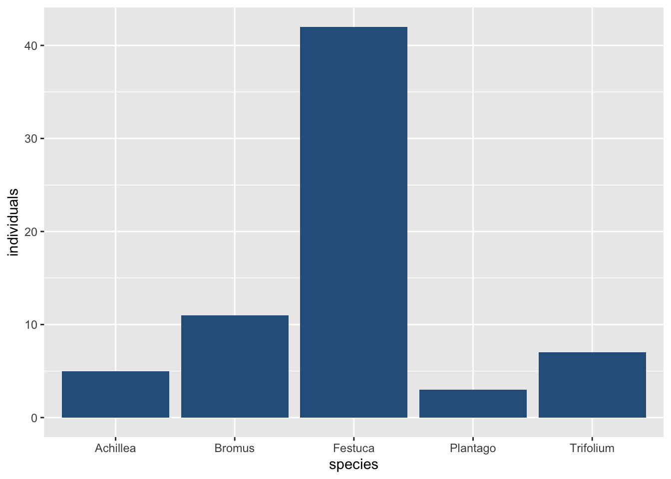
#| fig-cap: "Colour set outside aes, as a plain argument to geom_col. Now blue is an instruction to the mark, not a variable to be mapped, so every bar is that colour and there is no legend. The rule: a constant that should apply to every mark goes outside aes; a column that should vary the marks goes inside."
#| fig-alt: "The same five species bars, now all coloured a solid forest blue, with no legend. The requested colour was applied directly to every bar."
ggplot(counts, aes(x = species, y = individuals)) +
  geom_col(fill = "#2c5f8a")
```
Every bar is blue, no legend. The distinction is the whole of the lesson. Inside `aes` means map this column to this channel, and it is what you want when the colour should carry information: one colour per species, per treatment, per site. Outside `aes`, in the geom, means set this channel to this fixed value for every mark, and it is what you want when the colour is just a colour.
The same split governs a genuine mapping. To colour by a real column, `fill` goes back inside `aes`, pointed at a variable rather than a constant:
```{r fig-mapped}
#| fig-cap: "Fill mapped to the species column, which is a real variable, so here the mapping is correct and the legend earns its place. This is the same fill = inside aes as the error above, except it points at a column instead of a constant word. The position of the argument, inside or outside aes, is the decision; the argument name is the same either way."
#| fig-alt: "The five species bars, each a different colour, with a legend on the right listing the five species names against their colours. The fill now encodes which species each bar represents."
ggplot(counts, aes(x = species, y = individuals, fill = species)) +
  geom_col() +
  scale_fill_brewer(palette = "Dark2")
```
## Swapping the geom
Because the data and the mapping are separate from the mark, you can change the mark without touching either. The same `aes` that drew bars will draw points:
```{r fig-swap}
#| fig-cap: "geom_col replaced with geom_point, and nothing else changed. The data and the aes mapping are identical to the first plot; only the mark is different. This separation is why ggplot has one geom per kind of mark rather than one function per kind of chart."
#| fig-alt: "The same five species on the x axis and their counts on the y axis, now shown as five dots instead of bars. Festuca sits highest at forty-two, the others cluster low."
ggplot(counts, aes(x = species, y = individuals)) +
  geom_point(size = 3)
```
`geom_col` to `geom_point` is a one word edit. The data did not move and the mapping did not move, because those were never the geom's job. The x axis is the same, but the y axis is not, and that difference is the geom's doing: a bar is drawn up from zero, so `geom_col()` stretches the axis down to include zero, while a point needs only its own value, so the point chart's y axis starts just below the smallest count. When you find yourself searching for a bar chart function and then a scatter plot function, stop: it is the same function, and only the geom changes.
## Zooming in without deleting rows
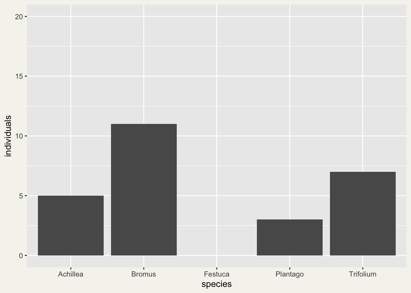
Festuca's 42 individuals set the height of every plot above, and the four short bars are hard to compare with each other. The natural fix is to stop the y axis at 20, and the natural way to write that is `ylim()`:
```{r fig-ylim}
#| warning: true
#| fig-cap: "The first plot with ylim(0, 20) added. The Festuca bar is not cut off at the top of the panel: it is missing, because its count lies outside the limits and ggplot2 removed that row before drawing."
#| fig-alt: "A grey bar chart with the y axis running from zero to twenty. Achillea, Bromus, Plantago and Trifolium have bars of five, eleven, three and seven individuals; above the Festuca label there is an empty gap and no bar at all."
ggplot(counts, aes(x = species, y = individuals)) +
  geom_col() +
  ylim(0, 20)
```
The Festuca bar has not been cut off; it has gone. `ylim(0, 20)` is short for `scale_y_continuous(limits = c(0, 20))`, and a limit on a scale says which values are allowed. A value outside the limits is turned into `NA`, and ggplot2 then removes that row before it calculates or draws anything. The only message about it is the warning printed with the plot. On this page that warning is expected: it is the message this section is about.
The exact words depend on the ggplot2 version and on the layer. For these bars, version 3.4.4 says `Removed 1 rows containing missing values`, and from 3.5.0 on it says `Removed 1 row containing missing values or values outside the scale range` (the name in brackets at the end is the part of ggplot2 that dropped the row, and it can differ between versions). A layer that calculates something from the rows, such as the boxplot below, says `non-finite` where the bars say `missing`: `Removed 1 rows containing non-finite values` in 3.4.4. Either way it means a row of your data is not in the plot, and it has three usual causes: an `NA` in the column itself, a limit like this one, or a zero on a log axis, where `log10(0)` is `-Inf` (a boxplot drops that row, while `geom_point()` keeps it and draws it on the edge of the panel, as [ggplot2 facets: fixed or free axis scales](../fixed-or-free-scales-in-facets/) shows). To zoom without removing anything, set the limits on the coordinate system instead:
```{r fig-coord}
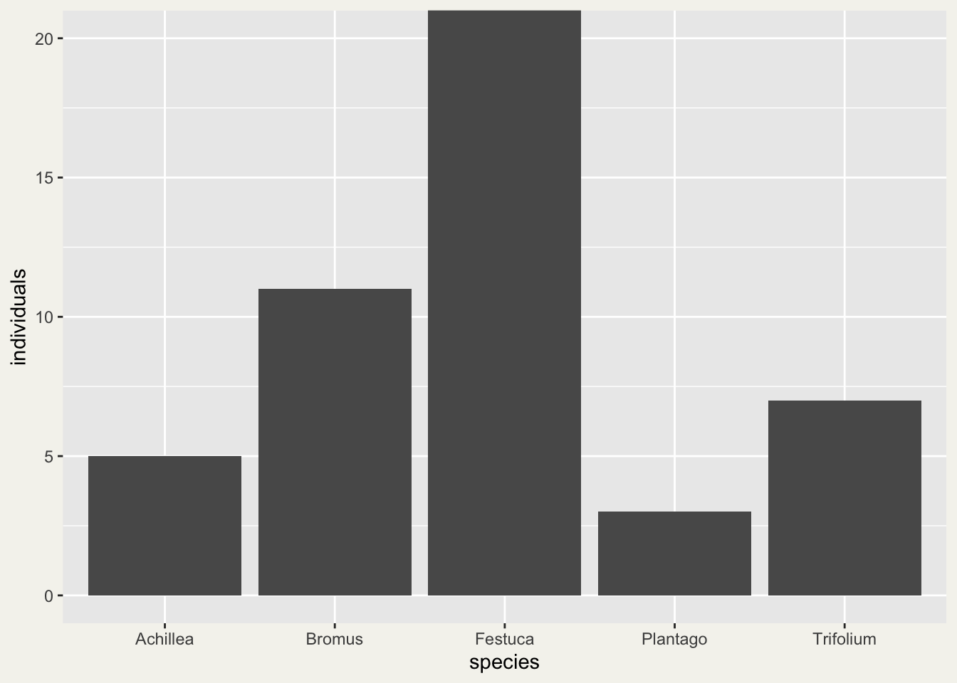
#| fig-cap: "The same zoom written with coord_cartesian(ylim = c(0, 20)). All five rows are still in the plot and there is no warning; the Festuca bar simply runs off the top of the panel."
#| fig-alt: "The same grey bar chart with the y axis from zero to twenty, now with all five bars. The Festuca bar fills the panel to the top edge and is cut off there, while Achillea, Bromus, Plantago and Trifolium are unchanged."
ggplot(counts, aes(x = species, y = individuals)) +
  geom_col() +
  coord_cartesian(ylim = c(0, 20))
```
`coord_cartesian()` changes which part of the plot you look at, not what is in it. The difference matters most for a geom that calculates something from the rows, because a limit removes rows before that calculation. `geom_boxplot()` draws the median and quartiles of a column; here it is on the same five counts, with its median read back from the plot each way. `layer_data()` returns the numbers ggplot2 calculated for a layer, and `middle` is the median.
```{r zoom-medians}
#| warning: true
count_box <- ggplot(counts, aes(y = individuals)) + geom_boxplot()
median_plain <- layer_data(count_box)$middle
median_ylim <- layer_data(count_box + ylim(0, 20))$middle
median_coord <- layer_data(count_box + coord_cartesian(ylim = c(0, 20)))$middle
c(no_limits = median_plain, with_ylim = median_ylim, with_coord_cartesian = median_coord)
```
```{r removed-rows-checks}
#| include: false
# Checks behind the sentences in this section: the page stops building if a newer ggplot2 differs.
# drawn_warnings() draws a plot without showing it and keeps the warnings it raises.
drawn_warnings <- function(plot) { found <- character(0); withCallingHandlers(ggplotGrob(plot), warning = function(w) { found <<- c(found, conditionMessage(w)); invokeRestart("muffleWarning") }); found }
removed_rows <- function(plot) sum(as.numeric(sub("^Removed ([0-9]+) row.*$", "\\1", grep("^Removed [0-9]+ row", drawn_warnings(plot), value = TRUE))))
bars <- ggplot(counts, aes(species, individuals)) + geom_col()
zoom <- coord_cartesian(ylim = c(0, 20))
kept <- counts$individuals[counts$individuals <= 20]
logged <- ggplot(data.frame(site = c("A", "B", "C"), value = c(0, 3, 5)), aes(site, value)) + scale_y_log10()
one_site <- ggplot(data.frame(site = "A", value = counts$individuals), aes(site, value))
bar_warn <- drawn_warnings(bars + ylim(0, 20))
box_warn <- drawn_warnings(count_box + ylim(0, 20))
old_gg <- packageVersion("ggplot2") < "3.5.0"
stopifnot(median_ylim == median(kept), median_coord == median(counts$individuals), median_plain == median(counts$individuals),
any(grepl("^Removed 1 row.*missing", bar_warn)), !any(grepl("non-finite", bar_warn)), any(grepl("^Removed 1 row.*non-finite", box_warn)),
!old_gg || any(startsWith(bar_warn, "Removed 1 rows containing missing values")), !old_gg || any(startsWith(box_warn, "Removed 1 rows containing non-finite values")),
old_gg || any(startsWith(bar_warn, "Removed 1 row containing missing values or values outside the scale range")),
removed_rows(ggplot(data.frame(block = c("a", "b"), m = c(38, 42.25)), aes(block, m)) + geom_col() + ylim(36, 44)) == 2)
stopifnot(removed_rows(bars + ylim(0, 20)) == 1, length(drawn_warnings(bars + zoom)) == 0, removed_rows(bars + ylim(5, 50)) == nrow(counts),
length(drawn_warnings(count_box + zoom)) == 0, identical(layer_data(count_box + zoom)$outliers[[1]], 42), identical(ylim(0, 20)$limits, c(0, 20)),
removed_rows(ggplot(data.frame(value = c(NA, 3, 5)), aes(y = value)) + geom_boxplot()) == 1, inherits(ylim(0, 20), "ScaleContinuousPosition"),
removed_rows(logged + geom_boxplot()) == 1, removed_rows(logged + geom_point()) == 0, identical(ylim(0, 20)$oob(c(-1, 5, 25), c(0, 20)), c(NA, 5, NA)),
all.equal(suppressWarnings(layer_data(one_site + stat_summary(fun = mean, geom = "point") + ylim(0, 20))$y), mean(kept)))
```
The warning in that output comes from the `ylim()` line and is expected too: it is the boxplot's `non-finite` version of the message above. Without limits the median is `r sprintf("%g", median_plain)`, the median of all five counts. With `ylim(0, 20)` it is `r sprintf("%g", median_ylim)`. That is not a quirk of the boxplot: it is simply the median of the `r sprintf("%d", length(kept))` counts left after Festuca was removed. With `coord_cartesian()` it stays at `r sprintf("%g", median_coord)`, and Festuca is still counted, as an outlier point that now sits above the visible part of the panel. Anything a geom calculates from the rows, such as a mean or a median, is calculated from the rows that survive the limits.
Bars have one more trap. Each bar starts at zero, so a lower limit above zero, such as `ylim(5, 50)`, removes every bar, not only the short ones: the warnings then add up to all `r sprintf("%d", nrow(counts))` rows. That is why the cut-axis bar chart in [Checking a figure](../checking-a-figure/) has to be drawn with `coord_cartesian()`: with `ylim(36, 44)` both of its bars would disappear. The rule to keep: zoom with `coord_cartesian(ylim = ...)` or `coord_cartesian(xlim = ...)`. Use `ylim()`, `xlim()` or `limits =` only when you want values outside the range removed from the plot and from everything calculated in it, and then say so in the caption.
## What to carry forward
A ggplot is `ggplot(data, aes(...)) + geom_...()`, joined with `+`. The mapping in `aes` connects columns to things you can see; the geom draws the marks. The one rule worth memorising past everything else: a value that varies with the data goes inside `aes` as a mapping, and a constant that applies to every mark goes outside `aes` as an argument to the geom. Almost every unexpected legend and every ignored colour in a beginner's plot is that line crossed.
Everything after this is more of the same shape. `facet_wrap` splits the marks into panels, `scale_*` controls how a mapping turns into colours or positions, `theme` changes the surround, and each is added with another `+`. To zoom, use `coord_cartesian()`; a limit on a scale removes data. The three pieces do not change.
## Where to go next
The plots here use a hand made data frame; real ones come from [Reading field data into R](../reading-field-data-into-r/) and usually need the long shape from [Wide and long: reshaping species data](../wide-and-long-species-data/). For the counts themselves, [Diversity indices in R](../diversity-indices-in-r/) turns a species table into the numbers worth plotting.
## References
- Wickham H, Navarro D, Pedersen TL 2016 ggplot2: Elegant Graphics for Data Analysis, Springer (ISBN 978-3-319-24277-4)
- Wilkinson L 2005 The Grammar of Graphics, 2nd edn, Springer (ISBN 978-0-387-24544-7)
## Related tutorials
- [Wide and long: reshaping species data](../wide-and-long-species-data/)
- [Reading field data into R](../reading-field-data-into-r/)
- [Choosing colours for ecological data](../choosing-colours-for-ecological-data/)
- [ggplot2 facets: fixed or free axis scales](../fixed-or-free-scales-in-facets/)