library(ggplot2); library(dplyr); library(tidyr)
set.seed(521)
J <- 12; Tn <- 20; T0 <- 13; tvec <- 1:Tn
F1 <- scale(cumsum(rnorm(Tn, 0.04, 0.6)))[, 1]          # common smooth component
F2 <- sin(2 * pi * tvec / 9)                            # cyclical component
trend <- (tvec - mean(tvec)) / Tn                       # centred trend
Fmat <- cbind(F1, F2, trend)
Ld <- matrix(0, J, 3)                                    # donor loadings, two clusters
Ld[1:3, ]  <- cbind(rnorm(3, 1.2, 0.12), rnorm(3, 0.6, 0.12), rnorm(3, 1.4, 0.2))   # neighbours: rising
Ld[4:12, ] <- cbind(rnorm(9, 0.1, 0.35), rnorm(9, 0.4, 0.3), rnorm(9, -0.2, 0.4))   # flatter
mud <- c(runif(3, 5.2, 5.8), runif(9, 3.6, 4.4))
donors <- sapply(1:J, function(j) mud[j] + Fmat %*% Ld[j, ] + rnorm(Tn, 0, 0.12))
colnames(donors) <- paste0("D", 1:J)
wtrue <- c(0.5, 0.3, 0.2); mix <- 1:3                    # treated resembles donors 1-3
Lt <- colSums(wtrue * Ld[mix, ]); mut <- sum(wtrue * mud[mix])
treat0 <- as.numeric(mut + Fmat %*% Lt + rnorm(Tn, 0, 0.12))     # untreated potential outcome
eff_true <- ifelse(tvec >= T0, 0.30 * (tvec - T0 + 1), 0)        # growing effect after T0
treated <- treat0 + eff_trueThe synthetic control method
causal inference
ecology tutorial
R
For a single treated region, an average of comparison regions is a poor counterfactual. Build a weighted mix of donors that matches the pre-intervention path.
Difference-in-differences needs a control group that moves in parallel with the treated group. When there is only one treated unit, a single reserve that adopted a policy, a region where a management regime changed, that parallel group has to be assembled rather than assumed. The obvious choice, averaging all the comparison regions, rarely works: the treated region is seldom the average of the others, so the plain average sits at the wrong level and follows the wrong shape, and any post-intervention gap mixes the real effect with that mismatch.
The synthetic control method (Abadie and Gardeazabal, 2003; Abadie, Diamond and Hainmueller, 2010) constructs the comparison instead. It searches for weights on the donor regions, all non-negative and summing to one, so that the weighted combination reproduces the treated region’s outcome before the intervention. If a mix of donors tracks the treated region for many pre-intervention periods, it is a credible stand-in for what would have happened without the intervention, and the post-intervention gap estimates the effect.
One region, a pool of donors
Here one region adopts a conservation intervention in year 13 of a 20-year native-diversity series, with 12 donor regions that never do. The treated region genuinely resembles a small neighbourhood of the pool (three donors with a shared upward trajectory), while the pool as a whole is dominated by flatter regions. That is exactly the situation where a plain average misleads.
Solving for the weights
The weights come from a constrained least-squares fit on the pre-intervention periods. Writing one donor weight as one minus the sum of the others keeps the weights on the simplex, and constrOptim enforces that every weight stays non-negative. The objective is the mean squared pre-period distance between the treated region and the weighted donor mix.
pre <- 1:(T0 - 1); post <- T0:Tn
Dpre <- donors[pre, , drop = FALSE]; ypre <- treated[pre]
obj <- function(p) { w <- c(p, 1 - sum(p)); mean((ypre - Dpre %*% w)^2) }
ui <- rbind(diag(J - 1), rep(-1, J - 1)); ci <- c(rep(0, J - 1), -1)     # w_j >= 0 and sum <= 1
opt <- constrOptim(rep(1 / J, J - 1), obj, grad = NULL, ui = ui, ci = ci,
                   method = "Nelder-Mead", control = list(maxit = 20000, reltol = 1e-12))
w_sc <- c(opt$par, 1 - sum(opt$par)); w_sc[w_sc < 1e-6] <- 0; w_sc <- w_sc / sum(w_sc)
names(w_sc) <- colnames(donors)
synth <- as.numeric(donors %*% w_sc)      # synthetic control path
naive <- rowMeans(donors)                 # plain donor average, for contrast
The fit concentrates almost all of its weight on the three neighbour regions the treated one actually resembles: D3 at 0.48, D2 at 0.30 and D1 at 0.20, with the rest of the pool at or near zero (only D7 adds anything at all, at 0.02). Sparse weights like these are typical: the method leans on the few regions that resemble the treated one and discards the others.
te <- list(ink="#16241d",body="#2c3a31",forest="#275139",label="#46604a",sage="#93a87f",paper="#f5f4ee",
           line="#dad9ca",faint="#5d6b61",grazed="#cda23f",mown="#2f8f63",aband="#b5534e")
th <- theme_minimal(base_size = 12) + theme(text = element_text(colour = te$body),
  plot.title = element_text(colour = te$ink, face = "bold"), plot.subtitle = element_text(colour = te$faint, size = rel(0.9)),
  axis.title = element_text(colour = te$label), axis.text = element_text(colour = te$faint), panel.grid.minor = element_blank(),
  panel.grid.major = element_line(colour = te$line, linewidth = 0.3), legend.position = "bottom",
  legend.title = element_blank(), legend.text = element_text(colour = te$faint, size = rel(0.8)),
  plot.background = element_rect(fill = te$paper, colour = NA), panel.background = element_rect(fill = te$paper, colour = NA))
don_long <- data.frame(t = rep(tvec, J), y = as.vector(donors), d = rep(colnames(donors), each = Tn))
df1 <- pivot_longer(data.frame(t = tvec, Treated = treated, Synthetic = synth, `Donor average` = naive, check.names = FALSE),
                    -t, names_to = "series", values_to = "y")
df1$series <- factor(df1$series, levels = c("Treated", "Synthetic", "Donor average"))
ggplot() +
  geom_line(data = don_long, aes(t, y, group = d), colour = te$line, linewidth = 0.35) +
  geom_vline(xintercept = T0 - 0.5, colour = te$faint, linetype = "22", linewidth = 0.5) +
  geom_line(data = df1, aes(t, y, colour = series, linetype = series), linewidth = 0.9) +
  geom_point(data = subset(df1, series == "Treated"), aes(t, y), colour = te$ink, size = 1.3) +
  annotate("text", x = T0 - 0.3, y = min(donors) + 0.2, label = "intervention", hjust = 0, colour = te$faint, size = 3) +
  scale_colour_manual(values = c("Treated" = te$ink, "Synthetic" = te$mown, "Donor average" = te$grazed)) +
  scale_linetype_manual(values = c("Treated" = "solid", "Synthetic" = "solid", "Donor average" = "4212")) +
  labs(x = "Year", y = "Native-diversity index",
       title = "The synthetic control matches the pre-period; the donor average does not",
       subtitle = "Grey: individual donors. The synthetic mix tracks the treated region before the intervention;\nthe plain average sits well below.") + th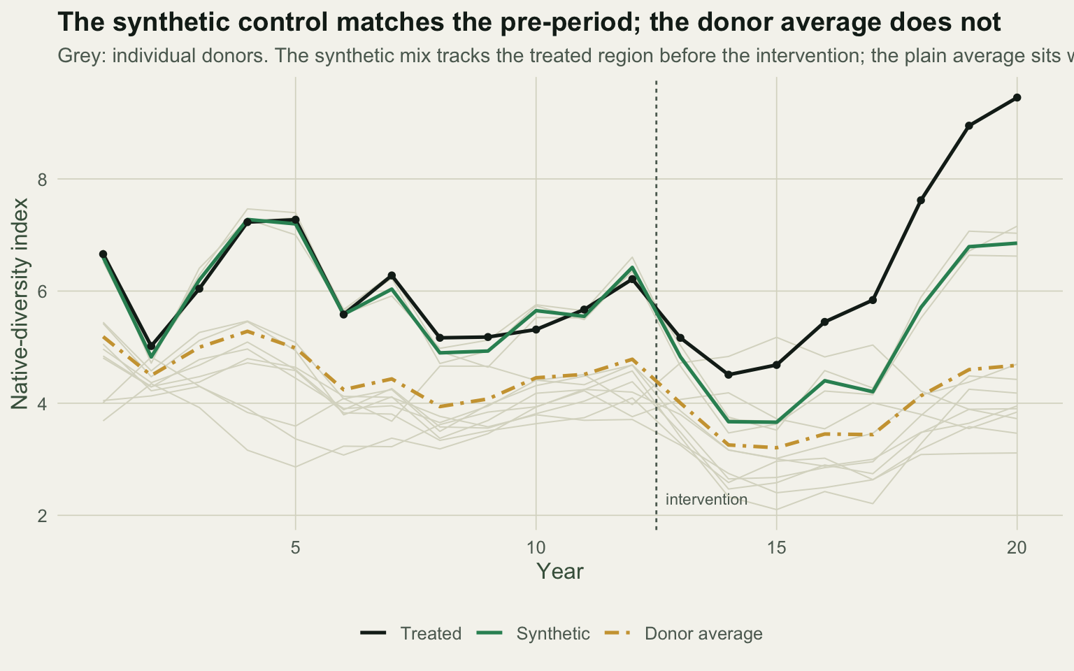
Reading the effect off the gap
Fit quality is judged on the pre-intervention periods, where the treatment has not yet acted. The synthetic control’s pre-period root mean squared prediction error is 0.19 index units, against 1.43 for the plain average: a match roughly seven times closer. Because the synthetic control sits almost on top of the treated region before the intervention, the post-intervention gap is a clean estimate of the effect.
gap_sc <- treated - synth; gap_nv <- treated - naive
att_sc <- mean(gap_sc[post]); att_nv <- mean(gap_nv[post]); att_true <- mean(eff_true[post])
postdev_sc <- max(abs(gap_sc[post] - eff_true[post]))
The synthetic-control gap averages 1.44 over the post-intervention years, within 0.24 of the true effect at every horizon, against a true average of 1.35. The plain donor average, mismatched from the start, returns 2.61, overstating the effect by 1.26 index units: the pre-existing gap between the treated region and the pool average is silently counted as impact.
df2 <- pivot_longer(data.frame(t = tvec, `Synthetic control gap` = gap_sc, `Donor-average gap` = gap_nv,
                               `True effect` = eff_true, check.names = FALSE), -t, names_to = "series", values_to = "y")
df2$series <- factor(df2$series, levels = c("Synthetic control gap", "Donor-average gap", "True effect"))
ggplot(df2, aes(t, y, colour = series, linetype = series)) +
  annotate("rect", xmin = T0 - 0.5, xmax = Tn + 0.5, ymin = -Inf, ymax = Inf, fill = te$sage, alpha = 0.12) +
  geom_hline(yintercept = 0, colour = te$faint, linewidth = 0.4) +
  geom_vline(xintercept = T0 - 0.5, colour = te$faint, linetype = "22", linewidth = 0.5) +
  geom_line(linewidth = 0.9) + geom_point(size = 1.2) +
  scale_colour_manual(values = c("Synthetic control gap" = te$mown, "Donor-average gap" = te$grazed, "True effect" = te$forest)) +
  scale_linetype_manual(values = c("Synthetic control gap" = "solid", "Donor-average gap" = "4212", "True effect" = "31")) +
  labs(x = "Year", y = "Treated minus counterfactual",
       title = "The gap is the estimated effect: clean pre-period, honest post-period",
       subtitle = "The synthetic-control gap is near zero before the intervention and tracks the true effect after;\nthe donor-average gap is biased throughout.") + th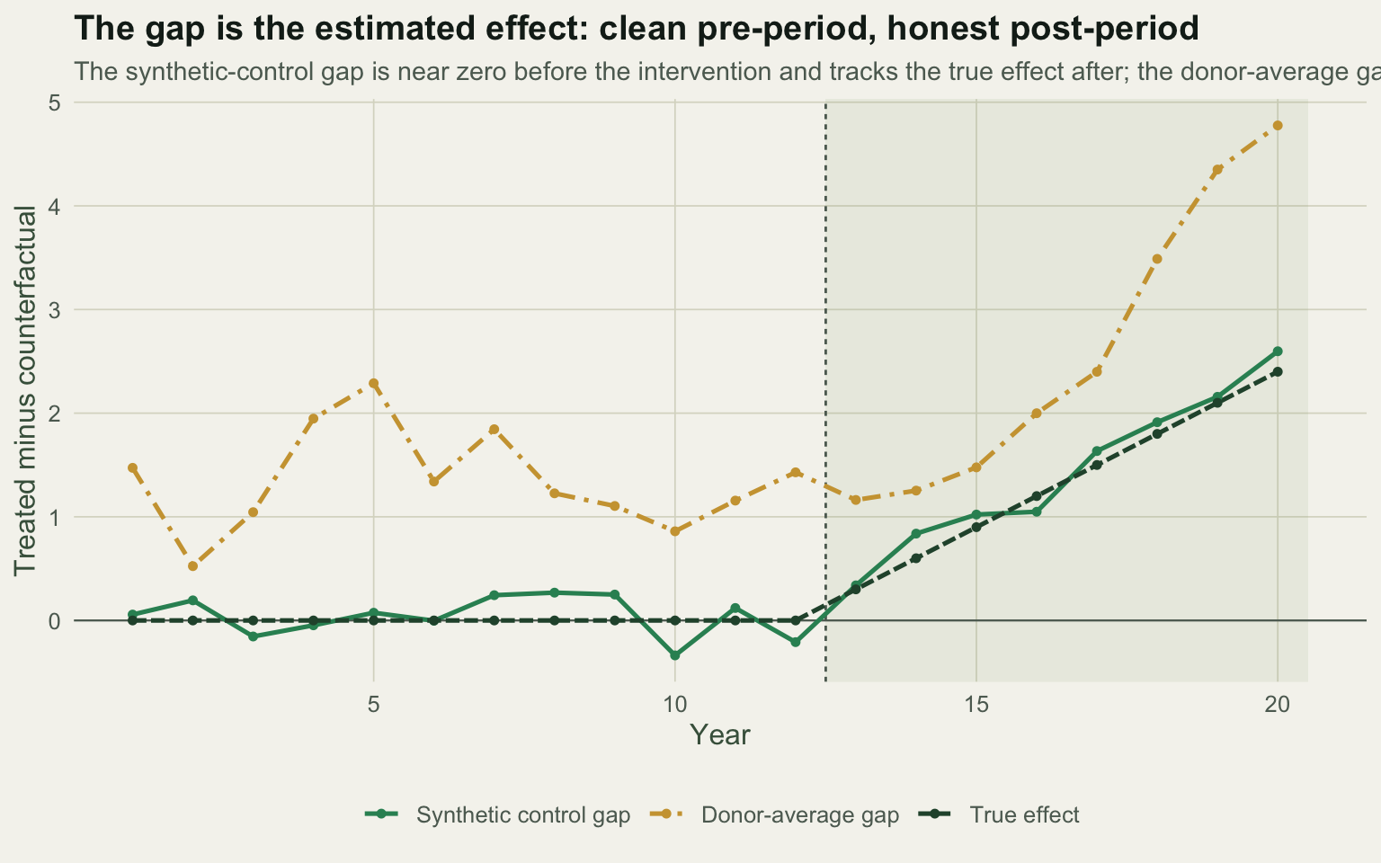
Where it holds and where it breaks
The method rests on the pre-period fit, and that is also its main limit. If no convex mix of donors tracks the treated region before the intervention, there is no credible counterfactual and the post-period gap means little; a large pre-period error is a signal to stop, not a number to report. The restriction to non-negative weights summing to one is deliberate: it prevents extrapolation beyond the range of the donors, so a treated region more extreme than every donor cannot be matched. Weights are often not unique when donors resemble each other, as the near-collinear neighbours here show, but non-uniqueness of the weights does not undermine the fit or the gap.
The harder question is inference. There is one treated region, so there is no sampling distribution to lean on and no standard error to quote from the fit. The honest answer is a placebo comparison: apply the same procedure to each donor as if it had been treated, and ask whether the treated region’s gap stands out against that reference set. That is the subject of the final post in this series.
References
- Abadie A, Gardeazabal J 2003 American Economic Review 93(1):113-132 (10.1257/000282803321455188)
- Abadie A, Diamond A, Hainmueller J 2010 Journal of the American Statistical Association 105(490):493-505 (10.1198/jasa.2009.ap08746)
- Abadie A, Diamond A, Hainmueller J 2015 American Journal of Political Science 59(2):495-510 (10.1111/ajps.12116)
- Abadie A 2021 Journal of Economic Literature 59(2):391-425 (10.1257/jel.20191450)
- Butsic V, Lewis DJ, Radeloff VC, Baumann M, Kuemmerle T 2017 Basic and Applied Ecology 19:1-10 (10.1016/j.baae.2017.01.005)