library(ggplot2)
library(patchwork)

te_paper  <- "#f5f4ee"
te_ink    <- "#16241d"
te_body   <- "#2c3a31"
te_forest <- "#275139"
te_rust   <- "#b5534e"
te_gold   <- "#c9b458"
te_line   <- "#dad9ca"

theme_datasheet <- function() {
  theme_minimal(base_size = 12) +
    theme(plot.background  = element_rect(fill = te_paper, colour = NA),
          panel.background = element_rect(fill = te_paper, colour = NA),
          panel.grid.major = element_line(colour = te_line, linewidth = 0.3),
          panel.grid.minor = element_blank(),
          text             = element_text(colour = te_body),
          plot.title       = element_text(colour = te_ink, face = "bold"),
          plot.subtitle    = element_text(colour = te_body),
          axis.text        = element_text(colour = te_body))
}Snapshot prevalence and the phase of an epidemic
R
disease ecology
prevalence
serology
simulation
GLM
ecology tutorial
One PCR survey across sites reads each epidemic’s phase, so the density slope can flip sign with survey date when introductions are synchronous. Serology in R.
Thirty woodlots, thirty bank voles live-trapped and bled in each, one visit in late summer. Every blood sample goes through a PCR for an acute virus and an antibody assay for the same virus, and the trapping gives a density index for every woodlot. The analysis that follows is the one many field papers run: a binomial regression of the share of PCR-positive voles on log host density, one point per woodlot. A positive slope reads as density-dependent transmission, no slope reads as frequency dependence or no effect, and a negative slope gets written up as a quirk of the system or, when the covariate is host diversity rather than density, as a dilution effect. Keesing, Holt and Ostfeld reviewed how host density and community composition are expected to move disease risk, and Salkeld, Padgett and Jones found in a meta-analysis that the measured direction of the diversity and risk relationship varies from study to study; prevalence surveys of this kind are one of the data types behind such comparisons.
An acute infection does not sit at a level. It rises, peaks and burns out in each woodlot, and host density sets how fast that happens. One visit therefore catches the dense woodlots and the sparse ones at different points of their own epidemics, and the slope of prevalence on density measures that difference in phase as much as anything about transmission. This post measures what that does to the fitted slope: for which survey dates it is positive, for which it is negative, and how the answer depends on whether the virus arrived in all the woodlots at about the same time or over several months. The peak and final-size arithmetic of the SIR model that predicts the timing is textbook (Anderson and May 1991), and the post derives it and checks it against the simulation rather than presenting it as a result. What the simulation adds are the rates: how often a survey reports a significant slope in each direction, by survey date and by the spread of introduction dates, and what an antibody assay on the same blood does.
This site fits transmission from time courses and from an endemic age cross-section. Density or frequency transmission in enclosures follows every animal daily until the outbreak is over and prices the range of group sizes needed to tell the two forms apart, the design argument McCallum, Barlow and Hone made in 2001; its honest limits note that field studies usually see seroconversion only at trapping intervals. Force of infection from age prevalence reads a single cross-section, but of an irreversible infection acquired at a constant rate, where the snapshot is the right summary. Host density and endemic disease derives the endemic prevalence as one minus one over the reproduction number, which rises with density and is the positive slope a survey reader expects. Checking a metapopulation model warns that a snapshot of a recovering network is not an equilibrium and that a missing area signal should be read as “a warning about equilibrium, not as biology”. This post is the one-visit field survey of an acute pulse, where the survey date and the synchrony of introductions decide whether the density slope is positive, absent or negative, and serology from the same visit is the repair once the introductions are over.
Thirty woodlots, one chain binomial each
Each woodlot is a closed population of N hosts with no births, deaths or movement over the season. The virus is introduced as three infectious hosts on a day drawn uniformly from 1 to W, independently for every woodlot, and W is the axis this post turns on: W = 1 means every woodlot is seeded on the same day, W = 100 means introductions spread over a hundred days. After seeding, each day every susceptible is infected with probability 1 - exp(-beta I), where I is the number of infectious hosts in its woodlot, so transmission is density dependent, and every infectious host recovers with probability 1 - exp(-gamma). Recovered hosts keep their antibodies for the rest of the season.
On the survey day thirty hosts are sampled from each woodlot without replacement. PCR detects current infection, so a host is PCR positive if it is infectious that day; the antibody assay detects past or current infection, so a host is seropositive if it is infectious or recovered. Both assays are perfect here, on purpose, so that everything that goes wrong below is about timing. Host densities are log-uniform between 100 and 800 per woodlot.
beta_dd  <- 0.0015              # daily transmission coefficient per infectious host
gam      <- 0.1                 # recovery hazard per day
p_rec    <- 1 - exp(-gam)       # daily recovery probability
i_seed   <- 3                   # infectious hosts introduced into each woodlot
n_site   <- 30                  # woodlots per survey
n_samp   <- 30                  # hosts sampled per woodlot, without replacement
n_fd_ref <- 450                 # density at which the frequency-dependent null matches
survey_days <- c(20, 40, 60, 80, 100, 140)

sim_arm <- function(n_surv, n_lo, n_hi, w_intro, form = "DD", days = survey_days) {
  n_all  <- n_surv * n_site
  host_n <- round(exp(runif(n_all, log(n_lo), log(n_hi))))
  intro  <- sample.int(w_intro, n_all, replace = TRUE)
  s_n <- host_n; i_n <- numeric(n_all); r_n <- numeric(n_all)
  pcr_mat <- sero_mat <- matrix(0L, n_all, length(days))
  unseeded <- numeric(length(days)); k <- 1
  for (t_day in seq_len(max(days))) {
    new_i <- intro == t_day
    s_n[new_i] <- s_n[new_i] - i_seed
    i_n[new_i] <- i_n[new_i] + i_seed
    lam <- if (form == "DD") beta_dd * i_n else beta_dd * n_fd_ref * i_n / host_n
    inf <- rbinom(n_all, s_n, 1 - exp(-lam))
    rec <- rbinom(n_all, i_n, p_rec)
    s_n <- s_n - inf; i_n <- i_n + inf - rec; r_n <- r_n + rec
    if (t_day %in% days) {
      pcr <- rhyper(n_all, i_n, host_n - i_n, n_samp)
      pcr_mat[, k]  <- pcr
      sero_mat[, k] <- pcr + rhyper(n_all, r_n, s_n, n_samp - pcr)
      unseeded[k] <- mean(intro > t_day)
      k <- k + 1
    }
  }
  list(host_n = host_n, pcr = pcr_mat, sero = sero_mat, unseeded = unseeded,
       survey = rep(seq_len(n_surv), each = n_site))
}
The analysis of one survey is the regression a field paper would run: a quasibinomial GLM of the positives out of thirty on log density, with the slope called significant at a two-sided p below 0.05 and its sign recorded. The quasibinomial family is there because woodlots differ in phase, which puts far more spread between them than binomial sampling alone; how much the plain binomial overstates the evidence is measured in the section on calibration. Fitting thousands of these regressions through glm() and summary() is slow, so the function below calls glm.fit() directly and computes the quasi-likelihood t test by hand; the first lines check it against glm() on one simulated survey.
slope_test <- function(y, x_log) {
  if (sum(y) == 0 || sum(y) == n_site * n_samp) return(c(b = NA, quasi = 0, plain = 0))
  fit <- suppressWarnings(glm.fit(cbind(1, x_log), y / n_samp,
                                  weights = rep(n_samp, length(y)),
                                  family = quasibinomial()))
  if (fit$rank < 2) return(c(b = NA, quasi = 0, plain = 0))
  cov_u <- chol2inv(fit$qr$qr[1:2, 1:2, drop = FALSE])
  disp  <- sum(fit$weights * fit$residuals^2) / fit$df.residual
  b_1   <- unname(fit$coefficients[2])
  p_q   <- 2 * pt(-abs(b_1 / sqrt(disp * cov_u[2, 2])), fit$df.residual)
  p_b   <- 2 * pnorm(-abs(b_1 / sqrt(cov_u[2, 2])))
  c(b = b_1, quasi = sign(b_1) * (p_q < 0.05), plain = sign(b_1) * (p_b < 0.05))
}

set.seed(515)
chk      <- sim_arm(1, 100, 800, 41)
chk_y    <- chk$pcr[, 4]
chk_x    <- log(chk$host_n)
chk_glm  <- summary(glm(cbind(chk_y, n_samp - chk_y) ~ chk_x,
                        family = quasibinomial))$coefficients
chk_fast <- slope_test(chk_y, chk_x)
chk_gap  <- abs(chk_glm[2, 1] - chk_fast[["b"]])
chk_p    <- chk_glm[2, 4]
On one survey taken on day 80 glm() returns a slope of -1.436402 with p = 0.0046, and the hand-coded route returns -1.436402 and also calls it significant. A survey in which every sampled host is negative, or every one positive, has no slope to test and is scored as not significant.
The arithmetic of phase
Before any survey is simulated, the deterministic SIR model says what to expect. With a daily recovery probability p, an infectious host stays infectious for 1/p days on average, and each of those days it infects each susceptible with probability close to beta. The basic reproduction number of a woodlot is therefore R0 = beta N / p, which is beta N / gamma in the continuous-time model and slightly larger here because the daily step makes the mean infectious period 1/p rather than 1/gamma.
r0_of <- function(n_host) beta_dd * n_host / p_rec
r0_lo <- r0_of(100); r0_hi <- r0_of(800); r0_fd <- r0_of(n_fd_ref)

peak_prev_cf <- function(n_host) {
  r0 <- r0_of(n_host); s0 <- 1 - i_seed / n_host
  1 - (1 + log(r0 * s0)) / r0
}
final_cf <- function(n_host) {
  r0 <- r0_of(n_host); s0 <- 1 - i_seed / n_host
  uniroot(function(z) 1 - z - s0 * exp(-r0 * z), c(i_seed / n_host, 1), tol = 1e-12)$root
}

det_path <- function(n_host, t_max = 200) {
  s_d <- n_host - i_seed; i_d <- i_seed; r_d <- 0
  out <- matrix(0, t_max, 2, dimnames = list(NULL, c("prev", "sero")))
  for (t_d in seq_len(t_max)) {
    inf <- s_d * (1 - exp(-beta_dd * i_d)); rec <- i_d * p_rec
    s_d <- s_d - inf; i_d <- i_d + inf - rec; r_d <- r_d + rec
    out[t_d, ] <- c(i_d, r_d + i_d) / n_host
  }
  out
}
det_lo <- det_path(100); det_hi <- det_path(800)
peak_day_lo <- which.max(det_lo[, "prev"]); peak_day_hi <- which.max(det_hi[, "prev"])
pk_lo_det <- max(det_lo[, "prev"]); pk_hi_det <- max(det_hi[, "prev"])
shortcut  <- function(n_host) log(n_host / i_seed) / (gam * (beta_dd * n_host / gam - 1))
short_lo  <- shortcut(100); short_hi <- shortcut(800)
fz_lo <- final_cf(100); fz_hi <- final_cf(800)
fade_lo <- (1 / r0_lo)^i_seed
r_cont  <- function(n_host) gam * (beta_dd * n_host / gam - 1)
r_daily <- function(n_host) log(1 - p_rec + beta_dd * (n_host - i_seed))
dense_first <- which(det_hi[, "prev"] > det_lo[, "prev"])[1]
At the ends of the density range R0 is 1.58 for 100 hosts and 12.6 for 800. Two textbook results follow from it. The peak prevalence of a deterministic SIR epidemic is 1 - (1 + ln(R0 s0)) / R0, where s0 is the susceptible share at seeding; that gives 0.096 at 100 hosts and 0.720 at 800, and iterating the daily model with every random draw replaced by its mean gives 0.096 and 0.719. The share ever infected solves the final-size equation 1 - z = s0 exp(-R0 z), derived in the SIR epidemic model: 0.654 at 100 hosts, and 0.999997 at 800. So a dense woodlot runs a short, tall epidemic that infects almost every host, and a sparse one runs a long, low epidemic that leaves about a third of its hosts untouched.
The peak day has no closed form. The usual shortcut, ln(N / 3) / (gamma (R0 - 1)) with the continuous-time R0 = beta N / gamma, gives 70 days at 100 hosts and 5 at 800. The iterated daily model puts the peaks at day 42 and day 10 after seeding. The shortcut is the time it takes to grow from the three seeds to N infectious hosts at the initial continuous-time rate gamma (R0 - 1). At 100 hosts the peak is only about 10 infectious hosts, far short of N, and the shortcut overshoots by 28 days. At 800 hosts it undershoots by 5 days: early in the daily model each infectious host is followed by 1 - p + beta (N - 3) infectious hosts a day later, a log growth rate of 0.74 per day against the 1.10 of the continuous-time rate, and growth slows further as susceptibles run out. The peak days below come from the iteration.
n_chk <- 4000
set.seed(8123)
chk_sites <- function(n_host) {
  s_n <- rep(n_host - i_seed, n_chk); i_n <- rep(i_seed, n_chk); r_n <- rep(0, n_chk)
  i_max <- i_n; t_max <- rep(0, n_chk)
  for (t_d in 1:200) {
    inf <- rbinom(n_chk, s_n, 1 - exp(-beta_dd * i_n)); rec <- rbinom(n_chk, i_n, p_rec)
    s_n <- s_n - inf; i_n <- i_n + inf - rec; r_n <- r_n + rec
    up <- i_n > i_max; i_max[up] <- i_n[up]; t_max[up] <- t_d
  }
  list(ever = (r_n + i_n) / n_host, fin = r_n / n_host, t_max = t_max)
}
chk_sum <- function(run, cut_at = 0.2) {
  big <- run$ever > cut_at
  c(big = mean(big), peak_day = median(run$t_max[big]),
    final = mean(run$fin[big]), final_se = sd(run$fin[big]) / sqrt(sum(big)))
}
run_lo <- chk_sites(100); run_hi <- chk_sites(800)
sim_lo <- chk_sum(run_lo); sim_hi <- chk_sum(run_hi)
cut_set <- c(0.1, 0.2, 0.3)
cut_tab <- sapply(cut_set, function(cut_at) chk_sum(run_lo, cut_at))
round(cut_tab, 3)
[,1] [,2] [,3]
big 0.786 0.719 0.673
peak_day 33.000 34.000 35.000
final 0.573 0.613 0.637
final_se 0.004 0.003 0.003Stochastic woodlots seeded on day 1, 4000 at each end of the density range and run for 200 days, check the arithmetic. At 800 hosts every epidemic takes off, the median peak falls on day 10 and the mean share ever infected is 0.999999. At 100 hosts, with R0 only 1.58, there is no clean line between an introduction that fizzles and an epidemic that takes off, so any split depends on where the line is drawn. Calling an introduction a failure when it has infected at most 0.1, 0.2 or 0.3 of the woodlot by day 200 gives failure shares of 0.214, 0.281 and 0.327; the branching-process value one over R0 cubed, 0.255, is a rough check on these and no more. The mean share infected by the rest rises with the cut, 0.573, 0.613 and 0.637 (Monte Carlo standard error at most 0.004), against the deterministic 0.654. With the 0.2 cut the epidemics that take off peak at a median of day 34, earlier than the deterministic 42, because an epidemic that escapes extinction is one that started fast.
n_show <- 6
set.seed(4127)
tc_list <- lapply(c(100, 800), function(n_host) {
  s_n <- rep(n_host - i_seed, n_show); i_n <- rep(i_seed, n_show)
  out <- matrix(0, 140, n_show)
  for (t_d in 1:140) {
    inf <- rbinom(n_show, s_n, 1 - exp(-beta_dd * i_n)); rec <- rbinom(n_show, i_n, p_rec)
    s_n <- s_n - inf; i_n <- i_n + inf - rec
    out[t_d, ] <- i_n / n_host
  }
  data.frame(day = rep(1:140, n_show), prev = as.vector(out),
             site = rep(seq_len(n_show), each = 140),
             density = paste(n_host, "hosts"))
})
tc_df  <- do.call(rbind, tc_list)
det_df <- rbind(data.frame(day = 1:140, prev = det_lo[1:140, "prev"], density = "100 hosts"),
                data.frame(day = 1:140, prev = det_hi[1:140, "prev"], density = "800 hosts"))
pk_df  <- data.frame(day = c(peak_day_lo, peak_day_hi), density = c("100 hosts", "800 hosts"))
dens_col <- c("100 hosts" = te_gold, "800 hosts" = te_forest)

ggplot(tc_df, aes(day, prev, colour = density)) +
  geom_vline(data = pk_df, aes(xintercept = day, colour = density),
             linetype = "dashed", linewidth = 0.7) +
  geom_line(aes(group = interaction(site, density)), linewidth = 0.45, alpha = 0.8) +
  geom_line(data = det_df, colour = te_ink, linewidth = 0.8,
            aes(group = density)) +
  scale_colour_manual(values = dens_col, name = NULL) +
  scale_x_continuous(breaks = survey_days) +
  labs(x = "day (all woodlots seeded on day 1)", y = "share of hosts infectious",
       title = "Dense woodlots peak early and high, sparse ones late and low",
       subtitle = "thin lines: six stochastic woodlots each; black: deterministic; dashed: its peak day") +
  theme_datasheet() +
  theme(legend.position = "bottom")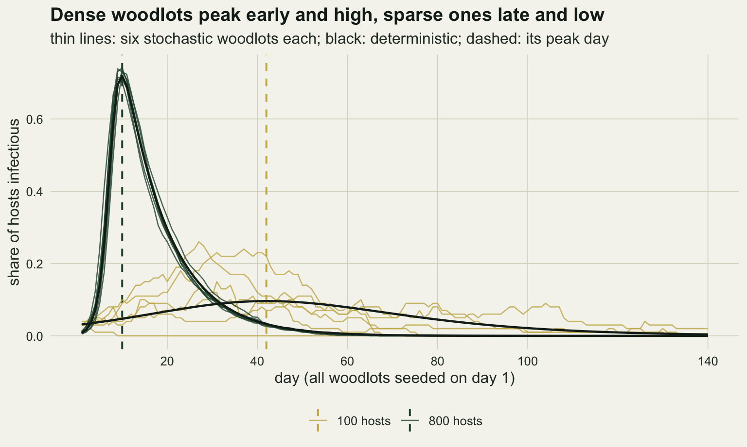
The timing that matters for a survey is where the two curves cross. When all woodlots are seeded on the same day, the dense ones have higher prevalence from day 4 and the sparse ones after the dense epidemics have burnt out; on the first 3 days the three seeds are still a larger share of a small woodlot, which is why the chunk below looks for the crossing only after day 5. When introductions spread over W days, what a survey on day d sees is each curve averaged over the introduction days, and the crossing moves later. The next chunk computes the crossing day of the averaged deterministic curves for every W used below; it is the day the density slope is expected to change sign, and it says nothing about how often a survey of thirty woodlots will detect either sign.
w_set <- c(1, 20, 41, 70, 100)
cross_day <- function(w_intro, path_lo = det_lo, path_hi = det_hi, t_max = 180) {
  avg <- function(path) vapply(seq_len(t_max), function(t_d) {
    tau <- t_d - seq_len(w_intro) + 1
    mean(ifelse(tau >= 1, path[pmax(tau, 1), "prev"], 0))
  }, 0)
  a_lo <- avg(path_lo); a_hi <- avg(path_hi)
  which(a_lo > a_hi & seq_len(t_max) > 5)[1]
}
cross_tab    <- vapply(w_set, cross_day, 0)
cross_narrow <- cross_day(41, det_lo, det_path(400))
names(cross_tab) <- paste0("W", w_set)
cross_tab
W1 W20 W41 W70 W100
32 44 59 84 113 For introductions within 1, 20, 41, 70 and 100 days, the averaged curves for 100 and 800 hosts cross on days 32, 44, 59, 84 and 113. The crossing moves later by more than the mean introduction delay of (W - 1) / 2 days: at W = 100 that delay is 49.5 days and the crossing moves by 81. For the two widest windows it sits 13 and 14 days after the window closes: the averaged curve of the dense woodlots stays up for as long as dense woodlots are still being seeded, and falls only once the last of them has burnt out.
One survey, six dates, five introduction windows
The survey design is fixed: 30 woodlots, 30 hosts sampled in each. Seven arms are simulated. Five use densities from 100 to 800 with introduction windows W of 1, 20, 41, 70 and 100 days. The sixth narrows the density range to 100 to 400 at W = 41. The seventh is a null: transmission is frequency dependent, P(infection) = 1 - exp(-beta 450 I / N), so every woodlot has the same R0 of 7.09 whatever its density, and any slope a survey finds there is a false alarm. Each arm is 1000 simulated surveys, each surveyed on all six days.
n_surv <- 1000
se_max <- sqrt(0.25 / n_surv)
arm_tab <- data.frame(
  arm   = c("W 1", "W 20", "W 41", "W 70", "W 100", "W 41, N 100-400", "FD null, W 41"),
  n_lo  = c(100, 100, 100, 100, 100, 100, 100),
  n_hi  = c(800, 800, 800, 800, 800, 400, 800),
  w     = c(1, 20, 41, 70, 100, 41, 41),
  form  = c(rep("DD", 6), "FD"))

score_arm <- function(sim, days = survey_days) {
  x_log <- log(sim$host_n)
  n_s   <- max(sim$survey)
  res   <- array(NA_real_, c(n_s, length(days), 2, 3),
                 dimnames = list(NULL, paste0("d", days), c("pcr", "sero"),
                                 c("b", "quasi", "plain")))
  for (s in seq_len(n_s)) {
    rows <- which(sim$survey == s)
    for (k in seq_along(days)) {
      res[s, k, "pcr", ]  <- slope_test(sim$pcr[rows, k], x_log[rows])
      res[s, k, "sero", ] <- slope_test(sim$sero[rows, k], x_log[rows])
    }
  }
  res
}

set.seed(20261007)
arm_res <- lapply(seq_len(nrow(arm_tab)), function(i) {
  sim <- sim_arm(n_surv, arm_tab$n_lo[i], arm_tab$n_hi[i], arm_tab$w[i], arm_tab$form[i])
  list(score = score_arm(sim), unseeded = sim$unseeded)
})
names(arm_res) <- arm_tab$arm

rate_df <- do.call(rbind, lapply(names(arm_res), function(a) {
  sc <- arm_res[[a]]$score
  do.call(rbind, lapply(c("pcr", "sero"), function(assay) {
    data.frame(arm = a, day = survey_days, assay = assay,
               neg = colMeans(sc[, , assay, "quasi"] == -1),
               pos = colMeans(sc[, , assay, "quasi"] == 1),
               plain_any = colMeans(sc[, , assay, "plain"] != 0))
  }))
}))
rt <- function(a, d, assay, dir) rate_df[rate_df$arm == a & rate_df$day == d &
                                           rate_df$assay == assay, dir]
The denominator throughout is surveys: a rate is the share of the 1000 simulated thirty-woodlot surveys whose slope is significant in the stated direction, never a share of woodlots. The Monte Carlo standard error of any rate is at most 0.016.
With all woodlots seeded on the same day, a PCR survey on day 20 finds a significantly positive density slope in 0.980 of surveys. By day 40, past the crossing on day 32, the slope is significantly negative in 0.644, and on day 60 in 0.906. By day 140 it is down to 0.108, in part because 0.761 of those surveys find no PCR-positive host at all and have no slope to test; of the surveys that do have one, 0.452 are significantly negative. With introductions spread over 41 days the positive phase is weaker and longer: 0.388 on day 20 and 0.449 on day 40. Day 60 sits at the crossing (day 59) and reports almost nothing, 0.001 positive and 0.049 negative, and days 80 and 100 report a significantly negative slope in 0.652 and 0.638 of surveys. The same woodlots, the same virus and the same density-dependent transmission give a positive or a negative answer depending on the survey date.
Spreading the introductions further, to W = 70, cuts the positive phase and delays and weakens the negative one. The positive rate is 0.191 on day 20 and 0.151 on day 40, 0.49 and 0.34 times the W = 41 rates, and no PCR survey date before day 100 reaches a significantly positive rate above 0.191 or a negative rate above 0.006; the negative slope appears after the crossing on day 84, in 0.255 of surveys on day 100 and 0.403 on day 140. At W = 100 every date from 20 to 100 is significant in either direction in at most 0.117 of surveys, and the negative slope shows only on day 140, in 0.299.
fd_band <- aggregate(cbind(neg, pos) ~ day, data = rate_df[rate_df$arm == "FD null, W 41", ],
                     FUN = max)
dd_arms <- arm_tab$arm[arm_tab$form == "DD"]
plot_df <- rate_df[rate_df$arm %in% dd_arms, ]
plot_long <- rbind(data.frame(plot_df[, c("arm", "day", "assay")], share = plot_df$pos,
                              direction = "positive"),
                   data.frame(plot_df[, c("arm", "day", "assay")], share = -plot_df$neg,
                              direction = "negative"))
plot_long$assay <- factor(ifelse(plot_long$assay == "pcr", "PCR (current infection)",
                                 "serology (ever infected)"),
                          levels = c("PCR (current infection)", "serology (ever infected)"))
plot_long$arm <- factor(plot_long$arm, levels = dd_arms)
band_df <- do.call(rbind, lapply(dd_arms, function(a)
  data.frame(arm = a, day = fd_band$day, lo = -fd_band$neg, hi = fd_band$pos)))
band_df$arm <- factor(band_df$arm, levels = dd_arms)
cross_df <- data.frame(arm = factor(dd_arms, levels = dd_arms),
                       day = c(cross_tab, cross_narrow))

ggplot(plot_long, aes(day, share, colour = assay)) +
  geom_ribbon(data = band_df, aes(x = day, ymin = lo, ymax = hi), inherit.aes = FALSE,
              fill = "grey70", alpha = 0.5) +
  geom_hline(yintercept = 0, colour = te_body, linewidth = 0.4) +
  geom_vline(data = cross_df, aes(xintercept = day), linetype = "dashed",
             colour = te_body, linewidth = 0.5) +
  geom_line(aes(group = interaction(assay, direction)), linewidth = 0.8) +
  geom_point(size = 1.6) +
  facet_wrap(~arm, ncol = 2) +
  scale_colour_manual(values = c(te_rust, te_forest), name = NULL) +
  scale_x_continuous(breaks = survey_days) +
  scale_y_continuous(limits = c(-1, 1), breaks = c(-1, -0.5, 0, 0.5, 1),
                     labels = c("1 neg", "0.5 neg", "0", "0.5 pos", "1 pos")) +
  labs(x = "survey day", y = "share of surveys with a significant slope",
       title = "The sign of the density slope depends on the date",
       subtitle = "above zero: positive slopes; below zero: negative slopes") +
  theme_datasheet() +
  theme(legend.position = "bottom")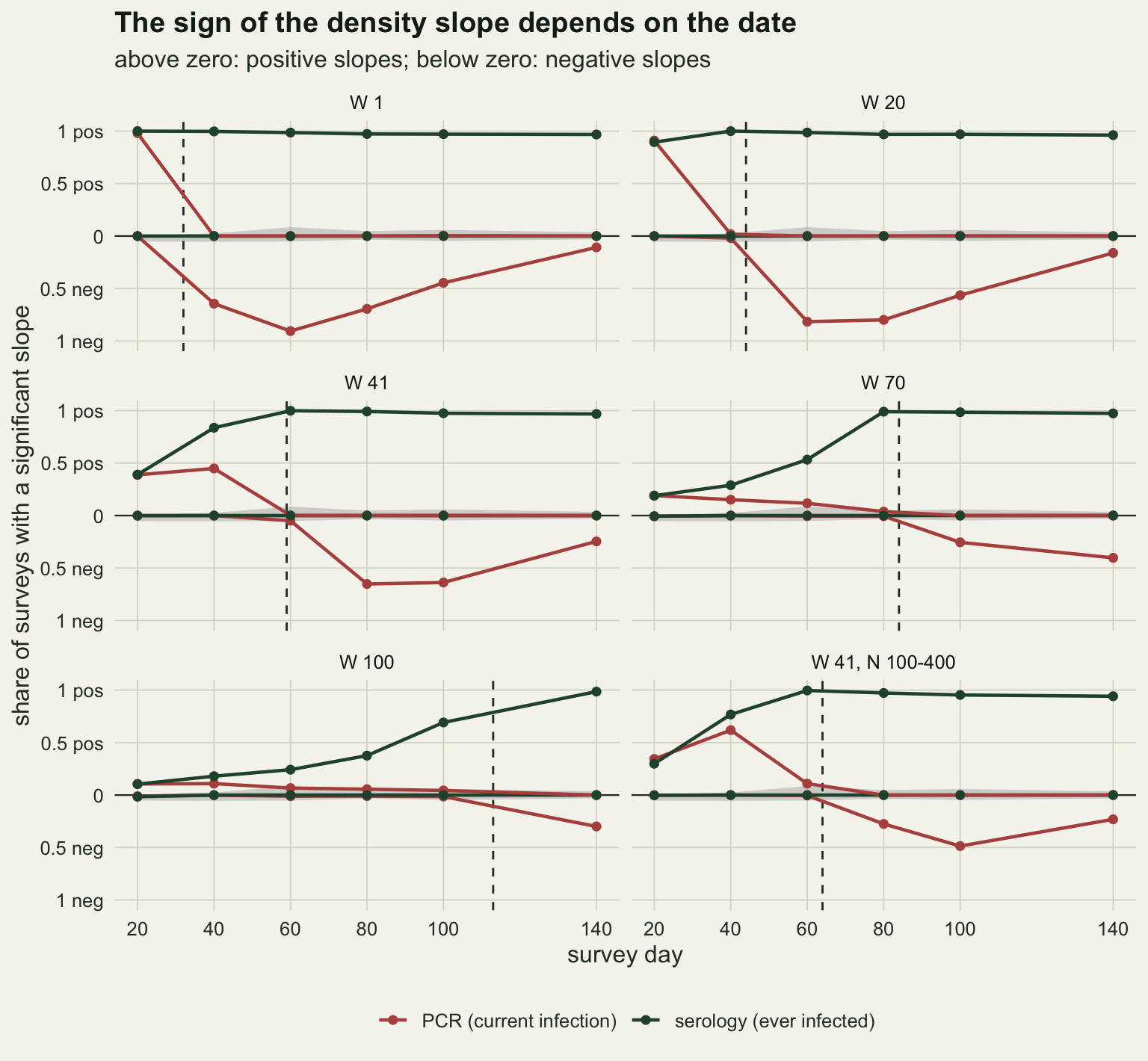
Synchrony, not empty woodlots
Part of what a spread of introductions does is plain: early in the season many woodlots have not been reached yet. For introduction days uniform on 1 to W, the share still unseeded on day d is (W - d) / W while d is below W, and zero afterwards. The simulation counts it directly.
unseed_tab <- t(vapply(arm_tab$arm[1:5], function(a) arm_res[[a]]$unseeded,
                       numeric(length(survey_days))))
unseed_cf  <- t(vapply(w_set, function(w) pmax(w - survey_days, 0) / w,
                       numeric(length(survey_days))))
unseed_gap <- max(abs(unseed_tab - unseed_cf))
dimnames(unseed_tab) <- list(arm_tab$arm[1:5], paste0("d", survey_days))
round(unseed_tab, 3)
d20 d40 d60 d80 d100 d140
W 1 0.000 0.000 0.000 0.000 0 0
W 20 0.000 0.000 0.000 0.000 0 0
W 41 0.511 0.023 0.000 0.000 0 0
W 70 0.713 0.429 0.142 0.000 0 0
W 100 0.800 0.600 0.399 0.196 0 0w70_any <- rt("W 70", 80, "pcr", "pos") + rt("W 70", 80, "pcr", "neg")
w20_any <- rt("W 20", 40, "pcr", "pos") + rt("W 20", 40, "pcr", "neg")
slope_sum <- do.call(rbind, lapply(arm_tab$arm[1:5], function(a) {
do.call(rbind, lapply(c("pcr", "sero"), function(assay) {
b_mat <- arm_res[[a]]$score[, , assay, "b"]
data.frame(arm = a, day = survey_days, assay = assay,
med = apply(b_mat, 2, median, na.rm = TRUE),
iqr = apply(b_mat, 2, IQR, na.rm = TRUE),
no_pos = colMeans(is.na(b_mat)))
}))
}))
pcr_sum <- slope_sum[slope_sum$assay == "pcr", ]
med_d20 <- range(pcr_sum$med[pcr_sum$day == 20])
iqr_d20 <- pcr_sum$iqr[pcr_sum$day == 20]
iqr_ratio <- iqr_d20[5] / iqr_d20[1]
med_d80 <- pcr_sum$med[pcr_sum$day == 80]
no_pos_max <- max(slope_sum$no_pos[slope_sum$day %in% c(20, 80)])The simulated shares match the closed form to within 0.004. At W = 100, 0.600 of woodlots are still empty on day 40 and 0.196 on day 80, so some of the lost signal early in the season is empty woodlots. A single low rate cannot show more than that, because a survey close to the crossing reports little whatever the synchrony. At W = 70 on day 80, 4 days before that arm’s crossing and with no woodlot empty, the PCR slope is significant in either direction in 0.044 of surveys; at W = 20 on day 40, 4 days before its crossing and with no woodlot empty either, in 0.037. The comparison that isolates asynchrony uses surveys taken after the window has closed, when no woodlot is empty, and after the crossing, where the negative phase is at its strongest. The six survey dates are too sparse after day 100 for that at W = 70 and end too early at W = 100, so the next chunk takes a second draw of 1000 surveys in each of those arms on days 100 to 200 and records the largest significantly negative PCR share on the 20-day grid of dates.
late_days <- seq(100, 200, by = 20)
set.seed(9907)
late_neg <- sapply(c("W 70" = 70, "W 100" = 100), function(w) {
  sc <- score_arm(sim_arm(n_surv, 100, 800, w, days = late_days), late_days)
  colMeans(sc[, , "pcr", "quasi"] == -1)
})
main_neg <- sapply(arm_tab$arm[1:3], function(a)
  rate_df$neg[rate_df$arm == a & rate_df$assay == "pcr"])
peak_neg <- c(apply(main_neg, 2, max), apply(late_neg, 2, max))
peak_at  <- c(survey_days[apply(main_neg, 2, which.max)],
              late_days[apply(late_neg, 2, which.max)])
round(rbind(peak_neg, peak_at), 3)
W 1 W 20 W 41 W 70 W 100
peak_neg 0.906 0.816 0.652 0.49 0.318
peak_at 60.000 60.000 80.000 120.00 160.000The largest negative share is 0.906 at W = 1 (day 60), 0.816 at W = 20 (day 60), 0.652 at W = 41 (day 80), 0.490 at W = 70 (day 120) and 0.318 at W = 100 (day 160). Every one of these days falls after its introduction window has closed, so no woodlot is empty in any of them, and the negative phase still weakens as W grows. That part is asynchrony: woodlots of the same density sit at different points of their own curves, and the phase contrast between dense and sparse woodlots is smeared across the survey.
On day 20 the fitted slopes show the two effects mixed. The median PCR slope on log density is positive in every arm, between 0.87 and 1.36, and no smaller at W = 100 (1.07) than at W = 1 (0.87), but the middle half of the survey slopes is 4.8 times as wide at W = 100 as at W = 1. The positive phase is still there on average; it is drowned by woodlots at very different points of their own curves, and at W = 100 most of them are not yet seeded (0.800 empty on day 20), so on that day empty woodlots and asynchrony cannot be told apart. On day 80 the medians themselves move: -2.44, -1.86 and -1.13 for W = 1, 20 and 41, and 0.15 and 0.25 for W = 70 and 100, whose crossings on days 84 and 113 have not yet come. Surveys in which no sampled host is positive have no slope and are left out; on these two days that is at most 0.005 of the surveys in any arm.
slope_df <- do.call(rbind, lapply(arm_tab$arm[1:5], function(a) {
  do.call(rbind, lapply(c(20, 80), function(d) {
    rbind(data.frame(arm = a, day = paste("day", d), assay = "PCR",
                     b = arm_res[[a]]$score[, paste0("d", d), "pcr", "b"]),
          data.frame(arm = a, day = paste("day", d), assay = "serology",
                     b = arm_res[[a]]$score[, paste0("d", d), "sero", "b"]))
  }))
}))
slope_df <- slope_df[is.finite(slope_df$b), ]
slope_df$arm <- factor(slope_df$arm, levels = arm_tab$arm[1:5])
slope_lim <- quantile(slope_df$b, c(0.005, 0.995))

ggplot(slope_df, aes(arm, b, fill = assay)) +
  geom_hline(yintercept = 0, colour = te_body, linewidth = 0.4) +
  geom_boxplot(outlier.shape = NA, width = 0.6, colour = te_ink, linewidth = 0.4,
               position = position_dodge(width = 0.7)) +
  facet_wrap(~day) +
  coord_cartesian(ylim = slope_lim) +
  scale_fill_manual(values = c(PCR = te_rust, serology = te_forest), name = NULL) +
  labs(x = "introduction window (days)", y = "fitted slope on log density",
       title = "Spread introductions widen the early slopes and delay the late ones",
       subtitle = "boxes: middle half of 1000 surveys; whiskers: 1.5 box lengths") +
  theme_datasheet() +
  theme(legend.position = "bottom")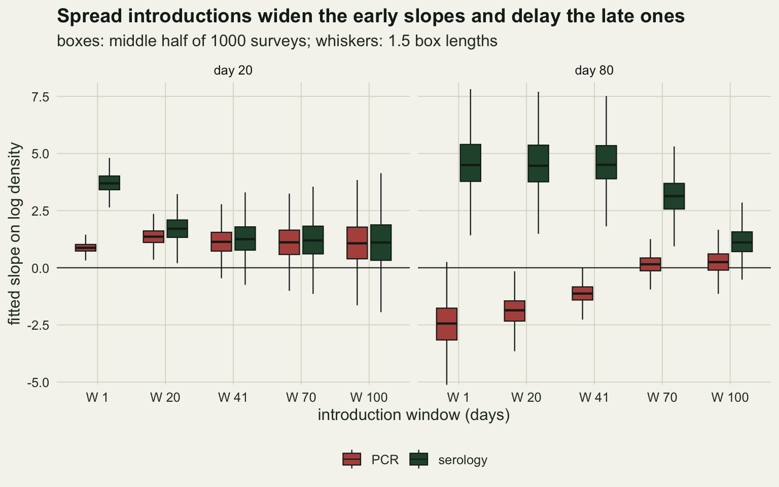
Serology from the same visit
The antibody assay counts every host that has ever been infected. Once the epidemics in a woodlot are over, that share is the final size, which only grows with R0, so a density-dependent pathogen must leave a positive serology slope behind it; the final-size arithmetic above already says that sparse woodlots end near 0.65 and dense ones near one. That part is algebra. What the simulation measures is when, in the season, the serology slope becomes visible and whether it is ever negative before that.
sero_neg_dd <- max(rate_df$neg[rate_df$assay == "sero" & rate_df$arm %in% dd_arms])
sero_pos    <- function(a) rate_df$pos[rate_df$arm == a & rate_df$assay == "sero"]
sero_w41    <- sero_pos("W 41"); sero_w70 <- sero_pos("W 70"); sero_w100 <- sero_pos("W 100")
sero_sync   <- range(c(sero_pos("W 1"), sero_pos("W 20")[-1]))
fd_sero_neg <- rate_df$neg[rate_df$arm == "FD null, W 41" & rate_df$assay == "sero"]
Across the six density-dependent arms and all six days, the serology slope is significantly negative in at most 0.016 of surveys, against up to 0.055 under the frequency-dependent null of the next section. It is significantly positive in 0.962 to 1.000 of surveys at every date when W = 1, and from day 40 on when W = 20. At W = 41 it reaches 0.837 by day 40 and 0.999 by day 60, the day on which PCR reports almost nothing.
The repair has its own timing condition, and it is the introduction window again. At W = 70 the serology slope is positive in 0.533 of surveys on day 60 and 0.990 on day 80; at W = 100 in 0.376 on day 80, 0.692 on day 100 and 0.986 on day 140. Serology reads density once the introduction window has closed and the dense woodlots have had time to finish; a survey taken while woodlots are still being reached often misses the slope, because the empty and newly seeded woodlots dilute it.
A null that is not quite nominal
fd_rows  <- rate_df[rate_df$arm == "FD null, W 41", ]
fd_max   <- max(c(fd_rows$neg, fd_rows$pos))
fd_where <- fd_rows[which.max(pmax(fd_rows$neg, fd_rows$pos)), c("day", "assay")]
fd_plain <- max(fd_rows$plain_any[fd_rows$assay == "pcr"])
fd_plain_day <- fd_rows$day[fd_rows$assay == "pcr"][which.max(fd_rows$plain_any[fd_rows$assay == "pcr"])]
fd_assay <- ifelse(fd_where$assay == "pcr", "PCR", "serology")
det_fd_peak <- function(n_host, t_max = 100) {
  s_d <- n_host - i_seed; i_d <- i_seed; prev <- numeric(t_max)
  for (t_d in seq_len(t_max)) {
    inf <- s_d * (1 - exp(-beta_dd * n_fd_ref * i_d / n_host)); rec <- i_d * p_rec
    s_d <- s_d - inf; i_d <- i_d + inf - rec; prev[t_d] <- i_d / n_host
  }
  which.max(prev)
}
fd_pk <- c(det_fd_peak(100), det_fd_peak(800))
narrow_pos40 <- rt("W 41, N 100-400", 40, "pcr", "pos")
narrow_neg   <- c(rt("W 41, N 100-400", 80, "pcr", "neg"), rt("W 41, N 100-400", 100, "pcr", "neg"))
narrow_sero  <- range(sero_pos("W 41, N 100-400")[3:5])
Under frequency-dependent transmission a two-sided test at 0.05 should give 0.025 in each direction. The frequency-dependent arm reaches 0.085 in one direction (PCR, day 60). Part of that is phase again: with the same R0 everywhere, a larger woodlot starts from a smaller infected share and needs more doublings to peak, day 15 after seeding at 800 hosts against day 11 at 100 in the deterministic version, so the frequency-dependent null has a small phase structure of its own. It shows in serology too: the small woodlots are further along their epidemics on any given day, so they have more hosts ever infected, and the serology slope is significantly negative in 0.053, 0.055 and 0.052 of null surveys on days 20, 40 and 60, and 0.031 on day 140. The grey band in the rate figure is this arm, drawn as the empirical baseline, and no rate in the density-dependent arms should be read against 0.025.
The plain binomial GLM, which treats the thirty hosts in a woodlot as the only source of variation, calls a PCR slope significant in either direction in up to 0.551 of null surveys (day 20). Differences in phase between woodlots are overdispersion from the point of view of that model, and a survey of an acute infection should not be analysed without a dispersion term or a woodlot random effect.
The effect also depends on the density range. With densities from 100 to 400 rather than 800 and W = 41, the crossing moves to day 64, the PCR slope is significantly positive in 0.619 of surveys on day 40, more than with the wide range, and significantly negative in 0.275 and 0.486 on days 80 and 100, about 0.42 and 0.76 of the wide-range rates. Serology is positive in 0.954 to 0.997 of surveys from day 60 to day 100.
What to report
Report the survey date against the season, not only the calendar date: where the survey sat relative to the first detections, and how long after them. A slope from a single PCR survey of an acute infection is a statement about the phase of the woodlots’ epidemics on that day. In this simulation the same density-dependent virus gave a significantly positive slope in 0.980 of surveys on day 20 and a significantly negative one in 0.906 on day 60 when all woodlots were seeded together.
Say what is known about the spread of introduction dates, and say it before interpreting a null. With introductions spread over 100 days, PCR surveys up to day 100 were significant in either direction in at most 0.117 of surveys, although transmission was density dependent throughout. A flat slope from such a survey is not evidence against density dependence.
Run the antibody assay on the same blood and report both slopes. The serology slope was significantly negative in at most 0.016 of surveys in any density-dependent arm on any day, and it turned positive in nearly every survey once the introductions were over and the dense woodlots had finished. If PCR and serology slopes disagree in sign, the most economical reading is phase, not two mechanisms.
Use a dispersion term and quote the null baseline of the design, not the nominal level. A quasibinomial or woodlot-level random effect is the minimum; the plain binomial reached 0.551 false significance on the frequency-dependent null, and even the quasibinomial reached 0.085 in one direction.
Honest limits
Everything here is one pathogen with a mean infectious period of 10.5 days, no latent period and permanent antibodies, in closed woodlots over a season of 140 days (200 in the late-season check). Antibody waning and a birth pulse would add susceptible juveniles and remove seropositive adults, and the serology slope would then acquire a phase dependence of its own; whether it stays non-negative under those conditions was not simulated. Even without waning the frequency-dependent null gave serology a significantly negative slope in up to 0.055 of surveys while its epidemics were running, against the nominal 0.025, so serology is not free of phase either. Gilbert and colleagues review what waning, maternal antibodies and assay thresholds do to the reading of wildlife serology, and each of them is absent here.
The introductions are independent of density. In a real landscape the virus spreads from woodlot to woodlot, and dense woodlots may be reached earlier because they send out and receive more dispersers; that would correlate introduction date with density and change the phase contrast in a direction this post does not measure. Nothing here estimates W from the survey either. Serology given PCR in each woodlot carries some information about how long the epidemic has been running there, which is the kind of question the catalytic model in the force-of-infection post answers for an endemic infection, but no estimator of the introduction window was built or tested.
The tests are perfect and the sampling is simple random sampling of thirty hosts without replacement. Imperfect sensitivity and specificity, trappability that changes with infection, and a density index measured with error would each move the rates. The density range, 100 to 800 hosts per woodlot, spans R0 from 1.58 to 12.6. The narrower range moved the crossing and shrank the negative phase while the positive phase on day 40 grew, so the rates are specific to the density range and cannot be carried to another system; only the direction of the sequence, positive and then negative, follows from the arithmetic.
Each arm is one draw of 1000 surveys. The rates are therefore estimates with a Monte Carlo standard error of at most 0.016, and the crossing days are properties of the deterministic model, not of any finite survey. How much of the variation in published prevalence and density or diversity relationships is phase of this kind cannot be read off a simulation; it needs the survey dates and the epidemic timing of the real data sets.
References
Anderson RM, May RM 1991 Infectious Diseases of Humans: Dynamics and Control (ISBN 978-0-19-854040-3)
McCallum H, Barlow N, Hone J 2001 Trends in Ecology and Evolution 16(6):295-300 (10.1016/S0169-5347(01)02144-9)
Keesing F, Holt RD, Ostfeld RS 2006 Ecology Letters 9(4):485-498 (10.1111/j.1461-0248.2006.00885.x)
Salkeld DJ, Padgett KA, Jones JH 2013 Ecology Letters 16(5):679-686 (10.1111/ele.12101)
Gilbert AT, Fooks AR, Hayman DTS, Horton DL, Muller T, Plowright RK, Peel AJ, Bowen RA, Wood JLN, Mills JA, Cunningham AA, Rupprecht CE 2013 EcoHealth 10(3):298-313 (10.1007/s10393-013-0856-0)