library(ggplot2); library(dplyr)
paper<-"#f5f4ee"; ink<-"#16241d"; body<-"#2c3a31"; forest<-"#275139"
sage<-"#93a87f"; line<-"#dad9ca"; faint<-"#5d6b61"; gold<-"#cda23f"; brick<-"#b5534e"
theme_te <- function(base=12) theme_minimal(base_size=base) +
  theme(plot.background=element_rect(fill=paper,colour=NA),
        panel.background=element_rect(fill=paper,colour=NA),
        panel.grid.major=element_line(colour=line,linewidth=0.3),
        panel.grid.minor=element_blank(),
        axis.text=element_text(colour=body), axis.title=element_text(colour=ink),
        plot.title=element_text(colour=ink,face="bold"),
plot.subtitle=element_text(colour=faint), legend.position="top")Regression discontinuity design
R
causal inference
ecology tutorial
When a threshold decides who gets treated, the jump in the outcome at the cutoff estimates a local causal effect. Local-linear RDD built by hand in R.
Some treatments are handed out by a rule. A grazing scheme enrols parcels above a slope threshold; a subsidy reaches farms below an income line; a survey protocol changes once a patch exceeds a size. Just to either side of the line, parcels are almost the same in everything except the treatment, so the threshold acts like a local coin flip. Any jump in the outcome exactly at the cutoff can be read as the effect of the treatment, at least for units near the line. The design goes back to Thistlethwaite and Campbell in 1960 and has become a workhorse for observational causal inference. This tutorial builds the estimator by hand, shows why a global fit gets the jump wrong, and works through the two checks the design leans on: bandwidth and manipulation.
A discontinuity to recover
The running variable is centred so the cutoff sits at zero; treatment switches on at the line. The outcome follows a smooth but curved trend in the running variable, plus a true jump of 0.8 at the cutoff.
set.seed(4164)
n <- 1200; tau <- 0.8; c0 <- 0
xr <- runif(n, -1, 1)                 # running variable, centred at the cutoff
D  <- as.integer(xr >= c0)            # treatment switches on at the line
Y  <- 2 + 0.9*xr + 1.1*xr*abs(xr) + tau*D + rnorm(n, 0, 0.35)
Why a global fit gets the jump wrong
The most naive estimate compares mean outcomes above and below the line. It absorbs the whole upward trend and is nonsense:
naive_diff <- mean(Y[D==1]) - mean(Y[D==0])
gl <- lm(Y ~ D + xr); naive_lin <- coef(gl)["D"]; ci_lin <- confint(gl)["D", ]
The raw difference is 2.5, several times the truth. A global linear fit with one slope for the whole range does better but still misses: it reports 0.485, interval [0.402, 0.568], well below 0.8. A single straight line cannot follow a curved trend, so the misfit is dumped into the jump. Forcing a higher-order global polynomial can chase the curve, but the estimate then swings with the polynomial degree, which is why the modern advice is to fit locally instead.
Local-linear estimation at the cutoff
The fix is to use only points near the line and fit a separate straight line on each side, weighting points by closeness to the cutoff with a triangular kernel. The gap between the two lines at the cutoff is the estimate.
ll <- function(h){
  keep <- abs(xr - c0) <= h
  w    <- 1 - abs(xr[keep] - c0)/h        # triangular kernel weights
  d    <- data.frame(Y=Y[keep], D=D[keep], x=xr[keep]-c0)
  m    <- lm(Y ~ D*x, data=d, weights=w)  # separate intercept and slope each side
  list(tau=unname(coef(m)["D"]),
       se =unname(summary(m)$coef["D","Std. Error"]), nobs=sum(keep))
}
h0 <- 0.5; e0 <- ll(h0)
ci0 <- e0$tau + c(-1,1)*1.96*e0$se
With a bandwidth of 0.5 (using 577 of the 1200 points) the estimate is 0.834, standard error 0.051, interval [0.735, 0.934], which contains the true 0.8. The global shape no longer matters: only the behaviour right at the line does.
cf <- coef(lm(Y ~ D*I(xr-c0), weights=ifelse(abs(xr-c0)<=h0, 1-abs(xr-c0)/h0, 0),
              subset=abs(xr-c0)<=h0))
gridL <- data.frame(x=seq(-h0,0,length=50)); gridL$y <- cf[1] + cf[3]*gridL$x
gridR <- data.frame(x=seq(0,h0,length=50));  gridR$y <- (cf[1]+cf[2]) + (cf[3]+cf[4])*gridR$x
bins <- data.frame(xr=xr, Y=Y, D=D) %>%
  mutate(b=cut(xr, breaks=seq(-1,1,by=0.1))) %>%
  group_by(b) %>% summarise(mx=mean(xr), my=mean(Y), D=first(D), .groups="drop")
jumpL <- cf[1]; jumpR <- cf[1]+cf[2]
ggplot() +
  geom_point(data=data.frame(xr=xr,Y=Y,D=factor(D)), aes(xr,Y,colour=D), alpha=0.10, size=0.7) +
  geom_point(data=bins, aes(mx,my,colour=factor(D)), size=2.4) +
  geom_line(data=gridL, aes(x,y), colour=ink, linewidth=0.9) +
  geom_line(data=gridR, aes(x,y), colour=ink, linewidth=0.9) +
  geom_vline(xintercept=0, linetype="dashed", colour=faint, linewidth=0.4) +
  geom_segment(aes(x=0,xend=0,y=jumpL,yend=jumpR), colour=gold, linewidth=1.2) +
  annotate("text", x=0.06, y=(jumpL+jumpR)/2, label="jump", hjust=0, colour=gold, size=3.4) +
  scale_colour_manual(values=c("0"=brick,"1"=forest),
                      labels=c("below cutoff","at/above cutoff"), name=NULL) +
  labs(x="running variable (centred at cutoff)", y="outcome",
       title="The treatment effect is the jump at the threshold",
       subtitle="Binned means and local-linear fits either side; the gap at the cutoff is the estimate") +
  theme_te()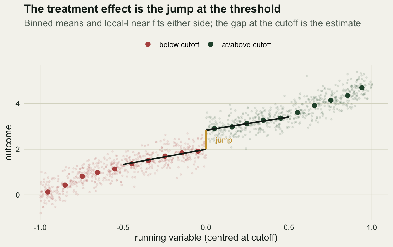
Bandwidth is the knob that matters
A narrow window keeps only comparable points but leaves few of them, so the estimate is noisy; a wide window borrows more points but lets the curved trend creep back in, biasing the jump. Sweeping the bandwidth makes the trade-off visible.
hs <- seq(0.15, 1.0, by=0.05)
sw <- lapply(hs, function(h){ e <- ll(h); data.frame(h=h, tau=e$tau, se=e$se) }) %>%
  bind_rows()
At the narrow end (bandwidth 0.15) the estimate is 0.951 with a wide error (0.09); at the wide end (bandwidth 1) it sinks to 0.655 as the curvature leaks in. Somewhere in between it passes through the truth.
ggplot(sw, aes(h, tau)) +
  geom_ribbon(aes(ymin=tau-1.96*se, ymax=tau+1.96*se), fill=sage, alpha=0.30) +
  geom_hline(yintercept=tau, linetype="dashed", colour=forest, linewidth=0.5) +
  geom_line(colour=ink, linewidth=0.7) + geom_point(colour=forest, size=1.9) +
  annotate("text", x=0.9, y=tau+0.03, label="true effect", hjust=1, colour=forest, size=3.3) +
  labs(x="bandwidth (half-width of the window around the cutoff)",
       y="estimated jump (with 95% interval)",
       title="The estimate depends on the bandwidth",
       subtitle="Too narrow: noisy. Too wide: the curved trend leaks in and biases the jump") +
  theme_te()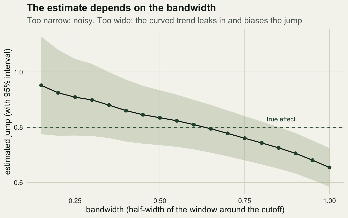
Because the answer moves with the bandwidth, the honest interval has to account for the choice. A short experiment across many datasets shows what the plain interval misses.
set.seed(8164); nsim <- 500
res <- t(sapply(1:nsim, function(i){
  xr <- runif(n,-1,1); D <- as.integer(xr>=0)
  Y  <- 2 + 0.9*xr + 1.1*xr*abs(xr) + tau*D + rnorm(n,0,0.35)
  gl <- lm(Y~D+xr); bl <- coef(gl)["D"]; cl <- confint(gl)["D",]
  keep <- abs(xr)<=h0; w <- 1-abs(xr[keep])/h0
  m  <- lm(Y~D*x, data=data.frame(Y=Y[keep],D=D[keep],x=xr[keep]), weights=w)
  bh <- coef(m)["D"]; se <- summary(m)$coef["D","Std. Error"]; ch <- bh+c(-1,1)*1.96*se
  c(lin_cov=unname(tau>=cl[1]&tau<=cl[2]), loc_cov=unname(tau>=ch[1]&tau<=ch[2]))
}))
cov_lin <- mean(res[,"lin_cov"]); cov_loc <- mean(res[,"loc_cov"])
The global-linear interval covered the truth 0% of the time: confidently wrong. The local-linear interval at 0.5 covered 76%, better but still short of 95%, because a fixed nonzero bandwidth leaves a small bias the usual interval ignores. Closing that gap is the job of data-driven bandwidth selectors and the bias-corrected intervals of Calonico, Cattaneo and Titiunik (2014).
Manipulation breaks the design
The whole argument rests on units being unable to sort themselves across the line. If they can, those just above differ from those just below in ways beyond the treatment. A density check looks for bunching: if the running variable is not manipulated, its density should be smooth through the cutoff. We compare a clean sample with one where most units just below the line were nudged just above it.
set.seed(2164)
mcc <- function(x){
  win <- 0.1; lo <- sum(x>=-win & x<0); hi <- sum(x>=0 & x<win)
  bt  <- binom.test(hi, lo+hi, 0.5)
  c(lo=lo, hi=hi, ratio=hi/lo, p=bt$p.value)
}
xr_clean <- runif(n,-1,1); xr_manip <- xr_clean
idx <- which(xr_clean >= -0.1 & xr_clean < 0)
mv  <- sample(idx, round(0.6*length(idx)))
xr_manip[mv] <- abs(xr_manip[mv])
mc_clean <- mcc(xr_clean); mc_manip <- mcc(xr_manip)
In the clean sample the counts just below and just above the line are 61 and 57, a ratio of 0.93, and the test for a jump in density gives p = 0.78: no sign of sorting. In the manipulated sample the counts are 24 and 94, a ratio of 3.9, with p far below 0.001. The formal version of this check (McCrary 2008) fits a local-linear density on each side and tests the discontinuity in its log; a clear jump is a red flag that the design has broken.
What the design buys, and what it does not
Regression discontinuity turns an arbitrary administrative line into a natural experiment, and the local-linear fit recovers the jump where a global fit cannot. Three cautions travel with it. The effect is local: it holds for units near the cutoff, not for the whole population, so a scheme’s threshold effect need not equal its effect elsewhere. The estimate depends on the bandwidth, and the plain interval understates uncertainty, so a bias-corrected interval and a sweep across bandwidths belong in every report. And the density-continuity assumption is a claim about behaviour near the line that a manipulation test can flag but never fully clear. In ecology, where thresholds hide in eligibility rules, elevations and reserve boundaries, these designs are underused and worth the care (Butsic et al. 2017; Larsen, Meng & Kendall 2019).
References
Thistlethwaite DL, Campbell DT 1960. Journal of Educational Psychology 51(6):309-317 (10.1037/h0044319).
Lee DS, Lemieux T 2010. Journal of Economic Literature 48(2):281-355 (10.1257/jel.48.2.281).
McCrary J 2008. Journal of Econometrics 142(2):698-714 (10.1016/j.jeconom.2007.05.005).
Calonico S, Cattaneo MD, Titiunik R 2014. Econometrica 82(6):2295-2326 (10.3982/ECTA11757).
Butsic V, Lewis DJ, Radeloff VC, Baumann M, Kuemmerle T 2017. Basic and Applied Ecology 19:1-10 (10.1016/j.baae.2017.01.005).
Larsen AE, Meng K, Kendall BE 2019. Methods in Ecology and Evolution 10(7):924-934 (10.1111/2041-210X.13190).