library(vegan)
library(dplyr)
library(ggplot2)
te_canvas <- theme(plot.background  = element_rect(fill = "#f5f4ee", colour = NA),
                   panel.background = element_rect(fill = "#f5f4ee", colour = NA))

set.seed(11)
S <- 200
geom_sad <- function(R, k) { w <- k^(0:(R - 1)); w / sum(w) }   # uneven
even_sad <- function(R) rep(1 / R, R)                            # even
draw_site <- function(rich, N, sad) {
  cnt <- as.vector(rmultinom(1, N, sad))
  out <- numeric(S); out[seq_len(rich)] <- cnt; out
}

comm <- rbind(
  Riverine  = draw_site(95, 6000, geom_sad(95, 0.88)),   # uneven, sampled deeply
  Upland    = draw_site(120,  60, even_sad(120)),         # even and richer, barely sampled
  Disturbed = draw_site(16,  600, geom_sad(16, 0.80))     # genuinely poor
)
colnames(comm) <- paste0("sp", seq_len(S))Rarefaction and accumulation curves in R
R
community ecology
diversity
ecology tutorial
More individuals and more plots both raise the species count, whatever the true richness. Rarefaction and accumulation curves separate diversity from effort.
Step 13 of the Tidy Ecology course, Part three: describe the community.
Species richness, the plain count of species in a sample, is the most intuitive diversity measure there is. It is also the most easily fooled by effort. Count more individuals and you find more species. Walk more plots and you find more species. Neither increase tells you the community is richer; it tells you that you looked harder. When two sites were sampled with different effort, their raw species counts are not comparable, and ranking them by those counts can be exactly wrong.
Rarefaction and accumulation curves are the standard fix. They put richness on a common footing so that a comparison reflects the communities rather than the fieldwork. This post builds both in R with the vegan package and shows a case where the raw ranking reverses once effort is equalised.
Two questions, two curves
The two curve types answer different questions, and mixing them up is a common source of confusion.
Individual-based rarefaction asks: if I had counted only n individuals at this site, how many species would I expect to have seen? It interpolates a single site’s richness down to smaller numbers of individuals, using the formula from Hurlbert (1971). This is the tool for comparing sites that were sampled to different depths: read every site’s curve down to the smallest site’s sample size and compare there.
Sample-based accumulation asks: as I add survey plots, how does the total species count grow? It accumulates richness across sampling units rather than individuals. This is the tool for a different question, whether a survey has captured most of the species present, or whether more plots would keep turning up new ones.
The first is about fair comparison; the second is about completeness. Both come from the same idea, that richness is a function of effort and you have to say which level of effort you mean.
The trap: comparing raw counts
Gotelli and Colwell (2001) laid out why raw richness comparisons mislead and why rarefaction is the remedy. The short version: a larger sample almost always contains more species than a smaller one drawn from the same community, purely because rarer species need more draws to appear. So a site that was sampled harder gets a head start that has nothing to do with its diversity. The worked example below makes that head start visible, and shows it can be large enough to flip a ranking.
Worked example 1: individual-based rarefaction
Here are three sites built so that sampling effort and true richness pull in different directions. The data is synthetic and illustrative. “Riverine” is a moderately rich but very uneven community sampled deeply (6000 individuals). “Upland” holds the largest species pool of the three and its species are evenly abundant, but it was barely sampled (60 individuals). “Disturbed” is a genuinely species-poor community sampled moderately. The pool sizes are written into the draw_site calls below, so the true ranking is known: Upland first, then Riverine, then Disturbed.
First the raw and rarefied richness side by side. Observed richness is just the count of species present; rarefy gives the expected richness if each site were thinned to the common sample size, which here is the size of the smallest site.
common_N <- min(rowSums(comm))
data.frame(
  individuals = rowSums(comm),
  observed    = specnumber(comm),
  rarefied    = round(as.numeric(rarefy(comm, common_N)), 1)
)
individuals observed rarefied
Riverine 6000 61 20.4
Upland 60 48 48.0
Disturbed 600 16 12.4n_riv <- rowSums(comm)[["Riverine"]]
n_upl <- rowSums(comm)[["Upland"]]
obs_upl <- specnumber(comm)[["Upland"]]
raw_gap <- specnumber(comm)[["Riverine"]] - obs_upl
rar <- as.numeric(rarefy(comm, common_N))
names(rar) <- rownames(comm)
rar_riv <- round(rar[["Riverine"]])
rar_upl <- round(rar[["Upland"]])
n_seq <- 2:n_riv
n_match <- n_seq[which(as.numeric(rarefy(comm["Riverine", , drop = FALSE], n_seq)) >= obs_upl)[1]]Read those two richness columns against each other. By raw count, Riverine looks like the richest site, 13 species ahead of Upland. Thin everything to the common effort and the order reverses: Upland is expected to hold 48 species at that sample size, while Riverine drops to roughly 20. The reversed order is the one that matches the pools the sites were built from, so Riverine’s apparent lead was an artefact of counting 6000 individuals instead of 60. Disturbed, meanwhile, stays poor whether you rarefy it or not, which is the other half of the lesson: its low count is real, not a sampling shortfall.
The curves show why. Plotting expected richness against number of individuals for each site, the comparison is whatever sits above the dashed common-effort line.
curve_df <- do.call(rbind, lapply(rownames(comm), function(s) {
  N    <- sum(comm[s, ])
  grid <- unique(round(exp(seq(log(1), log(N), length.out = 80))))
  data.frame(site = s, n = grid,
             richness = as.numeric(rarefy(comm[s, , drop = FALSE], grid)))
}))
rare_at_common <- data.frame(site = rownames(comm), n = common_N,
                             richness = as.numeric(rarefy(comm, common_N)))
endpts <- curve_df %>% group_by(site) %>% slice_max(n, n = 1) %>% ungroup()
sitecols <- c(Riverine = "#275139", Upland = "#c98a2e", Disturbed = "#3a7ca5")

ggplot(curve_df, aes(n, richness, color = site)) +
  geom_vline(xintercept = common_N, linetype = "dashed", color = "#16241d", linewidth = 0.4) +
  geom_line(linewidth = 0.9) +
  geom_point(data = endpts, size = 2.6) +
  geom_point(data = rare_at_common, shape = 21, fill = "white", stroke = 1.1, size = 2.6) +
  annotate("text", x = common_N, y = 2, label = paste0("common N = ", common_N),
           hjust = -0.05, size = 3.2, color = "#16241d") +
  scale_color_manual(values = sitecols, name = NULL) +
  scale_x_log10() +
  labs(x = "individuals sampled (log scale)", y = "expected species richness") +
  theme_minimal(base_size = 12) + te_canvas + theme(legend.position = "top")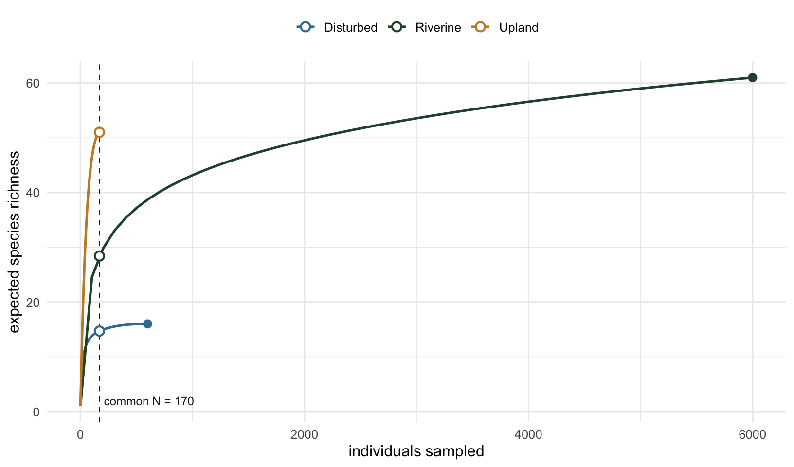
The filled dots are each site’s observed richness at its own sample size, the open dots are the rarefied values at the common effort. Upland’s curve climbs fast because its species are evenly abundant, so each extra individual has a good chance of being one you have not recorded yet. Riverine’s climbs slowly because a few common species dominate the early draws and the rest are rare: it takes 1702 individuals before Riverine has accumulated the 48 species Upland showed in 60. The deep sample lets Riverine eventually pass Upland in raw count, but at equal effort it is nowhere close. The vertical gap at the dashed line is the honest comparison.
Worked example 2: accumulation and how much is left
The second question is completeness. Here is a survey of 16 plots from one habitat, and the species accumulation curve as plots are added. specaccum with the exact method gives the expected curve and its standard deviation analytically, and specpool estimates how many species the habitat holds in total, including ones not yet seen.
set.seed(21)
n_plots <- 16; Spool <- 40
commonness <- sort(rbeta(Spool, 0.7, 1.3), decreasing = TRUE)
plots <- t(sapply(seq_len(n_plots), function(p) rbinom(Spool, 1, commonness) * rpois(Spool, 6)))
colnames(plots) <- paste0("sp", seq_len(Spool))
plots <- plots[, colSums(plots) > 0, drop = FALSE]

sac  <- specaccum(plots, method = "exact")
pool <- specpool(plots)
round(pool[c("Species", "chao", "chao.se", "jack1")], 1)
Species chao chao.se jack1
All 34 39.9 7.1 38.7obs_species <- pool$Species
chao_total <- round(pool$chao)
found_pct <- 100 * pool$Species / pool$chaoThe survey observed 34 species across the 16 plots. The Chao2 estimator puts the total closer to 40, so roughly 85% of the estimated species pool has been found, and a handful are likely still out there. The curve below makes the gap concrete: it has bent over but not flattened, and the distance up to the Chao2 line is the richness more plots would probably recover.
sac_df <- data.frame(sites = sac$sites, richness = sac$richness, sd = sac$sd)
ggplot(sac_df, aes(sites, richness)) +
  geom_ribbon(aes(ymin = richness - 2 * sd, ymax = richness + 2 * sd),
              fill = "#275139", alpha = 0.15) +
  geom_line(color = "#275139", linewidth = 0.9) +
  geom_point(color = "#275139", size = 2) +
  geom_hline(yintercept = pool$chao, linetype = "dashed", color = "#c98a2e", linewidth = 0.5) +
  annotate("text", x = 2, y = pool$chao, label = paste0("Chao2 estimate = ", round(pool$chao)),
           vjust = -0.6, hjust = 0, size = 3.2, color = "#c98a2e") +
  scale_x_continuous(breaks = seq(2, 16, 2)) +
  labs(x = "plots surveyed", y = "accumulated species richness") +
  theme_minimal(base_size = 12) + te_canvas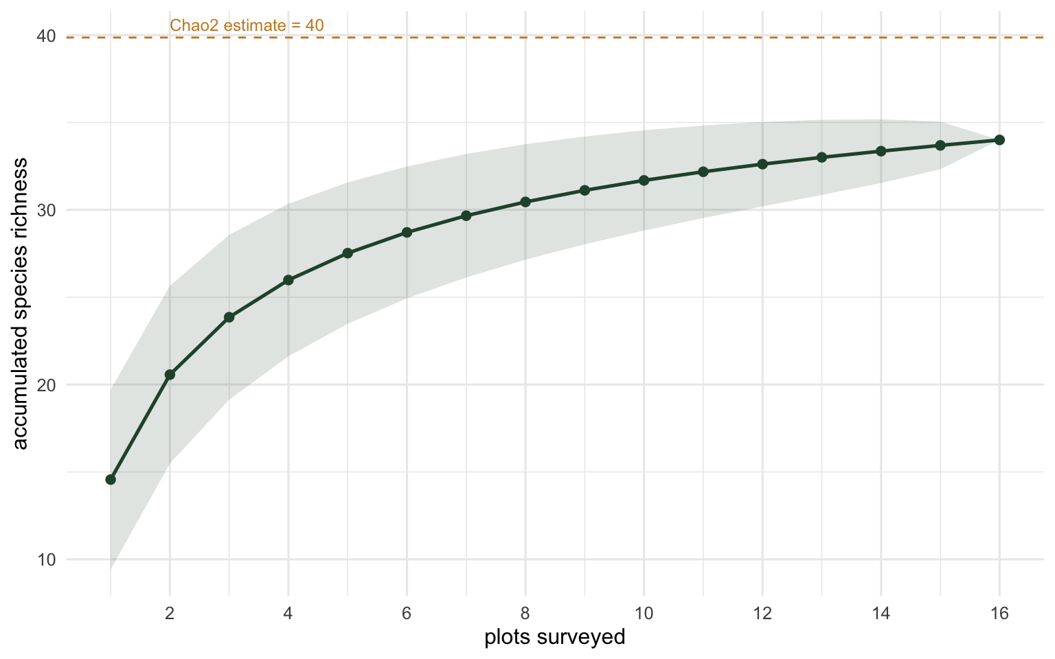
A curve still climbing steeply says keep sampling. A curve that has flattened is weaker evidence than it looks: it says only that the last few plots added little, which happens when the pool is nearly exhausted and also when what is left is too rare to appear at this effort. Read a plateau as consistent with a near-complete survey rather than as proof of one, and let the Chao2 line put a number on the gap that is still open.
The modern framing: Hill numbers and coverage
The approach here, rarefy everything to a common number of individuals or plots, is the classic one and still perfectly serviceable. Two refinements have become standard since. First, Colwell and colleagues (2012) unified rarefaction with extrapolation, so you can project a curve a little beyond your sample rather than only thinning the larger ones down, which avoids discarding data from the deep samples. Second, Chao and Jost (2012) argued for standardising by sample completeness (coverage) instead of raw size, since equal numbers of individuals can still represent very different fractions of two communities. Both ideas, together with Hill numbers as a richness-to-evenness family, are implemented in the iNEXT package (Hsieh, Ma and Chao 2016). For a serious diversity comparison today, that is the toolkit to reach for; the vegan functions shown here are the right way to understand what it is doing underneath.
Caveats
Rarefaction assumes your counts are counts of individuals drawn from the community, and that the samples are comparable in everything except size. If individuals are not independent (clustered colonial organisms, or counts that are really biomass), the expected-richness formula does not strictly apply. The estimators are stricter still: Chao1 counts the species represented by exactly one and exactly two individuals, so it has nothing to work with when the recorded quantity is cover or biomass, and rounding such a quantity to integers to make the function run gives an answer that tracks the recording resolution rather than the community. Chao2, the estimator plotted above, needs only presence and absence in each plot, which is why it is the safer choice when the abundance measure is not a count.
Down-sampling to the smallest site throws away information from the larger samples. With very unequal sample sizes, the common effort can be so small that the comparison is imprecise, which is part of why extrapolation-based methods became popular.
A rarefied comparison also ranks sites by expected richness at one particular effort, and that expectation depends on evenness as well as on the size of the species pool. Two curves can cross, and then the site that leads at a small common sample size is not the one that leads at a larger one. Look at the curves before you trust a single rarefied number, and say which effort a ranking refers to.
Richness, the focus here, is the diversity measure most sensitive to rare species and therefore to sampling. If you care about the common, abundant part of the community, an evenness-weighted measure (Shannon, Simpson, or Hill numbers of order one or two) is both more stable and often more ecologically relevant. Richness is where rarefaction matters most precisely because it is the most effort-dependent.
References
Chao A and Jost L 2012 Ecology 93(12):2533-2547 (10.1890/11-1952.1)
Colwell RK, Chao A, Gotelli NJ, Lin S-Y, Mao CX, Chazdon RL and Longino JT 2012 Journal of Plant Ecology 5(1):3-21 (10.1093/jpe/rtr044)
Gotelli NJ and Colwell RK 2001 Ecology Letters 4(4):379-391 (10.1046/j.1461-0248.2001.00230.x)
Hsieh TC, Ma KH and Chao A 2016 Methods in Ecology and Evolution 7(12):1451-1456 (10.1111/2041-210X.12613)
Hurlbert SH 1971 Ecology 52(4):577-586 (10.2307/1934145)