library(ggplot2)

theme_te <- function(base_size = 12) {
  theme_minimal(base_size = base_size) +
    theme(
      plot.background  = element_rect(fill = "#f5f4ee", colour = NA),
      panel.background = element_rect(fill = "#f5f4ee", colour = NA),
      panel.grid.major = element_line(colour = "#dad9ca", linewidth = 0.3),
      panel.grid.minor = element_blank(),
      axis.text   = element_text(colour = "#46604a"),
      axis.title  = element_text(colour = "#2c3a31"),
      plot.title  = element_text(colour = "#16241d", face = "bold"),
      plot.subtitle = element_text(colour = "#5d6b61"),
      legend.position = "none"
    )
}
forest <- "#275139"; red <- "#b5534e"; ink <- "#16241d"; faint <- "#5d6b61"Species-area relationships in R
ecology tutorial
R
biogeography
species richness
regression
community ecology
Fit species-area relationships in R: the power law and the logarithmic model, why the power exponent z matters, and how nls differs from log-log regression.
Sample a larger area and you find more species. The species-area relationship is one of the few genuine laws in ecology, and putting a curve through it lets you compare places, predict richness at unsampled scales, and reason about habitat loss. Two models have carried the idea for a century: the power law of Arrhenius (1921) and the logarithmic model of Gleason (1922). This post fits both in R, explains the exponent that ecologists actually report, and works through a fitting choice that quietly changes the answer.
Two models
The power law states that richness rises as a power of area:
S = c A^z
Taking logs of both sides turns it into a straight line, log S = log c + z log A, so on log-log axes a power-law community is a line with slope z. That exponent is the quantity worth remembering: it usually sits between 0.15 and 0.35, and it travels well between studies.
The Gleason model instead makes richness a linear function of log area:
S = c + z log A
This is the logarithmic, or semi-log, model. It is sometimes called the exponential model, but that label is misleading; Dengler (2009) recommends calling it logarithmic, since richness grows with the logarithm of area rather than exponentially. On semi-log axes it is the straight line, and on log-log axes it curves.
We simulate a dataset spanning four orders of magnitude of area, with richness generated from a power law and Poisson scatter.
set.seed(58)
n <- 24
area <- round(sort(10^runif(n, 0, 4)))        # 1 to 10^4, log-uniform
S <- rpois(n, lambda = 8 * area^0.27)          # power law with z = 0.27
S[S < 1] <- 1
dat <- data.frame(area = area, S = S)
c(n = n, area_min = min(area), area_max = max(area),
  S_min = min(S), S_max = max(S))
n area_min area_max S_min S_max
24 1 7613 4 104 Fitting the power law
There are two natural ways to fit S = c A^z. The first linearises: regress log richness on log area with lm, then read the slope as z. The second fits the curve directly on the arithmetic scale with nls, nonlinear least squares. The nls call needs starting values, and the linearised coefficients are the standard choice to seed it.
ols  <- lm(log(S) ~ log(area), data = dat)         # log-log linear
c_ols <- exp(coef(ols)[1]); z_ols <- coef(ols)[2]

nlsfit <- nls(S ~ c * area^z, data = dat,          # nonlinear least squares
              start = list(c = unname(c_ols), z = unname(z_ols)))
c_nls <- coef(nlsfit)[["c"]]; z_nls <- coef(nlsfit)[["z"]]

round(c(z_loglog_OLS = z_ols, z_nls = z_nls), 3)
z_loglog_OLS.log(area) z_nls
0.308 0.284 The two methods return different exponents: 0.308 from the linearised fit and 0.284 from the nonlinear fit. The data were generated with a true exponent of 0.27, and here the nonlinear fit landed closer. That is not a universal rule, and the next section explains why.
The Gleason model is an ordinary linear regression of richness on log area.
glf  <- lm(S ~ log(area), data = dat)
c_gl <- coef(glf)[1]; z_gl <- coef(glf)[2]
round(c(intercept = c_gl, slope = z_gl), 2)
intercept.(Intercept) slope.log(area)
-8.02 9.34 On the arithmetic scale the two model shapes are easy to tell apart. The power law keeps curving upward, while the logarithmic model bends over and grows ever more slowly.
sst <- sum((dat$S - mean(dat$S))^2)
R2_nls <- 1 - sum((dat$S - predict(nlsfit))^2) / sst
R2_gl  <- 1 - sum((dat$S - predict(glf))^2) / sst

grid <- data.frame(area = exp(seq(log(1), log(max(dat$area)), length.out = 200)))
grid$power   <- c_nls * grid$area^z_nls
grid$gleason <- c_gl + z_gl * log(grid$area); grid$gleason[grid$gleason < 0] <- NA

ggplot(dat, aes(area, S)) +
  geom_point(colour = ink, size = 2, alpha = 0.8) +
  geom_line(data = grid, aes(area, power), colour = forest, linewidth = 1) +
  geom_line(data = grid, aes(area, gleason), colour = red, linewidth = 1, linetype = "21") +
  annotate("text", x = max(dat$area), y = c_nls * max(dat$area)^z_nls,
           label = sprintf("power  (R2 = %.2f)", R2_nls), hjust = 1.02, vjust = -0.6,
           colour = forest, size = 3.5, fontface = "bold") +
  annotate("text", x = max(dat$area) * 0.9, y = c_gl + z_gl * log(max(dat$area)),
           label = sprintf("Gleason  (R2 = %.2f)", R2_gl), hjust = 1, vjust = 1.9,
           colour = red, size = 3.5, fontface = "bold") +
  labs(x = "area (arbitrary units)", y = "species richness",
       title = "Two species-area models on the arithmetic scale",
       subtitle = "power keeps curving up; the logarithmic model bends over") +
  theme_te()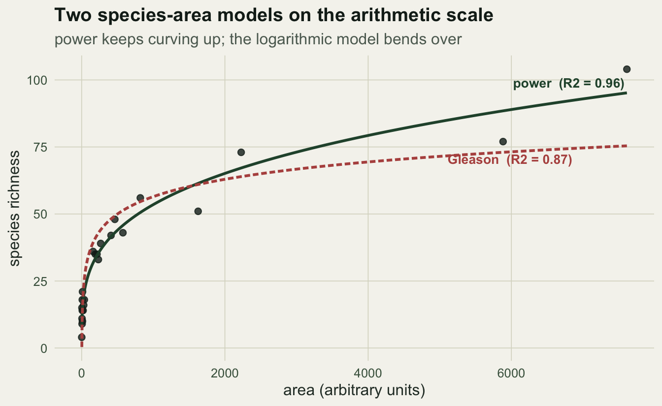
The power law captures the largest plots that the logarithmic model leaves behind, and its slope on log-log axes is the exponent z you would report.
ggplot(dat, aes(area, S)) +
  geom_point(colour = ink, size = 2, alpha = 0.8) +
  geom_line(data = grid, aes(area, power), colour = forest, linewidth = 1) +
  geom_line(data = grid, aes(area, gleason), colour = red, linewidth = 1, linetype = "21") +
  scale_x_log10() + scale_y_log10() +
  annotate("text", x = 30, y = max(dat$S) * 0.95,
           label = sprintf("power law: slope z = %.3f", z_nls),
           hjust = 0, colour = forest, size = 3.7, fontface = "bold") +
  annotate("text", x = 30, y = max(dat$S) * 0.72,
           label = "Gleason curves on log-log axes",
           hjust = 0, colour = red, size = 3.5) +
  labs(x = "area (log scale)", y = "species richness (log scale)",
       title = "The power law is a straight line in log-log",
       subtitle = "its slope is the exponent z, the number ecologists compare across studies") +
  theme_te()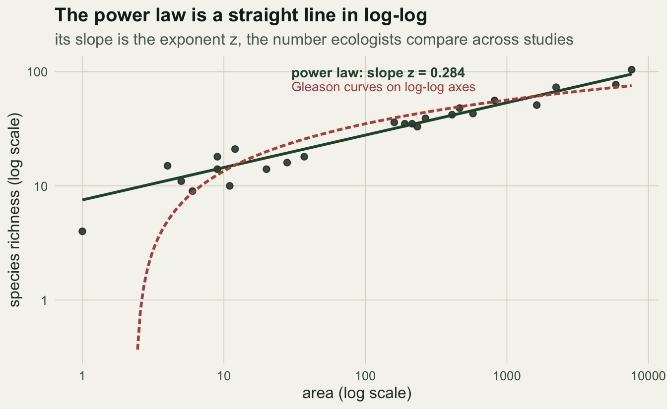
Choosing between models
For these data the power law wins, with an arithmetic-scale R-squared of 0.96 against 0.87 for the logarithmic model. A fair information criterion agrees.
gl_nls <- nls(S ~ a + b * log(area), data = dat,
              start = list(a = unname(c_gl), b = unname(z_gl)))
round(c(AIC_power = AIC(nlsfit), AIC_gleason = AIC(gl_nls)), 1)
AIC_power AIC_gleason
151.0 178.2 The power model carries the lower AIC by a wide margin. This is the common outcome: across hundreds of datasets the power law is the best or near-best model more often than any rival (Dengler 2009). It is not automatic, though, so fit both and let the data decide rather than reaching for one out of habit. The choice matters most outside the sampled range, where the two curves diverge sharply; a logarithmic model and a power model that agree across your plots can predict wildly different richness when extrapolated to a whole region.
OLS or nls for the power law?
The gap between the two exponents, 0.308 from linearising and 0.284 from nls, is not a rounding artefact. The two methods rest on different assumptions about where the scatter comes from (Connor and McCoy 1979).
grid$ols <- c_ols * grid$area^z_ols
ggplot(dat, aes(area, S)) +
  geom_point(colour = faint, size = 1.9, alpha = 0.7) +
  geom_line(data = grid, aes(area, power), colour = forest, linewidth = 1) +
  geom_line(data = grid, aes(area, ols), colour = red, linewidth = 1, linetype = "21") +
  annotate("text", x = max(dat$area), y = c_nls * max(dat$area)^z_nls,
           label = sprintf("nls: z = %.3f", z_nls), hjust = 1.03, vjust = 2.2,
           colour = forest, size = 3.6, fontface = "bold") +
  annotate("text", x = max(dat$area), y = c_ols * max(dat$area)^z_ols,
           label = sprintf("log-log OLS: z = %.3f", z_ols), hjust = 1.03, vjust = -1,
           colour = red, size = 3.6, fontface = "bold") +
  labs(x = "area (arbitrary units)", y = "species richness",
       title = "Same power model, two fitting methods",
       subtitle = "fitting the curve directly and linearising then back-transforming disagree") +
  theme_te()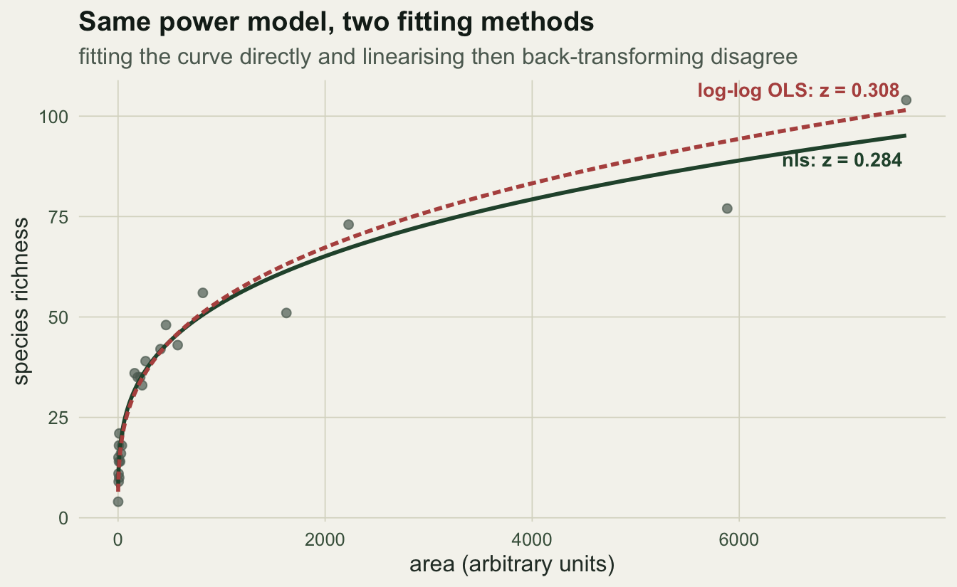
Log-log regression minimises squared deviations in log space, which treats the scatter as proportional: a small plot missing two species and a large plot missing twenty count the same. That matches multiplicative, roughly lognormal error. Nonlinear least squares minimises deviations on the arithmetic scale, which treats the scatter as absolute and lets the species-rich plots pull hardest on the fit. Neither is correct in the abstract; the right one depends on how your counts actually vary around the curve. A further trap sits in the back-transformation: predicting on the log scale and applying exp returns the median, not the mean, so arithmetic-scale predictions from a log-log fit are biased low unless you add a variance correction. Decide the method from the error structure, and state which you used.
What to take away
Fit the species-area relationship with the power law and the logarithmic model, compare them on the same footing, and report the power exponent z, which is what other studies will compare against. When you fit the power law, choose between log-log regression and nls deliberately rather than defaulting to the convenient straight line, because they encode different error models and can disagree enough to change a conclusion. Keep the relationship separate from a species accumulation curve, which adds plots within one area, and from a species-abundance distribution, which describes how individuals divide among species at a fixed scale.
References
Arrhenius, O. 1921. Journal of Ecology 9(1):95-99 (10.2307/2255763).
Gleason, H.A. 1922. Ecology 3(2):158-162 (10.2307/1929150).
Connor, E.F. and McCoy, E.D. 1979. American Naturalist 113(6):791-833 (10.1086/283438).
Dengler, J. 2009. Journal of Biogeography 36(4):728-744 (10.1111/j.1365-2699.2008.02038.x).