---
title: "Quantile regression in ecology: beyond the mean"
description: "Least squares fits the mean; quantile regression fits any part of the response distribution. A from-scratch look at the check loss and its ecological uses."
date: "2026-05-31 14:00"
categories: [quantile regression, R, ecology tutorial, ggplot2]
image: thumbnail.png
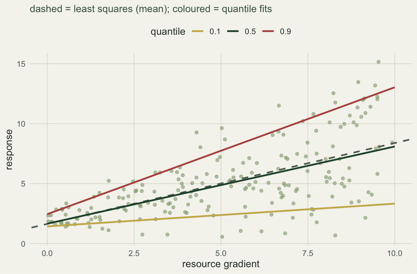
image-alt: "A scatter over a resource gradient with a dashed least-squares line that climbs at almost the same rate as the 0.5 quantile fit, and three quantile-regression fits for 0.1, 0.5 and 0.9 that fan apart as the gradient rises."
---
Fit a straight line to an ecological scatter and you usually fit the mean: least squares finds the line that minimises squared residuals, which is an estimate of the conditional average of the response. That is the right target when the interesting signal lives in the centre of the distribution. Often it does not. When the spread of the response changes across a gradient, or when the ecologically important relationship sits near an upper or lower edge, the mean is a poor summary and can hide the pattern you care about.
Quantile regression estimates the conditional quantiles instead: the line below which a chosen fraction of the response is expected to fall. This first post builds it from scratch in base R, shows how it differs from least squares on heteroscedastic data, and sets up the rest of the cluster: limiting factors and wedge-shaped scatter, modelling the spread directly, and checking a quantile fit.
## A gradient where the spread grows
We simulate a resource gradient `x` and a response whose average rises gently with `x` but whose spread widens as `x` increases. The true conditional-mean slope is 0.6; the standard deviation of the response grows from about 0.5 to about 4 across the range.
```{r}
#| label: setup
#| echo: false
#| message: false
#| warning: false
library(ggplot2); library(dplyr); library(tidyr)
ink <- "#16241d"; body <- "#2c3a31"; forest <- "#275139"
sage <- "#93a87f"; paper <- "#f5f4ee"; line <- "#dad9ca"
faint <- "#5d6b61"; warm <- "#b5534e"; gold <- "#c9b458"
theme_te <- function(base_size = 12) {
theme_minimal(base_size = base_size) +
theme(plot.background = element_rect(fill = paper, colour = NA),
panel.background = element_rect(fill = paper, colour = NA),
panel.grid.major = element_line(colour = line, linewidth = 0.3),
panel.grid.minor = element_blank(),
axis.text = element_text(colour = faint),
axis.title = element_text(colour = body),
plot.subtitle = element_text(colour = "#46604a"),
legend.position = "top", legend.key = element_blank(),
legend.text = element_text(colour = body),
legend.title = element_text(colour = body))
}
```
```{r}
#| label: data
set.seed(4202)
n   <- 200
x   <- runif(n, 0, 10)                 # resource gradient
sdx <- 0.5 + 0.35 * x                  # spread grows with the gradient
y   <- 2 + 0.6 * x + rnorm(n, 0, sdx)  # true conditional-mean slope 0.6

ols <- lm(y ~ x)
coef(ols)[2]
```
```{r}
#| label: spread
#| echo: false
lo <- x < quantile(x, 1/3); hi <- x > quantile(x, 2/3)
r_ols_slope <- round(unname(coef(ols)[2]), 3)
r_ols_se <- round(summary(ols)$coefficients[2, 2], 3)
r_sd_lo <- round(sd(y[lo]), 2); r_sd_hi <- round(sd(y[hi]), 2)
```
The least-squares slope is `r r_ols_slope` (standard error `r r_ols_se`), a fine estimate of the average trend. It says nothing about the widening: the response standard deviation is `r r_sd_lo` in the lowest third of the gradient and `r r_sd_hi` in the highest third. A single mean line cannot show that.
## The check loss, by hand
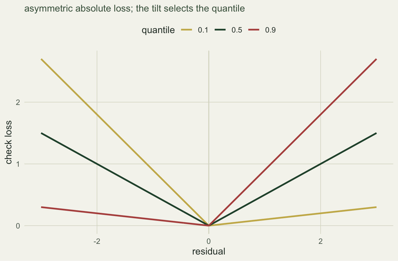
Least squares minimises the sum of squared residuals. Quantile regression at level tau minimises the sum of an asymmetric absolute loss, the check loss:
$$\rho_\tau(u) = u\,(\tau - \mathbf{1}[u < 0]).$$
For tau = 0.5 this is just the absolute value (scaled), so median regression minimises the sum of absolute residuals. For tau > 0.5 it penalises points that fall below the line more lightly than points above, which pushes the fit upward until a fraction tau of the data sits below it. Minimising this loss over the intercept and slope is a small optimisation, and we can hand it to `optim`:
```{r}
#| label: qr
rho <- function(u, tau) u * (tau - (u < 0))
qrfit <- function(x, y, tau) {
  obj <- function(b) sum(rho(y - (b[1] + b[2] * x), tau))
  optim(unname(coef(lm(y ~ x))), obj, method = "Nelder-Mead",
        control = list(reltol = 1e-12, maxit = 8000))$par
}
taus <- c(0.1, 0.5, 0.9)
qest <- t(sapply(taus, function(t) qrfit(x, y, t)))
rownames(qest) <- taus; colnames(qest) <- c("intercept", "slope")
round(qest, 3)
```
```{r}
#| label: qr-scalars
#| echo: false
r_q <- round(qest[, "slope"], 3)
r_qth <- round(0.6 + 0.35 * qnorm(taus), 3)
fb <- sapply(seq_along(taus), function(i) mean(y < qest[i, 1] + qest[i, 2] * x))
r_fb <- round(fb, 2)
```
The slopes climb across the distribution: `r r_q[1]` at the tenth percentile, `r r_q[2]` at the median, and `r r_q[3]` at the ninetieth. Because the true response is the mean plus a spread that grows with `x`, the tau-quantile slope should be 0.6 plus 0.35 times the standard normal quantile, that is `r r_qth[1]`, `r r_qth[2]` and `r r_qth[3]`. The estimates track that shape. The mean slope of `r r_ols_slope` is one number in the middle of a whole family.
```{r}
#| label: fig-quantile-fan
#| echo: false
#| fig-cap: "The mean line (dashed) is one summary; the quantile fits fan apart because the spread grows with the gradient."
#| fig-alt: "Scatter of response against a resource gradient with a dashed least-squares line and three coloured quantile lines fanning outward toward higher x."
#| fig-width: 7
#| fig-height: 4.6
xg <- seq(0, 10, length.out = 50)
qdf <- do.call(rbind, lapply(seq_along(taus), function(i)
data.frame(x = xg, y = qest[i, 1] + qest[i, 2] * xg, tau = factor(taus[i]))))
ggplot() +
geom_point(aes(x, y), colour = sage, alpha = 0.6, size = 1.5) +
geom_abline(intercept = coef(ols)[1], slope = coef(ols)[2],
colour = faint, linetype = "dashed", linewidth = 0.9) +
geom_line(data = qdf, aes(x, y, colour = tau), linewidth = 1) +
scale_colour_manual(values = c("0.1" = gold, "0.5" = forest, "0.9" = warm),
name = "quantile") +
labs(x = "resource gradient", y = "response",
subtitle = "dashed = least squares (mean); coloured = quantile fits") +
theme_te()
```
## A mechanical check and a useful property
A fitted quantile line has a defining feature: in the sample, close to a fraction tau of the points fall below it. Here the fractions below the tenth, median and ninetieth fits are `r r_fb[1]`, `r r_fb[2]` and `r r_fb[3]`, matching the target levels. That is not a coincidence; it follows from the check loss and is worth remembering when we come to checking, because in a fresh sample the fractions can drift.
The by-hand `optim` fit reproduces the exact linear-programming solution used by dedicated quantile-regression software (checked separately against the standard algorithm), so nothing here depends on a special package.
The median fit also carries a property that the mean lacks: it is insensitive to a single extreme point. Move the largest-`x` observation up by 40 units and refit:
```{r}
#| label: outlier
yo <- y; io <- which.max(x); yo[io] <- yo[io] + 40
c(ols = unname(coef(lm(yo ~ x))[2]),
  median_qr = qrfit(x, yo, 0.5)[2])
```
```{r}
#| label: outlier-scalars
#| echo: false
r_ols_out <- round(unname(coef(lm(yo ~ x))[2]), 3)
r_med_out <- round(qrfit(x, yo, 0.5)[2], 3)
```
The least-squares slope jumps from `r r_ols_slope` to `r r_ols_out`, dragged by the outlier. The median slope is unchanged at `r r_med_out`: it depends on the ordering of residuals, not their magnitude, so a point that is already above the line can move further without shifting the fit.
The check loss shows why the two disagree. For tau = 0.5 the loss is symmetric in the residual sign; for tau = 0.1 and tau = 0.9 the tilt pushes the fit down or up.
```{r}
#| label: fig-check-loss
#| echo: false
#| fig-cap: "The check loss for three quantile levels. The tilt away from symmetry is what selects a quantile rather than the mean."
#| fig-alt: "Three V-shaped loss curves against residual value, with different left and right slopes for the tenth, median and ninetieth percentiles."
#| fig-width: 7
#| fig-height: 4.6
u <- seq(-3, 3, length.out = 300)
ldf <- do.call(rbind, lapply(taus, function(t)
data.frame(u = u, loss = rho(u, t), tau = factor(t))))
ggplot(ldf, aes(u, loss, colour = tau)) +
geom_vline(xintercept = 0, colour = line) +
geom_line(linewidth = 1) +
scale_colour_manual(values = c("0.1" = gold, "0.5" = forest, "0.9" = warm),
name = "quantile") +
labs(x = "residual", y = "check loss",
subtitle = "asymmetric absolute loss; the tilt selects the quantile") +
theme_te()
```
## What comes next
The honest limit sits in the tail. The median is insensitive to outliers, but the extreme quantiles are estimated from the sparse edges of the data, so a tau = 0.95 or tau = 0.99 slope rests on a handful of points and is far less certain than the median. The next three posts follow this through: the upper quantile as an estimate of a limiting factor, modelling the spread with a distributional model, and the diagnostics that keep a quantile fit honest, including how quickly the tail slope becomes unreliable.
## References
Koenker and Bassett 1978 Econometrica 46(1):33-50 (10.2307/1913643)
Koenker and Hallock 2001 Journal of Economic Perspectives 15(4):143-156 (10.1257/jep.15.4.143)
Cade and Noon 2003 Frontiers in Ecology and the Environment 1(8):412-420 (10.1890/1540-9295(2003)001[0412:AGITQR]2.0.CO;2)
Yu, Lu and Stander 2003 Journal of the Royal Statistical Society Series D 52(3):331-350 (10.1111/1467-9884.00363)
Koenker 2005 Quantile Regression, Cambridge University Press (ISBN 978-0-521-84573-1)
## Related tutorials
- [Heteroscedasticity and limiting factors](../heteroscedasticity-and-limiting-factors/)
- [Distributional regression with location and scale](../distributional-regression-location-scale/)
- [Checking a quantile regression](../checking-a-quantile-regression/)
- [Robust regression for ecological outliers](../robust-regression-for-outliers/)