library(gstat)
library(sf)
library(ggplot2)
library(dplyr)
library(tidyr)From scattered plots to a surface: IDW and kriging in R
R
spatial
geostatistics
interpolation
Turning sparse point measurements into a continuous map in R: the empirical variogram, inverse distance weighting, and ordinary kriging with gstat and sf, compared by cross-validation, plus the uncertainty map only kriging gives you. A spatial ecology tutorial.
Field sampling gives you values at points: a soil core here, a moisture probe there, a hundred-odd plots scattered across a landscape. The map you actually want is continuous, a value at every location, including the ones you never visited. Getting from the points to the surface is spatial interpolation, and the choice of method decides both what the map looks like and whether it can tell you how much to trust it.
This post walks the standard route in R with gstat and sf. We build a synthetic moisture field, summarise its spatial structure with an empirical variogram, interpolate it two ways, and then let cross-validation referee the comparison. The first method, inverse distance weighting, is a deterministic average that needs no model. The second, ordinary kriging, uses the variogram to weight nearby observations optimally and, unlike its rival, returns a map of its own uncertainty. The variogram is the same object that sits underneath the Moran’s I post: both are ways of asking how fast similarity decays with distance, and that decay is exactly what makes interpolation possible at all.
A field measured at points
We work with synthetic topsoil moisture over a 10 by 10 km block, projected in UTM zone 34N. The values are illustrative, generated from a Gaussian random field with a known correlation range so we can check the machinery against a truth we set. A hundred and twenty plots are dropped at random across the block, and we carry them as an sf point layer, the same container the richness mapping post used.
set.seed(2024)
n  <- 120
xy <- data.frame(x = runif(n, 0, 10), y = runif(n, 0, 10))   # km
D  <- as.matrix(dist(xy))

# underlying field: exponential covariance, partial sill 4, range 2.5 km
psill_true <- 4; range_true <- 2.5; nugget_true <- 0.5
Sigma <- psill_true * exp(-D / range_true)
field <- as.vector(crossprod(chol(Sigma), rnorm(n)))   # correlated draw
moist <- 22 + field + rnorm(n, 0, sqrt(nugget_true))   # mean 22%, plus noise

dat <- st_as_sf(data.frame(xy, moisture = moist),
                coords = c("x", "y"), crs = 32634)

c(n = n, min = round(min(moist), 1), max = round(max(moist), 1),
  mean = round(mean(moist), 1))
n min max mean
120.0 17.3 25.0 20.9 The plots span roughly 17 to 25 percent moisture around a mean near 21. Because the field was built with a 2.5 km correlation range, nearby plots should resemble each other and distant ones should not. The variogram is how we read that off the data without knowing we put it there.
The variogram: how similarity decays with distance
A variogram plots semivariance, half the mean squared difference between pairs of points, against the distance separating them. Pairs that sit close together differ little, so semivariance starts low; as separation grows, pairs differ more, and the curve climbs until it flattens at a sill once points are far enough apart to be effectively independent. Three numbers describe the fitted curve. The nugget is the semivariance extrapolated to zero distance, capturing measurement error and variation finer than the shortest sampled gap. The partial sill is the height the curve gains as it rises. The range is how far you go before the curve levels off, the distance beyond which spatial autocorrelation has faded.
ev   <- variogram(moisture ~ 1, dat, cutoff = 6, width = 0.5)
vfit <- fit.variogram(ev, vgm(psill = 3, model = "Exp", range = 2, nugget = 0.5))
vfit
model psill range
1 Nug 0.5952394 0.000000
2 Exp 3.0293640 2.222254nug <- vfit$psill[1]; psl <- vfit$psill[2]; rng <- vfit$range[2]
c(nugget = round(nug, 2), partial_sill = round(psl, 2),
range_km = round(rng, 2), practical_range_km = round(3 * rng, 2),
nugget_fraction = round(nug / (nug + psl), 2)) nugget partial_sill range_km practical_range_km
0.60 3.03 2.22 6.67
nugget_fraction
0.16 The fit recovers the structure we built. An exponential model approaches its sill asymptotically rather than touching it, so by convention its practical range, where the curve reaches about 95 percent of the sill, is three times the fitted range parameter. That lands near 6.7 km here. The nugget makes up only about a sixth of the total sill, which says most of the variation is spatially structured rather than noise, and that is the regime where interpolation earns its keep.
te_paper <- "#f5f4ee"; te_ink <- "#16241d"; te_body <- "#2c3a31"; te_line <- "#dad9ca"
base_theme <- theme_minimal(base_size = 12) +
  theme(panel.grid.minor = element_blank(),
        panel.grid.major = element_line(color = te_line, linewidth = 0.3),
        plot.background  = element_rect(fill = te_paper, color = NA),
        panel.background = element_rect(fill = te_paper, color = NA),
        axis.text   = element_text(color = te_body),
        axis.title  = element_text(color = te_ink),
        plot.title  = element_text(color = te_ink, face = "bold", size = 12),
        legend.title = element_text(color = te_ink, size = 9),
        legend.text  = element_text(color = te_body, size = 8))

vline <- variogramLine(vfit, maxdist = 6)
ggplot() +
  geom_line(data = vline, aes(dist, gamma), color = "#275139", linewidth = 1) +
  geom_point(data = ev, aes(dist, gamma, size = np), color = "#16241d") +
  geom_hline(yintercept = nug + psl, linetype = "dotted", color = "#b5534e") +
  geom_vline(xintercept = 3 * rng, linetype = "dashed", color = "#5d6b61") +
  annotate("text", x = 3 * rng, y = 0.62, label = "practical range",
           hjust = 1.1, size = 3, color = "#5d6b61") +
  scale_size_continuous(range = c(1.5, 5), name = "pairs") +
  labs(x = "Distance (km)", y = "Semivariance",
       title = "Empirical variogram with fitted exponential model") +
  base_theme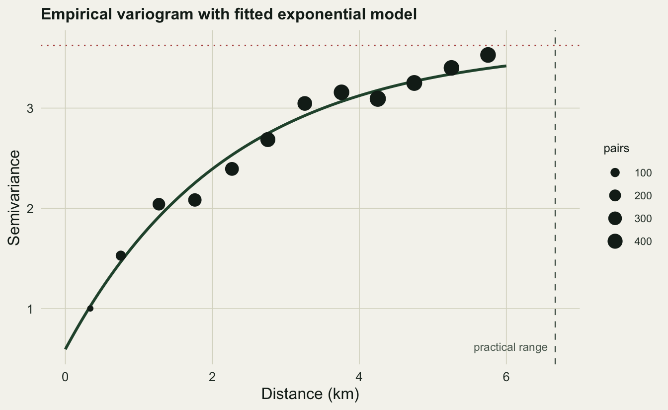
Each point aggregates many pairs of plots, and bigger points carry more pairs and so more weight in the fit. The dotted line marks the sill, the dashed line the practical range. Read together they are a compact summary of the field: how much total variation there is, and over what distance a plot tells you anything useful about its neighbours.
Inverse distance weighting: a deterministic baseline
The simplest interpolator needs no variogram at all. Inverse distance weighting predicts each unsampled location as a weighted average of the observations, with weights falling off as a power of distance, so closer plots count for more. A power of two is the usual default. It is fast, transparent, and exactly reproduces the data at sampled points, but it is purely geometric: it knows nothing about how far correlation actually reaches, and it cannot say how uncertain any prediction is.
gx  <- seq(0.25, 9.75, by = 0.25); gy <- gx
grd <- st_as_sf(expand.grid(x = gx, y = gy), coords = c("x", "y"), crs = 32634)

idw_pred <- idw(moisture ~ 1, dat, newdata = grd, idp = 2.0)
[inverse distance weighted interpolation]round(range(idw_pred$var1.pred), 1)[1] 17.4 23.9Ordinary kriging: weights from the variogram
Kriging replaces IDW’s fixed distance rule with weights derived from the fitted variogram, chosen to give the best linear unbiased prediction at each location. Because the variogram encodes both the range of correlation and the nugget, kriging downweights a cluster of redundant nearby plots, leans on isolated ones, and smooths through measurement noise in a way IDW’s blunt geometry cannot. The payoff that matters most: alongside each prediction, kriging returns a variance, and its square root is a standard error in the units of the data.
ok_pred <- krige(moisture ~ 1, dat, newdata = grd, model = vfit)[using ordinary kriging]c(pred_min = round(min(ok_pred$var1.pred), 1),
pred_max = round(max(ok_pred$var1.pred), 1),
sd_min = round(min(sqrt(ok_pred$var1.var)), 2),
sd_max = round(max(sqrt(ok_pred$var1.var)), 2))pred_min pred_max sd_min sd_max
17.70 23.40 0.94 1.55 Putting the two surfaces side by side shows the difference in character at a glance.
grad_low <- "#c9b458"; grad_high <- "#1d5b4e"
surf <- bind_rows(
  data.frame(st_coordinates(grd), z = idw_pred$var1.pred, method = "IDW (power 2)"),
  data.frame(st_coordinates(grd), z = ok_pred$var1.pred,  method = "Ordinary kriging")
)
pts <- data.frame(st_coordinates(dat), moisture = dat$moisture)

ggplot(surf, aes(X, Y, fill = z)) +
  geom_raster() +
  geom_point(data = pts, aes(X, Y), inherit.aes = FALSE,
             shape = 21, fill = NA, color = "#16241d", size = 0.8, stroke = 0.3) +
  facet_wrap(~ method) +
  scale_fill_gradient(low = grad_low, high = grad_high, name = "moisture %") +
  coord_equal() +
  labs(x = "Easting (km)", y = "Northing (km)",
       title = "Interpolated topsoil moisture: IDW vs ordinary kriging") +
  base_theme + theme(strip.text = element_text(color = te_ink, face = "bold"))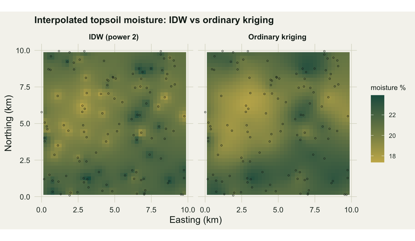
The IDW map is pocked with little halos, one bright or dark spot around each plot, because the weighting spikes at the observations and sags between them. This is the classic “bullseye” artifact. The kriging map is smooth: the variogram tells it how far influence should spread, so plots blend into a coherent surface instead of stamping local marks. Both honour the data, but only one looks like a field.
Letting cross-validation decide
Eyeballing surfaces is not enough. Leave-one-out cross-validation drops each plot in turn, predicts it from the rest, and scores the held-out errors, so a method cannot win by simply hugging the data it was given. We compare three predictors: a naive baseline that guesses the global mean everywhere, IDW, and ordinary kriging.
set.seed(1)
cv_ok   <- krige.cv(moisture ~ 1, dat, model = vfit, nfold = nrow(dat))
rmse_ok <- sqrt(mean(cv_ok$residual^2)); me_ok <- mean(cv_ok$residual)

idw_loo <- numeric(nrow(dat))
for (i in seq_len(nrow(dat))) {
  fit_i <- idw(moisture ~ 1, dat[-i, ], newdata = dat[i, ],
               idp = 2.0, debug.level = 0)
  idw_loo[i] <- fit_i$var1.pred
}
res_idw  <- dat$moisture - idw_loo
rmse_idw <- sqrt(mean(res_idw^2)); me_idw <- mean(res_idw)
rmse_mean <- sqrt(mean((dat$moisture - mean(dat$moisture))^2))

data.frame(
  method = c("global mean", "IDW (power 2)", "ordinary kriging"),
  RMSE   = round(c(rmse_mean, rmse_idw, rmse_ok), 3),
  mean_error = round(c(0, me_idw, me_ok), 3)
)
method RMSE mean_error
1 global mean 1.660 0.000
2 IDW (power 2) 1.270 -0.065
3 ordinary kriging 1.149 -0.016Both interpolators crush the global-mean baseline, which is the first thing to confirm, since if neither beat a flat guess there would be no spatial signal to exploit. Between them kriging edges IDW, cutting the held-out error by roughly nine and a half percent, and its mean error sits closer to zero, so it is the less biased of the two. The gain is real but modest. On a denser, more regular sample the two methods often converge, and the honest summary is that kriging’s predictions here are a little better, not transformatively so.
The map IDW cannot draw
If the prediction gain were the whole story, the case for kriging would be lukewarm. The decisive advantage is the uncertainty it reports. Because kriging models the spatial process, it knows that a location ringed by plots is well constrained while a location in a sampling gap is a guess, and it puts a number on that difference at every cell.
sdf <- data.frame(st_coordinates(grd), se = sqrt(ok_pred$var1.var))
ggplot(sdf, aes(X, Y, fill = se)) +
  geom_raster() +
  geom_point(data = pts, aes(X, Y), inherit.aes = FALSE,
             shape = 21, fill = "white", color = "#16241d", size = 1, stroke = 0.3) +
  scale_fill_gradient(low = "#eef2ea", high = "#7a2f2b", name = "kriging SD") +
  coord_equal() +
  labs(x = "Easting (km)", y = "Northing (km)",
       title = "Kriging standard error: uncertainty grows away from plots") +
  base_theme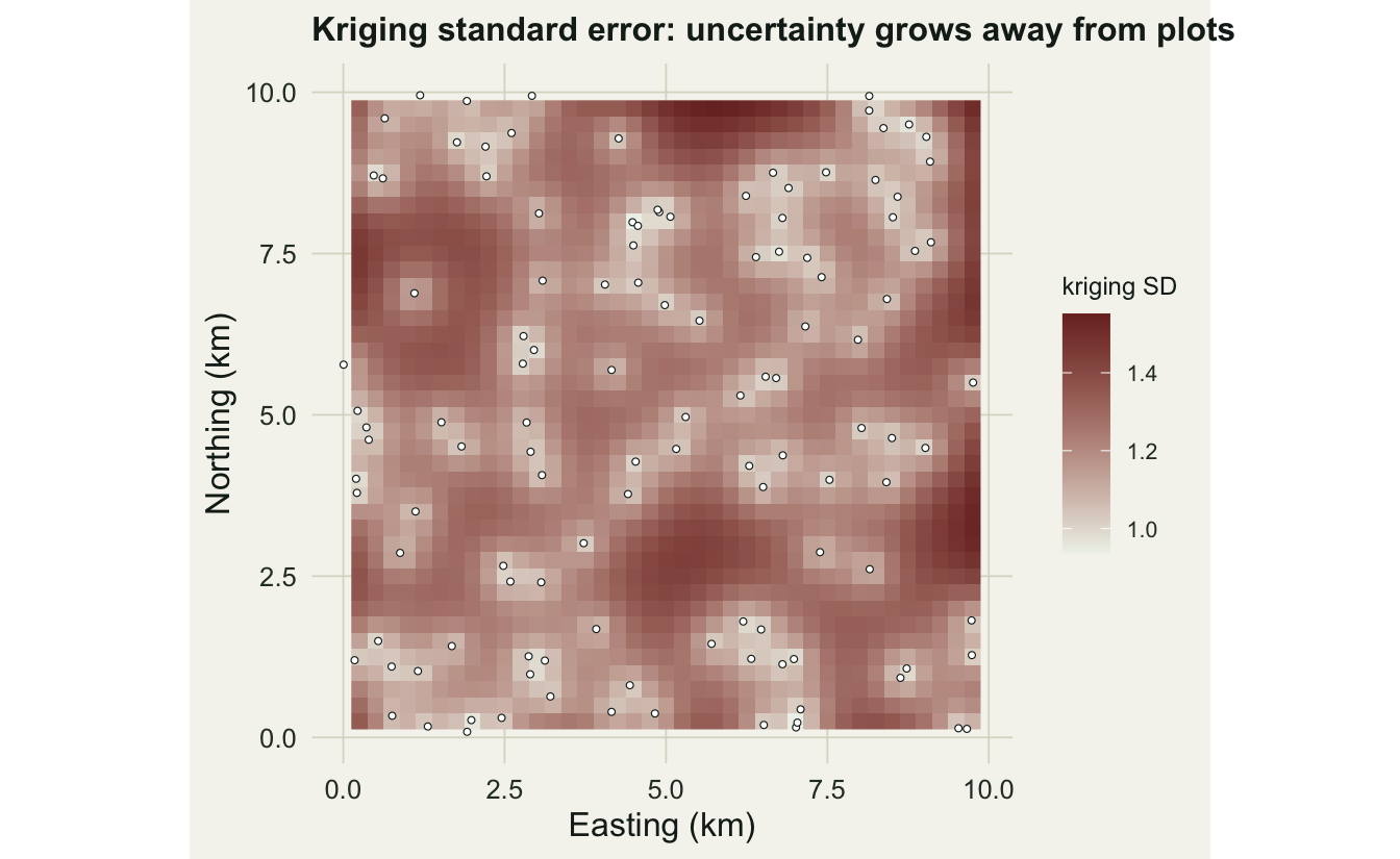
The standard error drops to under one near the plots and climbs past one and a half out in the gaps, tracing the sampling design directly. This is the map a survey planner actually wants: it shows where another visit would buy the most certainty, and it lets a downstream model carry honest error bars instead of pretending the interpolated surface is exact. No deterministic interpolator produces it.
What kriging assumes, and where it breaks
Ordinary kriging rests on stationarity: the same mean and the same variogram are taken to hold across the whole area. A landscape with a strong directional gradient, moisture falling steadily from a wet valley to a dry ridge, violates that, and forcing ordinary kriging onto it smears the trend into the residuals. The fix is to model the trend explicitly, with universal kriging or a regression-kriging hybrid, leaving the variogram to describe only what is left over.
Two more cautions are worth keeping in view. The kriging variance depends on the variogram and the sampling geometry but not on the observed values, so a badly chosen or poorly fitted variogram yields a confident-looking uncertainty map that is quietly wrong; the error surface is only as trustworthy as the variogram behind it. And real fields are often anisotropic, with correlation reaching further along a valley than across it, which an isotropic variogram cannot capture and which gstat handles through directional variograms. None of this argues against kriging. It argues for looking at the variogram before trusting the map, the same discipline the Moran’s I post urged for autocorrelation in general. To take a kriged surface further into raster-based analysis, the terra basics post picks up where this grid leaves off.
Takeaways
Spatial interpolation turns point samples into a surface, and the variogram is the hinge: it measures how fast similarity decays, through a nugget, a partial sill, and a range. Inverse distance weighting is a fast deterministic baseline that reproduces the data but invents bullseye halos and reports no uncertainty. Ordinary kriging uses the variogram to weight observations optimally, here beating IDW by about nine and a half percent in cross-validation, and, far more importantly, returning a standard-error map that grows in the sampling gaps. Mind the assumptions: stationarity fails under a trend (reach for universal kriging), the kriging variance reflects geometry rather than data values, and anisotropy needs a directional variogram. Look at the variogram before you trust the map.
References
Cressie, N. (1990). The origins of kriging. Mathematical Geology, 22(3), 239-252. https://doi.org/10.1007/BF00889887
Legendre, P. & Fortin, M.-J. (1989). Spatial pattern and ecological analysis. Vegetatio, 80(2), 107-138. https://doi.org/10.1007/BF00048036
Matheron, G. (1963). Principles of geostatistics. Economic Geology, 58(8), 1246-1266. https://doi.org/10.2113/gsecongeo.58.8.1246
Pebesma, E. J. (2004). Multivariable geostatistics in S: the gstat package. Computers & Geosciences, 30(7), 683-691. https://doi.org/10.1016/j.cageo.2004.03.012
Pebesma, E. (2018). Simple features for R: standardized support for spatial vector data. The R Journal, 10(1), 439-446. https://doi.org/10.32614/RJ-2018-009