library(ggplot2)

te_pal <- list(forest = "#275139", green = "#2f8f63", sage = "#93a87f",
               clay = "#b5534e", gold = "#cda23f", line = "#dad9ca",
               ink = "#16241d", paper = "#f5f4ee")

theme_te <- function() {
  theme_minimal(base_size = 12) +
    theme(panel.grid.minor = element_blank(),
          panel.grid.major = element_line(colour = "#e7e6dc"),
          plot.background = element_rect(fill = "#f5f4ee", colour = NA),
          panel.background = element_rect(fill = "#f5f4ee", colour = NA),
          plot.title = element_text(face = "bold", colour = te_pal$ink),
          axis.title = element_text(colour = "#2c3a31"),
          axis.text = element_text(colour = "#2c3a31"))
}Decline estimates and Red List criterion A
R
conservation
IUCN
monitoring
ecology tutorial
Turning a monitored index into an IUCN criterion A reduction in R: a confidence interval on the decline, and how often the Red List category comes out wrong.
A regional survey scheme has been counting a single bird species on sixty fixed plots every breeding season for nineteen years. One visit per plot per year, the same observers where possible, the same route through each plot, and the season’s peak count written into one column. The scheme reports an annual index: the log of the mean count per plot. The counts are not large, twenty birds per plot in a good early year, so the index wobbles from year to year with the weather and with whoever walked the transect.
The regional Red List panel now wants a category for this species, and the criterion that this dataset speaks to is criterion A: a population reduction, measured over the longer of ten years or three generations. The species is a medium-sized passerine with a generation length of about four years, so three generations is a twelve-year window and twelve is longer than ten. The panel needs one number out of nineteen years of counts, and then it needs to decide which side of a line that number falls on.
The lines are fixed and they are wide apart. A reduction of at least thirty per cent over the window qualifies the species as Vulnerable, at least fifty per cent as Endangered, at least eighty per cent as Critically Endangered, and below thirty per cent the species is not listed on this criterion at all. Mace et al (2008) set out the reasoning behind those particular numbers and behind the whole quantitative structure of the criteria; the operational detail, including what counts as a generation and how the window is chosen, is in the guidelines maintained by the IUCN Standards and Petitions Committee (2024).
Everything below is simulated. The species is generic, the plots are invented, and the true reduction is a number this post sets rather than a number about any real animal. Nothing here is a statement about the status of anything that exists.
What this post measures, and what it stays away from
Range size distributions already treats a Red List threshold as a measurement problem, and it treats the spatial one: area of occupancy and extent of occurrence against area thresholds, with a simulated atlas, and the category flipping when the grid grain, the recording effort or the choice of measure changes. This post does not touch any of that. There is no grid here, no map, no hull and no area threshold. Criterion A is a temporal measure, a population reduction against the thirty, fifty and eighty per cent thresholds, and its uncertainty comes from two places the spatial criteria never visit: a time series that has to be fitted, and a generation length that has to be assumed before the window can be drawn.
It also builds on two trend posts rather than repeating them. Estimating population trends in R is about the shape of a trend and about modelling counts as counts; the trend fitted here is deliberately the plainest possible, a straight line on the log scale, because criterion A asks for exactly one number and the interesting failure is downstream of the fit. Power to detect a population trend turns variance components into the probability of rejecting a zero trend. Criterion A does not ask whether the trend differs from zero. It asks whether the reduction exceeds thirty, or fifty, or eighty, which is a different question with a different error structure, and a scheme with ample power to reject zero can still be a coin flip on the category.
Six things get measured, in order: how a slope becomes a percentage reduction and what its interval looks like once transformed, how far the interval reaches across the category boundaries, how often the point estimate lands in the wrong category and where that error concentrates, how much the assumed generation length moves the answer against how much the survey noise moves it, how often a rolling reassessment changes the category on a population that is declining perfectly smoothly, and what an assessor should write down instead of a bare category.
The scheme, the window and the thresholds
The thresholds go into the code as a named vector, because every one of them is quoted several times below and a threshold retyped into a sentence is a threshold that can be retyped wrongly. The window follows the same rule: it is derived from the generation length and the ten-year floor rather than asserted.
thr <- c(vulnerable = 0.30, endangered = 0.50, critically_endangered = 0.80)
cat_lev <- c("Not listed on A", "Vulnerable", "Endangered",
             "Critically Endangered")

gen_len <- 4          # assumed generation length in years
n_gen <- 3            # criterion A counts three generations
min_win <- 10         # or ten years, whichever is longer
win_yr <- max(min_win, n_gen * gen_len)
n_obs <- win_yr + 1   # annual index values spanning that many years

n_plot <- 60
sd_plot <- 0.45       # persistent differences between plots
sd_year <- 0.12       # a year effect shared by the whole scheme
sd_pty <- 0.30        # plot by year departure
mu_log <- log(20)     # mean count per plot in the first year
n_hist <- 19          # years of index the scheme actually holds

red_true <- 0.45
beta_true <- log(1 - red_true) / win_yr

pp <- function(x, d = 1) sprintf(paste0("%.", d, "f"), 100 * x)

print(thr)
vulnerable endangered critically_endangered
0.3 0.5 0.8 print(c(generation_length = gen_len, generations = n_gen,
ten_year_floor = min_win, window_years = win_yr,
index_values_in_window = n_obs, years_available = n_hist)) generation_length generations ten_year_floor
4 3 10
window_years index_values_in_window years_available
12 13 19 print(round(c(true_reduction = red_true, true_log_slope = beta_true,
true_pct_per_year = 100 * (exp(beta_true) - 1)), 5)) true_reduction true_log_slope true_pct_per_year
0.45000 -0.04982 -4.85991 The window is 12 years, which takes 13 annual index values, and the scheme has 19 years to draw them from. The population underneath loses 4.86 per cent of itself every year, which compounds to a reduction of 45.0 per cent over the window. That truth sits between the Vulnerable threshold at 30 per cent and the Endangered threshold at 50 per cent, so the species really is Vulnerable on criterion A and the assessment has one job: to say so.
The generating model is the ordinary one for a plot-based scheme. Each plot has its own catchability, each year has an effect shared across the whole scheme, each plot-year has its own departure, and the count is Poisson around the result. The index is the log of the mean count per plot, which collapses the sixty plots to one figure a year before anything is fitted, because the year effect is common to all plots and treating plot-years as independent replicates for a trend would put the error term at the wrong scale.
sim_index <- function(seed, n_year, beta, noise = 1) {
  set.seed(seed)
  a_i <- rnorm(n_plot, mu_log, sd_plot)
  u_t <- rnorm(n_year, 0, sd_year * noise)
  tv <- seq_len(n_year) - 1
  e_it <- matrix(rnorm(n_plot * n_year, 0, sd_pty * noise), n_plot, n_year)
  eta <- outer(a_i, rep(1, n_year)) +
    outer(rep(1, n_plot), beta * tv + u_t) + e_it
  log(colMeans(matrix(rpois(n_plot * n_year, exp(eta)), n_plot, n_year)))
}

resid_pred <- sqrt(sd_year^2 + (sd_pty^2 + 1 / exp(mu_log)) / n_plot)
print(round(c(plots = n_plot, mean_count_year_one = exp(mu_log),
              predicted_index_sd_about_the_line = resid_pred), 4))
plots mean_count_year_one
60.0000 20.0000
predicted_index_sd_about_the_line
0.1294 The predicted scatter of the index about a straight line is 0.1294 on the log scale. Most of that is the year effect, which sixty plots do nothing to reduce: a cold spring lifts or drops every plot at once. That single quantity is what the whole assessment has to work against.
From a slope to a percentage reduction
The fit is a straight line of the index on year over the window. Its slope is a rate on the log scale, and criterion A wants a reduction over the whole window, so the two are connected by
\[R = 1 - e^{\beta W}\]
with \(W\) the window length in years. That is a nonlinear function of \(\beta\), and the nonlinearity is the first thing worth pinning down, because it decides what an interval on the reduction should look like.
Two ways of getting one are coded below. The delta method linearises: the standard error of \(R\) is \(W e^{\beta W}\) times the standard error of \(\beta\), and the interval is the estimate plus and minus a multiple of that, which is symmetric by construction. The other way is to take the ordinary interval on the slope and push both of its endpoints through the same transformation. Because \(R\) is a strictly monotone function of \(\beta\), the event that the slope interval covers the true slope is the same event as the transformed interval covering the true reduction, so the transformation carries the coverage across exactly rather than approximately. That is the reason to prefer it, and no bootstrap is needed to get there: a bootstrap would be the tool if the quantity were not a monotone function of one fitted parameter, and here it is.
assess <- function(idx, w, lev = 0.95) {
  yv <- idx[seq(length(idx) - w, length(idx))]
  tv <- seq_along(yv) - 1
  m <- lm(yv ~ tv)
  b <- unname(coef(m)[2])
  se <- unname(summary(m)$coefficients[2, 2])
  tq <- qt(1 - (1 - lev) / 2, length(yv) - 2)
  red <- 1 - exp(w * b)
  se_red <- w * exp(w * b) * se
  c(slope = b, slope_se = se, slope_lo = b - tq * se, slope_hi = b + tq * se,
    red = red,
    red_lo = 1 - exp(w * (b + tq * se)),
    red_hi = 1 - exp(w * (b - tq * se)),
    delta_lo = red - tq * se_red, delta_hi = red + tq * se_red,
    se_red = se_red, resid_sd = summary(m)$sigma,
    p_slope = unname(summary(m)$coefficients[2, 4]))
}

categorise <- function(r) {
  o <- rep(cat_lev[1], length(r))
  o[r >= thr[["vulnerable"]]] <- cat_lev[2]
  o[r >= thr[["endangered"]]] <- cat_lev[3]
  o[r >= thr[["critically_endangered"]]] <- cat_lev[4]
  factor(o, levels = cat_lev)
}

idx1 <- sim_index(20260802, n_hist, beta_true)
a1 <- assess(idx1, win_yr)
print(round(a1, 5))
slope slope_se slope_lo slope_hi red red_lo red_hi delta_lo
-0.05884 0.00807 -0.07660 -0.04109 0.50644 0.38923 0.60116 0.40127
delta_hi se_red resid_sd p_slope
0.61161 0.04778 0.10884 0.00002 print(as.character(categorise(a1[c("red", "red_lo", "red_hi")])))[1] "Endangered" "Vulnerable" "Endangered"print(round(c(lower_arm = a1[["red"]] - a1[["red_lo"]],
upper_arm = a1[["red_hi"]] - a1[["red"]],
delta_arm = a1[["red"]] - a1[["delta_lo"]],
arm_ratio = (a1[["red"]] - a1[["red_lo"]]) /
(a1[["red_hi"]] - a1[["red"]])), 5))lower_arm upper_arm delta_arm arm_ratio
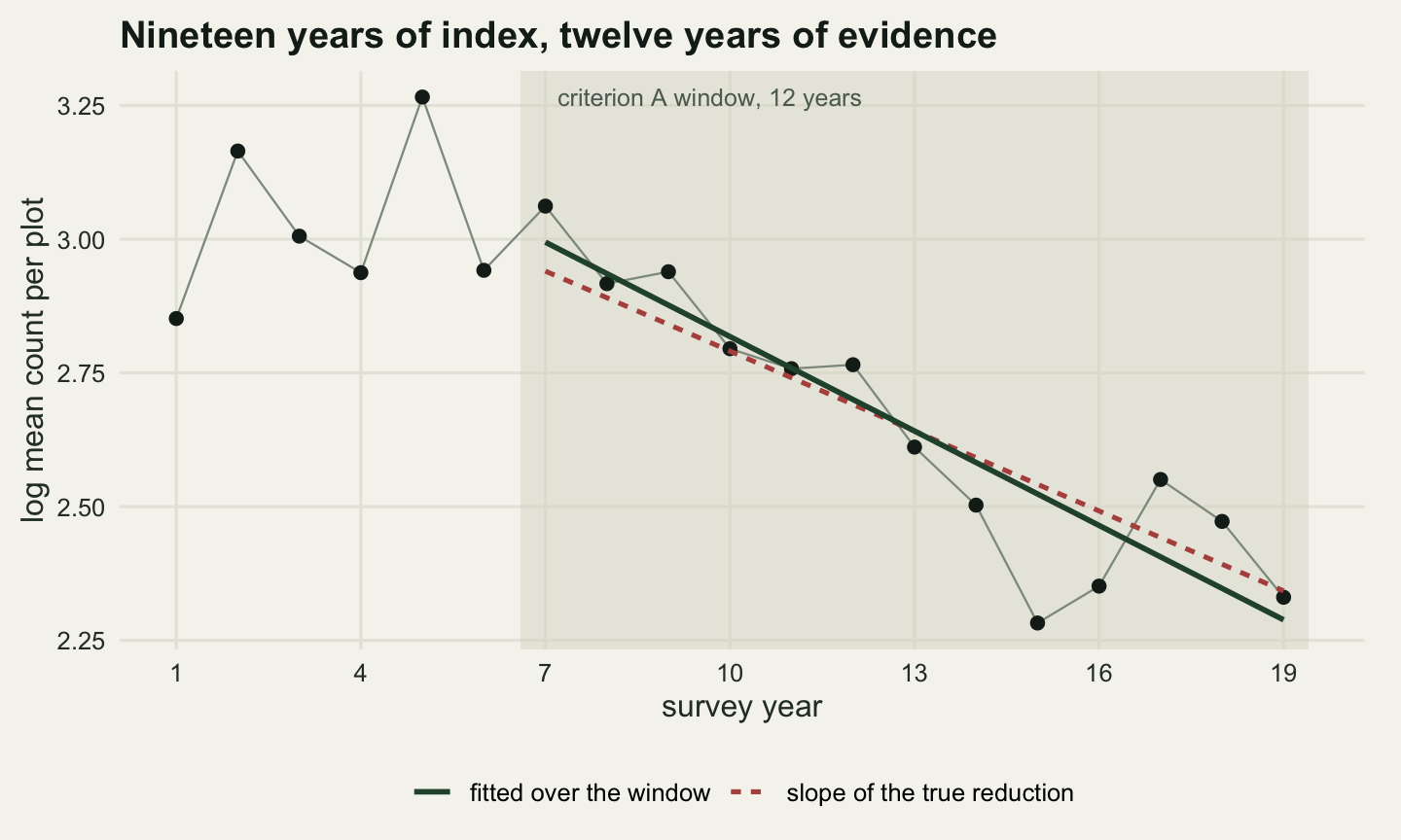
0.11721 0.09472 0.10517 1.23748 One dataset, analysed the way the panel would analyse it. The fitted slope is -0.05884 per year with a standard error of 0.00807, which is -7.29 standard errors from zero and a p value of 0.000016. On the question the power calculation asks, is there a decline, this scheme is not close to the margin. Transformed to the quantity criterion A wants, the reduction over 12 years is 50.6 per cent, with a 95 per cent interval running from 38.9 to 60.1 per cent.
The point estimate is Endangered. The truth is Vulnerable. One survey of a population declining at a steady 4.86 per cent a year has promoted it a category, and nothing in the fit misbehaved to make that happen.
The asymmetry is visible in the same output. The interval reaches 11.7 percentage points below the estimate and 9.5 above it, a ratio of 1.237. The delta method returns 10.5 points on each side, so its upper endpoint sits at 61.2 per cent where the transformed one sits at 60.1. The reason is the exponential: a reduction cannot exceed one hundred per cent however steep the slope gets, so the upper end of the interval is compressed against that ceiling while the lower end has room. A symmetric interval on a reduction is a sign that somebody linearised.
The category is a step function of a noisy number
The interval above is doing its job. What happens next is that somebody reads a category off it, and a category is a step function: it takes one of four values and it changes at three points. Applying a step function to a number that has a standard error throws away the standard error and keeps a label, and the label carries none of the information that made the interval honest.
The first measurement is how far these intervals reach. Over a thousand surveys of the same declining population, count how many of the four categories each interval touches.
n_arm <- 1000
arm_lo <- arm_hi <- numeric(n_arm)
del_arm <- numeric(n_arm)
est_v <- lo_v <- hi_v <- numeric(n_arm)
for (i in seq_len(n_arm)) {
  aa <- assess(sim_index(61e5 + i, n_obs, beta_true), win_yr)
  est_v[i] <- aa[["red"]]; lo_v[i] <- aa[["red_lo"]]; hi_v[i] <- aa[["red_hi"]]
  arm_lo[i] <- aa[["red"]] - aa[["red_lo"]]
  arm_hi[i] <- aa[["red_hi"]] - aa[["red"]]
  del_arm[i] <- aa[["delta_hi"]] - aa[["red"]]
}

n_span <- function(lo, hi) 1 + rowSums(outer(lo, thr, "<") & outer(hi, thr, ">"))
span_v <- n_span(lo_v, hi_v)
cover_v <- mean(lo_v <= red_true & hi_v >= red_true)

print(round(c(mean_estimate = mean(est_v), true_reduction = red_true,
              sd_of_estimate = sd(est_v),
              mean_lower_arm = mean(arm_lo), mean_upper_arm = mean(arm_hi),
              mean_arm_ratio = mean(arm_lo / arm_hi),
              mean_delta_arm = mean(del_arm),
              coverage_of_the_interval = cover_v), 5))
mean_estimate true_reduction sd_of_estimate
0.44282 0.45000 0.06368
mean_lower_arm mean_upper_arm mean_arm_ratio
0.16292 0.12475 1.29230
mean_delta_arm coverage_of_the_interval
0.14207 0.95300 print(round(100 * table(span_v) / n_arm, 2))span_v
1 2 3
1.2 52.0 46.8 print(round(100 * table(categorise(est_v)) / n_arm, 2))
      Not listed on A            Vulnerable            Endangered
                  2.4                  79.9                  17.7
Critically Endangered
                  0.0
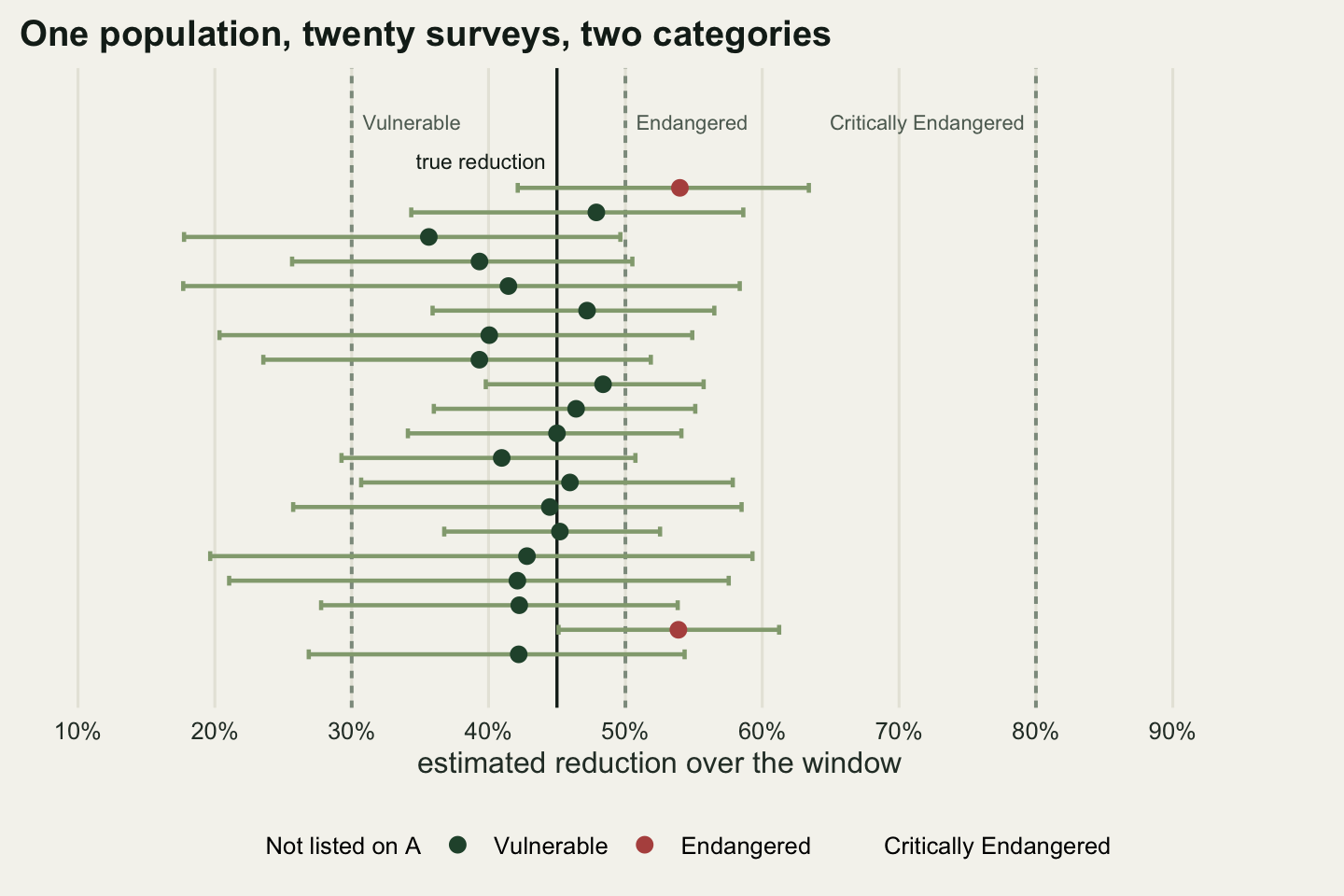
Over 1000 surveys the estimate averages 44.3 per cent against a truth of 45.0, so the estimator is close to unbiased on the reduction scale, and the interval covers the true reduction 95.3 per cent of the time. Both of those are the answers a statistician wants.
The category is another matter. The interval touches more than one category in 98.8 per cent of surveys and three of them in 46.8 per cent, so the honest reading of a typical assessment on this scheme is not Vulnerable but Vulnerable-or-Endangered, and about half the time it is not-listed-or-Vulnerable-or-Endangered. The point estimate lands on Vulnerable in 79.9 per cent of surveys, on Endangered in 17.7 per cent, and below the listing threshold entirely in 2.4 per cent. An interval that is right 95.3 per cent of the time is being reduced to a label that is right 79.9 per cent of the time, and the label is what gets published.
The arm lengths confirm the asymmetry over the long run rather than in one dataset. Averaged over 1000 surveys the interval reaches 16.3 percentage points below the estimate and 12.5 above it, a ratio of 1.2923, while the delta method puts 14.2 points on each side and so overstates the upper endpoint by 1.7 percentage points on average. At this precision the two intervals cover at much the same rate, so the delta method is not wrong in any way a coverage check would find. It puts its endpoints in the wrong places, and endpoints are what a threshold comparison uses.
Where the classification error lives
The next question is how the error rate depends on where the truth sits. Three true reductions are run: one midway between the Vulnerable and Endangered thresholds, one close to the Endangered boundary but below it, and one placed exactly on the boundary. Each is a thousand independent surveys of a population with that true reduction, assessed the same way.
n_sim <- 1000
mid_true <- mean(c(thr[["vulnerable"]], thr[["endangered"]]))
truths <- c(mid_true, red_true, thr[["endangered"]])
names(truths) <- c("midway", "near the boundary", "on the boundary")

run_truth <- function(rt, seed0) {
  bt <- log(1 - rt) / win_yr
  ee <- numeric(n_sim)
  for (i in seq_len(n_sim)) {
    ee[i] <- assess(sim_index(seed0 + i, n_obs, bt), win_yr)[["red"]]
  }
  ee
}
err_est <- Map(run_truth, truths, c(81e5, 82e5, 83e5))

err_tab <- t(vapply(seq_along(truths), function(j) {
  ee <- err_est[[j]]
  tb <- table(categorise(ee)) / n_sim
  c(truth = truths[[j]], correct = mean(categorise(ee) ==
                                          categorise(truths[[j]])),
    as.numeric(tb))
}, numeric(6)))
colnames(err_tab) <- c("truth", "correct", "not_listed", "VU", "EN", "CR")
rownames(err_tab) <- names(truths)
print(round(100 * err_tab, 2))
truth correct not_listed VU EN CR
midway 40 83.9 9.3 83.9 6.8 0
near the boundary 45 76.4 1.9 76.4 21.7 0
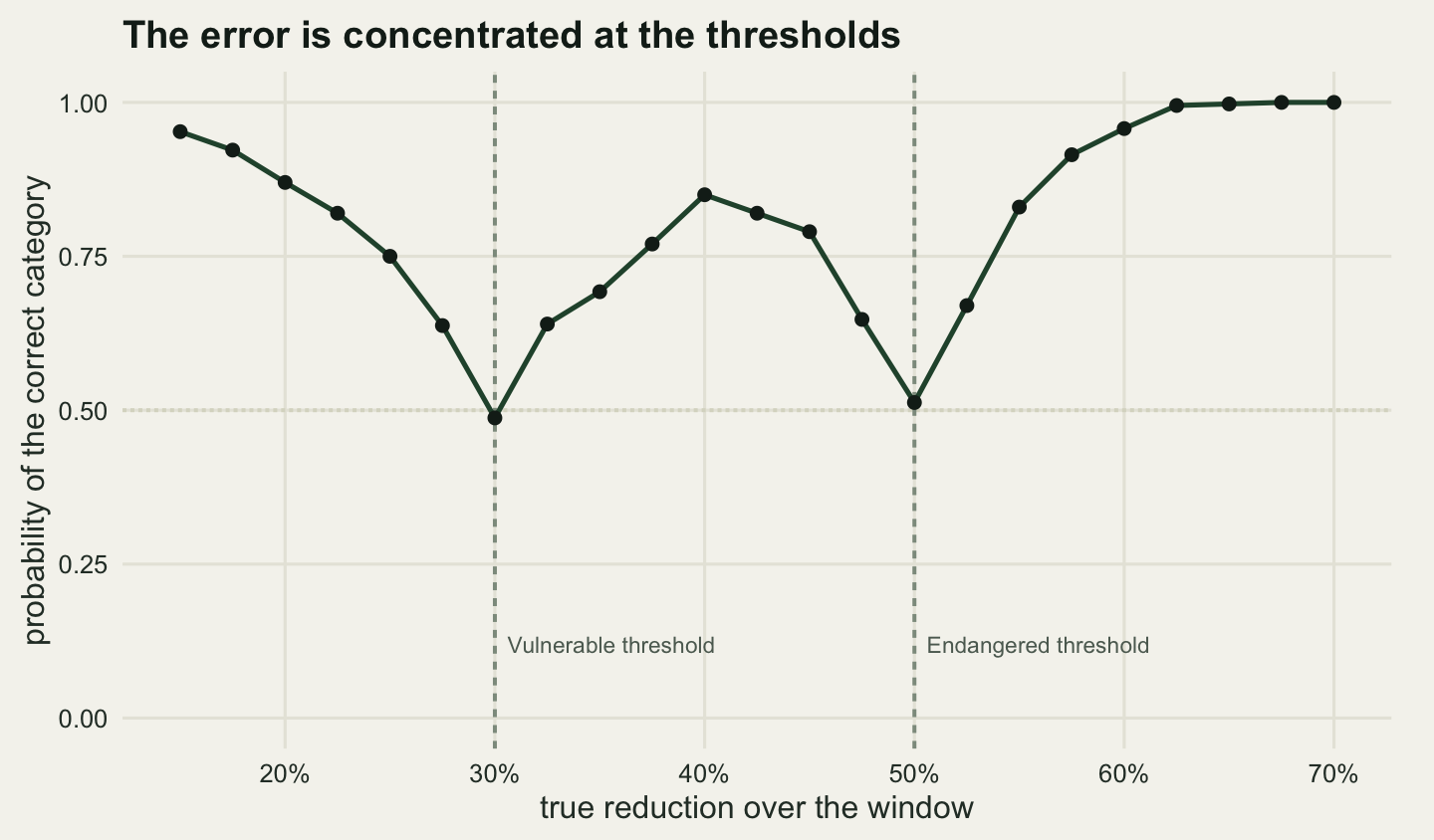
on the boundary 50 47.6 0.5 51.9 47.6 0Placed midway between two thresholds, at 40.0 per cent, the assessment gets the category right 83.9 per cent of the time, splitting the rest between the neighbours on either side: 9.3 per cent read as not listed and 6.8 per cent as Endangered. At the running truth of 45.0 per cent, five points below the Endangered boundary, the correct rate falls to 76.4 per cent, with 21.7 per cent promoted a category.
Placed exactly on the boundary the assessment is a coin flip: 47.6 per cent Endangered against 51.9 per cent Vulnerable. That is not a failure of the method; a species whose reduction is exactly fifty per cent is genuinely on the line, and no estimator can do better than guess. It is a statement about what the number means. Two panels looking at two independent survey datasets from the same population will disagree about half the time, and both will be defensible.
Running the same experiment across a grid of true reductions traces the whole curve.
grid_r <- seq(0.15, 0.70, by = 0.025)
n_curve <- 400
curve_ok <- vapply(seq_along(grid_r), function(j) {
  rt <- grid_r[j]
  bt <- log(1 - rt) / win_yr
  ee <- numeric(n_curve)
  for (i in seq_len(n_curve)) {
    ee[i] <- assess(sim_index(9e6 + j * 1000 + i, n_obs, bt), win_yr)[["red"]]
  }
  mean(categorise(ee) == categorise(rt))
}, numeric(1))

dist_thr <- vapply(grid_r, function(rt) min(abs(rt - thr)), numeric(1))
far <- curve_ok[dist_thr >= 0.08]
print(round(rbind(true_reduction = grid_r, correct = curve_ok), 3))
[,1] [,2] [,3] [,4] [,5] [,6] [,7] [,8] [,9] [,10] [,11]
true_reduction 0.150 0.175 0.20 0.225 0.25 0.275 0.300 0.325 0.350 0.375 0.40
correct 0.953 0.922 0.87 0.820 0.75 0.637 0.488 0.640 0.693 0.770 0.85
[,12] [,13] [,14] [,15] [,16] [,17] [,18] [,19] [,20] [,21]
true_reduction 0.425 0.45 0.475 0.500 0.525 0.55 0.575 0.600 0.625 0.650
correct 0.820 0.79 0.647 0.512 0.670 0.83 0.915 0.958 0.995 0.998
[,22] [,23]
true_reduction 0.675 0.7
correct 1.000 1.0print(round(c(worst = min(curve_ok),
at_worst_true_reduction = grid_r[which.min(curve_ok)],
best = max(curve_ok),
mean_when_at_least_8_points_from_a_threshold = mean(far),
lowest_when_that_far = min(far)), 4)) worst
0.4875
at_worst_true_reduction
0.3000
best
1.0000
mean_when_at_least_8_points_from_a_threshold
0.9494
lowest_when_that_far
0.8500 The curve is a set of wells cut into a flat surface. More than eight percentage points away from any threshold the classification is right 94.9 per cent of the time on average and never below 85.0 per cent. At the thresholds it collapses: the worst point on the grid is a true reduction of 30.0 per cent, where the category is right 48.8 per cent of the time. The error is not spread across the range of possible declines. It is concentrated in narrow bands around three numbers, and those three numbers are exactly where the consequences are.
That is the general result Akcakaya et al (2000) reached about Red List classification under uncertainty, and it has been measured in several places since with different machinery: Regan et al (2005) on the agreement between classification protocols, Porszt et al (2012) on how reliably different indicators of decline reproduce a status, and Connors et al (2014) on misclassification in noisy environments. Rueda-Cediel et al (2018) is the closest to the experiment above, propagating both estimation uncertainty and genuine population variability through the criteria and reading off the category distribution.
The assumption that moves the answer
Everything so far held the window fixed at 12 years, which came from a generation length of 4 years. That number is not a measurement of this population. It is an input, usually taken from a congener, from a life table assembled somewhere else, or from an allometric relationship, and for most species on a regional list it is a considered guess. d’Eon-Eggertson et al (2015) is the paper that treats generation length as the uncertain quantity it is and follows the consequence through to the listing.
The consequence here is arithmetical rather than statistical. A longer generation length means a longer window, a longer window means more of a steady decline is inside it, and criterion A does not compare rates. It compares total reductions. Hold the data completely fixed, change only the assumed generation length, and read the assessment again.
gl_grid <- 3:6
idx2 <- idx1

gl_tab <- t(vapply(gl_grid, function(g) {
  w <- max(min_win, n_gen * g)
  aa <- assess(idx2, w)
  c(generation_length = g, window = w, red = aa[["red"]],
    lo = aa[["red_lo"]], hi = aa[["red_hi"]],
    true_reduction_over_that_window = 1 - exp(w * beta_true))
}, numeric(6)))
gl_cat <- categorise(gl_tab[, "red"])
gl_true_cat <- categorise(gl_tab[, "true_reduction_over_that_window"])
print(round(gl_tab, 4))
generation_length window red lo hi
[1,] 3 10 0.4263 0.2611 0.5547
[2,] 4 12 0.5064 0.3892 0.6012
[3,] 5 15 0.5606 0.4551 0.6457
[4,] 6 18 0.5522 0.4354 0.6448
true_reduction_over_that_window
[1,] 0.3924
[2,] 0.4500
[3,] 0.5264
[4,] 0.5921print(rbind(estimated = as.character(gl_cat),
true = as.character(gl_true_cat))) [,1] [,2] [,3] [,4]
estimated "Vulnerable" "Endangered" "Endangered" "Endangered"
true "Vulnerable" "Vulnerable" "Endangered" "Endangered"target_swing <- (1 - exp(max(gl_tab[, "window"]) * beta_true)) -
(1 - exp(min(gl_tab[, "window"]) * beta_true))
print(round(c(estimate_swing = max(gl_tab[, "red"]) - min(gl_tab[, "red"]),
true_target_swing = target_swing,
categories_touched = length(unique(as.integer(gl_cat)))), 5)) estimate_swing true_target_swing categories_touched
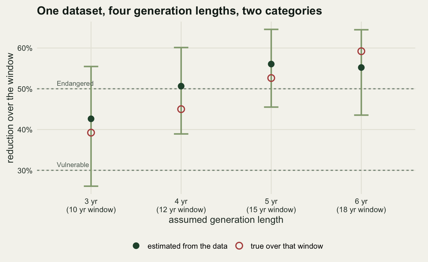
0.13427 0.19973 2.00000 On one dataset the estimated reduction moves from 42.6 per cent at a generation length of 3 years to 56.1 per cent at 5 and 55.2 per cent at 6, and the category moves with it. Note the windows: three generations at 3 years is 9 years, which is shorter than the ten-year floor, so the window stays at 10. The floor is doing real work at the short end of the range.
The truth moves too, and that is the part worth being careful about. The true reduction over ten years is 39.2 per cent and over eighteen years it is 59.2 per cent, a spread of 20.0 percentage points, because a population declining steadily really has lost more over a longer window. The estimate is not becoming wrong as the generation length changes. The question is changing. What the generation length buys is not a better or worse answer but a different one, and the category attached to it is different too, on data that did not move by a single count.
One dataset is one dataset, so the swing is measured across three hundred of them, and set against the swing that comes from the survey itself getting noisier.
n_rep_gl <- 300
gl_swing <- numeric(n_rep_gl)
gl_ncat <- numeric(n_rep_gl)
for (i in seq_len(n_rep_gl)) {
  ix <- sim_index(41e5 + i, n_hist, beta_true)
  rr <- vapply(gl_grid, function(g)
    assess(ix, max(min_win, n_gen * g))[["red"]], numeric(1))
  gl_swing[i] <- max(rr) - min(rr)
  gl_ncat[i] <- length(unique(as.integer(categorise(rr))))
}

n_noise <- 1000
noise_run <- function(mult, seed0) {
  ee <- numeric(n_noise)
  for (i in seq_len(n_noise)) {
    ee[i] <- assess(sim_index(seed0 + i, n_obs, beta_true, noise = mult),
                    win_yr)[["red"]]
  }
  ee
}
ns1 <- noise_run(1, 21e5)
ns2 <- noise_run(2, 22e5)

print(round(c(mean_genlen_swing = mean(gl_swing),
              median_genlen_swing = median(gl_swing),
              true_target_swing = target_swing,
              share_touching_two_categories = mean(gl_ncat > 1)), 5))
mean_genlen_swing median_genlen_swing
0.20719 0.20751
true_target_swing share_touching_two_categories
0.19973 0.92667 print(round(c(median_shift_normal_noise = median(abs(ns1 - red_true)),
median_shift_double_noise = median(abs(ns2 - red_true)),
extra_shift_from_doubling = median(abs(ns2 - red_true)) -
median(abs(ns1 - red_true)),
sd_normal_noise = sd(ns1), sd_double_noise = sd(ns2)), 5))median_shift_normal_noise median_shift_double_noise extra_shift_from_doubling
0.04562 0.08508 0.03946
sd_normal_noise sd_double_noise
0.06739 0.13241 print(round(100 * rbind(normal = table(categorise(ns1)) / n_noise,
doubled = table(categorise(ns2)) / n_noise), 2)) Not listed on A Vulnerable Endangered Critically Endangered
normal 2.6 75.7 21.7 0
doubled 15.5 52.1 32.4 0Here are the two numbers side by side. Moving the assumed generation length from 3 to 6 years, on data that is held fixed, moves the estimated reduction by an average of 20.7 percentage points, and it moves the category in 92.7 per cent of datasets. Doubling every source of survey noise, so that the year effect and the plot-year scatter are both twice what the scheme actually has, moves a given estimate by a median of 8.5 percentage points against 4.6 at the real noise level: an increase of 3.9 points.
So the assumption moves the answer roughly 5.3 times as far as halving the quality of the entire survey scheme does. Say that plainly: on this species, a panel arguing about whether the generation length is three years or six is arguing about 20.7 percentage points of reduction, and a panel arguing about whether the scheme runs at the year-to-year and plot-to-plot noise it has or at twice that is arguing about 3.9.
The category counts carry the same message from the other direction, and they are the reason the noise still matters. At the scheme’s real noise level the category is correct in 75.7 per cent of surveys; at double the noise that falls to 52.1 per cent, with 15.5 per cent of surveys now failing to list the species at all. (That first figure is another independent estimate of a rate two earlier sections also measured, at 79.9 and 76.4 per cent; each comes from its own thousand surveys, so the spread between them is simulation error.) Doubling the noise does not shift the answer in any direction; it scatters it further. The generation length shifts it, and shifts it the same way in every dataset.
Reassessment churn
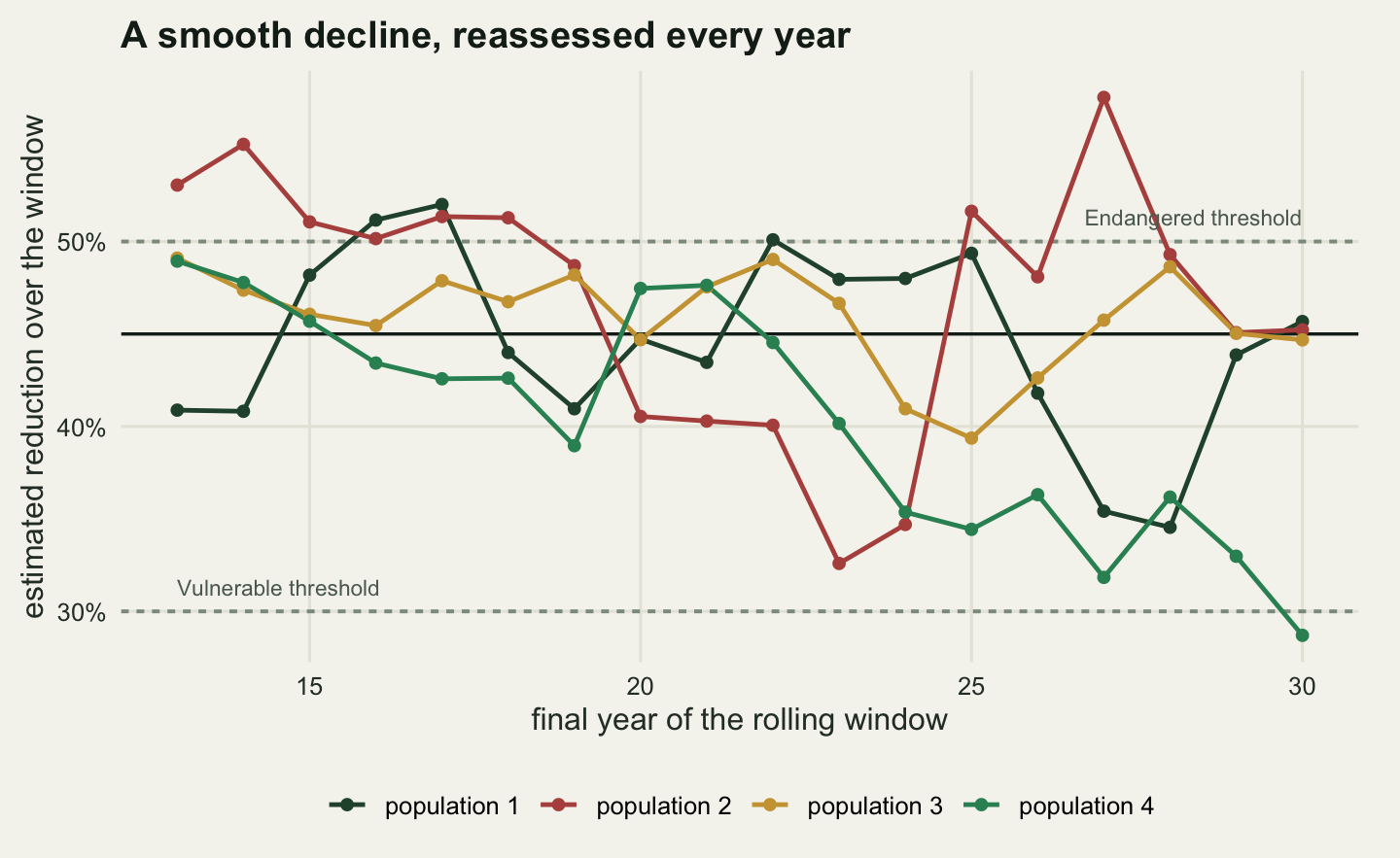
Red List assessments are repeated. A scheme that adds a year of data every year can rerun criterion A every year on a window that rolls forward, and the category history that comes out of that looks like a record of the species getting better and worse. On a population declining at a perfectly constant rate, every one of those changes is estimation noise.
The experiment runs a thirty-year scheme, starts assessing as soon as 13 annual values exist, and rolls the window forward one year at a time, over three hundred independent populations that all decline at the same steady rate.
n_long <- 30
n_pop <- 300
n_assess <- n_long - n_obs + 1
churn_p <- numeric(n_pop)
n_switch <- numeric(n_pop)
traj <- vector("list", 4)

for (p in seq_len(n_pop)) {
  ix <- sim_index(31e5 + p, n_long, beta_true)
  rr <- vapply(seq(n_obs, n_long),
               function(k) assess(ix[seq_len(k)], win_yr)[["red"]],
               numeric(1))
  cc <- as.integer(categorise(rr))
  churn_p[p] <- mean(cc[-1] != cc[-length(cc)])
  n_switch[p] <- sum(cc[-1] != cc[-length(cc)])
  if (p <= 4) traj[[p]] <- rr
}

print(c(assessments_per_population = n_assess,
        consecutive_pairs = n_assess - 1, populations = n_pop))
assessments_per_population consecutive_pairs
18 17
populations
300 print(round(c(mean_churn_per_reassessment = mean(churn_p),
share_with_at_least_one_switch = mean(n_switch > 0),
mean_switches_per_population = mean(n_switch),
max_switches = max(n_switch)), 4)) mean_churn_per_reassessment share_with_at_least_one_switch
0.1888 0.9200
mean_switches_per_population max_switches
3.2100 8.0000 print(round(100 * table(n_switch) / n_pop, 2))n_switch
0 1 2 3 4 5 6 7 8
8.00 6.00 30.33 11.00 22.00 9.00 8.67 3.67 1.33 Each population is assessed 18 times, giving 17 consecutive pairs, and 18.9 per cent of those pairs carry a different category from one year to the next. Across the 300 populations, 92.0 per cent change category at least once and the average is 3.21 changes over 17 reassessments. The true category is Vulnerable in every year of every one of those populations.
Two features of the design make that number worth pausing on. Consecutive windows share 12 of their 13 years, so successive estimates are strongly correlated and the churn is much lower than it would be for independent surveys. And the trajectory has no turning points, no good years, no bad years beyond the ordinary year effect: it is a straight line on the log scale from the first count to the last. Churn at this rate is the floor, not the typical case.
The practical problem is that a category history is not annotated. A species that goes Vulnerable, Endangered, Vulnerable, Vulnerable, Endangered over five reassessments looks like a species whose situation is deteriorating and recovering, and a panel reading that history will reach for explanations. The same history is what a smooth constant decline produces when the boundary is 5.0 percentage points away and the estimate carries a standard deviation of 6.4 points, which is this scheme exactly. Genuine status change and estimation churn are the same picture, and only the underlying estimates with their intervals can tell them apart.
What to write down instead of a category
None of the above argues against thresholds. A list needs categories, categories need cut points, and a cut point applied to an estimate will always misclassify near itself. What the measurements argue against is reporting the category on its own, because the category is the one summary that cannot be reconstructed into anything else. The interval, the window and the generation length can all be carried forward by whoever reads the assessment next. A label cannot.
So the closing exercise is the sentence. Everything in it comes out of the fit and the assumptions already stated.
span_1 <- levels(categorise(0))[
  seq(as.integer(categorise(a1[["red_lo"]])),
      as.integer(categorise(a1[["red_hi"]])))]

report_line <- sprintf(
  paste("Reduction %s per cent (95 per cent CI %s to %s) over %d years,",
        "being %d generations at an assumed generation length of %d years,",
        "from a log-linear fit to %d annual index values on %d plots;",
        "the interval is consistent with %s."),
  pp(a1[["red"]]), pp(a1[["red_lo"]]), pp(a1[["red_hi"]]), win_yr,
  n_gen, gen_len, n_obs, n_plot,
  paste(span_1, collapse = " or "))

print(report_line)
[1] "Reduction 50.6 per cent (95 per cent CI 38.9 to 60.1) over 12 years, being 3 generations at an assumed generation length of 4 years, from a log-linear fit to 13 annual index values on 60 plots; the interval is consistent with Vulnerable or Endangered."print(nchar(report_line))[1] 251Reduction 50.6 per cent (95 per cent CI 38.9 to 60.1) over 12 years, being 3 generations at an assumed generation length of 4 years, from a log-linear fit to 13 annual index values on 60 plots; the interval is consistent with Vulnerable or Endangered.
That is 251 characters and it survives everything this post measured. A reader can see that the point estimate is 50.6 per cent and that the data do not separate two categories. A reader who thinks the generation length is wrong can recompute, because the window and the assumption behind it are both printed. A reader comparing this assessment with the same species five years from now can tell an estimate that moved from an estimate that wobbled. The bare category, Endangered, supports none of those and is also, on this dataset, the wrong one.
The honest limit
The statistical part of an assessment is the smallest part of it, and this post priced only that. Criterion A has sub-criteria that differ in more than arithmetic: whether the reduction is observed, estimated, inferred, projected or suspected, whether its causes have ceased, whether they are understood, and whether they are reversible. The experiment above is an A2 style assessment on an observed index, where the causes are not assumed to have ceased and the window looks backwards. An A1 assessment on the same numbers requires all three of those conditions about the causes and carries higher thresholds accordingly, and an A3 or A4 assessment projects forward, which brings in an error the simulation here does not have at all. The guidelines from the IUCN Standards and Petitions Committee (2024) run to more than a hundred pages, and almost none of that length is about fitting a line.
A real listing also combines criteria. A species can qualify under A and B and C at once, or fail A on the numbers and be listed under B, and the published category is the highest one any criterion supports. A misclassification rate on criterion A alone is not a misclassification rate on the listing. It is not obvious in which direction the combination pushes: several noisy criteria give several chances to cross a line, which raises the listed category on average, and the panel’s judgement about which criteria the data can support pulls the other way.
The largest limit is in the response variable. An index is not a population size. Everything above assumed that the mean count per plot is proportional to abundance with a constant of proportionality that does not change, and the estimated reduction is the reduction in the index. If detectability drifts, for whatever reason, the reduction in the index is the reduction in the population plus the drift in detectability, and criterion A has no way to tell the two apart. A protocol change part-way through the window does the same thing more sharply, which is measured in splicing a monitoring series: a ten per cent step in the index, small enough that nobody writes it up, is worth several percentage points of apparent reduction over a twelve-year window, and several percentage points is most of the distance from the middle of the Vulnerable band to the Endangered boundary.
Two smaller ones. The population here declines log-linearly, which is the model the assessment fits, so nothing in these numbers is paying for the wrong functional form; a real trajectory with a crash and a partial recovery would give a reduction that depends heavily on where the window happens to fall. And the plots are a fixed panel with no turnover, no missing years and no observers changing between them.
Where to go next
If the question is whether the decline is real rather than how large it is, power to detect a population trend is the design calculation, and the contrast with this post is worth holding onto: the scheme here rejects a zero trend without difficulty and still cannot place the species reliably in a category. Those are different sample size problems and a scheme designed for one is not automatically adequate for the other.
If the trajectory is not a straight line, estimating population trends in R fits the shape, and the shape is what decides whether a single reduction figure means anything. Population viability analysis and extinction risk goes at the same conservation question from the other end, projecting a population forward to a probability of extinction rather than summarising the past into a percentage, which is what criterion E does and what criterion A deliberately avoids doing.
References
Mace GM, Collar NJ, Gaston KJ, Hilton-Taylor C, Akcakaya HR, Leader-Williams N, Milner-Gulland EJ, Stuart SN 2008 Conservation Biology 22(6):1424-1442 (10.1111/j.1523-1739.2008.01044.x)
Akcakaya HR, Ferson S, Burgman MA, Keith DA, Mace GM, Todd CR 2000 Conservation Biology 14(4):1001-1013 (10.1046/j.1523-1739.2000.99125.x)
Regan TJ, Burgman MA, McCarthy MA, Master LL, Keith DA, Mace GM, Andelman SJ 2005 Conservation Biology 19(6):1969-1977 (10.1111/j.1523-1739.2005.00235.x)
Porszt EJ, Peterman RM, Dulvy NK, Cooper AB, Irvine JR 2012 Conservation Biology 26(5):894-904 (10.1111/j.1523-1739.2012.01882.x)
Connors BM, Cooper AB, Peterman RM, Dulvy NK 2014 Proceedings of the Royal Society B 281(1787):20132935 (10.1098/rspb.2013.2935)
d’Eon-Eggertson F, Dulvy NK, Peterman RM 2015 Conservation Letters 8(2):86-96 (10.1111/conl.12123)
Rueda-Cediel P, Anderson KE, Regan TJ, Regan HM 2018 Conservation Biology 32(4):916-925 (10.1111/cobi.13081)
IUCN Standards and Petitions Committee 2024 Guidelines for Using the IUCN Red List Categories and Criteria, Version 16 (https://www.iucnredlist.org/resources/redlistguidelines)