library(ggplot2)
library(dplyr)
library(tidyr)Population viability analysis and extinction risk
R
population dynamics
conservation
extinction
ecology tutorial
A count-based population viability analysis in R: estimate the mean and variance of log growth from monitoring counts, then project quasi-extinction risk.
A population viability analysis asks a blunt question: given what we have seen, how likely is this population to fall below some critical level within a management horizon? The simplest useful version needs only a time series of total counts. It ignores age and stage structure and treats the population as a single number growing multiplicatively with a random shock each year. From the counts you estimate two numbers, the mean and the variance of log growth, and from those two numbers you can project the whole distribution of times to quasi-extinction. This post builds that count-based analysis in base R, validates the projection against simulation, and then shows why the resulting risk estimate deserves a wide error bar.
The monitoring data
The density-independent stochastic model says that log abundance takes a random step each year: the change in log N is a mean rate plus a normal shock. Here is a monitored population that has been declining for 25 years, generated from that model so we know the truth behind it.
mu_true <- -0.035; sig_true <- 0.18; N0 <- 250; years_obs <- 25
set.seed(18)
logN <- numeric(years_obs + 1); logN[1] <- log(N0)
for (t in seq_len(years_obs)) logN[t + 1] <- logN[t] + mu_true + sig_true * rnorm(1)
counts <- exp(logN)
round(counts)
[1] 250 285 382 276 253 230 237 180 269 263 335 231 262 200 195 163 196 160 137
[20] 168 176 135 159 134 114 120Estimating growth and variance
The two parameters are the mean and variance of the annual log growth. Dennis, Munholland and Scott set out the estimators in 1991: take the differences of the log counts, and their sample mean and variance estimate the drift and the environmental variance directly.
r <- diff(log(counts))          # log(N_{t+1} / N_t) for each year
mu_hat <- mean(r)
s2_hat <- var(r)
s_hat <- sqrt(s2_hat)
Nc <- counts[years_obs + 1]     # current abundance = the last count
Nx <- 25                        # quasi-extinction threshold
d <- log(Nc) - log(Nx)          # log-distance from now to the threshold

c(mu_hat = mu_hat, sigma_hat = s_hat, current_N = Nc, log_distance_d = d)
mu_hat sigma_hat current_N log_distance_d
-0.02941534 0.21020115 119.83039882 1.56720158 The drift estimate is about minus 0.029 per year, a slow decline, with a standard deviation of log growth of about 0.21. The population currently stands near 120, and the quasi-extinction floor of 25 is a log-distance of about 1.57 below it. These three numbers, the drift, the variance and the distance, are all the projection needs.
Projecting the risk
For a declining population the boundary is reached with certainty; the open question is when. The time to first cross the threshold follows an inverse Gaussian distribution, the first-passage time of a drifting random walk. Its cumulative distribution gives the probability of quasi-extinction by any future year.
ext_cdf <- function(t, d, mu, s2) {
  s <- sqrt(s2); md <- -mu       # absolute drift for a declining population
  pnorm((-d + md * t) / (s * sqrt(t))) +
    exp(2 * d * md / s2) * pnorm((-d - md * t) / (s * sqrt(t)))
}

years <- 1:50
risk <- ext_cdf(years, d, mu_hat, s2_hat)
c(mean_time_d_over_mu = d / (-mu_hat),
  median_year = years[which.min(abs(risk - 0.5))],
  P_within_20yr = ext_cdf(20, d, mu_hat, s2_hat),
  P_within_50yr = ext_cdf(50, d, mu_hat, s2_hat))
mean_time_d_over_mu median_year P_within_20yr P_within_50yr
53.2783757 36.0000000 0.2368960 0.6391742 The mean time to quasi-extinction, the distance divided by the drift, is about 53 years. The median is sooner, near 36 years, because the distribution is right-skewed. The probability of dropping below the threshold within 20 years is about 24 percent, and within 50 years about 64 percent. A manager reading only the point estimates would call this population at serious risk over the next half century.
set.seed(321); npr <- 45
proj <- lapply(seq_len(npr), function(i) {
  lp <- log(Nc); v <- numeric(51); v[1] <- Nc
  for (t in seq_len(50)) { lp <- lp + mu_hat + s_hat * rnorm(1); v[t + 1] <- exp(lp) }
  data.frame(year = years_obs + (0:50), N = v, rep = i)
}) |> bind_rows()
obs <- data.frame(year = 0:years_obs, N = counts)

ggplot() +
  geom_line(data = proj, aes(year, N, group = rep), colour = te_sage, linewidth = 0.3, alpha = 0.5) +
  geom_hline(yintercept = Nx, colour = te_brick, linetype = "22", linewidth = 0.7) +
  geom_line(data = obs, aes(year, N), colour = te_forest, linewidth = 0.9) +
  geom_point(data = obs, aes(year, N), colour = te_forest, size = 1.2) +
  geom_vline(xintercept = years_obs, colour = te_faint, linetype = "42", linewidth = 0.4) +
  scale_y_log10() +
  annotate("text", x = 1, y = Nx * 0.72, label = "quasi-extinction threshold",
           colour = te_brick, hjust = 0, size = 3.1) +
  annotate("text", x = years_obs - 0.5, y = max(counts) * 1.05, label = "observed",
           colour = te_forest, hjust = 1, size = 3.1) +
  annotate("text", x = years_obs + 1.5, y = max(counts) * 1.05, label = "projected",
           colour = te_sage, hjust = 0, size = 3.1) +
  labs(title = "Count-based population viability projection",
       subtitle = "Fitted stochastic model projected 50 years from the last count",
       x = "Year", y = "Population count (log scale)") +
  theme_te()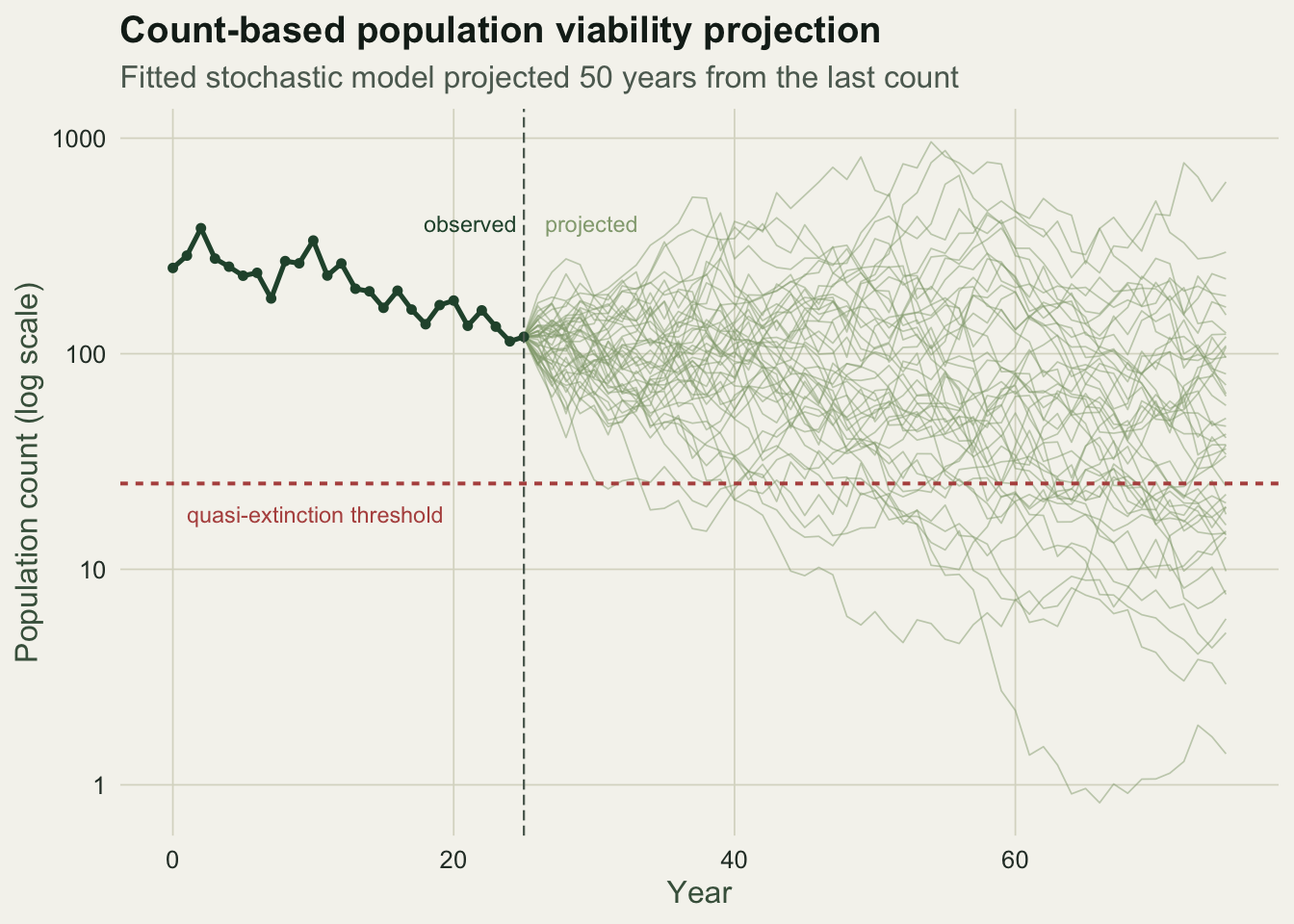
Does the formula match simulation
The inverse Gaussian result is worth checking against brute force. Running many replicate trajectories from the fitted model and recording the first year each crosses the threshold reproduces the analytical curve closely.
M <- 20000; set.seed(909)
ext_time <- rep(NA_integer_, M)
for (m in seq_len(M)) {
  lp <- log(Nc)
  for (t in seq_len(50)) {
    lp <- lp + mu_hat + s_hat * rnorm(1)
    if (lp <= log(Nx)) { ext_time[m] <- t; break }
  }
}
risk_sim <- sapply(years, function(y) mean(!is.na(ext_time) & ext_time <= y))
c(P50_simulated = risk_sim[50], P50_formula = risk[50],
  max_gap = max(abs(risk_sim - risk)))
P50_simulated P50_formula max_gap
0.60565000 0.63917423 0.04372288 The largest discrepancy between the simulated and analytical curves over 50 years is about 0.04, well within simulation noise. The formula is doing exactly what the simulation does, at no computational cost.
The uncertainty that matters
The point estimate hides the real problem. Twenty-five years of counts pin down the drift only loosely and the variance more loosely still, and quasi-extinction risk is extremely sensitive to the variance. A parametric bootstrap makes this concrete: resample the whole monitoring series from the fitted model, re-estimate the parameters, and re-project. The spread of the resulting risk curves is enormous.
set.seed(4040); B <- 2000
band <- matrix(NA, B, length(years))
for (b in seq_len(B)) {
  lb <- numeric(years_obs + 1); lb[1] <- log(N0)
  for (t in seq_len(years_obs)) lb[t + 1] <- lb[t] + mu_hat + s_hat * rnorm(1)
  rb <- diff(lb); mub <- mean(rb); s2b <- var(rb)
  Ncb <- exp(lb[years_obs + 1]); db <- log(Ncb) - log(Nx)
  band[b, ] <- ext_cdf(years, db, mub, s2b)
}
lo <- apply(band, 2, quantile, 0.05); hi <- apply(band, 2, quantile, 0.95)

curve_df <- data.frame(year = years, pred = risk, lo = lo, hi = hi, sim = risk_sim)
ggplot(curve_df, aes(year)) +
  geom_ribbon(aes(ymin = lo, ymax = hi), fill = te_gold, alpha = 0.30) +
  geom_line(aes(y = pred), colour = te_forest, linewidth = 1.0) +
  geom_point(data = curve_df[seq(2, 50, by = 3), ], aes(y = sim), colour = te_brick, size = 1.4) +
  annotate("text", x = 2, y = 0.93, label = "90 percent interval (parameter uncertainty)",
           colour = "#8a7a30", hjust = 0, size = 3.1) +
  annotate("text", x = 30, y = 0.30, label = "diffusion formula (line), simulation (points)",
           colour = te_forest, hjust = 0, size = 3.1) +
  labs(title = "Cumulative risk of quasi-extinction",
       subtitle = "The point estimate is precise; the parameter uncertainty around it is wide",
       x = "Years from present", y = "Probability of quasi-extinction by year") +
  coord_cartesian(ylim = c(0, 1)) +
  theme_te()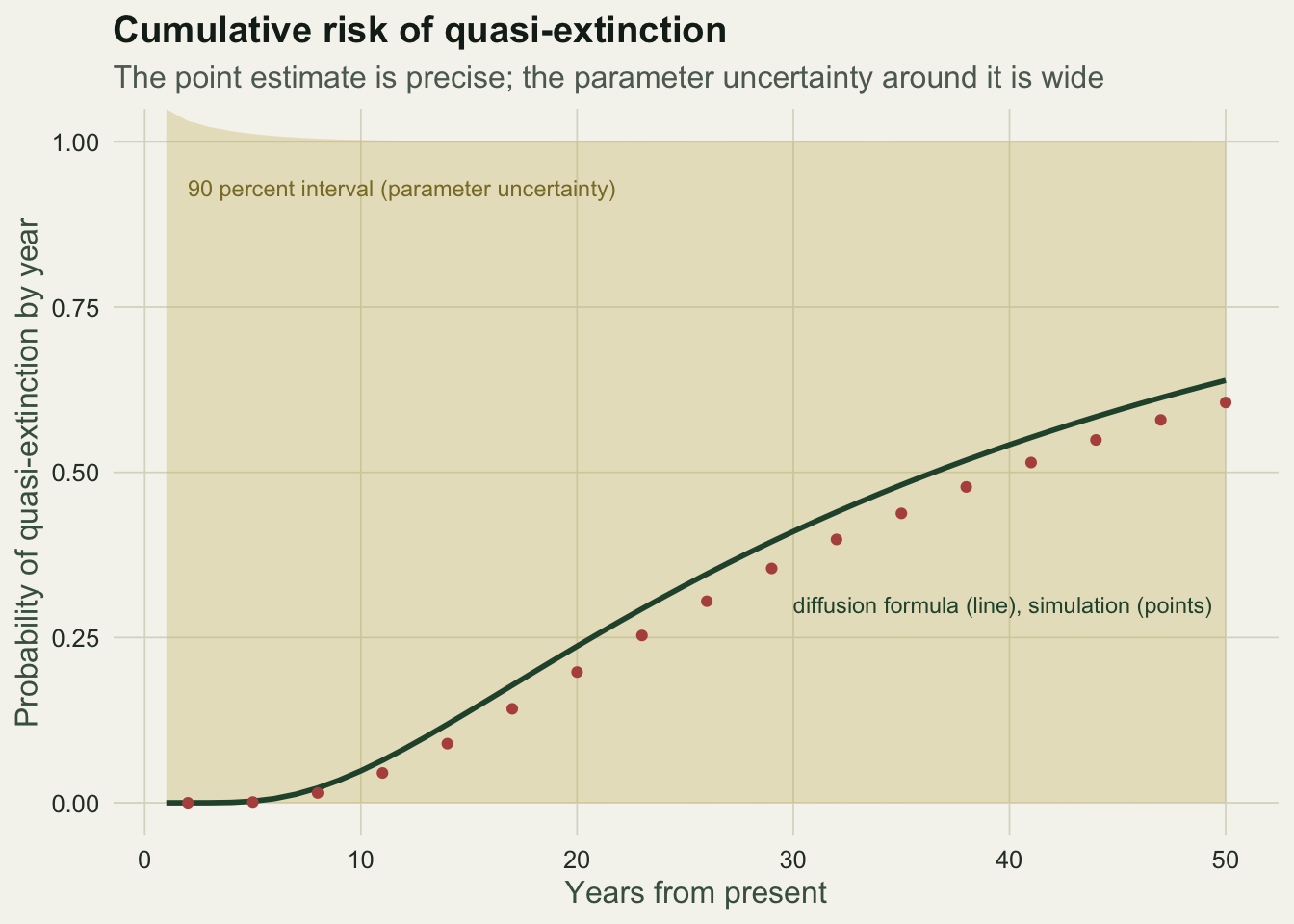
c(P50_point = risk[50],
  P50_lower = lo[50], P50_upper = hi[50])
P50_point P50_lower P50_upper
0.6391742327 0.0005195964 1.0000012214 The 50-year risk has a point estimate near 0.64, but a 90 percent bootstrap interval that runs from close to zero to close to one. From 25 years of counts, the honest answer is that the population might be nearly safe or nearly doomed over this horizon, and the data cannot separate those. This is not a flaw in the method; it is the method reporting how little a short, noisy series can say. Fieberg and others have made the same point repeatedly, and it is the reason a single headline risk number should never travel without its interval.
Caveats worth stating
The model assumes density independence, which is reasonable for a small population far from carrying capacity but wrong for one near it. It uses only environmental variance and ignores demographic stochasticity, the extra chance variation in births and deaths that matters when abundance is very low; setting the quasi-extinction threshold well above one individual, at 25 here, keeps the analysis in the range where the continuous approximation holds. Lande separated these sources of risk formally in 1993, and for a structured population the drift and variance you feed in are simply the stochastic growth rate and its variance from the matrix model in the companion post on stochastic growth.
References
Dennis B, Munholland PL, Scott JM 1991. Ecological Monographs 61(2):115-143 (10.2307/1943004).
Lande R 1993. The American Naturalist 142(6):911-927 (10.1086/285580).
Lewontin RC, Cohen D 1969. Proceedings of the National Academy of Sciences 62(4):1056-1060 (10.1073/pnas.62.4.1056).
Morris WF, Doak DF 2002. Quantitative Conservation Biology: Theory and Practice of Population Viability Analysis. Sinauer Associates. ISBN 978-0-87893-546-8.