set.seed(4221)
f_true <- function(x) 0.40 + 1.2*x - 1.0*x^2 + 0.30*sin(3*x)
sigma0 <- 0.35                                                # homoscedastic observation noise
gen    <- function(n){ x <- runif(n); data.frame(x = x, y = f_true(x) + rnorm(n, 0, sigma0)) }

trf <- gen(150); trc <- gen(1000); te <- gen(6000)           # fit / calibrate / test
mf  <- lm(y ~ poly(x, 6), data = trf)
pse   <- predict(mf, newdata = data.frame(x = te$x), se.fit = TRUE)
mu_te <- as.numeric(pse$fit); se_mean <- as.numeric(pse$se.fit)   # SE of the fitted MEAN
res_c <- abs(trc$y - as.numeric(predict(mf, newdata = data.frame(x = trc$x))))  # conformal scores

levs <- seq(0.50, 0.95, 0.05)
cov_naive <- sapply(levs, function(L){ z <- qnorm(1 - (1-L)/2); mean(abs(te$y - mu_te) <= z*se_mean) })
cov_conf  <- sapply(levs, function(L){ k <- ceiling(L*(nrow(trc)+1)); q <- sort(res_c)[min(k, length(res_c))]
                                       mean(abs(te$y - mu_te) <= q) })
i90 <- which(abs(levs - 0.90) < 1e-6)Checking predictive calibration and coverage
R
prediction
model checking
ecology tutorial
Do your model’s stated uncertainties hold up? Coverage calibration, PIT histograms and reliability diagrams with a Brier decomposition, on held-out data in R.
Corrected 1 October 2026: the post called the Platt recalibration a one-parameter fit; it fits an intercept and a slope, and the in-sample optimism is still small. It also said the naive PIT share sat in “the extreme bins”, which the figure draws twice as wide; it now names the outer twentieth at each end of the scale that the share counts.
This series built three ways to attach uncertainty to a prediction: a Gaussian process with a plug-in band, a local regression with a variance-only band, and conformal prediction with a coverage guarantee. Each came with a health warning. This closing post is the reckoning: given a model that reports uncertainty, how do you check whether that uncertainty is honest? The answer is always the same in spirit, measure it on data the model has not seen, and this post gives the three tools for doing so: coverage calibration for intervals, the PIT histogram for full predictive distributions, and the reliability diagram with a Brier decomposition for probabilities.
Does the interval cover what it claims?
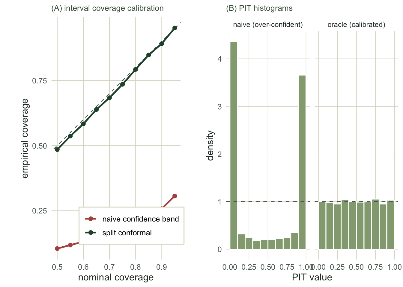
The most direct check for a prediction interval is to build it at many nominal levels and, on held-out data, count how often the truth actually falls inside. Plot empirical coverage against nominal: a calibrated method lies on the diagonal. A common and costly mistake makes a good test case. The confidence band a model reports describes the uncertainty in the fitted mean, and people routinely read it as a prediction interval for a new observation. It is not one: it leaves out the observation noise entirely. We build that naive interval and put it beside split conformal, which targets the new observation directly.
At the usual 90 per cent level the naive interval covers only 26 per cent of held-out observations, while conformal sits at 89 per cent. The naive band is not a little too narrow; it is dramatically too narrow, and it stays below the diagonal at every level, because with this much data the mean is pinned down tightly and almost all of the spread in a new observation is the noise the band ignores. Conformal, whose scores are the actual prediction errors, tracks the diagonal throughout.
Is the whole predictive distribution calibrated?
Coverage checks one interval at a time. A sharper tool for a model that returns a full predictive distribution is the probability integral transform: feed each observation through its own predictive cumulative distribution function. If the predictive is calibrated, these PIT values are uniform on the unit interval. An over-confident predictive, one whose spread is too small, piles PIT mass into the extreme bins, because real observations land far outside the narrow predictive far more often than they should.
pit_naive  <- pnorm((te$y - mu_te)/se_mean)                  # naive predictive N(mu, se_mean)
pit_oracle <- pnorm((te$y - f_true(te$x))/sigma0)            # an oracle predictive: should be uniform
ext <- function(p) mean(p < 0.05 | p > 0.95)                 # mass in the extreme 10% of the scale
ext_naive <- ext(pit_naive); ext_oracle <- ext(pit_oracle)
The naive predictive puts 74 per cent of its PIT mass in the outer twentieth of the scale at each end, against the 10 per cent a calibrated forecast would: the histogram is a deep U, the fingerprint of a distribution far too sure of itself. The oracle predictive, which uses the true mean and the true noise, sits at 10 per cent, flat as it should be. The shape tells you the direction of the error: a U means over-confidence, a central hump would mean the opposite, and a tilt would mean bias in the mean.
Are predicted probabilities calibrated?
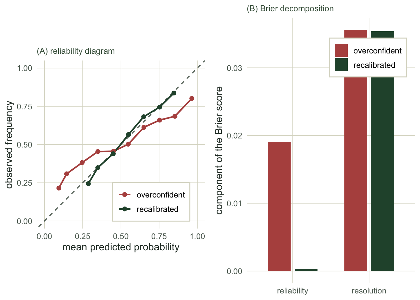
The same question for a model that outputs probabilities, a species distribution model reporting the chance of presence, needs a different tool. Bin the predictions and compare the mean predicted probability in each bin with the observed frequency of presence: this is the reliability diagram, and calibration means the points fall on the diagonal. The Brier score, the mean squared error of the probabilities, then splits into three parts (Murphy 1973): reliability, which measures departure from the diagonal and should be small, resolution, which rewards separating the classes and should be large, and the irreducible uncertainty of the outcome.
gx <- runif(4000); ptrue <- plogis(-1.0 + 3.0*gx)            # true presence probability
yb <- rbinom(length(gx), 1, ptrue)
base  <- glm(yb ~ gx, family = binomial)                     # a calibrated base model
pbase <- as.numeric(predict(base, type = "response"))
pover <- pbase^2.4 / (pbase^2.4 + (1-pbase)^2.4)             # sharpened: overconfident
z_over <- qlogis(pmin(pmax(pover, 1e-4), 1-1e-4))            # recalibrate (Platt: intercept and slope)
platt <- glm(yb ~ z_over, family = binomial); pcal <- as.numeric(predict(platt, type = "response"))

reld <- function(p, y, B = 10){
  b <- cut(p, seq(0,1,length.out = B+1), include.lowest = TRUE)
  data.frame(pbar = tapply(p, b, mean), obs = tapply(y, b, mean))
}
brier_decomp <- function(p, y, B = 10){
  b <- cut(p, seq(0,1,length.out = B+1), include.lowest = TRUE)
  nk <- tapply(y, b, length); pk <- tapply(p, b, mean); ok <- tapply(y, b, mean)
  k <- !is.na(nk); N <- sum(nk[k]); obar <- mean(y)
  c(reliability = sum(nk[k]*(pk[k]-ok[k])^2)/N, resolution = sum(nk[k]*(ok[k]-obar)^2)/N,
    brier = mean((p - y)^2))
}
bd_over <- brier_decomp(pover, yb); bd_cal <- brier_decomp(pcal, yb)
The overconfident model earns a Brier score of 0.221 against 0.203 after recalibration. The decomposition shows why: recalibration cuts the reliability term from 0.0190 to 0.0003, pulling the predictions back onto the diagonal, while leaving the resolution almost untouched (0.036 against 0.035). Calibration fixes the honesty of the probabilities without costing the model any of its power to tell presences from absences. One caveat on this panel: unlike the interval check above, the Platt fit is estimated on the same 4000 points it is then scored on, so the reliability term it reports is optimistic. With two free parameters (an intercept and a slope) and this many points the optimism is small, but in practice fit the recalibration on a held-out block, exactly as the coverage check does.
Where this leaves you
A number that reports uncertainty, a standard error, a 95 per cent band, a predicted probability, is a promise about frequencies, and a promise is worth checking. These three diagnostics are how: coverage calibration for a prediction interval, the PIT histogram for a full predictive distribution, and the reliability diagram with a Brier decomposition for probabilities. Together they close the loop this series has been circling, from the Gaussian process band that is too sure of itself where data is thin, through the local regression band centred on a biased fit, to the conformal interval that is honest on average but not everywhere.
One caution outlives the method. All of this rests on a held-out set that is genuinely independent of the training data, and ecological data rarely gives you one for free: spatial autocorrelation and temporal trends leak information across a random split and make every diagnostic here look better than the truth. Split the data in blocks that respect its structure (Roberts et al 2017), and only then believe the calibration you measure.
References
Brier GW 1950. Monthly Weather Review 78(1):1-3 (10.1175/1520-0493(1950)078<0001:VOFEIT>2.0.CO;2).
Murphy AH 1973. Journal of Applied Meteorology 12(4):595-600 (10.1175/1520-0450(1973)012<0595:ANVPOT>2.0.CO;2).
Gneiting T, Balabdaoui F, Raftery AE 2007. Journal of the Royal Statistical Society Series B 69(2):243-268 (10.1111/j.1467-9868.2007.00587.x).
Roberts DR, Bahn V, Ciuti S, et al 2017. Ecography 40(8):913-929 (10.1111/ecog.02881).