library(ggplot2)
pgev <- function(q, mu, sigma, xi) {
  z <- (q - mu) / sigma
  if (abs(xi) < 1e-6) return(exp(-exp(-z)))
  t <- pmax(1 + xi * z, 0); exp(-t^(-1 / xi))
}
qgev <- function(p, mu, sigma, xi) {
  if (abs(xi) < 1e-6) return(mu - sigma * log(-log(p)))
  mu + (sigma / xi) * ((-log(p))^(-xi) - 1)
}
rgev <- function(n, mu, sigma, xi) qgev(runif(n), mu, sigma, xi)
nll_gev <- function(par, x) {
  mu <- par[1]; sigma <- exp(par[2]); xi <- par[3]; z <- (x - mu) / sigma
  if (abs(xi) < 1e-6) { ll <- -log(sigma) - z - exp(-z) }
  else {
    t <- 1 + xi * z
    if (any(!is.finite(t)) || any(t <= 0)) return(1e10)
    ll <- -log(sigma) - (1 / xi + 1) * log(t) - t^(-1 / xi)
  }
  v <- -sum(ll); if (!is.finite(v)) return(1e10); v
}
fit_gev <- function(x) {
  s0 <- sd(x) * sqrt(6) / pi
  o <- optim(c(mean(x) - 0.5772 * s0, log(s0), 0.1), nll_gev,
             x = x, method = "BFGS", hessian = TRUE)
  list(mu = o$par[1], sigma = exp(o$par[2]), xi = o$par[3],
       cov = diag(c(1, exp(o$par[2]), 1)) %*% solve(o$hessian) %*%
             diag(c(1, exp(o$par[2]), 1)))
}

set.seed(4246)
ymax <- rgev(60, 31.0, 1.6, 0.13)
fit <- fit_gev(ymax)

ys <- sort(ymax); n <- length(ys)
emp_p <- (seq_len(n) - 0.5) / n
mod_p <- pgev(ys, fit$mu, fit$sigma, fit$xi)          # PP
mod_q <- qgev(emp_p, fit$mu, fit$sigma, fit$xi)       # QQ
pp_gap <- max(abs(emp_p - mod_p))
qq_cor <- cor(ys, mod_q)Checking an extreme value model
R
extreme value theory
statistics
ecology tutorial
Diagnose an extreme value fit in R with PP and QQ plots, test how far the return level moves with the threshold, and simulate what the interval really covers.
The three posts before this one built the machinery: the GEV for block maxima, the GPD for threshold exceedances, and confidence intervals for the return levels that come out of either. Each fit produced a design number with an interval attached. This closing post asks the questions a careful analysis has to ask before trusting any of it: does the model actually fit the data, how much does the answer depend on choices we made along the way, and does a stated ninety-five per cent interval really contain the truth ninety-five per cent of the time. The answers are a fitting end to the cluster, because they keep returning to the same limitation: the tail is an extrapolation, and the shape parameter that governs it is the thing we can least pin down.
Does the model fit? PP and QQ plots
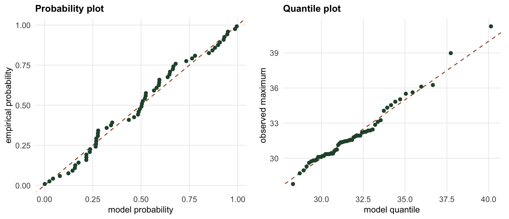
The first check is whether the fitted distribution matches the data at all. Two plots do most of the work, and both compare the empirical distribution of the maxima to the fitted one. The probability plot (PP) puts the empirical cumulative probability of each ordered value against the model’s cumulative probability there; the quantile plot (QQ) puts the ordered data against the quantiles the model predicts at the same plotting positions. Under a good fit both fall on the diagonal. They emphasise different regions: the PP plot is most sensitive in the body, where probabilities change fastest, and the QQ plot is most sensitive in the tail, which for extreme value work is exactly where a misfit would hurt.
We check the sixty-maxima GEV fit from the first post.
The largest vertical gap in the PP plot is 0.080, and the correlation between the observed maxima and the model quantiles in the QQ plot is 0.9908. Both point to an adequate fit: the points track the diagonal closely, with the mild scatter in the upper tail that is unavoidable when the largest few points are estimated from so little. A PP plot that bowed away from the line, or a QQ plot that curved off at the top, would be the signal that the chosen family or threshold is wrong. Neither happens here.
How much does the threshold move the answer?
A fit can pass its diagnostics and still rest on a choice that the data do not make for you. For peaks over threshold that choice is the threshold, and the honest way to report it is to show how the headline number moves as the threshold varies. We simulate a daily series with a genuine generalised Pareto tail, then refit the hundred-year return level at a range of thresholds.
qgpd <- function(p, sigma, xi) {
  if (abs(xi) < 1e-8) return(-sigma * log(1 - p))
  (sigma / xi) * ((1 - p)^(-xi) - 1)
}
rgpd <- function(n, sigma, xi) qgpd(runif(n), sigma, xi)
nll_gpd <- function(par, y) {
  sigma <- exp(par[1]); xi <- par[2]
  if (abs(xi) < 1e-8) return(length(y) * log(sigma) + sum(y) / sigma)
  t <- 1 + xi * y / sigma
  if (any(t <= 0)) return(1e10)
  length(y) * log(sigma) + (1 / xi + 1) * sum(log(t))
}
fit_gpd <- function(y) {
  o <- optim(c(log(mean(y)), 0.1), nll_gpd, y = y, method = "BFGS", hessian = TRUE)
  list(sigma = exp(o$par[1]), xi = o$par[2],
       cov = diag(c(exp(o$par[1]), 1)) %*% solve(o$hessian) %*% diag(c(exp(o$par[1]), 1)))
}

set.seed(3249)
Nd <- 9000
is_tail <- runif(Nd) < 0.10
draws <- numeric(0)
while (length(draws) < sum(!is_tail)) {
  cand <- rnorm(sum(!is_tail), 18, 3); draws <- c(draws, cand[cand < 24])
}
xd <- numeric(Nd)
xd[!is_tail] <- draws[seq_len(sum(!is_tail))]
xd[is_tail]  <- 24 + rgpd(sum(is_tail), 2.2, 0.12)

rl_pot <- function(fit, u, zeta, years) {
  m <- years * 365
  u + (fit$sigma / fit$xi) * ((m * zeta)^fit$xi - 1)
}
rl_se <- function(fit, u, zeta, years) {
  m <- years * 365; xi <- fit$xi; s <- fit$sigma; a <- (m * zeta)^xi
  d_s <- (1 / xi) * (a - 1)
  d_x <- s * (-(1 / xi^2) * (a - 1) + (1 / xi) * a * log(m * zeta))
  g <- c(d_s, d_x); sqrt(as.numeric(t(g) %*% fit$cov %*% g))
}

thr <- seq(23, 28, by = 1)
sweep <- do.call(rbind, lapply(thr, function(u) {
  e <- xd[xd > u] - u; fg <- fit_gpd(e); zeta <- mean(xd > u)
  est <- rl_pot(fg, u, zeta, 100); se <- rl_se(fg, u, zeta, 100)
  data.frame(u = u, nexc = length(e), xi = fg$xi,
             est = est, lo = est - 1.96 * se, hi = est + 1.96 * se)
}))
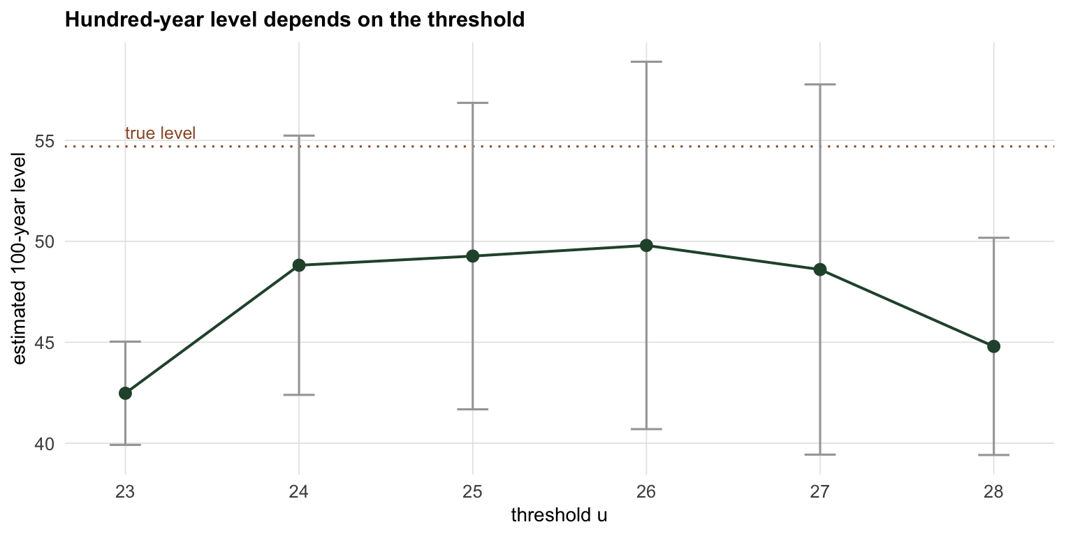
The true hundred-year daily level for this simulation is about 54.7. The estimates tell an uncomfortable story. At the lowest threshold the body of the distribution contaminates the fit, forcing the shape negative and returning a hundred-year level near 42 with a deceptively narrow interval. Raise the threshold into the range where the generalised Pareto actually holds and the estimate jumps to around 50, with an interval 3.6 times as wide. Two lessons stack up: the threshold genuinely moves the answer, so the sensitivity has to be reported rather than hidden behind one number, and a narrow interval from a low threshold is the most dangerous output of all.
Does a 95% interval cover 95% of the time?
The deepest check is on the intervals themselves. A confidence interval makes a promise about repeated sampling: a ninety-five per cent interval should contain the true value in ninety-five per cent of datasets. That promise rests on approximations, the asymptotic normality behind the delta method above all, and for extreme value return levels those approximations strain. We can test the promise directly by simulation: draw many datasets from a known GEV, build the interval each time, and count how often it catches the truth.
grad_zm <- function(m, sigma, xi) {
  y <- -log(1 - 1 / m)
  c(1, -(1 / xi) * (1 - y^(-xi)),
    (sigma / xi^2) * (1 - y^(-xi)) - (sigma / xi) * y^(-xi) * log(y))
}
mu_t <- 31; sig_t <- 1.6; xi_t <- 0.13
periods <- c(10, 50, 100, 500)
true_z <- sapply(periods, function(m) qgev(1 - 1 / m, mu_t, sig_t, xi_t))

set.seed(8249)
B <- 600; nblock <- 60
covered <- numeric(length(periods)); width <- numeric(length(periods)); nok <- 0
for (b in seq_len(B)) {
  yb <- rgev(nblock, mu_t, sig_t, xi_t)
  fb <- tryCatch(fit_gev(yb), error = function(e) NULL)
  if (is.null(fb) || any(!is.finite(diag(fb$cov))) || any(diag(fb$cov) < 0)) next
  nok <- nok + 1
  for (j in seq_along(periods)) {
    m <- periods[j]
    est <- qgev(1 - 1 / m, fb$mu, fb$sigma, fb$xi)
    v <- as.numeric(t(grad_zm(m, fb$sigma, fb$xi)) %*% fb$cov %*% grad_zm(m, fb$sigma, fb$xi))
    if (!is.finite(v) || v < 0) next
    se <- sqrt(v)
    if (true_z[j] >= est - 1.96 * se && true_z[j] <= est + 1.96 * se)
      covered[j] <- covered[j] + 1
    width[j] <- width[j] + 2 * 1.96 * se
  }
}
cover_pct <- 100 * covered / nok
mean_width <- width / nok
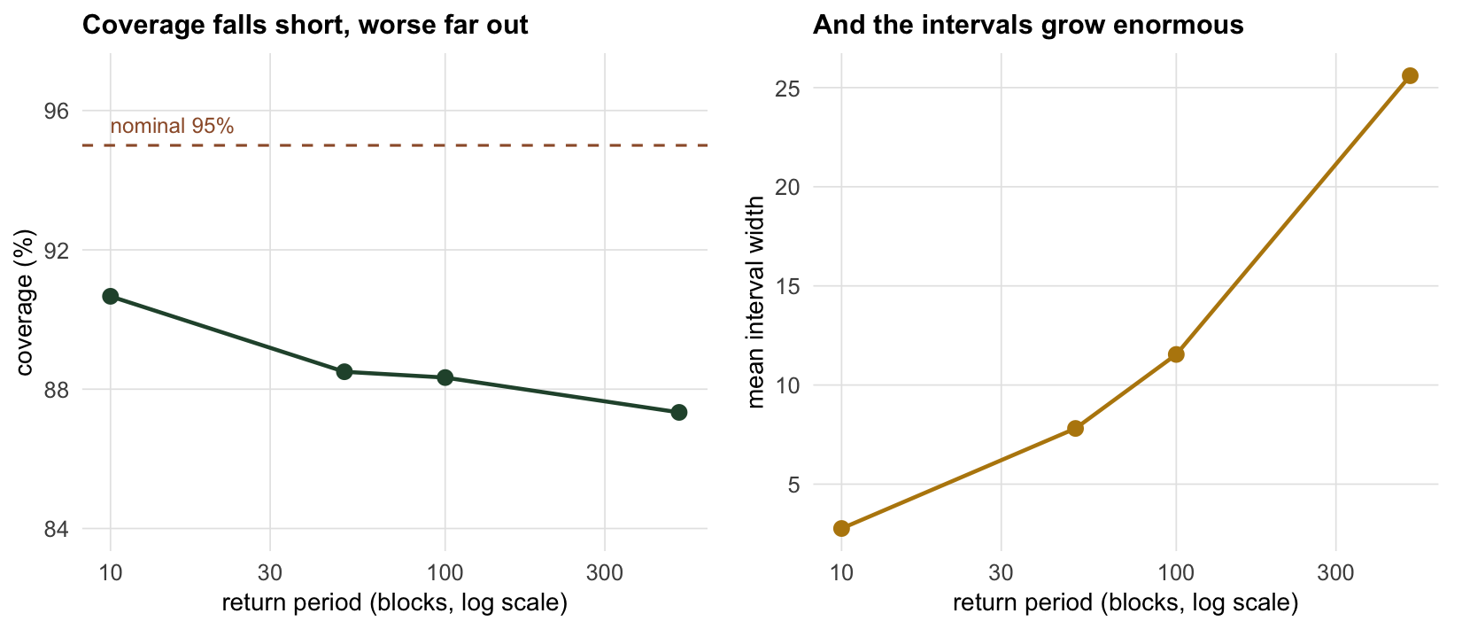
Across 600 simulated datasets the coverage of the nominal ninety-five per cent interval is 91 per cent at the ten-year level, 88 per cent at the hundred-year level, and 87 per cent at the five-hundred-year level. None of them reaches ninety-five, and the shortfall grows as the return period lengthens. At the same time the interval is becoming enormous: its mean width climbs from 2.8 at the ten-year level to 25.6 at the five-hundred-year level. So the delta-method interval manages to be both too narrow to keep its promise and too wide to be useful, a combination that gets worse the further out you extrapolate. The profile likelihood intervals of the previous post do better, because they follow the curvature of the likelihood rather than a straight-line approximation to it, but even they cannot manufacture information the data do not hold. A five-hundred-year level from sixty years of data is a guess with an honest label, and the label is wide.
What to take away
Checking an extreme value model comes down to three habits, and this cluster has met all three. Look at the fit with PP and QQ plots, and treat a curved tail in the quantile plot as a reason to change the family or the threshold. Report the sensitivity of the headline number to the choices only the analyst makes, the block and the threshold, because those choices move the answer and a single number hides that. And do not believe a return level interval further than the data reach: a simulation shows the nominal ninety-five per cent coverage is not delivered, the shortfall worsens with the return period, and the width grows until the number stops being informative. The through-line of the whole cluster is one honest sentence. Extreme value theory is the right framework for the rare, damaging events that ecology often cares about most, but the tail is an extrapolation steered by a shape parameter that short records barely constrain, so the estimates deserve wide intervals, explicit sensitivity, and real humility, most of all for the longest return periods and under a changing climate.
References
Coles S 2001 An Introduction to Statistical Modeling of Extreme Values, Springer (ISBN 978-1-85233-459-8)
Davison AC, Smith RL 1990 Journal of the Royal Statistical Society Series B 52(3):393-425 (10.1111/j.2517-6161.1990.tb01796.x)
Katz RW, Brush GS, Parlange MB 2005 Ecology 86(5):1124-1134 (10.1890/04-0606)
Coles S, Pericchi LR, Sisson S 2003 Journal of Hydrology 273(1-4):35-50 (10.1016/S0022-1694(02)00353-0)