---
title: "Temporal autocorrelation and effective sample size"
description: "How autocorrelation shrinks the effective sample size of a time series, why the naive correlation test between two series over-rejects, and how to correct it."
date: "2026-06-05 14:00"
date-modified: "2026-10-14"
categories: [R, time series, autocorrelation, ecology tutorial]
image: thumbnail.png
image-alt: "Sample autocorrelation function of an AR(1) series decaying towards zero, with the naive white-noise band marked."
---
*Corrected 14 October 2026: the take-away said a persistent record holds the information of a couple of dozen independent points and makes any test that assumes independence too confident; it now ties the couple of dozen to the mean and the over-confidence of a correlation or slope to a comparison with another persistent series. The post also said the effective-degrees-of-freedom correction restores the nominal rejection rate, and now says it brings the rate close to that level.*
*Corrected 7 October 2026: the post said it stays in base R throughout; it now says only the analysis does, since the figures are drawn with an add-on plotting package.*
*Corrected 30 September 2026: the sentence on spurious correlations between independent series read as a one-sided threshold; it now says the percentages count correlations beyond the threshold in either direction, as the code does.*
A field ecologist rarely gets independent observations through time. Counts, temperatures, water levels and phenological dates recorded month after month carry over: a warm April makes a warm May more likely, a high vole year props up the next. That carry-over is temporal autocorrelation, and ignoring it does more than annoy a reviewer. It quietly shrinks how much information the series actually holds, and it makes ordinary significance tests reject far too often. This post builds the autocorrelation and partial autocorrelation functions by hand, shows how they translate into an effective sample size, and demonstrates the single most common trap: two unrelated series that appear correlated simply because both are autocorrelated.
The analysis stays in base R: `arima.sim`, `acf`, `pacf`, `lm` and `cor` all come from `stats`, and ggplot2 is used only to draw the figures.
## An autocorrelated series and its correlogram
A first-order autoregressive process, AR(1), is the simplest useful model of carry-over. Each value is a fraction of the previous one plus fresh noise: `y[t] = phi * y[t-1] + e[t]`. The single parameter `phi` sets the persistence. We simulate ten years of monthly values with strong persistence.
```{r}
#| label: setup
#| message: false
#| warning: false
#| code-fold: true
#| code-summary: "Setup: packages, colours and plot theme"
library(ggplot2)

theme_te <- function(base_size = 12) {
  theme_minimal(base_size = base_size) + theme(
    text = element_text(colour = "#2c3a31"),
    plot.title = element_text(colour = "#16241d", face = "bold", size = rel(0.95)),
    plot.subtitle = element_text(colour = "#46604a", size = rel(0.80)),
    axis.title = element_text(colour = "#46604a", size = rel(0.88)),
    axis.text = element_text(colour = "#5d6b61", size = rel(0.78)),
    panel.grid.major = element_line(colour = "#dad9ca", linewidth = 0.3),
    panel.grid.minor = element_blank(),
    plot.background = element_rect(fill = "#f5f4ee", colour = NA),
    panel.background = element_rect(fill = "#f5f4ee", colour = NA),
    legend.title = element_text(colour = "#46604a", size = rel(0.80)),
    legend.text = element_text(colour = "#5d6b61", size = rel(0.78)),
    legend.position = "top")
}
FOREST <- "#275139"; GOLD <- "#c9b458"; RUST <- "#b5534e"; MOWN <- "#2f8f63"; SAGE <- "#93a87f"

# ACF by hand (biased estimator, matching stats::acf)
acf_hand <- function(x, kmax) {
  x <- x - mean(x); d0 <- sum(x^2)
  sapply(0:kmax, function(k) sum(x[(k + 1):length(x)] * x[1:(length(x) - k)]) / d0)
}
# PACF by the Durbin-Levinson recursion
pacf_dl <- function(rho, kmax) {
  phi_kk <- numeric(kmax); phi_prev <- numeric(0)
  for (k in 1:kmax) {
    if (k == 1) { phi_kk[1] <- rho[2] } else {
      phi_kk[k] <- (rho[k + 1] - sum(phi_prev * rho[k:2])) / (1 - sum(phi_prev * rho[2:k]))
    }
    phi_new <- numeric(k); phi_new[k] <- phi_kk[k]
    if (k > 1) phi_new[1:(k - 1)] <- phi_prev - phi_kk[k] * rev(phi_prev)
    phi_prev <- phi_new
  }
  phi_kk
}
# ACF at lags 1..kmax (no lag 0), for the effective-df correction
acf_est <- function(x, kmax) {
  x <- x - mean(x); d0 <- sum(x^2)
  sapply(1:kmax, function(k) sum(x[(k + 1):length(x)] * x[1:(length(x) - k)]) / d0)
}
# Dutilleul (1993) modified t-test p-value for cor(x, y)
mod_t_p <- function(x, y) {
  r <- cor(x, y); m <- length(x); kmax <- floor(m / 5)
  rx <- acf_est(x, kmax); ry <- acf_est(y, kmax)
  ne <- max(1 + m / (1 + 2 * sum(rx * ry)), 3)
  tstat <- r * sqrt((ne - 2) / (1 - r^2))
  2 * pt(-abs(tstat), df = ne - 2)
}
```
```{r}
#| label: sim-acf
set.seed(4240)
phi <- 0.7; n <- 120
y <- as.numeric(arima.sim(list(ar = phi), n = n))

K <- 20
acf_h <- acf_hand(y, K)                 # by hand
acf_b <- as.numeric(acf(y, lag.max = K, plot = FALSE)$acf)
pacf_h <- pacf_dl(acf_h, K)
pacf_b <- as.numeric(pacf(y, lag.max = K, plot = FALSE)$acf)

acf_match  <- max(abs(acf_h - acf_b))
pacf_match <- max(abs(pacf_h - pacf_b))
```
The hand computation reproduces `stats::acf` and `stats::pacf` to within floating-point rounding, so we understand exactly what the built-in functions return. The estimator is the standard biased one: the lag-`k` autocovariance is divided by the lag-0 sum, not by `n - k`.
```{r}
#| label: fp-guard-1
#| include: false
stopifnot(max(abs(acf_match)) < 1e-10, max(abs(pacf_match)) < 1e-10)
```
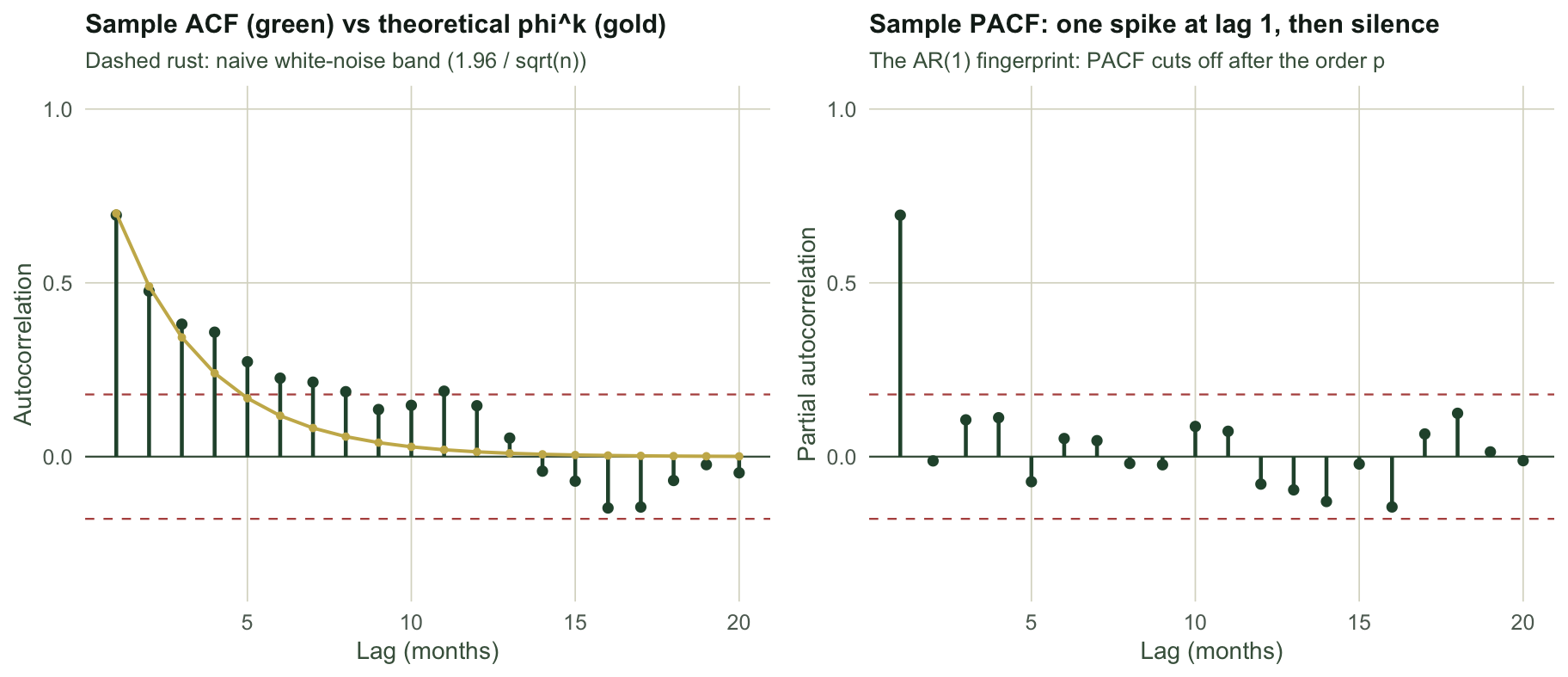
The two functions read a series in complementary ways. The **autocorrelation function (ACF)** measures the correlation between the series and a copy of itself shifted by `k` steps. For an AR(1) process it should decay geometrically as `phi^k`. The lag-1 sample value here is `r round(acf_h[2], 3)`, close to the true `phi` of `r phi`. The **partial autocorrelation function (PACF)** removes the intervening lags, asking what lag `k` adds once lags `1` to `k - 1` are accounted for. For an AR(1) process the PACF has a single spike at lag 1 and is near zero afterwards: here lag 1 is `r round(pacf_h[1], 3)`, lag 2 is `r round(pacf_h[2], 3)` and lag 3 is `r round(pacf_h[3], 3)`. That contrast, a slow ACF decay against a sharp PACF cutoff, is the signature that tells you the order of an autoregressive model. The next post uses it directly.
```{r}
#| label: fig-correlogram
#| echo: false
#| fig-width: 9.5
#| fig-height: 4.1
#| fig-cap: "Sample ACF and PACF of an AR(1) series. The ACF decays like phi^k; the PACF spikes once at lag 1 then falls silent."
#| fig-alt: "Two panels. Left: sample autocorrelation as green stems declining from about 0.7 towards zero, tracking a gold theoretical phi-to-the-k line, with dashed rust lines marking the naive white-noise band; the early lags sit well above the band. Right: partial autocorrelation as green stems with a single tall spike at lag 1 near 0.7 and all later lags close to zero within the band."
band <- 1.96 / sqrt(n)
dfA <- data.frame(lag = 1:K, acf = acf_h[2:(K + 1)], theo = phi^(1:K))
pA <- ggplot(dfA, aes(lag, acf)) +
geom_hline(yintercept = 0, colour = "#46604a", linewidth = 0.4) +
geom_hline(yintercept = c(-band, band), colour = RUST, linetype = "dashed", linewidth = 0.4) +
geom_segment(aes(xend = lag, yend = 0), colour = FOREST, linewidth = 0.8) +
geom_point(colour = FOREST, size = 1.6) +
geom_line(aes(y = theo), colour = GOLD, linewidth = 0.7) +
geom_point(aes(y = theo), colour = GOLD, size = 1.0) +
labs(title = "Sample ACF (green) vs theoretical phi^k (gold)",
subtitle = "Dashed rust: naive white-noise band (1.96 / sqrt(n))",
x = "Lag (months)", y = "Autocorrelation") +
coord_cartesian(ylim = c(-0.35, 1)) + theme_te()
dfB <- data.frame(lag = 1:K, pacf = pacf_h)
pB <- ggplot(dfB, aes(lag, pacf)) +
geom_hline(yintercept = 0, colour = "#46604a", linewidth = 0.4) +
geom_hline(yintercept = c(-band, band), colour = RUST, linetype = "dashed", linewidth = 0.4) +
geom_segment(aes(xend = lag, yend = 0), colour = FOREST, linewidth = 0.8) +
geom_point(colour = FOREST, size = 1.6) +
labs(title = "Sample PACF: one spike at lag 1, then silence",
subtitle = "The AR(1) fingerprint: PACF cuts off after the order p",
x = "Lag (months)", y = "Partial autocorrelation") +
coord_cartesian(ylim = c(-0.35, 1)) + theme_te()
grid::grid.newpage()
grid::pushViewport(grid::viewport(layout = grid::grid.layout(1, 2)))
print(pA, vp = grid::viewport(layout.pos.row = 1, layout.pos.col = 1))
print(pB, vp = grid::viewport(layout.pos.row = 1, layout.pos.col = 2))
```
## How much information does the series really hold?
The dashed band in the ACF panel is the interval a naive analysis would use to decide whether an autocorrelation is real: plus or minus `1.96 / sqrt(n)`, built on the assumption that the data are independent. That assumption is exactly what fails here. When observations carry over, each new value repeats part of what the last one already told you, so the series behaves as if it had fewer independent points than its length suggests.
For estimating a mean from an AR(1) series, the variance of the sample mean is inflated relative to the independent case by a factor that depends only on `phi`:
```{r}
#| label: eff-n
vif_mean <- (1 + phi) / (1 - phi)
n_eff <- n * (1 - phi) / (1 + phi)
```
With `phi` of `r phi`, the variance inflation factor is `r round(vif_mean, 2)` and the effective sample size drops from `r n` to about `r round(n_eff, 0)`. Ten years of monthly counts carry roughly the information of `r round(n_eff, 0)` independent observations. A short simulation confirms it: we draw many AR(1) series, take each sample mean, and compare its true spread against the naive standard error `sd / sqrt(n)`.
```{r}
#| label: mean-coverage
B <- 4000
means <- naive_se <- numeric(B)
set.seed(4240)
for (b in seq_len(B)) {
  z <- as.numeric(arima.sim(list(ar = phi), n = n))
  means[b] <- mean(z)
  naive_se[b] <- sd(z) / sqrt(n)
}
emp_sd <- sd(means)
ratio_se <- emp_sd / mean(naive_se)
cover_naive <- mean(abs(means) <= 1.96 * naive_se)
cover_eff <- mean(abs(means) <= 1.96 * naive_se * sqrt(vif_mean))
```
The true spread of the sample mean is `r round(emp_sd, 3)`, but the naive standard error averages `r round(mean(naive_se), 3)`. The naive figure is too small by a factor of `r round(ratio_se, 2)`, which matches `sqrt(VIF)` of `r round(sqrt(vif_mean), 2)`. The practical damage: a naive 95% confidence interval for the mean covers the truth only `r round(cover_naive * 100, 0)`% of the time, not 95%. Rescaling the standard error by `sqrt(VIF)`, equivalently using the effective sample size, restores coverage to `r round(cover_eff * 100, 0)`%.
## The classic trap: two series that are not related
The most costly consequence is not about a single mean but about comparing two series. Suppose you record two monitoring variables, each persistent through time, and ask whether they move together. Regressing one on the other with `lm`, or testing their correlation, uses a standard error built for independent data. Because both series drift and linger, spurious agreement is common.
```{r}
#| label: spurious-demo
set.seed(4240)
x1 <- as.numeric(arima.sim(list(ar = phi), n = n))
y1 <- as.numeric(arima.sim(list(ar = phi), n = n))   # generated independently of x1
r_demo <- cor(x1, y1)
p_ols <- summary(lm(y1 ~ x1))$coefficients[2, 4]
p_corr <- mod_t_p(x1, y1)
```
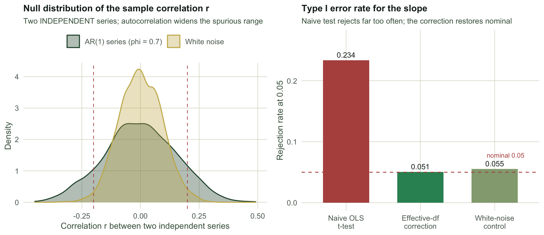
These two series share nothing by construction, yet their sample correlation is `r round(r_demo, 2)` and the ordinary slope test returns a p-value of `r round(p_ols, 3)`, close to conventional significance. The Dutilleul (1993) modified test, which replaces the sample size with an effective one derived from both series' autocorrelation, returns `r round(p_corr, 2)`, non-significant. To see that this is systematic rather than one unlucky draw, we repeat the experiment many times and count how often each test rejects the (true) null of no relationship.
```{r}
#| label: spurious-mc
B <- 3000
p_naive <- p_dutil <- p_white <- numeric(B)
set.seed(4241)
for (b in seq_len(B)) {
  x <- as.numeric(arima.sim(list(ar = phi), n = n))
  y <- as.numeric(arima.sim(list(ar = phi), n = n))
  p_naive[b] <- summary(lm(y ~ x))$coefficients[2, 4]
  p_dutil[b] <- mod_t_p(x, y)
  xw <- rnorm(n); yw <- rnorm(n)                       # white-noise control
  p_white[b] <- summary(lm(yw ~ xw))$coefficients[2, 4]
}
rej_naive <- mean(p_naive < 0.05)
rej_dutil <- mean(p_dutil < 0.05)
rej_white <- mean(p_white < 0.05)

set.seed(4242)
r_ar <- r_wn <- numeric(B)
for (b in seq_len(B)) {
  r_ar[b] <- cor(as.numeric(arima.sim(list(ar = phi), n = n)),
                 as.numeric(arima.sim(list(ar = phi), n = n)))
  r_wn[b] <- cor(rnorm(n), rnorm(n))
}
```
The naive slope test rejects `r round(rej_naive * 100, 0)`% of the time when it should reject 5%, an error rate inflated roughly `r round(rej_naive / 0.05, 0)`-fold. The white-noise control sits at `r round(rej_white * 100, 0)`%, confirming that the test itself is fine and the fault is the autocorrelation. The effective-df correction pulls the rate back close to the nominal level, to `r round(rej_dutil * 100, 0)`% in this run. The left panel below shows why: the null distribution of the sample correlation is far wider for autocorrelated series than for white noise. A correlation beyond plus or minus 0.2 between two independent series happens `r round(mean(abs(r_ar) > 0.2) * 100, 0)`% of the time when both are AR(1), against `r round(mean(abs(r_wn) > 0.2) * 100, 0)`% for white noise.
```{r}
#| label: fig-spurious
#| echo: false
#| fig-width: 9.5
#| fig-height: 4.1
#| fig-cap: "Left: the null distribution of the sample correlation between two independent series is much wider under autocorrelation. Right: the naive t-test rejects the true null far too often; an effective-degrees-of-freedom correction brings the rate close to the nominal level."
#| fig-alt: "Two panels. Left: two overlaid density curves of the correlation between two independent series; the green AR(1) curve is broad, spreading past plus and minus 0.2 marked by dashed rust lines, while the gold white-noise curve is narrow and concentrated near zero. Right: a bar chart of rejection rate at 0.05 for three methods; the naive OLS t-test bar reaches about 0.23, far above the dashed nominal 0.05 line, while the effective-df correction and the white-noise control both sit near 0.05."
dfR <- rbind(data.frame(r = r_ar, kind = "AR(1) series (phi = 0.7)"),
data.frame(r = r_wn, kind = "White noise"))
pA <- ggplot(dfR, aes(r, fill = kind, colour = kind)) +
geom_density(alpha = 0.35, linewidth = 0.6) +
scale_fill_manual(values = c("AR(1) series (phi = 0.7)" = FOREST, "White noise" = GOLD)) +
scale_colour_manual(values = c("AR(1) series (phi = 0.7)" = FOREST, "White noise" = GOLD)) +
geom_vline(xintercept = c(-0.2, 0.2), colour = RUST, linetype = "dashed", linewidth = 0.4) +
labs(title = "Null distribution of the sample correlation r",
subtitle = "Two INDEPENDENT series; autocorrelation widens the spurious range",
x = "Correlation r between two independent series", y = "Density",
fill = NULL, colour = NULL) +
theme_te()
dfT <- data.frame(
method = factor(c("Naive OLS\nt-test", "Effective-df\ncorrection", "White-noise\ncontrol"),
levels = c("Naive OLS\nt-test", "Effective-df\ncorrection", "White-noise\ncontrol")),
rate = c(rej_naive, rej_dutil, rej_white))
pB <- ggplot(dfT, aes(method, rate, fill = method)) +
geom_col(width = 0.62) +
geom_hline(yintercept = 0.05, colour = RUST, linetype = "dashed", linewidth = 0.5) +
geom_text(aes(label = sprintf("%.3f", rate)), vjust = -0.5, colour = "#16241d", size = 3.3) +
annotate("text", x = 3.4, y = 0.078, label = "nominal 0.05", colour = RUST, size = 2.9, hjust = 1) +
scale_fill_manual(values = c(RUST, MOWN, SAGE), guide = "none") +
labs(title = "Type I error rate for the slope",
subtitle = "Naive test rejects far too often; the correction comes near nominal",
x = NULL, y = "Rejection rate at 0.05") +
coord_cartesian(ylim = c(0, 0.27)) + theme_te()
grid::grid.newpage()
grid::pushViewport(grid::viewport(layout = grid::grid.layout(1, 2)))
print(pA, vp = grid::viewport(layout.pos.row = 1, layout.pos.col = 1))
print(pB, vp = grid::viewport(layout.pos.row = 1, layout.pos.col = 2))
```
## What to carry away
Temporal autocorrelation is not a nuisance to be swept into the residuals. It sets how much a series actually tells you. A persistent monthly record can hold the information of a couple of dozen independent points about its mean, and any test that assumes independence, whether a confidence interval for that mean or a correlation or regression slope against another persistent series, will be too confident. The effective-degrees-of-freedom correction shown here is the temporal cousin of the spatial adjustment used when neighbouring sites are not independent: same logic, same fix. Detecting that a real ecological relationship exists between two time series takes an honest accounting of the autocorrelation, not just a small p-value.
Two habits follow. First, always look at the correlogram before testing anything on a time series; the ACF and PACF tell you both how strong the carry-over is and what model might describe it. Second, when you compare two series, correct for their autocorrelation, whether through an effective sample size, a generalised least squares fit with an autoregressive error, or the prewhitening approach we return to when checking a time series model. The next post reads the ACF and PACF the other way round, using them to identify and fit an autoregressive-moving-average model.
## References
- Bartlett 1946 Supplement to the Journal of the Royal Statistical Society 8(1):27-41 (10.2307/2983611)
- Box, Jenkins, Reinsel & Ljung 2015 Time Series Analysis: Forecasting and Control, 5th ed, Wiley, ISBN 978-1-118-67502-1
- Clifford, Richardson & Hemon 1989 Biometrics 45(1):123-134 (10.2307/2532039)
- Dutilleul 1993 Biometrics 49(1):305-314 (10.2307/2532625)
- Legendre & Legendre 2012 Numerical Ecology, 3rd ed, Elsevier, ISBN 978-0-444-53868-0
## Related tutorials
- [Fitting ARIMA models to ecological time series](../fitting-arima-models/)
- [Spectral analysis of population cycles](../spectral-analysis-of-population-cycles/)
- [Checking a time series model](../checking-a-time-series-model/)
- [Tuning proxy records manufactures synchrony](../tuning-two-proxy-records/)