library(ggplot2)

knitr::opts_chunk$set(dev.args = list(bg = "#f5f4ee"))

te_pal <- list(forest = "#275139", green = "#2f8f63", sage = "#93a87f",
               clay = "#b5534e", gold = "#cda23f", line = "#dad9ca",
               ink = "#16241d", paper = "#f5f4ee")

theme_te <- function() {
  theme_minimal(base_size = 12) +
    theme(panel.grid.minor = element_blank(),
          panel.grid.major = element_line(colour = "#e7e6dc"),
          plot.background = element_rect(fill = "#f5f4ee", colour = NA),
          panel.background = element_rect(fill = "#f5f4ee", colour = NA),
          plot.title = element_text(face = "bold", colour = te_pal$ink),
          axis.title = element_text(colour = "#2c3a31"))
}When redrawing zones flips the sign
R
spatial ecology
model diagnostics
ecology tutorial
ggplot2
Redrawing survey zones at a fixed unit count can reverse the sign of an ecological relationship. Measured in R, with the variance check that predicts it.
Corrected 27 September 2026: the post described the random zonations as compact; it now says they are mostly compact, since the capacity rule leaves some units in scattered pieces, as the random panel of the zoning map shows.
The post on rasterising a vector layer already names this problem and cites Jelinski and Wu 1996 for it: slide the grid a metre under a hedgerow and the measured area changes, because the answer belongs to the zoning as much as to the thing measured. That post re-zones a single measured quantity, and the damage is a biased number: an area too big, an area too small, an area of zero. This post re-zones a relationship between two variables, and the damage is a reversed sign. Same fine-grained data, same number of reporting units, the same number of cells inside every unit; one set of boundaries reports a positive association and another reports a negative one. Two things come with that which the area version has no equivalent for: the condition the boundaries have to satisfy before the sign can move at all, and a one-line check that tells you whether your zones satisfy it.
The condition matters because the flip is not an ambient hazard. Two hundred randomly drawn zonations of the same data, at the same unit count and with the same number of cells in every unit, spread the estimate across less than a factor of two from end to end and did not flip it once. What flips it is a boundary set that carries information about a driver operating at a different scale and pushing the other way. That is a narrow precondition, it is common in ecology, and it is checkable.
A lattice with two processes running opposite ways
Everything here is synthetic, on a 120 by 120 lattice, so the processes that generated the data are known rather than inferred. Two fields are involved. A fine-scale process ties x and y together negatively: within a neighbourhood, more of one means less of the other, which is what competition, interference or a shared limiting resource looks like at short range. A regional gradient lifts both together: productivity, temperature or rainfall running south to north, raising x and y at the same time. Neither is exotic. Most field data sets have something like both.
The fine-scale field is white noise put through a separable Gaussian kernel with reflecting edges and then standardised, so its correlation length is set by one number and its variance is one whatever that number is. Writing the smoother out rather than calling a package keeps the only tunable in plain sight.
set.seed(227)
n_side <- 120L
gx <- matrix(rep(seq_len(n_side), each = n_side), n_side, n_side)
gy <- matrix(rep(seq_len(n_side), times = n_side), n_side, n_side)

smooth_field <- function(nn, sigma) {
  zf <- matrix(rnorm(nn * nn), nn, nn)
  kk <- ceiling(3 * sigma); dd <- (-kk):kk
  wt <- exp(-(dd^2) / (2 * sigma^2)); wt <- wt / sum(wt)
  zp <- rbind(zf[kk:1, , drop = FALSE], zf,
              zf[nn:(nn - kk + 1), , drop = FALSE])
  zp <- cbind(zp[, kk:1, drop = FALSE], zp,
              zp[, nn:(nn - kk + 1), drop = FALSE])
  o1 <- matrix(0, nrow(zp), ncol(zp))
  for (j in seq_along(dd))
    o1 <- o1 + wt[j] * zp[, pmin(pmax(seq_len(ncol(zp)) + dd[j], 1),
                                 ncol(zp)), drop = FALSE]
  o2 <- matrix(0, nrow(zp), ncol(zp))
  for (j in seq_along(dd))
    o2 <- o2 + wt[j] * o1[pmin(pmax(seq_len(nrow(zp)) + dd[j], 1),
                               nrow(zp)), , drop = FALSE]
  sm <- o2[(kk + 1):(kk + nn), (kk + 1):(kk + nn)]
  (sm - mean(sm)) / sd(sm)
}
The regional gradient is a plane running south to north, standardised the same way. Using a plane rather than a second random field makes the arithmetic below exact instead of approximate, which is worth one line in the limits section at the end.
broad <- (gy - mean(gy)) / sd(as.vector(gy))
fine  <- smooth_field(n_side, 3)
noise <- smooth_field(n_side, 3)

xv <- fine + 1.15 * broad
yv <- -1.0 * fine + 1.15 * broad + 0.25 * noise

ind_slope  <- unname(coef(lm(as.vector(yv) ~ as.vector(xv)))[2])
fine_slope <- unname(coef(lm(as.vector(yv) ~ as.vector(fine)))[2])
fine_gap   <- 100 * abs(fine_slope - (-1.0))
broad_var  <- var(as.vector(broad))
n_cell     <- n_side * n_side
print(round(c(cells = n_cell, individual = ind_slope,
              on_fine_field = fine_slope, fine_gap_pct = fine_gap,
              gradient_variance = broad_var), 3))
cells individual on_fine_field fine_gap_pct
14400.000 0.115 -0.972 2.833
gradient_variance
1.000 Regressing y on x cell by cell, over all 14400 cells, gives a slope of +0.115. That number is already a mixture and not a truth: the fine-scale process contributes -0.972, the gradient contributes a positive amount, and the cell-level answer is what you get when the two are weighted by however much of each happens to be in the data. The -0.972 is worth a second look, because the coefficient typed into the code above is -1.0 exactly. Regressing y on the fine field alone does not return it; it misses by 2.8 per cent, because on a finite lattice the fine field, the gradient and the extra noise are not exactly uncorrelated with one another. That is the size of the gap between a coefficient you wrote down and a coefficient you can measure, before any aggregation has happened at all. Hold on to it, because it means there is no privileged scale, and no exact target, to compare the aggregate answers against.
map_long <- rbind(
  data.frame(px = as.vector(gx), py = as.vector(gy),
             v = as.vector(broad), panel = "regional gradient"),
  data.frame(px = as.vector(gx), py = as.vector(gy),
             v = as.vector(xv), panel = "x"),
  data.frame(px = as.vector(gx), py = as.vector(gy),
             v = as.vector(yv), panel = "y"))

ggplot(map_long, aes(px, py, fill = v)) +
  geom_raster() +
  facet_wrap(~panel) +
  coord_equal() +
  scale_fill_gradient2(low = te_pal$clay, mid = "#efeee2",
                       high = te_pal$forest, midpoint = 0, name = NULL) +
  labs(title = "One gradient, two variables, opposite fine-scale signs",
       x = NULL, y = NULL) +
  theme_te() +
  theme(axis.text = element_blank(), panel.grid = element_blank(),
        legend.key.height = unit(0.9, "lines"))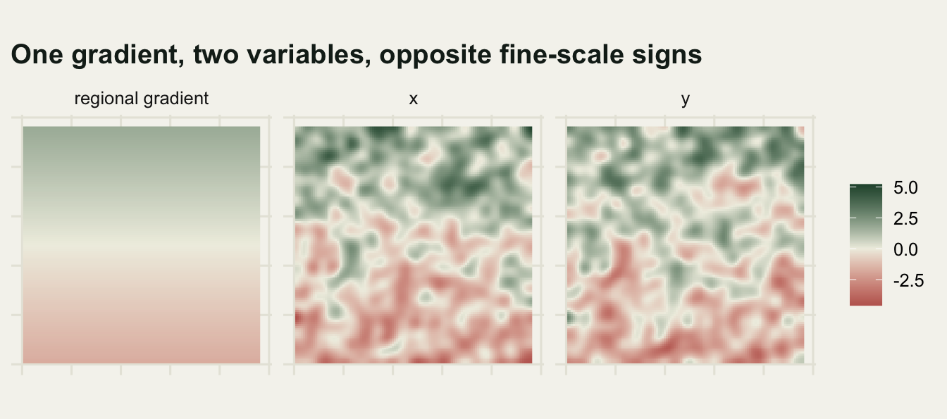
Look at the middle and right panels. The broad ramp is the same in both, and the speckle is inverted: a bright fleck in x sits over a dark fleck in y. An analyst who samples quadrats a few cells apart sees the speckle and reports a negative association. An analyst who compares regions hundreds of cells apart sees the ramp and reports a positive one. Both are looking at the same map.
Three zonations, one data set
Now aggregate. The three designs share a budget: the same number of units, and the same number of cells inside every one of them. A lattice 120 cells on a side divides exactly at the numbers below, which is what makes the comparison clean rather than approximate.
n_unit <- 60L
unit_n <- n_cell %/% n_unit
unit_w <- n_side %/% n_unit
print(c(cells = n_cell, units = n_unit, cells_per_unit = unit_n,
        strip_width = unit_w))
cells units cells_per_unit strip_width
14400 60 240 2 Every design below produces exactly 60 units of exactly 240 cells each, so unit count and grain are held fixed and only the boundaries change. That is the zoning half of the modifiable areal unit problem, as opposed to the scale half that changes the unit size; Openshaw 1984 separates them, and it is the zoning half that is usually skipped in sensitivity analyses because it has no obvious dial to turn.
Two of the designs are strips exactly 2 cells wide, differing only in orientation. Bands run east to west and are stacked one above another going north, so each band sits at its own point on the gradient. Strips run south to north and are placed side by side going east, so each strip spans the whole gradient. The third design drops 60 seed points at random and hands every cell to a seed near it, which approximates the compact, blobby zonation that census tracts, forest compartments and survey blocks resemble.
A plain nearest-seed rule would break the budget. Seeds land unevenly, so the units come out anywhere between a few cells and a thousand, and the random arm would then differ from the designed ones in grain as well as in boundaries. The rule below adds a capacity. Each seed may hold 240 cells and no more; on each pass every unplaced cell names the nearest seed that still has room, each seed keeps the closest claimants it can fit, and the cells that were turned away go round again. What comes out is random and balanced to the cell, and mostly compact: the capacity rule sends the last cells to whichever seed still has room, so some units end up in scattered pieces (the slivers and stray patches near the right edge of the random panel in the zoning map below).
bands  <- matrix((gy - 1L) %/% unit_w + 1L, n_side, n_side)
strips <- matrix((gx - 1L) %/% unit_w + 1L, n_side, n_side)

rand_zones <- function() {
  sx <- runif(n_unit, 0.5, n_side + 0.5)
  sy <- runif(n_unit, 0.5, n_side + 0.5)
  d2 <- outer(as.vector(gx), sx, "-")^2 + outer(as.vector(gy), sy, "-")^2
  zone <- integer(n_cell)
  room <- rep(unit_n, n_unit)
  repeat {
    free <- which(zone == 0L)
    if (!length(free)) break
    open <- which(room > 0L)
    dd <- d2[free, open, drop = FALSE]
    j <- max.col(-dd, ties.method = "first")
    want <- open[j]
    near <- dd[cbind(seq_along(free), j)]
    ok <- order(want, near)
    ws <- want[ok]
    took <- sequence(rle(ws)$lengths) <= room[ws]
    zone[free[ok][took]] <- ws[took]
    room <- room - tabulate(ws[took], n_unit)
  }
  matrix(zone, n_side, n_side)
}

agg_slope <- function(zn, xf, yf) {
  mx <- tapply(as.vector(xf), as.vector(zn), mean)
  my <- tapply(as.vector(yf), as.vector(zn), mean)
  unname(coef(lm(my ~ mx))[2])
}
The aggregation is the ordinary one: take the mean of x and the mean of y inside each unit, then regress the 60 unit means on each other. This is what happens when a data set arrives as a table of districts, transects or compartments rather than as points.
band_slope  <- agg_slope(bands, xv, yv)
strip_slope <- agg_slope(strips, xv, yv)
design_tab <- data.frame(
  design = c("bands along the gradient", "strips across the gradient"),
  units = c(length(unique(as.vector(bands))),
            length(unique(as.vector(strips)))),
  smallest_unit = c(min(table(bands)), min(table(strips))),
  largest_unit = c(max(table(bands)), max(table(strips))),
  slope = round(c(band_slope, strip_slope), 3))
print(design_tab, row.names = FALSE)
design units smallest_unit largest_unit slope
bands along the gradient 60 240 240 0.802
strips across the gradient 60 240 240 -1.011swing <- band_slope - strip_slope
print(round(c(swing = swing), 2))swing
1.81 Bands give +0.802. Strips give -1.011. Neither design touched a single cell value, neither changed how many units there are, and neither changed how many cells sit inside a unit: the smallest and the largest unit in both designs hold 240 cells. Rotating the boundary set by ninety degrees moved the reported slope from strongly positive to strongly negative, a swing of 1.81 on a variable whose cell-level slope is +0.115.
zone_map <- function(zn, lab) {
  mv <- tapply(as.vector(broad), as.vector(zn), mean)
  data.frame(px = as.vector(gx), py = as.vector(gy),
             v = as.numeric(mv[as.character(as.vector(zn))]), panel = lab)
}
Before the picture, the check itself, which is the part a reader can run on real zones.
The check: how much of the driver survives between units
Aggregation replaces each unit by a pair of means. Whatever varies inside a unit is gone; whatever varies between units is what the regression sees. So the aggregate slope is a weighted blend of the fine-scale relationship and the broad-scale one, and the weights are set by how much of each driver survives the averaging. That gives a quantity you can compute without any modelling: the share of the driver’s variance that lives between units rather than inside them.
The law of total variance is what makes it a share. It splits the total variance of the driver into a within-unit part and a between-unit part, and the between-unit part is a sum over units of the squared distance from the unit mean to the grand mean, each term weighted by the share of the observations that fall in that unit. Divide that by the total variance and the answer is a proportion of one, which is exactly what you want to report.
The obvious shortcut, var() over the vector of unit means, is a different quantity and it is not bounded by one. It weights every unit equally whatever its size, and it applies Bessel’s correction to what is a whole population of units rather than a sample of them. On the bands below the shortcut returns a number above one, which is a share of more than 100 per cent and therefore a signal that the wrong thing has been computed.
retained <- function(zn, vf) {
  vv <- as.vector(vf)
  zz <- as.vector(zn)
  wt <- table(zz)
  mu <- tapply(vv, zz, mean)
  between <- sum(wt * (mu - mean(vv))^2) / length(vv)
  between / mean((vv - mean(vv))^2)
}

rand_draw <- replicate(200, {
  zn <- rand_zones()
  c(slope = agg_slope(zn, xv, yv), lo = min(table(zn)), hi = max(table(zn)))
})
rand_slopes <- rand_draw["slope", ]
z_rand <- rand_zones()

keep_share <- c(bands = retained(bands, broad), strips = retained(strips, broad),
                random = retained(z_rand, broad))
naive <- var(tapply(as.vector(broad), as.vector(bands), mean))
print(round(c(keep_share, unweighted_var_on_bands = naive), 4))
bands strips random
0.9998 0.0000 0.9118
unweighted_var_on_bands
1.0167 print(c(smallest_unit_over_draws = min(rand_draw["lo", ]),
largest_unit_over_draws = max(rand_draw["hi", ])))smallest_unit_over_draws largest_unit_over_draws
240 240 The gradient is standardised, so its cell-level variance is 1.000 and all of it is available to be kept or lost. Bands keep 0.9998 of it between units, because a band that thin sits almost entirely at one value of a plane. Strips keep 0.0000: every strip runs the full length of the gradient, so every strip has the same mean, and nothing of the driver is left between units. The random zonation keeps 0.9118, the same order as the bands. The unweighted shortcut on the bands returns 1.017, and the excess over one is Bessel’s correction applied to what is a whole population of 60 units, a factor of 60 over 59.
That is the whole mechanism. Under strips the broad-scale process contributes nothing between units, so the regression falls back on the fine-scale process, and the estimate of -1.011 lands beside the -0.972 that the fine field gives on its own. Under bands the broad-scale process survives intact while the fine speckle is averaged down inside each long thin unit, so the estimate leans hard the other way. The sign is not being corrupted; it is being selected by which process the boundaries let through.
zone_long <- rbind(
  zone_map(bands, sprintf("bands (%.4f)", keep_share[["bands"]])),
  zone_map(strips, sprintf("strips (%.4f)", keep_share[["strips"]])),
  zone_map(z_rand, sprintf("random (%.4f)", keep_share[["random"]])))
zone_long$panel <- factor(zone_long$panel, levels = unique(zone_long$panel))

ggplot(zone_long, aes(px, py, fill = v)) +
  geom_raster() +
  facet_wrap(~panel) +
  coord_equal() +
  scale_fill_gradient2(low = te_pal$clay, mid = "#efeee2",
                       high = te_pal$forest, midpoint = 0,
                       limits = range(broad), name = NULL) +
  labs(title = "What each design does to the regional gradient",
       subtitle = "share of the gradient's variance retained between units",
       x = NULL, y = NULL) +
  theme_te() +
  theme(axis.text = element_blank(), panel.grid = element_blank(),
        legend.key.height = unit(0.9, "lines"))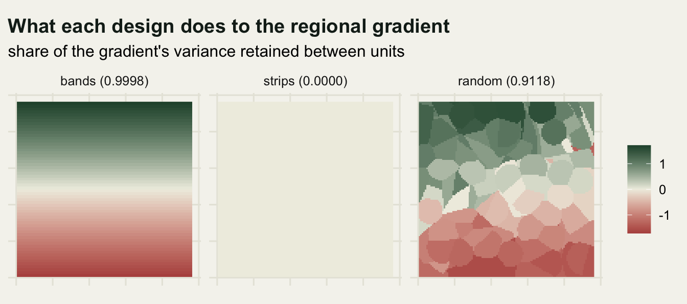
The middle panel is the diagnostic in visual form. It is not a rendering failure: every strip has the same mean gradient, so there is nothing left to shade. Any zonation whose panel looks like that has removed the driver, and any conclusion drawn from it is a statement about the residual process only.
On real data the driver is not hypothetical either. Elevation, mean annual temperature, latitude, distance to the coast and a productivity index are all available as rasters or point covariates, and the retained() function above is the whole calculation: unit sizes from table(unit_id), unit means from tapply(driver, unit_id, mean), the size-weighted mean of squared deviations from the grand mean, divided by the variance of the driver over the raw observations. A share near one says your units are laid out along the driver, a share near zero says they are laid out across it, and if a second process at another scale is pulling the other way, two studies at opposite ends of that share can disagree about the sign no matter how carefully each one is fitted.
Random re-zoning will not find this
The obvious sensitivity analysis is to redraw the boundaries at random a few hundred times and look at the spread. That check is worth running and it does not find the flip.
rand_summary <- c(median = median(rand_slopes), min = min(rand_slopes),
                  max = max(rand_slopes), positive = sum(rand_slopes > 0),
                  negative = sum(rand_slopes < 0))
print(round(rand_summary, 3))
median min max positive negative
0.560 0.399 0.695 200.000 0.000 rand_spread <- max(rand_slopes) / min(rand_slopes)
rand_amp <- median(rand_slopes) / ind_slope
rand_slope <- agg_slope(z_rand, xv, yv)
n_rand <- length(rand_slopes)
print(round(c(end_to_end_factor = rand_spread,
amplification_over_cells = rand_amp,
slope_of_the_mapped_draw = rand_slope), 3)) end_to_end_factor amplification_over_cells slope_of_the_mapped_draw
1.743 4.850 0.581 Across 200 random zonations, all with the same unit count and the same 240 cells in every unit as the bands and the strips, the median slope is +0.560 and the range runs from +0.399 to +0.695, a factor of 1.74 between the two ends. Every one of the 200 draws is positive, and the capacity rule held in all of them: the smallest unit anywhere in the set had 240 cells and so did the largest. The sign never moved.
Two things follow. The first is a warning about the check: a re-zoning envelope of +0.399 to +0.695 looks reassuring, and the honest reading of it is only that arbitrary boundaries are stable, which is not the failure mode. The second is quieter. The random median of +0.560 sits well above the cell-level +0.115, so aggregating with uninformative boundaries has already changed the answer by a factor of 4.8. Compact units average the fine-scale process down faster than they average the gradient down, and the gradient is the positive one. Even the boring zonation is not neutral.
mark_df <- data.frame(
  v = c(ind_slope, band_slope, strip_slope),
  lab = c("cells", "bands", "strips"))

hist_bw <- 0.02
brk <- seq(floor(min(rand_slopes) / hist_bw) * hist_bw,
           ceiling(max(rand_slopes) / hist_bw) * hist_bw, by = hist_bw)
lab_y <- max(hist(rand_slopes, breaks = brk, plot = FALSE)$counts)

ggplot(data.frame(v = rand_slopes), aes(v)) +
  geom_histogram(breaks = brk, fill = te_pal$green, colour = te_pal$paper,
                 linewidth = 0.2) +
  geom_vline(data = mark_df, aes(xintercept = v, colour = lab),
             linetype = "dashed", linewidth = 0.7) +
  geom_text(data = mark_df, aes(x = v, y = lab_y, label = lab, colour = lab),
            angle = 90, vjust = -0.4, hjust = 1, size = 3.5,
            show.legend = FALSE) +
  scale_colour_manual(values = c(cells = te_pal$ink, bands = te_pal$gold,
                                 strips = te_pal$clay), guide = "none") +
  labs(title = "Arbitrary boundaries are stable, informative ones are not",
       subtitle = sprintf("%d random zonations, %d units of %d cells each",
                          length(rand_slopes), n_unit, unit_n),
       x = "aggregate slope", y = "zonations") +
  theme_te()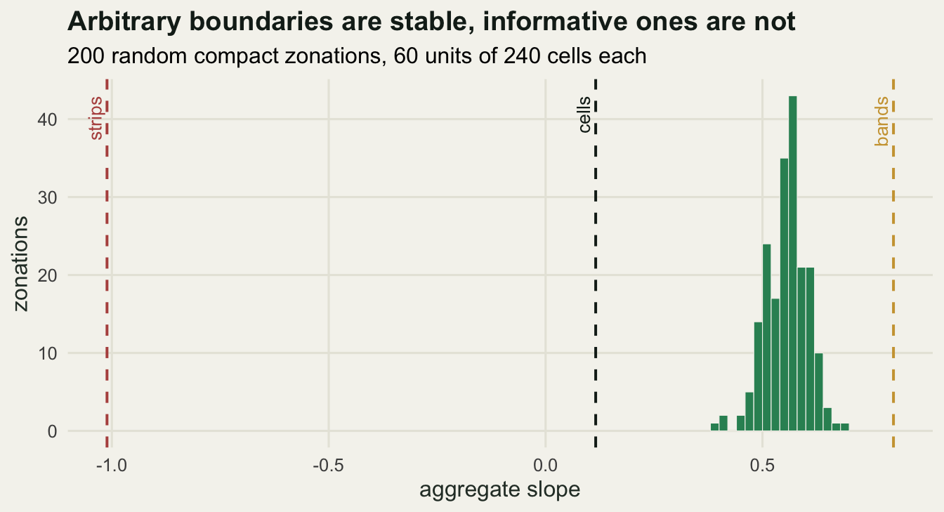
The three estimates side by side make the point that no amount of care in the regression itself would have helped. Each of them is a correctly fitted least squares line on 60 genuine unit means.
unit_means <- function(zn, lab) {
  data.frame(mx = as.numeric(tapply(as.vector(xv), as.vector(zn), mean)),
             my = as.numeric(tapply(as.vector(yv), as.vector(zn), mean)),
             panel = lab)
}
lab3 <- c(sprintf("bands: %+.3f", band_slope),
          sprintf("strips: %+.3f", strip_slope),
          sprintf("random: %+.3f", rand_slope))
scat <- rbind(unit_means(bands, lab3[1]), unit_means(strips, lab3[2]),
              unit_means(z_rand, lab3[3]))
scat$panel <- factor(scat$panel, levels = lab3)

ggplot(scat, aes(mx, my)) +
  geom_point(colour = te_pal$forest, size = 1.8, alpha = 0.85) +
  geom_smooth(method = "lm", formula = y ~ x, se = FALSE,
              colour = te_pal$clay, linewidth = 0.8) +
  facet_wrap(~panel) +
  labs(title = "Same cells, same unit count, three answers",
       x = "unit mean of x", y = "unit mean of y") +
  theme_te()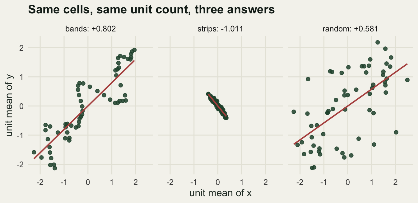
The middle panel also shows why the strip estimate is not a statistical artefact of a small cloud. The strips shrink the range of the unit means, because averaging along the full 120 cell length of the gradient removes most of the variation, but the points that remain lie along a clean negative line. A confidence interval computed inside that panel would be narrow and would exclude zero, and it would be answering a question about the fine-scale process without saying so.
The control: one scale, no flip
If zoning could reverse a sign whenever it felt like it, none of this would be a diagnosable problem. It cannot. The same random zonation machinery run against a single-scale data set does not get anywhere near zero.
set.seed(227)
xa <- smooth_field(n_side, 6)
ya <- -1.0 * xa + 0.8 * smooth_field(n_side, 6)
ctrl_ind <- unname(coef(lm(as.vector(ya) ~ as.vector(xa)))[2])
ctrl_slopes <- replicate(300, agg_slope(rand_zones(), xa, ya))
ctrl_bend <- 100 * max(abs(ctrl_slopes - ctrl_ind)) / abs(ctrl_ind)
print(round(c(individual = ctrl_ind, median = median(ctrl_slopes),
              min = min(ctrl_slopes), max = max(ctrl_slopes),
              negative = sum(ctrl_slopes < 0),
              positive = sum(ctrl_slopes > 0), bend_pct = ctrl_bend), 3))
individual median min max negative positive bend_pct
-1.107 -1.085 -1.310 -0.876 300.000 0.000 20.810 Here x drives y with a slope of -1 at one scale and there is no second process pulling the other way. The cell-level slope is -1.107. Across 300 random zonations the median is -1.085 and the extremes are -1.310 and -0.876. Every one of the 300 estimates is negative. Aggregation still bends the magnitude by up to 21 per cent, which is the ordinary aggregation effect that Gehlke and Biehl 1934 measured on census tracts, but the direction of the association is not in play.
So the precondition is specific: a second process at a different scale, pointing the other way, and boundaries that are informative about it. Take away the second process and zoning becomes a nuisance rather than a threat to the conclusion. That is what makes the between-unit variance check useful instead of alarmist, and it is the difference between this and a general warning that spatial units are arbitrary.
What to report
Give the unit definition, not only the unit count. “60 units of 240 cells” describes the bands and the strips equally well and distinguishes nothing. Say what the units are, how they were drawn, and by whom, because administrative boundaries were drawn for reasons that often correlate with an environmental gradient.
Name the broad-scale driver you are worried about and report the share of its variance that survives between units. Weight the units by their share of the observations, divide by the variance of the driver across the raw observations, and check that what you get is between zero and one; a number above one means the unweighted var() has been used by mistake. It costs three lines, it is interpretable without a model, and it converts an unfalsifiable worry about scale into a number a reviewer can check. Dark and Bram 2007 review how rarely physical geography reports anything about its units, and what they ask for is this kind of reporting rather than a better estimator.
If the driver is available at the fine scale, put it in the model rather than letting the boundaries decide how much of it survives. A regression of unit-mean y on unit-mean x plus unit-mean gradient separates the two contributions instead of blending them at a ratio set by the map. Where the fine data exist, fitting at the observation level with a unit-level random effect does the same job and reports both pieces.
Do not treat a random re-zoning envelope as a clean bill of health. It answers “would arbitrary boundaries have changed the answer”, and the honest reply here was no, in 200 draws out of 200, while a ninety degree rotation of a designed boundary set changed the sign. The informative version of the check is deliberately adversarial: build one zonation aligned with the suspected driver and one crossing it, and report both estimates. Wu 2004 sets out the general form of that habit, sweeping scale and zoning together and reporting the scaling relation rather than one number from one map.
Honest limits
The gradient is a plane and the strips are exactly perpendicular to it, which is why the share they retain is 0.0000 rather than merely small. Real gradients bend, real boundaries follow rivers and roads, and the cancellation in the field is partial. The practical consequence is that the diagnostic will rarely return zero; it returns a share, and the interpretation is comparative between candidate zonations rather than absolute.
Every unit here holds exactly 240 cells, in all three designs and in every random draw, and that is the only reason the three slopes are comparable at all. Real reporting units are not equal, and their inequality bites in two separate places. It bites the diagnostic, which is why the recipe above weights each unit by its cell count instead of taking a plain var() over the unit means; get that wrong and the share can exceed one, as the bands do under the shortcut. It bites the regression too, and this post does not fix that part: an unweighted least squares fit on unit means gives a tiny survey block and one a thousand times its area the same vote, which can pull the estimate either way. Weighting the fit by unit size is the usual response, and nothing here measures how much difference it would make.
The size of the flip was chosen, not discovered. The fine-scale coefficient is -1 and the gradient loading is 1.15, both typed in by hand, and a weaker second process gives a smaller swing or none. What the post can support is that the flip requires an opposed second scale, not that any particular field data set contains one strong enough.
One seed, one lattice, one correlation length for the fine field. The 200 random zonations and the 300 control zonations are replicated draws of the boundaries, but the underlying fields are single realisations, so the numbers quoted for bands and strips carry no sampling interval at all. They are exact for this data set and would move for another draw.
Finally, the cell-level slope of +0.115 is not the right answer that the aggregates got wrong. It is a third blend of the same two processes, weighted by their variances at the resolution the data happen to be recorded at. Fotheringham and Wong 1991 put this plainly: there is no scale-free parameter waiting underneath, so the goal is to report which scale a coefficient belongs to, not to recover a true one. Robinson 1950 made the same point about individuals and groups long before it had a name.
References
Gehlke CE, Biehl K 1934 Journal of the American Statistical Association 29(185A):169-170 (10.1080/01621459.1934.10506247)
Robinson WS 1950 American Sociological Review 15(3):351-357 (10.2307/2087176)
Openshaw S 1984 The Modifiable Areal Unit Problem. Concepts and Techniques in Modern Geography 38, Geo Books, Norwich (ISBN 0-86094-134-5)
Fotheringham AS, Wong DWS 1991 Environment and Planning A 23(7):1025-1044 (10.1068/a231025)
Jelinski DE, Wu J 1996 Landscape Ecology 11(3):129-140 (10.1007/BF02447512)
Wu J 2004 Landscape Ecology 19(2):125-138 (10.1023/B:LAND.0000021711.40074.ae)
Dark SJ, Bram D 2007 Progress in Physical Geography 31(5):471-479 (10.1177/0309133307083294)