---
title: "Geographically weighted regression in R"
description: "A coefficient map from GWR is drawn at a bandwidth you chose. On data with no spatial variation at all, a small one manufactures a map with sign reversals."
date: "2026-08-07 15:00"
categories: [R, spatial ecology, regression, model diagnostics, ecology tutorial]
image: thumbnail.png
image-alt: "Four small maps of local regression slopes across a square study area on a warm off-white panel. At the narrowest bandwidth the colours swing from strong negative to strong positive; as the bandwidth widens the maps flatten to a uniform mid tone at the true value."
---
The temperature effect on species richness is stronger in the north of the study area than in the south. That is the kind of claim geographically weighted regression exists to support: fit the regression separately at every location, weighting nearby observations more heavily, and map the coefficient that comes out. The map is the result, and it usually goes in the paper as evidence that the relationship is not the same everywhere.
The estimator has one free parameter, the bandwidth of the distance kernel, and it decides how much variation the map shows. This post fits GWR to data generated with the same slope at every location, so that any structure in the coefficient map is manufactured, and measures how much of it appears at each bandwidth.
The one dimensional machinery is already on the site: local averaging, the local linear smoother, and cross validation for choosing a smoothing parameter. What is different here is the output. A smoother returns fitted values, and a bad bandwidth shows up as a curve that wiggles. GWR returns a map of coefficients, and a bad bandwidth shows up as ecology.
## The estimator in six lines
At each location, the weight given to observation j is a Gaussian function of the distance between them. The local slope is then the ordinary weighted least squares slope, which for one predictor and an intercept has a closed form, so the whole surface is a few matrix products rather than a loop over locations.
```{r setup}
#| message: false
#| warning: false
library(ggplot2)

te_paper  <- "#f5f4ee"
te_ink    <- "#16241d"
te_body   <- "#2c3a31"
te_forest <- "#275139"
te_rust   <- "#b5534e"
te_gold   <- "#c9b458"
te_line   <- "#dad9ca"

theme_datasheet <- function() {
  theme_minimal(base_size = 12) +
    theme(plot.background  = element_rect(fill = te_paper, colour = NA),
          panel.background = element_rect(fill = te_paper, colour = NA),
          panel.grid.major = element_line(colour = te_line, linewidth = 0.3),
          panel.grid.minor = element_blank(),
          text             = element_text(colour = te_body),
          plot.title       = element_text(colour = te_ink, face = "bold"),
          axis.text        = element_text(colour = te_body))
}

# Gaussian distance kernel, and the local slopes it implies. Splitting the two
# matters later: a coordinate permutation is a reindex of the same kernel.
kernel_wt <- function(xy, bw) exp(-0.5 * as.matrix(dist(xy))^2 / bw^2)

gwr_from_wt <- function(wt, xv, yv) {
  s_w   <- rowSums(wt)
  s_wx  <- wt %*% xv
  s_wy  <- wt %*% yv
  s_wxx <- wt %*% (xv * xv)
  s_wxy <- wt %*% (xv * yv)
  as.vector((s_w * s_wxy - s_wx * s_wy) / (s_w * s_wxx - s_wx^2))
}
gwr_slopes <- function(xy, xv, yv, bw) gwr_from_wt(kernel_wt(xy, bw), xv, yv)

# leave-one-out cross validation score, the usual way the bandwidth is chosen
gwr_cv <- function(xy, xv, yv, bw) {
  wt <- exp(-0.5 * as.matrix(dist(xy))^2 / bw^2); diag(wt) <- 0
  s_w <- rowSums(wt); s_wx <- wt %*% xv; s_wy <- wt %*% yv
  s_wxx <- wt %*% (xv * xv); s_wxy <- wt %*% (xv * yv)
  b1 <- (s_w * s_wxy - s_wx * s_wy) / (s_w * s_wxx - s_wx^2)
  b0 <- (s_wy - b1 * s_wx) / s_w
  mean((yv - (b0 + b1 * xv))^2)
}

n_site <- 200; true_slope <- 0.5
set.seed(5101)
xy <- cbind(runif(n_site), runif(n_site))
xv <- rnorm(n_site)
yv <- 1 + true_slope * xv + rnorm(n_site, 0, 1)
round(coef(lm(yv ~ xv)), 3)
```
Two hundred sites on a unit square. The response is generated with a slope of `r sprintf("%.1f", true_slope)` at every one of them, plus noise. A global regression recovers `r sprintf("%.3f", coef(lm(yv ~ xv))[2])`, which is the right answer, and there is nothing spatial in the data at all.
## What the bandwidth decides
```{r bandwidth-sweep}
bw_grid <- c(0.05, 0.08, 0.12, 0.20, 0.30, 0.45)
sweep <- do.call(rbind, lapply(bw_grid, function(b) {
  sl <- gwr_slopes(xy, xv, yv, b)
  data.frame(bw = b, lowest = min(sl), highest = max(sl),
             far_off = 100 * mean(abs(sl - true_slope) > 0.2),
             negative = sum(sl < 0))
}))
round(sweep, 3)
```
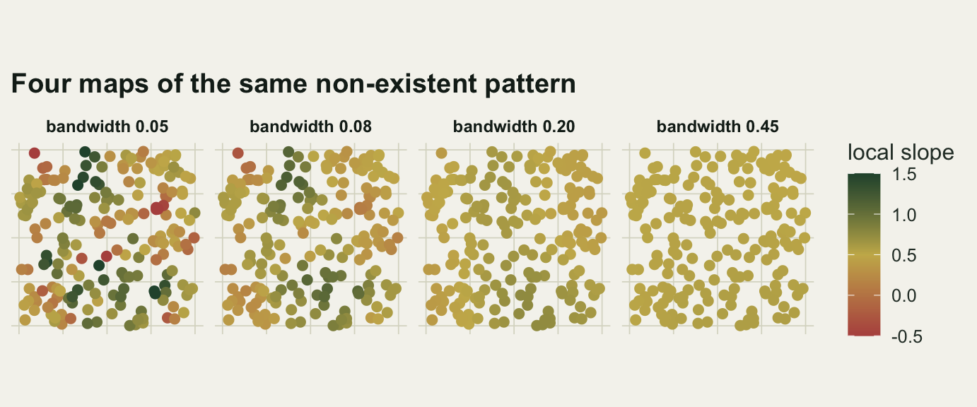
At the narrowest bandwidth the local slopes run from `r sprintf("%.2f", sweep$lowest[1])` to `r sprintf("%.2f", sweep$highest[1])`, `r sprintf("%.0f", sweep$far_off[1])` per cent of locations are more than 0.2 away from the truth, and the coefficient changes sign at `r sweep$negative[1]` of them. Nothing in the data varies in space. A reader handed that map sees a strong relationship in one part of the study area and a reversed one in another, and every word of that description is an artefact of a smoothing choice.
Widening the kernel removes the invention in the obvious order. By a bandwidth of `r sprintf("%.2f", sweep$bw[4])` the range has narrowed to `r sprintf("%.2f", sweep$lowest[4])` to `r sprintf("%.2f", sweep$highest[4])` and no location has a reversed sign; by `r sprintf("%.2f", sweep$bw[6])` the map is flat.
```{r fig-maps}
#| echo: false
#| fig-width: 7.2
#| fig-height: 3.0
#| fig-cap: "Local slope at each of the 200 sites, at four bandwidths, on data generated with the same slope everywhere. The colour scale is common to all four panels and centred on the true value, so a panel that is entirely mid tone is the correct picture."
#| fig-alt: "Four square maps of coloured points. The first is a patchwork of strong red and strong green with no pattern. The second is milder. The third is mostly mid tone with a few pale patches. The fourth is almost uniformly mid tone."
maps <- do.call(rbind, lapply(c(0.05, 0.08, 0.20, 0.45), function(b)
data.frame(x = xy[, 1], y = xy[, 2], slope = gwr_slopes(xy, xv, yv, b),
panel = sprintf("bandwidth %.2f", b))))
maps$panel <- factor(maps$panel, levels = unique(maps$panel))
maps$shown <- pmin(pmax(maps$slope, -0.5), 1.5)
ggplot(maps, aes(x, y, colour = shown)) +
geom_point(size = 2.1) +
facet_wrap(~ panel, nrow = 1) +
coord_fixed() +
scale_colour_gradient2(low = te_rust, mid = te_gold, high = te_forest,
midpoint = true_slope, name = "local slope") +
labs(x = NULL, y = NULL, title = "Four maps of the same non-existent pattern") +
theme_datasheet() +
theme(strip.text = element_text(colour = te_ink, face = "bold", size = 9),
axis.text = element_blank(), legend.position = "right")
```
## Cross validation is not the villain, and it is not a defence either
The usual answer is that the bandwidth is not a free choice because cross validation picks it. On these data cross validation behaves well: it is tuned for prediction, and on a process with no spatial variation the best predictor is close to the global fit, so the score falls steeply as the kernel widens and then stops moving.
```{r cv-one}
cv_grid <- c(0.05, 0.08, 0.12, 0.20, 0.30, 0.45, 0.65, 0.90, 1.25)
cv_scores <- sapply(cv_grid, function(b) gwr_cv(xy, xv, yv, b))

# where the minimum actually falls, and how flat the curve is beyond it
cv_best        <- cv_grid[which.min(cv_scores)]
cv_tail        <- cv_scores[cv_grid >= cv_best]
cv_tail_spread <- 100 * (max(cv_tail) / min(cv_tail) - 1)
data.frame(bandwidth = cv_grid, cv = round(cv_scores, 4))
```
The score falls from `r sprintf("%.3f", cv_scores[1])` at the narrowest bandwidth to `r sprintf("%.3f", min(cv_scores))` at a bandwidth of `r sprintf("%.2f", cv_best)`, and then sits flat: across the widest `r length(cv_tail)` bandwidths on the grid it varies by `r sprintf("%.1f", cv_tail_spread)` per cent. That flat tail is cross validation saying it has no use for a local model, though it still hands back a finite bandwidth rather than the edge of the grid.
It says so quietly. The one number cross validation reports is a prediction error, not a verdict on non-stationarity, and the difference between the best and worst score on this grid is `r sprintf("%.1f", 100 * (cv_scores[1] / min(cv_scores) - 1))` per cent, which does not look like a warning. Over a hundred stationary datasets the picture is the same in aggregate and not always in the individual case.
```{r cv-many}
set.seed(5102)
# each dataset scored twice: on the full grid, and on the grid cut off after
# its fifth point, which is the truncated grid the next paragraph asks about
picks <- replicate(100, {
  pts <- cbind(runif(n_site), runif(n_site)); px <- rnorm(n_site)
  py <- 1 + true_slope * px + rnorm(n_site, 0, 1)
  sc <- sapply(cv_grid, function(b) gwr_cv(pts, px, py, b))
  c(cv_grid[which.min(sc)], cv_grid[which.min(sc[1:5])])
})
chosen <- picks[1, ]; chosen_trunc <- picks[2, ]
table(chosen)
```
Cross validation puts the bandwidth at the widest value offered in `r sum(chosen == max(cv_grid))` of the hundred datasets, and at `r sprintf("%.2f", cv_grid[5])` or below in `r sum(chosen <= cv_grid[5])` of them. When it does land small, the analyst gets a coefficient map with structure in it, selected by a procedure that was answering a different question.
The deeper point is that the grid is part of the method. Offer cross validation a grid that stops at `r sprintf("%.2f", cv_grid[5])` and on stationary data it returns `r sprintf("%.2f", cv_grid[5])` in `r sum(chosen_trunc == cv_grid[5])` of the hundred datasets, because the score is usually still falling when the grid runs out. The map that follows is not a cross validated map of ecology; it is a cross validated map of where the grid ended.
## A test for the thing the map is claiming
The map is a description. The claim attached to it, that the relationship varies in space, is a hypothesis, and it can be tested with the same machinery. Hold the data pairs together and shuffle the coordinates: that destroys any spatial pattern in the relationship while keeping the sample, the pairing of predictor and response, and the set of sampling locations exactly as they were. What it does not keep is the spatial arrangement of the predictor, and the end of this section shows when that matters. Refit at the same bandwidth and compare the spread of the local slopes.
```{r stationarity-test}
ns_test <- function(pts, px, py, bw, nsim = 199) {
  wt  <- kernel_wt(pts, bw)
  obs <- sd(gwr_from_wt(wt, px, py))
  sims <- replicate(nsim, {
    ord <- sample(nrow(wt))
    sd(gwr_from_wt(wt[ord, ord], px, py))
  })
  c(observed_sd = obs, null_mean = mean(sims),
    p = (1 + sum(sims >= obs)) / (1 + nsim))
}
set.seed(5103)
round(ns_test(xy, xv, yv, 0.12), 4)
```
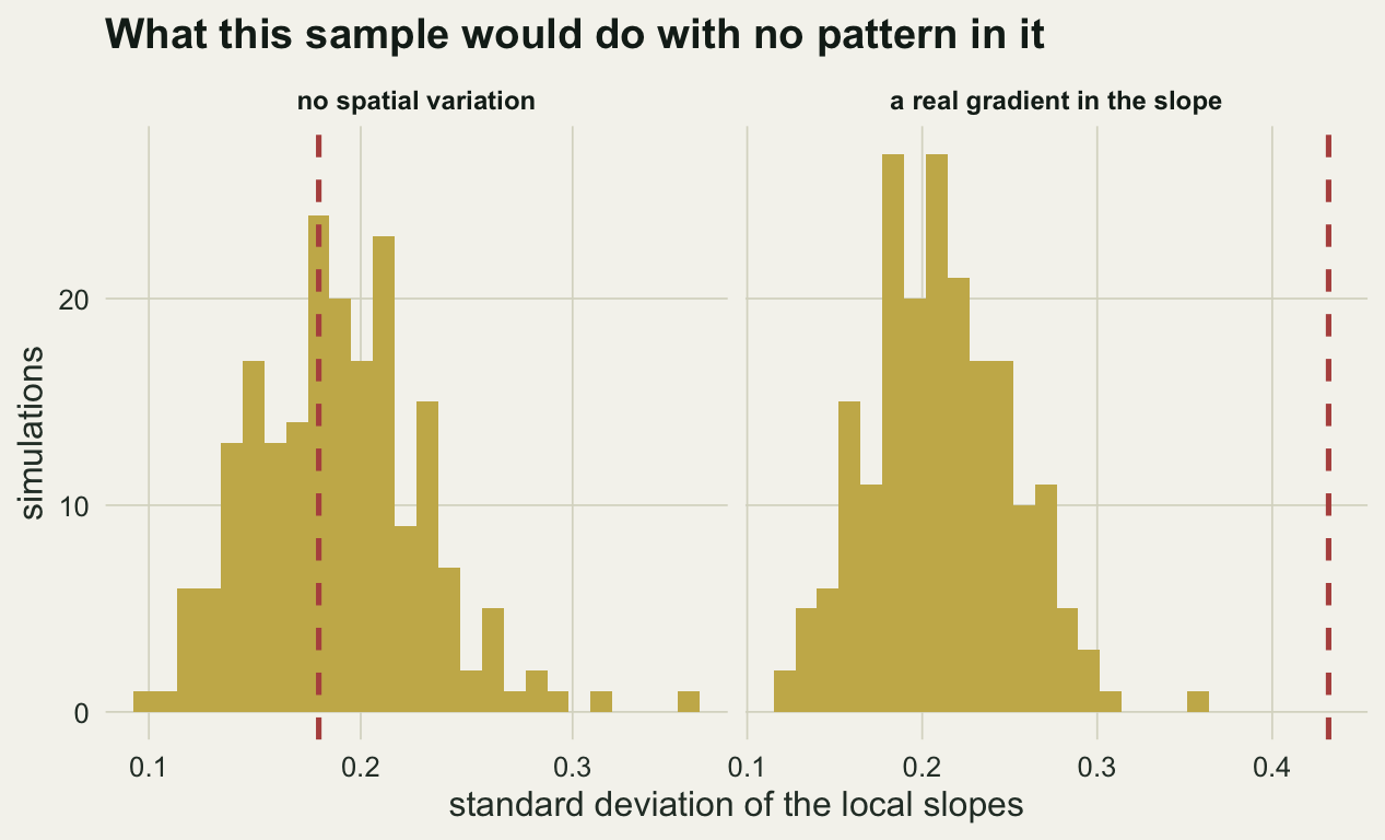
On the stationary dataset the observed spread of local slopes is close to the middle of its null distribution, so the test does not reject, even at a bandwidth where the map looks structured. The rates over repeated datasets are what matter.
```{r test-rates}
run_rates <- function(gen, nrep, seed, bw = 0.12) {
  set.seed(seed)
  mean(replicate(nrep, {
    d <- gen()
    ns_test(d$pts, d$px, d$py, bw)["p"] <= 0.05
  }))
}
flat <- function() {
  pts <- cbind(runif(n_site), runif(n_site)); px <- rnorm(n_site)
  list(pts = pts, px = px, py = 1 + true_slope * px + rnorm(n_site, 0, 1))
}
graded <- function() {
  pts <- cbind(runif(n_site), runif(n_site)); px <- rnorm(n_site)
  local_b <- true_slope + 1.2 * (pts[, 1] - 0.5)
  list(pts = pts, px = px, py = 1 + local_b * px + rnorm(n_site, 0, 1))
}
# two more surfaces, matched to the spread of local slopes the ramp produces:
# a step at the middle of the study area, and a ripple finer than the kernel
amp <- 1.2 / sqrt(12)
stepped <- function() {
  pts <- cbind(runif(n_site), runif(n_site)); px <- rnorm(n_site)
  local_b <- true_slope + amp * sign(pts[, 1] - 0.5)
  list(pts = pts, px = px, py = 1 + local_b * px + rnorm(n_site, 0, 1))
}
rippled <- function() {
  pts <- cbind(runif(n_site), runif(n_site)); px <- rnorm(n_site)
  local_b <- true_slope + amp * sqrt(2) * sin(2 * pi * pts[, 1] / 0.06)
  list(pts = pts, px = px, py = 1 + local_b * px + rnorm(n_site, 0, 1))
}
rates <- c(false_positive = 100 * run_rates(flat, 60, 5104),
           power = 100 * run_rates(graded, 60, 5105),
           step = 100 * run_rates(stepped, 60, 5107),
           ripple = 100 * run_rates(rippled, 60, 5108))
round(rates, 1)
```
The test rejects `r sprintf("%.1f", rates[["false_positive"]])` per cent of stationary datasets and detects a real east to west gradient in the slope in `r sprintf("%.1f", rates[["power"]])` per cent of cases, at a bandwidth narrow enough to draw a detailed map. The last two entries keep that spread of local slopes and change only its shape, to a step at the middle of the study area and to a ripple finer than the kernel; the Honest limits section reads them. The permutation supplies what the map cannot: a statement about how much local variation this sample would produce if there were none.
```{r fig-null}
#| echo: false
#| fig-width: 6.6
#| fig-height: 4.0
#| fig-cap: "Spread of the local slopes across the study area, for the stationary dataset and for one with a real gradient, each against the null distribution from 199 coordinate permutations of its own data. The dashed line is the observed value."
#| fig-alt: "Two panels of histograms. In the stationary panel the dashed observed line falls in the middle of the histogram. In the gradient panel the dashed line sits far to the right of the whole histogram."
set.seed(5106)
null_panel <- function(pts, px, py, nm) {
wt <- kernel_wt(pts, 0.12)
sims <- replicate(199, { ord <- sample(nrow(wt)); sd(gwr_from_wt(wt[ord, ord], px, py)) })
data.frame(spread = sims, obs = sd(gwr_from_wt(wt, px, py)), panel = nm)
}
gr <- graded()
nulls <- rbind(null_panel(xy, xv, yv, "no spatial variation"),
null_panel(gr$pts, gr$px, gr$py, "a real gradient in the slope"))
nulls$panel <- factor(nulls$panel, levels = unique(nulls$panel))
ggplot(nulls, aes(spread)) +
geom_histogram(bins = 26, fill = te_gold, colour = NA) +
geom_vline(aes(xintercept = obs), colour = te_rust, linetype = "dashed",
linewidth = 0.9) +
facet_wrap(~ panel, scales = "free_x") +
labs(x = "standard deviation of the local slopes", y = "simulations",
title = "What this sample would do with no pattern in it") +
theme_datasheet() +
theme(strip.text = element_text(colour = te_ink, face = "bold", size = 9))
```
The calibration above was measured on a predictor drawn independently at each site, and that is the assumption doing the work. Shuffling the coordinates breaks the spatial arrangement of the predictor along with the relationship, so the null it builds is that nothing in the dataset is spatially structured, not that the slope is constant. Ecological predictors are rarely unstructured: temperature, elevation and rainfall all vary smoothly across a study area. Generate a predictor with exponential spatial correlation over a range of a quarter of the study square, hold the slope at `r sprintf("%.1f", true_slope)` everywhere, and score each dataset twice: once with the permutation, and once against a null simulated from the fitted global model with the predictor and the locations left where they are.
```{r clustered-predictor}
clustered <- function(range = 0.25) {
  pts <- cbind(runif(n_site), runif(n_site))
  cs  <- chol(exp(-as.matrix(dist(pts)) / range) + diag(1e-8, n_site))
  px  <- as.vector(crossprod(cs, rnorm(n_site)))
  list(pts = pts, px = px, py = 1 + true_slope * px + rnorm(n_site, 0, 1))
}

# same statistic, same kernel, null built by resimulating the response instead
boot_test <- function(pts, px, py, bw, nsim = 199) {
  wt  <- kernel_wt(pts, bw); obs <- sd(gwr_from_wt(wt, px, py))
  fit <- lm(py ~ px); mu <- fitted(fit); s <- summary(fit)$sigma
  sims <- replicate(nsim, sd(gwr_from_wt(wt, px, rnorm(length(py), mu, s))))
  (1 + sum(sims >= obs)) / (1 + nsim)
}

set.seed(5109)
clustered_rates <- 100 * rowMeans(replicate(100, {
  d <- clustered()
  c(permutation  = ns_test(d$pts, d$px, d$py, 0.12)[["p"]] <= 0.05,
    global_model = boot_test(d$pts, d$px, d$py, 0.12) <= 0.05)
}))
round(clustered_rates, 1)
```
The slope is constant in every one of those datasets, and the permutation calls it non-stationary in `r sprintf("%.1f", clustered_rates[["permutation"]])` per cent of them at the 5 per cent level. The reason is the shuffle: where the predictor clusters in space, a neighbourhood of the real data holds less variation in the predictor than the same neighbourhood holds after the coordinates are shuffled, so the real local slopes come out more variable than the shuffled ones typically are. The null simulated from the global model leaves the arrangement in place, and its rejection rate over the same hundred datasets is `r sprintf("%.1f", clustered_rates[["global_model"]])` per cent, near the nominal 5 per cent.
## What to report
Report the bandwidth, how it was chosen, and the grid it was chosen from. A coefficient map without those three is not reproducible, and the third is the one that gets left out.
Report a test of non-stationarity next to the map, not the map on its own. A permutation of the coordinates is cheap and uses the estimator already written, but it only answers the question the map is being used to answer when the predictor is not itself patterned in space. Where it is, keep the predictor and the locations in place and simulate the response from the fitted global model instead.
Show the range of the local coefficients rather than only their spatial pattern. The eye reads a coloured surface as structure whatever its scale, and a map whose colour scale runs from `r sprintf("%.2f", sweep$lowest[4])` to `r sprintf("%.2f", sweep$highest[4])` is telling a very different story from one running from `r sprintf("%.2f", sweep$lowest[1])` to `r sprintf("%.2f", sweep$highest[1])`.
If the aim is prediction rather than explanation, none of this matters much: the cross validated bandwidth is the right one for prediction and the coefficient surface is an internal detail. The trouble starts when a surface tuned for prediction is read as a description of how ecology varies.
## Honest limits
Everything here uses one predictor, a Gaussian kernel and a fixed bandwidth on a square study area with sites scattered at random. An adaptive bandwidth that keeps the number of neighbours constant behaves differently where sites are sparse, and a real survey is never uniform in space, so the amount of invention will vary across the map for a reason that has nothing to do with the process.
The permutation test asks one specific question: is the spatial variation in this coefficient greater than the sample would produce by chance, and it answers that honestly only for a predictor that carries no spatial structure of its own. It does not test whether a particular local coefficient differs from the global one, and the per location t statistics that GWR software prints are not independent tests. Wheeler and Tiefelsdorf showed in 2005 that local coefficients from GWR are correlated with each other even when the predictors are not collinear globally, which is the reason a map of significance stars is misleading in a way a map of coefficients is not.
The generated non-stationarity is a smooth linear gradient in the slope. A relationship that flips abruptly at a boundary is caught in `r sprintf("%.1f", rates[["step"]])` per cent of runs against `r sprintf("%.1f", rates[["power"]])` per cent for the ramp, at a matched spread of local slopes, because the statistic is the spread of the local slopes, and a step inflates that nearly as readily as a ramp does. The test loses power as the scale of the variation shrinks towards the bandwidth: at a wavelength half the bandwidth the rejection rate falls to `r sprintf("%.1f", rates[["ripple"]])` per cent, the nominal level, because the kernel averages the pattern away before the statistic sees it. Paez and colleagues ran a much larger simulation study in 2011 and reached the same conclusion from the other direction: GWR recovers a varying coefficient surface when the variation is smooth and the sample is large, and invents one when it is neither.
Finally, this post says nothing about whether spatial non-stationarity is the right model for an ecological process at all. A coefficient that varies in space is often a missing covariate that varies in space, and no amount of care with the bandwidth will tell the two apart.
## References
Brunsdon C, Fotheringham AS, Charlton M 1996 Geographical Analysis 28(4):281-298 (10.1111/j.1538-4632.1996.tb00936.x)
Wheeler D, Tiefelsdorf M 2005 Journal of Geographical Systems 7(2):161-187 (10.1007/s10109-005-0155-6)
Paez A, Farber S, Wheeler D 2011 Environment and Planning A 43(12):2992-3010 (10.1068/a44111)
## Related tutorials
- [Local regression from scratch](../local-regression-from-scratch/)
- [Moran eigenvector spatial filtering](../moran-eigenvector-spatial-filtering/)
- [Checking a spatial regression](../checking-a-spatial-regression/)
- [GLS and spatial correlation](../gls-spatial-correlation/)