library(ggplot2)

te_pal <- list(forest = "#275139", green = "#2f8f63", sage = "#93a87f",
               clay = "#b5534e", gold = "#cda23f", line = "#dad9ca",
               ink = "#16241d", paper = "#f5f4ee")

theme_te <- function() {
  theme_minimal(base_size = 12) +
    theme(panel.grid.minor = element_blank(),
          panel.grid.major = element_line(colour = "#e7e6dc"),
          plot.background = element_rect(fill = "#f5f4ee", colour = NA),
          panel.background = element_rect(fill = "#f5f4ee", colour = NA),
          plot.title = element_text(face = "bold", colour = te_pal$ink),
          axis.title = element_text(colour = "#2c3a31"))
}Patch metrics and fragmentation in R
R
landscape ecology
GIS
ecology tutorial
ggplot2
Label habitat patches with base R, measure fragmentation at a fixed habitat amount, and watch the percolation threshold and the grain change the answer.
Corrected 14 October 2026: the post said the next tutorial writes out Dijkstra’s algorithm; that tutorial computes the cost distance by repeated sweeps over the grid, and the post now says so. It also said that above the percolation threshold one patch contains almost everything; it now says that just above it one patch holds most of the habitat, and almost all of it a little further above.
Corrected 1 October 2026: the grain table gives the mean patch size, the largest patch size and the edge density of the coarse maps in coarse cells beside fine-cell values, so for the clumped map all three appeared to move the wrong way; the text now says the coarse rows cannot be compared with the fine ones as printed.
Fragmentation metrics get computed early in almost every landscape study and interpreted as if they measured one thing. They do not. The number of patches, the mean patch size and the edge density all depend on three separate properties of the map: how much habitat there is, how it is arranged, and what grain the raster happens to use. Two of those are ecology and one is a decision made by whoever prepared the data.
This tutorial builds the machinery in base R, no raster package needed: a neutral landscape generator, connected-component labelling by label propagation, and the metrics themselves. Then it holds the habitat amount fixed and varies everything else.
A landscape generator and a patch labeller
The generator smooths a field of uniform noise by repeated local averaging and then thresholds it at a chosen quantile, so the habitat amount is exactly what you ask for and the spatial aggregation is controlled by the number of smoothing passes. Zero passes gives a random map; twenty gives large blobs.
smooth_field <- function(n, passes, seed) {
  set.seed(seed)
  z <- matrix(runif(n * n), n, n)
  for (p in seq_len(passes)) {
    pad <- rbind(z[1, ], z, z[n, ])
    pad <- cbind(pad[, 1], pad, pad[, n])
    z <- (pad[1:n, 2:(n + 1)] + pad[3:(n + 2), 2:(n + 1)] +
            pad[2:(n + 1), 1:n] + pad[2:(n + 1), 3:(n + 2)] +
            4 * pad[2:(n + 1), 2:(n + 1)]) / 8
  }
  z
}

make_map <- function(n, frac, passes, seed) {
  z <- smooth_field(n, passes, seed)
  z >= quantile(z, 1 - frac)
}

label_patches <- function(hab) {
  n <- nrow(hab)
  m <- ncol(hab)
  lab <- matrix(0L, n, m)
  lab[hab] <- seq_len(sum(hab))
  repeat {
    old <- lab
    up <- rbind(0L, lab[-n, ])
    down <- rbind(lab[-1, ], 0L)
    left <- cbind(0L, lab[, -m])
    right <- cbind(lab[, -1], 0L)
    best <- pmax(lab, up, down, left, right)
    lab[hab] <- best[hab]
    if (identical(lab, old)) break
  }
  lab
}

patch_stats <- function(hab) {
  lab <- label_patches(hab)
  sizes <- as.vector(table(lab[lab > 0]))
  n <- nrow(hab)
  edges <- sum(hab[-n, ] != hab[-1, ]) + sum(hab[, -n] != hab[, -1])
  c(habitat = mean(hab), patches = length(sizes),
    mean_size = mean(sizes), largest = max(sizes),
    largest_index = max(sizes) / sum(hab),
    edge_density = edges / (n * n))
}
The labeller is worth a second look because it is the one piece people usually reach for a package to do. Every habitat cell starts with a unique label; each iteration replaces a cell’s label with the largest label among itself and its four neighbours; iterate until nothing changes. Connected cells converge on their maximum label, which makes the labels arbitrary but the grouping correct. It is short, it is exact for four-neighbour connectivity, and switching to eight-neighbour connectivity means adding four more shifted matrices.
Same habitat amount, three different landscapes
Fix the habitat at forty per cent of a 120 by 120 grid and change only the aggregation.
cfg <- list(random = 0, clumped = 6, very_clumped = 20)
maps <- list()
tab_a <- NULL
for (nm in names(cfg)) {
  maps[[nm]] <- make_map(120, 0.4, cfg[[nm]], seed = 471)
  tab_a <- rbind(tab_a, data.frame(pattern = nm,
                                   t(round(patch_stats(maps[[nm]]), 4))))
}
print(tab_a, row.names = FALSE)
pattern habitat patches mean_size largest largest_index edge_density
random 0.4 1584 3.6364 69 0.0120 0.9512
clumped 0.4 119 48.4034 1062 0.1844 0.3476
very_clumped 0.4 36 160.0000 1861 0.3231 0.1967Identical habitat amount, and the metrics are not remotely comparable. The random map has 1584 patches with a mean size of 3.64 cells; the strongly clumped map has 36 patches averaging 160 cells. The largest patch holds 1.2 per cent of the habitat in the random map and 32.31 per cent in the strongly clumped one. Edge density runs from 0.9512 down to 0.1967.
For a species that needs a minimum patch area, those three maps are entirely different places, and a report that quotes only “forty per cent habitat remaining” has said almost nothing. This is why the amount and the arrangement have to be reported together, and why comparing patch counts between two study areas mapped at different times or with different classifiers is usually meaningless.
map_df <- do.call(rbind, lapply(names(maps), function(nm) {
  hab <- maps[[nm]]
  data.frame(x = rep(seq_len(ncol(hab)), each = nrow(hab)),
             y = rep(seq_len(nrow(hab)), times = ncol(hab)),
             habitat = as.vector(hab),
             panel = sprintf("%s (%d patches)", gsub("_", " ", nm),
                             patch_stats(hab)[["patches"]]))
}))
map_df$panel <- factor(map_df$panel, levels = unique(map_df$panel))

ggplot(map_df, aes(x, y, fill = habitat)) +
  geom_raster() +
  facet_wrap(~panel) +
  coord_equal() +
  scale_fill_manual(values = c(`FALSE` = te_pal$paper, `TRUE` = te_pal$forest),
                    guide = "none") +
  labs(title = "Forty per cent habitat, three landscapes", x = NULL, y = NULL) +
  theme_te() +
  theme(axis.text = element_blank(), panel.grid = element_blank())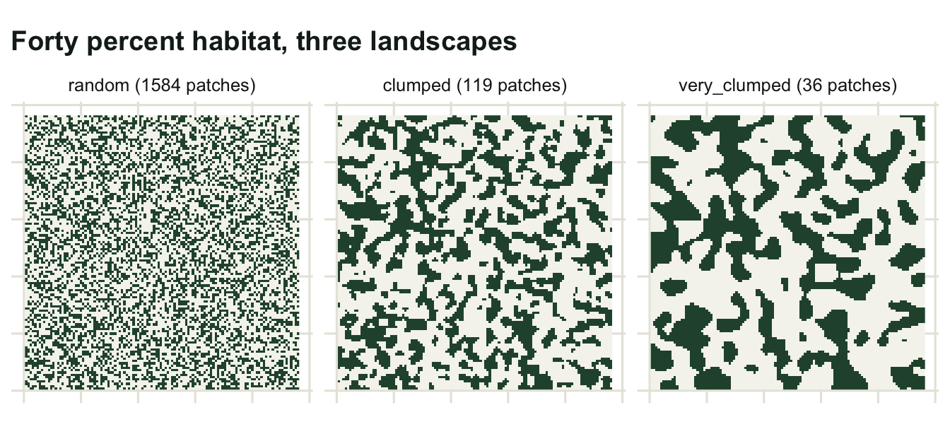
The percolation threshold
Habitat amount does not act gradually on connectivity. On a square grid with four-neighbour connectivity, a random map develops a spanning patch abruptly at a habitat fraction near 0.5927, the site percolation threshold. Below it the habitat is a collection of small islands; just above it, one patch holds most of the habitat, and a little further above it almost all of it.
set.seed(472)
frac_grid <- seq(0.3, 0.8, by = 0.05)
perc <- t(sapply(frac_grid, function(f) {
  vals <- sapply(1:5, function(r)
    patch_stats(make_map(120, f, 0, seed = 4720 + r))[["largest_index"]])
  c(habitat = f, largest_index = mean(vals))
}))
print(round(perc, 4))
habitat largest_index
[1,] 0.30 0.0057
[2,] 0.35 0.0079
[3,] 0.40 0.0095
[4,] 0.45 0.0144
[5,] 0.50 0.0394
[6,] 0.55 0.0887
[7,] 0.60 0.5916
[8,] 0.65 0.9059
[9,] 0.70 0.9774
[10,] 0.75 0.9911
[11,] 0.80 0.9979The largest patch holds 8.87 per cent of the habitat at a habitat fraction of 0.55 and 59.16 per cent at 0.60, then 90.59 per cent at 0.65. The transition happens inside one step of the sweep, exactly where percolation theory puts it.
Two things follow. First, a landscape can lose habitat for decades with little change in connectivity and then cross the threshold, at which point the largest patch breaks apart quickly; the response of connectivity to habitat loss is not proportional. Second, the threshold value itself is a property of the lattice and the connectivity rule rather than of ecology: switch to eight-neighbour connectivity and it drops to around 0.407. Any statement of the form “connectivity collapses below X per cent habitat” inherits that arbitrary choice.
perc_df <- as.data.frame(perc)

ggplot(perc_df, aes(habitat, largest_index)) +
  geom_vline(xintercept = 0.5927, linetype = "dashed", colour = te_pal$clay) +
  geom_line(colour = te_pal$forest, linewidth = 0.9) +
  geom_point(colour = te_pal$forest, size = 2.4) +
  annotate("text", x = 0.5927, y = 0.25, label = " percolation threshold",
           hjust = 0, colour = te_pal$clay, size = 3.6) +
  labs(title = "Connectivity does not decline gradually",
       subtitle = "random maps, four-neighbour connectivity, mean of five replicates",
       x = "habitat fraction", y = "share of habitat in the largest patch") +
  theme_te()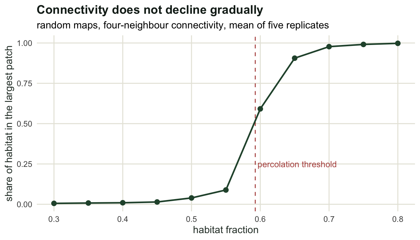
The grain is a decision, not a measurement
The last dependence is the one that is entirely in the analyst’s hands. Aggregate each map to a coarser grain by majority rule and recompute.
aggregate2 <- function(hab) {
  n <- nrow(hab) / 2
  out <- matrix(FALSE, n, n)
  for (i in seq_len(n)) {
    for (j in seq_len(n)) {
      out[i, j] <- mean(hab[(2 * i - 1):(2 * i), (2 * j - 1):(2 * j)]) >= 0.5
    }
  }
  out
}

res_tab <- NULL
for (nm in c("random", "clumped")) {
  res_tab <- rbind(res_tab, data.frame(
    pattern = nm, grain = c("fine", "coarse x2"),
    rbind(round(patch_stats(maps[[nm]]), 4),
          round(patch_stats(aggregate2(maps[[nm]])), 4))))
}
print(res_tab, row.names = FALSE)
pattern grain habitat patches mean_size largest largest_index edge_density
random fine 0.4000 1584 3.6364 69 0.0120 0.9512
random coarse x2 0.5183 233 8.0086 247 0.1324 0.9725
clumped fine 0.4000 119 48.4034 1062 0.1844 0.3476
clumped coarse x2 0.4642 79 21.1519 461 0.2759 0.6208Doubling the cell size does more than smooth the metrics: it changes the data. The majority rule turns forty per cent habitat into 51.83 per cent on the random map and 46.42 per cent on the clumped one, because a fragmented map has many blocks that are half habitat, and the tie-breaking rule sends them all one way. Patch counts collapse from 1584 to 233 and from 119 to 79, and the largest patch index rises in both cases. The mean patch size, the largest patch size and the edge density in the coarse rows are counted in coarse cells, each four fine cells in area, so they cannot be compared with the fine rows as printed.
So a fragmentation comparison between two studies is only meaningful if they share a grain, a connectivity rule and a classification threshold. When they do not, the differences in the metrics are mostly differences in the pipeline. The practical habit is to report all three choices next to the metrics, and to repeat the analysis at two grains as a sensitivity check, which is what the checking tutorial in this cluster does systematically.
Where to go next
Patch metrics describe the pattern; they say nothing about whether an organism can move between patches. That requires a model of movement cost across the matrix between them, and the next tutorial builds the classic one: a resistance surface and the least-cost path across it, with the cost distance computed by repeated sweeps over the grid, written out rather than called.
References
Gustafson EJ, Parker GR 1992 Landscape Ecology 7(2):101-110 (10.1007/BF02418941)
With KA, King AW 1997 Oikos 79(2):219-229 (10.2307/3546007)
Fahrig L 2003 Annual Review of Ecology, Evolution, and Systematics 34:487-515 (10.1146/annurev.ecolsys.34.011802.132419)
Wu J 2004 Landscape Ecology 19(2):125-138 (10.1023/B:LAND.0000021711.40074.ae)