---
title: "Thermal safety margins and warming"
description: "Thermal safety margins in R: why tropical ectotherms, already living close to their optimum, lose performance under warming while temperate species gain."
date: "2026-06-30 09:00"
categories: [ecology tutorial, R, thermal ecology, climate change, biogeography]
image: thumbnail.png
image-alt: "Change in performance under warming plotted against thermal safety margin, negative for small margins and rising to strongly positive for large ones."
---
```{r setup}
#| code-fold: true
#| code-summary: "Setup: packages, colours and plot theme"
#| results: hide
#| message: false
#| warning: false
knitr::opts_chunk$set(echo = TRUE, message = FALSE, warning = FALSE,
                      dev = "png", dpi = 120, fig.path = "figures/",
                      fig.width = 7, fig.height = 4.4)
library(ggplot2)
theme_te <- theme_minimal(base_size = 12) +
  theme(panel.background = element_rect(fill = "#f5f4ee", colour = NA),
        plot.background  = element_rect(fill = "#f5f4ee", colour = NA),
        panel.grid.minor = element_blank(),
        plot.title = element_text(face = "bold", size = 12))
theme_set(theme_te)
col_trop <- "#b5651d"; col_temp <- "#3a6b52"; col_ref <- "#555555"

briere <- function(T, a, T0, Tm) { p <- a*T*(T-T0)*sqrt(pmax(Tm-T, 0)); p[T < T0 | T > Tm] <- 0; p }

## latitudinal gradient: safety margin shrinks toward the tropics
briere_opt <- function(T0, Tm) (4*Tm + 3*T0 + sqrt(16*Tm^2 + 9*T0^2 - 16*T0*Tm)) / 10
lat    <- seq(0, 50, 5)
Thab   <- 34 - 0.34 * lat
CTmax  <- 41 - 0.12 * lat
Tzero  <- CTmax - 32
Topt   <- briere_opt(Tzero, CTmax)
margin <- Topt - Thab
warming <- 3
perf <- function(i, dT = 0) briere(Thab[i] + dT, 8e-4, Tzero[i], CTmax[i])
now  <- sapply(seq_along(lat), perf, 0)
fut  <- sapply(seq_along(lat), perf, warming)
dperf <- 100 * (fut / now - 1)
grad <- data.frame(lat, Thab, margin, Topt, CTmax, dperf)
n_lose <- sum(dperf < 0)

## two representative species
it <- 1; ie <- 9                              # tropical (lat 0), temperate (lat 40)
tp <- function(dT = 0) briere(Thab[it] + dT, 8e-4, Tzero[it], CTmax[it])
te <- function(dT = 0) briere(Thab[ie] + dT, 8e-4, Tzero[ie], CTmax[ie])
d_trop <- 100 * (tp(warming) / tp(0) - 1)
d_temp <- 100 * (te(warming) / te(0) - 1)
```
The [thermal performance curve](../thermal-performance-curves/) has a steep upper side, and that asymmetry has a geography. It predicts, against first intuition, that the ectotherms most threatened by a warming climate are not the ones with the lowest heat tolerance. They are the ones already living closest to their own optimum. That is the argument of Deutsch et al. 2008 Proceedings of the National Academy of Sciences 105(18):6668-6672, and it is a few lines of R.
## Two margins
Fix two quantities for a species. Its habitat temperature (call it the mean body temperature it experiences) and its performance curve. From them come two margins. The **thermal safety margin** is the gap between the optimum and the habitat temperature, how much warming the species can take before it passes its peak. The **warming tolerance** is the larger gap up to CTmax, where performance hits zero. A species can have a high CTmax and yet almost no safety margin, if it already sits near its optimum.
Tropical ectotherms are the case in point. Tropical climates are warm and thermally stable, and tropical species have adapted to them by specialising: high optima, narrow curves, and habitat temperatures pressed right up against the peak. Temperate ectotherms live in cooler, more variable climates and typically sit well below their optima for much of the year.
One bookkeeping point before the numbers. The optimum of a Briere curve is not something you set. It follows from the lower limit and CTmax, and it sits well above their midpoint but a degree or so below where a careless parameterisation puts it. Write a peak temperature into the parameters by hand and the curve will quietly peak somewhere else, inflating every safety margin computed from it. The curves here are therefore defined by their limits and the optimum is read off them, with the closed form in `briere_opt`.
```{r two-species}
briere <- function(T, a, T0, Tm) { p <- a*T*(T-T0)*sqrt(pmax(Tm-T, 0)); p[T < T0 | T > Tm] <- 0; p }
tropical  <- function(dT = 0) briere(34.0 + dT, 8e-4, 9.0, 41.0)   # Thab 34.0, peak 33.8
temperate <- function(dT = 0) briere(20.4 + dT, 8e-4, 4.2, 36.2)   # Thab 20.4, peak 29.4
c(tropical_now = tropical(0),  tropical_plus3 = tropical(3),
  temperate_now = temperate(0), temperate_plus3 = temperate(3))
```
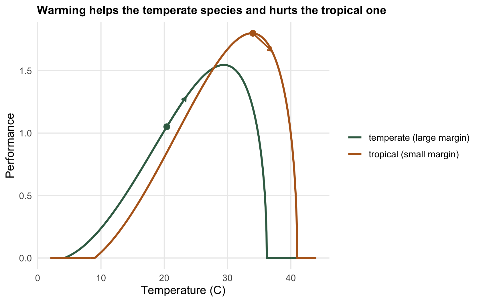
The tropical species has no margin left at all: it lives at `r sprintf("%.1f", Thab[it])` degrees and its curve peaks at `r sprintf("%.1f", Topt[it])`, so it is already a fraction of a degree past the top. Three degrees of warming takes it down the steep descending limb and performance falls by `r sprintf("%.1f", -d_trop)` per cent. The temperate species lives at `r sprintf("%.1f", Thab[ie])` against a peak of `r sprintf("%.1f", Topt[ie])`, far down its rising limb, so the same warming pushes it *toward* the peak: performance rises by `r sprintf("%.1f", d_temp)` per cent. Same climate change, opposite sign, and the difference is entirely the safety margin.
```{r fig-two}
#| fig-cap: "Two performance curves. The tropical species (ochre) sits near its optimum, so warming (arrow) drops it down the steep side. The temperate species (green) sits low, so the same warming climbs it toward the peak."
#| fig-alt: "Two thermal performance curves; on the ochre tropical curve the habitat marker sits near the peak and an arrow points down the steep side, on the green temperate curve the marker sits low and an arrow points up toward the peak."
Tg <- seq(2, 44, 0.05)
cur <- rbind(data.frame(T = Tg, P = briere(Tg, 8e-4, 9, 41),   sp = "tropical (small margin)"),
             data.frame(T = Tg, P = briere(Tg, 8e-4, 4.2, 36.2), sp = "temperate (large margin)"))
pts <- data.frame(sp = c("tropical (small margin)","temperate (large margin)"),
                  T0 = c(34, 20.4), T1 = c(37, 23.4),
                  P0 = c(tropical(0), temperate(0)), P1 = c(tropical(3), temperate(3)))
ggplot(cur, aes(T, P, colour = sp)) +
  geom_line(linewidth = 1) +
  geom_segment(data = pts, aes(x = T0, xend = T1, y = P0, yend = P1, colour = sp),
               arrow = arrow(length = unit(0.18, "cm")), linewidth = 0.8, show.legend = FALSE) +
  geom_point(data = pts, aes(T0, P0, colour = sp), size = 2.6, show.legend = FALSE) +
  scale_colour_manual(values = c("tropical (small margin)" = col_trop, "temperate (large margin)" = col_temp)) +
  labs(x = "Temperature (C)", y = "Performance", colour = NULL,
       title = "Warming helps the temperate species and hurts the tropical one")
```
## The pattern across a gradient
Scale this up to many species along a latitudinal gradient, letting the safety margin shrink toward the equator, and warm each by the same three degrees.
```{r gradient}
lat    <- seq(0, 50, 5)
Thab   <- 34 - 0.34 * lat            # habitat temperature: hot in the tropics
CTmax  <- 41 - 0.12 * lat            # heat limit, falling more slowly than the habitat
Tzero  <- CTmax - 32                 # lower limit; every curve has the same width
briere_opt <- function(T0, Tm) (4*Tm + 3*T0 + sqrt(16*Tm^2 + 9*T0^2 - 16*T0*Tm)) / 10
Topt   <- briere_opt(Tzero, CTmax)   # the peak the curve actually has
margin <- Topt - Thab                # safety margin: none in the tropics, large at high latitude
perf   <- function(i, dT = 0) briere(Thab[i] + dT, 8e-4, Tzero[i], CTmax[i])
dperf  <- 100 * (sapply(seq_along(lat), perf, 3) / sapply(seq_along(lat), perf, 0) - 1)
round(setNames(dperf, paste0("margin", round(margin, 1)))[c(1, 6, 11)], 1)
```
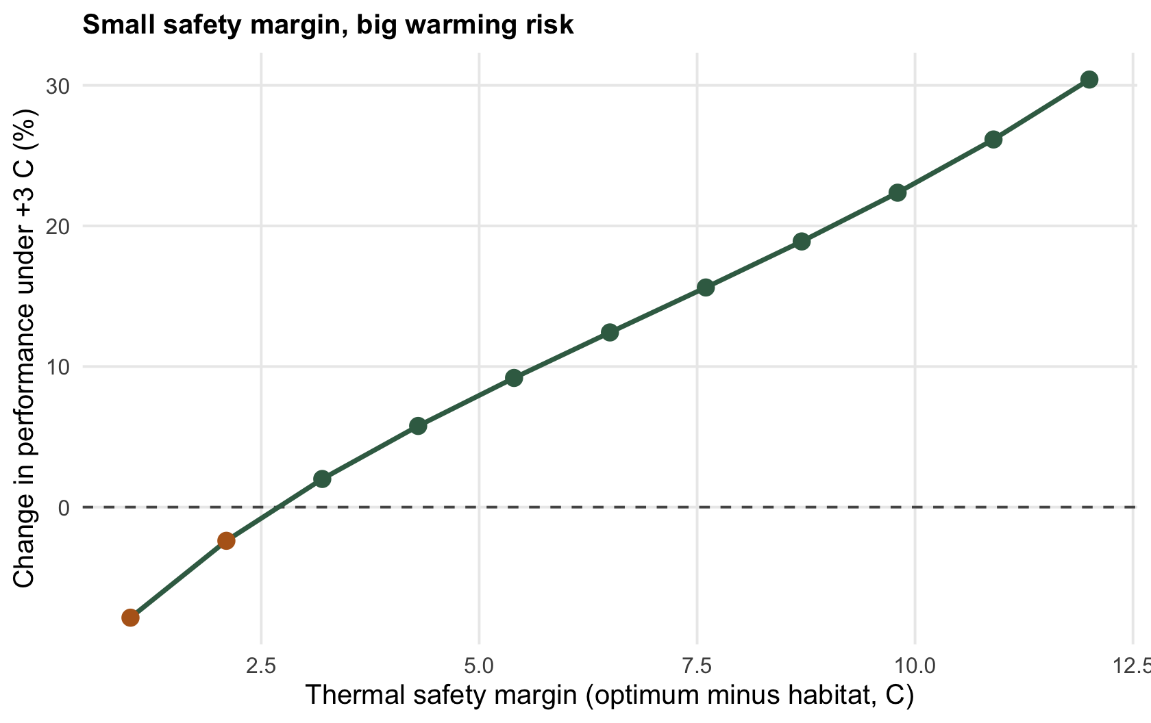
Every species with a small safety margin loses; every species with a large one gains. Here `r n_lose` of the `r length(lat)` species, the most tropical, drop in performance under warming, while the temperate end gains up to `r sprintf("%.0f", max(dperf))` per cent. The threatened species are not the least heat-tolerant in absolute terms; they are the ones with the least room between where they live and where they peak.
```{r fig-gradient}
#| fig-cap: "Change in performance under three degrees of warming against the thermal safety margin. Species with small margins (tropical) lose; species with large margins (temperate) gain. The dashed line is no change."
#| fig-alt: "Points and a line showing per cent change in performance rising from negative at small thermal safety margins to strongly positive at large margins, crossing zero at a small margin."
p_gradient <- ggplot(grad, aes(margin, dperf)) +
  geom_hline(yintercept = 0, colour = col_ref, linetype = "dashed") +
  geom_line(colour = col_temp, linewidth = 1) +
  geom_point(aes(colour = dperf < 0), size = 3) +
  scale_colour_manual(values = c("FALSE" = col_temp, "TRUE" = col_trop), guide = "none") +
  labs(x = "Thermal safety margin (optimum minus habitat, C)",
       y = "Change in performance under +3 C (%)",
       title = "Small safety margin, big warming risk")
p_gradient
```
```{r}
#| label: thumb
#| include: false
ggsave("thumbnail.png",
p_gradient +
labs(title = NULL, subtitle = NULL) +
theme(plot.title = element_text(size = 13, face = "bold"),
plot.subtitle = element_text(size = 9.5),
plot.margin = ggplot2::margin(8, 14, 8, 8)),
width = 7.5, height = 5.4, dpi = 100, bg = "#f5f4ee")
```
## The honest limits
The pattern holds in outline and is fragile in detail, and it is worth saying why. The curve is measured for one trait at one life stage; whole-organism fitness is many traits, and they need not share an optimum. The habitat temperature is a single number standing in for a whole distribution, and the [previous post](../jensens-inequality-and-thermal-variability/) showed that the distribution, not its mean, is what performance integrates over. Above all, the calculation freezes the curve in place: it allows no acclimation, no evolution, and no behaviour. A lizard can move into shade; a population can shift its curve over generations (Sinclair et al. 2016 Ecology Letters 19(11):1372-1385). Thermal safety margins are a way to see which species have the least slack, not a forecast of who survives. That distinction is what the checking post is for.
## References
- Deutsch CA et al. 2008. Proceedings of the National Academy of Sciences 105(18):6668-6672 (10.1073/pnas.0709472105).
- Kingsolver JG 2009. The American Naturalist 174(6):755-768 (10.1086/648310).
- Sinclair BJ et al. 2016. Ecology Letters 19(11):1372-1385 (10.1111/ele.12686).
## Related tutorials
- [Thermal performance curves in R](../thermal-performance-curves/)
- [Jensen's inequality and thermal variability](../jensens-inequality-and-thermal-variability/)
- [Checking a thermal performance analysis](../checking-a-thermal-performance-analysis/)
- [Thermal death time and the ramping rate](../thermal-death-time-and-ramping-rate/)