---
title: "Checking a thermal performance analysis"
description: "Three checks for a thermal performance curve in R: the extrapolated critical maximum, curve-family dependence, and measurement error in body temperature."
date: "2026-06-30 10:00"
date-modified: "2026-10-15"
categories: [ecology tutorial, R, thermal ecology, model diagnostics, physiology]
image: thumbnail.png
image-alt: "Grey performance measurements plotted against temperature in degrees C, with two fitted thermal performance curves that lie on top of each other across the temperatures both were fitted to and part company on the descending limb above the cut, and a dotted vertical line at 35 degrees marking where the dropped data begin."
---
*Corrected 15 October 2026: Check one said the refit drops the descending-limb points; it now says it drops the two hottest temperatures, so that sampling stops just past the optimum. Check three said a curve fitted to air temperature looks more heat-tolerant than the animal; it now limits that to random error in the measured temperature, as simulated, and adds that a systematic offset between air and body temperature shifts the whole curve either way.*
*Corrected 7 October 2026: Check one said that CTmax is guessed rather than estimated when sampling stops near the optimum; it now says the refit still estimates it, far less precisely and only through the assumed shape of the curve. Check two now advises testing each curve family against the hottest measurements and reporting the spread only among the families that fit them.*
```{r setup}
#| code-fold: true
#| code-summary: "Setup: packages, colours and plot theme"
#| results: hide
#| message: false
#| warning: false
knitr::opts_chunk$set(echo = TRUE, message = FALSE, warning = FALSE,
                      dev = "png", dpi = 120, fig.path = "figures/",
                      fig.width = 7, fig.height = 4.4)
library(ggplot2)
theme_te <- theme_minimal(base_size = 12) +
  theme(panel.background = element_rect(fill = "#f5f4ee", colour = NA),
        plot.background  = element_rect(fill = "#f5f4ee", colour = NA),
        panel.grid.minor = element_blank(),
        plot.title = element_text(face = "bold", size = 12))
theme_set(theme_te)
col_full <- "#3a6b52"; col_cut <- "#b5651d"; col_err <- "#b5651d"; col_true <- "#3a6b52"; col_ref <- "#555555"

briere <- function(T, a, T0, Tm) { p <- a*T*(T-T0)*sqrt(pmax(Tm-T, 0)); p[T < T0 | T > Tm] <- 0; p }
a0 <- 8e-4; T0 <- 8; Tm <- 42
Tg <- seq(0, 45, 0.005); Topt <- Tg[which.max(briere(Tg, a0, T0, Tm))]; Pmax0 <- max(briere(Tg, a0, T0, Tm))

set.seed(394)
Td <- rep(seq(10, 40, 2.5), each = 4)
y  <- pmax(briere(Td, a0, T0, Tm) + rnorm(length(Td), 0, 0.06), 0)

n_above <- sum(Td > Topt); hot <- max(Td)

## curve-family disagreement on the upper limit
cb <- coef(nls(y ~ aa*Td*(Td-t0)*sqrt(pmax(tm-Td, 0)), start = list(aa = 6e-4, t0 = 6, tm = 44)))
cg <- coef(nls(y ~ A*exp(-((Td-mo)^2)/(2*s^2)), start = list(A = 2, mo = 34, s = 8)))
ctmax_bri <- cb["tm"]; ctmax_gau <- cg["mo"] + cg["s"]*sqrt(-2*log(0.05))

## measurement error in body temperature (own seed: reusing 394 would make the
## thermometer error a perfect copy of the noise already in y)
set.seed(1394)
Terr <- Td + rnorm(length(Td), 0, 2.5)
ce <- coef(nls(y ~ aa*Terr*(Terr-t0)*sqrt(pmax(tm-Terr, 0)),
               start = list(aa = 6e-4, t0 = 6, tm = 46), control = nls.control(warnOnly = TRUE, maxiter = 200)))
TgE <- seq(ce["t0"], ce["tm"], 0.01); PgE <- ce["aa"]*TgE*(TgE-ce["t0"])*sqrt(pmax(ce["tm"]-TgE, 0))
PmaxE <- max(PgE); pmax_drop <- 100 * (PmaxE/Pmax0 - 1)
```
A [thermal performance curve](../thermal-performance-curves/) delivers three headline numbers, the optimum, the breadth, and the critical thermal maximum, and they carry very different weights of evidence. The optimum and breadth sit inside the data. CTmax usually does not. This post is three checks that a performance-curve result should survive before those numbers are used to rank species or predict range limits.
## Check 1: how much data supports CTmax?
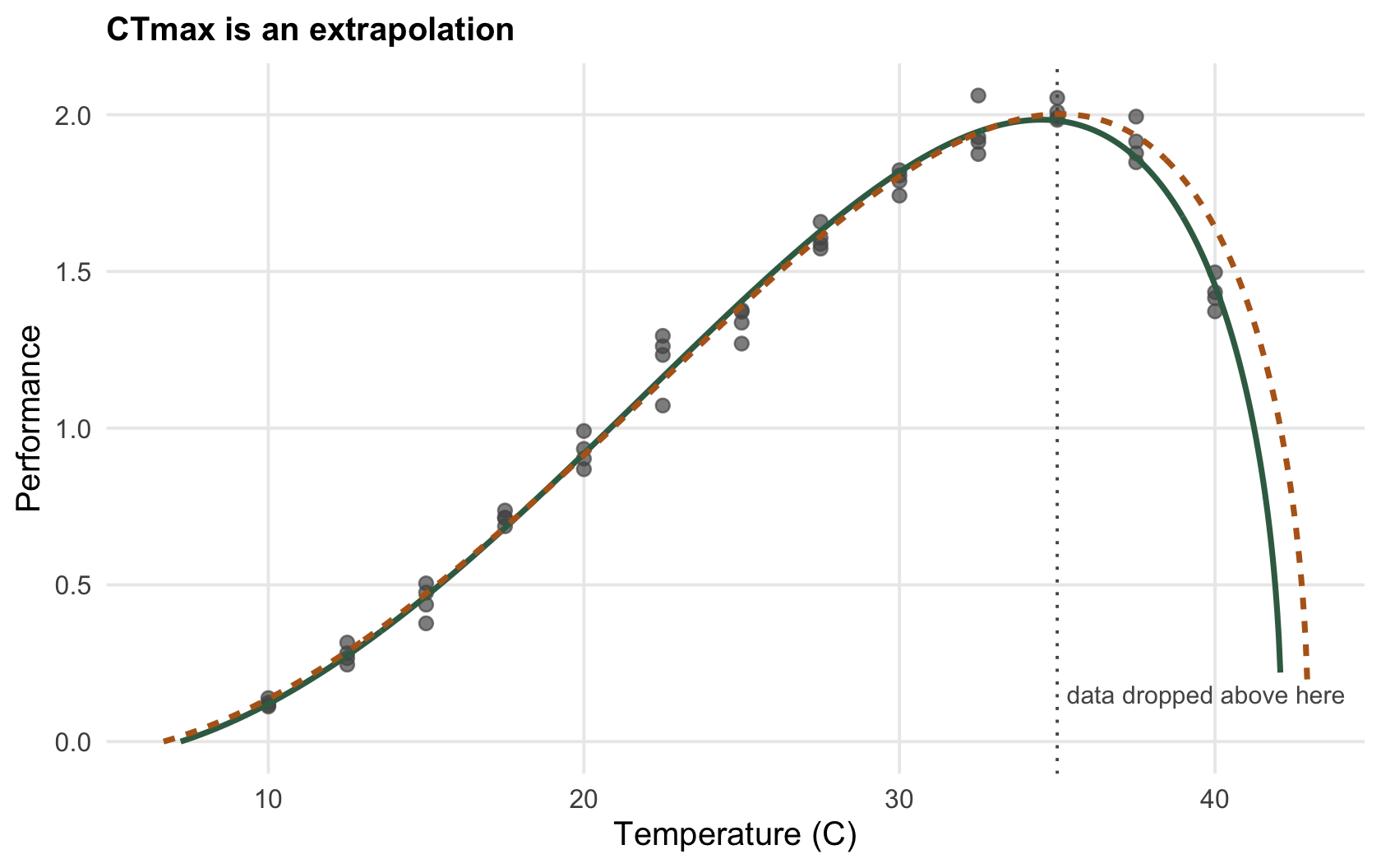
CTmax is where the fitted curve reaches zero, and that point is almost always past the hottest temperature anyone measured. Refit the curve after dropping the warmest data and watch the estimate move.
```{r ctmax}
fitTm <- function(T, yy) {
  f <- nls(yy ~ aa*T*(T-t0)*sqrt(pmax(tm-T, 0)),
           start = list(aa = 6e-4, t0 = 6, tm = 44), control = nls.control(warnOnly = TRUE))
  s <- summary(f)$coefficients
  c(est.tm = s["tm","Estimate"], se.tm = s["tm","Std. Error"], coef(f))
}
full <- fitTm(Td, y)
r38  <- fitTm(Td[Td <= 37.5], y[Td <= 37.5])
r35  <- fitTm(Td[Td <= 35],   y[Td <= 35])
rbind(full = round(full[1:2], 2), drop_37.5 = round(r38[1:2], 2), drop_35 = round(r35[1:2], 2))
```
The hottest measurement is `r sprintf("%.0f", hot)` degrees C, yet CTmax comes out near `r sprintf("%.1f", full["est.tm"])`: it is already an extrapolation `r sprintf("%.0f", full["est.tm"]-hot)` degrees beyond the data, and only `r n_above` of the `r length(Td)` points sit above the optimum at all. Drop the two hottest temperatures, so that sampling stops just past the optimum, and the estimate reads `r sprintf("%.1f", r35["est.tm"])`, but the real tell is the standard error, which grows from `r sprintf("%.1f", full["se.tm"])` to `r sprintf("%.1f", r35["se.tm"])` degrees. If sampling stops near the optimum, CTmax is still estimated, but far less precisely, and only through the shape the model assumes beyond the data. The check: report CTmax with its interval, and refuse to compare CTmax across species unless each is anchored by measurements on the descending limb.
```{r fig-ctmax}
#| fig-cap: "The upper limit is pinned by a handful of hot points. The full-data fit (green) reaches zero near 42 degrees; the refit without the two hottest temperatures (ochre) reaches zero further right, and its standard error is the larger of the two."
#| fig-alt: "Performance data with two fitted curves against temperature; the green full-data curve rises to a peak in the mid thirties and falls to zero near 42 degrees, the ochre reduced-data curve extends further right, and a dotted vertical line at 35 degrees marks where the dropped data begin."
cf <- function(cc) { g <- c(seq(cc["t0"], cc["tm"], 0.05), cc["tm"]); data.frame(T = g, P = cc["aa"]*g*(g-cc["t0"])*sqrt(pmax(cc["tm"]-g, 0))) }
cA <- cf(full[3:5]); cB <- cf(r35[3:5])
p_ctmax <- ggplot(data.frame(Td, y), aes(Td, y)) +
  geom_point(colour = col_ref, size = 2, alpha = 0.7) +
  geom_line(data = cA, aes(T, P), colour = col_full, linewidth = 1) +
  geom_line(data = cB, aes(T, P), colour = col_cut, linewidth = 1, linetype = "22") +
  geom_vline(xintercept = 35, colour = col_ref, linetype = "dotted") +
  annotate("text", x = 34.7, y = 0.15, label = "data dropped above here", hjust = 1, colour = col_ref, size = 3.2) +
  labs(x = "Temperature (C)", y = "Performance", title = "Full-data fit and refit without the hottest points")
p_ctmax
```
```{r}
#| label: thumb
#| include: false
ggsave("thumbnail.png", p_ctmax, width = 7.5, height = 5.4, dpi = 100)
```
## Check 2: does the answer depend on the curve family?
Because CTmax lives in the extrapolated region, the model chosen to get there matters more than anywhere else on the curve. Fit the asymmetric Briere and a symmetric Gaussian to the same data and compare where each says performance vanishes.
```{r family}
cb <- coef(nls(y ~ aa*Td*(Td-t0)*sqrt(pmax(tm-Td, 0)), start = list(aa = 6e-4, t0 = 6, tm = 44)))
cg <- coef(nls(y ~ A*exp(-((Td-mo)^2)/(2*s^2)),        start = list(A = 2, mo = 34, s = 8)))
c(briere_CTmax = unname(cb["tm"]), gaussian_upper = unname(cg["mo"] + cg["s"]*sqrt(-2*log(0.05))))
```
The Briere model puts the upper limit at `r sprintf("%.1f", ctmax_bri)` degrees; the Gaussian, reaching five per cent of its peak, at `r sprintf("%.1f", ctmax_gau)`. Inside the measured range the two curves stay close without being identical, and the symmetric family puts its optimum below the asymmetric one, pulled down by the long left shoulder it cannot represent. On the extrapolated limit they part by `r sprintf("%.0f", ctmax_gau - ctmax_bri)` degrees, from identical data, much the larger of the two disagreements. When a number depends this strongly on a modelling choice, fit more than one family, check each against the hottest measurements, where the Gaussian here misses by much more than the Briere, and report the spread among the families that fit them, rather than trusting the decimal a single model returns.
## Check 3: is the temperature measured with error?
Performance is regressed on body temperature, but body temperature is hard to measure and is often replaced by air temperature. Error in the predictor distorts a nonlinear curve, the same regression dilution that attenuates a straight-line slope, and it biases every summary.
```{r measerror}
set.seed(1394)                                  # not 394: that seed would replay the noise already in y
Terr <- Td + rnorm(length(Td), 0, 2.5)          # body temperature measured with error
ce <- coef(nls(y ~ aa*Terr*(Terr-t0)*sqrt(pmax(tm-Terr, 0)),
               start = list(aa = 6e-4, t0 = 6, tm = 46), control = nls.control(warnOnly = TRUE)))
round(c(true_CTmax = 42, fitted_CTmax = unname(ce["tm"])), 1)
```
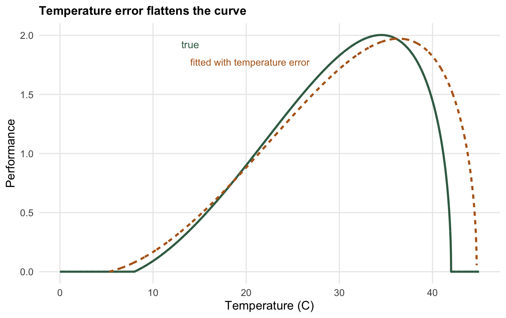
A temperature standard deviation of `r sprintf("%.1f", 2.5)` degrees pushes the apparent CTmax up to `r sprintf("%.1f", ce["tm"])` degrees. With random error in the measured temperature, as here, the fitted curve looks more heat-tolerant than the animal really is; air temperature can also run systematically warmer or cooler than the body, and such an offset shifts the whole curve warmer or cooler with it. The check: use body temperature, not a proxy, and where a proxy is unavoidable, treat the estimated breadth and optimum as approximate ([measurement error and regression dilution](../measurement-error-regression-dilution/) has the general version).
```{r fig-error}
#| fig-cap: "The true curve (green) and the curve fitted to error-laden temperatures (ochre): the ochre curve reaches zero further right."
#| fig-alt: "Two thermal performance curves; the ochre curve fitted with temperature error extends to a higher upper limit than the true green curve."
ggplot() +
  geom_line(data = data.frame(T = Tg, P = briere(Tg, a0, T0, Tm)), aes(T, P), colour = col_true, linewidth = 1) +
  geom_line(data = data.frame(T = TgE, P = PgE), aes(T, P), colour = col_err, linewidth = 1, linetype = "22") +
  annotate("text", x = 14, y = Pmax0*0.96, label = "true", colour = col_true, size = 3.6) +
  annotate("text", x = 14, y = PmaxE*0.9, label = "fitted with temperature error", colour = col_err, hjust = 0, size = 3.4) +
  labs(x = "Temperature (C)", y = "Performance", title = "True curve and curve fitted with temperature error")
```
## The deeper caveat
These three checks bound the numbers a curve returns. They do not fix what the curve is. A performance curve is measured by holding an animal at a constant temperature and reading a rate, and the two earlier posts showed why that is not the field: performance under [fluctuating temperature](../jensens-inequality-and-thermal-variability/) is not performance at the mean, and the curve itself shifts with acclimation and can be edited by behaviour (Sinclair et al. 2016 Ecology Letters 19(11):1372-1385). Run the three checks so the numbers are honest, then remember that even an honest constant-temperature curve is a laboratory object, and the animal lives outside.
## References
- Kingsolver JG 2009. The American Naturalist 174(6):755-768 (10.1086/648310).
- Schoolfield RM et al. 1981. Journal of Theoretical Biology 88(4):719-731 (10.1016/0022-5193(81)90246-0).
- Sinclair BJ et al. 2016. Ecology Letters 19(11):1372-1385 (10.1111/ele.12686).
## Related tutorials
- [Thermal performance curves in R](../thermal-performance-curves/)
- [Jensen's inequality and thermal variability](../jensens-inequality-and-thermal-variability/)
- [Thermal safety margins and warming](../thermal-safety-margins-and-warming/)
- [Activation energy and the rising limb](../activation-energy-and-the-rising-limb/)