---
title: "Thermal performance curves in R"
description: "Fitting thermal performance curves in R with nls: the optimum, the critical thermal maximum and breadth, and why a symmetric curve misplaces the upper limit."
date: "2026-06-29 14:00"
categories: [ecology tutorial, R, thermal ecology, climate change, physiology]
image: thumbnail.png
image-alt: "An asymmetric thermal performance curve rising gently then falling steeply, with the optimum sitting close to the upper thermal limit."
---
```{r setup}
#| code-fold: true
#| code-summary: "Setup: packages, colours and plot theme"
#| results: hide
#| message: false
#| warning: false
knitr::opts_chunk$set(echo = TRUE, message = FALSE, warning = FALSE,
                      dev = "png", dpi = 120, fig.path = "figures/",
                      fig.width = 7, fig.height = 4.4)
library(ggplot2)
theme_te <- theme_minimal(base_size = 12) +
  theme(panel.background = element_rect(fill = "#f5f4ee", colour = NA),
        plot.background  = element_rect(fill = "#f5f4ee", colour = NA),
        panel.grid.minor = element_blank(),
        plot.title = element_text(face = "bold", size = 12))
theme_set(theme_te)
col_dat <- "#555555"; col_bri <- "#3a6b52"; col_gau <- "#b5651d"; col_ref <- "#8a8a8a"

briere <- function(T, a, T0, Tm) { p <- a*T*(T-T0)*sqrt(pmax(Tm-T, 0)); p[T < T0 | T > Tm] <- 0; p }

## true curve
a0 <- 8e-4; T0 <- 8; Tm <- 42
Tg <- seq(0, 45, 0.01); Pg <- briere(Tg, a0, T0, Tm)
Topt_true <- Tg[which.max(Pg)]; Pmax_true <- max(Pg)
b80 <- range(Tg[Pg >= 0.8 * Pmax_true]); breadth <- diff(b80)
asym <- 100 * (Topt_true - T0) / (Tm - T0)

## simulate data
set.seed(391)
Td <- rep(seq(10, 40, 2.5), each = 4)
y  <- pmax(briere(Td, a0, T0, Tm) + rnorm(length(Td), 0, 0.03 * Pmax_true), 0)

## fits
fitB <- nls(y ~ aa*Td*(Td-t0)*sqrt(pmax(tm-Td, 0)),
            start = list(aa = 6e-4, t0 = 6, tm = 44), control = nls.control(warnOnly = TRUE))
cb <- coef(fitB)
TgB <- seq(cb["t0"], cb["tm"], 0.01); PgB <- cb["aa"]*TgB*(TgB-cb["t0"])*sqrt(pmax(cb["tm"]-TgB, 0))
Topt_B <- TgB[which.max(PgB)]; CTmax_B <- cb["tm"]
bf <- range(TgB[PgB >= 0.8 * max(PgB)]); breadth_fit <- diff(bf)

fitG <- nls(y ~ A*exp(-((Td-mo)^2)/(2*s^2)),
            start = list(A = Pmax_true, mo = Topt_true, s = 8), control = nls.control(warnOnly = TRUE))
cg <- coef(fitG); Topt_G <- cg["mo"]; CTmax_G <- cg["mo"] + 2 * cg["s"]
overest <- CTmax_G - Tm
```
Give an insect, a lizard or a leaf a body temperature and it performs at some rate: it grows, sprints, develops or photosynthesises. Plot that rate against temperature and you get a thermal performance curve, one of the workhorses of thermal ecology (Huey and Stevenson 1979 American Zoologist 19(1):357-366; Kingsolver 2009 The American Naturalist 174(6):755-768). The curve rises slowly from a lower limit, peaks at a thermal optimum, then falls off a cliff to an upper limit. That last word, cliff, is the whole point: performance curves are asymmetric, and pretending otherwise misplaces the numbers ecologists most want.
## The shape, and a model for it
Two features define the curve. It is bounded, between a critical thermal minimum (CTmin) and maximum (CTmax) where performance reaches zero, and it is left-skewed: the rise is gentle, the fall is steep. A convenient model that captures both is the Briere function (Briere et al. 1999 Environmental Entomology 28(1):22-29), which is exactly zero outside the thermal limits and asymmetric in between.
```{r briere}
briere <- function(T, a, T0, Tm) {
  p <- a * T * (T - T0) * sqrt(pmax(Tm - T, 0))
  p[T < T0 | T > Tm] <- 0
  p
}
```
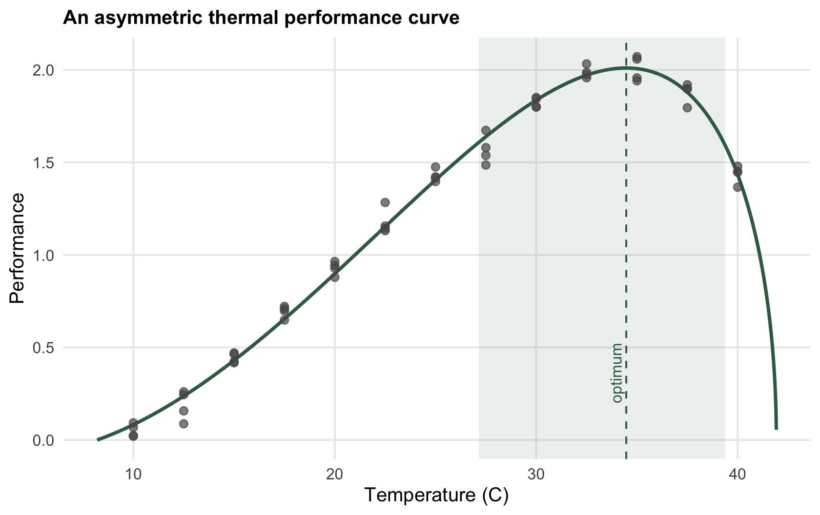
Here `T0` is CTmin, `Tm` is CTmax, and `a` scales the height. For a curve with CTmin `r sprintf("%.0f", T0)` and CTmax `r sprintf("%.0f", Tm)` degrees C, the optimum falls at `r sprintf("%.1f", Topt_true)` degrees, which is `r sprintf("%.0f", asym)`% of the way from the lower limit to the upper one. The optimum sits close to the upper limit, not in the middle: an organism performing near its best is only a few degrees from the temperature that shuts it down.
## Fitting a curve to data
Real data are performance measurements at a set of temperatures, with noise. Fit the Briere model with `nls`.
```{r fit}
set.seed(391)
Td <- rep(seq(10, 40, 2.5), each = 4)
y  <- pmax(briere(Td, 8e-4, 8, 42) + rnorm(length(Td), 0, 0.06), 0)
fitB <- nls(y ~ aa * Td * (Td - t0) * sqrt(pmax(tm - Td, 0)),
            start = list(aa = 6e-4, t0 = 6, tm = 44))
round(coef(fitB), 4)
```
The fit recovers the optimum at `r sprintf("%.1f", Topt_B)` degrees and CTmax at `r sprintf("%.1f", CTmax_B)`, both close to the truth. From the fitted curve you read off the three quantities that matter: the optimum, the upper limit, and the thermal breadth, the width of the temperature band over which performance stays above eighty per cent of its peak, here about `r sprintf("%.1f", breadth_fit)` degrees.
```{r fig-tpc}
#| fig-cap: "A thermal performance curve fitted with the Briere model. The optimum (dashed) sits close to the critical thermal maximum; the shaded band is the thermal breadth where performance exceeds eighty per cent of the peak."
#| fig-alt: "Scatter of performance against temperature with a fitted curve rising gently to a peak near 35 degrees then falling steeply to zero near 42 degrees; a shaded band marks the breadth and a dashed line the optimum."
dd  <- data.frame(Td = Td, y = y)
cur <- data.frame(T = TgB, P = PgB)
ggplot(dd, aes(Td, y)) +
  annotate("rect", xmin = bf[1], xmax = bf[2], ymin = -Inf, ymax = Inf, fill = col_bri, alpha = 0.10) +
  geom_line(data = cur, aes(T, P), colour = col_bri, linewidth = 1) +
  geom_point(colour = col_dat, size = 2, alpha = 0.7) +
  geom_vline(xintercept = Topt_B, colour = col_bri, linetype = "dashed") +
  annotate("text", x = Topt_B - 0.5, y = 0.2, label = "optimum", angle = 90, hjust = 0, colour = col_bri, size = 3.4) +
  labs(x = "Temperature (C)", y = "Performance", title = "An asymmetric thermal performance curve")
```
## Why the symmetry matters
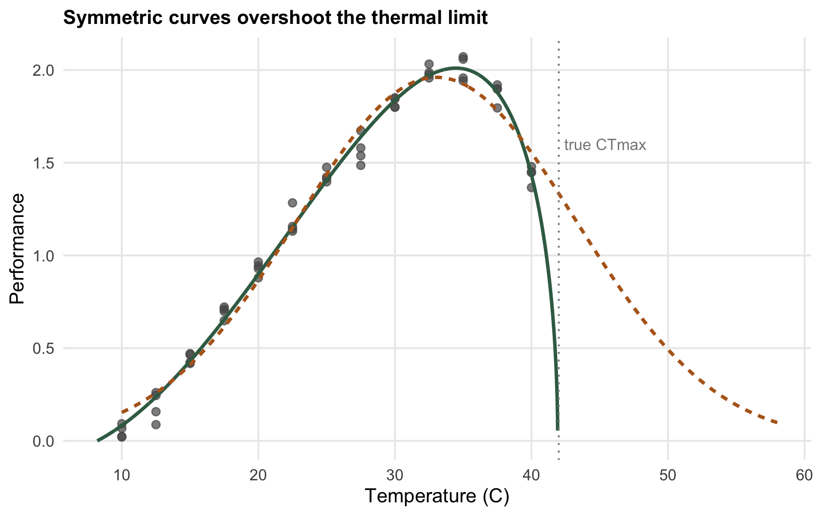
It is tempting to reach for a Gaussian, the familiar bell, because it is symmetric and easy. Fit one to the same data and it will happily find a peak. The trouble is on the way down.
```{r gaussian}
fitG <- nls(y ~ A * exp(-((Td - mo)^2) / (2 * s^2)),
            start = list(A = 2, mo = 34, s = 8))
round(coef(fitG), 3)
```
The Gaussian places the optimum at `r sprintf("%.1f", Topt_G)` degrees, a little low, because a symmetric curve cannot lean toward the upper limit. Worse is what it implies for the thermal maximum. A Gaussian never reaches zero, so any limit read off it is a convention. Take two standard deviations above the optimum, where the curve is still at exp(-2) of its peak, and it already sits near `r sprintf("%.1f", CTmax_G)` degrees, about `r sprintf("%.0f", overest)` degrees above the real CTmax of `r sprintf("%.0f", Tm)`. The symmetric curve smears the steep descending limb across a temperature range the organism could never survive.
```{r fig-compare}
#| fig-cap: "Briere (green) and Gaussian (ochre) fits to the same data. They agree on the rising limb and disagree sharply on the fall: the symmetric curve pushes the apparent upper limit far too high."
#| fig-alt: "Two fitted curves over the same points; the green Briere curve falls steeply to zero near 42 degrees while the ochre Gaussian curve declines gradually and extends well past 50 degrees."
TgG <- seq(10, 58, 0.1); PgG <- cg["A"] * exp(-((TgG - cg["mo"])^2) / (2 * cg["s"]^2))
ggplot(dd, aes(Td, y)) +
  geom_point(colour = col_dat, size = 2, alpha = 0.7) +
  geom_line(data = cur, aes(T, P), colour = col_bri, linewidth = 1) +
  geom_line(data = data.frame(T = TgG, P = PgG), aes(T, P), colour = col_gau, linewidth = 1, linetype = "22") +
  geom_vline(xintercept = Tm, colour = col_ref, linetype = "dotted") +
  annotate("text", x = Tm + 0.4, y = 1.6, label = "true CTmax", hjust = 0, colour = col_ref, size = 3.4) +
  labs(x = "Temperature (C)", y = "Performance", title = "Symmetric curves overshoot the thermal limit")
```
## What to trust, and what to check
The optimum and the breadth are interpolated from the bulk of the data and are reasonably safe. CTmax is different: it is an extrapolation to the edge of the curve, where there are few measurements and where the choice of model matters most. Treat it as the least certain number on the curve, and see the [checking post](../checking-a-thermal-performance-analysis/) for how far it can move. The two follow-ups take the curve somewhere useful: what it says about performance in a fluctuating climate, and which species a warming world actually threatens.
## References
- Briere JF et al. 1999. Environmental Entomology 28(1):22-29 (10.1093/ee/28.1.22).
- Huey RB, Stevenson RD 1979. American Zoologist 19(1):357-366 (10.1093/icb/19.1.357).
- Kingsolver JG 2009. The American Naturalist 174(6):755-768 (10.1086/648310).
- Sinclair BJ et al. 2016. Ecology Letters 19(11):1372-1385 (10.1111/ele.12686).
## Related tutorials
- [Jensen's inequality and thermal variability](../jensens-inequality-and-thermal-variability/)
- [Thermal safety margins and warming](../thermal-safety-margins-and-warming/)
- [Checking a thermal performance analysis](../checking-a-thermal-performance-analysis/)
- [Thermal death time and the ramping rate](../thermal-death-time-and-ramping-rate/)