library(ggplot2)

te_pal <- list(forest = "#275139", green = "#2f8f63", sage = "#93a87f",
               clay = "#b5534e", gold = "#cda23f", line = "#dad9ca",
               ink = "#16241d", paper = "#f5f4ee")

theme_te <- function() {
  theme_minimal(base_size = 12) +
    theme(panel.grid.minor = element_blank(),
          panel.grid.major = element_line(colour = "#e7e6dc"),
          plot.background = element_rect(fill = "#f5f4ee", colour = NA),
          panel.background = element_rect(fill = "#f5f4ee", colour = NA),
          plot.title = element_text(face = "bold", colour = te_pal$ink),
          axis.title = element_text(colour = "#2c3a31"),
          axis.text = element_text(colour = "#2c3a31"),
          legend.position = "bottom")
}Taxonomic revision and species trends
R
monitoring
data cleaning
ecology tutorial
A long monitoring series records names, not species. Simulate a split and a lump in R, measure the false richness trend, and price the two available repairs.
A hay meadow has been surveyed every July since the programme started: the same forty quadrats, the same fortnight, the same two recorders for most of it. Twenty five years of species lists, one of the better datasets in the region, and in year thirteen the national checklist the programme follows adopts a revision. A sedge that had always been recorded under one name turns out to be three; two rushes that had always been recorded separately turn out to be one. The recording cards for the next survey are reprinted, everybody carries on, and the report written after year twenty five says that richness in the meadow is rising.
Nothing in the meadow changed. The abundances are the same, the species are the same plants in the same places, and the survey effort never moved. What changed was the map from names to organisms, and a monitoring series stores names.
This is not the same problem as a misspelt name, and the difference is the whole post. If a recorder writes Festuca rubra one year and festuca rubra the next, there is a correct answer: they are one species, and a lookup table written once puts the record right. That job is cleaning species names before you count, and it ends with a decision written down rather than a function called, but the decision is still a decision about spelling. There is a fact of the matter. When a sedge is split into three, no lookup table exists that turns the first twelve years into the new scheme, because in those twelve years nobody looked at the character that distinguishes the three. The old record is not wrong. It is coarser, and it is coarser in a way that cannot be undone from the sheet.
The clearest real example is the common pipistrelle. British and Irish bat workers recorded Pipistrellus pipistrellus for decades, and through the 1990s it became clear that the bats calling at 45 kHz and the bats calling at 55 kHz were two species, not one variable one. The echolocation work that opened the question was published in 1993, the formal separation of P. pygmaeus followed, and every bat survey dataset that spans the change contains one name that means two things before it and one thing after. A roost count series filed under P. pipistrellus loses every 55 kHz roost from the later years, and nothing happened to those bats. This is the single most common shape of the problem: a nominate species keeps its name and loses part of its content, so the name looks continuous in a database and the series under it is not.
The direction is not random either. Splits have outnumbered lumps for decades, in mammals, in birds and in most well-worked plant groups, partly because new characters keep arriving (genetic ones especially) and partly because the phylogenetic species concept treats diagnosable populations as species where the biological species concept did not. Isaac and colleagues called the result taxonomic inflation and showed that it distorts macroecological and conservation numbers that were never meant to be sensitive to nomenclature; Garnett and Christidis, more bluntly, called the resulting instability a governance problem. For a monitoring series the practical consequence is that the artefact measured below has a sign. If splits outnumber lumps in your taxon over your study period, every richness series in the programme drifts upward, together, for the same reason, and that is exactly the pattern a reader would take as a real regional signal.
I owe this post to three earlier ones. The cleaning walkthrough for occurrence records ends by saying that the other half of cleaning is taxonomic, reconciling synonyms and misspelt names, and points at name_backbone() and taxize. The species-names post says that for a real dataset you write the accepted name beside each variant by hand or against a taxonomic authority. The regular expressions post says that cleaning the taxonomy in a species column is a different job, and links to the species-names post, which is where the loop closes without anyone having done the job. All three treat the name-to-species map as a fixed thing you look up. In a long series it is not fixed, and the part that moves is the part no authority file can repair.
What follows is a simulation of one meadow with a genuinely constant community, one revision in year thirteen, and five measurements: how large the false trend is and whether its confidence interval excludes zero, which diagnostic sees the revision and how little noise it takes to hide it, why a split and a lump are not mirror images, what happens to the trend of a single species, and what the two available repairs cost.
The unit that does not change, and the name that does
The simulation keeps two things apart that a real dataset keeps together. There are biological units, which are the things out in the meadow, and there are recorded names, which are what the sheet holds. The units are fixed for all twenty five years: same set, same relative abundances, no colonisation and no loss. Only the map from units to names moves, and it moves once.
Twenty six units get a geometric rank abundance from ninety expected individuals a year down to two and a half, which is the ordinary shape of a quadrat dataset. Units two, three and four are the cryptic sedges: before the revision all three are written as Carex nigra, after it they are written as three separate names, and the commonest of the three keeps the old name. Units twenty five and twenty six are the two rare rushes: before the revision they are written separately, after it both are written as Juncus articulatus, and again one of the two old names is the one that survives. The names are borrowed from real sedges and rushes because letters and numbers are hard to read; the revision itself is invented.
Counts come from a Poisson draw around a mean that carries a small lognormal wobble between years, which is the between-year variation any real programme has. Nothing in the count model knows what year it is.
n_year   <- 25
rev_year <- 13
n_unit   <- 26

true_mean <- exp(seq(log(90), log(2.5), length.out = n_unit))
unit_id   <- sprintf("u%02d", seq_len(n_unit))
split_ids <- c(2, 3, 4)
lump_ids  <- c(25, 26)

name_pre  <- unit_id
name_post <- unit_id
name_pre[split_ids]  <- "Carex nigra"
name_post[split_ids] <- c("Carex nigra", "Carex bigelowii", "Carex rariflora")
name_pre[lump_ids]   <- c("Juncus articulatus", "Juncus alpinoarticulatus")
name_post[lump_ids]  <- "Juncus articulatus"

sim_counts <- function(cv = 0.25, decline = 0) {
  mu <- outer(true_mean, exp(decline * (seq_len(n_year) - 1))) *
    exp(matrix(rnorm(n_unit * n_year, 0, cv), n_unit, n_year))
  matrix(rpois(n_unit * n_year, mu), n_unit, n_year)
}

never <- n_year + 1L
record <- function(cnt, split_from = rev_year, lump_from = rev_year) {
  do.call(rbind, lapply(seq_len(n_year), function(t) {
    nm <- unit_id
    nm[split_ids] <- if (t >= split_from) name_post[split_ids] else "Carex nigra"
    nm[lump_ids] <- if (t >= lump_from) "Juncus articulatus" else name_pre[lump_ids]
    tot <- tapply(cnt[, t], nm, sum)
    data.frame(year = t, taxon = names(tot), count = as.vector(tot))
  }))
}
rich_of <- function(rr) as.vector(tapply(rr$count > 0, rr$year, sum))

print(data.frame(unit = unit_id[c(split_ids, lump_ids)],
                 mean_count = round(true_mean[c(split_ids, lump_ids)], 2),
                 before = name_pre[c(split_ids, lump_ids)],
                 after = name_post[c(split_ids, lump_ids)]))
unit mean_count before after
1 u02 77.98 Carex nigra Carex nigra
2 u03 67.57 Carex nigra Carex bigelowii
3 u04 58.54 Carex nigra Carex rariflora
4 u25 2.89 Juncus articulatus Juncus articulatus
5 u26 2.50 Juncus alpinoarticulatus Juncus articulatusprint(round(c(biological_units = n_unit,
names_before_revision = length(unique(name_pre)),
names_after_revision = length(unique(name_post)),
aggregate_mean_count = sum(true_mean[split_ids]),
largest_daughter_share = true_mean[2] / sum(true_mean[split_ids])), 4)) biological_units names_before_revision names_after_revision
26.0000 24.0000 25.0000
aggregate_mean_count largest_daughter_share
204.0934 0.3821 Two numbers there are worth pausing on. Before the revision the sheet can hold at most 24 names for 26 units; afterwards it can hold 25. The revised checklist is a better description of the meadow than the old one, closer to the twenty six units actually present. The data improved and, as the next section measures, the time series got worse. That is the uncomfortable shape of the whole problem, and it is why “just use the old names” is not obviously the right answer either.
The trend that nobody caused
Take the recorded names at face value, count distinct names per year, and fit the line any report would fit.
set.seed(101)
cnt  <- sim_counts()
rec  <- record(cnt)
rich <- rich_of(rec)
yr   <- seq_len(n_year)

fit <- lm(rich ~ yr)
ci  <- confint(fit)["yr", ]
base_rich <- mean(rich[yr < rev_year])
pct_dec <- 100 * 10 * c(coef(fit)[["yr"]], ci) / base_rich

print(rich)
[1] 22 24 24 24 24 24 24 24 24 24 23 24 25 25 24 25 24 25 25 25 25 25 24 25 25print(round(c(slope_per_year = coef(fit)[["yr"]],
lower = ci[[1]], upper = ci[[2]],
p_value = summary(fit)$coefficients["yr", 4],
residual_sd = summary(fit)$sigma), 5))slope_per_year lower upper p_value residual_sd
0.06769 0.03585 0.09953 0.00021 0.55494 print(round(c(mean_richness_before = base_rich,
mean_richness_after = mean(rich[yr >= rev_year]),
pct_per_decade = pct_dec[1],
pct_lower = pct_dec[2], pct_upper = pct_dec[3]), 3))mean_richness_before mean_richness_after pct_per_decade
23.750 24.769 2.850
pct_lower.2.5 % pct_upper.97.5 %
1.510 4.191 The fitted slope is 0.0677 names a year with a ninety five per cent interval from 0.0359 to 0.0995. The interval excludes zero and the p value is 2.09e-04. Expressed the way a report would express it, against the mean richness of the first twelve years, that is 2.85 per cent per decade, interval 1.51 to 4.19. A meadow gaining richness at that rate is a publishable result and a plausible one; several real grassland series report numbers in that range.
One series is an anecdote, so here is the same programme run 1000 times with new counts each time and nothing else changed.
set.seed(202608031)
n_rep <- 1000
rep_sl <- t(vapply(seq_len(n_rep), function(i) {
  s <- summary(lm(rich_of(record(sim_counts())) ~ yr))$coefficients["yr", ]
  c(slope = s[1], p = s[4])
}, numeric(2)))
sig_rate <- mean(rep_sl[, 2] < 0.05 & rep_sl[, 1] > 0)

print(round(c(replicates = n_rep,
              median_slope = median(rep_sl[, 1]),
              median_pct_per_decade = median(100 * 10 * rep_sl[, 1] / base_rich),
              significant_and_positive = sig_rate,
              any_significant_negative = mean(rep_sl[, 2] < 0.05 &
                                                rep_sl[, 1] < 0)), 4))
replicates median_slope median_pct_per_decade
1000.0000 0.0692 2.9150
significant_and_positive any_significant_negative
0.9980 0.0000 In 99.8 per cent of 1000 replicate programmes the apparent increase is significant at the five per cent level and positive. Not sometimes: essentially always. The true richness never moved in any of them. What is being estimated with such conviction is the slope of a step function, and a step function fitted with a straight line always has a slope.
pr <- predict(fit, interval = "confidence")
d_rich <- data.frame(yr, rich, fit = pr[, 1], lo = pr[, 2], hi = pr[, 3])

ggplot(d_rich, aes(yr, rich)) +
  geom_ribbon(aes(ymin = lo, ymax = hi), fill = te_pal$clay, alpha = 0.18) +
  geom_vline(xintercept = rev_year - 0.5, linetype = "22",
             colour = te_pal$ink, linewidth = 0.5) +
  geom_hline(yintercept = n_unit, colour = te_pal$gold, linewidth = 0.9) +
  geom_line(aes(y = fit), colour = te_pal$clay, linewidth = 0.9) +
  geom_line(colour = te_pal$forest, linewidth = 0.5) +
  geom_point(colour = te_pal$forest, size = 2.2) +
  annotate("text", x = rev_year + 0.4, y = 22.2, hjust = 0, size = 3.4,
           colour = te_pal$ink, label = "revision") +
  annotate("text", x = 1, y = n_unit - 0.35, hjust = 0, vjust = 1, size = 3.4,
           colour = "#8a6a1c", label = "biological units present in every year") +
  coord_cartesian(ylim = c(21.9, 26.2)) +
  scale_x_continuous(breaks = seq(1, 25, 4)) +
  labs(x = "year of the programme", y = "distinct names recorded",
       title = "A richness trend with no biology in it") +
  theme_te()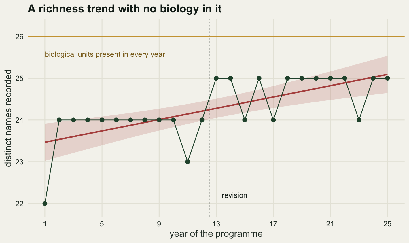
Look at the green points and the red line together. The points are flat, flat, step, flat. The line is a steady climb. Neither describes the meadow, but only one of them gets written into a summary table, and the residual standard deviation of 0.5549 names is small enough that nothing in the model output complains.
Species richness is the most reported quantity in community ecology and the most fragile, because it counts categories rather than measuring a magnitude. Magurran and McGill’s survey of diversity measurement spends a lot of its length on sampling effort and detectability for that reason. The failure here is a level below either: not that the count of categories is biased by effort, but that the categories themselves were redefined halfway through. No amount of rarefaction or effort correction touches it, because both take the species list as given.
The one signal that is actually in the data
There is exactly one thing in this dataset that betrays the revision, and it is not richness. It is the composition of the name list from one year to the next. In a constant community with good survey effort, consecutive years share almost all their names. In the revision year the list loses one name and gains two at once.
The Jaccard distance between two name sets is one minus the size of the intersection over the size of the union. It is one line of base R and does not need vegan.
jaccard <- function(a, b) 1 - length(intersect(a, b)) / length(union(a, b))

sets <- split(rec$taxon[rec$count > 0], rec$year[rec$count > 0])
jd <- vapply(2:n_year, function(t) jaccard(sets[[t - 1]], sets[[t]]), numeric(1))

print(round(jd, 4))
[1] 0.0833 0.0000 0.0000 0.0000 0.0000 0.0000 0.0000 0.0000 0.0000 0.0417
[11] 0.0417 0.1154 0.0000 0.0400 0.0400 0.0400 0.0400 0.0000 0.0000 0.0000
[21] 0.0000 0.0400 0.0400 0.0000print(round(c(distance_at_revision = jd[rev_year - 1],
next_largest = max(jd[-(rev_year - 1)]),
median_elsewhere = median(jd[-(rev_year - 1)]),
ratio_to_next = jd[rev_year - 1] / max(jd[-(rev_year - 1)])), 4))distance_at_revision next_largest median_elsewhere
0.1154 0.0833 0.0000
ratio_to_next
1.3846 The transition into year 13 has a distance of 0.1154. The next largest anywhere in the series is 0.0833, and the median of the other 23 transitions is 0. The spike stands exactly where the revision is and nowhere else, which is what you would hope for from a diagnostic.
Now the awkward part. That worked because the community was frozen. Real communities turn over: a taxon present in one year is genuinely absent the next, and every such event adds to the background distance. The sweep below adds a background turnover rate, the per-year chance that any given taxon goes unrecorded, and asks how often the revision transition is still the largest of the twenty four. Pure chance would put it at the top one time in 24.
dist_series <- function(tau) {
  cc <- sim_counts()
  cc[runif(n_unit * n_year) < tau] <- 0
  rr <- record(cc)
  ss <- split(rr$taxon[rr$count > 0], rr$year[rr$count > 0])
  vapply(2:n_year, function(t) jaccard(ss[[t - 1]], ss[[t]]), numeric(1))
}

set.seed(202608032)
taus <- c(0, 0.01, 0.02, 0.04, 0.06, 0.09, 0.12, 0.16, 0.20)
sweep <- as.data.frame(t(vapply(taus, function(tau) {
  d <- vapply(seq_len(400), function(i) dist_series(tau), numeric(n_year - 1))
  c(detect = mean(apply(d, 2, which.max) == rev_year - 1),
    at_revision = mean(d[rev_year - 1, ]),
    elsewhere = mean(d[-(rev_year - 1), ]))
}, numeric(3))))
sweep$turnover <- taus
sweep$ratio <- sweep$at_revision / sweep$elsewhere
chance   <- 1 / (n_year - 1)
half_tau <- sweep$turnover[which(sweep$detect < 0.5)[1]]

print(round(sweep[, c("turnover", "detect", "at_revision", "elsewhere",
                      "ratio")], 4))
turnover detect at_revision elsewhere ratio
1 0.00 0.9200 0.1219 0.0143 8.5310
2 0.01 0.6625 0.1384 0.0328 4.2232
3 0.02 0.4525 0.1513 0.0525 2.8837
4 0.04 0.3275 0.1859 0.0868 2.1411
5 0.06 0.2750 0.2125 0.1214 1.7498
6 0.09 0.2325 0.2622 0.1715 1.5286
7 0.12 0.1650 0.2922 0.2189 1.3349
8 0.16 0.1650 0.3483 0.2741 1.2709
9 0.20 0.1475 0.3938 0.3310 1.1897print(round(c(chance_level = chance, detect_at_zero_turnover = sweep$detect[1],
first_turnover_under_half = half_tau,
detect_at_largest_turnover = sweep$detect[nrow(sweep)],
ratio_at_zero = sweep$ratio[1],
ratio_at_largest = sweep$ratio[nrow(sweep)]), 4)) chance_level detect_at_zero_turnover
0.0417 0.9200
first_turnover_under_half detect_at_largest_turnover
0.0200 0.1475
ratio_at_zero ratio_at_largest
8.5310 1.1897 With no background turnover the revision transition is the largest of the twenty four in 92 per cent of series, and not 100 per cent, because the rarest units flicker in and out on sampling alone. Add a 2 per cent per-year chance that a taxon goes unrecorded, which is a very quiet community by any field standard, and it is already the largest in fewer than half. At the top of the sweep, a 20 per cent chance, it wins 14.8 per cent of the time against a chance level of 4.2 per cent.
lv <- c("at the revision", "every other year")
p_one <- data.frame(x = 2:n_year, d = jd, panel = "one series, by year",
                    series = ifelse(2:n_year == rev_year, lv[1], lv[2]))
p_sw <- rbind(
  data.frame(x = sweep$turnover, d = sweep$at_revision, series = lv[1]),
  data.frame(x = sweep$turnover, d = sweep$elsewhere, series = lv[2]))
p_sw$panel <- "400 series, by background turnover"
d_dist <- rbind(p_one, p_sw[names(p_one)])
d_dist$panel <- factor(d_dist$panel,
                       levels = c("one series, by year",
                                  "400 series, by background turnover"))
d_dist$series <- factor(d_dist$series, levels = lv)

ggplot(d_dist, aes(x, d, colour = series, shape = series)) +
  geom_line(data = subset(d_dist, panel == "one series, by year"),
            colour = te_pal$line, linewidth = 0.7, aes(group = 1)) +
  geom_line(data = subset(d_dist, panel != "one series, by year"),
            linewidth = 0.7) +
  geom_point(size = 2.2) +
  facet_wrap(~panel, scales = "free_x") +
  scale_colour_manual(values = c(te_pal$clay, te_pal$forest), name = NULL) +
  scale_shape_manual(values = c(17, 16), name = NULL) +
  labs(x = "year of the programme, or background turnover rate",
       y = "Jaccard distance between consecutive years",
       title = "The spike, and how easily it is buried") +
  theme_te() +
  theme(plot.margin = margin(8, 14, 4, 8))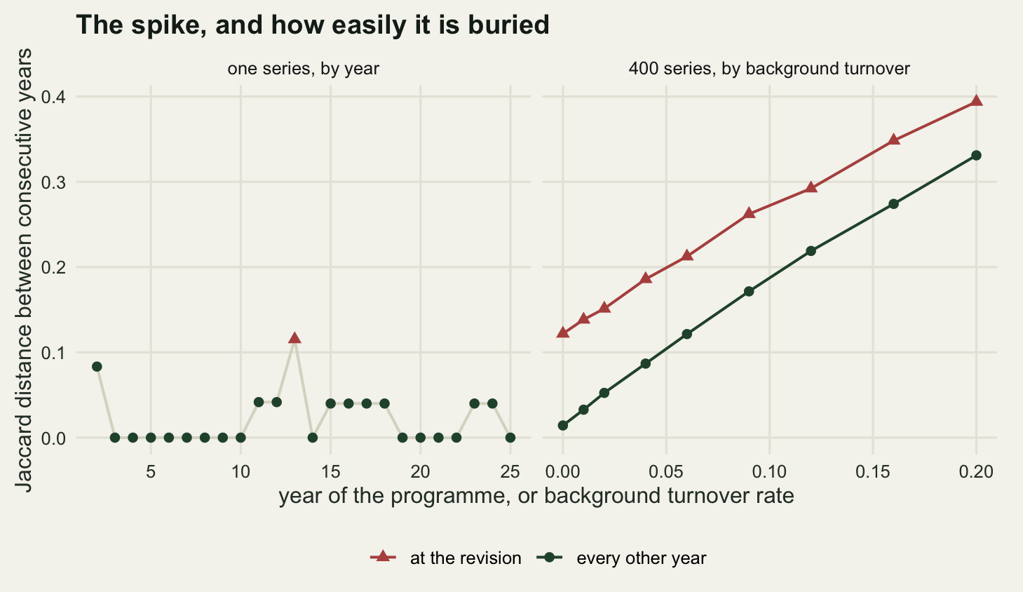
The right-hand panel says something the detection rate on its own does not. The revision transition stays larger than the background at every turnover level tested: the red line never touches the green one. What collapses is the ratio, from 8.53 to 1.19. The signal is still there in expectation and it is no longer identifiable in one series, which is the usual reason a diagnostic fails. Run this on your own data and a spike is worth investigating; the absence of one proves nothing at all.
A split and a lump are not mirror images
It is tempting to treat the two events as opposite signs of one thing: a split adds taxa, a lump removes them, and a programme that gets both roughly breaks even. The arithmetic says otherwise. Running the same counts through four naming regimes isolates each effect.
scen <- function(sf, lf) {
  set.seed(55)
  out <- vapply(seq_len(200), function(i) {
    rr <- record(sim_counts(), split_from = sf, lump_from = lf)
    rv <- rich_of(rr)
    cn <- rr$count[rr$taxon == "Carex nigra"]
    ju <- rr$count[rr$taxon == "Juncus articulatus"]
    pre <- yr < rev_year
    c(mean(rv[!pre]) - mean(rv[pre]), mean(cn[!pre]) / mean(cn[pre]),
      mean(ju[!pre]) / mean(ju[pre]))
  }, numeric(3))
  setNames(rowMeans(out), c("richness_change", "carex_ratio", "juncus_ratio"))
}

sl <- rbind(`split only` = scen(rev_year, never),
            `lump only`  = scen(never, rev_year),
            `both`       = scen(rev_year, rev_year),
            `neither`    = scen(never, never))
print(round(sl, 4))
richness_change carex_ratio juncus_ratio
split only 1.9785 0.3798 1.0249
lump only -0.8784 0.9980 1.9364
both 1.1216 0.3798 1.9364
neither -0.0215 0.9980 1.0249print(round(c(split_adds = sl["split only", "richness_change"],
lump_removes = -sl["lump only", "richness_change"],
naive_expectation_for_lump = 1,
net = sl["both", "richness_change"],
control = sl["neither", "richness_change"]), 4)) split_adds lump_removes
1.9785 0.8784
naive_expectation_for_lump net
1.0000 1.1216
control
-0.0215 The split adds 1.979 taxa on average, which is the two extra names you would predict. The lump removes only 0.878, not the one you would predict, and the shortfall is not noise: the control regime, where neither event happens, moves by -0.0215. Merging two rare taxa into one makes the merged concept easier to detect than either part was, so some of the loss is bought back in years when only one of the pair would have turned up. A lump of two common taxa would cost the full one; a lump of two rare ones costs less. The net effect of both events together is 1.122 taxa, and the asymmetry means you cannot cancel splits against lumps by counting them.
The per-taxon column is where the asymmetry stops being a curiosity. Both events leave one of the old names standing, and the counts filed under that surviving name change without any organism doing anything. Carex nigra after the revision carries 0.3798 of what it carried before, against 0.998 in the control. Juncus articulatus carries 1.9364 times what it carried before, against 1.0249 in the control. One name loses about three fifths of its individuals overnight and the other roughly doubles.
Which of the two you get more of depends on the group and the decade, and it matters for the direction of the bias rather than for the size of it. The asymmetry above is about detectability, so it is a property of your survey, not of the taxonomy: in a programme that records everything present, a lump costs a clean one taxon, and in a patchy one it costs noticeably less. Either way, a programme that has absorbed six splits and six lumps has not broken even.
The per-taxon series is the quieter casualty
Richness has one virtue: a step in it is visible in a plot of twenty five points, and somebody eventually asks about year thirteen. Per-taxon series get none of that attention, and there are twenty five of them.
d_ser <- rbind(
  data.frame(yr, n = rec$count[rec$taxon == "Carex nigra"],
             panel = "Carex nigra: a split", what = "the name as recorded"),
  data.frame(yr, n = colSums(cnt[split_ids, ]),
             panel = "Carex nigra: a split", what = "the constant concept behind it"),
  data.frame(yr, n = rec$count[rec$taxon == "Juncus articulatus"],
             panel = "Juncus articulatus: a lump", what = "the name as recorded"),
  data.frame(yr, n = colSums(cnt[lump_ids, ]),
             panel = "Juncus articulatus: a lump",
             what = "the constant concept behind it"))

ggplot(d_ser, aes(yr, n, colour = what)) +
  geom_vline(xintercept = rev_year - 0.5, linetype = "22",
             colour = te_pal$ink, linewidth = 0.5) +
  geom_line(data = ~subset(.x, what == "the constant concept behind it"),
            linewidth = 2.1) +
  geom_line(data = ~subset(.x, what == "the name as recorded"),
            linewidth = 0.8) +
  facet_wrap(~panel, scales = "free_y") +
  scale_colour_manual(values = c(te_pal$sage, te_pal$forest), name = NULL) +
  scale_x_continuous(breaks = seq(1, 25, 4)) +
  labs(x = "year of the programme", y = "individuals counted",
       title = "Two names that survived a revision") +
  theme_te() +
  theme(plot.margin = margin(8, 14, 4, 8))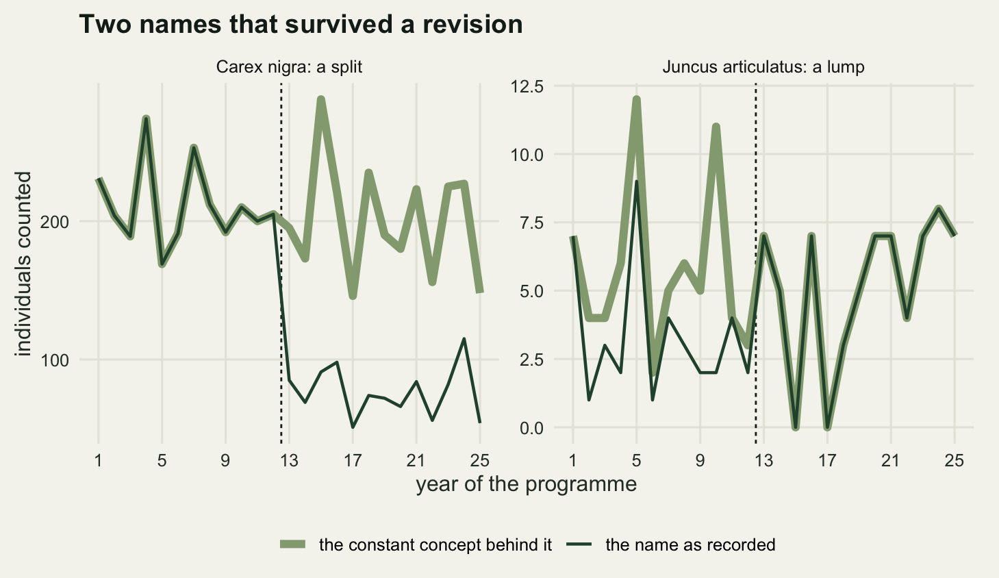
Now give the sedges a real trend and ask what the split does to the ability to find it. All three cryptic units decline together, at a rate a national scheme would want to catch and would struggle to reach significance on once the series is cut back to thirteen years. Counts are overdispersed by the between-year wobble, so the trend model is a quasi-Poisson generalised linear model rather than a Poisson one; fitting a plain Poisson here would shrink every standard error and make all four analyses look decisive. Four analyses of the same underlying decline:
decl <- -0.02
trend_est <- function(y, x) {
  s <- summary(glm(y ~ x, family = quasipoisson))$coefficients
  c(estimate = s[2, 1], p = s[2, 4])
}

set.seed(202608033)
n_pw <- 800
post <- rev_year:n_year
pw <- t(vapply(seq_len(n_pw), function(i) {
  cc  <- sim_counts(decline = decl)
  agg <- colSums(cc[split_ids, ])
  dau <- cc[split_ids[1], ]
  c(trend_est(agg, yr),
    trend_est(agg[post], post),
    trend_est(dau[post], post),
    trend_est(c(agg[yr < rev_year], dau[post]), yr))
}, numeric(8)))

pw_rate <- function(e, p) mean(pw[, p] < 0.05 & pw[, e] < 0)
pow <- c(full_25_years = pw_rate(1, 2), aggregate_13_years = pw_rate(3, 4),
         one_daughter_13_years = pw_rate(5, 6), the_surviving_name = pw_rate(7, 8))
pct_yr <- 100 * (exp(c(truth = decl, full_25_years = median(pw[, 1]),
                       one_daughter_13_years = median(pw[, 5]),
                       the_surviving_name = median(pw[, 7]))) - 1)

print(round(pow, 4))
full_25_years aggregate_13_years one_daughter_13_years
0.9875 0.2925 0.1300
the_surviving_name
1.0000 print(round(pct_yr, 3)) truth full_25_years one_daughter_13_years
-1.980 -1.996 -1.869
the_surviving_name
-7.262 print(round(c(power_lost_to_length = unname(pow[1] - pow[2]),
power_lost_to_division = unname(pow[2] - pow[3]),
overstatement_factor = pct_yr[["the_surviving_name"]] /
pct_yr[["truth"]]), 4)) power_lost_to_length power_lost_to_division overstatement_factor
0.6950 0.1625 3.6673 The true rate is set in the chunk as -0.02 a year on the log scale, which is -1.98 per cent a year, or a little under a fifth over a decade.
With the sedges kept together across all twenty five years, the decline is found in 98.8 per cent of 800 replicates. Analyse only the thirteen post-revision years, still with all three units pooled, and that falls to 29.2 per cent. Analyse a single daughter over those thirteen years, which is what the new name gives you, and it falls again to 13 per cent.
The decomposition is the useful part. Losing twelve years costs 69.5 percentage points of power; dividing the counts three ways costs a further 16.2. The damage is mostly about series length, not abundance, which is worth knowing because the instinct after a split is to worry about the small counts. The years are what you lost.
And then the fourth row, which is what an analyst gets by merging on the name column without noticing. Carex nigra runs the whole twenty five years: an aggregate of three units for twelve years, then one unit for thirteen. Fitted as one series it returns a decline of -7.26 per cent a year against a truth of -1.98, an overstatement by a factor of 3.67, and it is significant in 100 per cent of replicates. The honest analysis of the pooled data recovers -2 per cent a year and the single daughter recovers -1.87; both are near the truth. Only the name lies, and it lies with a tiny p value in every replicate.
That is the ranking the section title claims. The richness artefact is a step of one taxon that a careful reader can see in a figure. The per-taxon artefact is an overstatement of a decline by a factor of 3.67, in a series that looks continuous, for a name that was never retired. Twenty five names in this programme, two of them corrupted, and no output from any model flags which two.
There is a corollary worth stating plainly, because it runs against the reflex to salvage everything. A split leaves you with a choice between a short honest series and a long dishonest one, and the long one is not a compromise, it is worse than either. If you cannot pool the daughters back to the old concept, the correct analysis of a split taxon starts in the revision year and admits it has thirteen years, at 13 per cent power. The alternative on offer is a number that is wrong by a factor of 3.67 with a tiny p value.
Two repairs, and the price of each
There are two things you can do, and both cost something real.
The first is to aggregate every year to the coarsest concept that is common to the whole series. Concretely: two units belong to the same concept if they ever shared a name, in any period. That is a connected-components problem on a small graph, and it is a dozen lines of base R.
concept_of <- function(a, b) {
  g <- seq_along(a)
  repeat {
    old <- g
    for (nm in unique(c(a, b))) {
      for (ix in list(which(a == nm), which(b == nm))) {
        if (length(ix) > 1) g[ix] <- min(g[ix])
      }
    }
    g <- match(g, sort(unique(g)))
    if (identical(g, old)) break
  }
  g
}

concept <- concept_of(name_pre, name_post)
harm <- vapply(yr, function(t) sum(tapply(cnt[, t], concept, sum) > 0), numeric(1))

print(table(table(concept)))
 1  2  3
21 1 1 print(round(c(concepts = max(concept), units = n_unit,
names_after_revision = length(unique(name_post)),
mean_recorded_richness = mean(rich),
mean_harmonised_richness = mean(harm),
taxa_given_up_after_revision =
mean(rich[yr >= rev_year]) - mean(harm[yr >= rev_year]),
pct_of_richness_given_up = 100 * (1 - mean(harm) / mean(rich))), 4)) concepts units
23.0000 26.0000
names_after_revision mean_recorded_richness
25.0000 24.2800
mean_harmonised_richness taxa_given_up_after_revision
22.8400 2.0000
pct_of_richness_given_up
5.9308 The procedure returns 23 concepts: 21 singletons, one group of 3 and one pair. Every year of the series can be expressed in those 23 units, and the price is printed above: after the revision the sheet could have carried 25 names and the harmonised series carries 23, so 2 taxa are given up, 5.93 per cent of the mean recorded richness across the whole series. That loss is permanent and it grows with every future revision: the coarsest common concept only ever gets coarser.
The 5.93 per cent is the cheap case, because this revision was nested: the three daughters partition the old aggregate exactly, and the two rushes are exactly the new lumped taxon. Revisions are often not nested. A boundary gets moved, and some individuals that used to be called one thing are now called another thing that was already on the list. The connected-components rule handles that correctly and the price rises sharply, because the two taxa now have to be merged with each other as well.
name_third <- name_post
name_third[5] <- "Carex nigra"       # unit 5 is transferred into the aggregate
chain <- concept_of(concept_of(name_pre, name_post), name_third)

print(round(c(concepts_nested_revision = max(concept),
              concepts_after_transfer = max(chain),
              largest_concept_nested = max(table(concept)),
              largest_concept_after = max(table(chain)),
              extra_taxa_lost = max(concept) - max(chain)), 4))
concepts_nested_revision concepts_after_transfer largest_concept_nested
23 22 3
largest_concept_after extra_taxa_lost
4 1 One unit moved between two existing names and the common concept count falls from 23 to 22, with the largest concept growing from 3 units to 4. Four biological units are now inseparable across the series because of one boundary change affecting one of them. That is the ratchet: the coarsest common concept is a running intersection over every revision the series has lived through, and it only ever loses resolution. A programme that runs for fifty years through five revisions ends up reporting a coarser list than it started with, which is a strange thing for a dataset that got more accurate every decade.
The second repair keeps the recorded names and puts the revision in the model as a step, so the year effect and the taxonomy effect are estimated separately. It costs a degree of freedom and it requires knowing which year the revision landed in.
step <- as.numeric(yr >= rev_year)
fh <- lm(harm ~ yr)
fc <- lm(rich ~ yr + step)

set.seed(101)
cnt2 <- sim_counts()
arrival <- rpois(n_year, 9 * step)
rich2 <- rich_of(record(cnt2)) + (arrival > 0)
harm2 <- vapply(yr, function(t) sum(tapply(cnt2[, t], concept, sum) > 0),
                numeric(1)) + (arrival > 0)
fc2 <- lm(rich2 ~ yr + step)
fh2 <- lm(harm2 ~ yr)

show_term <- function(m, term) c(coef(m)[[term]], confint(m)[term, ])
print(round(rbind(`raw richness, slope`        = show_term(fit, "yr"),
                  `change point, slope`        = show_term(fc, "yr"),
                  `change point, step`         = show_term(fc, "step"),
                  `harmonised, slope`          = show_term(fh, "yr"),
                  `with real arrival: cp step` = show_term(fc2, "step"),
                  `with real arrival: harm`    = show_term(fh2, "yr")), 4))
2.5 % 97.5 %
raw richness, slope 0.0677 0.0359 0.0995
change point, slope 0.0262 -0.0356 0.0879
change point, step 0.6923 -0.1987 1.5833
harmonised, slope -0.0031 -0.0250 0.0188
with real arrival: cp step 1.6923 0.8013 2.5833
with real arrival: harm 0.0569 0.0344 0.0795print(round(c(step_from_revision_only = coef(fc)[["step"]],
step_with_real_arrival = coef(fc2)[["step"]],
difference = coef(fc2)[["step"]] - coef(fc)[["step"]]), 4))step_from_revision_only step_with_real_arrival difference
0.6923 1.6923 1.0000 Both repairs work on the artefact. The harmonised slope is -0.0031 names a year, interval -0.025 to 0.0188, comfortably containing zero. The change-point slope is 0.0262, interval -0.0356 to 0.0879, also containing zero. The step it absorbs is 0.6923 taxa.
The last two rows are the reason the change-point model is the weaker of the two. In that run one genuinely new species arrives in year thirteen and stays, exactly the sort of event a monitoring programme exists to catch. The step coefficient goes from 0.6923 to 1.6923, a difference of 1, and there is nothing in the model that says how much of the total is taxonomy and how much is the meadow. A step term cannot tell you what caused the step. The harmonised series has no such problem: the new arrival is a new concept, so the harmonised slope in that world is 0.0569 names a year with an interval from 0.0344 to 0.0795, which excludes zero and is the answer you want.
row_of <- function(m, lab, base) {
  e <- show_term(m, "yr")
  data.frame(lab = lab, est = 100 * 10 * e[1] / base,
             lo = 100 * 10 * e[2] / base, hi = 100 * 10 * e[3] / base)
}
labs4 <- c("recorded names, straight line",
           "recorded names, revision as a step",
           "coarsest common concepts",
           "coarsest common concepts, real arrival in year 13")
d_tr <- rbind(row_of(fit, labs4[1], base_rich),
              row_of(fc, labs4[2], base_rich),
              row_of(fh, labs4[3], mean(harm[yr < rev_year])),
              row_of(fh2, labs4[4], mean(harm2[yr < rev_year])))
d_tr$lab <- factor(d_tr$lab, levels = rev(labs4))
d_tr$sig <- ifelse(d_tr$lo > 0 | d_tr$hi < 0, "interval excludes zero",
                   "interval includes zero")

ggplot(d_tr, aes(est, lab, colour = sig)) +
  geom_vline(xintercept = 0, colour = te_pal$ink, linewidth = 0.5) +
  geom_errorbar(aes(xmin = lo, xmax = hi), orientation = "y", width = 0.18,
                linewidth = 0.7) +
  geom_point(size = 3) +
  scale_colour_manual(values = c(te_pal$clay, te_pal$forest), name = NULL) +
  scale_y_discrete(labels = function(x) gsub(", ", ",\n", x)) +
  labs(x = "estimated change in recorded richness, per cent per decade",
       y = NULL, title = "Four ways to report the same 25 years") +
  theme_te() +
  theme(plot.margin = margin(8, 16, 4, 8))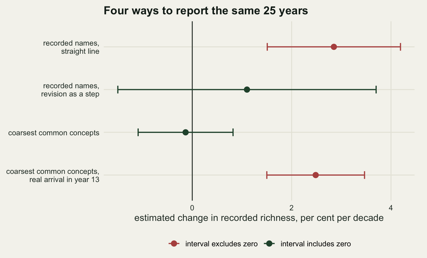
What a taxonomic package can and cannot do for you
taxize and rgbif are genuinely useful and they solve the neighbouring problem. Given a string, they will tell you the currently accepted name for it, what it is a synonym of, and where it sits in a hierarchy. Neither is installed here, so the calls below are not run.
library(rgbif)
library(taxize)

# current accepted name and its identifier in the GBIF backbone
name_backbone(name = "Carex nigra")$usageKey

# what a name is a synonym of, in one or more authorities
synonyms("Carex nigra", db = "itis")
Read what that gives you against what the problem needs. A backbone lookup answers “what is this name now”. It cannot answer “what did the recorder mean by this name in 1998”, because the answer lives in the recorder’s head and in the concept circumscription that the checklist used at the time, not in the string. Feeding the whole twenty five years through name_backbone() maps every pre-revision Carex nigra onto the post-revision Carex nigra and calls the job done, which is precisely the merge that produced the factor of 3.67 overstatement above. The tool is not wrong; the question put to it was.
It gets worse when programmes are pooled. An aggregator merges records from hundreds of sources that adopted a revision in different years, or never adopted it, and then maps every string onto one current backbone. The result is a dataset in which the revision is smeared across a decade instead of landing on one year, so even the Jaccard spike measured above, the one diagnostic the data offered, is gone: there is no single transition for it to sit on. Isaac and Pocock’s account of what biological records can and cannot support, and Meyer, Weigelt and Kreft’s audit of the gaps and biases in global plant occurrence data, are both worth reading before treating an aggregated download as a time series. Neither is about taxonomy in particular. The taxonomic layer sits underneath the biases they do describe, and it is the one that survives every filter you apply to the coordinates and the dates.
The field that would fix this exists. Darwin Core has terms for the concept rather than the string: taxonConceptID, and nameAccordingTo for the authority a determination followed. A programme that records nameAccordingTo alongside every determination can reconstruct which scheme each year was written in, and the harmonisation above becomes mechanical. Almost nobody records it, which is why this post is about damage limitation rather than about a lookup.
What to take away
A monitoring series records names. The map from names to organisms is a moving part, and unlike a typo it moves for good reasons, in the direction of better biology. In the simulation the post-revision list described the meadow more accurately than the pre-revision one and still produced an apparent gain of 2.85 per cent per decade, significant in 99.8 per cent of 1000 replicate programmes in which richness never moved.
Three of the measurements are worth carrying away on their own. The split and the lump are not opposites: the split added 1.979 taxa and the lump removed only 0.878, because merging two rare taxa makes the merged concept easier to find than either part. The per-taxon damage beats the richness damage: a name that survives a split carried a decline of -7.26 per cent a year against a true -1.98, with a significant result in every replicate, while the richness artefact was one taxon and visible in a plot. And most of the lost power after a split is lost to the shortened series rather than to the divided counts: 69.5 percentage points against 16.2.
The diagnostic is worth running and is weaker than it looks. A spike in consecutive-year compositional distance sat exactly at the revision, 0.1154 against a median of 0 elsewhere, in a community with no turnover at all. Give taxa a 2 per cent per-year chance of going unrecorded and the revision was no longer the largest step in more than half of series, though it stayed larger than the background on average at every level tested. Finding a spike tells you where to look. Finding none tells you nothing.
Of the two repairs, aggregating to the coarsest common concept is the one that keeps working. It cost 5.93 per cent of the mean recorded richness and it removed the artefact without removing a real arrival in the same year, which the change-point model could not do: its step coefficient went from 0.6923 to 1.6923 when a genuine colonisation was added and offered no way to divide the total.
The honest limit is the one that makes this a design problem rather than an analysis problem. Every repair here is a downgrade of the new data to the resolution of the old. Going the other way, pushing the old data up to the new resolution, needs the old records to be re-identifiable, and in a monitoring series they are not: there are no vouchers, the recorder counted and moved on, and the character that separates the three sedges was never looked at in the first twelve years. Retroactive harmonisation is possible for a herbarium and for a pinned insect collection, where the specimen can be pulled out of the drawer and looked at again. For a field count sheet the information does not exist to be recovered, and no package, authority file or amount of care will conjure it. What you can do is record which checklist you were following, in the year you were following it, so that the next person has the option you did not.
References
Isaac NJB, Mallet J, Mace GM 2004 Trends in Ecology and Evolution 19(9):464-469 (10.1016/j.tree.2004.06.004)
Garnett ST, Christidis L 2017 Nature 546(7656):25-27 (10.1038/546025a)
Jones G, Van Parijs SM 1993 Proceedings of the Royal Society B 251(1331):119-125 (10.1098/rspb.1993.0017)
Isaac NJB, Pocock MJO 2015 Biological Journal of the Linnean Society 115(3):522-531 (10.1111/bij.12532)
Meyer C, Weigelt P, Kreft H 2016 Ecology Letters 19(8):992-1006 (10.1111/ele.12624)
Wieczorek J, Bloom D, Guralnick R, Blum S, Doring M, Giovanni R, Robertson T, Vieglais D 2012 PLoS ONE 7(1):e29715 (10.1371/journal.pone.0029715)
Chamberlain SA, Szocs E 2013 F1000Research 2:191 (10.12688/f1000research.2-191.v2)
Magurran AE, McGill BJ 2011 Biological Diversity: Frontiers in Measurement and Assessment (ISBN 978-0-19-958066-8)