library(ggplot2)
library(patchwork)

te_paper  <- "#f5f4ee"
te_ink    <- "#16241d"
te_body   <- "#2c3a31"
te_forest <- "#275139"
te_rust   <- "#b5534e"
te_gold   <- "#c9b458"
te_line   <- "#dad9ca"

theme_datasheet <- function() {
  theme_minimal(base_size = 12) +
    theme(plot.background  = element_rect(fill = te_paper, colour = NA),
          panel.background = element_rect(fill = te_paper, colour = NA),
          panel.grid.major = element_line(colour = te_line, linewidth = 0.3),
          panel.grid.minor = element_blank(),
          text             = element_text(colour = te_body),
          plot.title       = element_text(colour = te_ink, face = "bold"),
          plot.subtitle    = element_text(colour = te_body),
          axis.text        = element_text(colour = te_body),
          strip.text       = element_text(colour = te_ink))
}Synthetic likelihood for noisy population dynamics
R
synthetic likelihood
approximate Bayesian computation
population dynamics
simulation
ecology tutorial
Fitting a chaotic Ricker model to Poisson counts in R with Wood’s synthetic likelihood: skeleton fits, simulations per point, and coverage against ABC.
A vole population on an upland grassland is trapped once a year for fifty years. The counts fall to zero in some years and pass a hundred in others, with no regular period. The obvious model for such a series is the Ricker map, in which each year’s density is last year’s density multiplied by a growth factor that falls with density, and at a high growth rate that map is chaotic: two populations started a hair apart are unrelated within a few years. Add a little environmental noise and Poisson counting error and the likelihood of the fifty counts becomes an integral over every hidden path, which nobody can write down.
Wood (2010) used exactly this model to make two points. The first is that the obvious workaround, fitting the deterministic skeleton of the map to the counts (by likelihood or, as here, by least squares), fails on chaotic dynamics because the fitting surface is a thicket of local minima. The second is his repair: simulate the model many times at a candidate parameter value, reduce each simulated series to a vector of summary statistics, fit a multivariate normal to those vectors, and evaluate the observed summaries under that normal. The log of that density is the synthetic likelihood, and it can be maximised or used inside Metropolis-Hastings like any other. Price and colleagues (2018) studied the Bayesian version and found the posterior insensitive to the number of simulations per evaluation. Hartig and colleagues (2011) review this family of methods for ecological simulation models. None of that is new here; this post is a demonstration of those sources, measured on a model this site already uses, so that the costs can be put next to the alternatives.
Three posts on this site set the comparison. Approximate Bayesian computation from scratch fits a noisy Ricker in its section on a model with no likelihood, at a growth rate where the dynamics are stable, by accepting prior draws whose summaries fall within a tolerance of the data. ABC-MCMC and sequential ABC samplers moves to the chaotic growth rate used below and ends with a single sentence that this post expands: Wood’s method “replaces the tolerance with a Gaussian likelihood fitted to the summaries, which is a different bargain rather than a better sampler”. Particle MCMC for state space models handles Poisson counts on a Gompertz model with a particle filter, which gives an exact posterior but needs a filter that can track the hidden state. Synthetic likelihood needs neither a tolerance nor a filter. What it needs is a normal distribution to be a fair description of the summaries, and enough simulations per evaluation to estimate its mean and covariance.
The post measures four things on the same simulator: what the skeleton and synthetic likelihood surfaces look like for one series, where each method’s best growth rate lands over many series, what the number of simulations per evaluation does to the noise of the estimate and to a Metropolis-Hastings chain, and how well the resulting intervals cover the truth compared with rejection ABC on the same data and the same summaries.
The simulator and Wood’s summaries
The model is the Ricker map of the ABC series, at the settings of the ABC-MCMC post. Density updates as the previous density times the exponential of the log growth rate minus density plus a normal shock with standard deviation sigma, and the count is Poisson with mean ten times density. The true values are a log growth rate of 3.8 and a sigma of 0.3, the values Wood used; each series runs 50 years after 50 discarded years, so the starting density is forgotten. The simulator works on a matrix with one row per simulated series and loops over years only. It can take its random numbers from outside: a matrix of standard normal shocks and a matrix of uniforms that are turned into Poisson counts with qpois. Passing the same two matrices at every parameter value gives common random numbers, so two nearby parameter values see the same weather and the same counting luck. Whether that makes the fitting surface smoother on a chaotic map is one of the things measured below.
log_r_true <- 3.8
sigma_true <- 0.3
phi_count  <- 10
n_year     <- 50
n_burn     <- 50

sim_counts <- function(log_r, sigma, n_sim, shocks = NULL, unifs = NULL) {
  if (is.null(shocks)) shocks <- matrix(rnorm(n_sim * (n_burn + n_year)), n_sim)
  dens <- rep(1, n_sim)
  counts <- matrix(0, n_sim, n_year)
  for (yr in seq_len(n_burn + n_year)) {
    dens <- dens * exp(log_r - dens + sigma * shocks[, yr])
    if (yr > n_burn) {
      lam <- phi_count * dens
      counts[, yr - n_burn] <- if (is.null(unifs)) rpois(n_sim, lam) else
        qpois(unifs[, yr - n_burn], lam)
    }
  }
  counts
}
The summaries follow the list in the methods of Wood (2010): the autocovariances of the counts at lags 0 to 5, the two coefficients of the autoregression of the count to the power 0.3 on the previous count to the powers 0.3 and 0.6 with no intercept, the mean count, the number of zeros, and the linear, quadratic and cubic coefficients of a regression of the sorted one-year differences of a simulated series on the sorted differences of the observed series. That last group compares the whole distribution of year-to-year changes; it depends on the observed data, so it is computed as a fixed projection matrix applied to the sorted simulated differences. The coding details (autocovariances divided by the series length, an intercept in the cubic regression, zero coefficients when a series has too few nonzero counts for the autoregression) are this post’s own choices, which is why the method is described below as following Wood’s recipe rather than reproducing his code.
summ_fixed <- function(counts, power = 0.3) {
  n_row <- nrow(counts)
  mean_ct <- rowMeans(counts)
  centred <- counts - mean_ct
  acv <- vapply(0:5, function(k) rowSums(centred[, 1:(n_year - k), drop = FALSE] *
                  centred[, (1 + k):n_year, drop = FALSE]) / n_year, numeric(n_row))
  acv <- matrix(acv, n_row)
  x1 <- counts[, -n_year, drop = FALSE]^power
  x2 <- x1^2
  resp <- counts[, -1, drop = FALSE]^power
  s11 <- rowSums(x1 * x1); s12 <- rowSums(x1 * x2); s22 <- rowSums(x2 * x2)
  s1w <- rowSums(x1 * resp); s2w <- rowSums(x2 * resp)
  det_ok <- s11 * s22 - s12^2
  usable <- det_ok > 1e-9 * s11 * s22
  b1 <- ifelse(usable, (s22 * s1w - s12 * s2w) / det_ok, 0)
  b2 <- ifelse(usable, (s11 * s2w - s12 * s1w) / det_ok, 0)
  cbind(mean_ct, rowSums(counts == 0), acv, b1, b2)
}

sorted_diffs <- function(counts) {
  dif <- counts[, -1, drop = FALSE] - counts[, -n_year, drop = FALSE]
  matrix(dif[order(row(dif), dif)], nrow(dif), byrow = TRUE)
}

cubic_projector <- function(diff_obs) {
  xmat <- cbind(1, diff_obs, diff_obs^2, diff_obs^3)
  solve(crossprod(xmat), t(xmat))[2:4, ]
}

summ_all <- function(counts, projector, power = 0.3) {
  cbind(summ_fixed(counts, power), sorted_diffs(counts) %*% t(projector))
}

synth_loglik <- function(s_obs, s_sim) {
  mu_s <- colMeans(s_sim)
  cov_s <- cov(s_sim)
  chol_s <- tryCatch(chol(cov_s + diag(1e-8 * mean(diag(cov_s)), ncol(cov_s))),
                     error = function(e) NULL)
  if (is.null(chol_s)) return(-Inf)
  z <- backsolve(chol_s, s_obs - mu_s, transpose = TRUE)
  -0.5 * sum(z^2) - sum(log(diag(chol_s)))
}
n_summ <- 13
The synthetic log likelihood above drops the constant term of the normal density, which is the same at every parameter value. One observed series fixes everything that follows in the first two sections.
set.seed(15101)
y_one <- sim_counts(log_r_true, sigma_true, 1)
proj_one <- cubic_projector(sorted_diffs(y_one)[1, ])
s_one <- summ_all(y_one, proj_one)[1, ]
mean_one <- mean(y_one); zeros_one <- sum(y_one == 0); max_one <- max(y_one)
The series has a mean count of 39.7, 17 zero years out of 50 and a largest count of 243.
A skeleton fit has nowhere to stand
The skeleton is the map with the noise switched off. Fitting it means choosing a growth rate and a starting density, running the map forward fifty years, and comparing the trajectory with the counts; here the comparison is the sum of squared differences on the log of one plus the count, and each growth rate gets the best of nine starting densities spread evenly on the log scale between 0.05 and 8. Sigma is held at its true value throughout this section and the next, so the only unknown is the growth rate, on a grid from 3.0 to 4.6.
The synthetic log likelihood is evaluated on the same grid twice, with 500 simulations per point: once with fresh random numbers at every grid point, and once with common random numbers.
grid_1d <- seq(3.0, 4.6, by = 0.02)
start_dens <- exp(seq(log(0.05), log(8), length.out = 9))

skeleton_sse <- function(y, log_r) {
  dens <- start_dens; sse <- 0
  for (yr in seq_along(y)) {
    sse <- sse + (log1p(y[yr]) - log1p(phi_count * dens))^2
    dens <- dens * exp(log_r - dens)
  }
  min(sse)
}

n_prof <- 500
set.seed(15102)
crn_shocks <- matrix(rnorm(n_prof * (n_burn + n_year)), n_prof)
crn_unifs  <- matrix(runif(n_prof * n_year), n_prof)
prof_skel  <- vapply(grid_1d, function(g) skeleton_sse(y_one[1, ], g), 0)
prof_crn   <- vapply(grid_1d, function(g) synth_loglik(s_one,
  summ_all(sim_counts(g, sigma_true, n_prof, crn_shocks, crn_unifs), proj_one)), 0)
prof_fresh <- vapply(grid_1d, function(g) synth_loglik(s_one,
  summ_all(sim_counts(g, sigma_true, n_prof), proj_one)), 0)

n_local <- function(v, sgn) sum(diff(sign(diff(sgn * v))) < 0)
loc_skel  <- n_local(prof_skel, -1)
loc_crn   <- n_local(prof_crn, 1)
loc_fresh <- n_local(prof_fresh, 1)
best_skel <- grid_1d[which.min(prof_skel)]
best_crn  <- grid_1d[which.max(prof_crn)]
best_fresh <- grid_1d[which.max(prof_fresh)]
drop_crn <- max(prof_crn) - prof_crn[c(1, length(grid_1d))]

# ripple: standard deviation of second differences above a log growth rate of 3.4
above_34 <- grid_1d >= 3.4
ripple <- function(v) sd(diff(v[above_34], differences = 2))
rip_skel <- ripple(prof_skel); rip_crn <- ripple(prof_crn); rip_fresh <- ripple(prof_fresh)

# how far common random numbers couple two nearby growth rates:
# correlation across simulations, year by year and summary by summary
ct_a <- sim_counts(3.80, sigma_true, n_prof, crn_shocks, crn_unifs)
ct_b <- sim_counts(3.82, sigma_true, n_prof, crn_shocks, crn_unifs)
couple_year <- mean(vapply(seq_len(n_year), function(k) cor(ct_a[, k], ct_b[, k]), 0))
sm_a <- summ_all(ct_a, proj_one); sm_b <- summ_all(ct_b, proj_one)
couple_summ <- range(vapply(seq_len(n_summ), function(k) cor(sm_a[, k], sm_b[, k]), 0))
On the 81 point grid the skeleton’s sum of squares has 29 local minima and its lowest point is at a log growth rate of 3.06. The synthetic log likelihood with fresh simulations has 14 local maxima, which can only be Monte Carlo noise, and its highest point is at 3.74. With common random numbers the same surface has 16 local maxima and peaks at 3.78; it falls by 372 log units towards 3.0 and by 26 towards 4.6. Counting local extrema treats a small ripple the same as a real valley, so a second measure is the standard deviation of the second differences of each curve above a log growth rate of 3.4: 102.5 for the skeleton, 1.74 for synthetic likelihood with fresh simulations and 1.81 with common random numbers.
Common random numbers did not smooth the surface; by the ripple measure the two curves are about equally rough (1.81 coupled against 1.74 fresh is one draw of each). The reason is the one that breaks the skeleton, and it can be measured. With shared shocks and shared uniforms, the simulated counts at log growth rates of 3.80 and 3.82 have an average correlation across the 500 simulations of 0.07 over the fifty years, and the 13 summaries correlate between 0.01 and 0.26. The chaotic map pulls two series at nearby growth rates apart within a few years, and each simulated series here has fifty discarded years before its first count, so by the first count the shared random numbers no longer tie the two together. Both curves are smooth at the scale of the valleys in the skeleton fit, and what keeps the synthetic surface smooth at the scale that matters is the number of simulations behind each point, not the coupling of the random numbers.
p_series <- ggplot(data.frame(year = seq_len(n_year), count = y_one[1, ]), aes(year, count)) +
  geom_line(colour = te_line, linewidth = 0.6) +
  geom_point(colour = te_forest, size = 1.6) +
  labs(x = "year", y = "count", title = "Fifty counts from a chaotic Ricker map") +
  theme_datasheet()
p_skel <- ggplot(data.frame(log_r = grid_1d, sse = prof_skel), aes(log_r, sse)) +
  geom_vline(xintercept = log_r_true, linetype = "dashed", colour = te_body) +
  geom_line(colour = te_rust, linewidth = 0.7) +
  labs(x = "log growth rate", y = "sum of squares", title = "Skeleton fit") +
  theme_datasheet()
prof_df <- rbind(data.frame(log_r = grid_1d, sl = prof_fresh, arm = "fresh simulations"),
                 data.frame(log_r = grid_1d, sl = prof_crn, arm = "common random numbers"))
p_sl <- ggplot(prof_df, aes(log_r, sl, colour = arm)) +
  geom_vline(xintercept = log_r_true, linetype = "dashed", colour = te_body) +
  geom_line(linewidth = 0.7) +
  scale_colour_manual(values = c("fresh simulations" = te_gold,
                                 "common random numbers" = te_forest), name = NULL) +
  coord_cartesian(ylim = c(max(prof_df$sl) - 60, max(prof_df$sl) + 3)) +
  guides(colour = guide_legend(nrow = 2)) +
  labs(x = "log growth rate", y = "synthetic log likelihood", title = "Synthetic likelihood") +
  theme_datasheet() +
  theme(legend.position = "bottom")
(p_series / (p_skel | p_sl)) + plot_layout(heights = c(1, 1.4)) +
  plot_annotation(theme = theme_datasheet())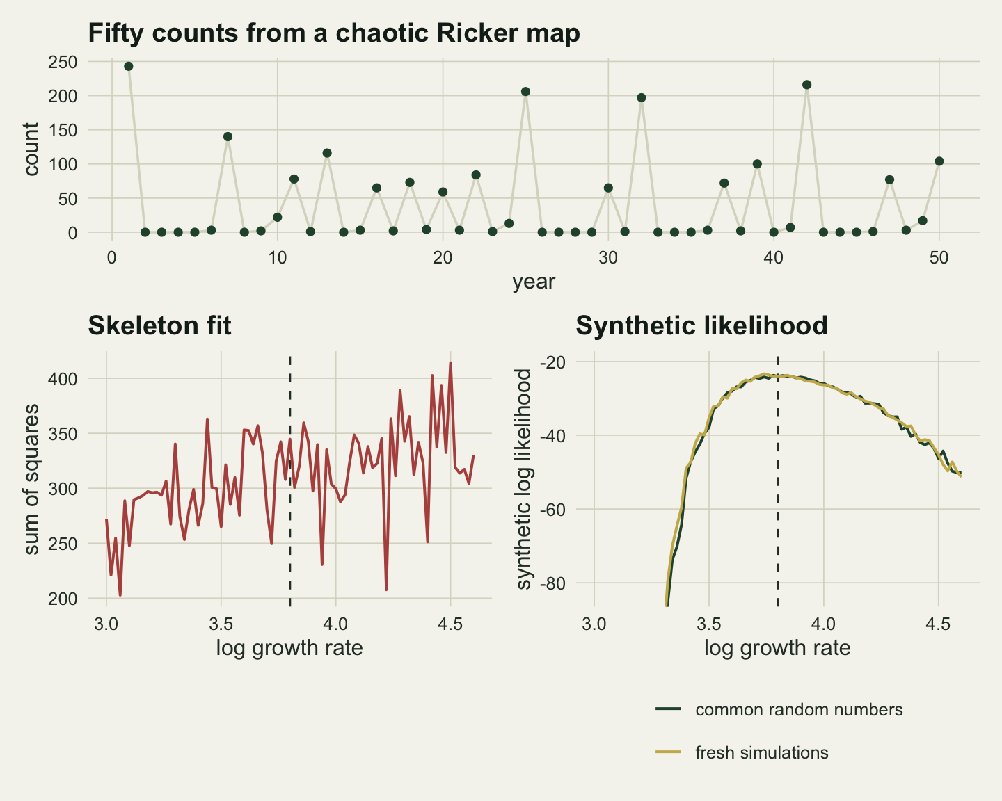
The skeleton is not being fitted badly. A chaotic map amplifies a small change in the growth rate into a different trajectory within a few years, so the sum of squares compares the counts with an unrelated sequence at almost every grid point, and its minimum is wherever one of those sequences happens to line up with the data. The summaries do not have this problem because they describe the kind of series the model produces (how variable, how often zero, how one year leads to the next) rather than the exact order of the years.
Where the best growth rate lands over many series
One series shows the shape of the surfaces; it cannot say how far off each maximum tends to be. The next chunk repeats the grid search on 30 new series, again with sigma fixed at the truth and a coarser grid of 0.04. Each series gets its own common random numbers for 300 simulations, and the estimate at 50 simulations uses the first 50 rows of the same draws. The reference is a guess drawn uniformly over the 3.0 to 4.6 range, whose mean absolute error against 3.8 follows from the geometry of the interval.
n_mae <- 30
grid_mae <- seq(3.0, 4.6, by = 0.04)
set.seed(15103)
est_mae <- t(vapply(seq_len(n_mae), function(i) {
  y_i <- sim_counts(log_r_true, sigma_true, 1)
  proj_i <- cubic_projector(sorted_diffs(y_i)[1, ])
  s_i <- summ_all(y_i, proj_i)[1, ]
  shocks_i <- matrix(rnorm(300 * (n_burn + n_year)), 300)
  unifs_i  <- matrix(runif(300 * n_year), 300)
  sk <- vapply(grid_mae, function(g) skeleton_sse(y_i[1, ], g), 0)
  sl <- vapply(grid_mae, function(g) {
    s_sim <- summ_all(sim_counts(g, sigma_true, 300, shocks_i, unifs_i), proj_i)
    c(synth_loglik(s_i, s_sim), synth_loglik(s_i, s_sim[1:50, ]))
  }, c(0, 0))
  c(skeleton = grid_mae[which.min(sk)], sl300 = grid_mae[which.max(sl[1, ])],
    sl50 = grid_mae[which.max(sl[2, ])])
}, c(skeleton = 0, sl300 = 0, sl50 = 0)))

abs_err <- abs(est_mae - log_r_true)
mae <- colMeans(abs_err)
mae_se <- apply(abs_err, 2, sd) / sqrt(n_mae)
mae_uniform <- ((log_r_true - 3.0)^2 + (4.6 - log_r_true)^2) / (2 * (4.6 - 3.0))
mean_est <- colMeans(est_mae)
skel_below <- mean(est_mae[, "skeleton"] < log_r_true)
Over 30 series the mean absolute error in the log growth rate is 0.405 for the skeleton (Monte Carlo standard error 0.040), 0.119 for synthetic likelihood with 300 simulations per point (0.013) and 0.115 with 50 (0.015). A uniform guess over the grid range has an expected error of 0.40. The mean skeleton estimate is 3.52 and 73 per cent of the skeleton estimates fall below the truth; the synthetic likelihood estimates average 3.73 and 3.75.
The skeleton does no better than a guess, while synthetic likelihood lands within about a tenth of a log unit on average. Cutting the simulations from 300 to 50 did not raise the error in this run: the difference between the two, 0.004, is about the size of one standard error, and because the 50 simulations are a subset of the 300 the two errors are not independent.
est_df <- data.frame(method = factor(rep(c("skeleton, best of 9 starts", "synthetic likelihood, N = 50",
                                           "synthetic likelihood, N = 300"), each = n_mae),
                                     levels = c("synthetic likelihood, N = 300",
                                                "synthetic likelihood, N = 50",
                                                "skeleton, best of 9 starts")),
                     estimate = c(est_mae[, "skeleton"], est_mae[, "sl50"], est_mae[, "sl300"]))
set.seed(15104)
ggplot(est_df, aes(estimate, method, colour = method)) +
  geom_vline(xintercept = log_r_true, linetype = "dashed", colour = te_body) +
  geom_vline(xintercept = c(3.0, 4.6), linetype = "dotted", colour = te_body) +
  geom_jitter(width = 0, height = 0.18, size = 2, alpha = 0.8) +
  scale_colour_manual(values = c(te_forest, te_gold, te_rust), guide = "none") +
  labs(x = "best log growth rate", y = NULL,
       title = "Where the best growth rate lands") +
  theme_datasheet()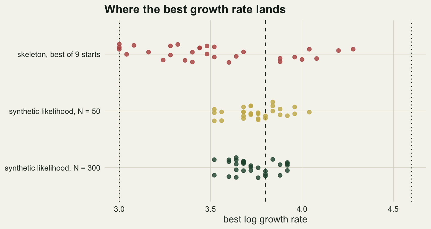
How many simulations per evaluation
A synthetic likelihood evaluation is itself a random number. Its noise depends on the number of simulations behind the mean and covariance, and the next chunk measures that noise at the true parameter values of the one observed series, repeating each evaluation 60 times with fresh simulations.
n_grid_sim <- c(20, 50, 100, 200, 1000)
n_rep_noise <- 60
set.seed(15105)
sl_at <- function(theta, n_sim) {
  synth_loglik(s_one, summ_all(sim_counts(theta[1], theta[2], n_sim), proj_one))
}
noise_tab <- t(vapply(n_grid_sim, function(n_sim) {
  v <- replicate(n_rep_noise, sl_at(c(log_r_true, sigma_true), n_sim))
  c(n_sim = n_sim, sd_ll = sd(v), mean_ll = mean(v))
}, c(n_sim = 0, sd_ll = 0, mean_ll = 0)))
noise_tab <- as.data.frame(noise_tab)
# Monte Carlo error of a standard deviation from 60 runs, normal approximation
sd_rel_se <- 1 / sqrt(2 * (n_rep_noise - 1))
The standard deviation of the synthetic log likelihood is 4.69 at 20 simulations, 1.02 at 50, 0.68 at 100, 0.46 at 200 and 0.17 at 1000, each with a relative Monte Carlo error of about 9 per cent. Its mean also moves: -26.6 at the smallest number of simulations against -23.9 at the largest, because the log of a normal density with an estimated covariance is a biased estimate of the log of the true one.
That noise matters inside Metropolis-Hastings in the same way as a noisy particle filter estimate does: an evaluation that came out high by chance is hard to leave. The chunk below runs a random walk over log growth rate and sigma, with a uniform prior on the box from 3.2 to 4.6 and 0 to 0.7, two chains of 1000 iterations at each of three simulation numbers. The proposal standard deviations, 0.12 and 0.09, were set from the width of a pilot posterior before these chains ran, and the chains start at the truth, so no burn-in is removed and the measurement is of mixing only.
ess_single <- function(x) {
  n_it <- length(x)
  if (var(x) == 0) return(1)
  rho <- acf(x, lag.max = min(n_it - 1, 200), plot = FALSE)$acf[-1]
  cut_at <- which(rho[-length(rho)] + rho[-1] < 0)[1]
  if (is.na(cut_at)) cut_at <- length(rho)
  n_it / (1 + 2 * sum(rho[seq_len(cut_at)]))
}
lo_box <- c(3.2, 0); hi_box <- c(4.6, 0.7)
sl_chain <- function(n_sim, n_iter, prop_sd) {
  theta <- c(log_r_true, sigma_true)
  ll_cur <- sl_at(theta, n_sim)
  draws <- matrix(NA, n_iter, 2); n_acc <- 0
  for (it in seq_len(n_iter)) {
    prop <- theta + rnorm(2) * prop_sd
    if (all(prop > lo_box & prop < hi_box)) {
      ll_prop <- sl_at(prop, n_sim)
      if (log(runif(1)) < ll_prop - ll_cur) { theta <- prop; ll_cur <- ll_prop; n_acc <- n_acc + 1 }
    }
    draws[it, ] <- theta
  }
  list(draws = draws, acc = n_acc / n_iter)
}
n_iter_mh <- 1000; n_chain_mh <- 2; n_mh <- c(20, 50, 200)
set.seed(15106)
mh_tab <- do.call(rbind, lapply(n_mh, function(n_sim) {
  runs <- lapply(seq_len(n_chain_mh), function(k) sl_chain(n_sim, n_iter_mh, c(0.12, 0.09)))
  ess_r <- sum(vapply(runs, function(rn) ess_single(rn$draws[, 1]), 0))
  ess_s <- sum(vapply(runs, function(rn) ess_single(rn$draws[, 2]), 0))
  stick <- max(vapply(runs, function(rn) max(rle(rn$draws[, 1])$lengths), 0))
  n_sims_used <- n_chain_mh * (n_iter_mh + 1) * n_sim
  data.frame(n_sim = n_sim, acc = mean(vapply(runs, function(rn) rn$acc, 0)),
             longest = stick, ess_min = min(ess_r, ess_s),
             ess_per_1000 = 1000 * min(ess_r, ess_s) / n_sims_used)
}))
mh_tab
n_sim acc longest ess_min ess_per_1000
1 20 0.1415 123 58.11410 1.4514011
2 50 0.2600 50 76.69370 0.7661708
3 200 0.3675 22 67.08833 0.1675533With 20 simulations per evaluation the chains accept 0.14 of proposals and the longest run without a move is 123 iterations; at 50 the figures are 0.26 and 50, and at 200 they are 0.37 and 22. The smaller effective sample size of the two parameters, summed over the two chains of 1000 iterations, is 58, 77 and 67, which per thousand simulations is 1.45, 0.77 and 0.17. Effective sample sizes this small from two short chains carry a large Monte Carlo error of their own, so the ranking is the finding and the decimals are not.
ggplot(noise_tab, aes(n_sim, sd_ll)) +
  geom_hline(yintercept = 1, linetype = "dashed", colour = te_body) +
  geom_line(colour = te_forest, linewidth = 0.8) +
  geom_point(colour = te_forest, size = 2.6) +
  scale_x_log10(breaks = n_grid_sim) +
  scale_y_log10() +
  labs(x = "simulations per evaluation (log scale)",
       y = "sd of synthetic log likelihood (log scale)",
       title = "Each evaluation is a random number") +
  theme_datasheet()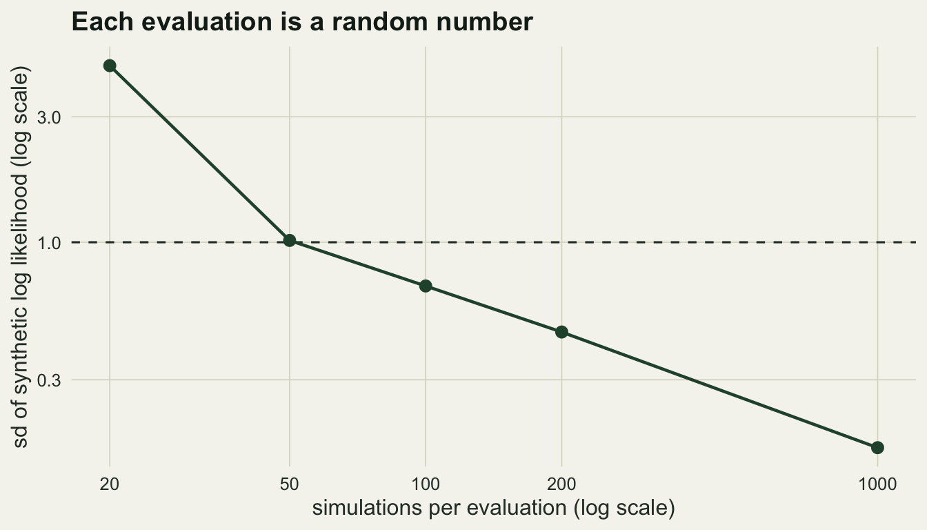
Coverage against the ABC reference
The last question is whether the intervals are right. Running chains on many data sets would take longer than this page may spend, so the posterior is computed on a grid instead: log growth rate from 3.2 to 4.6 in steps of 0.025 and sigma from 0 to 0.7 in steps of 0.05, one evaluation at each cell centre, a uniform prior on the box, and a 90 per cent equal-tailed interval for each parameter read from the marginal with the mass spread evenly across each cell. 40 observed series are generated at the true values. At each grid cell 1000 series are simulated once and shared by all the observed series, and the evaluations with 50 and 200 simulations use the first rows of the same bank. A fourth arm uses 200 simulations with the autoregression computed on the raw counts instead of their 0.3 power, which leaves those two summaries skewed.
step_r <- 0.025; step_s <- 0.05
cells_r <- seq(3.2 + step_r / 2, 4.6, by = step_r)
cells_s <- seq(step_s / 2, 0.7, by = step_s)
cells <- expand.grid(log_r = cells_r, sigma = cells_s)
n_cov <- 40; n_bank <- 1000
arms <- c("SL, N = 50", "SL, N = 200", "SL, N = 1000", "SL, raw counts, N = 200")
arm_n <- c(50, 200, 1000, 200)

set.seed(15107)
y_cov <- sim_counts(log_r_true, sigma_true, n_cov)
diff_cov <- sorted_diffs(y_cov)
proj_cov <- lapply(seq_len(n_cov), function(j) cubic_projector(diff_cov[j, ]))
cub_cov <- t(vapply(seq_len(n_cov), function(j) drop(proj_cov[[j]] %*% diff_cov[j, ]), numeric(3)))
s_cov <- cbind(summ_fixed(y_cov), cub_cov)
s_cov_raw <- cbind(summ_fixed(y_cov, power = 1), cub_cov)

ll_grid <- array(NA, c(nrow(cells), n_cov, length(arms)))
for (g in seq_len(nrow(cells))) {
  bank <- sim_counts(cells$log_r[g], cells$sigma[g], n_bank)
  dif_bank <- sorted_diffs(bank)
  fixed_bank <- summ_fixed(bank)
  ar_raw <- summ_fixed(bank, power = 1)[, 9:10]
  for (j in seq_len(n_cov)) {
    s_sim <- cbind(fixed_bank, dif_bank %*% t(proj_cov[[j]]))
    for (a in 1:3) ll_grid[g, j, a] <- synth_loglik(s_cov[j, ], s_sim[seq_len(arm_n[a]), ])
    s_sim[, 9:10] <- ar_raw
    ll_grid[g, j, 4] <- synth_loglik(s_cov_raw[j, ], s_sim[seq_len(arm_n[4]), ])
  }
}

grid_interval <- function(ll_vec) {
  wt <- exp(ll_vec - max(ll_vec)); wt[!is.finite(wt)] <- 0
  q_marg <- function(mass, centres, step) {
    cdf <- c(0, cumsum(mass) / sum(mass))
    approx(cdf, c(centres - step / 2, max(centres) + step / 2), c(0.05, 0.95), ties = "ordered")$y
  }
  c(q_marg(tapply(wt, cells$log_r, sum), cells_r, step_r),
    q_marg(tapply(wt, cells$sigma, sum), cells_s, step_s))
}
The reference is rejection ABC with the same thirteen summaries, the same prior and the same observed series: 200,000 draws from the prior, one simulation each, summaries scaled by their median absolute deviation over the table, and the closest 0.5 and 0.1 per cent of draws accepted.
n_ref <- 200000
set.seed(15108)
theta_ref <- cbind(runif(n_ref, lo_box[1], hi_box[1]), runif(n_ref, lo_box[2], hi_box[2]))
fixed_ref <- matrix(0, n_ref, 10); dif_ref <- matrix(0, n_ref, n_year - 1)
for (blk in split(seq_len(n_ref), ceiling(seq_len(n_ref) / 10000))) {
  ct <- sim_counts(theta_ref[blk, 1], theta_ref[blk, 2], length(blk))
  fixed_ref[blk, ] <- summ_fixed(ct)
  dif_ref[blk, ] <- sorted_diffs(ct)
}
keep_fracs <- c(0.005, 0.001)
abc_int <- lapply(keep_fracs, function(kf) matrix(NA, n_cov, 4))
for (j in seq_len(n_cov)) {
  s_ref <- cbind(fixed_ref, dif_ref %*% t(proj_cov[[j]]))
  scl <- apply(s_ref, 2, mad); scl[scl == 0] <- 1
  dist2 <- colSums(((t(s_ref) - s_cov[j, ]) / scl)^2)
  for (k in seq_along(keep_fracs)) {
    keep <- dist2 <= quantile(dist2, keep_fracs[k])
    abc_int[[k]][j, ] <- c(quantile(theta_ref[keep, 1], c(0.05, 0.95)),
                           quantile(theta_ref[keep, 2], c(0.05, 0.95)))
  }
}

sl_int <- lapply(seq_along(arms), function(a)
  t(vapply(seq_len(n_cov), function(j) grid_interval(ll_grid[, j, a]), numeric(4))))
all_int <- c(sl_int, abc_int)
all_lab <- c(arms, "ABC, keep 0.5 per cent", "ABC, keep 0.1 per cent")
cov_tab <- do.call(rbind, lapply(seq_along(all_int), function(k) {
  iv <- all_int[[k]]
  data.frame(method = all_lab[k],
             parameter = c("log growth rate", "sigma"),
             coverage = c(mean(iv[, 1] <= log_r_true & iv[, 2] >= log_r_true),
                          mean(iv[, 3] <= sigma_true & iv[, 4] >= sigma_true)),
             width = c(mean(iv[, 2] - iv[, 1]), mean(iv[, 4] - iv[, 3])))
}))
cov_tab$mcse <- sqrt(cov_tab$coverage * (1 - cov_tab$coverage) / n_cov)
mcse_nominal <- sqrt(0.9 * 0.1 / n_cov)
cov_of <- function(m, p) cov_tab$coverage[cov_tab$method == m & cov_tab$parameter == p]
wid_of <- function(m, p) cov_tab$width[cov_tab$method == m & cov_tab$parameter == p]
iv_1000 <- sl_int[[3]]
sig_miss_low  <- sum(iv_1000[, 4] < sigma_true)   # whole interval below the truth
sig_miss_high <- sum(iv_1000[, 3] > sigma_true)
lr_miss_low   <- sum(iv_1000[, 2] < log_r_true)
lr_miss_high  <- sum(iv_1000[, 1] > log_r_true)
width_ratio_r <- wid_of("ABC, keep 0.1 per cent", "log growth rate") / wid_of("SL, N = 1000", "log growth rate")
width_ratio_s <- wid_of("ABC, keep 0.1 per cent", "sigma") / wid_of("SL, N = 1000", "sigma")
cov_tab
method parameter coverage width mcse
1 SL, N = 50 log growth rate 0.775 0.3653898 0.06602556
2 SL, N = 50 sigma 0.800 0.2821134 0.06324555
3 SL, N = 200 log growth rate 0.775 0.3611904 0.06602556
4 SL, N = 200 sigma 0.800 0.2748004 0.06324555
5 SL, N = 1000 log growth rate 0.775 0.3561800 0.06602556
6 SL, N = 1000 sigma 0.800 0.2688061 0.06324555
7 SL, raw counts, N = 200 log growth rate 0.675 0.3655945 0.07405657
8 SL, raw counts, N = 200 sigma 0.825 0.2742657 0.06007807
9 ABC, keep 0.5 per cent log growth rate 0.950 0.5418074 0.03446012
10 ABC, keep 0.5 per cent sigma 0.950 0.4674638 0.03446012
11 ABC, keep 0.1 per cent log growth rate 0.900 0.5018794 0.04743416
12 ABC, keep 0.1 per cent sigma 0.975 0.4562278 0.02468552cov_tab$method <- factor(cov_tab$method, levels = rev(all_lab))
cov_tab$family <- ifelse(grepl("^ABC", cov_tab$method), "ABC", "SL")
p_cov <- ggplot(cov_tab, aes(coverage, method, colour = family)) +
geom_vline(xintercept = 0.9, linetype = "dashed", colour = te_body) +
geom_errorbar(aes(xmin = pmax(0, coverage - 2 * mcse), xmax = pmin(1, coverage + 2 * mcse)),
orientation = "y", width = 0.25) +
geom_point(size = 2.4) +
facet_wrap(~ parameter, ncol = 1, scales = "free_x") + # same strip and axis layout as the width column
scale_x_continuous(limits = c(0.4, 1)) +
scale_colour_manual(values = c(ABC = te_rust, SL = te_forest), guide = "none") +
labs(x = "coverage", y = NULL, title = "Coverage") +
theme_datasheet()
p_wid <- ggplot(cov_tab, aes(width, method, colour = family)) +
geom_point(size = 2.4) +
facet_wrap(~ parameter, ncol = 1, scales = "free_x") +
scale_colour_manual(values = c(ABC = te_rust, SL = te_forest), guide = "none") +
labs(x = "mean width", y = NULL, title = "Width") +
theme_datasheet() +
theme(axis.text.y = element_blank())
(p_cov | p_wid) + plot_layout(widths = c(1.6, 1)) + plot_annotation(theme = theme_datasheet())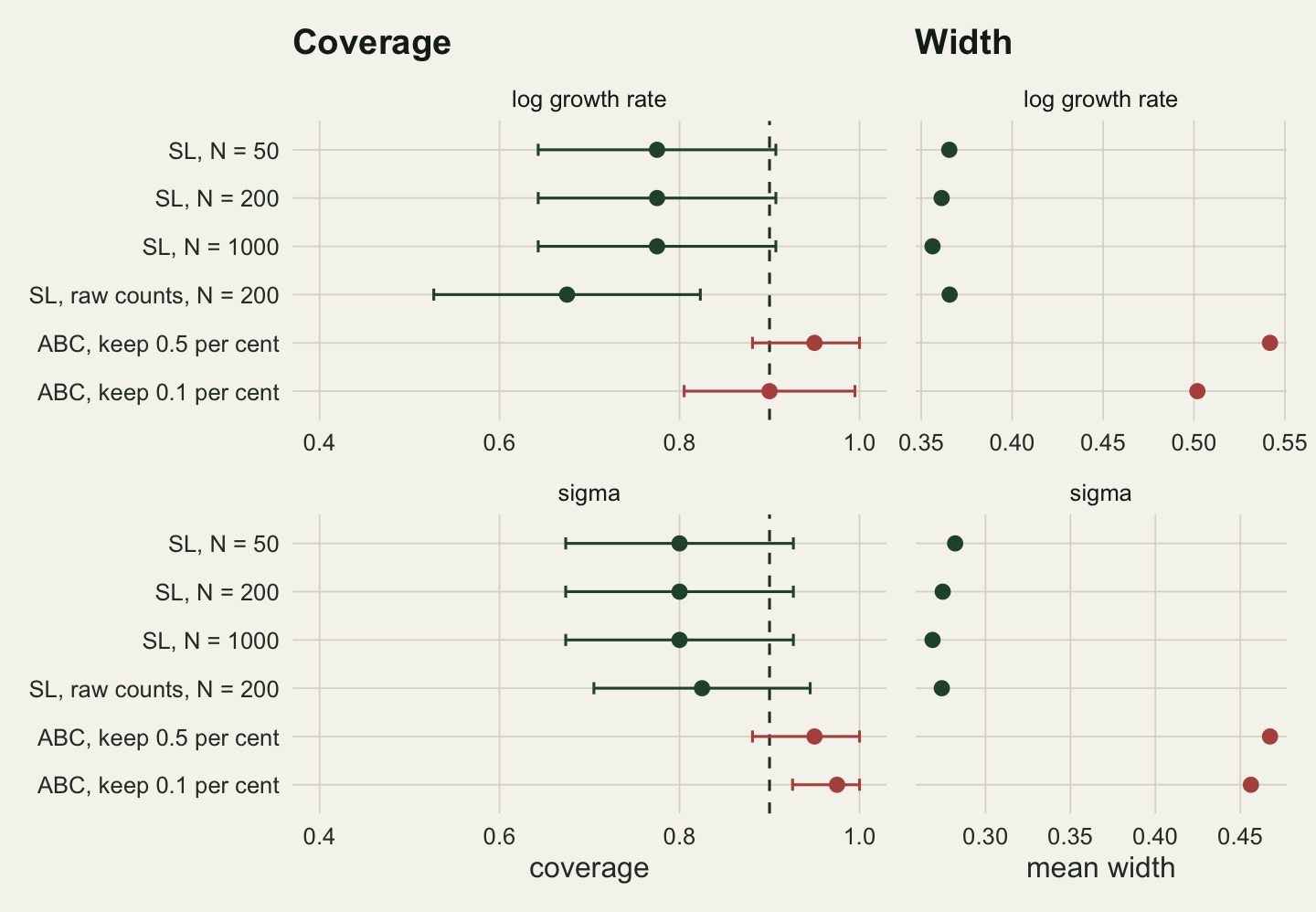
Over the 40 series, the synthetic likelihood intervals for the log growth rate hold the truth in 77.5, 77.5 and 77.5 per cent of cases at 50, 200 and 1000 simulations, and the intervals for sigma in 80.0, 80.0 and 80.0 per cent. At a true coverage of 90 per cent, forty series give a Monte Carlo standard error of 4.7 percentage points. Rejection ABC covers 90.0 per cent for the growth rate and 97.5 per cent for sigma when it keeps the closest 0.1 per cent of draws, with intervals 1.41 and 1.70 times as wide as synthetic likelihood at 1000 simulations.
The number of simulations barely moved coverage or width, consistent with the insensitivity to the number of simulations that Price and colleagues report for the Bayesian version. The three arms share one simulation bank, so their agreement is partly built in; what the bank cannot build in is the level, and the level is low for sigma. Of the 8 sigma intervals at 1000 simulations that miss, 6 lie wholly below the true 0.3 and 2 wholly above; for the growth rate the split is 8 below and 1 above.
None of this makes ABC the better answer. Its extra width is partly the tolerance, which adds its own spread to the posterior exactly as the rejection post measured, and a posterior computed exactly from the same summaries would sit somewhere between the two. A fixed true value and a flat prior also do not guarantee nominal coverage even to an exact posterior. What the comparison does show is that the synthetic likelihood intervals are the narrow ones, and that on sigma their narrowness is not matched by coverage.
Is the normal the first thing to break
Wood’s own check of the Gaussian assumption is a quantile plot of the squared Mahalanobis distances of simulated summary vectors against a chi-squared distribution with as many degrees of freedom as there are summaries. The chunk below draws 2000 series at the true values and makes that comparison for the transformed and the raw-count autoregression, and records the skewness of each summary.
n_norm <- 2000
set.seed(15109)
ct_norm <- sim_counts(log_r_true, sigma_true, n_norm)
s_norm <- summ_all(ct_norm, proj_one)
s_norm_raw <- summ_all(ct_norm, proj_one, power = 1)
maha <- function(s_mat) {
  z_mat <- scale(s_mat)  # the distance is scale free; scaling avoids a singular solve
  mahalanobis(z_mat, colMeans(z_mat), cov(z_mat))
}
q_theory <- qchisq(ppoints(n_norm), n_summ)
maha_tr <- sort(maha(s_norm)); maha_raw <- sort(maha(s_norm_raw))
skew <- function(x) mean((x - mean(x))^3) / mean((x - mean(x))^2)^1.5
skew_tr <- apply(s_norm, 2, skew); skew_raw <- apply(s_norm_raw, 2, skew)
summ_names <- c("mean", "zeros", paste0("acv lag ", 0:5), "ar b1", "ar b2",
                "cubic 1", "cubic 2", "cubic 3")
top_q <- c(transformed = maha_tr[round(0.99 * n_norm)], raw = maha_raw[round(0.99 * n_norm)])
chi_99 <- qchisq(0.99, n_summ)
worst_tr <- summ_names[which.max(abs(skew_tr))]
zero_frac <- mean(ct_norm == 0)
tail_tr <- mean(maha_tr > chi_99); tail_raw <- mean(maha_raw > chi_99)
The 99th percentile of the squared distances is 56.1 for the power-transformed autoregression and 68.7 for the raw counts, against 27.7 for the chi-squared distribution. The summary with the largest skewness under the transformation is acv lag 0, at 0.85; the two raw-count autoregression coefficients have skewness 0.91 and -1.14 against -0.45 and 0.27 after the transformation. The number of zeros, which is a count bounded at zero and might be expected to fail first at low counts, has skewness 0.06: at these parameters 37 per cent of simulated years are zero, so the zero count sits in the middle of its range rather than against its floor.
Under a multivariate normal 1 per cent of the distances would exceed the chi-squared 99th percentile; 4.6 per cent do with the transformation and 5.7 per cent with raw counts. The figure shows both sets of distances close to the diagonal through the body of the distribution and bending away in the upper tail. The power transformation reduces the skewness of the two coefficients it acts on but leaves most of that heavy tail in place, and in the coverage section the raw-count arm covered 67.5 and 82.5 per cent against 77.5 and 80.0 per cent for the transformed summaries at the same number of simulations, differences inside one Monte Carlo standard error. At these parameters the first thing to fail is the joint tail of the summaries, not the zero count and not the marginal skewness. A normal with tails that are too light is consistent with intervals that are too narrow, but nothing here shows that it is the cause of the shortfall for sigma.
qq_df <- rbind(data.frame(theory = q_theory, observed = maha_tr, summaries = "power 0.3"),
               data.frame(theory = q_theory, observed = maha_raw, summaries = "raw counts"))
ggplot(qq_df, aes(theory, observed, colour = summaries)) +
  geom_abline(slope = 1, intercept = 0, linetype = "dashed", colour = te_body) +
  geom_point(size = 0.8, alpha = 0.6) +
  scale_colour_manual(values = c("power 0.3" = te_forest, "raw counts" = te_rust), name = NULL) +
  labs(x = "chi-squared quantile, 13 df", y = "squared Mahalanobis distance",
       title = "How normal are the summaries") +
  theme_datasheet() +
  theme(legend.position = "bottom")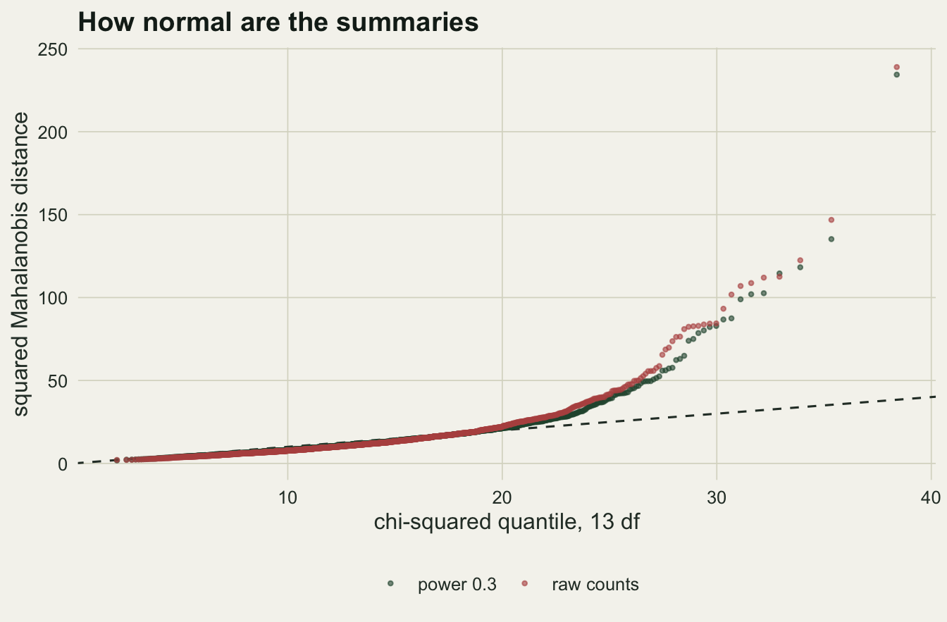
What to report
Report the summaries in full, with their transformations, and say which of them depend on the observed data. The sorted-difference regression is not a property of a simulated series alone, and a reader who recodes the method without it is fitting a different model.
Report the number of simulations per evaluation next to the standard deviation of the synthetic log likelihood it gave, and the parameter values where that was measured. Here 50 simulations gave a standard deviation of 1.02 and produced the most effective draws per simulation of the three settings tried, while 20 gave 4.69 and chains that stood still for up to 123 iterations. A chain’s acceptance rate alone does not separate a badly tuned proposal from a noisy likelihood.
Show the Mahalanobis check against the chi-squared distribution at the fitted values. It costs one batch of simulations and it is the only direct evidence a reader gets about the assumption the whole method rests on.
If the skeleton was fitted as well, report it as a contrast and not as an estimate. On a chaotic series its best growth rate was no closer to the truth than a uniform guess.
State the coverage question as open unless it was checked. A synthetic likelihood interval from a single series is narrower than the ABC interval on the same summaries, and in this simulation the interval for the noise parameter was too narrow.
Honest limits
Everything here is one parameter setting: a log growth rate of 3.8, sigma of 0.3, a counting rate of 10 and fifty years. At a lower growth rate the dynamics stop being chaotic, the skeleton fit stops being hopeless, and the comparison in the second section changes character. At lower counting rates the zero count and the autoregression lose information, and the normal approximation to the summaries would need to be checked again.
The counting rate was treated as known. Wood estimated it along with the other two parameters, and a third parameter that trades off against the growth rate through the mean count would widen every interval here.
The skeleton and maximum synthetic likelihood comparisons fixed sigma at its true value and searched a grid. That gives both methods the same help, but it is not how either is used, and a real optimiser on the noisy synthetic surface would add its own error to the 0.119 measured here.
The coverage section used a grid posterior with one synthetic likelihood evaluation per cell, not a Metropolis-Hastings chain, and one simulation bank shared by all forty series. Treating a noisy evaluation as exact is not the Bayesian synthetic likelihood target of Price and colleagues, which averages the Gaussian density over simulation noise, and sharing the bank means the forty series are not independent replicates of the whole procedure. The grid step for sigma, 0.05, is coarse against intervals about a quarter wide, and the interval ends were interpolated within cells. Forty series give a coverage standard error of about five percentage points, enough to see the shortfall for sigma and not enough to rank the synthetic likelihood arms against each other.
There is no exact posterior in this post. Particle MCMC, as in the neighbouring post, would give one for this model, and it is the right reference for deciding whether the synthetic likelihood interval for sigma is too narrow or the ABC interval too wide; Fasiolo, Pya and Wood (2016) compare synthetic likelihood with particle filter methods on models of this kind. That run was not affordable inside this page.
The summaries follow Wood’s list but the code is this post’s own. The autoregression, the sorted-difference regression and the rule for series with too many zeros could each be coded differently, and with the method sitting on a normal approximation to those numbers, coding choices are part of the model.
References
Wood SN 2010 Nature 466(7310):1102-1104 (10.1038/nature09319)
Price LF, Drovandi CC, Lee A, Nott DJ 2018 Journal of Computational and Graphical Statistics 27(1):1-11 (10.1080/10618600.2017.1302882)
Fasiolo M, Pya N, Wood SN 2016 Statistical Science 31(1) (10.1214/15-STS534)
Hartig F, Calabrese JM, Reineking B, Wiegand T, Huth A 2011 Ecology Letters 14(8):816-827 (10.1111/j.1461-0248.2011.01640.x)