library(nlme)

ar1 <- function(T, phi, sigma) {
  e <- numeric(T)
  e[1] <- rnorm(1, 0, sigma)
  for (t in 2:T) e[t] <- phi * e[t - 1] + rnorm(1, 0, sigma * sqrt(1 - phi^2))
  e
}

gen <- function(nsubj = 15, T = 10, phi = 0.7, sigma = 1, tau = 1, mu = 5) {
  do.call(rbind, lapply(1:nsubj, function(i) {
    a <- rnorm(1, 0, tau)                       # subject baseline
    data.frame(subject = factor(sprintf("U%02d", i)),
               time = 1:T,
               y = mu + a + ar1(T, phi, sigma))  # AR(1) within subject, no trend
  }))
}Repeated measures and temporal correlation in R
mixed models
R
nlme
time series
ecology tutorial
Measuring the same plots over time creates correlated residuals. Ignoring temporal autocorrelation inflates false positives; model it with corAR1 in nlme.
Measure the same plots month after month and the measurements are not independent. A plot that sits above the mean in May tends to sit above it in June; the deviations drift rather than reset. A random intercept handles part of this, giving each plot its own baseline, but it assumes that once the baseline is removed the leftover residuals within a plot are independent. For data collected through time that assumption is usually wrong, and the residuals carry temporal autocorrelation the model has not accounted for.
The consequence is the same one the pseudoreplication post raised, moved into the time dimension: a time series of ten correlated points is worth less than ten independent points, so treating them as independent overstates the precision of any time-varying effect. This post quantifies the false-positive cost with a simulation, then fixes it with an AR(1) correlation structure in nlme.
Repeated measures with no real trend
Fifteen subjects, each measured at ten equally spaced time points. The response has a subject-level baseline and within-subject errors that follow a first-order autoregressive process (each error is correlated with the one before it). There is no time trend in the truth: any apparent slope is an artefact.
The within-subject series wander: each line stays near its own recent values rather than bouncing around independently. That smoothness is the autocorrelation.
library(ggplot2)

set.seed(9)
demo <- gen()

ggplot(demo, aes(time, y, group = subject)) +
  geom_line(colour = "#275139", alpha = 0.5, linewidth = 0.6) +
  geom_point(colour = "#5d6b61", size = 0.9, alpha = 0.6) +
  scale_x_continuous(breaks = 1:10) +
  labs(x = "Time point", y = "Response") +
  theme_minimal(base_size = 12)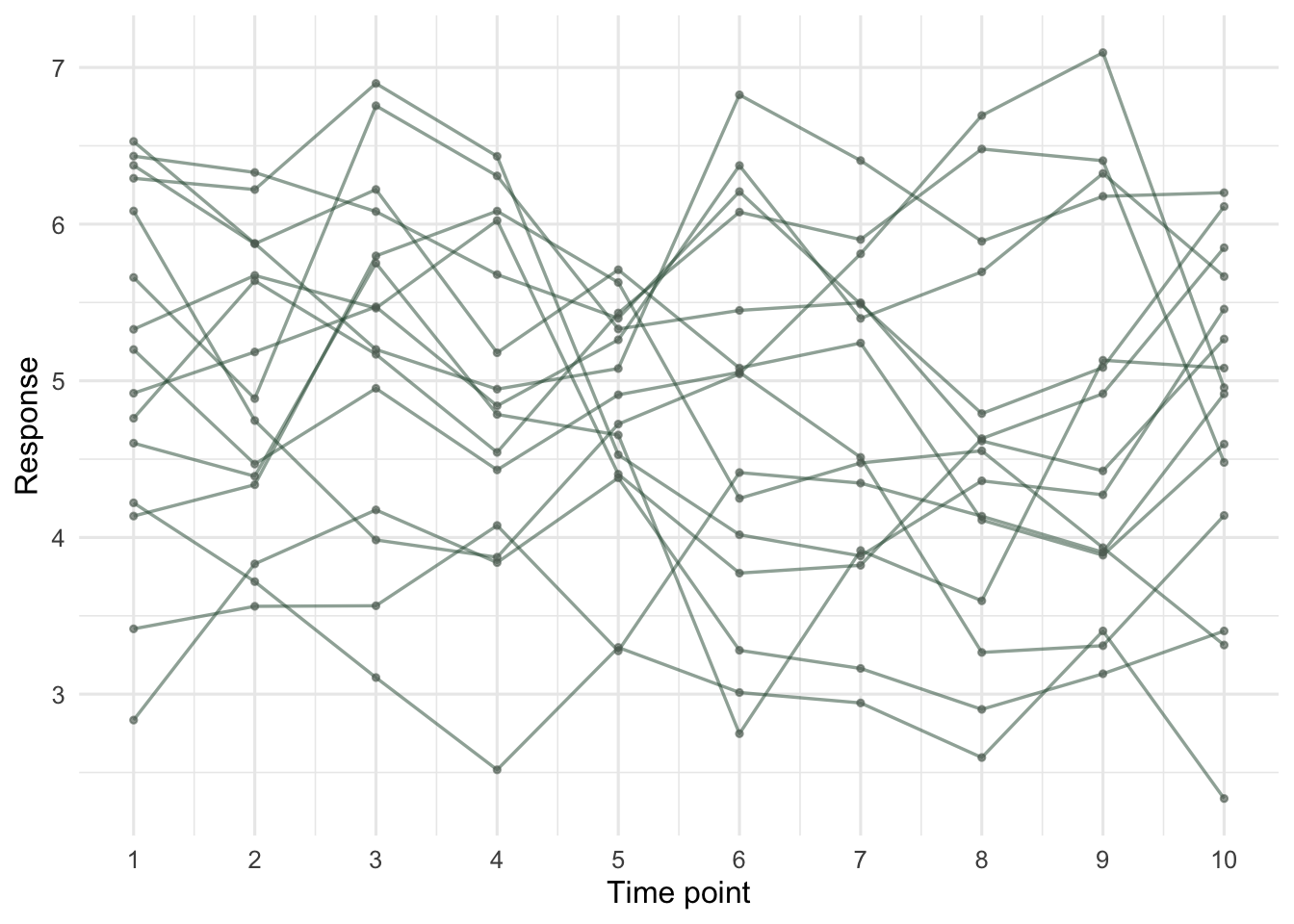
How often does the naive model fire?
Two models, both with a subject random intercept, differing only in the within-subject error structure. The naive one leaves residuals independent; the second adds corAR1, a first-order autoregressive correlation within each subject. Generate a thousand null datasets and count how often each declares the (non-existent) time trend significant at 0.05.
set.seed(101)
nsim <- 1000
p_naive <- p_ar1 <- numeric(nsim)

for (s in 1:nsim) {
  d <- gen()
  m_naive <- lme(y ~ time, random = ~ 1 | subject,
                 data = d, method = "REML")
  m_ar1   <- lme(y ~ time, random = ~ 1 | subject,
                 correlation = corAR1(form = ~ time | subject),
                 data = d, method = "REML")
  p_naive[s] <- summary(m_naive)$tTable["time", "p-value"]
  p_ar1[s]   <- summary(m_ar1)$tTable["time", "p-value"]
}

c(naive_no_AR1 = mean(p_naive < 0.05),
  corAR1       = mean(p_ar1   < 0.05))
naive_no_AR1 corAR1
0.285 0.058 The naive model rejects the null 28.5% of the time, against a nominal 5%. The corAR1 model lands at 5.8%, on target. Ignoring within-subject autocorrelation does not nudge the error rate; it multiplies it almost sixfold. Any “trend” from such a model is as likely to be autocorrelated noise as a real signal.
One dataset, one false positive
A single draw makes the mechanism concrete. This dataset (one of the null draws, chosen because the naive model trips on it) has no trend, yet the naive model reports a significant one.
set.seed(9)
d <- gen()

m_naive <- lme(y ~ time, random = ~ 1 | subject, data = d, method = "REML")
m_ar1   <- lme(y ~ time, random = ~ 1 | subject,
               correlation = corAR1(form = ~ time | subject),
               data = d, method = "REML")

rbind(
  naive  = summary(m_naive)$tTable["time", c("Value", "Std.Error", "p-value")],
  corAR1 = summary(m_ar1)$tTable["time",   c("Value", "Std.Error", "p-value")]
)
Value Std.Error p-value
naive -0.05194512 0.02140084 0.01654233
corAR1 -0.04399377 0.03321281 0.18755767# estimated AR(1) parameter
phi_hat <- coef(m_ar1$modelStruct$corStruct, unconstrained = FALSE)
round(phi_hat, 3) Phi
0.604 AIC(m_naive, m_ar1) df AIC
m_naive 4 391.0815
m_ar1 5 348.9831Both models estimate a slope near zero, as they should. The difference is the standard error: the naive model reports 0.021, the corAR1 model 0.033. That extra width is the autocorrelation being paid for. With the narrower naive error the slope clears significance (p = 0.017, a false positive); with the honest error it does not (p = 0.188). The autoregressive parameter is estimated at 0.60, close to the 0.7 used to generate the data, and AIC drops from 391.1 to 349.0 when the correlation structure is added. Because the two models share their fixed effects and are fitted with REML, that AIC comparison is valid.
The residual signature
The naive model leaves the autocorrelation in its residuals, where it is easy to see: plot each residual against the previous one within the same subject. Independent residuals would form a shapeless cloud; these line up along a positive diagonal.
d$res <- resid(m_naive)
lagdf <- do.call(rbind, lapply(split(d, d$subject), function(s) {
  s <- s[order(s$time), ]
  data.frame(prev = s$res[-nrow(s)], curr = s$res[-1])
}))

ggplot(lagdf, aes(prev, curr)) +
  geom_hline(yintercept = 0, colour = "#dad9ca") +
  geom_vline(xintercept = 0, colour = "#dad9ca") +
  geom_point(colour = "#b5534e", alpha = 0.6, size = 1.4) +
  geom_smooth(method = "lm", se = FALSE, colour = "#275139", linewidth = 1) +
  labs(x = "Naive residual at t-1", y = "Naive residual at t") +
  theme_minimal(base_size = 12)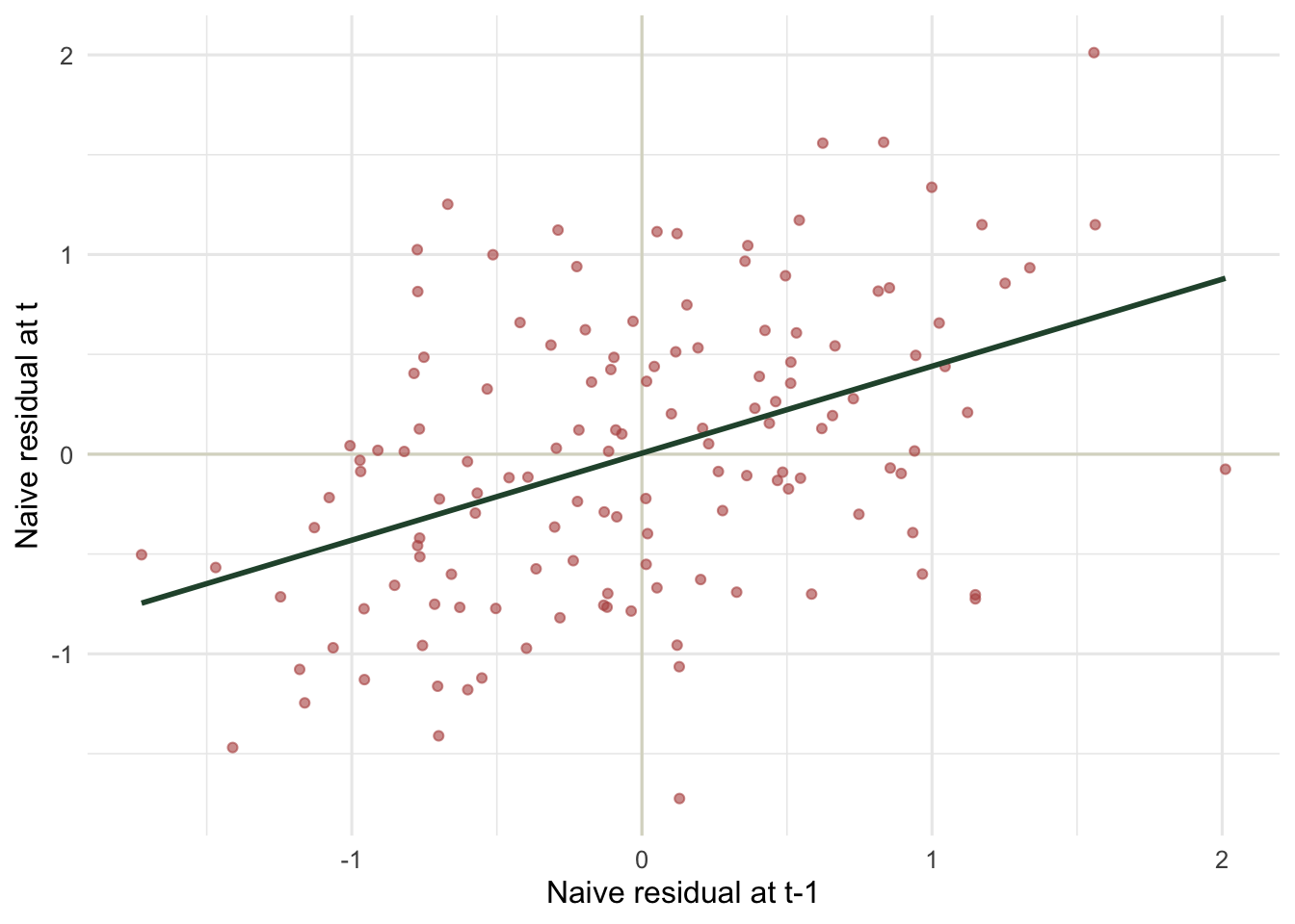
This plot is the quick field check on any repeated-measures fit: pull the residuals, lag them within unit, and look for a slope. A clear positive band means the independence assumption is broken and a correlation structure is needed.
Practical notes
The form = ~ time | subject part tells corAR1 two things: order the residuals by time, and reset the correlation at each subject. Get the grouping wrong and you either model correlation that is not there or miss the correlation that is.
corAR1 assumes the time points are equally spaced. Ecological sampling often is not: gaps of a week and a month should not carry the same correlation. For unequally spaced or continuous time, corCAR1 (a continuous-time autoregressive structure) uses the actual time values, and corExp or corGaus offer other decay shapes. The same nlme machinery that handles spatial correlation in the GLS post handles temporal correlation here; only the distance changes from space to time.
AR(1) is the common first choice, not a universal answer. If autocorrelation persists at longer lags after fitting it, a higher-order structure or an explicit temporal smooth may be needed. Always re-check the lagged residuals after adding the structure, the same way you would re-check a variogram in space.
References
Pinheiro JC, Bates DM 2000. Mixed-Effects Models in S and S-PLUS. Springer (ISBN 978-0-387-98957-0)
Zuur AF, Ieno EN, Walker NJ, Saveliev AA, Smith GM 2009. Mixed Effects Models and Extensions in Ecology with R. Springer (ISBN 978-0-387-87457-9)