T<-30; year<-1:T
logmu <- log(90) - 0.9*sin(pi*(year-1)/(T-1))   # dip to the high 30s, then recover
set.seed(311); count <- rpois(T, exp(logmu))
dat <- data.frame(year, count)Estimating population trends in R
R
population dynamics
time series
GAMs
mgcv
ecology tutorial
Why one linear rate can hide a population crash and recovery, using a GAM in R to show trend shape, and why count data need a count model rather than log-OLS.
A population trend is often reported as a single number: so many percent per year. That summary answers one question, the average rate of change, but it quietly assumes the change has a constant rate. When a population declines and then recovers, or holds steady and then collapses, the single rate can be close to zero while the trajectory tells a story a manager would need to act on. This post fits a smooth trend with a generalised additive model in R to recover the shape a linear rate throws away, and then makes a second point that matters for monitoring data: counts should be modelled as counts, not as log-transformed responses in an ordinary regression.
A trend that averages to nothing
Consider thirty years of counts from a population that falls to less than half its size and then climbs back. The true mean follows a smooth dip, from about ninety down to the high thirties near the middle and back to ninety, and the counts are Poisson draws around it.
Fit two trend models. The first is a log-linear Poisson regression, the constant-rate trend that a single percentage per year comes from. The second is a Poisson generalised additive model with a smooth term in year, whose wiggliness is chosen by restricted maximum likelihood rather than fixed in advance.
glin <- glm(count ~ year, family=poisson, data=dat)
gam1 <- gam(count ~ s(year), family=poisson, data=dat, method="REML")

sl <- summary(glin)$coefficients["year", ]
edf <- sum(gam1$edf[-1]); de <- summary(gam1)$dev.expl
c(pct_per_yr = round(100*(exp(sl["Estimate"])-1), 2),
  lin_p      = round(sl["Pr(>|z|)"], 2),
  gam_edf    = round(edf, 1),
  gam_dev_expl = round(de, 2),
  dAIC       = round(AIC(glin)-AIC(gam1), 0))
pct_per_yr.Estimate lin_p.Pr(>|z|) gam_edf gam_dev_expl
0.02 0.95 4.30 0.86
dAIC
162.00 The linear model reports a change of \(0.02\%\) per year, with a \(p\) value of \(0.95\): essentially zero on the log scale. Read on its own that is a flat line, no trend, a stable population. The additive model tells a different story. Its smooth term uses about \(4.3\) effective degrees of freedom, explains \(86\%\) of the deviance, and improves the AIC by \(162\) over the straight line. The population did not sit still; it crashed and recovered, and only the model that allows a shape can see it.
gg <- data.frame(year=seq(1,T,length.out=200))
pr <- predict(gam1, gg, type="link", se.fit=TRUE)
gg$fit<-exp(pr$fit); gg$lo<-exp(pr$fit-1.96*pr$se.fit); gg$hi<-exp(pr$fit+1.96*pr$se.fit)
gl <- data.frame(year=seq(1,T,length.out=200)); gl$fit <- exp(predict(glin, gl))
ggplot()+
  geom_ribbon(data=gg, aes(year, ymin=lo, ymax=hi), fill=forest, alpha=.15)+
  geom_point(data=dat, aes(year, count), colour=ink, size=2, alpha=.85)+
  geom_line(data=gl, aes(year, fit, colour="Linear trend"), linewidth=1)+
  geom_line(data=gg, aes(year, fit, colour="GAM smooth"), linewidth=1)+
  scale_colour_manual(values=c("Linear trend"=gold,"GAM smooth"=forest))+
  labs(x="year", y="count", colour=NULL,
       title="A flat linear trend hides a crash and recovery")+
  theme_te()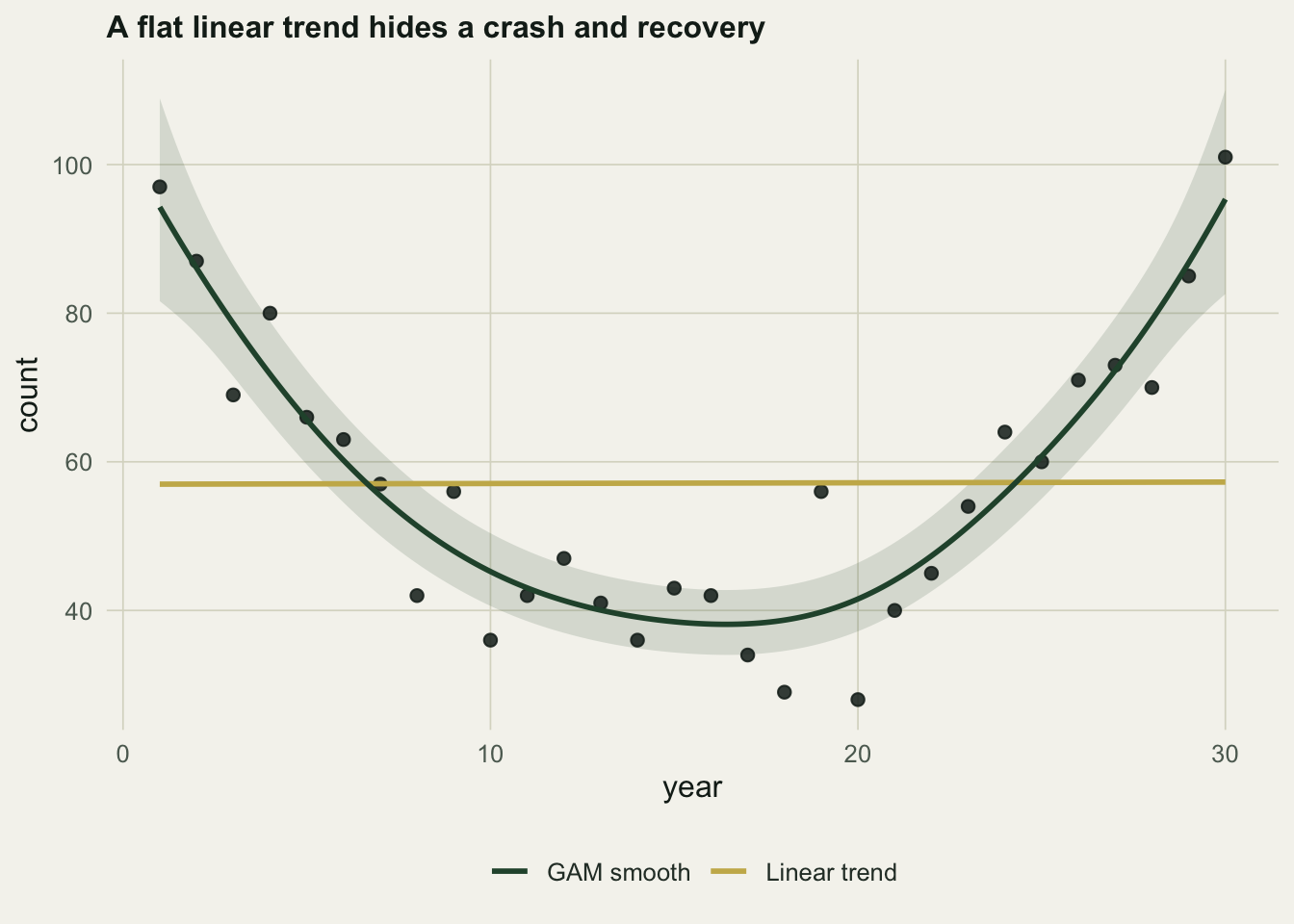
The smooth is not a licence to chase every wiggle. The penalty on its wiggliness, tuned by restricted maximum likelihood, is what keeps it from interpolating the noise, and the same fit collapses back towards a straight line when the data really are linear, because a straight line is the smoothest option available to it. The effective degrees of freedom, here about four, report how much curvature the data actually support. This flexible-trend approach is the basis of the generalised additive models used for national bird monitoring by Fewster and colleagues.
Model counts as counts
The second point is about the response, not its shape. Monitoring counts are non-negative integers, often small, sometimes zero, and their variance grows with their mean. A common habit is to take logs and run an ordinary regression, but \(\log 0\) is undefined, so people add a constant first, and that constant is an arbitrary choice that changes the answer. Take a shorter series of low counts with a genuine decline and a couple of zeros.
T2<-25; yr2<-1:T2; logmu2 <- log(9) - 0.075*(yr2-1)
set.seed(69); y2 <- rpois(T2, exp(logmu2))
dat2 <- data.frame(year=yr2, count=y2)

gp <- glm(count ~ year, family=poisson, data=dat2)         # count model
o1 <- lm(log(count+1)   ~ year, data=dat2)                 # log(y+1) OLS
o5 <- lm(log(count+0.5) ~ year, data=dat2)                 # log(y+0.5) OLS
round(c(n_zeros=sum(y2==0),
        poisson_pct=100*(exp(coef(gp)["year"])-1),
        logp1_pct=100*(exp(coef(o1)["year"])-1),
        logp0.5_pct=100*(exp(coef(o5)["year"])-1)), 2)
n_zeros poisson_pct.year logp1_pct.year logp0.5_pct.year
2.00 -9.50 -7.59 -8.97 The Poisson model estimates a decline of about \(9.5\%\) per year and needs no fudge for the two zeros. The log-transformed regressions give \(7.6\%\) per year when the added constant is one and \(9.0\%\) per year when it is a half: a swing of roughly a fifth of the estimate, driven entirely by a number the analyst picked to avoid taking the log of zero. The count model has no such lever. It handles zeros directly, its log link keeps predictions positive, and its Poisson variance matches the way count scatter grows with the mean, none of which the log-plus-constant regression gets right.
gg2 <- data.frame(year=seq(1,T2,length.out=200))
gg2$pois <- exp(predict(gp, gg2))
gg2$logols <- exp(predict(o1, gg2)) - 1
ggplot()+
  geom_point(data=dat2, aes(year, count), colour=ink, size=2, alpha=.85)+
  geom_line(data=gg2, aes(year, pois, colour="Poisson GLM"), linewidth=1)+
  geom_line(data=gg2, aes(year, logols, colour="log(y+1) OLS"), linewidth=1, linetype="22")+
  scale_colour_manual(values=c("Poisson GLM"=forest,"log(y+1) OLS"=aban))+
  labs(x="year", y="count", colour=NULL,
       title="Count model against log-transformed regression")+
  theme_te()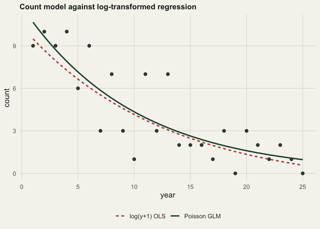
What to take from this
Two habits are worth keeping. First, before quoting a single rate of change, fit a smooth trend and look at the shape; if the smooth is close to a straight line the single rate is a fair summary, and if it is not, the rate is hiding something. Second, model counts with a count distribution, moving to a negative binomial or a mixed model when the scatter is wider than Poisson allows, rather than logging the counts and reaching for an ordinary regression. Neither step is more work than the analysis it replaces, and both keep the trend honest. The rate of change also says nothing about the mechanism behind it, which is where the earlier tools for density dependence and process versus observation error come back in.
References
Fewster RM, Buckland ST, Siriwardena GM, Baillie SR & Wilson JD 2000 Ecology 81(7):1970-1984 (10.1890/0012-9658(2000)081[1970:AOPTFF]2.0.CO;2)
Wood SN 2011 Journal of the Royal Statistical Society Series B 73(1):3-36 (10.1111/j.1467-9868.2010.00749.x)
O’Hara RB & Kotze DJ 2010 Methods in Ecology and Evolution 1(2):118-122 (10.1111/j.2041-210X.2010.00021.x)