library(ggplot2)
library(patchwork)
library(mgcv)

te_paper  <- "#f5f4ee"
te_ink    <- "#16241d"
te_body   <- "#2c3a31"
te_forest <- "#275139"
te_rust   <- "#b5534e"
te_gold   <- "#c9b458"
te_line   <- "#dad9ca"

theme_datasheet <- function() {
  theme_minimal(base_size = 12) +
    theme(plot.background  = element_rect(fill = te_paper, colour = NA),
          panel.background = element_rect(fill = te_paper, colour = NA),
          panel.grid.major = element_line(colour = te_line, linewidth = 0.3),
          panel.grid.minor = element_blank(),
          text             = element_text(colour = te_body),
          plot.title       = element_text(colour = te_ink, face = "bold"),
          plot.subtitle    = element_text(colour = te_body),
          axis.text        = element_text(colour = te_body))
}Overdispersion, year noise and a wiggly GAM trend
R
GAMs
mgcv
overdispersion
monitoring
population trends
simulation
ecology tutorial
A Poisson GAM reads extra-Poisson spread as a wiggly trend. In R: why nb() fixes spread between sites, but only a year random effect removes year noise.
A breeding bird scheme counts one common species at the same fifteen plots every spring for thirty years. The mean count is about seven birds a plot, the counts go into a generalised additive model with a smooth term in year and a Poisson family, and the fitted trend comes back with bend after bend: a rise in the early years, a dip, a recovery, another dip. Each bend has a derivative interval that clears zero somewhere, so each one can be written up as a change.
The Poisson GAM is the model the site introduces for trends. Estimating population trends in R fits it to counts that “are Poisson draws around” a smooth dip, and explains that “the penalty on its wiggliness, tuned by restricted maximum likelihood, is what keeps it from interpolating the noise”. That sentence is true when the family’s noise is the real noise. This post measures what happens when it is not, in two ways that look the same to a Poisson model: counts that vary more between plots than Poisson allows, and years that are good or bad at every plot at once. None of the machinery is new. REML smoothness selection is Wood’s (2011), GAM trends for monitoring schemes go back to Fewster and colleagues (2000), and the model that ends up removing both problems, a smooth trend beside a random effect for year, is the decomposition Knape (2016) proposed for Swedish bird counts. The undersmoothing below is the expected consequence of a wrong variance function, and the arithmetic that explains it takes two lines.
The neighbours each hold one piece. Checking a generalised additive model warns that when “the residuals are correlated, the smooth mistakes that correlation for signal and bends to follow it”; here the year effects are drawn independently, so there is no autocorrelation to blame, and the smooth bends anyway. Variance components in monitoring data shows that “the year effect makes all sites in the same year move together”, which leaves a linear trend’s standard error too small, and repairs it by averaging within years before regressing; with a smooth, the same year noise changes the curve itself, not only its interval. Harmonics or cyclic splines for a narrow seasonal peak notes in its limits that overdispersed counts under a Poisson likelihood “would push … REML towards less smoothing”; that direction is measured here, on a trend in year rather than a seasonal curve. The false-change rate used throughout is the one Derivatives of a GAM trend measured under Gaussian noise, with its simultaneous band. Put shortly: the GAM check blames a wiggly trend on correlated residuals and the monitoring post blames a too-narrow slope interval on year noise; here the residuals are independent, the extra spread bends the curve itself, and the family can remove it only when it comes from the sites, not from the years.
Thirty years at fifteen plots
Every count is drawn from a negative binomial with mean exp(2 + f(year) + u_year), where f is the true trend, flat until the last section, and u_year is a year effect shared by every plot, normal with its own standard deviation. A negative binomial with an infinite size parameter is a Poisson. With mean mu and size k the variance is phi * mu with phi = 1 + mu / k, so a size of 1.5 at a mean of exp(2) multiplies the Poisson variance several times over.
n_yr    <- 30           # years in the series
n_site  <- 15           # plots counted every year
mu0     <- exp(2)       # mean count per plot, about 7.4
k_basis <- 20           # basis dimension of s(year)
n_draw  <- 2000         # coefficient draws for the simultaneous band
n_main  <- 40           # series per main cell, set by the knit-time budget
n_side  <- 20           # series per side cell
grid_yr <- seq(1, n_yr, length.out = 100)
eps     <- 1e-4

phi_of   <- function(size) 1 + mu0 / size
sd_equiv <- function(size, n) sqrt((phi_of(size) - 1) / (n * mu0))
flat <- function(t) 0 * t
hump <- function(t) 0.6 * exp(-((t - 15) / 5)^2)

make_counts <- function(n, size, sd_year, f = flat) {
  yr <- rep(seq_len(n_yr), each = n)
  mu <- exp(log(mu0) + f(yr) + rnorm(n_yr, 0, sd_year)[yr])
  y <- if (is.finite(size)) rnbinom(length(mu), mu = mu, size = size) else rpois(length(mu), mu)
  data.frame(y = y, year = yr, yearf = factor(yr, levels = seq_len(n_yr)))
}
Three models are fitted to every series, all with s(year, k = 20) and REML: a Poisson family, a negative binomial family with its size estimated (nb()), and the negative binomial with a random intercept for year, s(yearf, bs = "re"), beside the smooth. A fourth fit, a Poisson regression spline with nine fixed degrees of freedom, is carried along for the last section.
fit_all <- function(d) list(
  poisson = gam(y ~ s(year, k = k_basis), family = poisson, data = d, method = "REML"),
  nb      = gam(y ~ s(year, k = k_basis), family = nb(), data = d, method = "REML"),
  nb_re   = gam(y ~ s(year, k = k_basis) + s(yearf, bs = "re"), family = nb(),
                data = d, method = "REML"),
  fixed9  = gam(y ~ s(year, k = 10, fx = TRUE), family = poisson, data = d))
fit_lab <- c(poisson = "Poisson", nb = "nb()", nb_re = "nb() + year effect",
             fixed9 = "Poisson, 9 fixed df")
The false-change metric follows Derivatives of a GAM trend. The derivative of s(year) on a grid of 100 points comes from a finite difference of the prediction matrix, its standard error from the coefficient covariance, and the simultaneous multiplier from 2000 draws of the coefficients (the construction of Ruppert, Wand and Carroll 2003): the 95th percentile, over draws, of the largest standardised deviation along the grid. A series counts as a false change if the band excludes zero anywhere, once with the pointwise multiplier 1.96 and once with the simultaneous one. The year effect’s columns are zeroed, so the band is on the trend alone.
nd_base <- data.frame(year = grid_yr, yearf = factor(1, levels = seq_len(n_yr)))
nd_int  <- data.frame(year = seq_len(n_yr), yearf = factor(1, levels = seq_len(n_yr)))

deriv_band <- function(fit) {
  nd_up <- nd_base; nd_up$year <- nd_up$year + eps
  D <- (predict(fit, nd_up, type = "lpmatrix") -
        predict(fit, nd_base, type = "lpmatrix")) / eps
  D[, !grepl("s\\(year\\)", colnames(D))] <- 0
  V <- vcov(fit); d_hat <- drop(D %*% coef(fit)); se <- sqrt(rowSums((D %*% V) * D))
  R <- chol(V + diag(1e-10, nrow(V)))
  Z <- matrix(rnorm(n_draw * nrow(V)), n_draw) %*% R
  crit <- unname(quantile(apply(abs(Z %*% t(D)) / rep(se, each = n_draw), 1, max), 0.95))
  list(d = d_hat, se = se, crit = crit,
       pw = any(abs(d_hat / se) > qnorm(0.975)), sim = any(abs(d_hat / se) > crit),
       edf = sum(fit$edf[grepl("s\\(year\\)", names(fit$edf))]))
}
count_turns <- function(s) sum(diff(sign(diff(s))) != 0)
curve_stats <- function(fit, f) {
  s_int <- predict(fit, nd_int, type = "terms", se.fit = TRUE)
  s_hat <- s_int$fit[, "s(year)"]
  truth <- f(seq_len(n_yr)) - mean(f(seq_len(n_yr)))
  s_grid <- predict(fit, nd_base, type = "terms")[, "s(year)"]
  re15 <- if ("s(yearf).15" %in% names(coef(fit))) unname(coef(fit)["s(yearf).15"]) else 0
  c(range = diff(range(s_hat)), rmse = sqrt(mean((s_hat - truth)^2)),
    se_s = mean(s_int$se.fit[, "s(year)"]), turns = count_turns(s_grid),
    peak = unname(s_hat[15]), low = min(s_hat), re15 = re15)
}
One series, three families
Two flat series make the point before any simulation. The first has site-level overdispersion, negative binomial size 1.5 and no year effect. The second is pure Poisson at every plot, but each year carries a shared effect with standard deviation 0.211, a value the next section derives. Both are the first draw after the seed, not chosen, and the year-noise draw turns out milder than the median of its cell further down.
set.seed(7300)
ex_list <- list(sites = make_counts(n_site, 1.5, 0),
                years = make_counts(n_site, Inf, sd_equiv(1.5, n_site)))
ex_fits <- lapply(ex_list, function(d) {
  f3 <- fit_all(d)[c("poisson", "nb", "nb_re")]
  f3$quasi <- gam(y ~ s(year, k = k_basis), family = quasipoisson, data = d, method = "REML")
  f3
})
ex_edf <- sapply(ex_fits, function(fl) sapply(fl, function(m)
  sum(m$edf[grepl("s\\(year\\)", names(m$edf))])))
ex_disp <- sapply(ex_fits, function(fl)
  sum(residuals(fl$poisson, type = "pearson")^2) / df.residual(fl$poisson))
ex_theta <- sapply(ex_fits, function(fl) fl$nb$family$getTheta(TRUE))
ex_band <- lapply(ex_fits, function(fl) lapply(fl[c("poisson", "nb", "nb_re")], deriv_band))
ex_flag <- sapply(ex_band, function(bl) sapply(bl, `[[`, "sim"))
ex_flag_pw <- sapply(ex_band, function(bl) sapply(bl, `[[`, "pw"))
ex_disp_p <- sapply(ex_fits, function(fl) pchisq(sum(residuals(fl$poisson, type = "pearson")^2),
                                                 df.residual(fl$poisson), lower.tail = FALSE))
yn <- function(x) if (x) "does" else "does not"
ex_curves <- do.call(rbind, lapply(names(ex_fits), function(src) {
  do.call(rbind, lapply(c("poisson", "nb", "nb_re"), function(fn) {
    p <- predict(ex_fits[[src]][[fn]], nd_base, se.fit = TRUE, exclude = "s(yearf)")
    data.frame(source = src, fit = fn, year = grid_yr, eta = p$fit,
               lo = p$fit - 1.96 * p$se.fit, hi = p$fit + 1.96 * p$se.fit)
  }))
}))
ex_means <- do.call(rbind, lapply(names(ex_list), function(src) {
  a <- aggregate(y ~ year, data = ex_list[[src]], FUN = mean)
  data.frame(source = src, year = a$year, log_mean = log(a$y))
}))
On the overdispersed series the Poisson smooth spends 15.4 effective degrees of freedom on a flat truth, against 1.00 for nb(), 1.00 for nb() with the year effect and 1.00 for a quasipoisson family with the scale estimated. The Pearson dispersion of the Poisson fit is 5.78, so the usual check would have caught the problem. On the year-noise series the Poisson smooth spends 5.0, nb() spends 3.2, quasipoisson 3.1, and only the model with the year effect comes back to 1.55. The Pearson dispersion of that Poisson fit is 1.41. The size that nb() estimates is 1.50 on the first series, against a true 1.5, and 17.3 on the second, where the plots are Poisson inside each year; that size implies a variance ratio of 1.43, while the year means carry 5.93 to first order (a little more once the lognormal curvature of the next section is counted). A chi-square test of the Poisson fit’s dispersion on the year-noise series gives p below 0.001, so a formal test would have objected there, but the repair it suggests, nb(), keeps 3.2 degrees of freedom. On this draw the pointwise derivative band of the Poisson smooth does claim a change and the simultaneous band does not.
ex_curves$fit <- factor(fit_lab[ex_curves$fit], levels = fit_lab[1:3])
src_lab <- c(sites = "Spread between plots (NB size 1.5)",
             years = "Shared year effect (Poisson plots)")
ex_curves$source <- factor(src_lab[ex_curves$source], levels = src_lab)
ex_means$source  <- factor(src_lab[ex_means$source], levels = src_lab)
ggplot(ex_curves, aes(year)) +
  geom_hline(yintercept = log(mu0), colour = te_body, linetype = "dashed", linewidth = 0.4) +
  geom_ribbon(aes(ymin = lo, ymax = hi, fill = fit), alpha = 0.18) +
  geom_line(aes(y = eta, colour = fit), linewidth = 0.9) +
  geom_point(data = ex_means, aes(y = log_mean), colour = te_ink, size = 1.4) +
  facet_wrap(~ source) +
  scale_colour_manual(values = c(te_rust, te_gold, te_forest), name = NULL) +
  scale_fill_manual(values = c(te_rust, te_gold, te_forest), name = NULL) +
  labs(x = "year", y = "log mean count",
       title = "A flat truth, read three ways",
       subtitle = "points: log of each year's mean count; dashed: the true level") +
  theme_datasheet() +
  theme(legend.position = "bottom", strip.text = element_text(colour = te_ink, face = "bold"))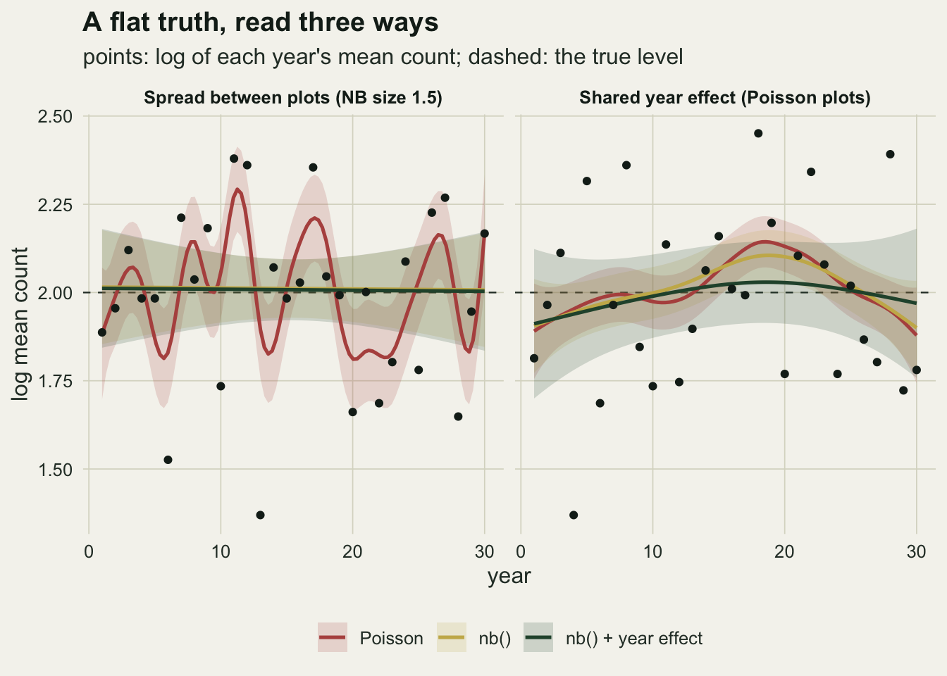
The arithmetic behind the bends
The smoothing parameter is chosen by weighing the penalty against the noise the family claims for the data. For a smooth in year the part of that noise that matters is the noise of each year’s mean. Poisson claims a variance of mu / n for the mean of n plots. With site-level overdispersion the truth is phi * mu / n. The ratio of the two is phi, and n cancels: adding plots shrinks the claimed and the true variance together and leaves the excess, in proportion, exactly where it was. That excess has to go somewhere, and in a model with no other term for it, it goes into year-to-year signal.
A shared year effect produces the same excess. On the log scale, to first order, the mean of n Poisson plots has variance 1 / (n * mu), and a year effect with standard deviation s adds s^2. Matching 1 / (n * mu) + s^2 to phi / (n * mu) gives s^2 = (phi - 1) / (n * mu). With phi = 5.93, fifteen plots and a mean of 7.39, that is the standard deviation 0.211 used on the right of the figure. None of this is a finding; it is a variance count, and the chunk below checks it by drawing year means directly.
set.seed(7311)
n_years_chk <- 20000
ratio_chk <- sapply(c(5, 15, 40), function(n) {
  ybar_nb <- colMeans(matrix(rnbinom(n * n_years_chk, mu = mu0, size = 1.5), n))
  u <- rnorm(n_years_chk, 0, sd_equiv(1.5, n))
  ybar_yr <- colMeans(matrix(rpois(n * n_years_chk, rep(mu0 * exp(u), each = n)), n))
  c(n = n, nb = var(ybar_nb) / (mu0 / n), years = var(ybar_yr) / (mu0 / n),
    sd_eq = sd_equiv(1.5, n))
})
Across 20000 simulated years, the variance of a year mean divided by the Poisson claim is 5.90, 5.91 and 5.92 at 5, 15 and 40 plots under site-level overdispersion, against phi = 5.93. With Poisson plots and the matching year effect (standard deviation 0.365, 0.211 and 0.129) the ratio is 7.14, 6.22 and 5.99. The excess over phi is the curvature of the lognormal year effect, which the first-order match ignores; it is largest at 5 plots, where the matching standard deviation is largest, and small at 15 and 40.
What the arithmetic does not say is how many degrees of freedom REML will buy with that excess, or how often a derivative band will then claim a change. Those have no formula and carry the rest of the post. It also says why nb() should behave differently for the two sources. The negative binomial estimates its size from the spread of counts around the fitted mean, and nearly all of that spread is between plots inside a year. Site-level overdispersion is visible there. A year effect moves all fifteen plots together and adds little to the spread inside a year, so nb() estimates a large size, and the year-mean variance it claims stays far below the truth.
False change on a flat trend
The main table has five cells of 40 series each: negative binomial size 1.5 and size 5 with no year effect, the Poisson control, Poisson plots with the year effect matched to size 1.5, and size 5 with a real year effect of standard deviation 0.3. Five side cells of 20 series add the year effect matched to size 5, size 5 with a year standard deviation of 0.15, size 1.5 at 5 and at 40 plots, and the hump truth of the last section. Every true trend except the hump is flat.
cells <- data.frame(
  cell = c("NB size 1.5", "NB size 5", "Poisson", "Poisson + year sd 0.211",
           "NB size 5 + year sd 0.3", "Poisson + year sd 0.115", "NB size 5 + year sd 0.15",
           "NB size 1.5, 5 plots", "NB size 1.5, 40 plots", "hump"),
  n = c(15, 15, 15, 15, 15, 15, 15, 5, 40, 15),
  size = c(1.5, 5, Inf, Inf, 5, Inf, 5, 1.5, 1.5, 5),
  sd_year = c(0, 0, 0, sd_equiv(1.5, 15), 0.3, sd_equiv(5, 15), 0.15, 0, 0, 0.15),
  reps = c(rep(n_main, 5), rep(n_side, 5)),
  seed = 7301:7310)

one_series <- function(n, size, sd_year, f = flat) {
  d <- make_counts(n, size, sd_year, f)
  fits <- fit_all(d)
  b <- lapply(fits, deriv_band)
  x2 <- sum(residuals(fits$poisson, type = "pearson")^2)
  disp <- x2 / df.residual(fits$poisson)
  disp_rej <- pchisq(x2, df.residual(fits$poisson), lower.tail = FALSE) < 0.05
  stats <- data.frame(fit = names(fits), edf = sapply(b, `[[`, "edf"),
                      pw = sapply(b, `[[`, "pw"), sim = sapply(b, `[[`, "sim"),
                      disp = disp, disp_rej = disp_rej, row.names = NULL)
  stats <- cbind(stats, t(sapply(fits, curve_stats, f = f)))
  curves <- sapply(fits, function(m) predict(m, nd_base, type = "terms")[, "s(year)"])
  list(stats = stats, curves = curves)
}

sim_out <- lapply(seq_len(nrow(cells)), function(i) {
  set.seed(cells$seed[i])
  f_i <- if (cells$cell[i] == "hump") hump else flat
  lapply(seq_len(cells$reps[i]), function(j) one_series(cells$n[i], cells$size[i],
                                                        cells$sd_year[i], f_i))
})
res <- do.call(rbind, lapply(seq_len(nrow(cells)), function(i)
  do.call(rbind, lapply(seq_along(sim_out[[i]]), function(j)
    cbind(cell = cells$cell[i], rep = j, sim_out[[i]][[j]]$stats)))))

res$turn2 <- res$turns >= 2
tab <- aggregate(cbind(pw, sim, disp, disp_rej, range, rmse, se_s, turns, turn2, peak, low, re15) ~
                   cell + fit, data = res, FUN = mean)
tab$edf <- aggregate(edf ~ cell + fit, data = res, FUN = median)$edf
tab$edf_lo <- aggregate(edf ~ cell + fit, data = res, FUN = quantile, probs = 0.1)$edf
tab$edf_hi <- aggregate(edf ~ cell + fit, data = res, FUN = quantile, probs = 0.9)$edf
g <- function(cell, fit, what) tab[tab$cell == cell & tab$fit == fit, what]
mcse_half <- sqrt(0.25 / n_main)
The rate is the share of flat series whose band excludes zero somewhere; its Monte Carlo standard error is at most 0.079 in a main cell. The Poisson control sets each band’s own baseline. There the Poisson fit flags a change in 0.075 of series with the pointwise band and 0.025 with the simultaneous one, both within Monte Carlo error of 0.05. The fitted smooth is a straight line in most control series (median 1.00 degrees of freedom, 90th percentile 2.60), so the grid of 100 points adds few extra chances.
With site-level overdispersion at size 1.5 (phi = 5.93) the Poisson smooth has a median of 12.7 effective degrees of freedom (10th to 90th percentile 1.1 to 16.7) and flags a change in 0.850 of the flat series pointwise and 0.700 simultaneously. nb() has a median of 1.00 (10th to 90th percentile 1.00 to 1.93) and rates of 0.050 and 0.000, at the control’s level. The family fixes this cell, and the Pearson dispersion of the Poisson fit, 5.97 on average, announces that it needs fixing.
At size 5 (phi = 2.48) the rate is the wrong headline. The Poisson fit flags 0.500 of series pointwise but only 0.200 simultaneously, against 0.075 and 0.050 for nb(). The curve itself does not recover: the Poisson smooth’s median is 2.66 degrees of freedom (10th to 90th percentile 1.00 to 7.54) against 1.00 for nb(), and the fitted curve has 2.5 turning points on average against 0.3, on a truth with none. That average leans on a tail: 0.475 of the Poisson curves have two or more turning points, against 0.075 of the nb() curves. A reader who looks at the curve rather than the band sees bends that are not there.
main_cells <- cells$cell[1:5]
rt <- tab[tab$cell %in% main_cells & tab$fit %in% c("poisson", "nb", "nb_re"), ]
rt$cell <- factor(rt$cell, levels = rev(main_cells))
rt$fit  <- factor(fit_lab[rt$fit], levels = fit_lab[1:3])
rt_long <- rbind(data.frame(rt[, c("cell", "fit")], band = "pointwise", rate = rt$pw),
                 data.frame(rt[, c("cell", "fit")], band = "simultaneous", rate = rt$sim))
rt_long$ypos <- as.numeric(rt_long$cell) + c(0.22, 0, -0.22)[as.numeric(rt_long$fit)]
ggplot(rt_long, aes(rate, ypos, colour = fit)) +
  geom_vline(xintercept = 0.05, colour = te_body, linetype = "dashed", linewidth = 0.4) +
  geom_line(aes(group = interaction(cell, fit)), linewidth = 0.5) +
  geom_point(aes(shape = band), size = 2.6, stroke = 0.9, fill = te_paper) +
  scale_y_continuous(breaks = seq_along(levels(rt$cell)), labels = levels(rt$cell)) +
  scale_shape_manual(values = c(pointwise = 21, simultaneous = 16), name = NULL) +
  scale_colour_manual(values = c(te_rust, te_gold, te_forest), name = NULL) +
  scale_x_continuous(limits = c(0, 1)) +
  guides(colour = guide_legend(nrow = 1), shape = guide_legend(nrow = 1)) +
  labs(x = "share of flat series flagged as changing", y = NULL,
       title = "False change by source of extra spread",
       subtitle = "dashed: 0.05") +
  theme_datasheet() + theme(legend.position = "bottom", legend.box = "vertical")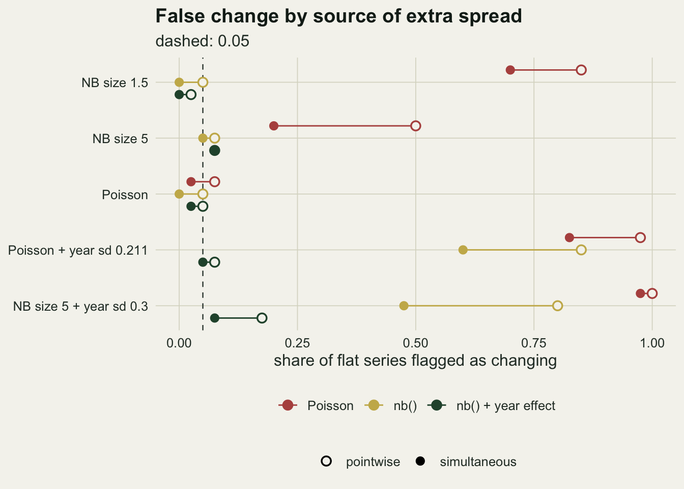
Year noise gets past the family, and weakens the check
The fourth cell has Poisson plots and a shared year effect with standard deviation 0.211, the value that matches size 1.5 in the arithmetic. The Poisson smooth reacts as it did to size 1.5: median 13.8 degrees of freedom, flags in 0.975 pointwise and 0.825 simultaneously. What changes is the warning. nb() now has a median of 11.6 degrees of freedom and flags 0.850 pointwise and 0.600 simultaneously, and the Pearson dispersion of the Poisson fit averages 1.14, far below the rules of thumb people act on. A formal chi-square test of the same statistic does better and rejects Poisson at the 5 per cent level in 0.650 of these series (0.300 in the side cell matched to size 5), but the repair it points to is a family with extra spread, and nb(), as above, leaves the year noise in the curve. The year effect beside the smooth brings the median back to 1.00 and the rates to 0.075 and 0.050.
The Pearson statistic is low for an arithmetic reason. It averages over single counts, and a year effect adds mu * s^2 to the variance-to-mean ratio of a single count, which at the matched value is (phi - 1) / n: a fifteenth of the excess the same effect puts on a year mean. Even a Poisson fit with a flat trend would show a dispersion of only about 1 + (phi - 1) / n = 1.33, and the wiggly smooth absorbs part of that, leaving the 1.14 measured. Site-level overdispersion puts its whole excess on every single count, which is why the same check reads 5.97 there.
The fifth cell combines both sources, size 5 between plots and a year standard deviation of 0.3. nb() handles the first and not the second: median 7.6 degrees of freedom, flags in 0.800 pointwise and 0.475 simultaneously, against 0.175 and 0.075 with the year effect. The Pearson dispersion of the Poisson fit is 2.82, against 2.49 in the size 5 cell without year noise: a year effect this large moves the check by 0.33, while it takes the nb() pointwise rate from 0.075 to 0.800. The check reports the spread between plots and says almost nothing about the years. In the side cells, the year effect matched to size 5 (standard deviation 0.115) gives a Poisson dispersion of 1.06 and an nb() median of 2.59 degrees of freedom, and size 5 with a year standard deviation of 0.15 gives nb() a pointwise rate of 0.400 against 0.000 with the year effect.
One ratio, nearly whatever its source
If the arithmetic is the whole story, the smooth should respond to one number: the true variance of a log year mean divided by the variance the fitted family claims for it. For the Poisson fit the claim is 1 / (n * mu) and the truth is (phi + n * mu * s^2) / (n * mu). For nb(), which absorbs phi, the claim is phi / (n * mu) and the ratio is 1 + n * mu * s^2 / phi. The model with the year effect claims the year variance too, and sits near a ratio of one by design. Plotting each flat cell’s median degrees of freedom against that ratio, for the Poisson and nb() fits, puts site-level and year-level excess on one axis.
flat_cells <- cells[cells$cell != "hump", ]
phi_c <- ifelse(is.finite(flat_cells$size), phi_of(flat_cells$size), 1)
nms2 <- flat_cells$n * mu0 * flat_cells$sd_year^2
source_c <- ifelse(phi_c > 1 & nms2 > 0, "plots and years",
            ifelse(phi_c > 1, "plots only", ifelse(nms2 > 0, "years only", "none")))
rat <- rbind(
  data.frame(cell = flat_cells$cell, fit = "poisson", ratio = phi_c + nms2, source = source_c),
  data.frame(cell = flat_cells$cell, fit = "nb", ratio = 1 + nms2 / phi_c, source = source_c))
rat$edf <- mapply(function(cc, ff) g(cc, ff, "edf"), rat$cell, rat$fit)
rat_cor <- cor(log(rat$ratio), rat$edf, method = "spearman")
pois_n <- sapply(c("NB size 1.5, 5 plots", "NB size 1.5", "NB size 1.5, 40 plots"), function(cc)
  c(pw = g(cc, "poisson", "pw"), sim = g(cc, "poisson", "sim"), edf = g(cc, "poisson", "edf"),
    reps = cells$reps[cells$cell == cc]))
diff_5_40 <- pois_n["sim", 1] - pois_n["sim", 3]
se_diff_5_40 <- sqrt(sum(pois_n["sim", c(1, 3)] * (1 - pois_n["sim", c(1, 3)]) / pois_n["reps", c(1, 3)]))
Across the nine flat cells and two fits, the rank correlation between the log ratio and the median degrees of freedom is 0.95, and the points from the two sources interleave rather than forming two curves: the Poisson fit to size 1.5 counts (ratio 5.93) and both fits to the matched year effect (ratio 5.93) sit together, at medians of 12.7, 13.8 and 11.6. The one clear exception is the pair of squares near a ratio of 5, where both sources act at once: the Poisson fit to size 5 counts with a year standard deviation of 0.15 (ratio 4.97) has a median of 11.7, and the nb() fit to size 5 counts with 0.3 (ratio 5.03) a median of 7.6. The ratio is a good first account of the degrees of freedom, not a complete one. At the ratio 2.48 of size 5 the medians are 2.66 for the Poisson fit to size 5 counts and 3.04 and 2.59 for the two fits to the matched year effect. This is also the answer to how large a year variance has to be before the year term matters: what counts is the year variance relative to the sampling variance of a log year mean, phi / (n * mu), and where the two are about equal (size 5 with a year standard deviation of 0.15, a ratio of 2.01 for nb()) the nb() smooth already has a median of 2.13 degrees of freedom on a flat truth and a pointwise rate of 0.400, though its simultaneous band flags only 0.050 (0.000 and 0.000 with the year effect).
The same axis explains the plot count. At size 1.5 the Poisson ratio is phi at any number of plots, and the Poisson fit flags 0.900, 0.850 and 0.800 of series pointwise at 5, 15 and 40 plots, and 0.700, 0.700 and 0.550 simultaneously, with medians of 13.9, 12.7 and 11.5 degrees of freedom. All three drift down slightly as plots are added. The drop in the simultaneous rate from 5 to 40 plots is 0.150, with a standard error of 0.151 from twenty series in each cell. Eight times the plots did not buy a flat curve. For a real year effect of fixed size the arithmetic runs the other way: n * mu * s^2 grows with n, so more plots make a year effect larger relative to what the family claims. That direction was not simulated here.
rat$fit <- factor(fit_lab[rat$fit], levels = fit_lab[1:2])
rat$source <- factor(rat$source, levels = c("none", "plots only", "years only", "plots and years"))
ggplot(rat, aes(ratio, edf, colour = fit, shape = source)) +
  geom_point(data = rat[rat$source != "none", ], size = 3, stroke = 1) +
  geom_point(data = rat[rat$source == "none", ], size = 3, stroke = 1,
             position = position_dodge(width = 0.08)) +
  scale_x_log10(breaks = c(1, 1.5, 2.5, 4, 6, 12)) +
  scale_colour_manual(values = c(te_rust, te_gold), name = NULL) +
  scale_shape_manual(values = c("none" = 1, "plots only" = 16, "years only" = 17,
                                "plots and years" = 15), breaks = levels(rat$source), name = NULL) +
  guides(colour = guide_legend(nrow = 1), shape = guide_legend(nrow = 2)) +
  labs(x = "true / claimed variance of a log year mean (log scale)",
       y = "median effective degrees of freedom",
       title = "The smooth sees mainly one ratio, not its source",
       subtitle = "nine flat cells, Poisson and nb() fits") +
  theme_datasheet() + theme(legend.position = "bottom", legend.box = "vertical")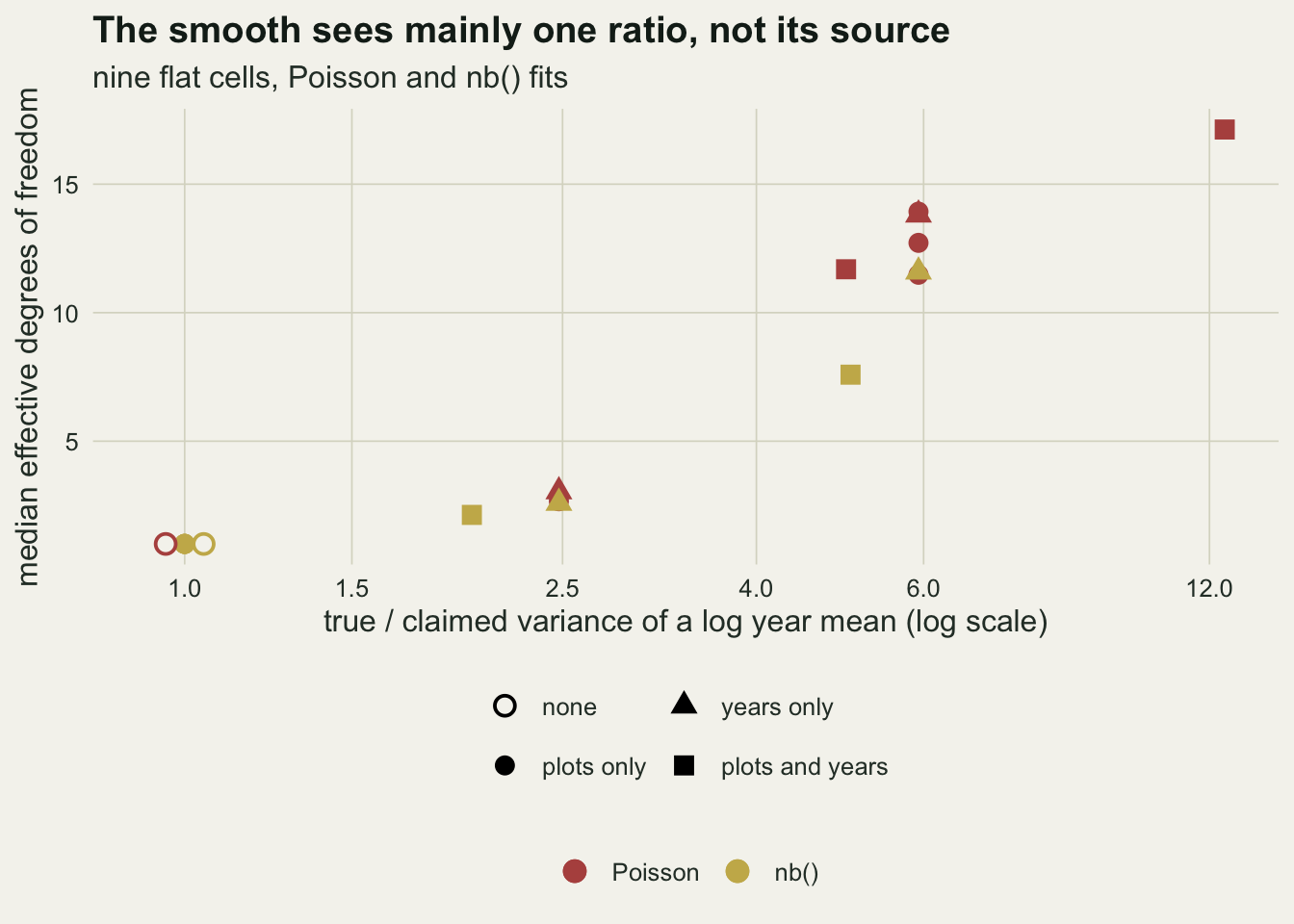
What the year term costs on a real hump
A random effect for year could, in principle, eat a real trend: a hump spread over several years is also a run of year deviations. The hump cell tests that with a true bump of height 0.6 on the log scale centred on year 15, negative binomial size 5 and a year standard deviation of 0.15, over 20 series.
hump_true <- hump(seq_len(n_yr)) - mean(hump(seq_len(n_yr)))
hump_range <- diff(range(hump_true))
hump_turns_true <- count_turns(hump(grid_yr))
hc <- "hump"
se_ratio <- g(hc, "nb_re", "se_s") / g(hc, "nb", "se_s")
hump_curves <- do.call(rbind, lapply(seq_along(sim_out[[10]]), function(j) {
  cv <- sim_out[[10]][[j]]$curves
  do.call(rbind, lapply(c("nb", "nb_re"), function(fn)
    data.frame(rep = j, fit = fn, year = grid_yr, s = cv[, fn])))
}))
truth_grid <- data.frame(year = grid_yr, s = hump(grid_yr) - mean(hump(seq_len(n_yr))))
The true curve spans 0.600 log units over the thirty years and has 1 turning point. nb() alone gives a mean range of 0.721, overshooting it, with 3.4 turning points on average and a median of 6.4 degrees of freedom. With the year effect the range is 0.639, with 2.0 turning points and a median of 4.7 degrees of freedom. The root mean square error against the truth is 0.092 without the year term and 0.089 with it; the Poisson smooth manages 0.132 with 9.2 turning points.
The range flatters the model with the year term. At year 15, where the true curve peaks at 0.423, the fitted smooth averages 0.362 for nb() alone and 0.319 with the year term. The year term did not eat the hump, but its fitted peak falls short of the true height by a fraction of 0.25, against 0.14 for nb() alone. The deviation the model fits for year 15 itself averages only 0.018, so the missing height has not simply moved into that year’s random effect; the lower peak comes with the smoother curve, a median of 4.7 degrees of freedom against 6.4. Its mean range stays near the truth only because the lowest points of its curves sit below the truth’s, at -0.312 on average against -0.177. The root mean square error hardly moves: the model with the year term loses height at the peak and wiggles less elsewhere (2.0 turning points against 3.4).
It does change the interval. The average pointwise standard error of the smooth is 1.16 times as large with the year effect as without, and the simultaneous derivative band finds the real hump in 0.200 of series against 0.700 for nb() alone. That gap is not mostly false alarms removed: in the flat cell with the same year noise the simultaneous band of nb() flagged only 0.050 of series, and that of the model with the year term 0.000. It is detection given up. Thirty years with a year standard deviation of 0.15 hold less information about a hump than a model without the year term claims; the year term keeps a single hump, lowers it, and often cannot certify it. The cost falls on the interval and on the height of the peak.
hump_curves$fit <- factor(fit_lab[hump_curves$fit], levels = fit_lab[2:3])
ggplot(hump_curves, aes(year, s)) +
  geom_line(aes(group = rep, colour = fit), linewidth = 0.45, alpha = 0.7) +
  geom_line(data = truth_grid, colour = te_ink, linewidth = 1.3) +
  facet_wrap(~ fit) +
  scale_colour_manual(values = c(te_gold, te_forest), guide = "none") +
  labs(x = "year", y = "s(year), log scale",
       title = "The year term keeps the hump but lowers its peak",
       subtitle = "thin lines: twenty fitted smooths; thick line: the truth") +
  theme_datasheet() + theme(strip.text = element_text(colour = te_ink, face = "bold"))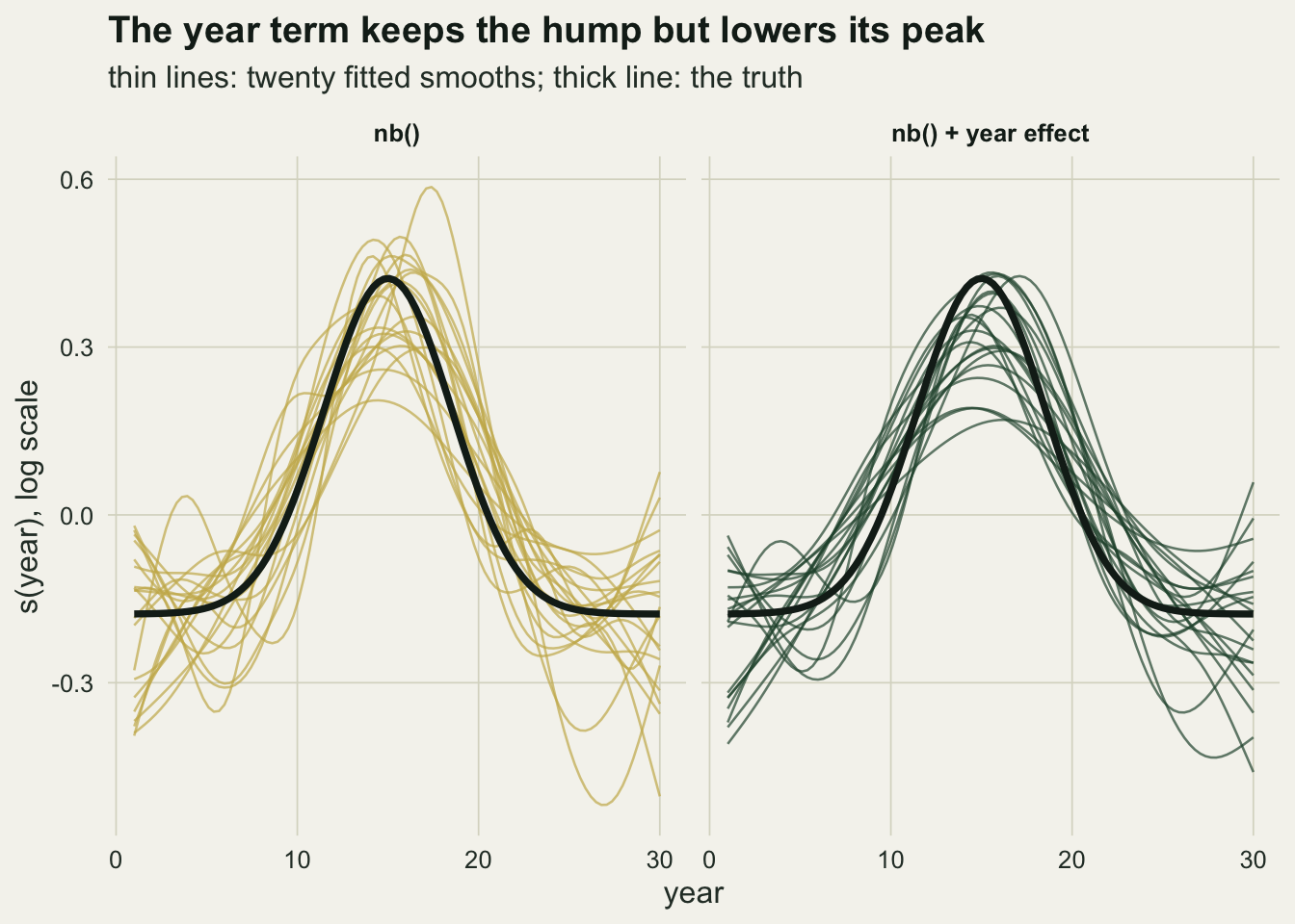
A fixed number of degrees of freedom
Fewster and colleagues (2000) did not let the data choose the smoothness of their farmland bird trends; they fixed it at about three tenths of the series length. The fourth fit does the same with a Poisson regression spline of 9 degrees of freedom. It cannot undersmooth, because there is nothing to select, but its band here, like every band in this post, is built from the Poisson covariance of the fit. In the Poisson control its simultaneous band flags 0.075 of flat series, a reasonable baseline; at size 5 it flags 0.500 and at size 1.5 0.850, and with Poisson plots and the matched year effect 0.925. Fixing the degrees of freedom removes the choice REML gets wrong and keeps the model-based interval the Poisson family gets wrong. Its curve always has nine degrees of freedom of shape, which on a flat truth means 6.3 turning points on average even in the control.
This is not a replay of Fewster and colleagues’ analysis, whose intervals need not come from a Poisson covariance: monitoring indices are often given intervals from a bootstrap that resamples sites instead. Such a bootstrap would see the spread between plots, but not a year effect shared by every plot, which is the same in every resample (see the limits below). For year noise, fixing the degrees of freedom leaves the problem where it was.
What to report
Report the family and the dispersion check, and do not treat a passed check as a clean bill. The Pearson statistic of a Poisson GAM sees spread between plots at full strength and a year effect at one over the number of plots of the weight it carries on a year mean, a fifteenth here, and the smooth absorbs part of that. A formal test on it can still reject, but the repair it then suggests, a family with extra spread, does not remove year noise.
Report the effective degrees of freedom of the trend, and whether a random effect for year was in the model. On a monitoring scheme with the same plots every year, fitting s(year) + s(yearf, bs = "re") is the default this post supports: on flat truths its simultaneous false-change rate was at most 0.075 in every cell (pointwise at most 0.175, in the cell with the largest year effect), and on the hump it kept a single hump but lowered its peak and widened the interval enough to find the hump less often. The model is Knape’s (2016), who used it to separate long-term trends from annual fluctuations in Swedish bird counts.
When a derivative band is the evidence for a change, say whether it is pointwise or simultaneous. At moderate overdispersion the two gave very different rates on the same flat series, and a curve with several turning points can sit inside a simultaneous band that never leaves zero.
State the number of plots, and do not offer it as protection. The excess that spread between plots puts on a year mean is a ratio, and the number of plots cancels from it; for a real year effect the arithmetic says more plots make the ratio larger, not smaller.
Honest limits
Every series here is a balanced design, the same plots every year with no missing counts, one mean for all plots and no plot effects. Real schemes add plot intercepts, plot turnover and missing visits; a plot random effect would take out between-plot differences in level, which is a different thing from the within-year spread nb() uses, and was not simulated.
The mean count is fixed at about 7.4. The quasipoisson family was fitted only to the two example series, where it tracked nb(); whether quasipoisson REML is as safe as nb() when counts are small, where the extended quasi-likelihood approximation is weakest (Ver Hoef and Boveng 2007 compare the two families’ variance functions), was not measured.
The main cells have 40 series and the side cells 20, so rates carry Monte Carlo standard errors of up to 0.08 and 0.11. The plot-count comparison in particular rests on twenty series per cell. The effective degrees of freedom are medians over the same series.
The year effects are independent and normal. Autocorrelated year effects, a cycle, or a drift would be partly real trend and partly noise, and the random effect would then compete with the smooth for them; Checking a generalised additive model is the place to start for that case. The hump is one shape, one height and one year noise level, and the cost of the year term on a smaller or sharper feature could be larger.
The bands condition on the smoothing parameter and use the Bayesian covariance from vcov(). Intervals from a bootstrap that resamples plots were not computed; such a bootstrap would see spread between plots, but a year effect shared by every plot is the same in every resample.
References
Wood SN 2011 Journal of the Royal Statistical Society B 73(1):3-36 (10.1111/j.1467-9868.2010.00749.x)
Fewster RM, Buckland ST, Siriwardena GM, Baillie SR, Wilson JD 2000 Ecology 81(7):1970-1984 (10.1890/0012-9658(2000)081[1970:AOPTFF]2.0.CO;2)
Knape J 2016 Journal of Applied Ecology 53(6):1852-1861 (10.1111/1365-2664.12720)
Ver Hoef JM, Boveng PL 2007 Ecology 88(11):2766-2772 (10.1890/07-0043.1)
Ruppert D, Wand MP, Carroll RJ 2003 Semiparametric Regression (ISBN 978-0-521-78516-7)