library(ggplot2)
library(dplyr)
library(tidyr)

te_ink    <- "#16241d"; te_body   <- "#2c3a31"; te_forest <- "#275139"
te_label  <- "#46604a"; te_sage   <- "#93a87f"; te_paper  <- "#f5f4ee"
te_line   <- "#dad9ca"; te_faint  <- "#5d6b61"; te_gold   <- "#c9b458"
te_rust   <- "#b5534e"

theme_te <- function(base_size = 12) {
  theme_minimal(base_size = base_size) +
    theme(
      panel.grid.minor = element_blank(),
      panel.grid.major = element_line(colour = te_line, linewidth = 0.3),
      plot.background  = element_rect(fill = te_paper, colour = NA),
      panel.background = element_rect(fill = te_paper, colour = NA),
      text        = element_text(colour = te_body),
      plot.title  = element_text(colour = te_ink, face = "bold"),
      axis.title  = element_text(colour = te_label),
      axis.text   = element_text(colour = te_faint),
      strip.text  = element_text(colour = te_ink, face = "bold"),
      legend.text = element_text(colour = te_body)
    )
}

n <- 200; A <- 1; lambda <- n / A; P <- 4   # unit square: area 1, perimeter 4

set.seed(41)
csr <- data.frame(x = runif(n), y = runif(n))

set.seed(42)
n_parent <- 15; sd_off <- 0.03
par_x <- runif(n_parent); par_y <- runif(n_parent)
cx <- numeric(0); cy <- numeric(0)
while (length(cx) < n) {
  k <- sample(n_parent, 1)
  px <- rnorm(1, par_x[k], sd_off); py <- rnorm(1, par_y[k], sd_off)
  if (px >= 0 && px <= 1 && py >= 0 && py <= 1) { cx <- c(cx, px); cy <- c(cy, py) }
}
clustered <- data.frame(x = cx, y = cy)

set.seed(43)
d_min <- 0.038
rx <- numeric(0); ry <- numeric(0)
while (length(rx) < n) {
  px <- runif(1); py <- runif(1)
  if (length(rx) == 0 || min((rx - px)^2 + (ry - py)^2) >= d_min^2) {
    rx <- c(rx, px); ry <- c(ry, py)
  }
}
regular <- data.frame(x = rx, y = ry)

patterns <- list(CSR = csr, Clustered = clustered, Regular = regular)
Nearest-neighbour analysis and Clark-Evans in R
R
spatial
point patterns
ecology tutorial
Measure nearest-neighbour distances in base R: the Clark-Evans index with edge correction, plus the G and F distance functions for aggregation and spacing.
Quadrat counts throw away the coordinates you worked to collect. The moment you lay a grid over a map, two points in the same cell look identical to two points at opposite corners of it. Distance methods keep the coordinates and ask a sharper question: how far is each point from its nearest neighbour, and is that distance shorter or longer than complete spatial randomness would produce?
This is the idea behind the oldest distance statistic in ecology, the Clark-Evans index, first published in 1954. It compares the average nearest-neighbour distance you observe against the average you would expect under CSR. Short observed distances mean points sit closer together than chance allows, the signature of clustering. Long observed distances mean points avoid one another, the signature of regularity. This post builds the index from scratch, handles the edge effect that trips it up, and then generalises from a single average to the full distribution of distances through the G and F functions.
The three patterns again
We reuse the random, clustered and regular patterns from the quadrat post, generated with the same seeds so the two tutorials describe the same maps.
Nearest-neighbour distances and the Clark-Evans index
For each point we find the distance to its closest neighbour. A full distance matrix with the diagonal set to infinity, then a row-wise minimum, does the job for a pattern of this size.
nn_dist <- function(p) {
  D <- as.matrix(dist(p)); diag(D) <- Inf
  apply(D, 1, min)
}
Under CSR the mean nearest-neighbour distance has a known value, one over twice the square root of the intensity, where the intensity is the number of points per unit area. The Clark-Evans index is the observed mean divided by this expected value. An index of one is consistent with randomness, below one indicates clustering, and above one indicates regularity, rising towards about 2.15 for a perfectly hexagonal lattice.
Left alone, the index has a well-known bias. A point near the boundary may have its true nearest neighbour just outside the window, where it goes unrecorded, so the measured distance is to a point farther inside and the average is pushed upward. Donnelly’s correction accounts for this by adding a boundary term, built from the perimeter, to the expected distance. We report both the naive index and the edge-corrected one, along with the standard Clark-Evans z-test.
clark_evans <- function(p) {
  nn   <- nn_dist(p)
  rbar <- mean(nn)
  e_naive <- 1 / (2 * sqrt(lambda))
  e_don   <- 0.5 * sqrt(A / n) + (0.0514 + 0.041 / sqrt(n)) * P / n
  se <- 0.26136 / sqrt(n * lambda)
  z  <- (rbar - e_naive) / se
  data.frame(
    mean_nn   = rbar,
    R_naive   = rbar / e_naive,
    R_donnelly = rbar / e_don,
    z = z,
    p = 2 * pnorm(-abs(z))
  )
}

ce <- bind_rows(lapply(patterns, clark_evans), .id = "pattern")
ce
pattern mean_nn R_naive R_donnelly z p
1 CSR 0.03509691 0.9926906 0.9631075 -0.1977555 8.432364e-01
2 Clustered 0.01509247 0.4268795 0.4141581 -15.5057154 3.173620e-54
3 Regular 0.05048633 1.4279691 1.3854144 11.5786607 5.286549e-31The expected nearest-neighbour distance under CSR is 0.03536 without the correction and 0.03644 with it, and the standard error is about 0.0013. Against those, the random pattern gives an index of 0.99, a z of -0.2 and a p-value of 0.84, so it reads as random. The clustered pattern gives an index of 0.43 and a z of -15.5: its points sit at less than half the expected spacing. The regular pattern gives an index of 1.43 and a z of 11.6, its points spaced well beyond chance. The edge correction nudges each index down slightly, most visibly for the two extreme patterns, but it leaves every conclusion intact. It matters most when a large share of the points sit near the boundary.
From one number to a whole curve
A single average hides a lot. Two patterns can share the same mean nearest-neighbour distance while differing completely in how those distances are spread. The G function keeps the whole distribution: it is the cumulative proportion of points whose nearest neighbour lies within distance r. Under CSR it has a closed form, one minus an exponential in the squared distance.
Edge effects return here, and the simplest honest fix is the border, or reduced-sample, estimator. At each distance r we only count points that sit at least r from the boundary, because only for those points is the nearest neighbour guaranteed to be observable within the window.
b_dist <- function(p) pmin(p$x, 1 - p$x, p$y, 1 - p$y)   # distance to boundary

G_hat <- function(p, r) {
  nn <- nn_dist(p); bd <- b_dist(p)
  sapply(r, function(rr) {
    keep <- bd >= rr
    if (!any(keep)) NA else mean(nn[keep] <= rr)
  })
}
The G function has a companion that looks at the same window from the opposite direction. Instead of measuring from each point to its nearest neighbour, the F function, or empty-space function, measures from a grid of arbitrary test locations to the nearest point. It describes how far you typically have to travel through empty space before you hit an event. Under CSR it shares the same closed form as G.
set.seed(441)
m_grid <- 40
gx <- rep(seq(0.5 / m_grid, 1 - 0.5 / m_grid, length.out = m_grid), times = m_grid)
gy <- rep(seq(0.5 / m_grid, 1 - 0.5 / m_grid, length.out = m_grid), each  = m_grid)

F_hat <- function(p, r) {
  E <- as.matrix(p[, c("x", "y")])
  d_test <- sapply(seq_along(gx),
                   function(i) sqrt(min((E[, 1] - gx[i])^2 + (E[, 2] - gy[i])^2)))
  bd <- pmin(gx, 1 - gx, gy, 1 - gy)
  sapply(r, function(rr) mean(d_test[bd >= rr] <= rr))
}
Clustering and regularity leave opposite marks on the two functions, and reading them together is more informative than either alone. Evaluated at a distance of 0.05, where the CSR value of both functions is 0.79, the contrast is stark.
gf_summary <- data.frame(
  pattern    = names(patterns),
  G_at_0.05  = sapply(patterns, function(p) G_hat(p, 0.05)),
  F_at_0.05  = sapply(patterns, function(p) F_hat(p, 0.05)),
  CSR_value  = 1 - exp(-lambda * pi * 0.05^2)
)
gf_summary
pattern G_at_0.05 F_at_0.05 CSR_value
CSR CSR 0.8035714 0.8040123 0.7921204
Clustered Clustered 0.9811321 0.3371914 0.7921204
Regular Regular 0.6322581 0.8865741 0.7921204The random pattern sits close to the CSR value on both functions, at 0.80 for G and 0.80 for F. The clustered pattern splits them apart: G climbs to 0.98 because almost every point has a close neighbour, while F drops to 0.34 because the large gaps between clumps mean empty space is often far from any point. The regular pattern reverses the split: G falls to 0.63 because inhibition removes the very closest neighbours, while F rises to 0.89 because the even spacing leaves no large voids to cross. Aggregation raises G and lowers F; spacing lowers G and raises F.
Plotting the full curves against the CSR reference makes the whole story visible at once rather than at a single distance.
r_seq <- seq(0, 0.10, by = 0.004)
theo  <- data.frame(r = r_seq, val = 1 - exp(-lambda * pi * r_seq^2))

curve_df <- function(fun, label) {
  do.call(rbind, lapply(names(patterns), function(nm)
    data.frame(pattern = nm, r = r_seq, val = fun(patterns[[nm]], r_seq), fn = label)))
}
dat <- rbind(curve_df(G_hat, "G(r)"), curve_df(F_hat, "F(r)"))
dat$pattern <- factor(dat$pattern, levels = c("CSR", "Clustered", "Regular"))
dat$fn <- factor(dat$fn, levels = c("G(r)", "F(r)"))
ref <- rbind(cbind(theo, fn = "G(r)"), cbind(theo, fn = "F(r)"))
ref$fn <- factor(ref$fn, levels = c("G(r)", "F(r)"))

ggplot(dat, aes(r, val, colour = pattern)) +
  geom_line(data = ref, aes(r, val), inherit.aes = FALSE,
            colour = te_faint, linetype = "dashed", linewidth = 0.5) +
  geom_line(linewidth = 0.9) +
  facet_wrap(~ fn) +
  scale_colour_manual(values = c(CSR = te_faint, Clustered = te_rust, Regular = te_forest)) +
  labs(x = "distance r", y = NULL, colour = NULL) +
  theme_te() + theme(legend.position = "bottom")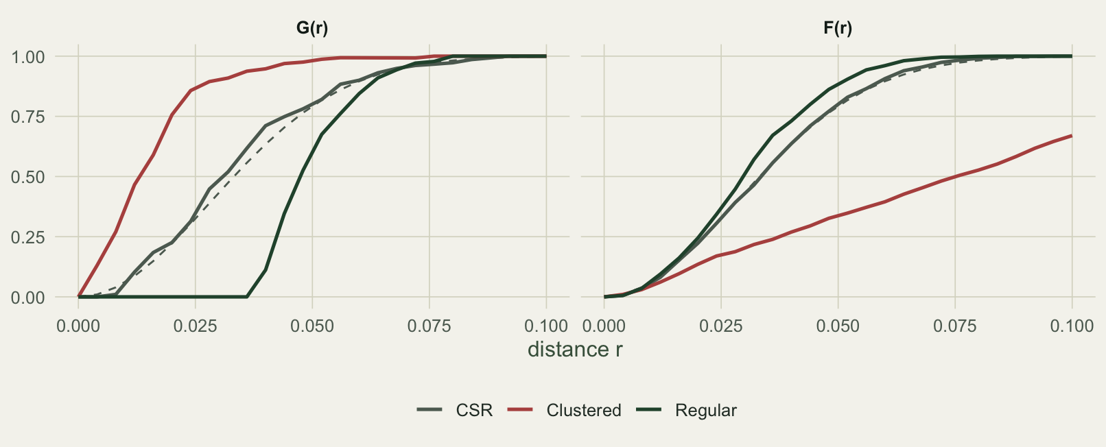
What nearest neighbours miss
Nearest-neighbour methods are a large step up from quadrats, but they still look at only one distance per point: the very nearest. That makes them sensitive to the finest scale of the pattern and largely blind to what happens beyond it. A pattern can be regular at short range because of a hard minimum spacing, yet clustered at a larger scale because the well-spaced points themselves fall into patches. The G function, driven by the single closest neighbour, will report the short-range regularity and say nothing about the larger-scale clumping.
The fix is to count neighbours out to every distance at once, not just the closest. That is Ripley’s K function, which the next post builds from scratch, together with the edge corrections and simulation envelopes that make it trustworthy.
References
Clark, P.J. and Evans, F.C. (1954) Ecology 35(4): 445-453. doi:10.2307/1931034
Ripley, B.D. (1977) Journal of the Royal Statistical Society Series B 39(2): 172-192. doi:10.1111/j.2517-6161.1977.tb01615.x
Wiegand, T. and Moloney, K.A. (2014) Handbook of Spatial Point-Pattern Analysis in Ecology. Chapman and Hall/CRC. ISBN 978-1-4200-8254-8
Diggle, P.J. (2013) Statistical Analysis of Spatial and Spatio-Temporal Point Patterns, 3rd edition. Chapman and Hall/CRC. ISBN 978-1-4665-6023-9