library(ggplot2)

te_paper  <- "#f5f4ee"
te_ink    <- "#16241d"
te_body   <- "#2c3a31"
te_forest <- "#275139"
te_rust   <- "#b5534e"
te_gold   <- "#c9b458"
te_line   <- "#dad9ca"

theme_datasheet <- function() {
  theme_minimal(base_size = 12) +
    theme(plot.background  = element_rect(fill = te_paper, colour = NA),
          panel.background = element_rect(fill = te_paper, colour = NA),
          panel.grid.major = element_line(colour = te_line, linewidth = 0.3),
          panel.grid.minor = element_blank(),
          text             = element_text(colour = te_body),
          plot.title       = element_text(colour = te_ink, face = "bold"),
          plot.subtitle    = element_text(colour = te_body),
          axis.text        = element_text(colour = te_body))
}

n_sp <- 16; n_fun <- 8; n_plot <- 400
pct_ref <- 95; n_top <- 5
fun_name <- c("biomass", "root mass", "soil carbon", "N retention",
"decomposition", "infiltration", "pollinators", "P available")Ecosystem multifunctionality and its threshold
R
biodiversity
ecosystem function
community ecology
ecology tutorial
The multifunctionality slope depends on the threshold you picked. Sweeping every threshold in R shows the whole curve, and why the averaging metric hides it.
A grassland experiment sows four hundred plots from a pool of sixteen species, from monocultures up to the full mixture, and measures eight things in each plot: above ground biomass, root mass, soil carbon, nitrogen retention, litter decomposition, water infiltration, pollinator visits and available phosphorus. Nobody planted the experiment to answer a question about biomass. The question is whether a species rich plot does more jobs at once than a species poor one.
That question needs a single number per plot, and there are two families of them in common use. The averaging metric standardises each function to a common scale and takes their mean; Maestre et al. 2012 used it across global drylands and it is still the default in large observational studies. The threshold metric picks a threshold, counts how many of the eight functions clear it in each plot, and regresses that count on richness. The second is more popular because it sounds like it is measuring something the first cannot: not how high the functions are on average, but how many of them are simultaneously doing well.
The trouble is the threshold. A paper reports that each extra species buys a fraction of a function more above a threshold set at half of the maximum, and the reader takes that fraction as a property of the grassland. It is not. Run the same four hundred plots through the same metric at every threshold from five per cent of the maximum to ninety five per cent and the slope traces a curve that starts at zero, climbs to a peak and collapses again. Any single published slope is one point on that curve, chosen by somebody.
This post builds that curve in R from a simulated experiment where the truth is known, shows that the averaging metric’s slope is an algebraic identity rather than a measurement, measures how far the peak of the threshold curve moves when the standardisation changes, and asks what the curve does when the data contain no diversity effect at all. It is the multi function question, so it sits on top of two earlier posts rather than beside them: the biodiversity and ecosystem function post measures one function against its monoculture references, and the partitioning post splits that single function effect into complementarity and selection. Neither of them has more than one response variable, and everything below only starts to matter once there are several.
Eight functions, four hundred plots
The multifunctionality question entered this literature with Hector and Bagchi 2007, who reported that the set of species needed to sustain several processes at once is larger than the set needed for any one of them, and Gamfeldt et al. 2008 gave a conditional version: where species complement each other across several functions, the number of species needed rises with the number of functions asked for. The condition is easy to drop in the retelling, and dropping it turns a statement about complementarity into a law about diversity. Both results are statements about a count of functions, and both are read through one of the two metrics above, so how those metrics behave is not a side issue.
The generating model is deliberately plain. Each species carries its own contribution to each function; a plot’s raw value for a function is the mean contribution of the species present, plus a complementarity term that grows linearly with richness, plus noise. The complementarity rate differs between functions, so the eight functions genuinely respond to richness at eight different strengths, and every one of them responds positively. There is no threshold anywhere in the generating process.
set.seed(414)
contrib   <- matrix(rlnorm(n_sp * n_fun, log(1), 0.26), n_sp, n_fun)
comp_rate <- runif(n_fun, 0.009, 0.032)
noise_sd  <- runif(n_fun, 0.05, 0.09)

make_plots <- function(rates, sat = FALSE, rho = 0) {
  kk  <- sample(seq_len(n_sp), n_plot, replace = TRUE)
  mat <- matrix(0, n_plot, n_fun)
  for (i in seq_len(n_plot)) {
    who  <- sample(seq_len(n_sp), kk[i])
    lift <- if (sat) rates * (n_sp - 1) * log(kk[i]) / log(n_sp)
            else rates * (kk[i] - 1)
    eps  <- rnorm(n_fun, 0, noise_sd)
    if (rho > 0)
      eps <- noise_sd * (sqrt(rho) * rnorm(1) + sqrt(1 - rho) * rnorm(n_fun))
    mat[i, ] <- colMeans(contrib[who, , drop = FALSE]) + lift + eps
  }
  list(k = kk, raw = mat)
}

main <- make_plots(comp_rate)
rich <- main$k; fun_raw <- main$raw
standardise <- function(mat, ref_vec) sweep(mat, 2, ref_vec, "/")
ols_slope   <- function(y, x) unname(coef(lm(y ~ x))[2])
ref_max <- apply(fun_raw, 2, max)
z_max   <- standardise(fun_raw, ref_max)
z_lo    <- min(z_max); n_mono <- sum(rich == 1)
Standardising each function by its own observed maximum puts every plot on a zero to one scale, and the lowest standardised value anywhere in the experiment is 0.291. That number matters later: no threshold below it can ever fail a plot. 31 of the 400 plots are monocultures.
The averaging metric’s slope is an identity
The averaging metric takes the row mean of the standardised functions and regresses it on richness. Its slope is not a measurement of anything the individual regressions did not already contain, and the reason is one line of algebra.
The least squares slope of y on x is cov(x, y) / var(x). Covariance is linear in its second argument, so for the row mean of eight functions, cov(x, mean_f z_f) = (1/8) sum_f cov(x, z_f). Every function is regressed on the same richness column, so the denominator var(x) is the same in all eight fits. Dividing through, the slope of the average is exactly the average of the slopes. The result is not special to eight functions or to simple regression: it holds for any linear model in which all responses share a design matrix, including one with blocks and covariates in it.
slope_ind <- apply(z_max, 2, ols_slope, x = rich)
slope_avg <- ols_slope(rowMeans(z_max), rich)
gap_ident <- slope_avg - mean(slope_ind); tol_ident <- .Machine$double.eps
ratio_med <- slope_avg / median(slope_ind)
mean_raw  <- mean(apply(fun_raw, 2, ols_slope, x = rich))

set.seed(3131)
lop       <- make_plots(c(rep(0.002, n_fun - 1), 0.05))
z_lop     <- standardise(lop$raw, apply(lop$raw, 2, max))
ind_lop   <- apply(z_lop, 2, ols_slope, x = lop$k)
avg_lop   <- ols_slope(rowMeans(z_lop), lop$k)
n_below   <- sum(ind_lop < avg_lop); ratio_lop <- avg_lop / median(ind_lop)

z_gap <- z_max
z_gap[rich >= 9, which.min(colMeans(z_max))] <- NA
ind_gap <- apply(z_gap, 2, function(v) ols_slope(v[!is.na(v)], rich[!is.na(v)]))
gap_na  <- ols_slope(rowMeans(z_gap, na.rm = TRUE), rich) - mean(ind_gap)

set.seed(77)
wt_fun <- runif(n_fun, 0.5, 1.5); wt_fun <- wt_fun / sum(wt_fun)
gap_wt <- ols_slope(as.vector(z_max %*% wt_fun), rich) - mean(slope_ind)

slope_worst <- ols_slope(apply(z_max, 1, min), rich)
ratio_worst <- slope_worst / slope_avg; pct_worst <- 100 * (ratio_worst - 1)

set.seed(818); n_ratio <- 500
rep_ratio <- replicate(n_ratio, {
  g  <- make_plots(comp_rate)
  zz <- standardise(g$raw, apply(g$raw, 2, max))
  ols_slope(apply(zz, 1, min), g$k) / ols_slope(rowMeans(zz), g$k)
})
ratio_mn <- mean(rep_ratio)
ratio_ci <- unname(quantile(rep_ratio, c(0.025, 0.975)))
The eight individual slopes run from 0.0081 to 0.0177 standardised units per species. The averaging metric returns 0.0124, and the mean of the eight is the same number, down to floating-point rounding. That is not a close agreement, it is the same arithmetic done twice.
So the averaged slope is the arithmetic mean of the individual slopes. That puts it between the smallest and the largest, but nothing in the algebra puts it near their centre. Here it lands close to the median, 1.01 times it, because the eight complementarity rates were drawn from one narrow interval. Draw them differently and the tidy picture goes: with seven functions responding weakly and one strongly, the same identity returns 0.0043 per species, above 7 of the eight individual slopes and 3.0 times their median. It is not conservative, it is not a lower bound, and it cannot be described as the effect on the functions that respond least. Reporting it alongside the individual slopes adds no information; reporting it instead of them removes seven numbers and keeps one that could have been computed from them on paper. Two conditions carry the identity and neither is usually stated. The functions have to be complete. Take the lowest scoring function out of the plots of nine species or more, as an unmeasured variable in a real dataset would be, and average the rest with na.rm = TRUE: the row mean stops being a fixed linear combination of the same eight columns, and the two sides part by 0.0023 against an averaged slope of 0.0124. The weights have to be equal. Give the functions unequal weights, as anybody who thinks one function matters more will want to, and the slope of the weighted mean is the weighted mean of the slopes, so the plain average of the eight misses it by 0.0001.
That is also why the metric feels safe and why it cannot answer the question the field asks it. A plot in which one function collapses and another compensates scores the same as a plot where both sit at the middle. Regressing the worst function in each plot on richness, which is not a linear operation and so is not covered by the identity, gives 0.0157 per species here, 1.27 times the averaged slope: in this draw richness lifts the floor faster than it lifts the mean, by 27 per cent. One experiment does not fix that figure. Repeating the design 500 times with the same species pool puts the ratio at 1.18 on average, with a 95 per cent interval from 0.99 to 1.49: the direction holds in most draws, the lower end of the interval reaches parity, and the per cent gap is not a number to quote from one experiment. That is still the friendly case, built so that every function responds positively. Where some functions trade off against each other, the gap between the floor and the mean is the whole result, and only one of the two is on the page.
slope_tab <- data.frame(fn = factor(fun_name, levels = fun_name[order(slope_ind)]),
                        slope = slope_ind)
ggplot(slope_tab, aes(slope, fn)) +
  geom_vline(xintercept = slope_avg, colour = te_rust,
             linetype = "dashed", linewidth = 0.8) +
  geom_point(size = 3, colour = te_forest) +
  scale_x_continuous(expand = expansion(mult = 0.10)) +
  labs(x = "slope per species", y = NULL,
       title = "Eight slopes and their mean",
       subtitle = "dashed: the averaging metric, which is that mean") +
  theme_datasheet()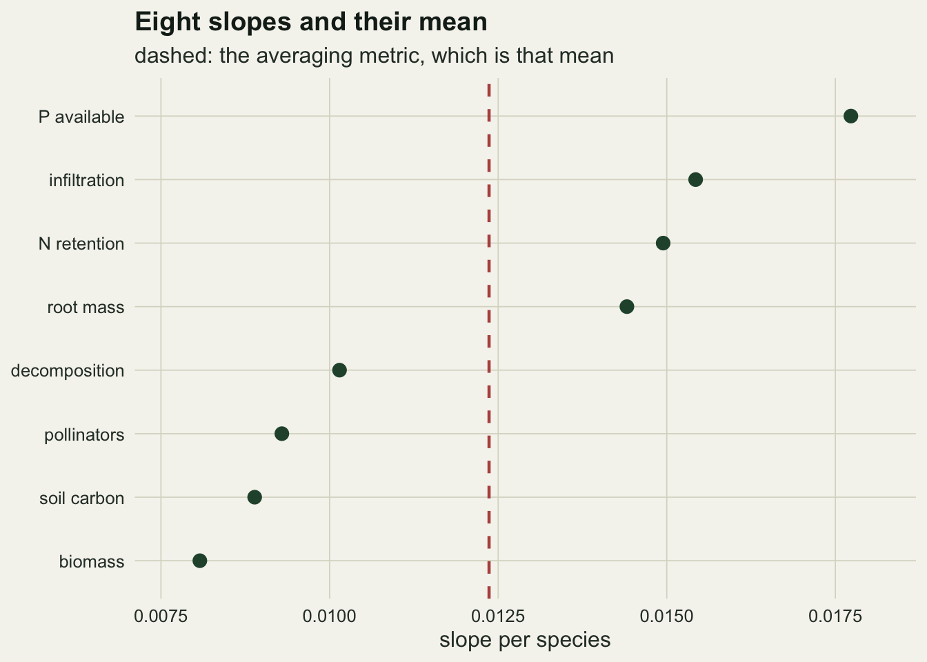
The threshold metric turns the same data into a curve
The threshold version comes from Gamfeldt et al. 2008; Zavaleta et al. 2010 applied it to grassland and read it at several thresholds rather than one. Byrnes et al. 2014 then compared four multifunctionality approaches, found the single threshold version the weakest of them, and formalised the sweep across all thresholds that the rest of this post runs. It replaces the mean with a count: how many of the eight functions in a plot exceed a threshold T times their standardising reference. The count is then regressed on richness, and the slope has an appealing unit, functions gained per species added.
thr_grid <- seq(5, 95, by = 1) / 100
thr_lo <- 0.10; thr_hi <- 0.95; thr_demo <- 0.50

count_above <- function(zmat, tt) rowSums(zmat > tt)
sweep_slopes <- function(zmat, x, grid)
  vapply(grid, function(tt) ols_slope(count_above(zmat, tt), x), 0)
at_thr <- function(v, tt) v[which.min(abs(thr_grid - tt))]

slope_max <- sweep_slopes(z_max, rich, thr_grid)
mean_cnt  <- vapply(thr_grid, function(tt) mean(count_above(z_max, tt)), 0)

peak_i   <- which.max(slope_max)
thr_pk   <- thr_grid[peak_i]; slope_pk <- slope_max[peak_i]
slope_lo <- at_thr(slope_max, thr_lo); slope_hi <- at_thr(slope_max, thr_hi)
cnt_lo   <- at_thr(mean_cnt, thr_lo);  cnt_hi   <- at_thr(mean_cnt, thr_hi)
thr_half <- range(thr_grid[slope_max > slope_pk / 2])
se_hi    <- summary(lm(count_above(z_max, thr_hi) ~ rich))$coefficients[2, 2]
t_hi     <- slope_hi / se_hi
At a threshold of 0.10 the slope is 0.0000, and it could not have been anything else: the smallest standardised value in the whole experiment is 0.291, so every plot clears every function and the response is the same number, 8.0, in all 400 plots. With no variance in the response there is nothing for richness to explain.
k_split  <- 4
pass_hi  <- count_above(z_max, thr_hi)
cnt_poor <- pass_hi[rich <= k_split]
cnt_rich <- pass_hi[rich >= n_sp - k_split]
m_poor   <- mean(cnt_poor); se_poor <- sd(cnt_poor) / sqrt(length(cnt_poor))
m_rich   <- mean(cnt_rich); se_rich <- sd(cnt_rich) / sqrt(length(cnt_rich))
se_diff  <- sqrt(se_poor^2 + se_rich^2); cell_ok <- sum(pass_hi)
p_welch  <- t.test(cnt_poor, cnt_rich)$p.value
cls_mean <- tapply(pass_hi, cut(rich, c(0, 1, 4, 8, 12, n_sp)), mean)

hi_draw <- function(tt) {
  g   <- make_plots(comp_rate)
  zz  <- standardise(g$raw, apply(g$raw, 2, max))
  fit <- summary(lm(count_above(zz, tt) ~ g$k))$coefficients
  c(fit[2, 1], fit[2, 1] / fit[2, 2])
}

set.seed(1401)
n_hi    <- 800; n_probe <- 300; thr_probe <- c(0.90, 0.98)
rep_hi  <- replicate(n_hi, hi_draw(thr_hi))
mean_hi <- mean(rep_hi[1, ]); mcse_hi <- sd(rep_hi[1, ]) / sqrt(n_hi)
p_neg   <- mean(rep_hi[1, ] < 0); q_draw <- mean(rep_hi[1, ] < slope_hi)
p_tneg  <- mean(rep_hi[2, ] < -1.96); p_tpos <- mean(rep_hi[2, ] > 1.96)
probe_tab <- vapply(thr_probe, function(tt) {
  rr <- replicate(n_probe, hi_draw(tt))
  c(mean(rr[1, ]), mean(rr[1, ] < 0))
}, c(0, 0))
At 0.95 the mean count has fallen to 0.09 functions per plot, which is 37 passing cells in the whole table of 3200. The fitted slope is -0.0087 with a standard error of 0.0041, a t of -2.15, and it is tempting to read the minus sign. It does not survive replication. Redrawing the plot composition and the noise 800 times, holding the species pool and the complementarity rates fixed, puts the expected slope at this threshold at -0.00036 with a Monte Carlo standard error of 0.00025, which is within a couple of standard errors of zero and a small fraction of what this draw produced. The sign comes out negative in 0.57 of replicates, the t statistic falls below minus 1.96 in 0.19 of them and above plus 1.96 in 0.14, and the draw above sits at the 0.10 quantile of that distribution. A negative slope here is a coin toss with a wide coin.
The contrast that seems to explain it is no firmer. Plots of 4 species or fewer average 0.212 functions above the line (standard error 0.061) against 0.109 (standard error 0.027) for plots of 12 or more, a difference of 0.103 with a standard error of 0.067 and a Welch p of 0.12. Nor is the pattern monotone: the class means from monocultures upwards run 0.581, 0.055, 0.012, 0.000, 0.140, which is a spike at the monocultures and a rise again at the top, not a gradient. A straight line through that is unstable by construction, and higher up the range the picture is different again: the expected slope is +0.041 at a threshold of 0.90, negative in 0.013 of replicates, and -0.0043 at 0.98, negative in 0.90. The sign flips somewhere in between, and where it flips is not a property of the grassland. Between the two dead ends the slope has to rise and fall, and here it peaks at 0.345 functions per species at a threshold of 0.72. It is not a narrow spike: the slope stays above half its maximum from 0.55 to 0.82.
set.seed(707)
zero_rate  <- rep(0, n_fun); null_dat <- make_plots(zero_rate)
z_null     <- standardise(null_dat$raw, apply(null_dat$raw, 2, max))
slope_null <- sweep_slopes(z_null, null_dat$k, thr_grid)
null_pk    <- max(slope_null); thr_null_pk <- thr_grid[which.max(slope_null)]
null_tr    <- min(slope_null); thr_null_tr <- thr_grid[which.min(slope_null)]
avg_null   <- ols_slope(rowMeans(z_null), null_dat$k)

set.seed(31); n_null <- 100
rep_null <- replicate(n_null, {
  g <- make_plots(zero_rate)
  s <- sweep_slopes(standardise(g$raw, apply(g$raw, 2, max)), g$k, thr_grid)
  c(max(s), min(s))
})
frac_pk <- sum(rep_null[1, ] > 0); frac_tr <- sum(rep_null[2, ] < 0)
The mechanism that a single high threshold slope is too weak to show is real, and it is visible once the complementarity is switched off. Generate the same 400 plots with every complementarity rate set to zero, so that no function responds to richness at all, and sweep again. The averaging metric returns 0.0003 per species, which is the right answer. The threshold curve does not: it peaks at 0.103 functions per species at a threshold of 0.56 and reaches -0.109 at 0.71. Across 100 replicates of that null the peak came out positive in 100 of them and the trough negative in 100.
Nothing produced those numbers except the spread of small mixtures. A two species plot averages two draws from the species pool, a fourteen species plot averages fourteen, so the poor plot has the wider distribution of function values and more often puts a function below a low threshold or above a high one. The count metric reads that as a richness effect, positive at the low end and negative at the high end, out of data in which richness does nothing. That is the sampling effect a single threshold cannot separate from complementarity, and it is why the tails of the curve are not evidence. The same geometry produces the hump in between: a threshold has power only where plots are still crossing it, so the peak sits where the richness gradient carries the largest number of function values across the line, which is a fact about the position of the eight distributions rather than about the community.
show_thr <- c(thr_lo, thr_pk, thr_hi); lab_thr <- sprintf("threshold %.2f", show_thr)
cnt_dat <- do.call(rbind, lapply(seq_along(show_thr), function(j)
  data.frame(rich = rich, cnt = count_above(z_max, show_thr[j]),
             lab = factor(lab_thr[j], levels = lab_thr))))

ggplot(cnt_dat, aes(rich, cnt)) +
  geom_jitter(width = 0.25, height = 0.12, colour = te_forest,
              alpha = 0.3, size = 0.9) +
  geom_smooth(method = "lm", formula = y ~ x, se = FALSE,
              colour = te_rust, linewidth = 0.9) +
  facet_wrap(~ lab, nrow = 1) +
  scale_y_continuous(limits = c(-0.4, 8.4), breaks = seq(0, 8, 2)) +
  labs(x = "species richness", y = "functions above the threshold",
       title = sprintf("The same %d plots, read three ways", n_plot),
       subtitle = "flat, steep, flat") +
  theme_datasheet()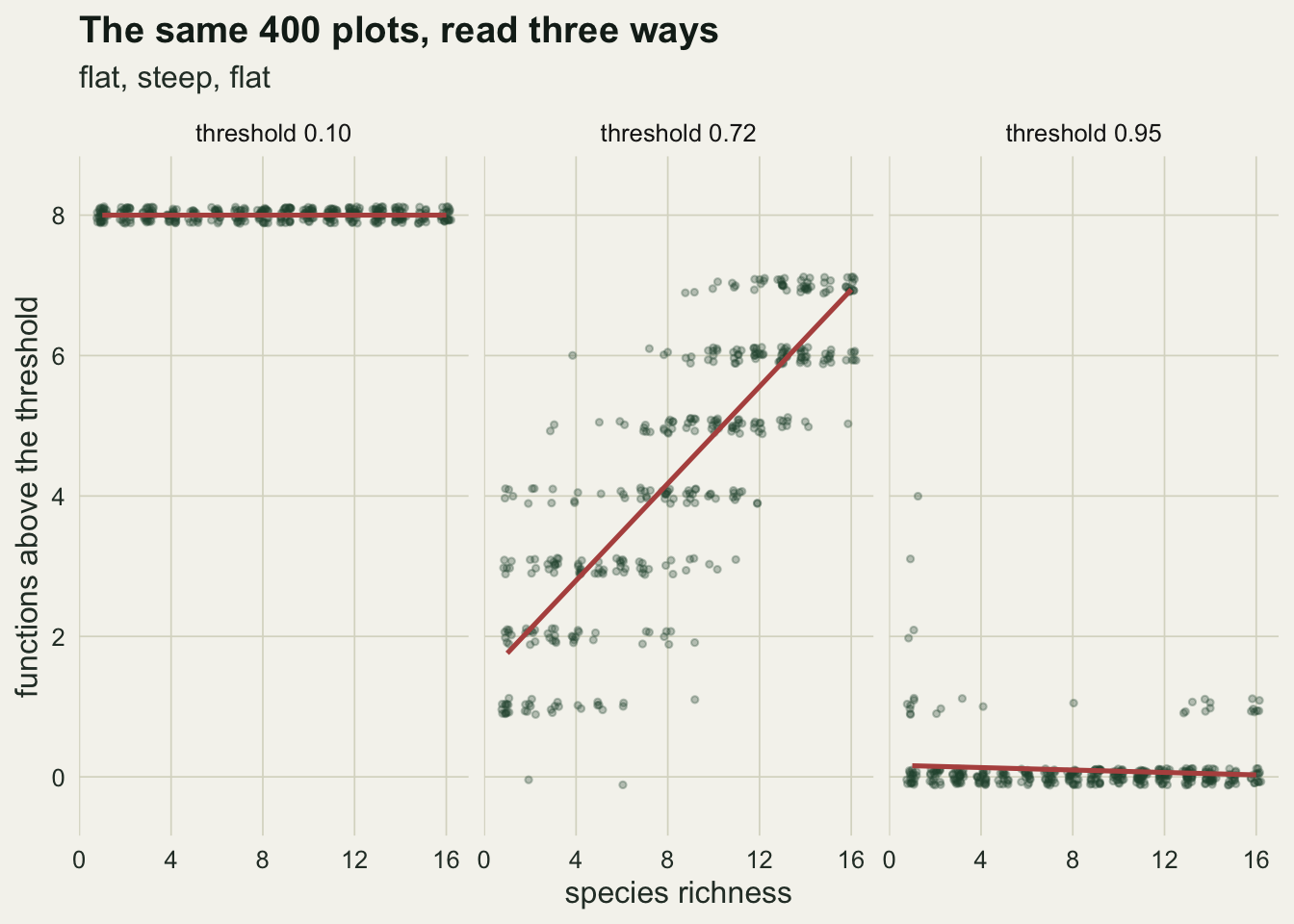
The count slope is a sum of eight indicator slopes
ind_slope <- vapply(seq_len(n_fun),
                    function(j) ols_slope(as.numeric(z_max[, j] > thr_pk), rich), 0)
gap_sum   <- sum(ind_slope) - slope_pk

set.seed(515)
flat_fun  <- 1 + rnorm(n_plot, 0, mean(noise_sd))
z_nine    <- cbind(z_max, flat_fun / max(flat_fun))
flat_own  <- ols_slope(z_nine[, n_fun + 1], rich)
ind_nine  <- ols_slope(as.numeric(z_nine[, n_fun + 1] > thr_pk), rich)
cnt_nine  <- ols_slope(count_above(z_nine, thr_pk), rich)
avg_nine  <- ols_slope(rowMeans(z_nine), rich)
prp_eight <- ols_slope(count_above(z_max,  thr_pk) / n_fun, rich)
prp_nine  <- ols_slope(count_above(z_nine, thr_pk) / (n_fun + 1), rich)

z_seven   <- z_max[, -which.max(slope_ind)]
cnt_seven <- ols_slope(count_above(z_seven, thr_pk), rich)
avg_seven <- ols_slope(rowMeans(z_seven), rich)
pct_seven <- 100 * (cnt_seven / slope_pk - 1)
The threshold metric’s response is a sum of eight zero or one indicators, so its slope is the sum of the eight indicator slopes, exactly: at the peak threshold of 0.72 the individual indicators contribute from -0.0006 to 0.0646 and their sum equals the fitted count slope to within floating-point rounding. That single fact settles what happens when the panel of functions changes, and it settles it differently from the averaging metric.
Add a ninth function that is flat in richness, with a slope of its own of 0.0011, and the count slope goes from 0.3453 to 0.3444. The move is exactly the ninth indicator’s own slope, -0.0009, which is what a term that does not respond to richness contributes to a sum. The averaging metric behaves the other way: the ninth term is one ninth of the new mean, so the averaged slope falls from 0.0124 to 0.0111. Divide the count by the number of functions and report the proportion passing, and the dilution comes back, 0.0432 against 0.0383, which is worth knowing before comparing studies that measured different numbers of functions. Dropping a function that does respond is the case that bites either way. Take out the function with the steepest standardised slope and the count slope falls from 0.3453 to 0.2807, 19 per cent lower, while the averaged slope falls from 0.0124 to 0.0116. Both metrics move down, so a panel of functions assembled from what a laboratory happened to measure sets the size of the published effect before any ecology enters.
set.seed(1212)
n_rho <- 40; thr_var <- 0.70; rho_set <- c(0, 0.75, 0.98)
rho_tab <- vapply(rho_set, function(rr) {
  out <- replicate(n_rho, {
    g  <- make_plots(comp_rate, rho = rr)
    zz <- standardise(g$raw, apply(g$raw, 2, max))
    s  <- sweep_slopes(zz, g$k, thr_grid)
    c(var(count_above(zz, thr_var)), max(s))
  })
  c(mean(out[1, ]), mean(out[2, ]))
}, c(0, 0))

n_sat <- 150
sat_tab <- vapply(c(FALSE, TRUE), function(ss) {
  set.seed(4242); out <- replicate(n_sat, {
    g <- make_plots(comp_rate, sat = ss)
    s <- sweep_slopes(standardise(g$raw, apply(g$raw, 2, max)), g$k, thr_grid)
    c(thr_grid[which.max(s)], max(s))
  })
  c(mean(out[1, ]), mean(out[2, ]), sd(out[2, ]) / sqrt(n_sat))
}, c(0, 0, 0))
sat_drop <- 100 * (1 - sat_tab[2, 2] / sat_tab[2, 1])
Two perturbations of the generating model follow from the same decomposition, and both were run as replicated experiments rather than asserted. Correlate the functions, so that the residual of one carries part of the residual of another, and the count becomes more variable, not less: at a threshold of 0.70 its variance goes from 3.42 with independent functions to 4.24 and 4.35 as the correlation rises, averaged over 40 replicates each. The variance of a sum of indicators rises with positive correlation; that is what a sum does. The peak of the curve barely notices, 0.347 against 0.345, because correlation redistributes the indicators without changing how many of them the richness gradient carries across the line. Swap the linear complementarity term for a logarithmic one, so that the richness effect saturates, and the curve does change: over 150 replicates each the peak moves from a threshold of 0.722 to 0.733, and the peak height falls from 0.350 to 0.297, a drop of 15 per cent against a replicate standard error of 0.0026. The functional form of the richness effect is not a detail the threshold curve is immune to.
Where the peak sits is a standardisation choice
The threshold is a fraction of a reference value, and the reference is chosen too. Dividing by the observed maximum is the common default and it is the one most exposed to a single extreme plot. Dividing by the 95th percentile, or by the mean of the top 5 plots, are the usual defences, and Byrnes et al. 2014 treat the choice of that reference as part of the method rather than as a detail of the plotting. Each of them rescales the standardised values, which moves the whole distribution relative to any fixed threshold, which moves the peak.
ref_list <- list(
  "observed maximum" = ref_max,
  "95th percentile"  = apply(fun_raw, 2, quantile, probs = pct_ref / 100),
  "mean of top five" = apply(fun_raw, 2, function(v)
                              mean(sort(v, decreasing = TRUE)[seq_len(n_top)])))

curve_tab <- do.call(rbind, lapply(names(ref_list), function(nm) {
  zz <- standardise(fun_raw, ref_list[[nm]])
  data.frame(thr = thr_grid, slope = sweep_slopes(zz, rich, thr_grid),
             ref = factor(nm, levels = names(ref_list)))
}))

peak_tab <- do.call(rbind, lapply(split(curve_tab, curve_tab$ref), function(d)
  d[which.max(d$slope), ]))
thr_span   <- diff(range(peak_tab$thr))
peak_ratio <- max(peak_tab$slope) / min(peak_tab$slope)

at_ref    <- function(j) curve_tab$slope[curve_tab$ref == names(ref_list)[j]]
demo_i    <- which.min(abs(thr_grid - thr_demo))
demo_a    <- at_ref(1)[demo_i]; demo_b <- at_ref(2)[demo_i]
demo_fold <- demo_a / demo_b

div_ratio <- ref_list[[2]] / ref_max
ratio_mid <- mean(div_ratio); ratio_spr <- diff(range(div_ratio))
thr_pred  <- thr_pk / ratio_mid

s_unif    <- sweep_slopes(standardise(fun_raw, ref_max * ratio_mid), rich, thr_grid)
thr_unif  <- thr_grid[which.max(s_unif)]; peak_unif <- max(s_unif)

gap_grid <- abs(at_ref(2) - at_ref(1))
gap_max  <- max(gap_grid); gap_med <- median(gap_grid)
thr_gapx <- thr_grid[which.max(gap_grid)]; n_grid <- length(thr_grid)
The three references put the peak at 0.72, 0.84 and 0.75, a span of 0.12 on the threshold axis, and the height of the peak moves as well: 0.345, 0.445 and 0.399 functions per species, a factor of 1.29 between the smallest and the largest. The data are identical in all three. Only the divisor changed.
The two halves of that result are not the same kind of thing, and only one of them is a finding. Counting standardised values above a threshold under one divisor is the same operation as counting under another divisor at a rescaled threshold, so if every function’s divisor changed by the same factor the curve would only slide along the axis. That factor is available: the 95th percentile divisors are 0.8488 of the maxima on average, which predicts a peak at 0.848 against the observed 0.84. Standardise by the maxima scaled by that one common factor and the peak indeed moves to 0.84 while the height stays at 0.347, against 0.345 under the maxima themselves. The shift in peak location is a change of units on the threshold axis, nothing more.
The height is the part that carries information, and it comes from the part of the divisor change that the average factor hides. The divisor ratios are not equal across functions: under the 95th percentile they run from 0.688 to 0.949, a spread of 0.260, so each function’s threshold crossing is displaced by a different amount along the richness gradient. The eight crossings de-synchronise, and since the count slope is the sum of the eight indicator slopes, spreading them out over the gradient is what lifts the sum: the peak rises to 0.445 against 0.347 for the same average rescaling applied uniformly. A standardisation that treats the functions unevenly changes what the metric measures, not just where it is read.
The practical consequence is the one that should worry a reader of the literature. At the threshold this field most often picks, half of the maximum, the maximum standardisation gives 0.112 functions per species and the 95th percentile standardisation gives 0.027, a factor of 4.1 from the same 400 plots. That is not even the worst point on the grid: across the 91 thresholds the two curves differ by up to 0.353 (at 0.87), with a median gap of 0.058. Neither analyst did anything wrong, and neither number is comparable with the other.
set.seed(909); n_rep <- 40
peak_reps <- replicate(n_rep, {
  g <- make_plots(comp_rate)
  s <- sweep_slopes(standardise(g$raw, apply(g$raw, 2, max)), g$k, thr_grid)
  thr_grid[which.max(s)]
})
peak_rng <- range(peak_reps); peak_sd <- sd(peak_reps)
span_gen <- diff(range(c(thr_pk, peak_tab$thr[2], thr_null_pk, sat_tab[1, 2])))
Sampling adds its own wobble on top of that. Repeating the same experiment 40 times, with the same species pool and the same complementarity rates and only the plot composition and the noise redrawn, puts the peak anywhere from 0.66 to 0.78, with a standard deviation of 0.026. The peak location under the four generating and standardising set ups used above, the maximum standardisation, the percentile standardisation, the null with no complementarity and the saturating richness effect, covers 0.28 on the threshold scale, from the null at one end to the percentile standardisation at the other, against a sampling range of 0.12. A peak threshold read off one experiment is not a stable quantity, and it moves further with the assumptions than with the data.
ggplot(curve_tab, aes(thr, slope, colour = ref)) +
  geom_hline(yintercept = 0, colour = te_line, linewidth = 0.4) +
  geom_line(linewidth = 1) +
  geom_point(data = peak_tab, size = 2.6) +
  scale_colour_manual(values = c(te_forest, te_rust, te_gold), name = NULL) +
  labs(x = "threshold", y = "slope (functions per species)",
       title = "A curve, not a number",
       subtitle = "points: the peak of each curve") +
  guides(colour = guide_legend(nrow = 1)) +
  theme_datasheet() +
  theme(legend.position = "bottom")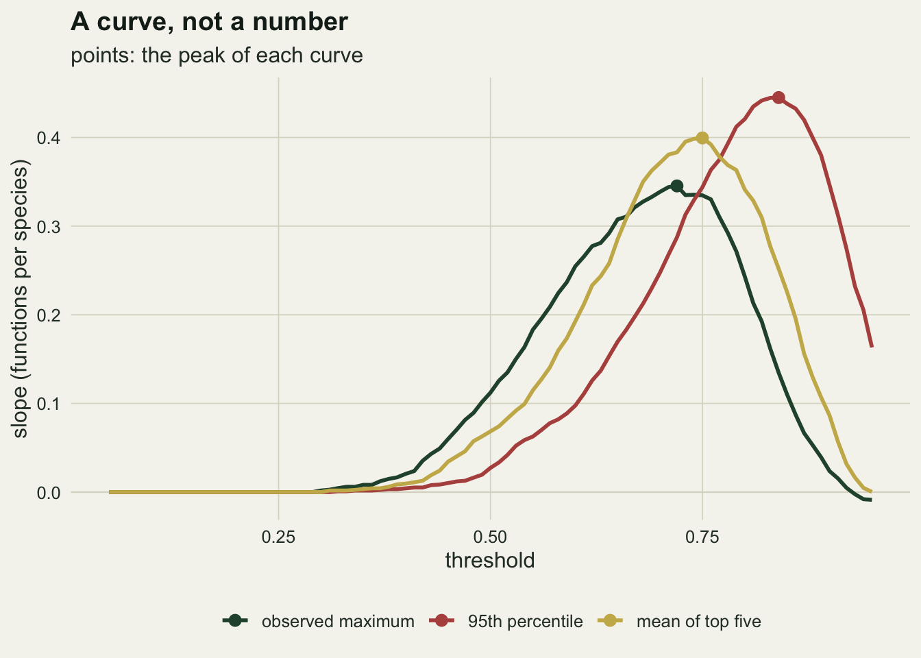
What to report
Report the whole curve. A plot of the richness slope against the threshold, over the full range from below the lowest standardised value to above the highest, costs one figure and it contains every number a single threshold analysis could have produced. Byrnes et al. 2014 give the multiple threshold approach and the summary quantities that go with it, and there is no good reason left to report one threshold on its own.
Report the standardisation with the same weight as the threshold, and say which part of its effect is which. The peak location moves by 0.12 on the threshold scale here, and most of that is the relabelling of the axis that a change of divisor performs. The peak height moves by a factor of 1.29, and that part is a change in what the count is counting, driven by divisors that differ across functions. A slope quoted without its divisor cannot be compared with anybody else’s slope on either count.
Report the per function slopes. They are the quantities that the averaging metric collapses, and once they are on the page, on the same standardised scale, a reader can average them and recover the averaged slope. The scale is not optional: the per function slopes on the raw measurement scale average to 0.0213, which is not the averaged metric’s 0.0124 and never will be. If any of the functions trades off against another, the per function table is the only place that will show.
Report the number of functions and how they were chosen. The count metric’s slope is the sum of the per function indicator slopes, so a function that is flat in richness leaves it where it was, and what a responsive one adds depends on the threshold it is read at: a function whose values sit almost entirely on one side of the line barely moves it, -0.0006, the smallest of the eight contributions above. The size of the published slope grows with the number of functions crossing the threshold along the gradient. Report the proportion passing instead of the count and a flat function dilutes the slope rather than leaving it alone. Either way, dropping a function that responds strongly lowers the slope, for both metrics. Manning et al. 2018 argue that the set of functions should be chosen from the ecosystem services actually at stake rather than from what the laboratory happened to measure, and that argument bites hardest on this metric.
Say whether the count was fitted by least squares. The response is an integer from zero to the number of functions, bounded at both ends, and it piles up on those bounds at both ends of the threshold range: eight for every plot at the bottom, zero for nearly every plot at the top. That is where the least squares residuals are worst behaved, and it is also where the curve says nothing. In the middle, where the peak sits, the count spreads across its range and the normal approximation is under the least strain. The convention in the literature is ordinary regression and that is what is used above, for comparability. A binomial model on the proportion passing respects the bounds; it changes the units of the slope, so the height of a curve fitted that way is not comparable with the one plotted here, and whether it also moves the peak is a question this post does not answer.
Honest limits
Every function here responds positively to richness, by construction. That is the friendly case, and it is why the slope on the worst function per plot, 0.0157, comes out the same size as the averaged slope: 1.27 times it in this draw, with a replicate interval that runs from 0.99 to 1.49 and so includes parity. Real multifunctionality data contain trade offs: a plot that maximises biomass may not maximise soil carbon. With trade offs present, the averaging metric and the threshold metric can point in different directions, and the identity above still holds, which is the point: the averaging metric would keep returning the mean of the individual slopes while the plots underneath it were doing something the mean cannot express.
Two structural assumptions were tested rather than left standing, and neither is free. The complementarity term is linear in richness where real richness effects usually saturate: a logarithmic lift of the same total size moved the peak threshold from 0.722 to 0.733 and cut the peak height by 15 per cent over 150 replicates of each, a smaller move than the standardisation factor of 1.29 but the same kind of size. Every function’s noise is drawn independently where two functions sharing a mechanism, root mass and infiltration say, would be correlated; correlating them made the count more variable and left the peak almost where it was. That correlation went into the noise term only. Correlation built into the species contributions themselves would also change how plot composition maps onto function values, and that case is not measured here.
The peak location has no standard error attached to it. The 40 replicate experiments give a standard deviation of 0.026 on the threshold scale, which is a crude interval and it holds the species pool fixed. A proper interval would resample the pool as well, and it would be wider. The same applies to every replicate figure quoted above: they all condition on this one species pool.
Finally, the sweep is run over a fixed grid from 0.05 to 0.95. Under the 95th percentile standardisation some plots have standardised values above one, so a threshold of 0.95 is not near the top of that distribution and the curve has not finished collapsing at the right hand edge of the figure. The grid is a choice as well, and it should be set from the observed range of the standardised values rather than from habit.
References
Byrnes JEK et al. 2014 Methods in Ecology and Evolution 5(2):111-124 (10.1111/2041-210X.12143)
Gamfeldt L, Hillebrand H, Jonsson PR 2008 Ecology 89(5):1223-1231 (10.1890/06-2091.1)
Hector A, Bagchi R 2007 Nature 448(7150):188-190 (10.1038/nature05947)
Zavaleta ES, Pasari JR, Hulvey KB, Tilman GD 2010 Proceedings of the National Academy of Sciences 107(4):1443-1446 (10.1073/pnas.0906829107)
Maestre FT et al. 2012 Science 335(6065):214-218 (10.1126/science.1215442)
Manning P et al. 2018 Nature Ecology and Evolution 2(3):427-436 (10.1038/s41559-017-0461-7)